
Pastel interiors continue to dominate the global design landscape. At the forefront of this season’s pastel takeover, Feast Watson has introduced six new pastel colours to its Liming White range. Mix and match Feast Watson sorbet tones in Velvet Pistachio, Lavender Field, Skye, Smooth Coral, Natural Buttercup and Macaroon Dream to create a charming and inviting …
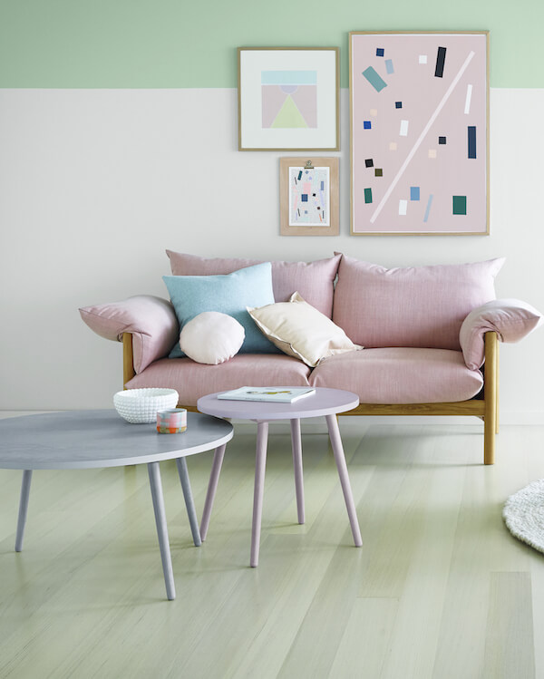
Pastel interiors continue to dominate the global design landscape. At the forefront of this season’s pastel takeover, Feast Watson has introduced six new pastel colours to its Liming White range.
Mix and match Feast Watson sorbet tones in Velvet Pistachio, Lavender Field, Skye, Smooth Coral, Natural Buttercup and Macaroon Dream to create a charming and inviting living area, or alternatively reinvent a standalone furniture piece as a striking design element.
Reflecting the latest in international design trends, the newest pastel additions from Feast Watson include a mix of gentle muted pastels and soft neutrals. This adds to the five shades of grey, introduced into the range earlier this year, to create a beautiful selection of colours ready to match for a harmonised look.
“Pastels are set to make a welcome return to Australian interiors, especially with standalone furniture and feature items. Pastels are a great way to experiment with colour in your home – they are soft and easy on the eye and complement existing neutral base colours” says James Fisher, Feast Watson Brand Manager.
Design and trend consultant Bree Leech has some tips on how to use pastels in your home –
- Don’t be afraid to mix your pastel tones – they all compliment each other.
- Add some strength to the scheme with a contrasting hue – black or white accents are perfect or just add some bursts of similar colours with more depth in artwork or cushions.
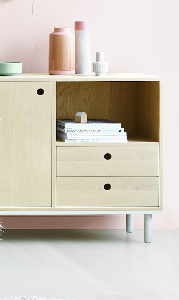
- Liven tired timber by applying soft pastels to timber furniture or accessories that need a new life.
What are your thoughts on pastel interiors? Do you a tired piece of furniture that could do with a pastel revamp?
♥︎ KC.


Comments
European Interior Design
Love pastels color, especially in interior design 🙂