The rules in styling and design have always been to ensure a cohesive and balanced aesthetic in the home. But some styling rules are meant to be broken, which is why we’re going to explore what they are and how to successfully execute them in a room. All sounds a bit serious doesn’t it? It’s …
The rules in styling and design have always been to ensure a cohesive and balanced aesthetic in the home.
But some styling rules are meant to be broken, which is why we’re going to explore what they are and how to successfully execute them in a room.
All sounds a bit serious doesn’t it? It’s not. Styling can be both fun and methodical at the same time. A lot of the time it’s about arranging and swapping then rearranging again to get the final look you’re happy with.
- Blue and Green shouldn’t be seen together
Remember the saying ‘Blue and Green should never be seen?’ Well it’s a rule that can be broken, with a few exceptions.
Both colours are cool and sometimes they can clash. To make blue and green work effectively with each other, they will require another colour to separate them.
To make blue and green work together, work with contrast and texture.
- Emerald with indigo
- Forest green with duck blue
- Navy blue with sage
Make one colour louder than the other to achieve a balanced look.
Alternatively, if you go bold with both colours, add another colour into the mix to help it blend better. Try a warm colour like orange or a neutral like white.

(image)
- All metallic finishes should match
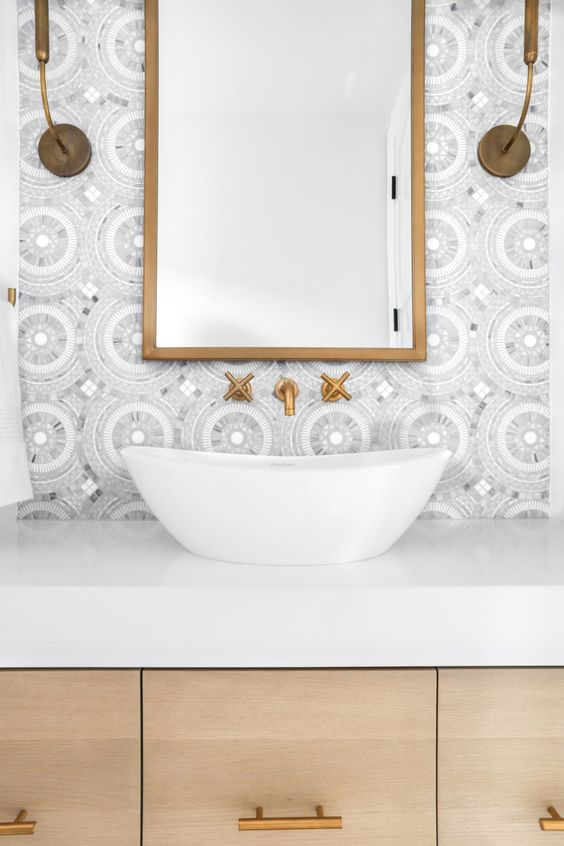
This rule has often crept up in bathrooms and kitchens where the tapware should match all accessories and hardware in the bathroom.
But we’ve seen the emergence of a variety of metallic finishes for tapware and often it’s not possible to match accessories with it. So mixing your metallic finishes is the only option and it can be done successfully.
There are a few ways to make this rule work by ensuring the metallic finishes are subtle in the room.
Choose similar tones like brass and gold or bronze and copper. Or mix two tones together like chrome and brass. It will create a unique look and you might spur on a new trend.
(image)
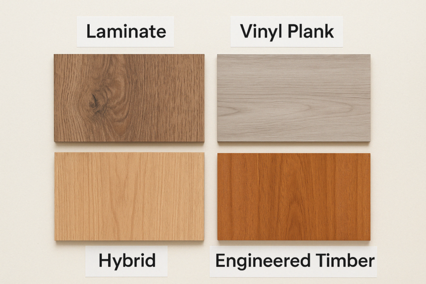
- Floors and furniture should match with the same timber
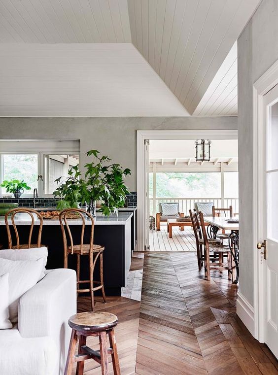
Another rule to break is ensuring all your furniture and floors are made from the same or similar timber.
While it’s not physically possible to do this, it can also make the room feel bland.
Mixing timbers is definitely A-ok and definitely adds depth to your space. Look for similar tones to make it work effectively in your home.
(image)
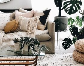
- Don’t mix patterns
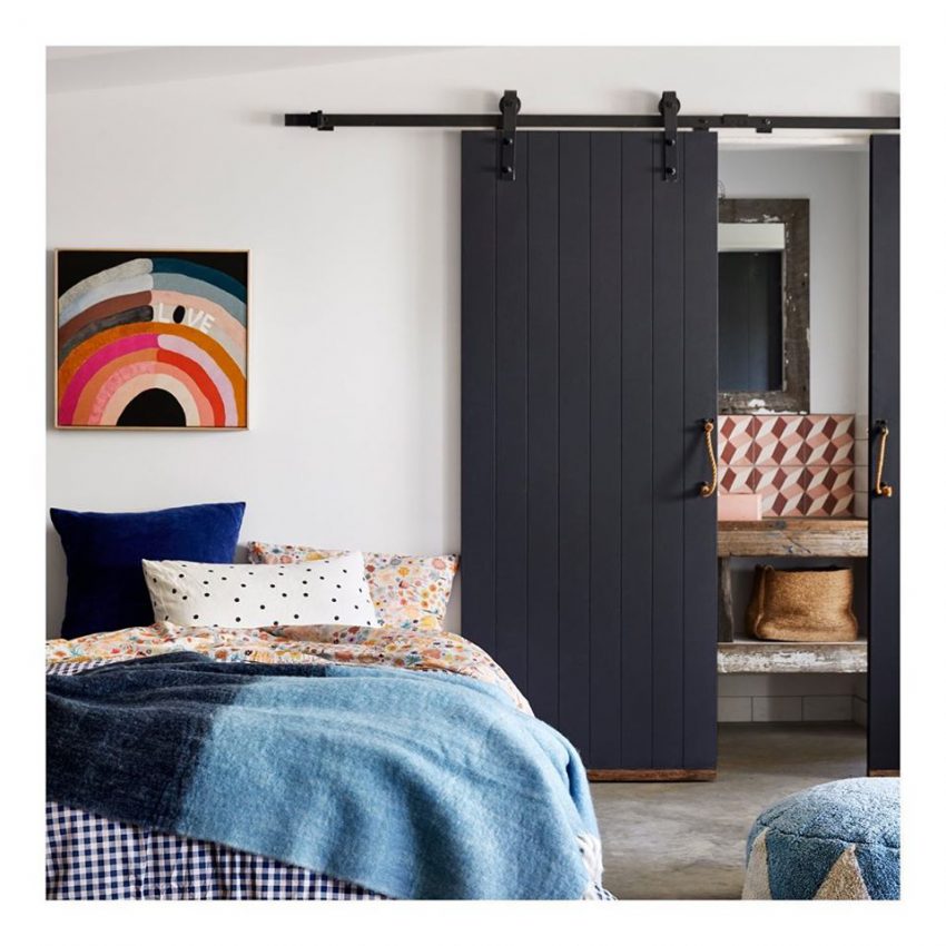
Of course you can mix patterns in your home. But there is a way to do this effectively without turning your living space into an eye sore.
The key to a successful pattern clash is to have the same denominator colour in both patterns. For example if you have a plaid cushion and a floral cushion, make sure they both have similar colours or one same block colour to make it work.
There are some bright and colourful bohemian spaces which go all out with their colours and patterns. You will notice they stick to a repeating colour palette and that’s why they work.
(image)
- Balance can only be achieved with symmetry
In theory, symmetry will always look balanced, but when it comes to interiors, it can make the room look boxed in. And sometimes a little too perfect.
Change the sofas so they aren’t facing each other, or swap one out with an occasional chair.
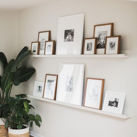
Layer art with one large print behind a smaller framed print.
Even gallery walls can look effective with different sized pictures and frames.
To get balance right in a room, it does take time to rearrange and swap and sometimes rearrange again. But don’t get sucked into symmetrical placement or it will look over-styled.
(image)
♥ KC.
You might like – 9 Ways To Make Your Living Room Bigger.
Be the first to read my stories
Get Inspired by the World of Interior Design
Thank you for subscribing to the newsletter.
Oops. Something went wrong. Please try again later.




Comments
Graysonau
Thanks for sharing very useful information. Katrina