[vc_row][vc_column][vc_column_text]Hi there! Thanks for stopping by today. It was Guest Bedroom week this week on The Block and the contestants delivered some great rooms! I was surprised some of them bothered to add bathrooms and walk-in-robes?? Where were they grabbing that space from? Surely it will impact on the rest of the house layout? But …
[vc_row][vc_column][vc_column_text]Hi there! Thanks for stopping by today. It was Guest Bedroom week this week on The Block and the contestants delivered some great rooms! I was surprised some of them bothered to add bathrooms and walk-in-robes?? Where were they grabbing that space from? Surely it will impact on the rest of the house layout? But good on some of them for doing so. I was sure the judges HAD to score those who added bathrooms with more points, but clearly not after last night’s reveals!
The final scores for guest bedrooms were Ronnie and Georgia on 28, Josh and Elyse on 27.5, Jason and Sarah on 27, Hannah and Clint also on 27 and Wombat and Sticks on 26.5.
Come and check them out in order of points this week…[/vc_column_text][vc_column_text]
Georgia & Ronnie


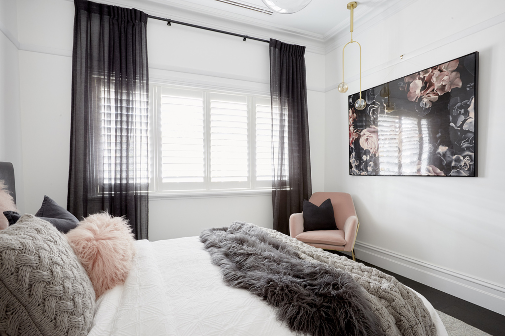
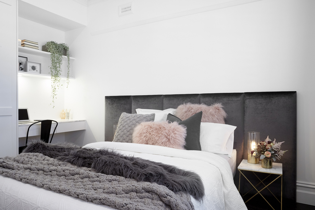
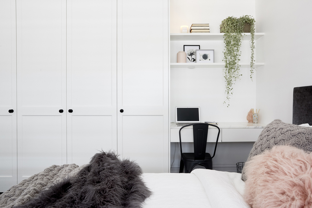
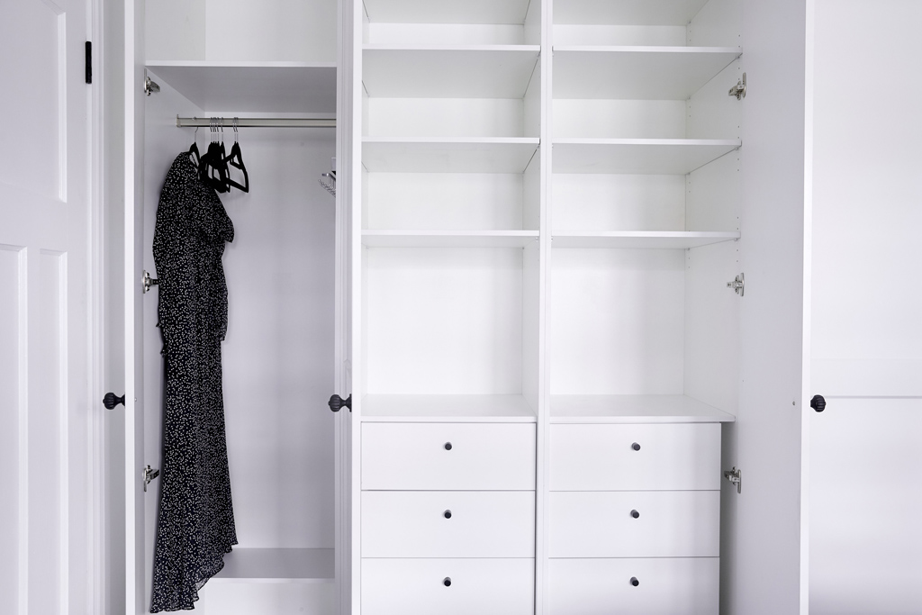
Top of the leader board this week with a really pretty guest bedroom (and no ensuite). Ronnie & Georgia do know how to flip a quick bedroom. I liked it, but it wasn’t anything special was it?
You can SHOP some of their room below…[/vc_column_text][/vc_column][/vc_row][vc_row][vc_column width=”1/3″][vc_single_image image=”48628″ onclick=”custom_link” link=”https://www.theblockshop.com.au/store/single/wild-roses-art-print”][/vc_column][vc_column width=”1/3″][vc_single_image image=”48629″ onclick=”custom_link” link=”https://www.theblockshop.com.au/store/single/carmine-floor-rug-200×300-in-grey”][/vc_column][vc_column width=”1/3″][vc_single_image image=”48630″ onclick=”custom_link” link=”https://www.theblockshop.com.au/store/single/copper-toilet-roll-hand-towel-holder”][/vc_column][/vc_row][vc_row][vc_column][vc_column_text]
Josh & Elyse
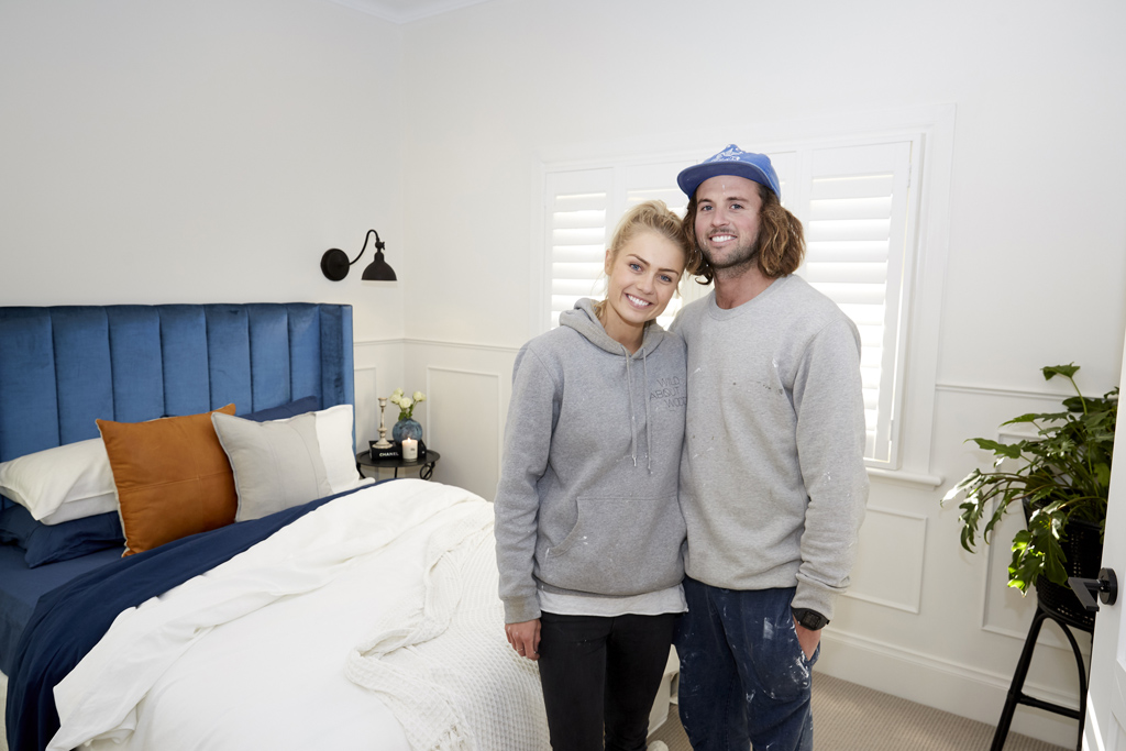


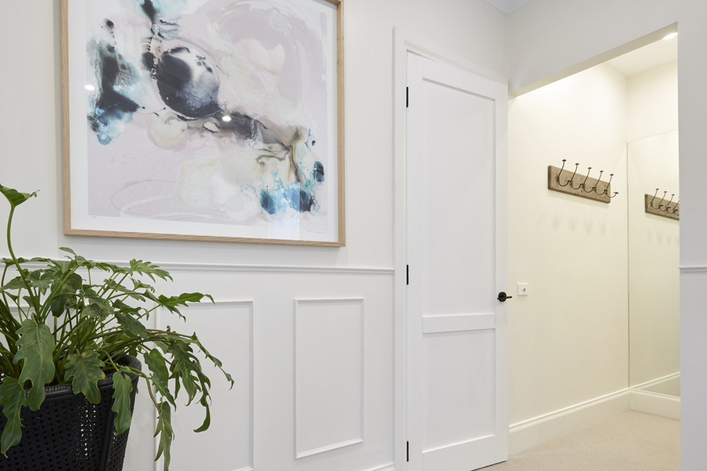
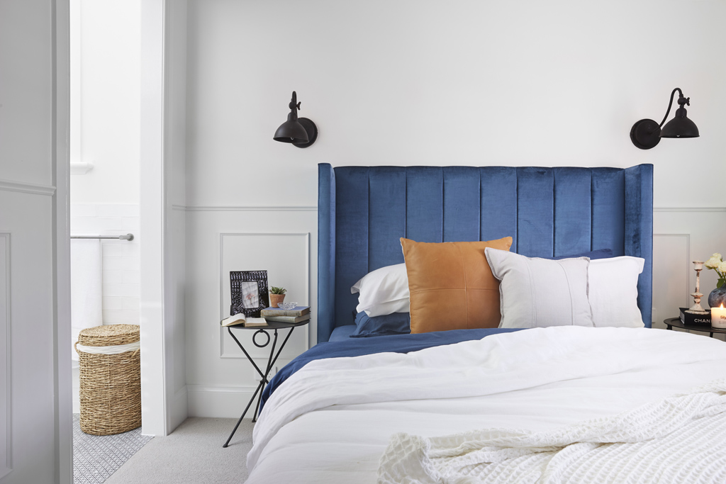

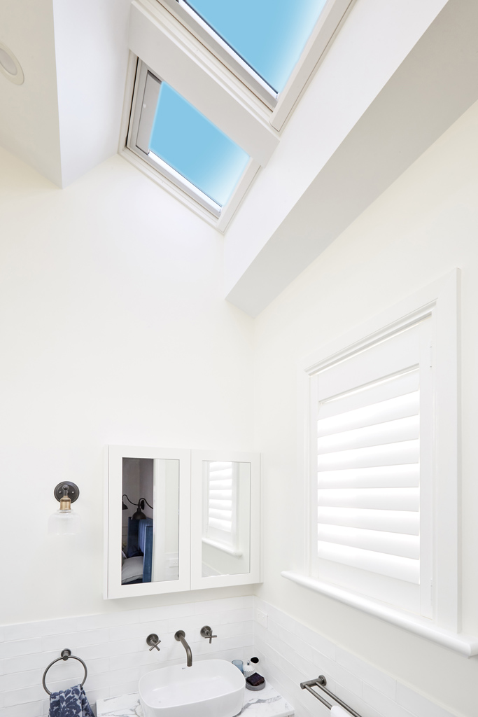

Gorgeous room and beautiful colours, with an ensuite too. There’s a lot of detail in the space with the wainscoting and layering. I really like their style.
You can SHOP some of Josh and Elyse’s room below…[/vc_column_text][/vc_column][/vc_row][vc_row][vc_column width=”1/3″][vc_single_image image=”48632″ onclick=”custom_link” link=”https://www.theblockshop.com.au/store/single/rattan-plant-stand-chicken-eye-black”][/vc_column][vc_column width=”1/3″][vc_single_image image=”48633″ onclick=”custom_link” link=”https://www.theblockshop.com.au/store/single/vanoise-wall-bracket-light-rust-patina”][/vc_column][vc_column width=”1/3″][vc_single_image image=”48634″ onclick=”custom_link” link=”https://www.theblockshop.com.au/store/single/lincoln-bedhead-with-wings-in-ellison-cornflower-velvet”][/vc_column][/vc_row][vc_row][vc_column][vc_column_text]
Sarah & Jason
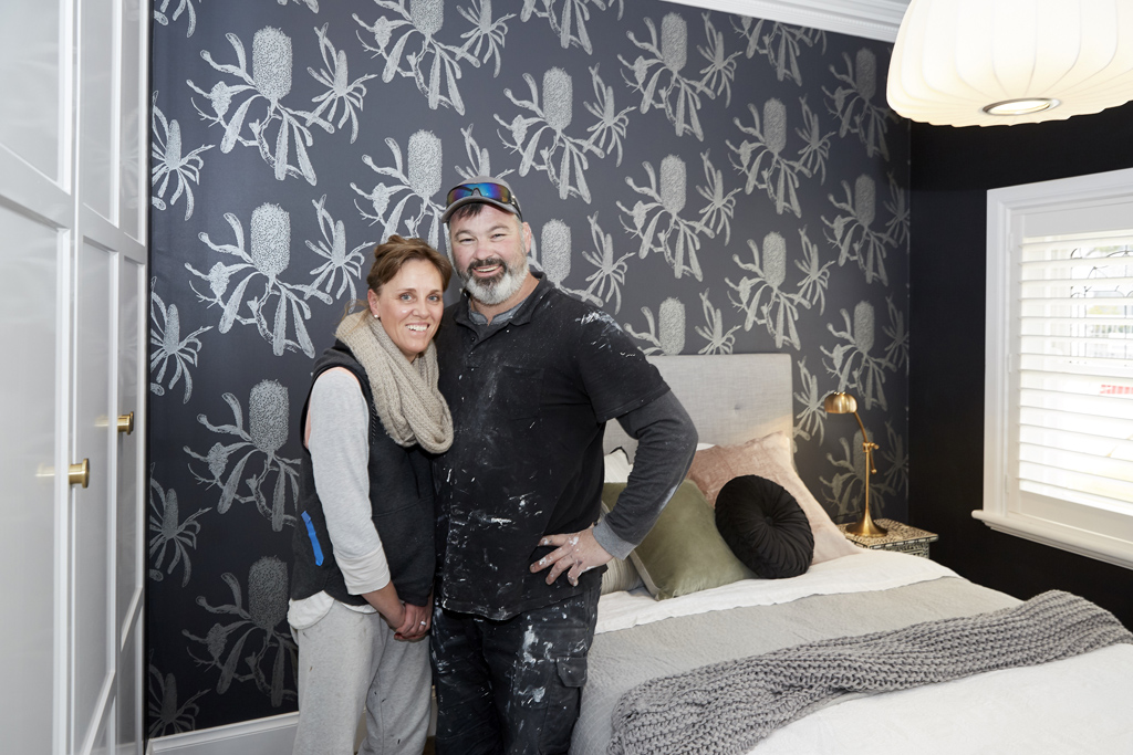
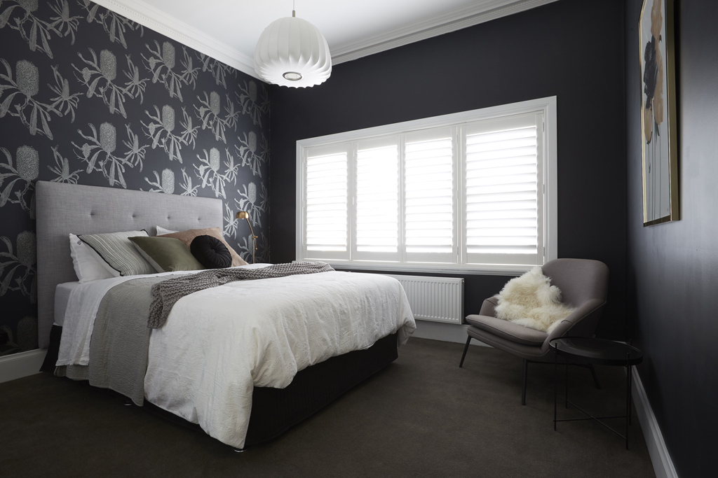

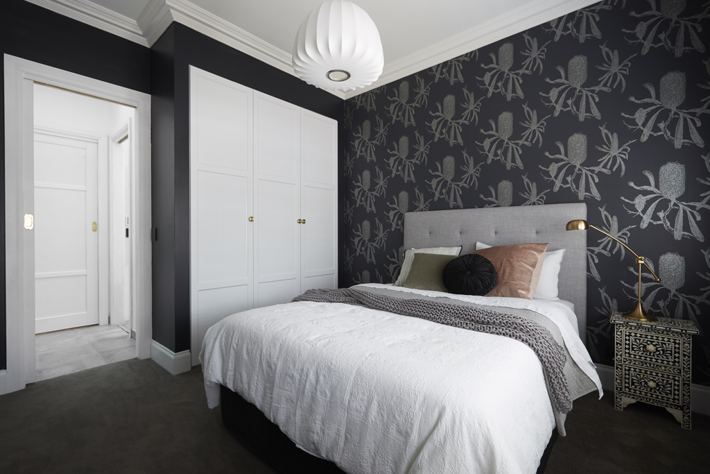


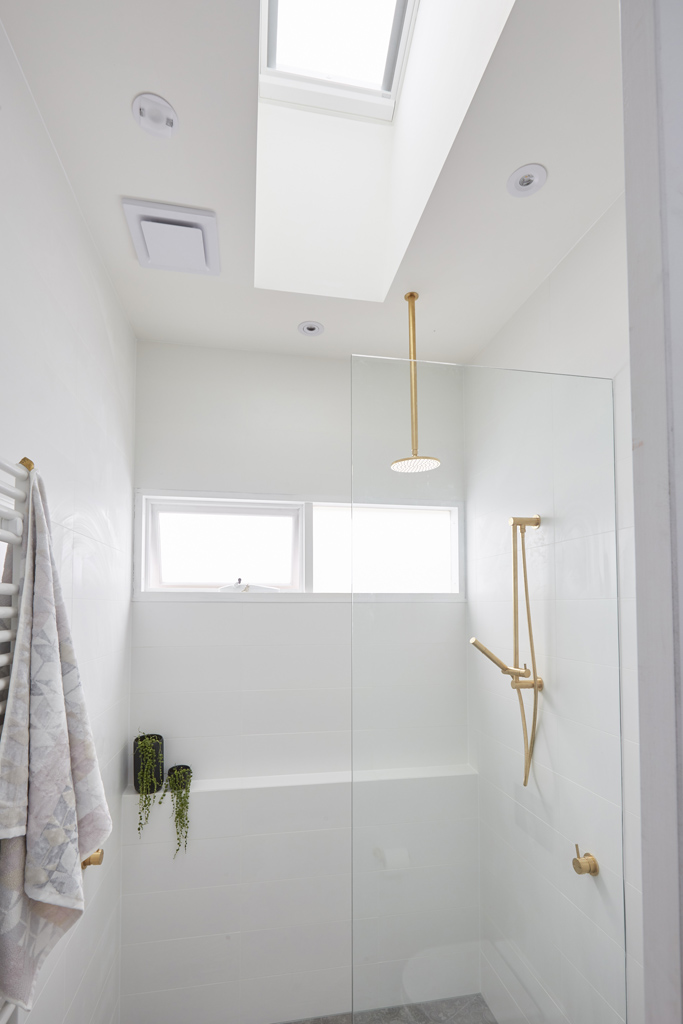

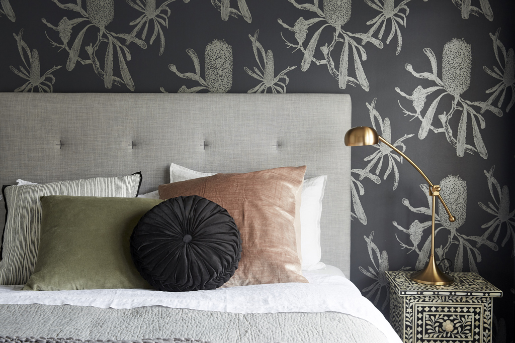
Jason and Sarah produced a moody and cosy guest bedroom with ensuite this week. I like the colours, but wasn’t a fan of the wall paper. I love the bedside on its own, but it didn’t work for me in that room. What did you think??
You can SHOP their room below…[/vc_column_text][/vc_column][/vc_row][vc_row][vc_column width=”1/3″][vc_single_image image=”48635″ onclick=”custom_link” link=”https://www.theblockshop.com.au/store/single/serenity-framed-art-print”][/vc_column][vc_column width=”1/3″][vc_single_image image=”48636″ onclick=”custom_link” link=”https://www.theblockshop.com.au/store/single/fenwick-bedhead”][/vc_column][vc_column width=”1/3″][vc_single_image image=”48637″ onclick=”custom_link” link=”https://www.theblockshop.com.au/store/single/melton-grey-marle-quilted-jersey-quilt-cover”][/vc_column][/vc_row][vc_row][vc_column][vc_column_text]
Hannah & Clint
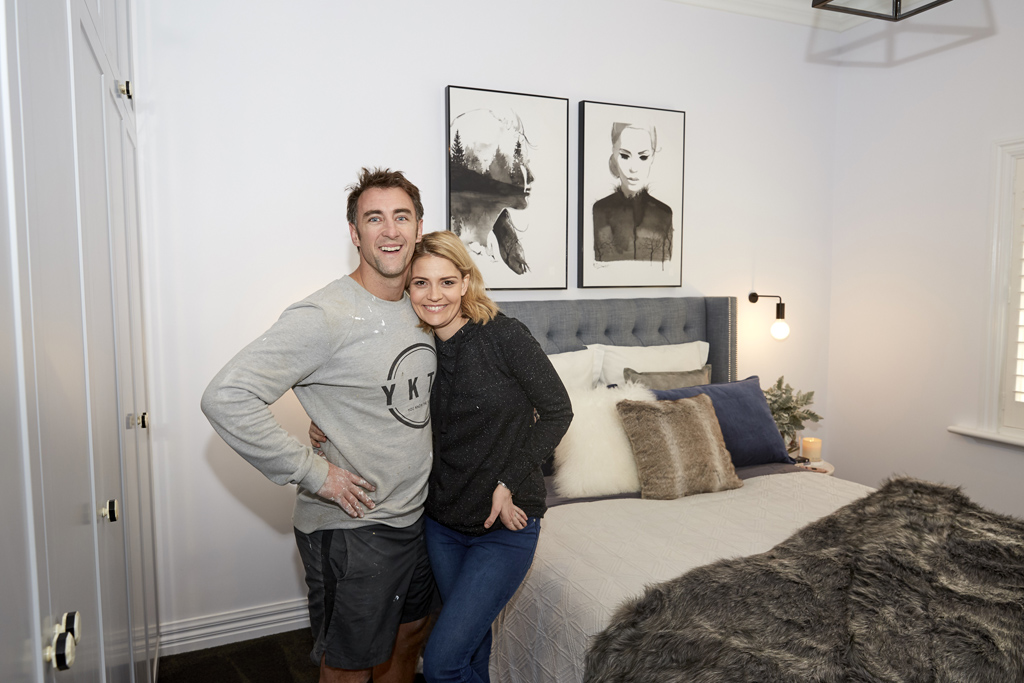
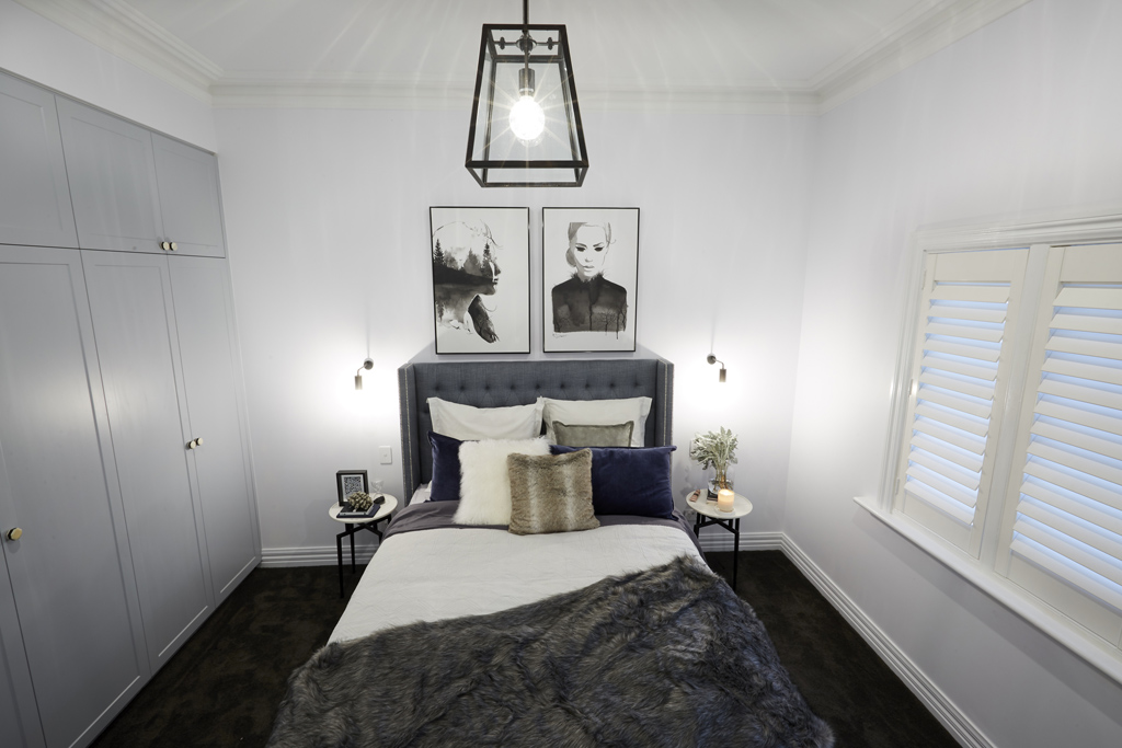


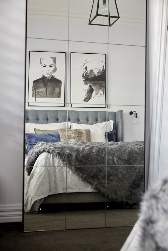
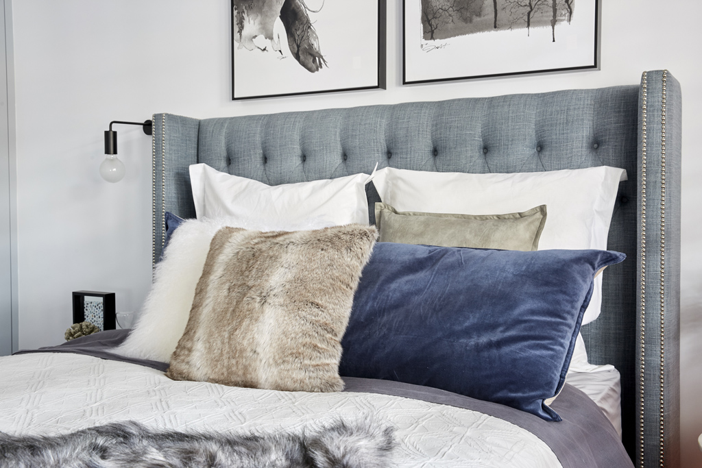
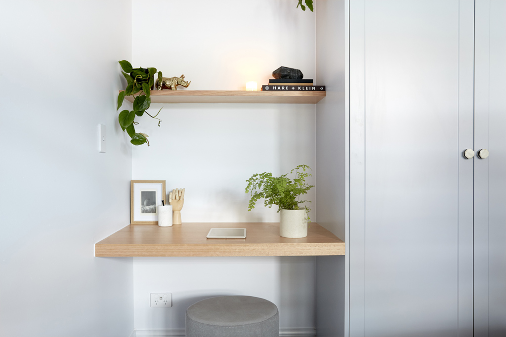
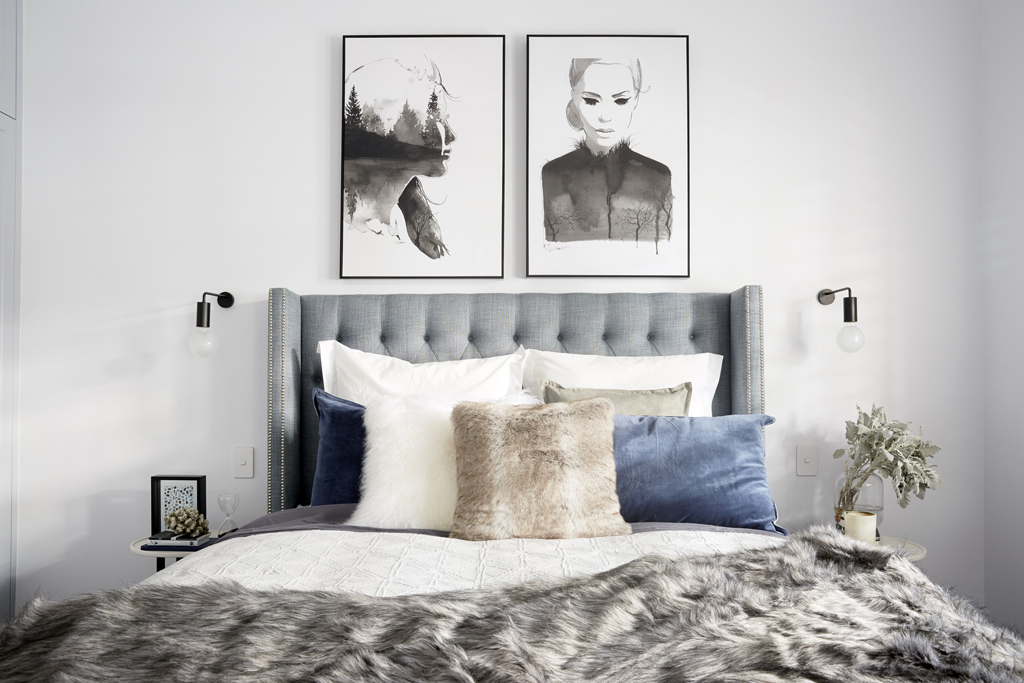
I think Hannah and Clint should have won. Although they didn’t do a ensuite (same as Georgia and Ronnie) I just think their style is good. Soft, calming and appealing to the masses. They’re having a rough start to The Block, but I bet they end on a high! LOVE the wardrobes.
You can SHOP some of their room below…[/vc_column_text][/vc_column][/vc_row][vc_row][vc_column width=”1/3″][vc_single_image image=”48638″ onclick=”custom_link” link=”https://www.theblockshop.com.au/store/single/grid-leaning-mirror-90x180cm”][/vc_column][vc_column width=”1/3″][vc_single_image image=”48639″ onclick=”custom_link” link=”https://www.theblockshop.com.au/store/single/waldorf-bedhead-in-canterbury-lagoon”][/vc_column][vc_column width=”1/3″][vc_single_image image=”48640″ onclick=”custom_link” link=”https://www.theblockshop.com.au/store/single/southampton-1-light-pendant-in-antique-black”][/vc_column][/vc_row][vc_row][vc_column][vc_column_text]
Sticks & Wombat
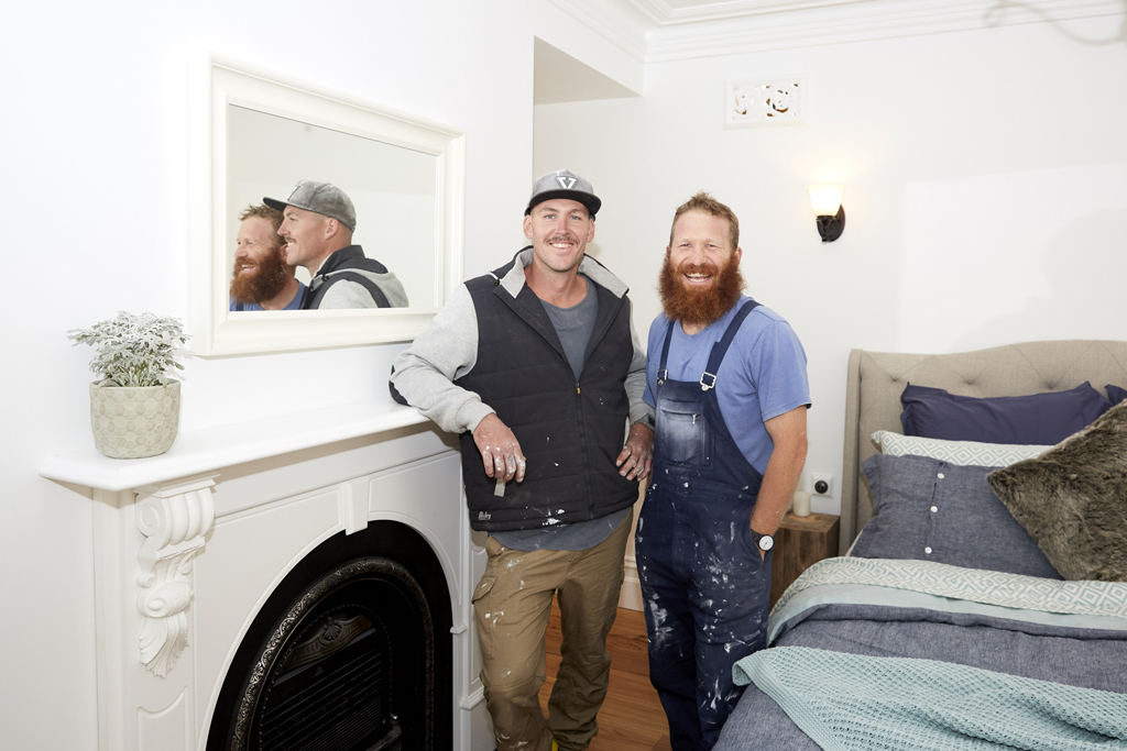


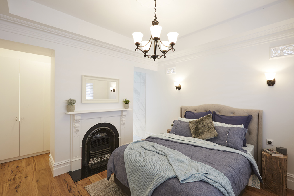
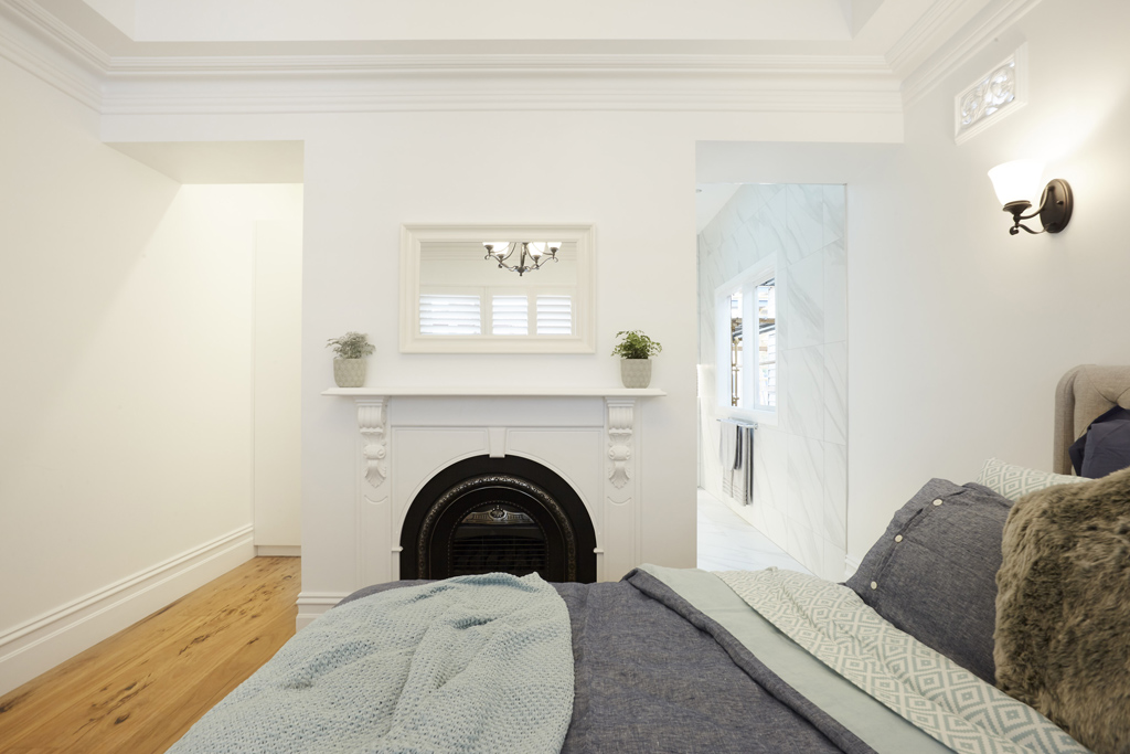
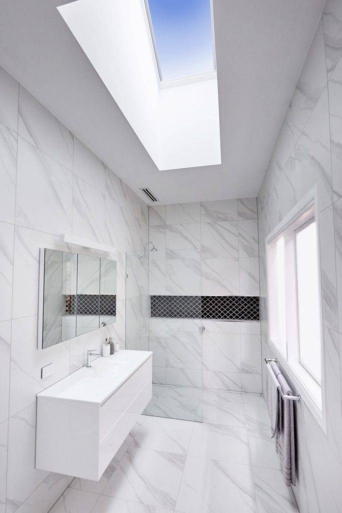
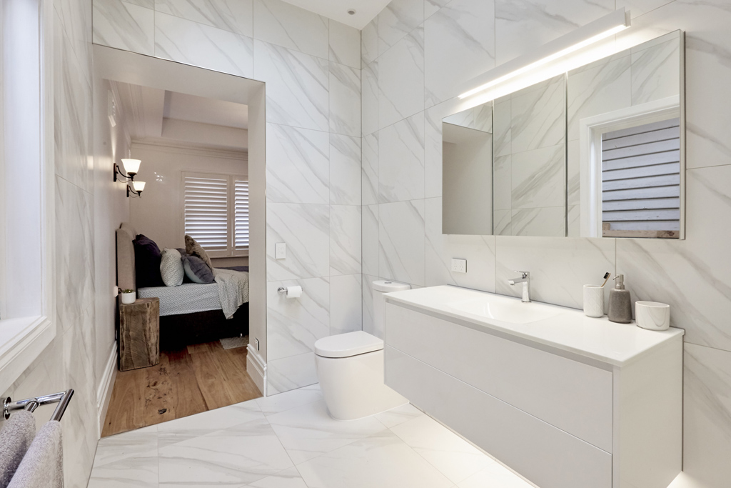

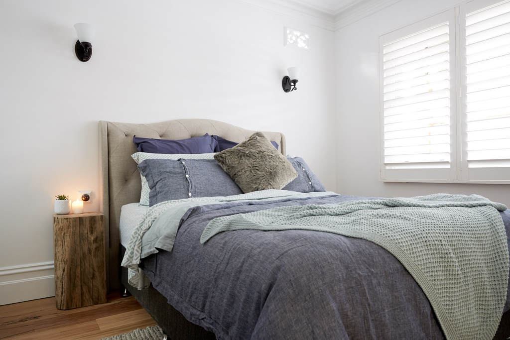
The boys went for a natural feel in the bedroom but then went modern in the bathroom? I was hoping to see their whole house evolve based around sustainable elements especially seeing as they’ve done great floorboards. Hoping that flavour will come through more as we move through the house.
You can SHOP Sticks & Wombat’s room here…[/vc_column_text][/vc_column][/vc_row][vc_row][vc_column width=”1/3″][vc_single_image image=”48641″ onclick=”custom_link” link=”https://www.theblockshop.com.au/store/single/chambray-seafoam-reversible-duvet-set”][/vc_column][vc_column width=”1/3″][vc_single_image image=”48642″ onclick=”custom_link” link=”https://www.theblockshop.com.au/store/single/hourglass-stump”][/vc_column][vc_column width=”1/3″][vc_single_image image=”48643″ onclick=”custom_link” link=”https://www.theblockshop.com.au/store/single/kellen-square-side-table-stool”][/vc_column][/vc_row][vc_row][vc_column][vc_column_text]What did you think of the rooms? Which did you prefer? ♥ KC.[/vc_column_text][/vc_column][/vc_row]
Be the first to read my stories
Get Inspired by the World of Interior Design
Thank you for subscribing to the newsletter.
Oops. Something went wrong. Please try again later.





Comments
Rebecca Hendricks
I really liked Ronnie and Georgia’s room and I’m glad they won (even tho their personalities drive me mental!! Haha). I don’t think the boys were wise taking up so much space from their media room to make that massive ensuite and wir! Crazy! From the drawings they showed the media room is now smaller than the ensuite or the wir???
I think some of the teams are thinking about winning rooms more than the overall layout and design of the house as a whole! I personally wouldn’t be adding more bathrooms than necessary because it means cleaning more bathrooms! At this stage it looks like the contestants who added the ensuite this week will have four bathrooms throughout the house with the extension! That’s just overkill! Be interesting to see the homes when they’re all done!
Katrina Ashton
my thoughts exactly!
Kathy Fisher
I am astounded at the dollar amount being spent on each room. $52,000 for one bathroom. That is absurd. I used to love The Block and wish it would revert to the old days. Judge on the actual building / application – not on the decor which can be changed at the snap of a finger.
Löz Alãnnah
I’m the same – it’s not about the build anymore, only the cosmetics.
Kathy Fisher
I used to love the show with a passion. Now it’s all glitz & glamour, bitching & backstabbing. I just can’t comprehend the amount that gets spent on each room and the fact the budget allows it. These contestants would struggle to renovate their own houses on a strict budget. The old days the contestants did most of their own work with the exception of the professional trades. I know it’s all about sponsorship but places like Reece are so overpriced. Make it a true competition and have them renovate on a strict budget for the whole place which will force them to shop / bargain / barter etc and bring back the voting on their work. Many years ago we went to the South Melbourne houses and the quality of the work is shocking.
Löz Alãnnah
I agree. The last few have been built in our patch, so we’ve been invited to view before the auctions. I went to the ones on High St in Prahran, and the workmanship was substandard – I’d be pissed if that standard of work was in my house. I used to watch the show religiously but now hardly watch it at all because it’s all about buying $300 cushions and the like. The judges are almost as bad now as well, sometimes they are so rude with their ‘feedback’. It’s not constructive anymore. If it were about the build and construction, or restoration, like it was with the heritage listed properties in Richmond, I’d be more interested again.
Kathy Fisher
Totally agree. I often wander if the buyers at auction have inspected the properties before they buy and really look at the work. Gosh, I bought a unit with an orange wall in lounge. I hate it. Others loved it. Who cares about the colour – it can be changed.
Kathy Fisher
I think they should split the voting: 70% on build (if not more) and 30% on styling (and by styling, I only mean bedding / cushions etc
Löz Alãnnah
That’s a better idea. Half the stuff I see in the rooms these days that cost hundreds of dollars, can usually be found in places like Kmart or Target for a fraction of the price.