[vc_row][vc_column][vc_row_inner][vc_column_inner][vc_column_text]This week on Reno Rumble we saw Debbie's whole house get a full renovation. The reveals were split over 2 nights (one half was last week), but I thought I'd blog the entire one all together. Check out the rooms below...[/vc_column_text][/vc_column_inner][/vc_row_inner][vc_row_inner][vc_column_inner][vc_column_text] The communal room this week was the hallway... [/vc_column_text][vc_separator border_width="2"][/vc_column_inner][/vc_row_inner][vc_column_text] Office (Dane and Leanne) …
[vc_row][vc_column][vc_row_inner][vc_column_inner][vc_column_text]This week on Reno Rumble we saw Debbie’s whole house get a full renovation. The reveals were split over 2 nights (one half was last week), but I thought I’d blog the entire one all together.
Check out the rooms below…[/vc_column_text][/vc_column_inner][/vc_row_inner][vc_row_inner][vc_column_inner][vc_column_text]
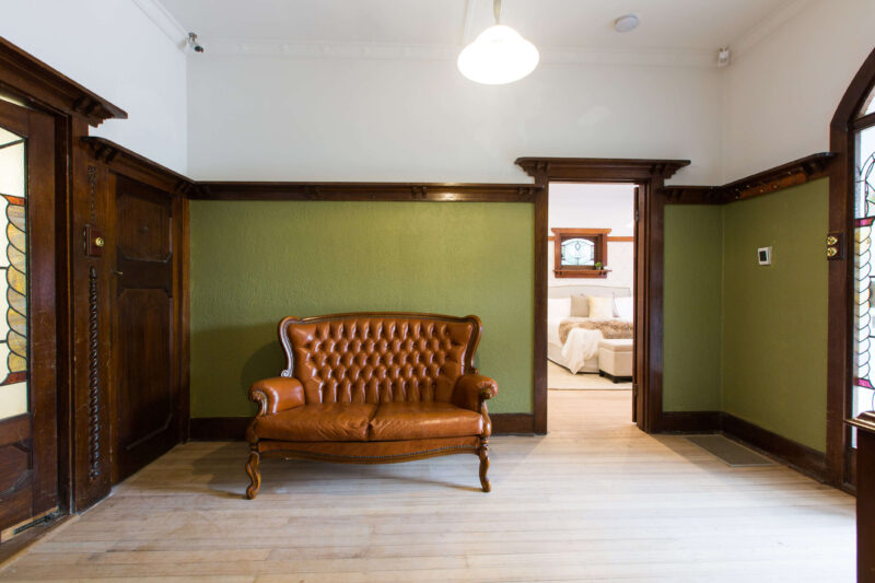
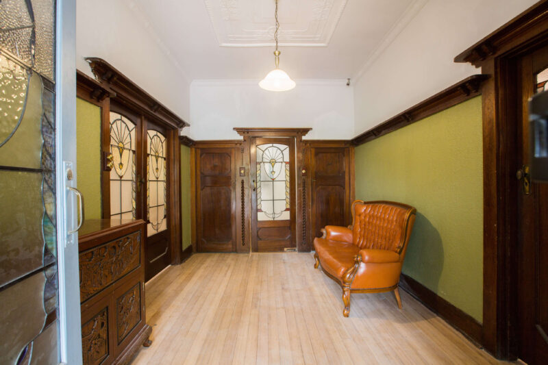
The communal room this week was the hallway…
 [/vc_column_text][vc_separator border_width=”2″][/vc_column_inner][/vc_row_inner][vc_column_text]
Office (Dane and Leanne)
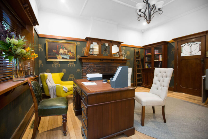
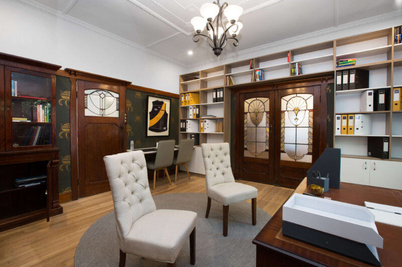
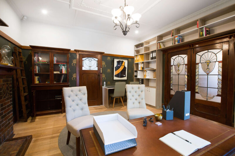
Colin thought that the wallpaper choice was commanding because of the single bold repeated print. The judges loved the desk and choice of different chairs. They felt the shelving around the door was practical but the colour and finish of it let the overall tone of the room down.
Colin’s score: 8/10 Justin’s score: 8/10 Total: 16/20
Bathroom
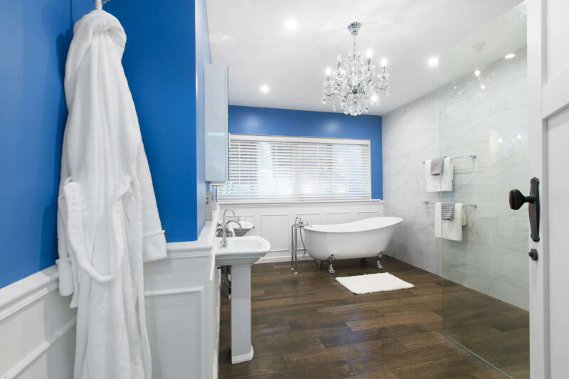
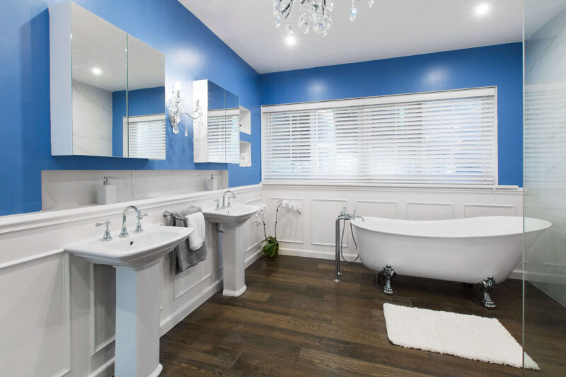
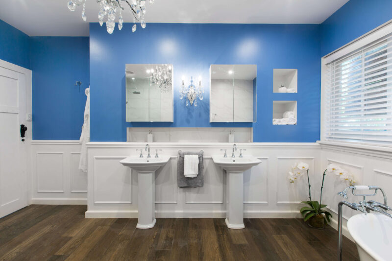
Upon walking into the bathroom, the judges thought it was very glam and they loved the chandelier. Colin thought Dane and Leanne had really satisfied Debbie’s brief with the size of the bathroom. Colin said that he would have preferred to see the lighter baby blue colour from the shower tiles on the walls instead of the darker blue they used. Justin felt the panelling was let down by the rough plywood finish.
Colin’s score: 8/10 Justin’s score: 7/10 Total: 15/20
…
Shop the look here…[/vc_column_text][vc_row_inner][vc_column_inner width=”1/3″][vc_single_image image=”42630″][vc_column_text]
[/vc_column_text][/vc_column_inner][vc_column_inner width=”1/3″][vc_single_image image=”42631″][vc_column_text]
[/vc_column_text][/vc_column_inner][vc_column_inner width=”1/3″][vc_single_image image=”42632″][vc_column_text]
[/vc_column_text][/vc_column_inner][/vc_row_inner][vc_separator border_width=”2″][/vc_column][/vc_row][vc_row][vc_column][vc_column_text]
Living room (Lisa and John)
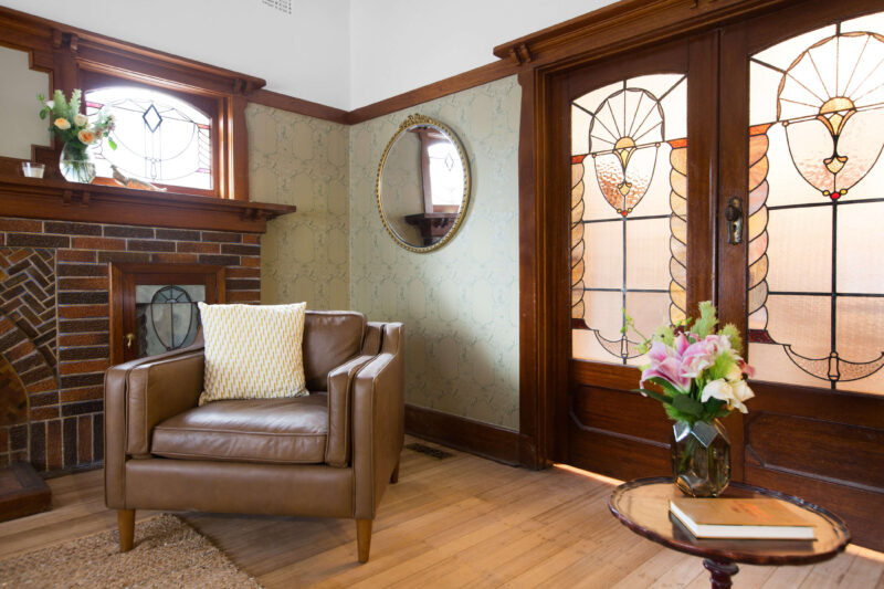
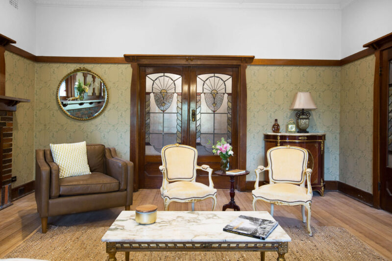
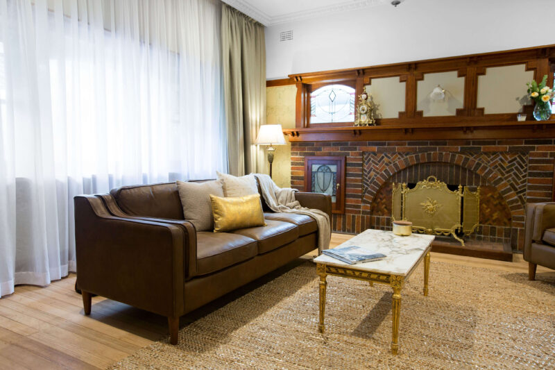
Colin thought the wallpaper choice was a good one and Justin loved the detailing in the ceiling and the overall reference to the time period in the room. Both Colin and Justin felt the lighting was a letdown, suggesting a bigger floor lamp to add to the space.
Colin’s score: 8/10 Justin’s score: 8/10 Total: 16/20
Guest bedroom

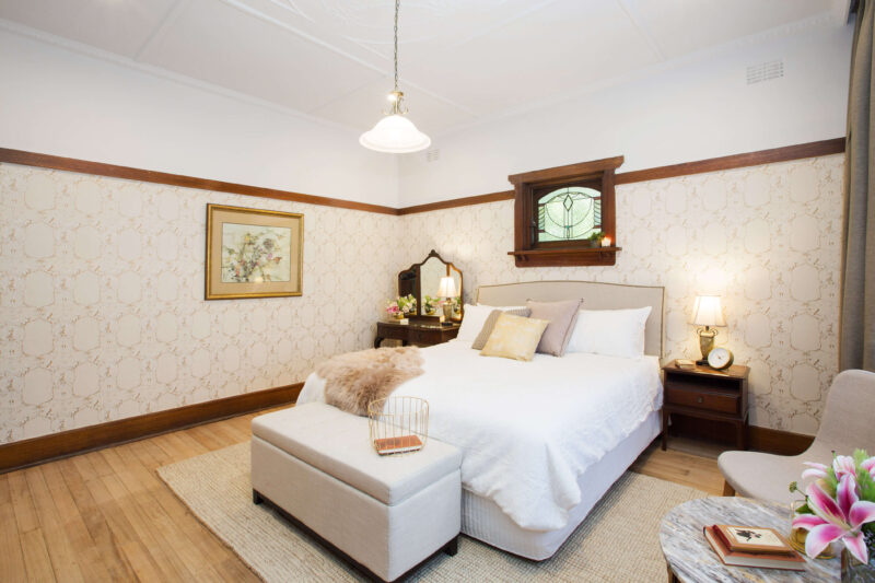
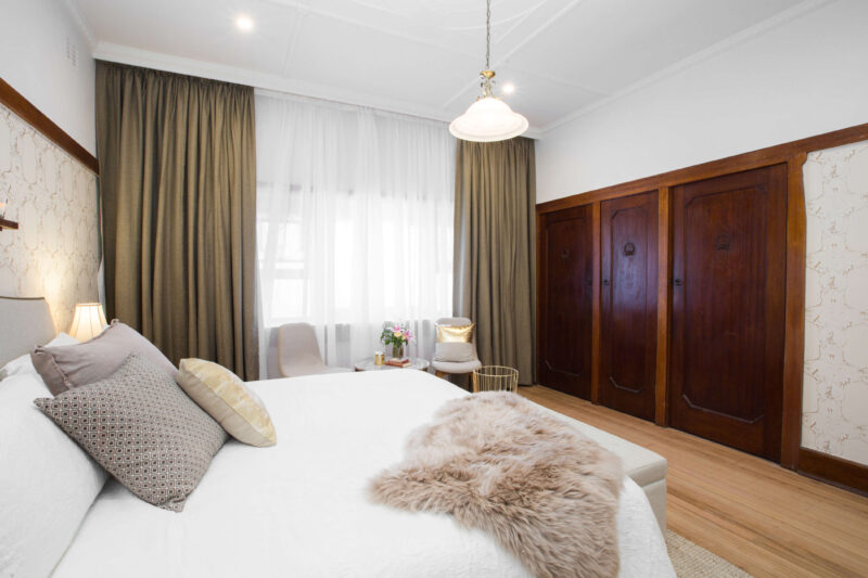
Justin thought they hit the nail on the head with the brief – a comfortable space for everyone. Colin thought the unbalanced bedside tables were great and accentuated the casual vibe of the room. The sanding of the floors was a bit too light for Colin’s liking, who suggested a darker rug to offset this. Justin thought the atmosphere overall was triple A.
Colin’s score: 9/10 Justin’s score: 8/10 Total: 17/20
…
Shop the look here…[/vc_column_text][vc_row_inner][vc_column_inner width=”1/3″][vc_single_image image=”42480″][vc_column_text]
[/vc_column_text][/vc_column_inner][vc_column_inner width=”1/3″][vc_single_image image=”42636″][vc_column_text]
[/vc_column_text][/vc_column_inner][vc_column_inner width=”1/3″][vc_single_image image=”42637″][vc_column_text]
[/vc_column_text][/vc_column_inner][/vc_row_inner][vc_separator border_width=”2″][/vc_column][/vc_row][vc_row][vc_column][vc_column_text]
Kitchen and dining area (Sarah and Renee)
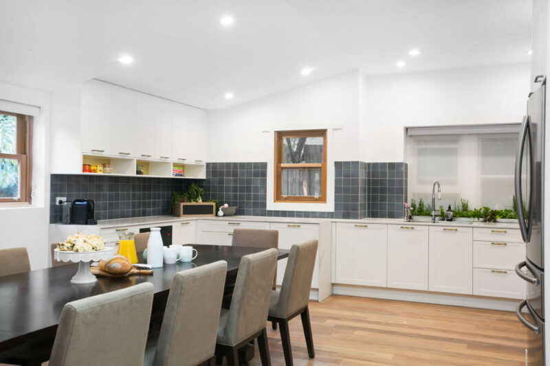
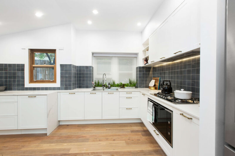
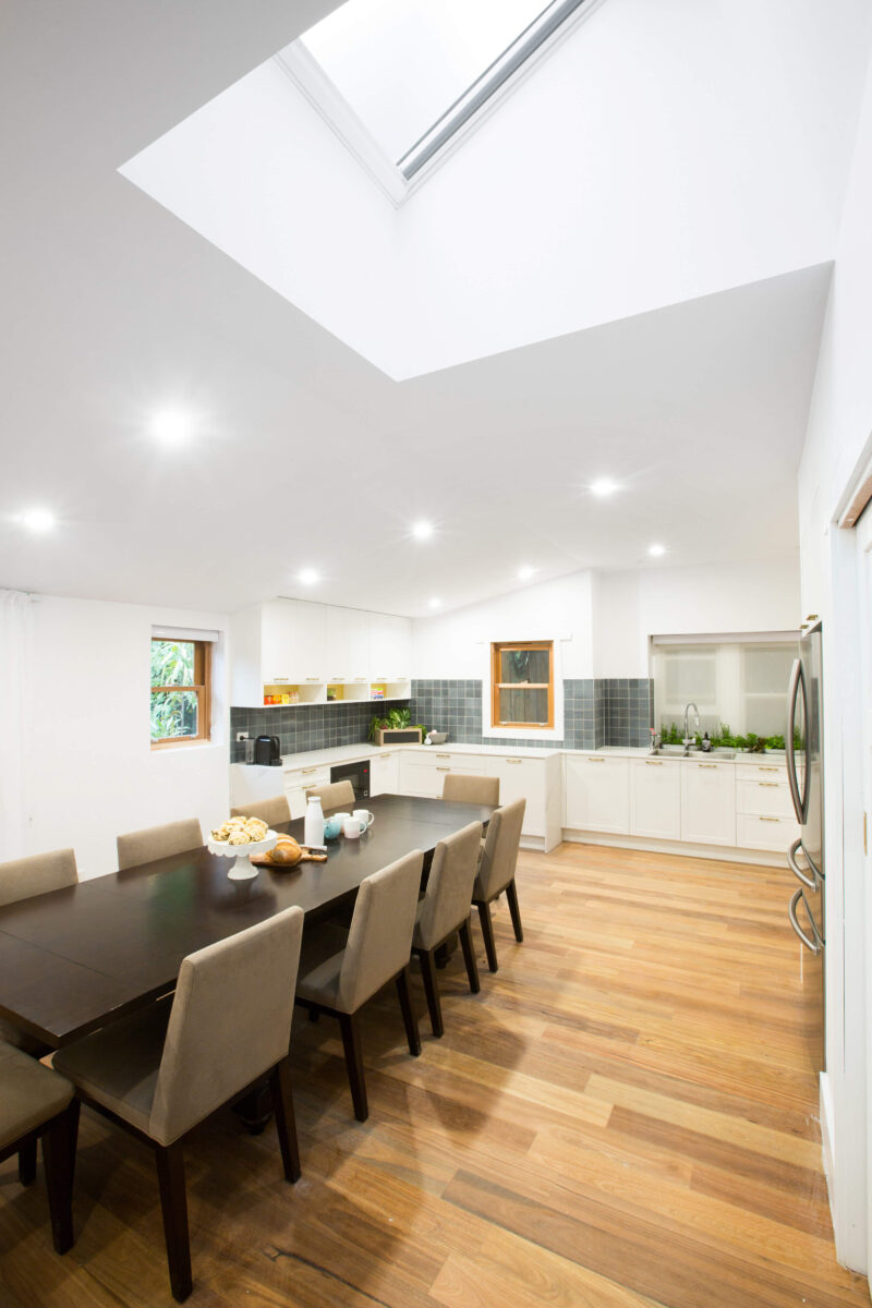
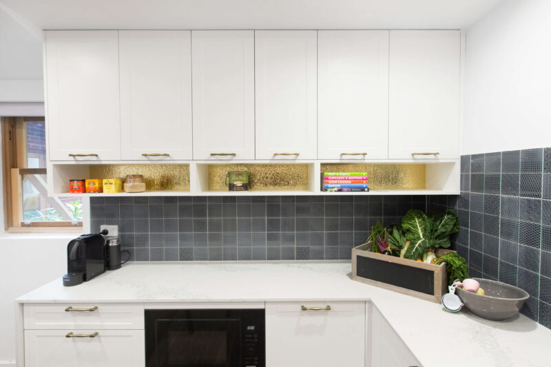
Justin loved the cabinets with the brass handles and how well they complimented the chrome tapware. Overall he felt the space was balanced and well played with the wrap around casearstone bench top. Both judges loved the butler’s pantry, but Colin felt the tiled splashback throughout the kitchen was too modern.
Colin’s score: 8/10 Justin’s score: 7/10 Total: 15/20
The drop in

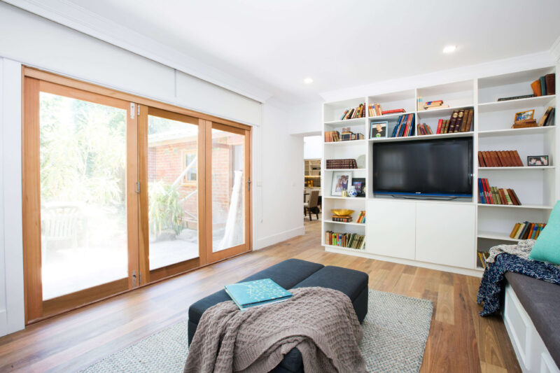
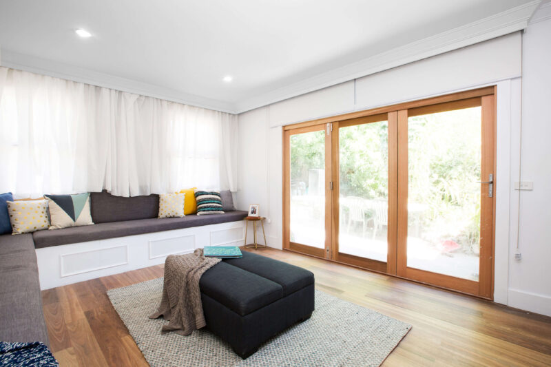
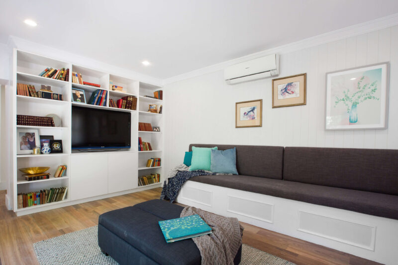
The judges thought the seating also doubling as storage was very clever design. Colin felt the l-shaped lounge would well as it worked with the shape of the room and maximised seating space. Justin loved the multipurpose ottoman which doubled as a bed, ticking a box on the homeowners wish for the space. Unfortunately the judges felt this room was a little one dimensional, suggesting adding colour or pattern in the blinds or other soft furnishings.
Colin’s score: 7/10 Justin’s score: 7/10 Total: 14/20
…
Shop the look here…[/vc_column_text][vc_row_inner][vc_column_inner width=”1/3″][vc_single_image image=”42638″][vc_column_text]
[/vc_column_text][/vc_column_inner][vc_column_inner width=”1/3″][vc_single_image image=”42639″][vc_column_text]
[/vc_column_text][/vc_column_inner][vc_column_inner width=”1/3″][vc_single_image image=”42640″][vc_column_text]
[/vc_column_text][/vc_column_inner][/vc_row_inner][vc_separator border_width=”2″][/vc_column][/vc_row][vc_row][vc_column][vc_column_text]
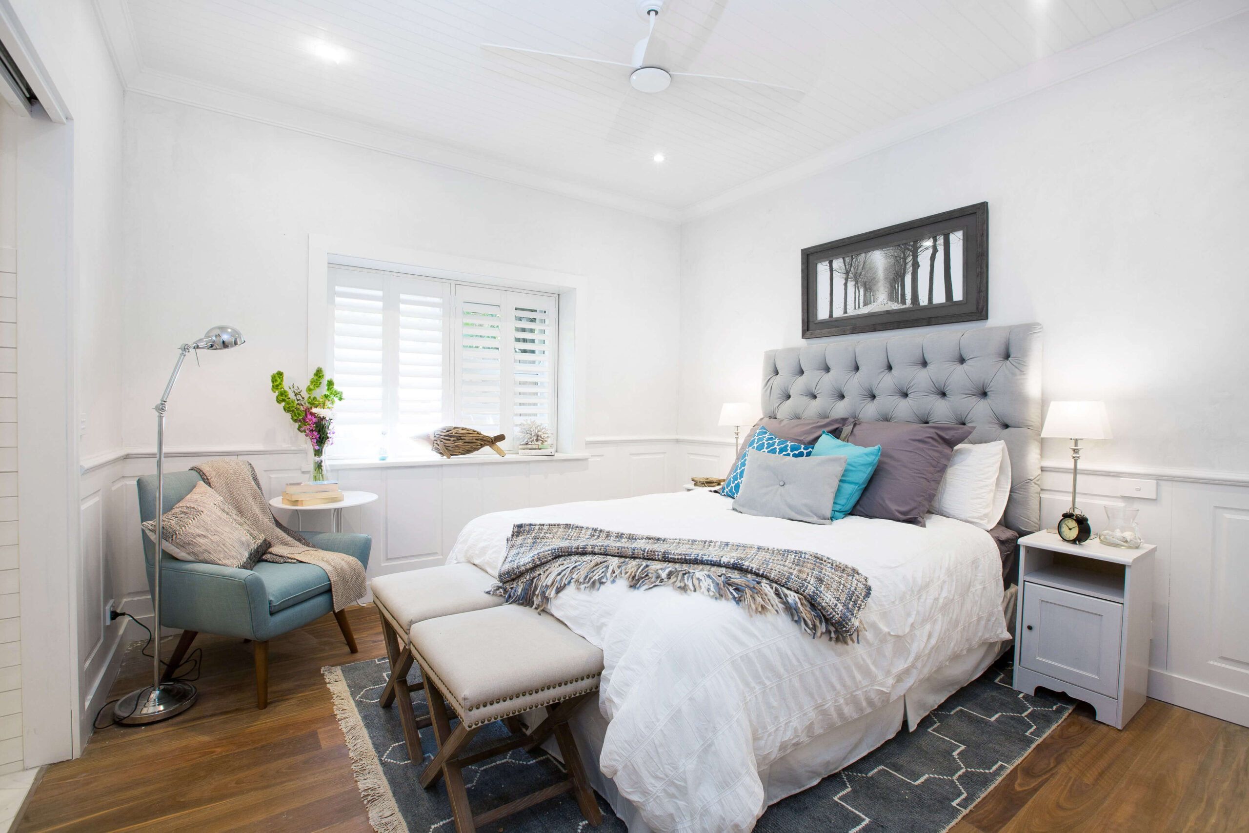
Master bedroom (Scott and Nadia)

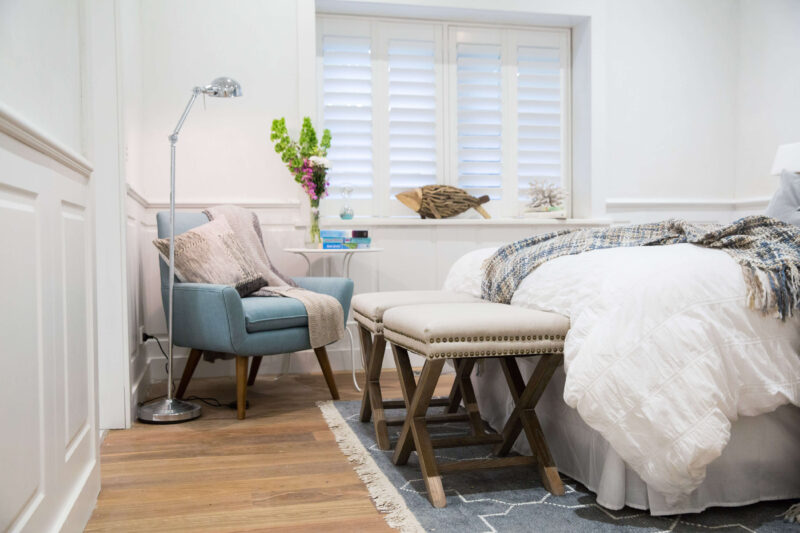
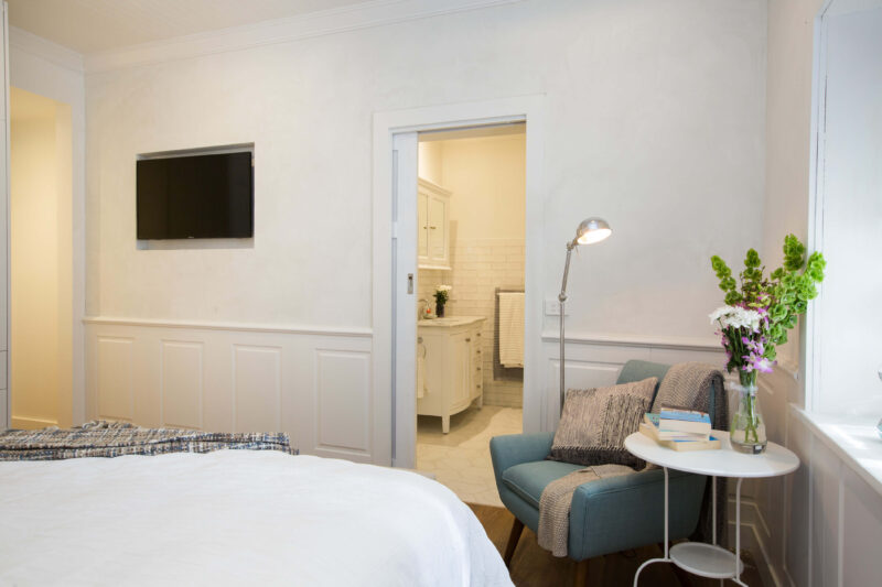

Justin felt like he was on holiday when he walked into this room. Colin thought the plantation shutters, throw and rug were gorgeous, but Justin didn’t like the wooden nightstands painted the same colour as the walls. Both judges noticed poor paintwork on the wall panels and stressed the importance of strong finishes.
Colin’s score: 8/10 Justin’s score: 7/10 Total: 15/20
Ensuite


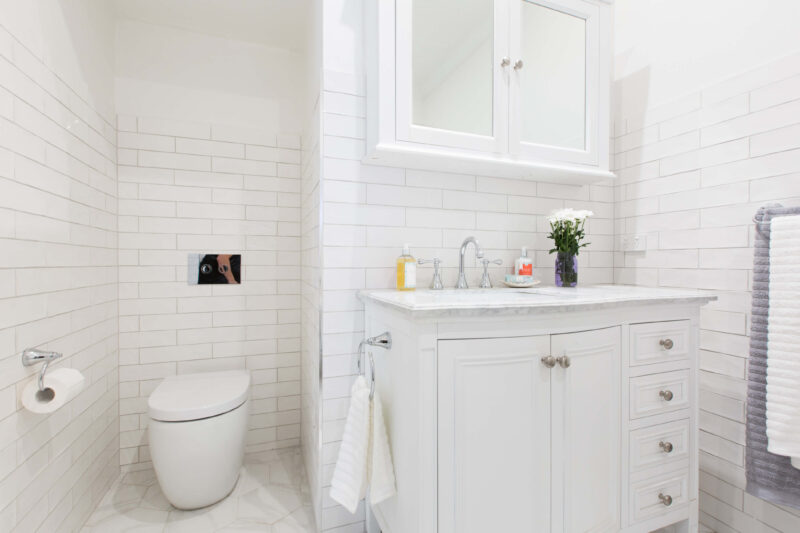
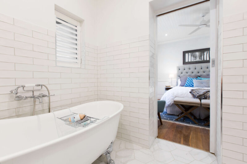
Justin loved that Scott and Nadia listened to what Debbie wanted for her ensuite. The wooden ceiling and the detail in the hexagonal tiles were a standout for Justin. Colin loved the plantation shutters again. Both judges loved the feet on the bath, with Justin envisioning himself happily having a soak in it. Justin didn’t like the placement of the plant next to the bath though, he felt it wasn’t needed.
Colin’s score: 8/10 Justin’s score: 9/10 Total: 17/20
…
Shop the look here…[/vc_column_text][vc_row_inner][vc_column_inner width=”1/3″][vc_single_image image=”42633″][vc_column_text]
[/vc_column_text][/vc_column_inner][vc_column_inner width=”1/3″][vc_single_image image=”42634″][vc_column_text]
[/vc_column_text][/vc_column_inner][vc_column_inner width=”1/3″][vc_single_image image=”42635″][vc_column_text]
[/vc_column_text][/vc_column_inner][/vc_row_inner][vc_separator border_width=”2″][/vc_column][/vc_row][vc_row][vc_column][vc_column_text]
What did you think of the finished house? Who do you think will WIN??
Left to battle it out in Grand Final week is just Scott & Nadia and John & Lisa. House reveal 5 is under way and I will come back with those pictures soon.[/vc_column_text][vc_separator border_width=”2″][/vc_column][/vc_row]
Be the first to read my stories
Get Inspired by the World of Interior Design
Thank you for subscribing to the newsletter.
Oops. Something went wrong. Please try again later.





Comments
Donna
Once again you’ve done a great job Katrina. Channel nine should just use you. I did love that they kept that beautiful original woodwork.