[vc_row][vc_column][vc_column_text]Hi there! Thanks for stopping by today. It was Kids' Bedroom week this week on The Block. I couldn't wait to see these photos. They always tend to design little kids' rooms though. I was waiting for the bigger kid reveal! Maybe next time. What did you think of the rooms? Anything blow your socks …
[vc_row][vc_column][vc_column_text]Hi there! Thanks for stopping by today. It was Kids’ Bedroom week this week on The Block. I couldn’t wait to see these photos. They always tend to design little kids’ rooms though. I was waiting for the bigger kid reveal! Maybe next time. What did you think of the rooms? Anything blow your socks off? I thought they were all ok. Nothing stood out though for me.
The final scores for kids bedrooms were Ronnie and Georgia on 29, Sarah and Jason on 27, Sticks and Wombat on 25.5, Josh and Elyse on 23 and Hannah and Clint on 22.
Come and check them out in order of points this week…[/vc_column_text][vc_column_text]
Georgia & Ronnie
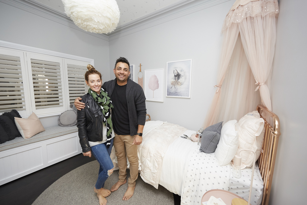


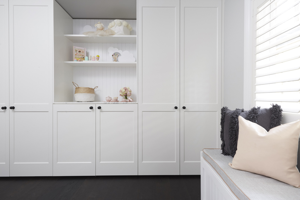
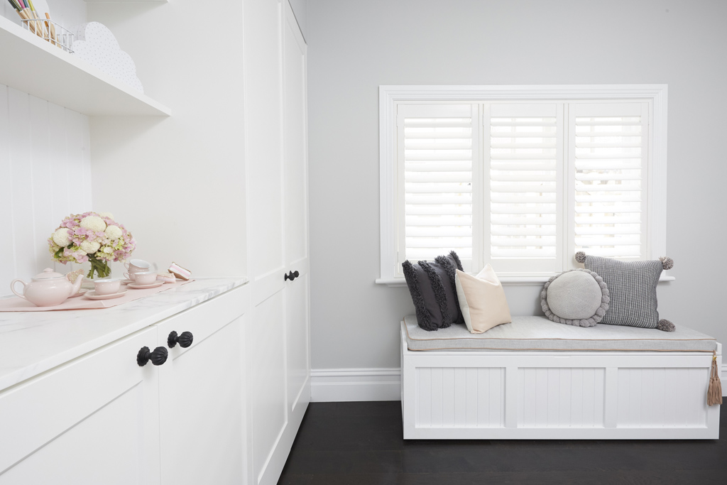
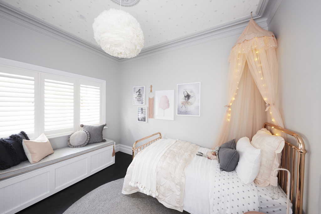

Top of the leader board this week AGAIN was Ronnie and Georgia. It was a very lovely little girls room. It could have been in any one of my Instagram or Pinterest feeds. You could easily have swapped out the bed and canopy for a bigger bed and it becomes a guest room.
You can SHOP some of their room below…[/vc_column_text][/vc_column][/vc_row][vc_row][vc_column width=”1/3″][vc_single_image image=”48815″ onclick=”custom_link” link=”https://www.theblockshop.com.au/store/single/large-belly-basket”][/vc_column][vc_column width=”1/3″][vc_single_image image=”48816″ onclick=”custom_link” link=”https://www.theblockshop.com.au/store/single/mrs-mighetto-dear-toffle-watercolour-art-print-40x50cm”][/vc_column][vc_column width=”1/3″][vc_single_image image=”48817″ onclick=”custom_link” link=”https://www.theblockshop.com.au/store/single/eden-bed”][/vc_column][/vc_row][vc_row][vc_column][vc_column_text]
Sarah & Jason
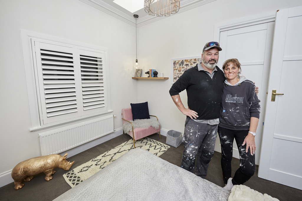
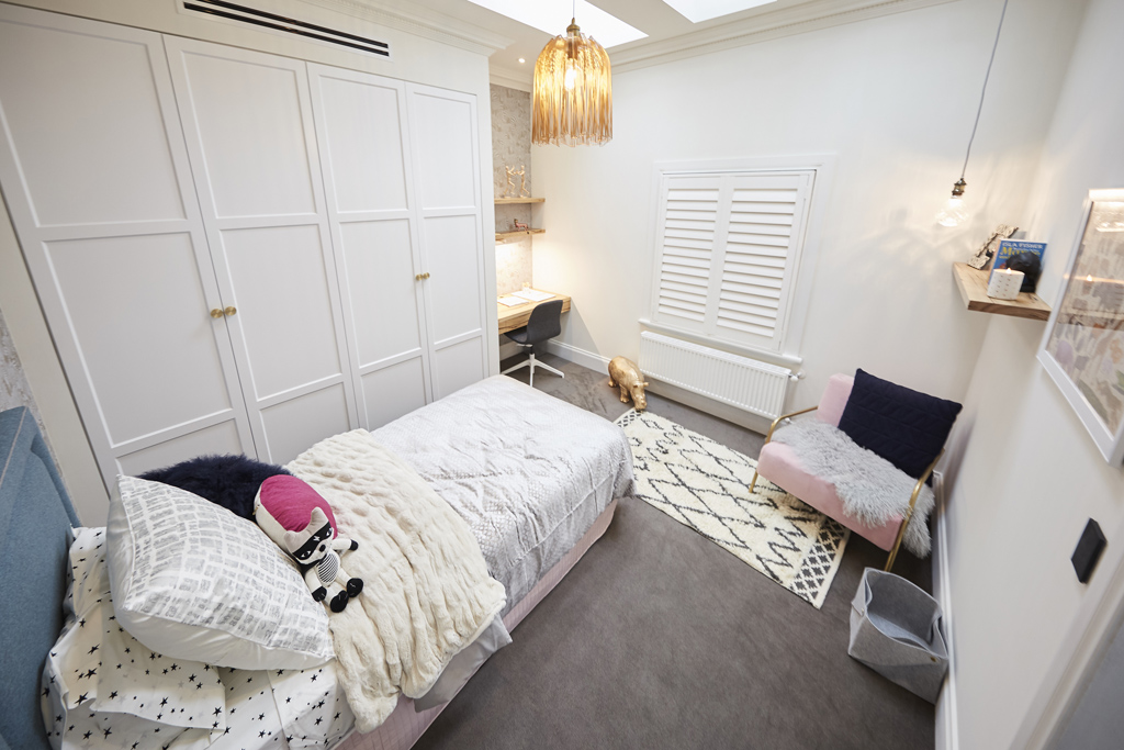

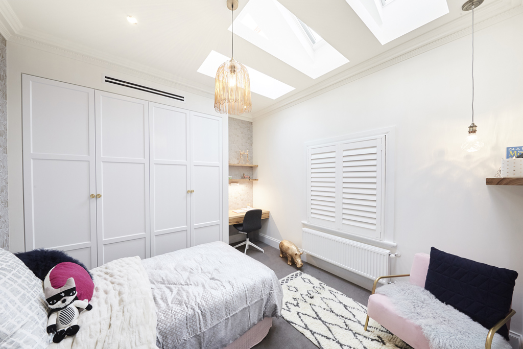
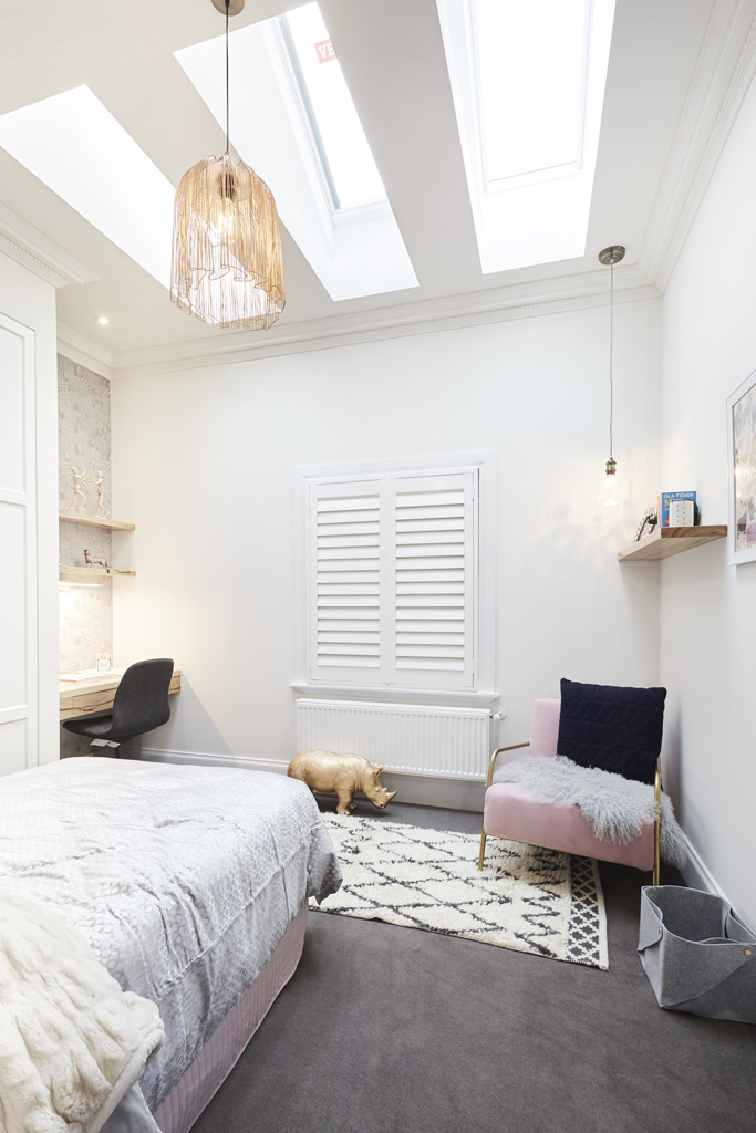
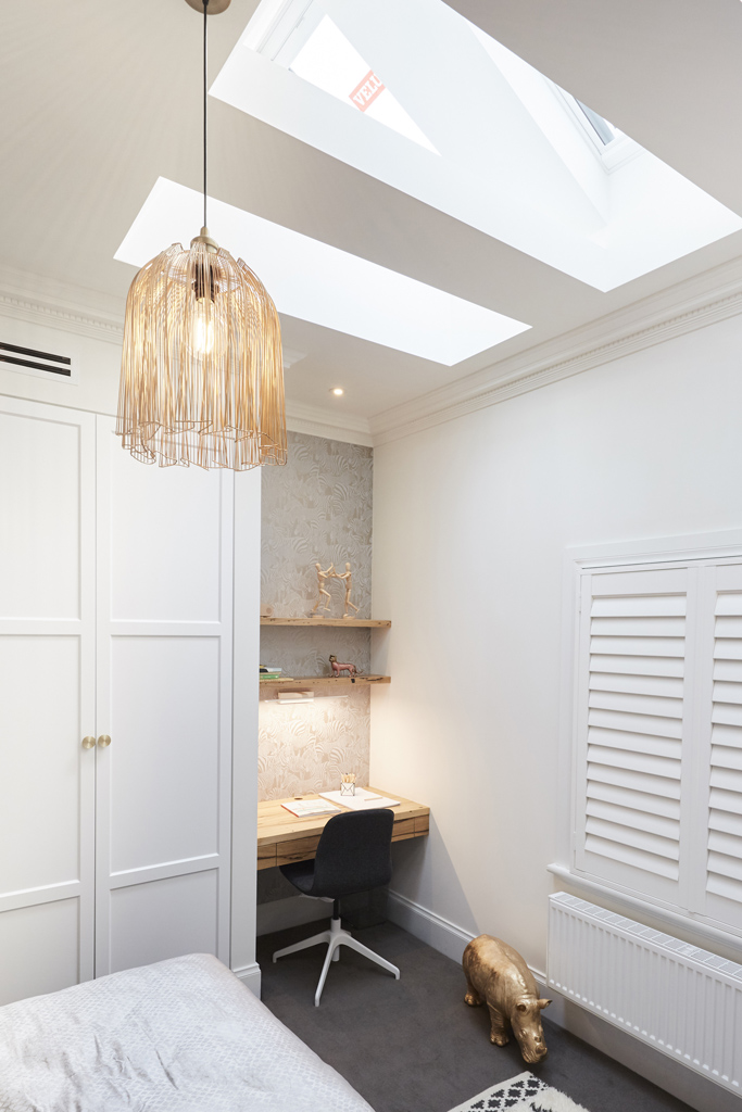
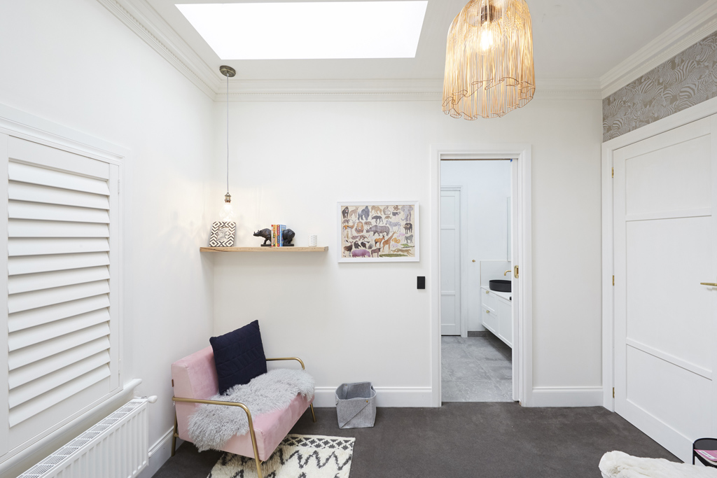


Jason and Sarah produced a little girls bedroom too. They were 2nd this week. I like the fact that you can share the bathroom from this room. It didn’t really grab me. Seems the wardrobes were the big feature in here with a small animal print and odd shelf on the opposite wall. The room looks tiny and the rug was way out of proportion.
You can SHOP their room below…[/vc_column_text][/vc_column][/vc_row][vc_row][vc_column width=”1/3″][vc_single_image image=”48818″ onclick=”custom_link” link=”https://www.theblockshop.com.au/store/single/giant-rhino”][/vc_column][vc_column width=”1/3″][vc_single_image image=”48819″ onclick=”custom_link” link=”https://www.theblockshop.com.au/store/single/eurowalls-upstairs-downstairs-zebra-wallpaper”][/vc_column][vc_column width=”1/3″][vc_single_image image=”48820″ onclick=”custom_link” link=”https://www.theblockshop.com.au/store/single/matte-black-champagne-wire-cage-with-g95-long-filament-lightglobe”][/vc_column][/vc_row][vc_row][vc_column][vc_column_text]
Sticks & Wombat
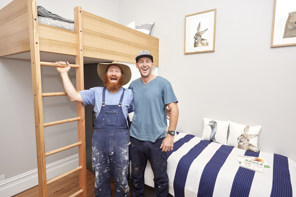

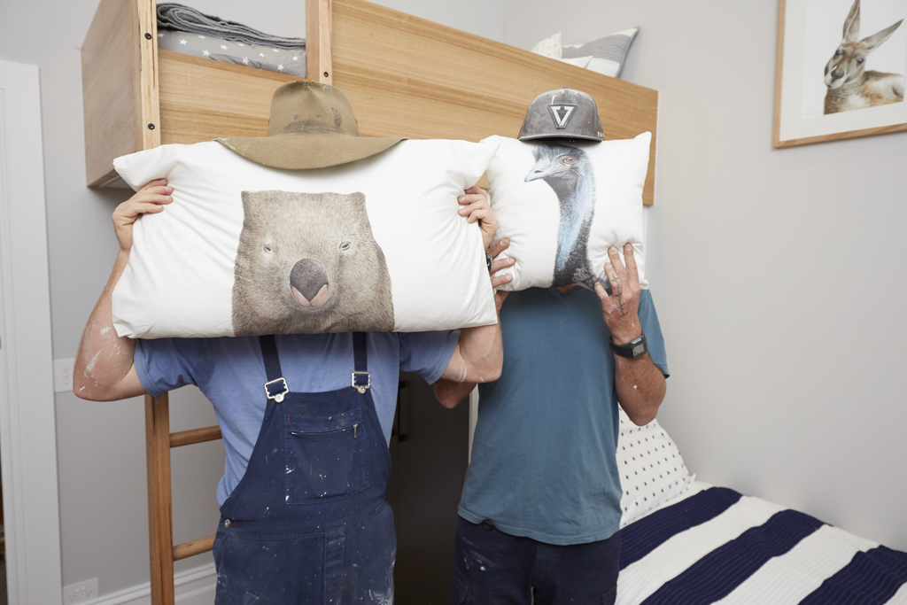
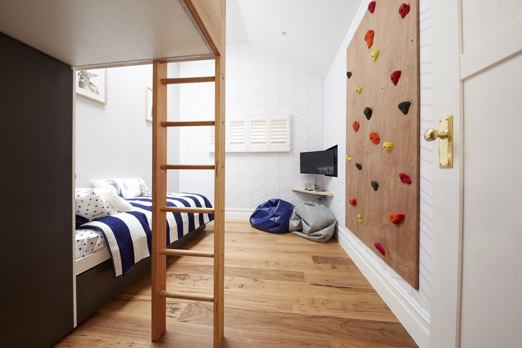
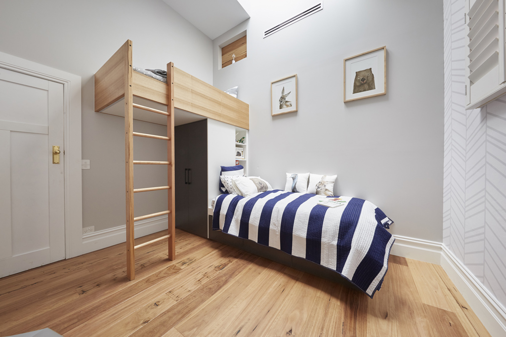

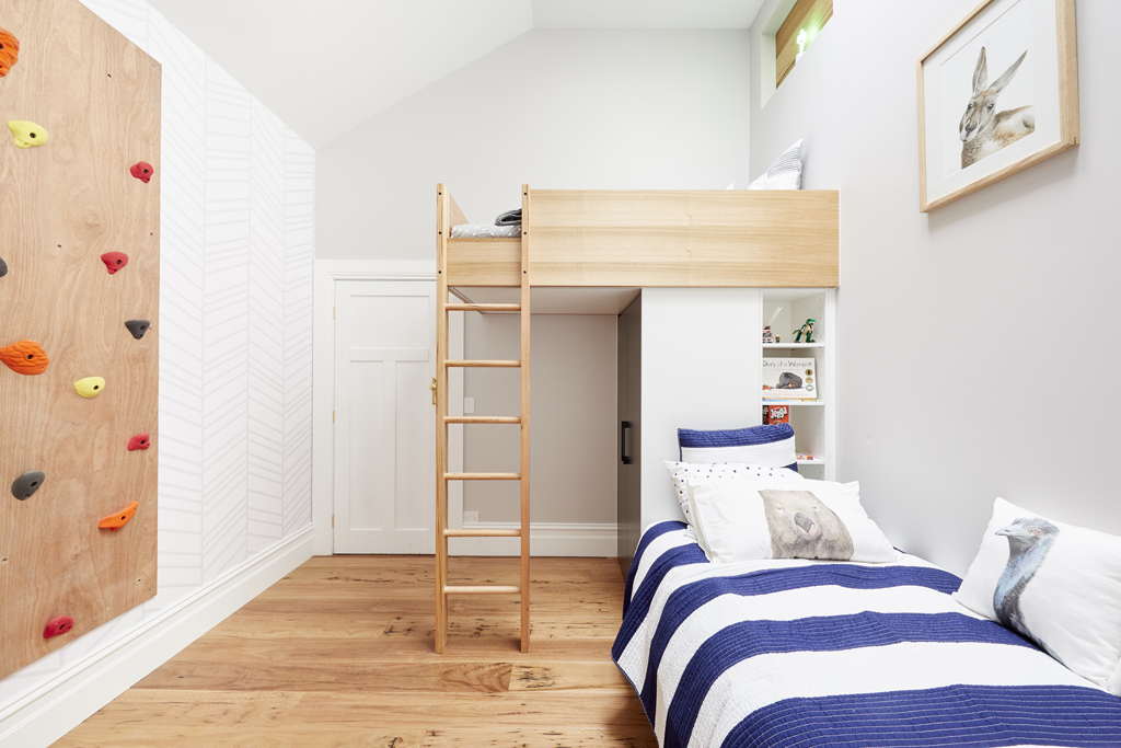
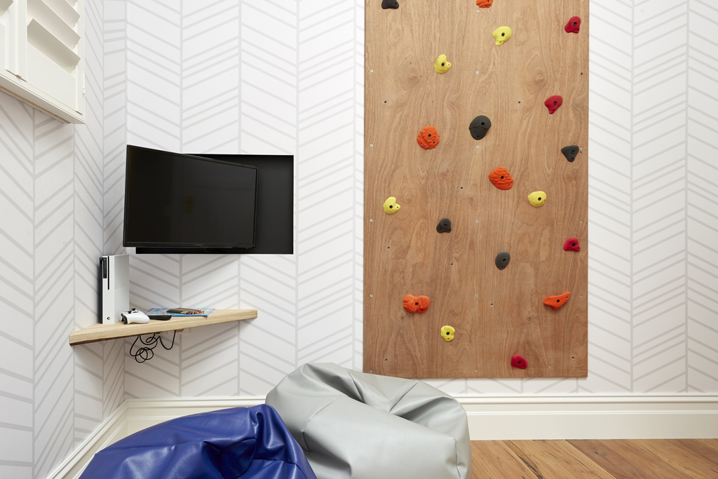
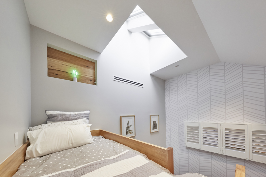
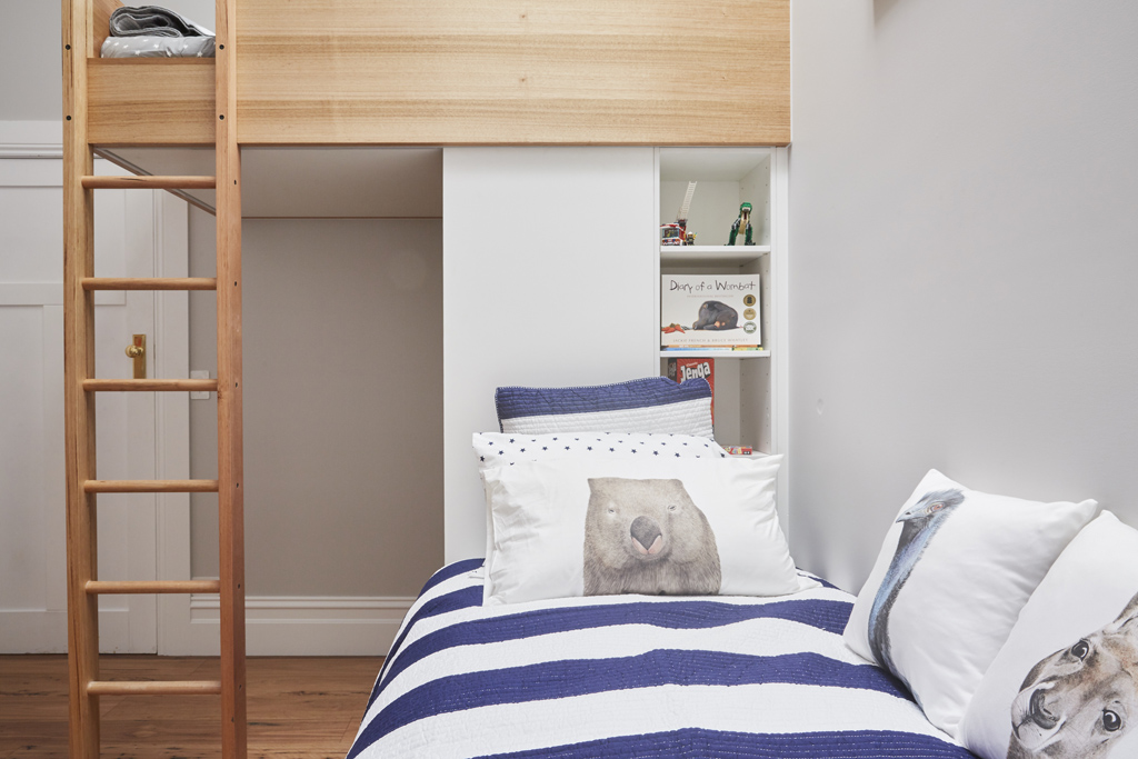
Not sure about this room from Sticks and Wombat! I have 3 boys and that climbing wall wouldn’t be a thing in our house. The overall concept of creating a bunk, a reading nook and a gaming area is good. But I am not sure it all flowed and worked well in this design. What’s the panel above the bed with the little light? Would a child be able to reach that without falling out because those bunk sides look a little low! What did you think of this room? And yes or a no in your house?
You can SHOP Sticks & Wombat’s room here…[/vc_column_text][/vc_column][/vc_row][vc_row][vc_column width=”1/3″][vc_single_image image=”48822″ onclick=”custom_link” link=”https://www.theblockshop.com.au/store/single/winston-the-wombat-giclee-print”][/vc_column][vc_column width=”1/3″][vc_single_image image=”48823″ onclick=”custom_link” link=”https://www.theblockshop.com.au/store/single/pottery-barn-kids-rugby-stripe-quilted-bedding-quilt-navy-white”][/vc_column][vc_column width=”1/3″][vc_single_image image=”48824″ onclick=”custom_link” link=”https://www.theblockshop.com.au/store/single/kev-the-koala-pillowcase”][/vc_column][/vc_row][vc_row][vc_column][vc_column_text]
Josh & Elyse

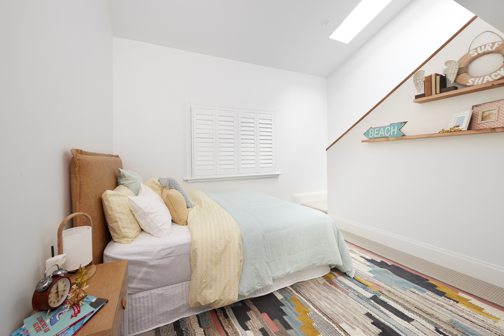

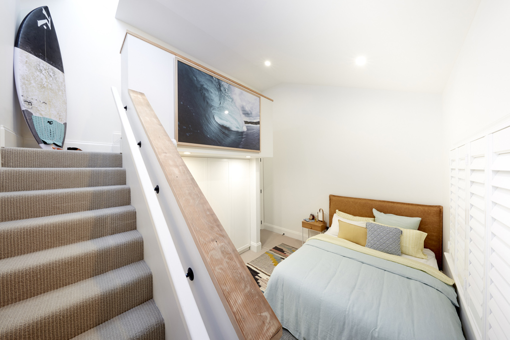
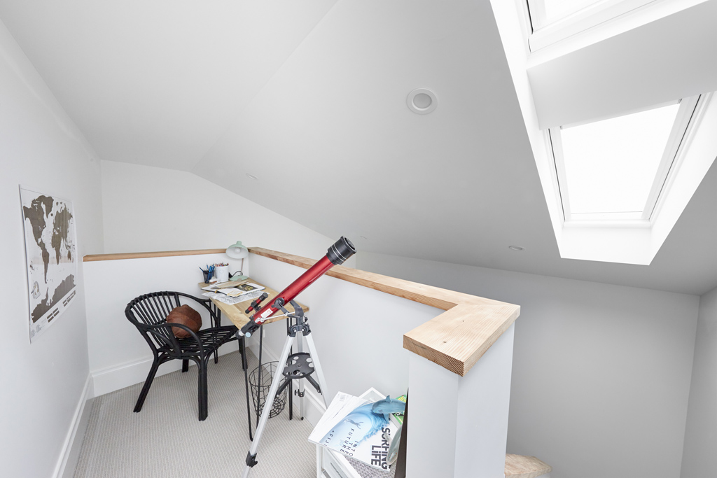


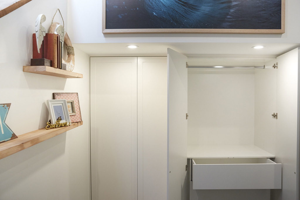
Not their best? I was a little underwhelmed with this room from Josh and Elyse this week. I am not sure who it is speaking to? Clearly a boy, but it’s not very cool if you ask me. A little bland and the surfy theme could have been really ramped up.
You can SHOP some of Josh and Elyse’s room below…[/vc_column_text][/vc_column][/vc_row][vc_row][vc_column width=”1/3″][vc_single_image image=”48825″ onclick=”custom_link” link=”https://www.theblockshop.com.au/store/single/multi-pixel-woven-rug”][/vc_column][vc_column width=”1/3″][vc_single_image image=”48826″ onclick=”custom_link” link=”https://www.theblockshop.com.au/store/single/rupert-bedhead-in-trench-leather”][/vc_column][vc_column width=”1/3″][vc_single_image image=”48827″ onclick=”custom_link” link=”https://www.theblockshop.com.au/store/single/rikke-1-light-round-table-lamp-in-teak”][/vc_column][/vc_row][vc_row][vc_column][vc_column_text]
Hannah & Clint

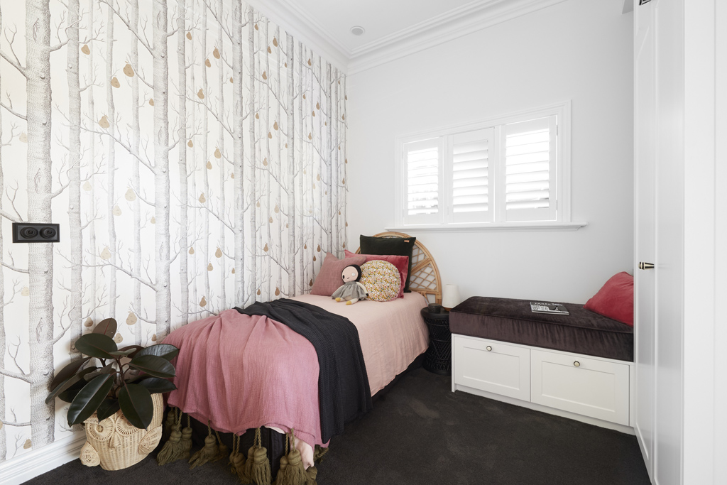

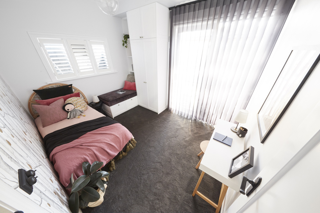
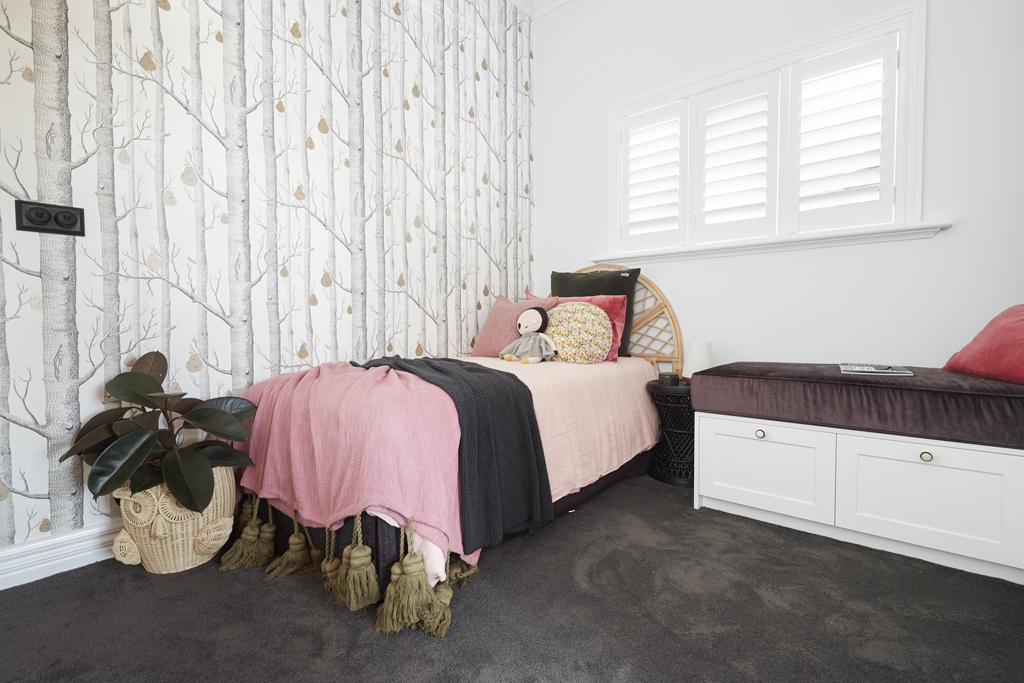
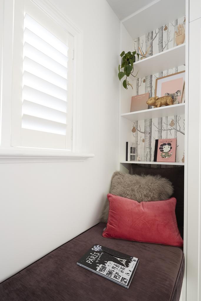


Poor Hannah and Clint! They just can’t get over the line can they? I was in love with the wallpaper and bedding in their room. It was GOOD! But the room is tiny and the decision for a glass sliding door was odd in a child’s bedroom. I am sure they are still finding their feet and will bring it home soon. I think they have great style!
You can SHOP some of their room below…[/vc_column_text][/vc_column][/vc_row][vc_row][vc_column width=”1/3″][vc_single_image image=”48828″ onclick=”custom_link” link=”https://www.theblockshop.com.au/store/single/sunrise-bed-head-natural-various-sizes”][/vc_column][vc_column width=”1/3″][vc_single_image image=”48830″ onclick=”custom_link” link=”https://www.theblockshop.com.au/store/single/cacharel-bed-cover-raven-various-sizes”][/vc_column][vc_column width=”1/3″][vc_single_image image=”48829″ onclick=”custom_link” link=”https://www.theblockshop.com.au/store/single/owl-planter-basket-natural”][/vc_column][/vc_row][vc_row][vc_column][vc_column_text]What did you think of the rooms? Which did you prefer? ♥ KC.[/vc_column_text][/vc_column][/vc_row]
Be the first to read my stories
Get Inspired by the World of Interior Design
Thank you for subscribing to the newsletter.
Oops. Something went wrong. Please try again later.



Comments
Nicole Gray
They definitely got it right
Nicole Lannoy
Yep, the right team won.
Tania Young
Ronnie and Georgias room won vecause of the styling. Take away the cute teaset and dust collecting (asthma nightmare) canopy and its a very plain structurally boring room.
Rachel Wood
Interesting you think that it’s structurally boring. It had built in cabinetry and nice finishes. I think building a staircase and mezzanine that only fit a small table and chair was a waste of money.
Tania Young
Anyone can pay a tradie to build cupboards…
Alex McLean
They’re all a little plain for kids’ rooms but I guess they have to sell the houses to the widest market.
Donna Wilson
It’s beautiful but as people are saying, it’s every second photo on Instagram.
It’s the “in” things at the moment. She hasn’t really chosen anything different.
Casey Coleman
I loved the winning room, the cabinetry was amazing and so well thought out, fantastic storage! And the ceiling was beautiful
I’m not the hugest fan of Ronnie and Georgia only because I feel like they have a huge really unfair advantage over all the other contestants and I don’t think they should be on the show but I can’t deny how stunning their kids room was.
Tania Young
If they have renovated 10 times why are they on the show? No-one has actually asked them if they made any money from their renovations. Did they make losses? You can renovate and it’s not necessarily going to make you money……………
Casey Coleman
That’s very true, I just think regardless of what they made off those houses they’ve got a huge advantage over the other contestants, they’ve got experience with tradies, styling, renovating ect, some of the other teams have no experience at all, I just don’t think they should have been on there, it needs to be a more even playing field.
Sarah Styles
I agree nailed it
Rebecca Hendricks
I totally agree with everything you mentioned Katrina! That mezzanine in Josh and Elise’s room was such a waste of space and money! It was too small to be functional for anything. And definitely agree on sticks and wombat’s bed! Way too high and the rail way too low! It would have to be an older kid in that bed otherwise I’d be worried they would fall out!
Clint and god can’t remember her name!!! I don’t understand why they would change the floor plan so the kids bedroom was in the laundry??? And a sliding door in a kids bedroom was crazy….they have little kids you would think they would’ve thought about the safety aspect!
I’m saying all that it’s very easy to be a judge from the couch!! I’m sure it’s the most stressful experience in real life! So hard to make good decisions when you’re super stressed!
Kerry Neville Gestier
The skylights intrigue me! I like my bedrooms to be capable of cave-like darkness
Tracey Cox
We said the same thing! Blazing sunlight as soon as the sun rises in a kid’s room?! Crazy.
Linda Alexandra
I thought they were all pretty underwhelming.. Nicer rooms on pottery barn websites
Manda Kendall
They didn’t get it right at all..R&G room has grey and white fluffy clouds and stars on the roof. So potential buys coming with 3 boys 7 and up. Who gets that’s room? Are they going to spend millions of dollars on a house then fork out more money to remove the wall paper. Yes it was kids room week but they went too specific. It was the same old boring pink and grey. Clint and Hannah’s room was under styled but it’s not a styling competion. Their room will attract a wide range of buyers. Cause there’s nothing stopping that room from becoming a study, just wait till outside Reno week, they smash that outside area and it’ll all make sense. Georgia and ronnies room will be the only one needing to be changed due to the fact it’s restricting the age group with the buyers children. I wouldn’t even like my 3 year old boy to have clouds and stars on the roof.
Maria Stephenson
I am sorry I didn’t like any of the rooms. They all looked so cold and unloved.
Rebecca McFarlane
I felt the same.
Leanne Clarke
Beautiful room Ronnie and Georgia’s. They are very Savy at Reno’s and watching their budget.
Leonie Hackett
Skylights in a kids bedroom? They’ve got to be kidding. Also who in the hell is going to make the bed in Sticks and Wombats room. It’s difficult enough in a bunk bed at normal height. Unless you had teenage boys it would be dangerous.
Mel Gumpert
I have to agree with some of the judges comments for Josh & Elyse’s room . It did look like it could be a room from a new build. Bit disappointing as the heritage features in their guest room were just beautiful !!
Katrina Smith
None of them were WOW. Winning room pretty and well styled Shaynna got exited over a tea set was a joke. I hope buyer has little girl otherwise you will see it all on ebay. Sarah and Jason unisex so a quick tweek to suit age. Hannah & Clint should never have moved the room to laundry. No-one wants door on their kids room. They should have styled it for teenager. I hope they have a plan for laundry week where will they buying exit the house to hang the washing Its not apartment so I hope they don’t have plans of indoor drying. Sticks & Wombat, climbing wall and high bed not something practical. Stuff getting up that ladder to make the bed. No soft landing if the kids falls off wall, but they did style it to target teenager. Josh & Elyse styled it correct for the target age but that mezzanine just isn’t wide enough to function as a good study area. If they have just take it out a foot or two more and pumped some more into the styling they had the winning room.
Wendy Robinson
Liked the soft grey wall
Colour Georgia & Ronnie used – does anyone know the colour?
Lyndall Vinck
My main concern in all the kids bedrooms is that the beds are up against a wall except for Jason & Sarah although it would still be a struggle to open the wardrobe door in their kids room.
And why the Victorian ceiling roses & cornices in Californian Bungalows?