House 1 - Michael & Carlene House 2 – Chris & Jenna House 3 – Max & Karstan House 4 – Simon & Shannon House 5 – Darren & Dee What did you think about the TIE BREAKER - Michael and Carlene and Shannon and Simon both came equal first for kitchen week... So whose …
House 1 – Michael & Carlene
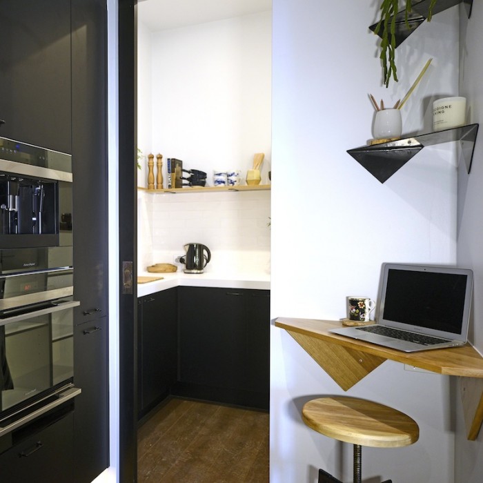
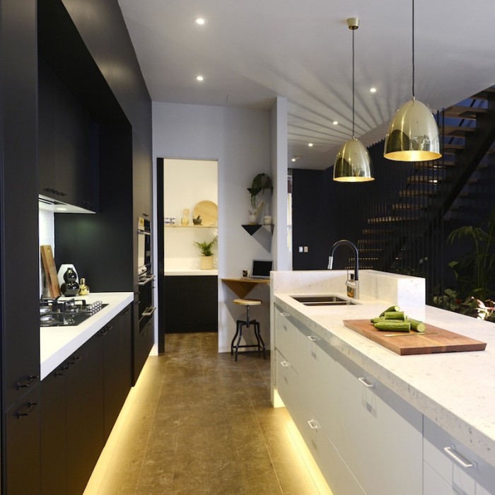
House 2 – Chris & Jenna
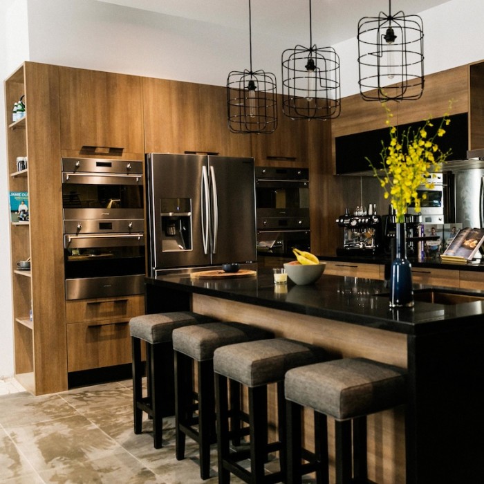
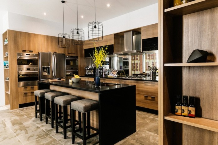
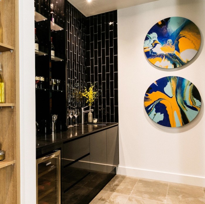
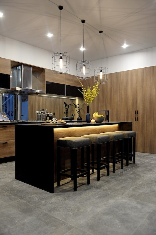
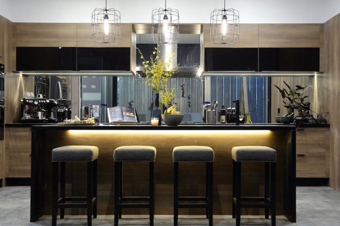
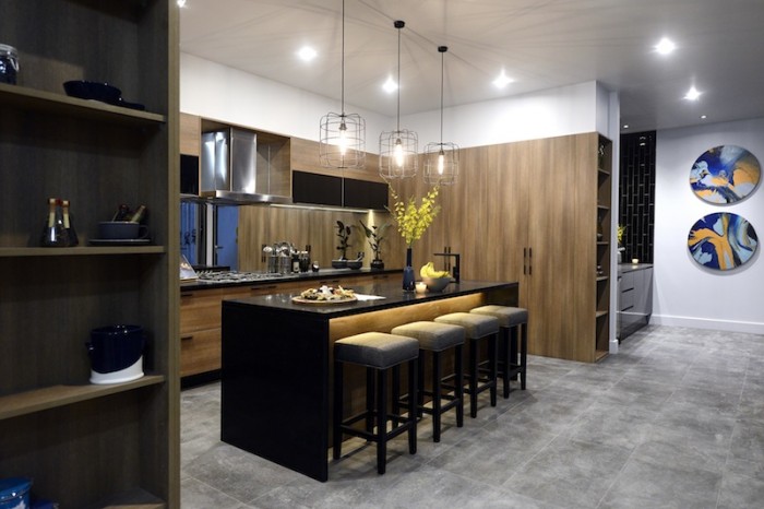
House 3 – Max & Karstan
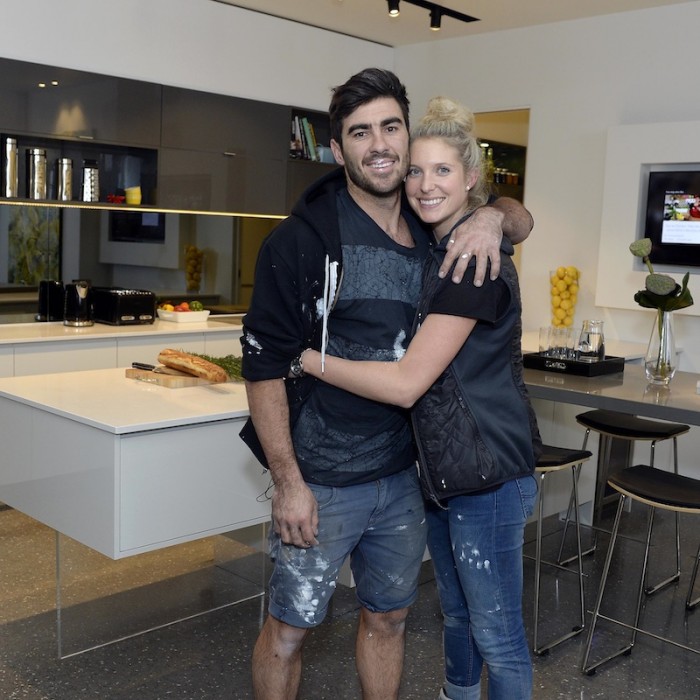
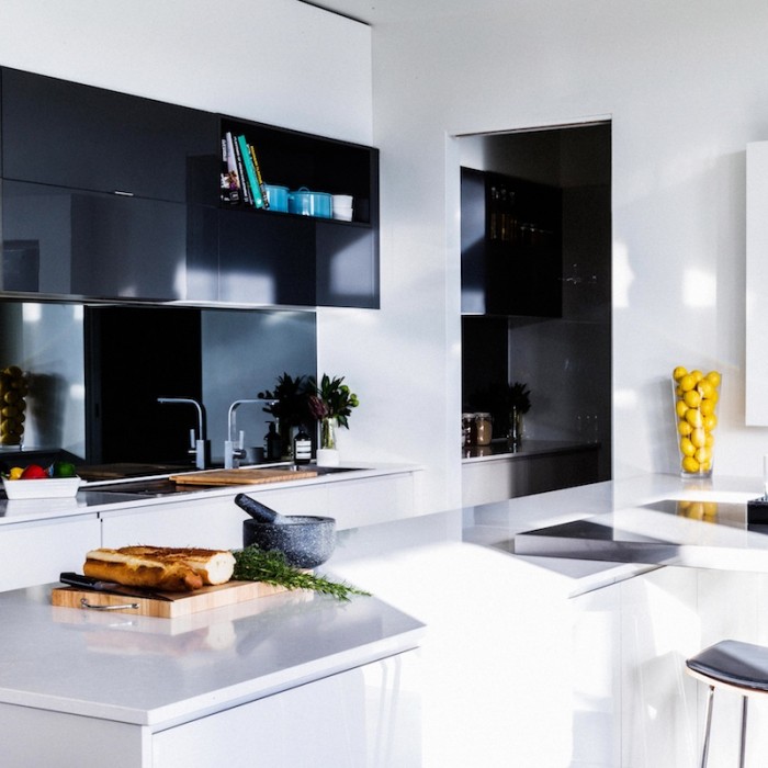
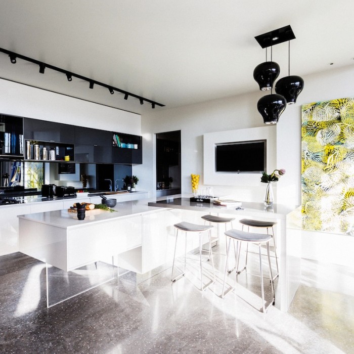
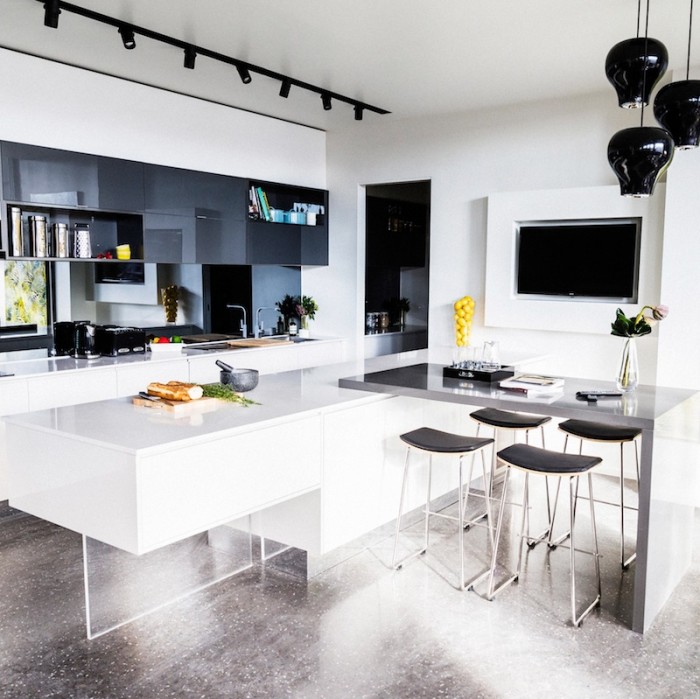
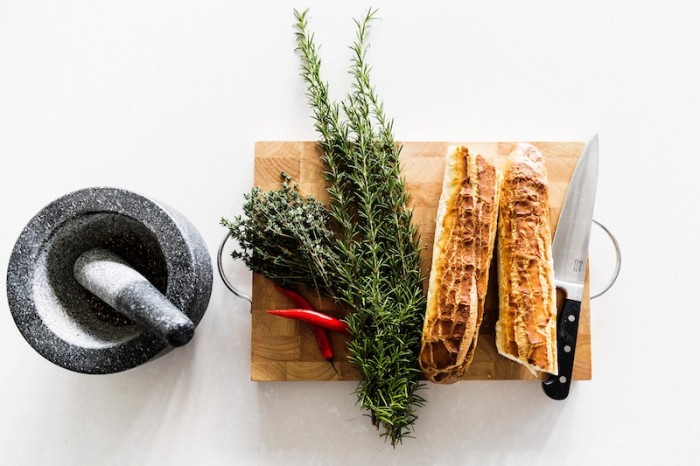
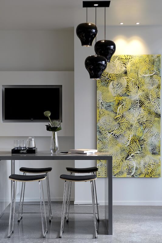
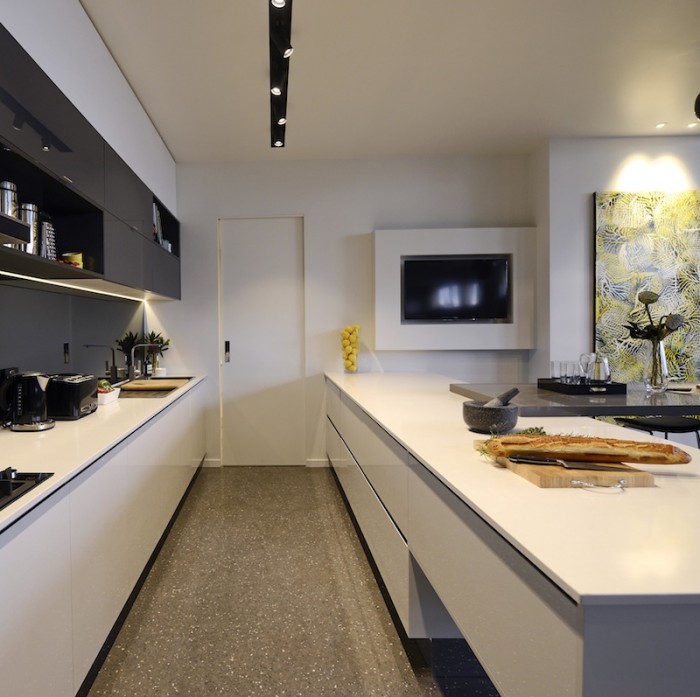
House 4 – Simon & Shannon

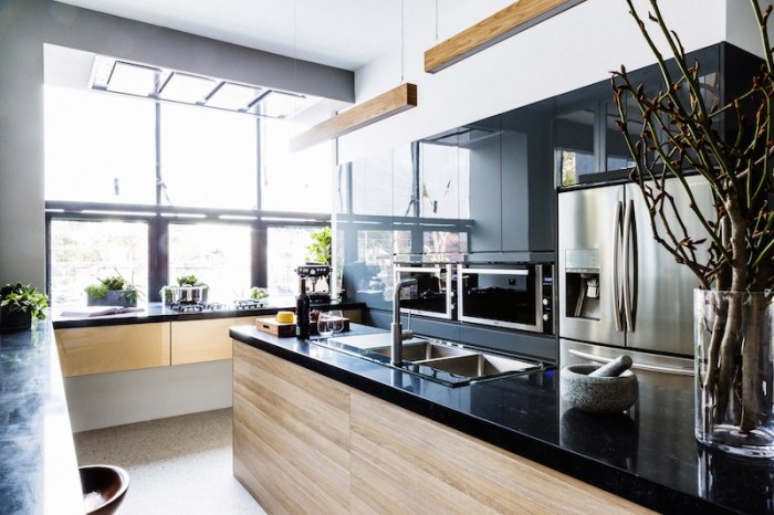
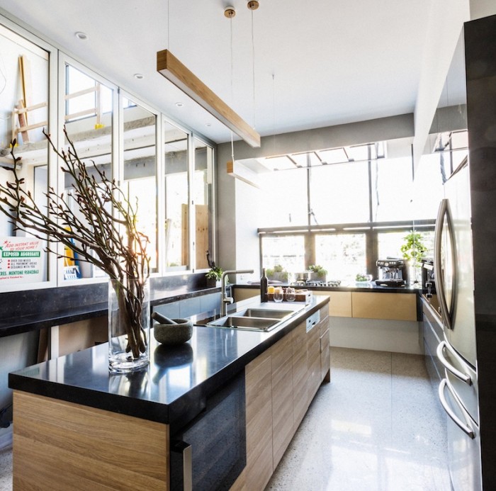
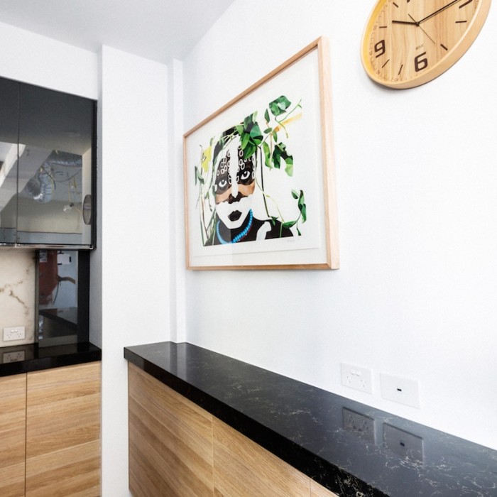

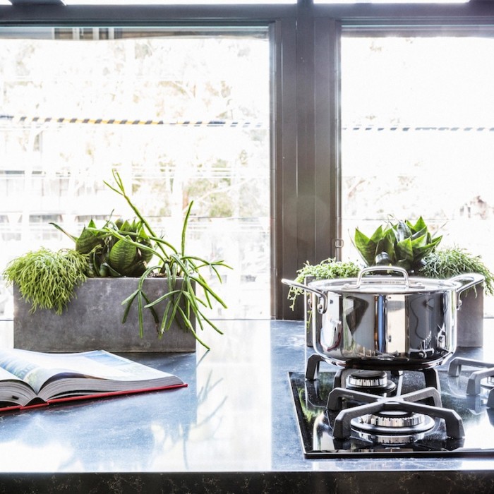
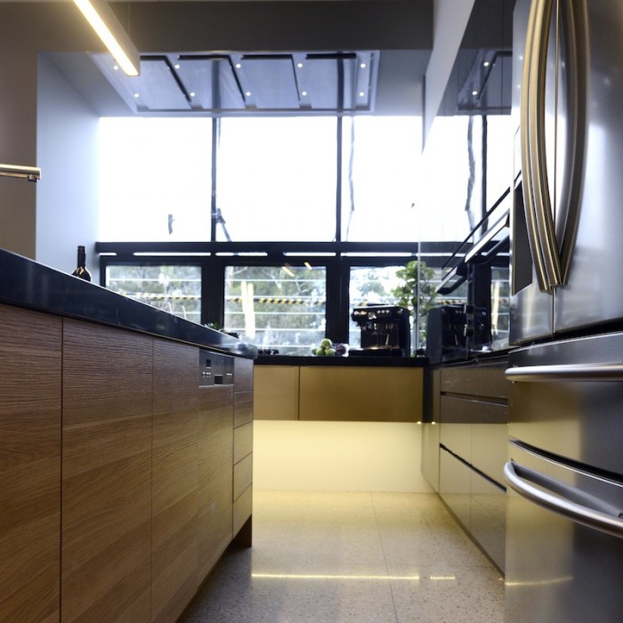
House 5 – Darren & Dee
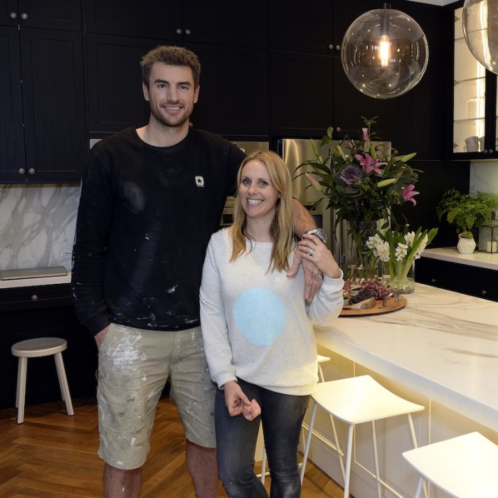


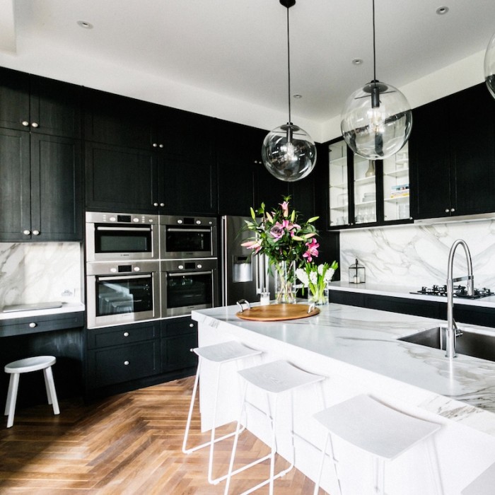
What did you think about the TIE BREAKER – Michael and Carlene and Shannon and Simon both came equal first for kitchen week… So whose kitchen was better?
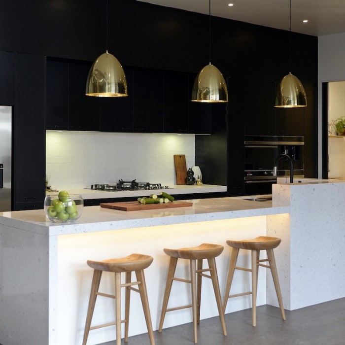
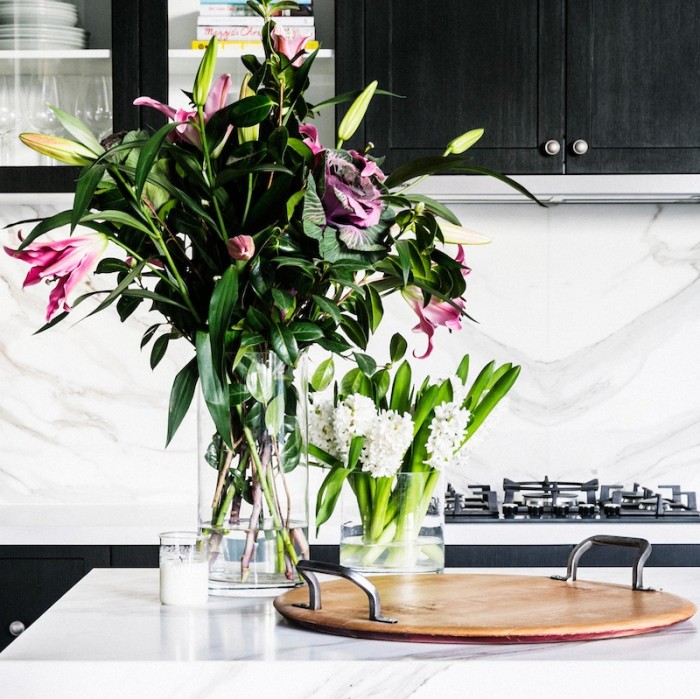
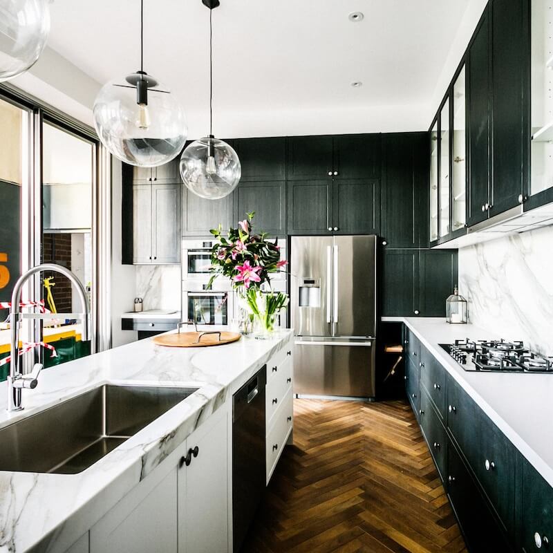
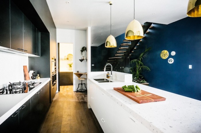
Dee was so unhappy, and Facebook was very unhappy about Dee being so unhappy! Ahhh social media. However, my favourite was Dee and Darren’s this week. That marble! And those lights (cough.. cough.. only because I have the same ones!).
What did you think of the kitchens? I was a little underwhelmed with them and hated the grey/black cabinets the boys chose + there was too much timber in Chris and Jenna’s. It felt a little 90s to me!
Be the first to read my stories
Get Inspired by the World of Interior Design
Thank you for subscribing to the newsletter.
Oops. Something went wrong. Please try again later.
Tags:The Block





Comments
Robyn Elizabeth
Loved D & D’s
Megan Rice
Each kitchen had something I liked. Darren and Dee’s kitchen was beautiful but a drawer that you can’t open because it hits the fridge – massive oversight!
Sytarnya Roebuck
the boys! love their use of the window and the wood.
Mel Hall
Is that real marble in dees kitchen?
Kerryn Woods
Poor Dee. Two hugely stressful and disappointing weeks, plus sleep deprivation probably contributed to her ill-judged comments. And of COURSE the producers decided to air them. Ah, reality TV… I just felt sorry for her. And yes, their kitchen was gorgeous, that marble! I really loved all of them except Max & Karsten’s. It felt a bit sterile to me.
Natalie Land
I think the tiebreakers was there just to give some money to M&C. It was no way better than D&Ss. I liked the boys but only because it had a window. I hate kitchens that are stuck in the middle of a house with no natural light coming through a window. If D&Ds had a window it would have been unstoppable. Max and Karsten’s was just yuck and boring. (Those are technical decorating terms he he he)
Di
Hi Natalie….who is D and S?
Amanda Garven
D &D. So lovely and family friendly.
Jade McGuigan
Boys for sure and D&D. I feel for Dee she takes design very seriously and takes it to heart. They deserved more
Kathryn Letheby
The boys was AWSOME
littlekarstar
Loved them all – only wish I’d seen this before our kitchen was finished! We are in the middle of renos so watching the block leaves me going ‘oh we should have done that! too late!’ 🙂
Calli
Love D & Ds too. Where are the lights from?
Jenny Langmaid
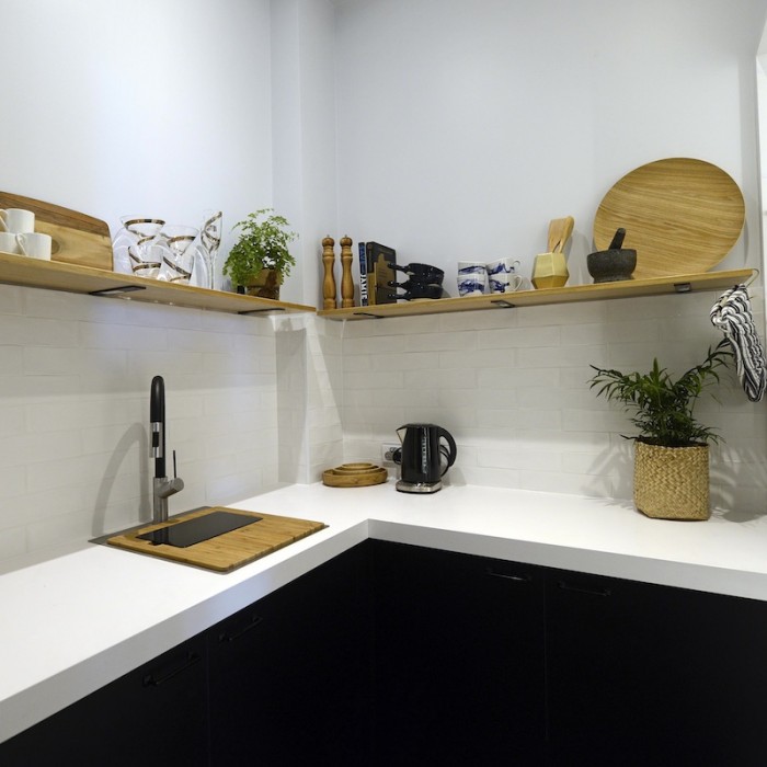
I think they all missed the boat with the purpose of the Butlers Pantry – the only one that didn’t was Dea and Darren and they didn’t show theres last night /maybe because its small? They are all nice Kitchens and the photos of course are great…just nothing that really wowed me..and after 5 renovations I need to be wowed! Thanks for sharing Katrina !http://www.pinterest.com/Metallicmum/
Leanne - Lime & Mortar
I really liked Dee & Darrens it was my fav. People seem to hate on her so much (going by what my readers etc say) but i love what she does 🙂