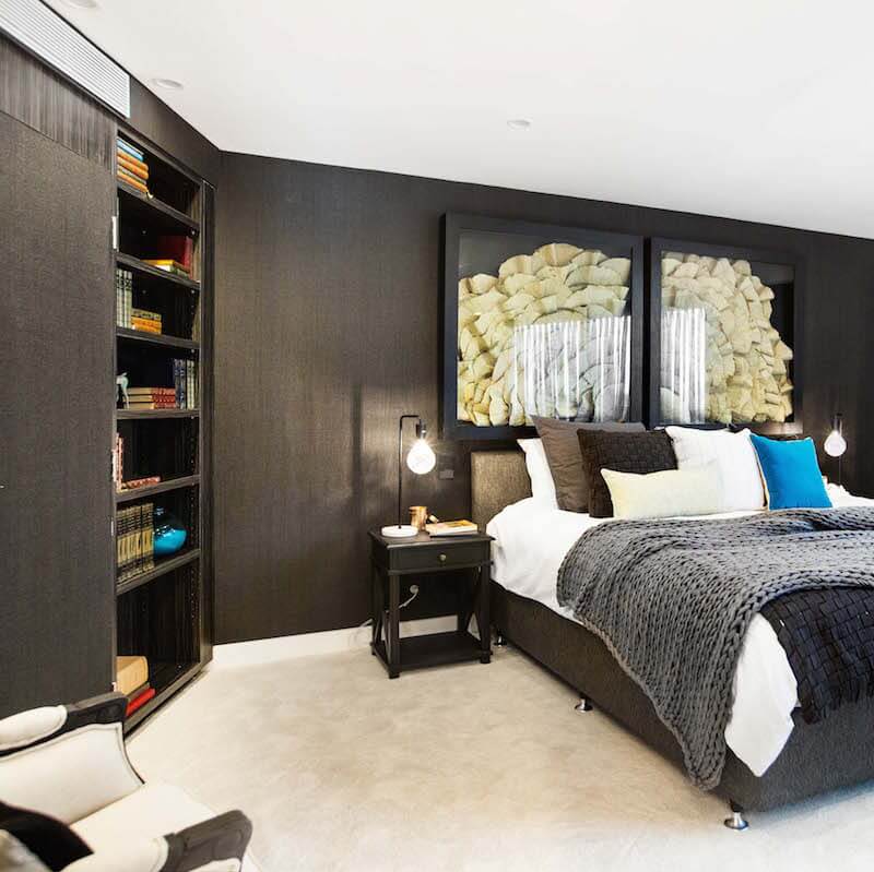
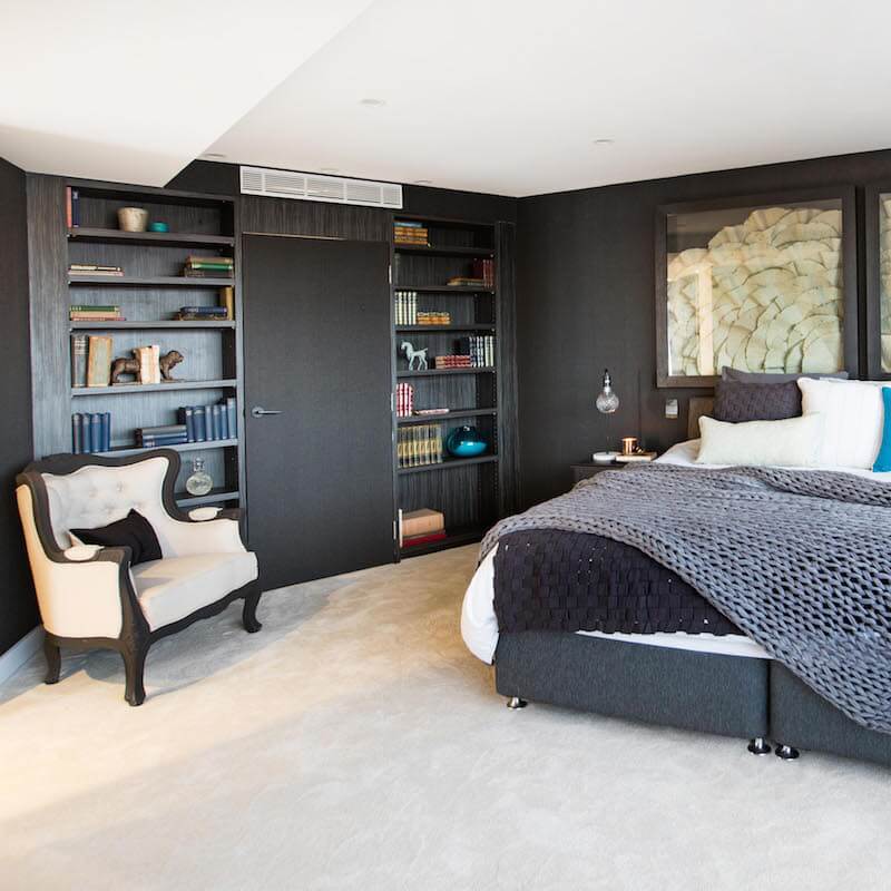
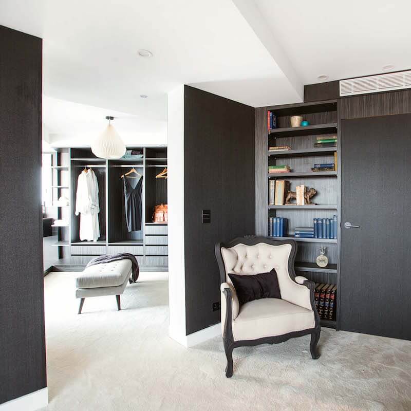
[vc_row][vc_column][vc_column_text]Last night on The Block Octagon we saw the master bedrooms be revealed. Taking out first prize with a $10,000 cash injection in to their budget was given to Suzi and Vonnie for their dark and hotel inspired master bedroom and WIR. The judges gave them a perfect score 30/30. See all the photos below + …
[vc_row][vc_column][vc_column_text]Last night on The Block Octagon we saw the master bedrooms be revealed. Taking out first prize with a $10,000 cash injection in to their budget was given to Suzi and Vonnie for their dark and hotel inspired master bedroom and WIR. The judges gave them a perfect score 30/30.
See all the photos below + scroll to the bottom for your chance to win a $50 voucher to spend at The Block Shop!
::
Here’s what Neale said about the girls:
“It feels like a gentleman’s club; I love that. This is a room where I want to pour myself a whiskey, curl up on that bed and read and not leave.”
The girls also won the bedhead challenge during the week which saw their WIR cabinetry all paid for. They’d been running low in funds so this week they’ve managed to top the budget up a little bit more.
The bedroom is not my cup of tea. I know we’ll just be seeing more black and brown from these girls.[/vc_column_text][vc_column_text]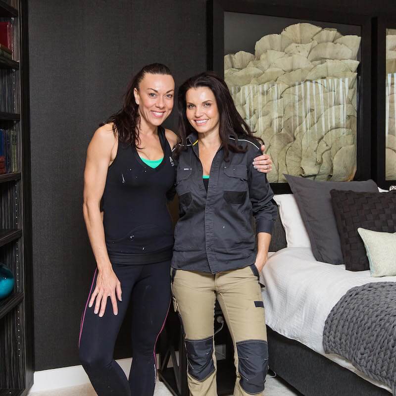
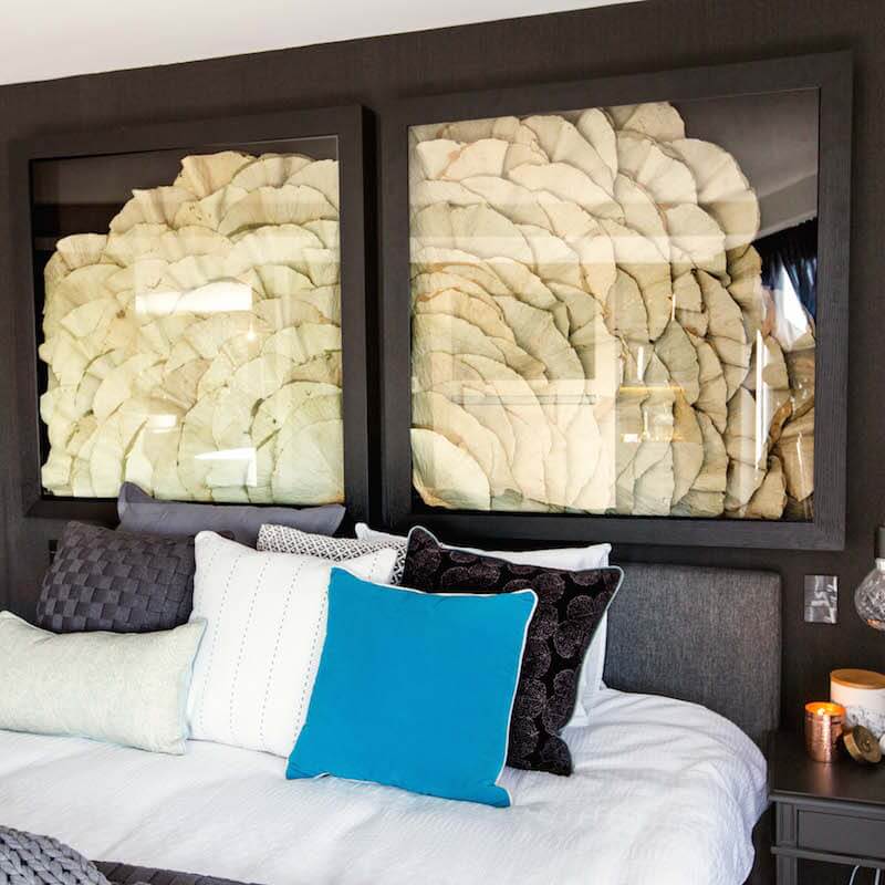

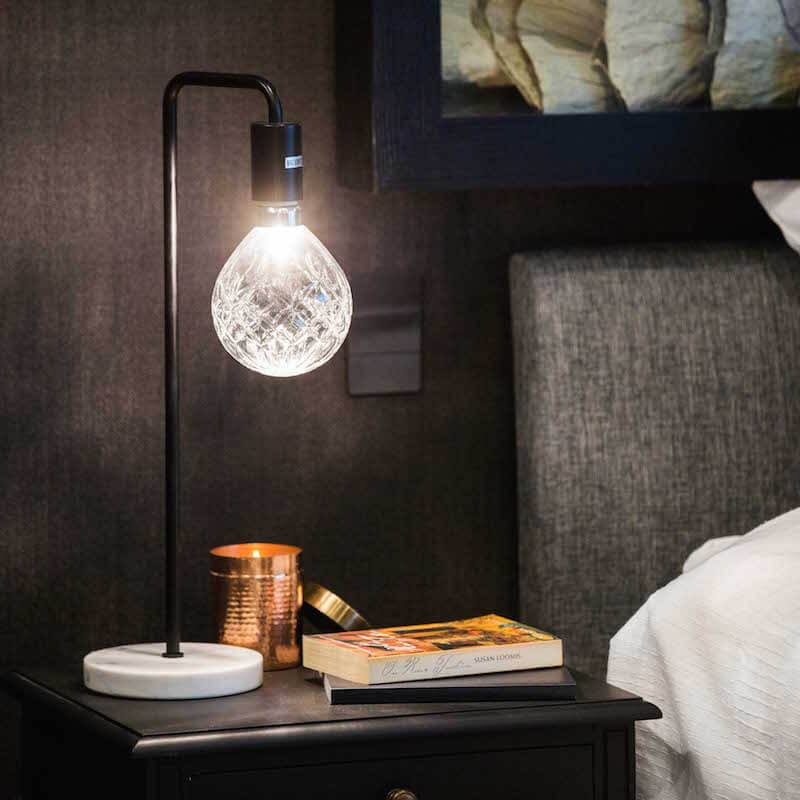
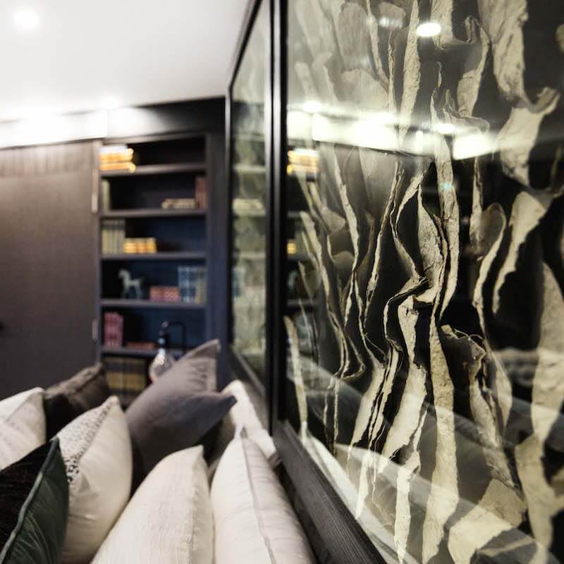
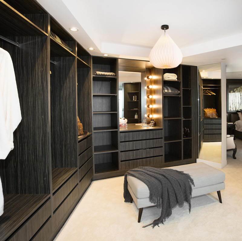
You can shop Suzi and Vonni’s room below…[/vc_column_text][vc_row_inner][vc_column_inner width=”1/6″][vc_column_text]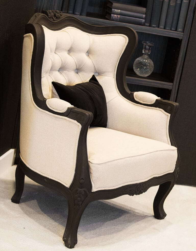
Occasional Chair[/vc_column_text][/vc_column_inner][vc_column_inner width=”1/6″][vc_column_text]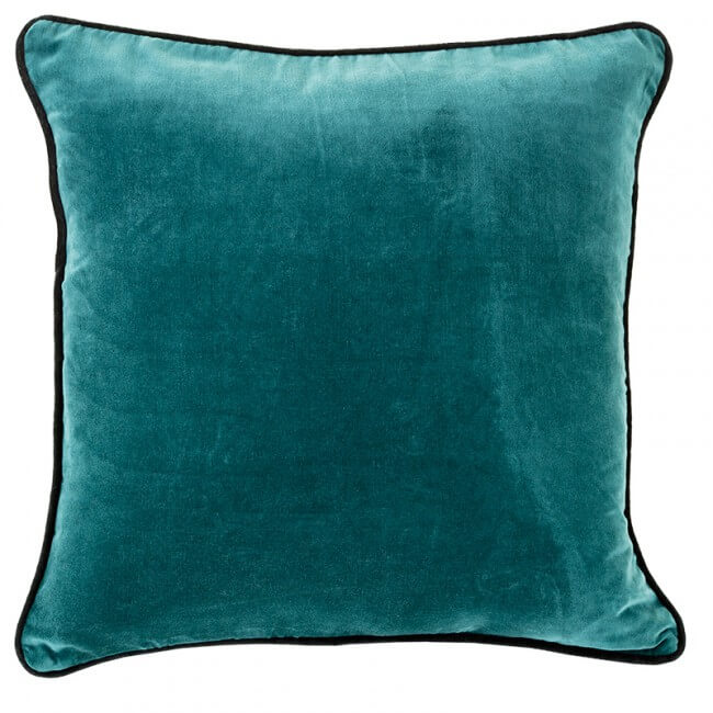
Teal Velvet Cushion[/vc_column_text][/vc_column_inner][vc_column_inner width=”1/6″][vc_column_text]
Lotus Leaf Artwork[/vc_column_text][/vc_column_inner][vc_column_inner width=”1/6″][vc_column_text]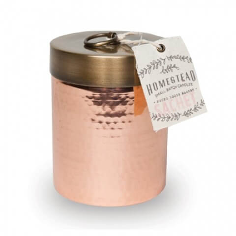
Copper candle[/vc_column_text][/vc_column_inner][vc_column_inner width=”1/6″][vc_column_text]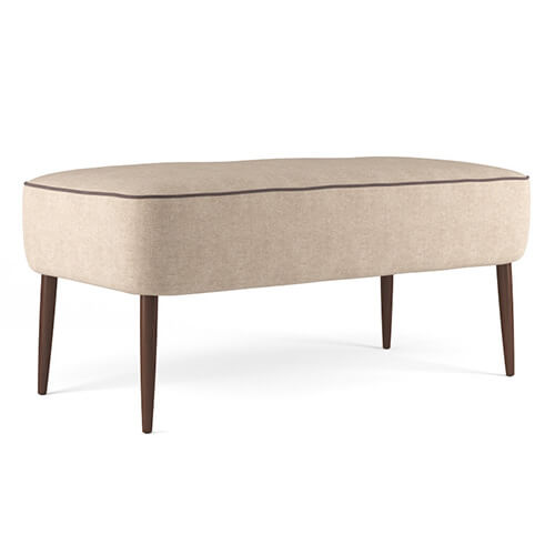
Ottoman[/vc_column_text][/vc_column_inner][vc_column_inner width=”1/6″][vc_column_text]
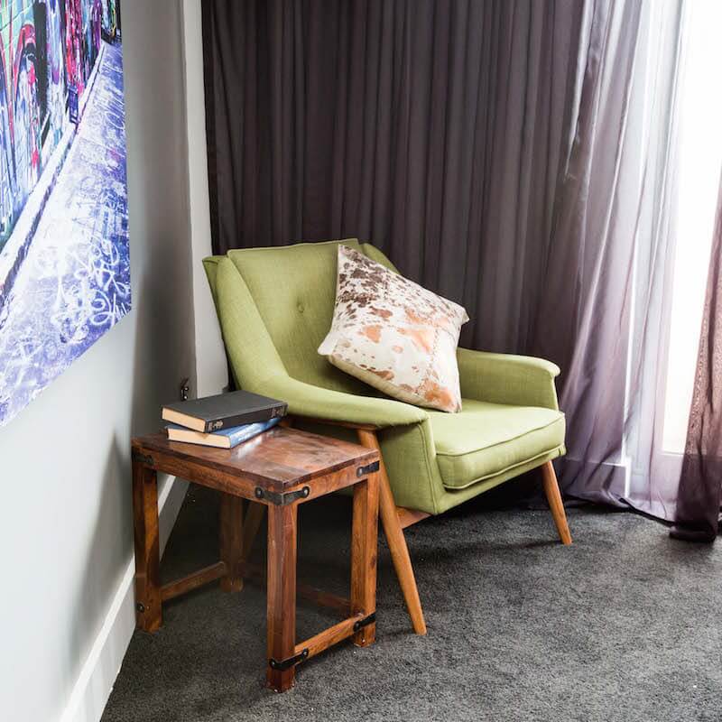
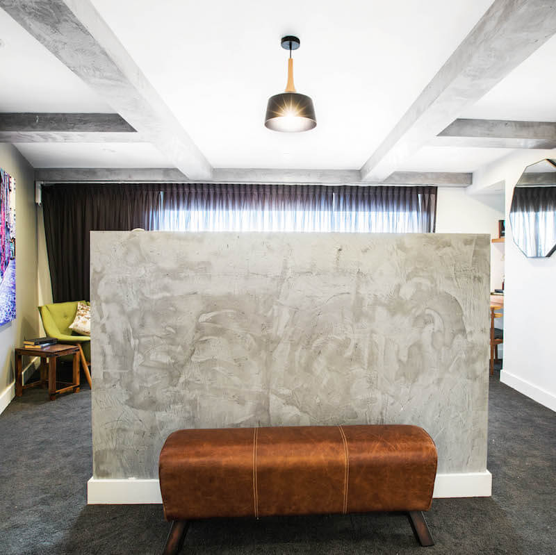
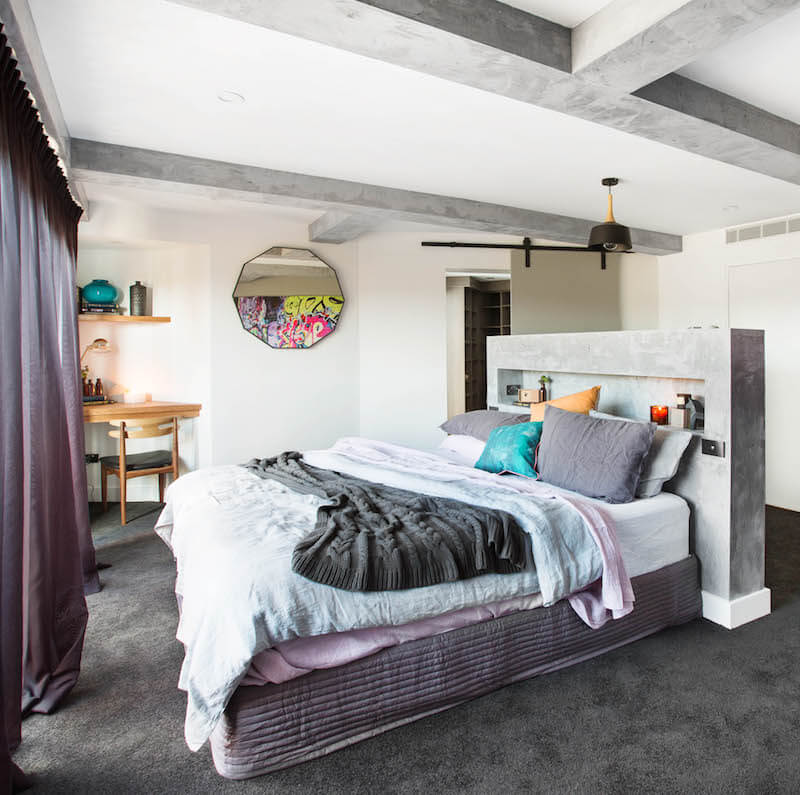
Paper Diamond[/vc_column_text][/vc_column_inner][/vc_row_inner][vc_separator][/vc_column][/vc_row][vc_row][vc_column][vc_column_text]Next on the score board came Caro and Kingi. The judges gave them 27.5/30 – same score as last week. They again used a lot of render in the room with a freestanding nib wall for the bedhead so their bed could face the views. I quite liked the edgy raw feel mixed in with some white. I wasn’t a fan of the graffiti though – that doesn’t feel grown up enough for me in a master bedroom. I really like the barn style door to the WIR and the leather ottoman is fabulous.

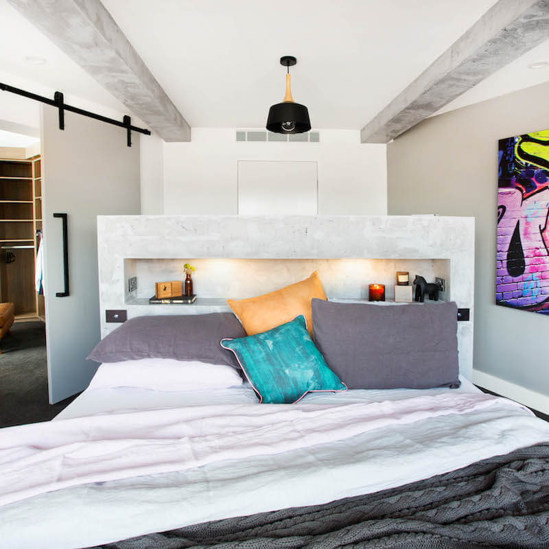
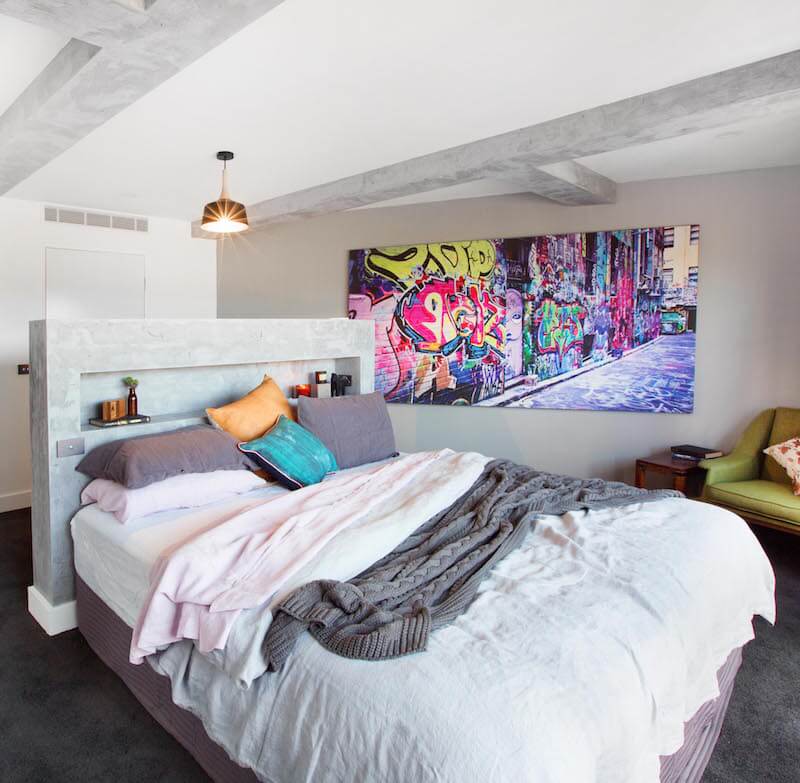
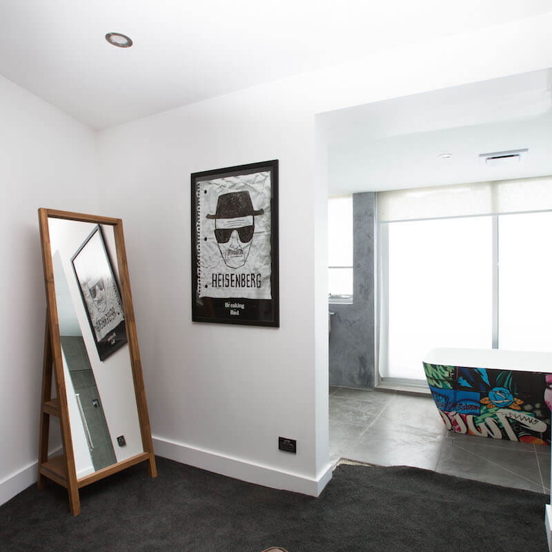
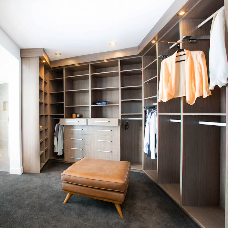
You can shop Kingi and Caro’s look below…[/vc_column_text][vc_row_inner][vc_column_inner width=”1/6″][vc_column_text]
Graffiti Art – Canvas[/vc_column_text][/vc_column_inner][vc_column_inner width=”1/6″][vc_column_text]
Bed Linen[/vc_column_text][/vc_column_inner][vc_column_inner width=”1/6″][vc_column_text]
Vases[/vc_column_text][/vc_column_inner][vc_column_inner width=”1/6″][vc_column_text]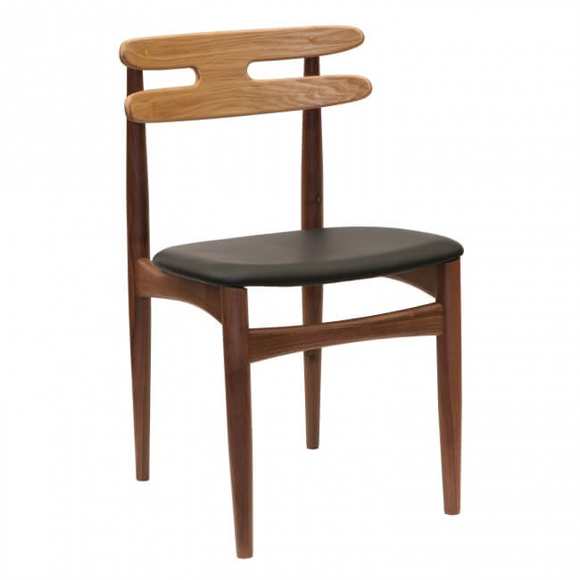
Chair[/vc_column_text][/vc_column_inner][vc_column_inner width=”1/6″][vc_column_text]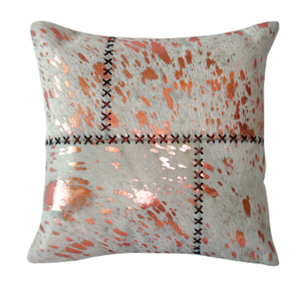
Copper Cushion[/vc_column_text][/vc_column_inner][vc_column_inner width=”1/6″][vc_column_text]
Pendant[/vc_column_text][/vc_column_inner][/vc_row_inner][vc_separator][/vc_column][/vc_row][vc_row][vc_column][vc_column_text]Dean and Shay were knocked down to third place last night. The judges said their room was good but there was no wow. I agree, but I still LOVE it. I would walk in and buy it. I think that’s what the buyers will love too. The judges gave them 23/30. Their WIR was beautiful and flowed well in to the en suite.

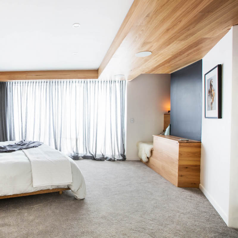
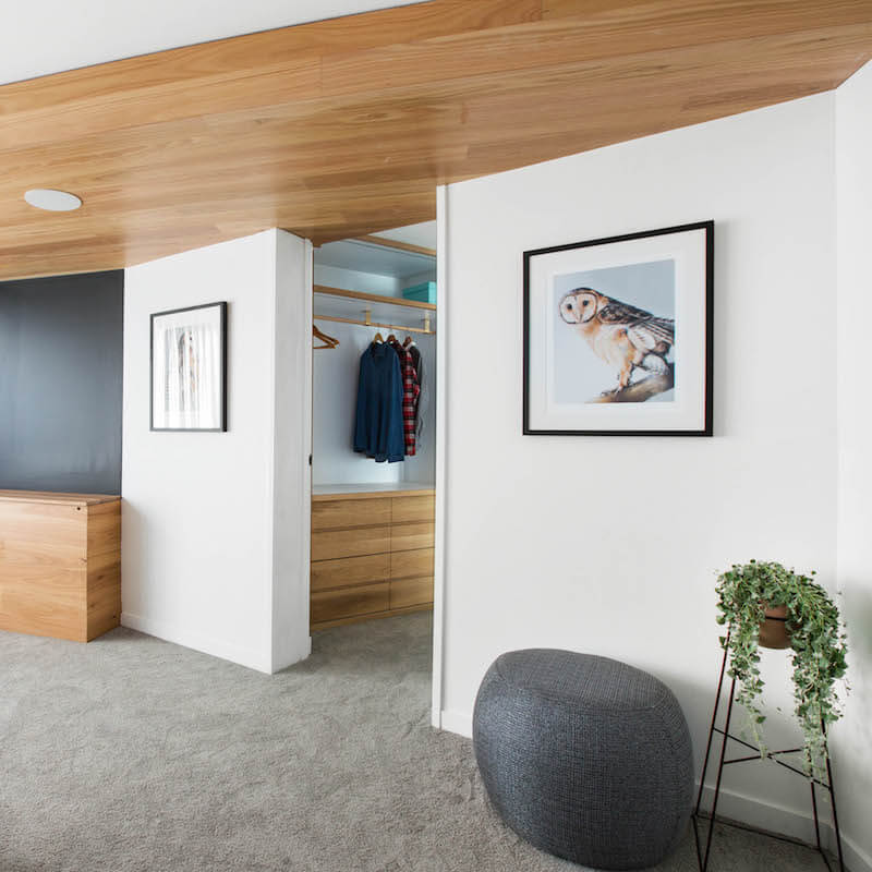
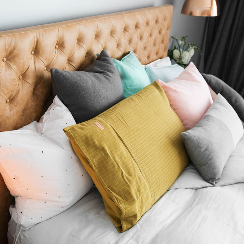
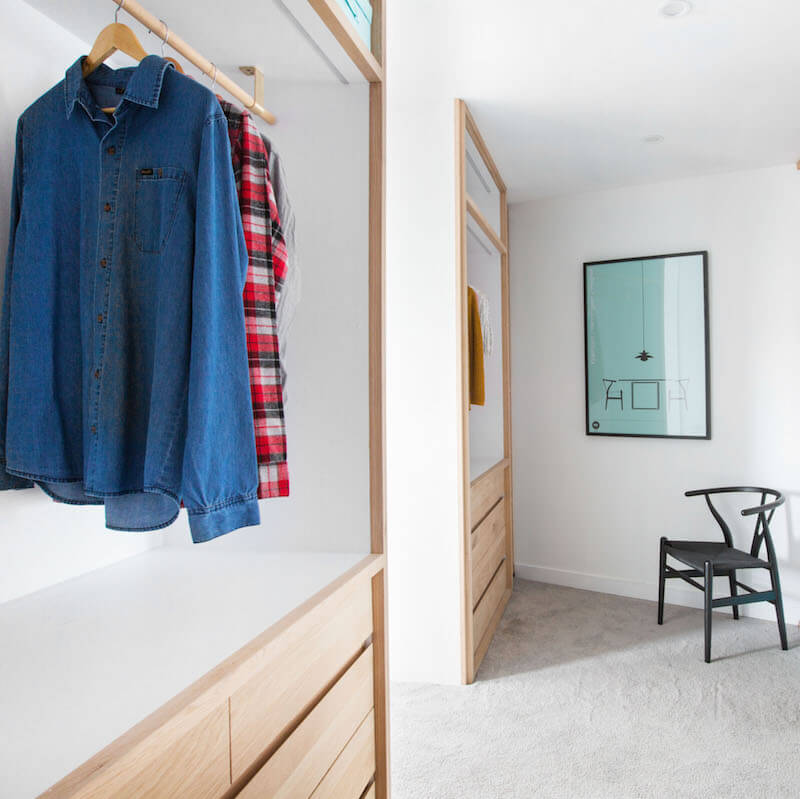

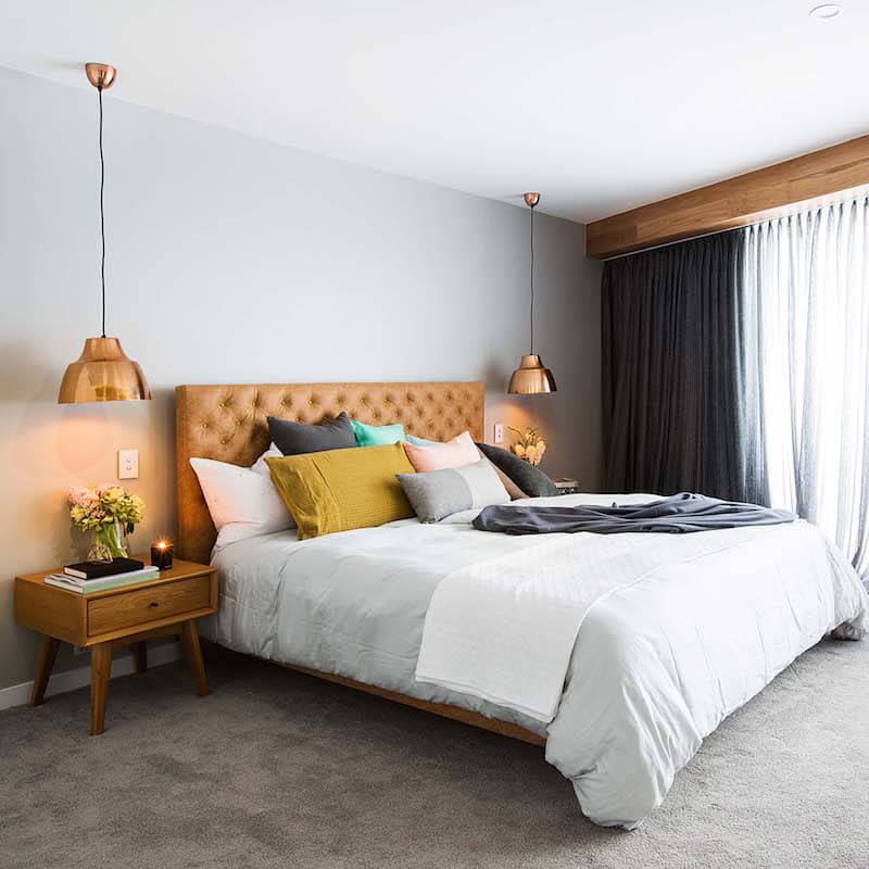
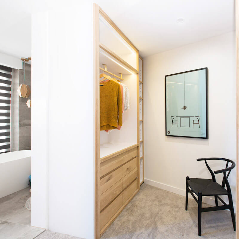
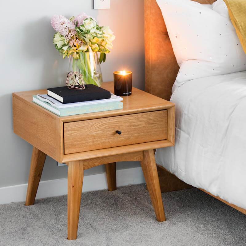
Snatch a good buy with some of Dean and Shay’s items below…[/vc_column_text][vc_row_inner][vc_column_inner width=”1/6″][vc_column_text]
Owl Print Face[/vc_column_text][/vc_column_inner][vc_column_inner width=”1/6″][vc_column_text]
Leather Bed[/vc_column_text][/vc_column_inner][vc_column_inner width=”1/6″][vc_column_text]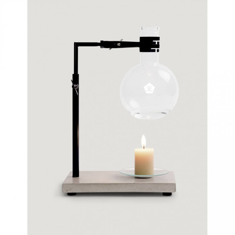
Oil Burner[/vc_column_text][/vc_column_inner][vc_column_inner width=”1/6″][vc_column_text]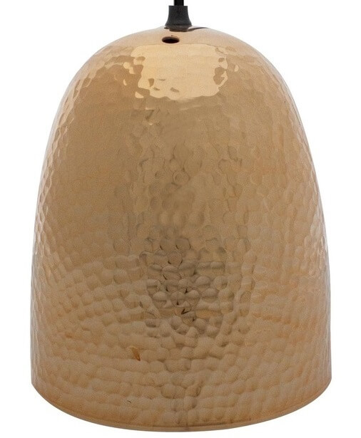
Copper Pendant[/vc_column_text][/vc_column_inner][vc_column_inner width=”1/6″][vc_column_text]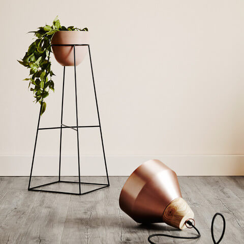
Plant Stand[/vc_column_text][/vc_column_inner][vc_column_inner width=”1/6″][vc_column_text]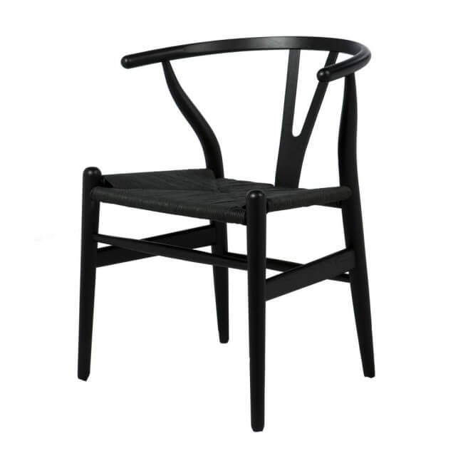
Wishbone Chair[/vc_column_text][/vc_column_inner][/vc_row_inner][vc_separator][/vc_column][/vc_row][vc_row][vc_column][vc_column_text]Fourth on the board this week were Luke and Ebony. They’ve climbed up a spot (the only way is up guys!). They were given 22/30 for their glamour and luxe style room. The berry coloured paint is right there in your face isn’t it? I didn’t like much about this room at all. I was really unhappy with the bedsides and the lamps. Not a fan! I was hoping they could pull out something awesome… still waiting.

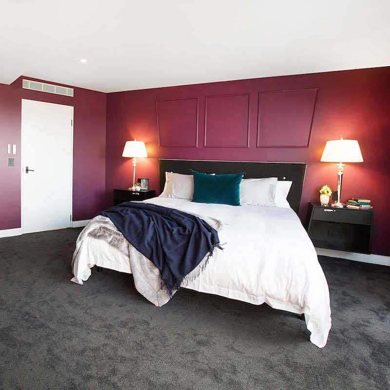
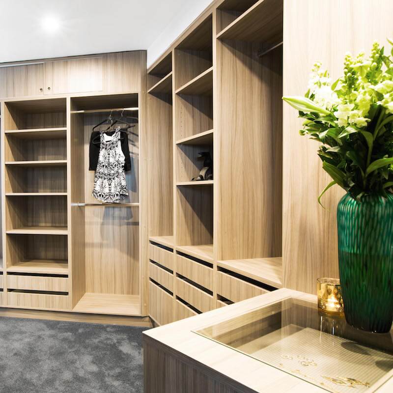

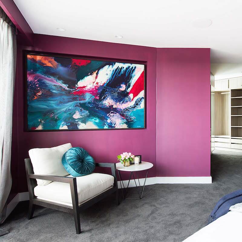
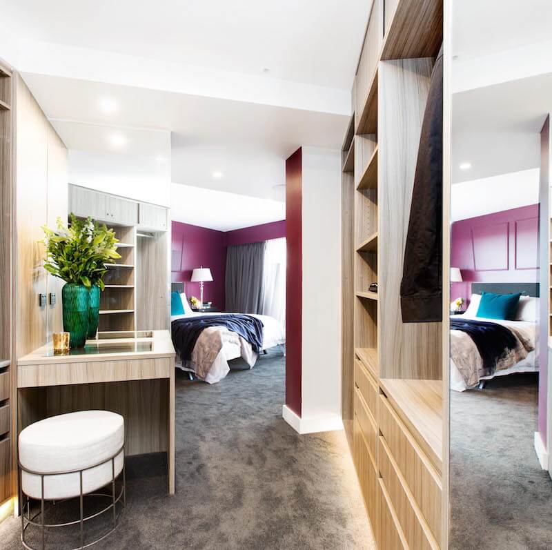
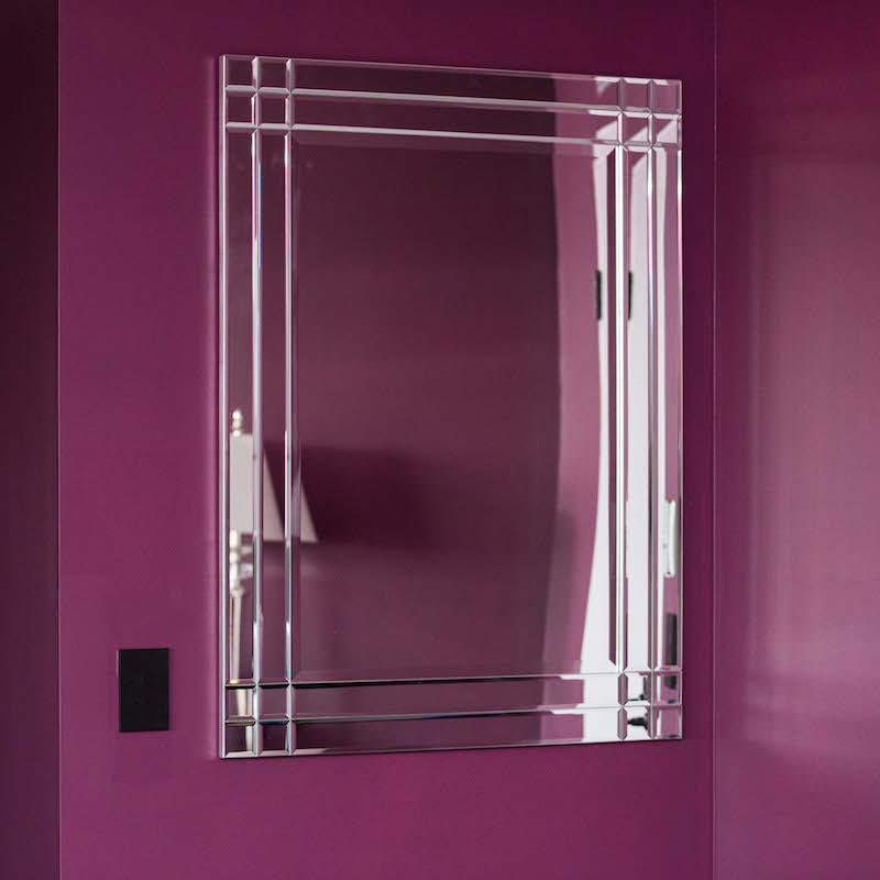
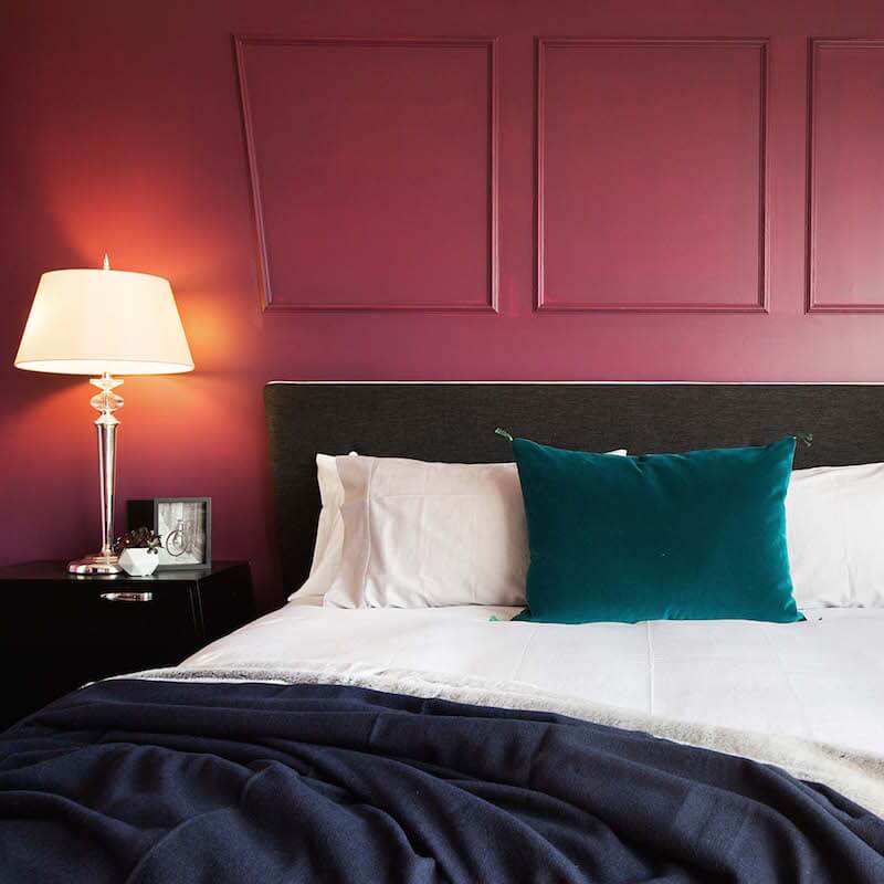
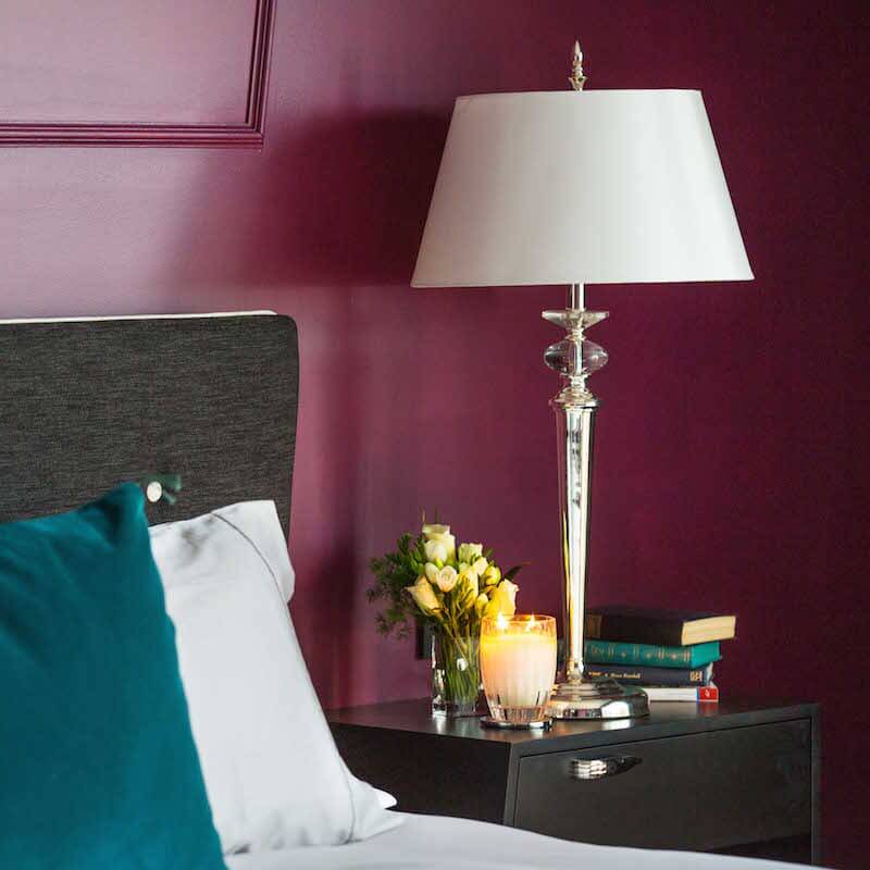
You can shop Luke and Ebony’s room here…[/vc_column_text][/vc_column][/vc_row][vc_row][vc_column width=”1/6″][vc_column_text]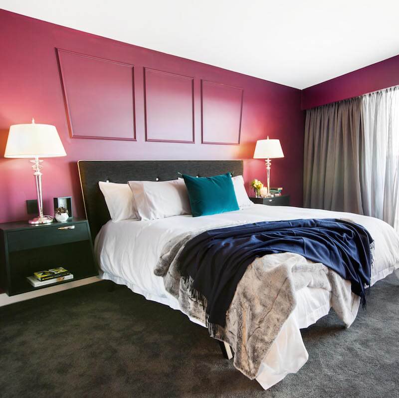
Bed Frame[/vc_column_text][/vc_column][vc_column width=”1/6″][vc_column_text]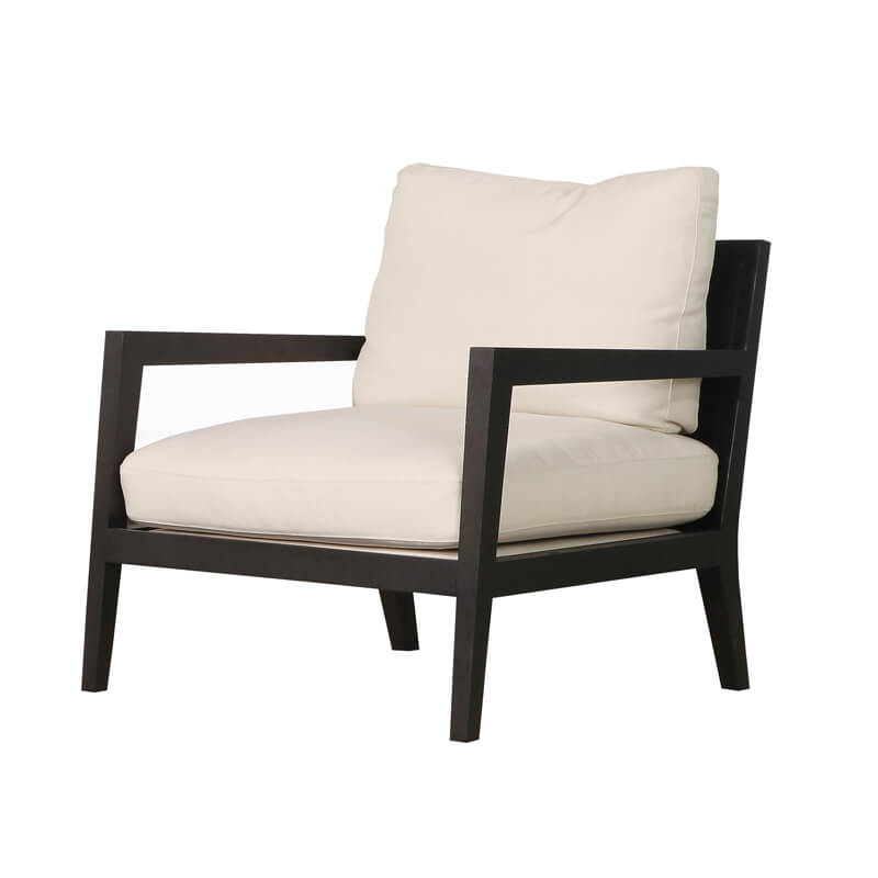
Chair[/vc_column_text][/vc_column][vc_column width=”1/6″][vc_column_text]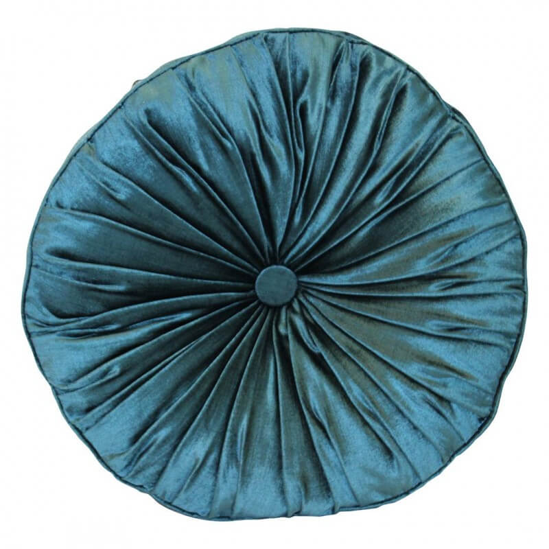
Teal Cushion[/vc_column_text][/vc_column][vc_column width=”1/6″][vc_column_text]
Indigo Throw[/vc_column_text][/vc_column][vc_column width=”1/6″][vc_column_text]
Ottoman[/vc_column_text][/vc_column][vc_column width=”1/6″][vc_column_text]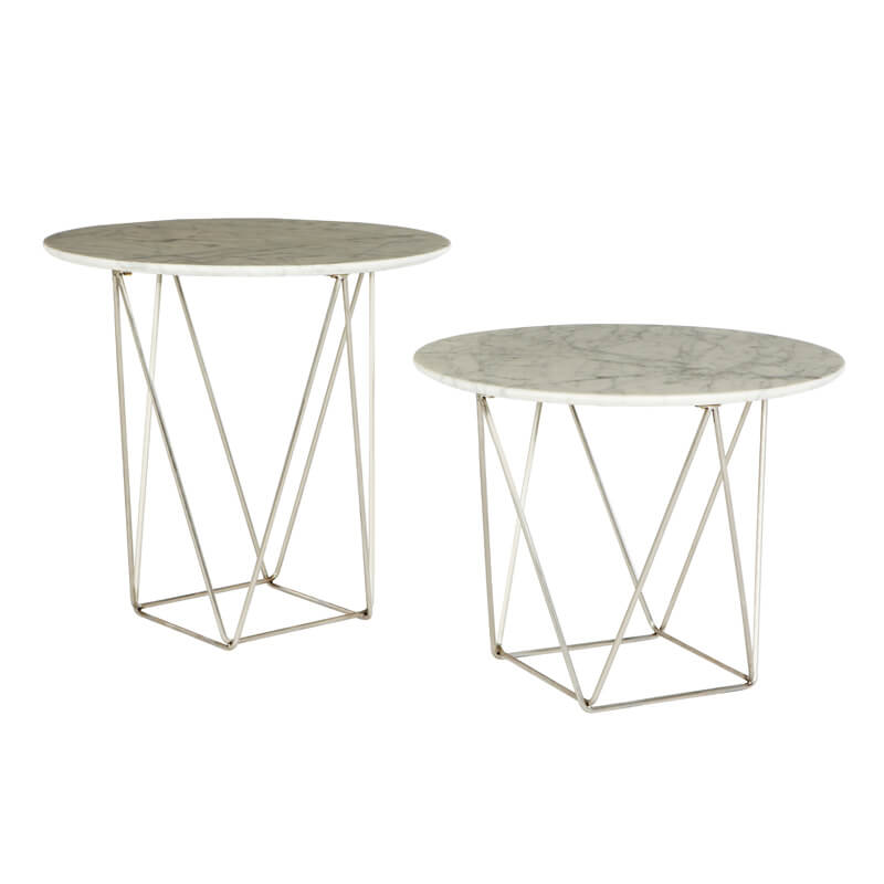
Side Table[/vc_column_text][/vc_column][/vc_row][vc_row][vc_column][vc_separator][vc_column_text]Next came the Tinder love birds Whitney and Andy. They were awarded 18.5/30. They were given low marks because they didn’t finish their room. You can see they barely got through it this week. They have been struggling – I feel bad for them! I know what it’s like. The girls have obviously jagged good builders so they don’t seem to be under the pump as much as Andy and Whitney. I thought what they did finish was great! LOVE the bed and how it looks like it’s floating on a platform.

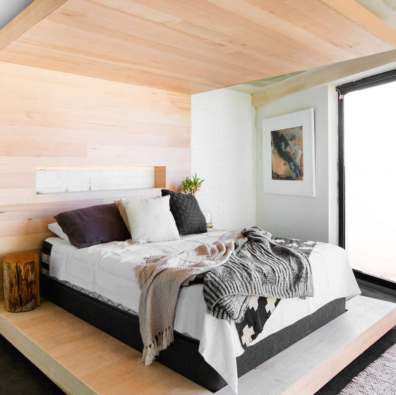
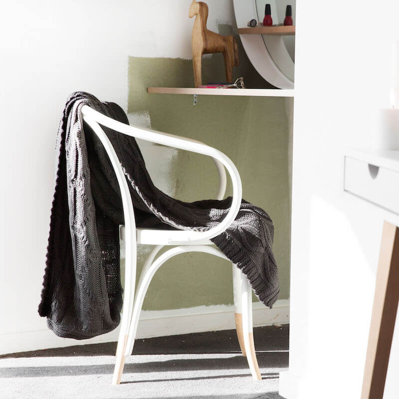

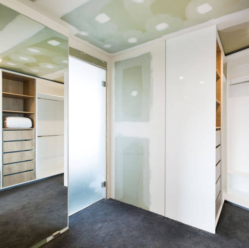
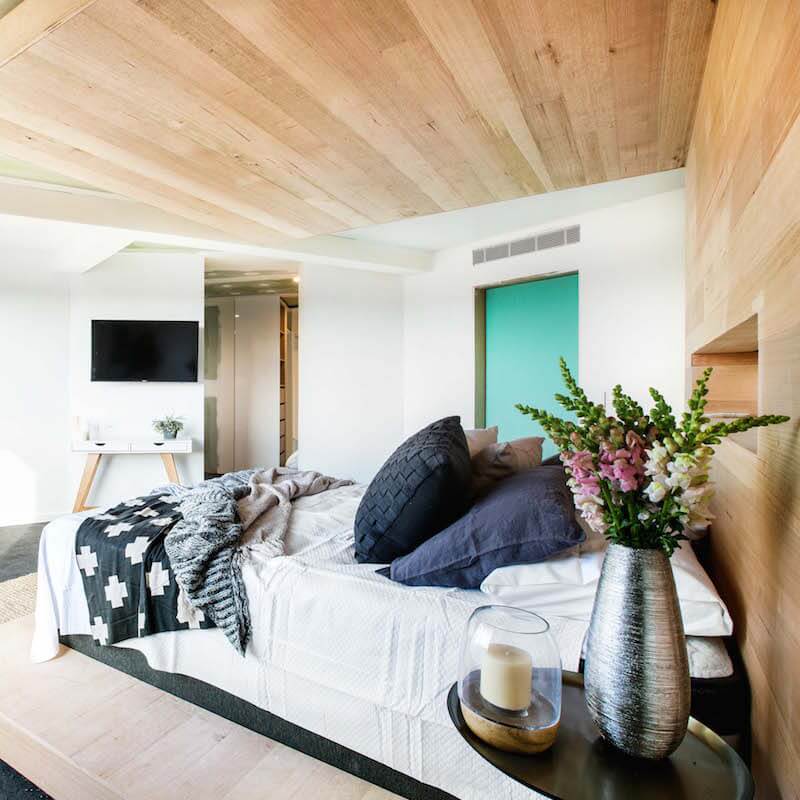
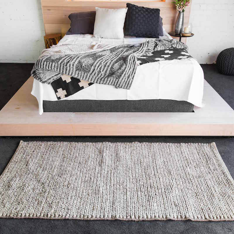
Shop Whitney and Andy’s look here…[/vc_column_text][vc_row_inner][vc_column_inner width=”1/6″][vc_column_text]
Cracked Log Lamp[/vc_column_text][/vc_column_inner][vc_column_inner width=”1/6″][vc_column_text]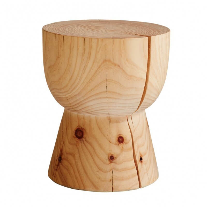
Eggcup Stool[/vc_column_text][/vc_column_inner][vc_column_inner width=”1/6″][vc_column_text]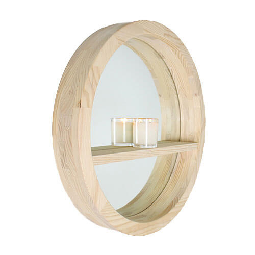
Round Mirror[/vc_column_text][/vc_column_inner][vc_column_inner width=”1/6″][vc_column_text]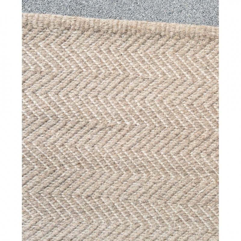
Rug[/vc_column_text][/vc_column_inner][vc_column_inner width=”1/6″][vc_column_text]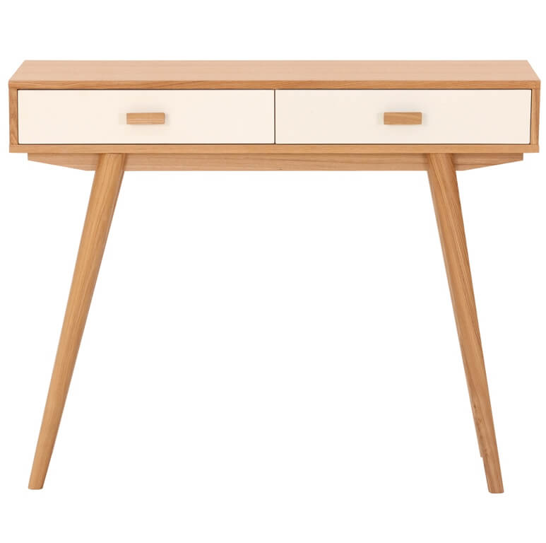
Side Table[/vc_column_text][/vc_column_inner][vc_column_inner width=”1/6″][vc_column_text]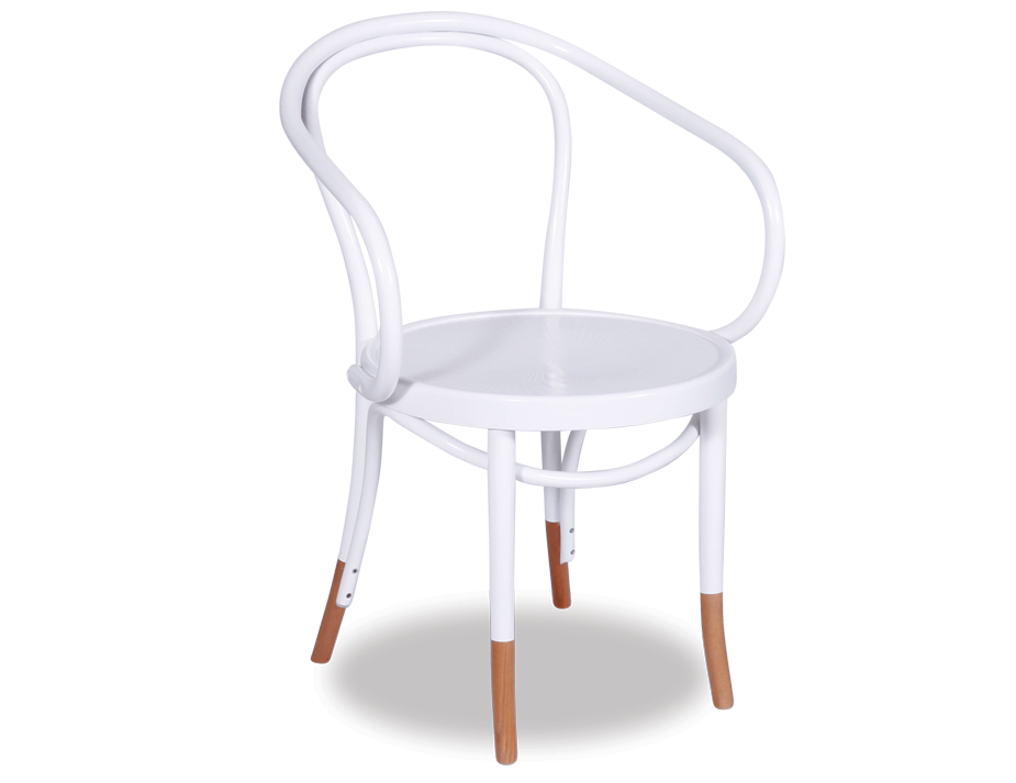
Chair[/vc_column_text][/vc_column_inner][/vc_row_inner][vc_separator][/vc_column][/vc_row][vc_row][vc_column][vc_column_text]
So what do you think last night?? Can’t wait to see more of the rooms!
I’ve got a $50 voucher to give away for YOU to spend in The Block Shop.
CLOSED: Winner is Joanne Fergus who has been contacted via email.
[/vc_column_text][vc_separator][/vc_column][/vc_row]
Be the first to read my stories
Get Inspired by the World of Interior Design
Thank you for subscribing to the newsletter.
Oops. Something went wrong. Please try again later.




Comments
Melinda denton
I love Dean and Shay’s Scand style that was my pick of the night. I’m not sure about the use of render in a bedroom, I love render but out of the bedroom for me. I hope that Ebony and Luke can get back up there in the competition they are a lovely brother and sister duo. I think Whitney and Andy need to clean up as they go I could not work in a messy spot. I’m not a fan of the gentlemans look in the bedroom wardrobe or bathroom. Overall it was definitely Shay and Dean’s style that is a clear winner for me. Loving the block again can’t wait to see the kitchens that’s always a great week.
Ashlea @ Glamour Coastal Living
None of the rooms were amzing – but Dean and Shay’s were my pick if I had to choose.
I am unsure of Luke & Ebony’s style – the berry was too in your face and I thought a little dated?
Kylee
Is it just me, or is the carpet not finished off in Kingi and Caro’s room? In the photo leading into the bathroom it looks like the carpet is not complete. I find it strange that they came second if that was the case.
I’m really hoping that Whitney and Andrew can pull themselves through it. I really loved the elements that they had in their bedroom so it’s such a shame that they didn’t finish.
Hamza Asif
Artistic work is good that you shared in these images. It is a good approach to renovate your home interior in a better way. Moreover, beds and roofs are common, not so much unique. It is looking beautiful because of wall hangings and paint contrasts as well at some places. I know many other places where you can get latest ideas if required all over the world.