[vc_row][vc_column][vc_column_text]Last night on The Block Octagon a guest bedroom and an ensuite was revealed. Again Dean and Shay took out the top spot. They look like the team to win! This is going to stir up the other couples if they keep on with this winning streak. What did you think of the rooms? Here …
[vc_row][vc_column][vc_column_text]Last night on The Block Octagon a guest bedroom and an ensuite was revealed. Again Dean and Shay took out the top spot. They look like the team to win! This is going to stir up the other couples if they keep on with this winning streak.
What did you think of the rooms?
Here are the photos below plus what I think of each room…
::
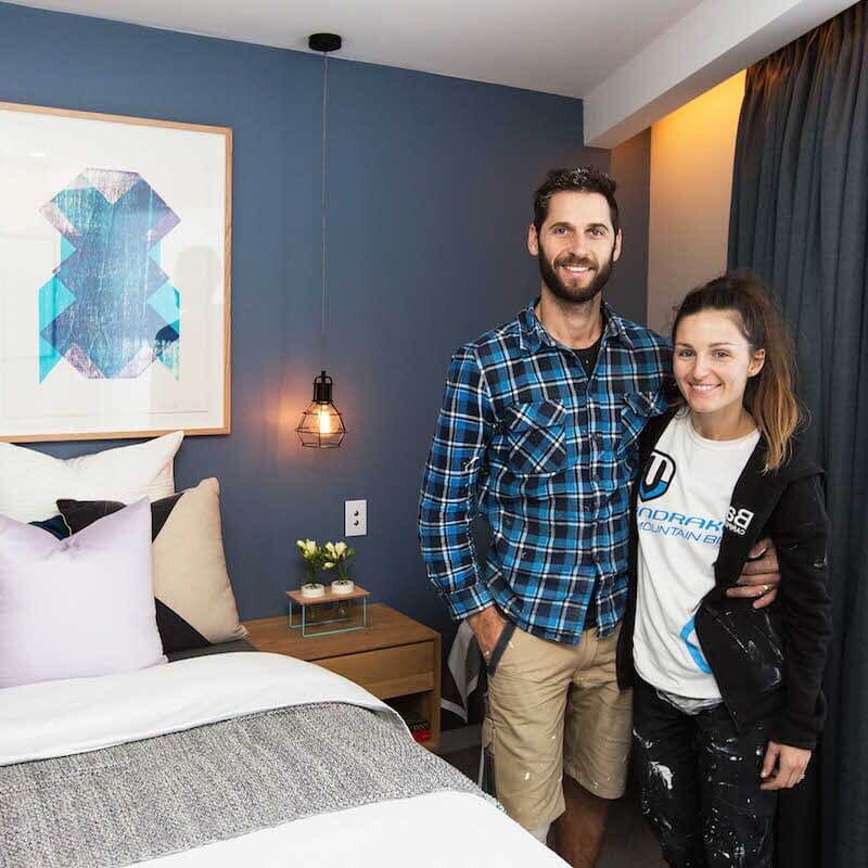
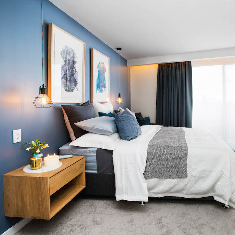
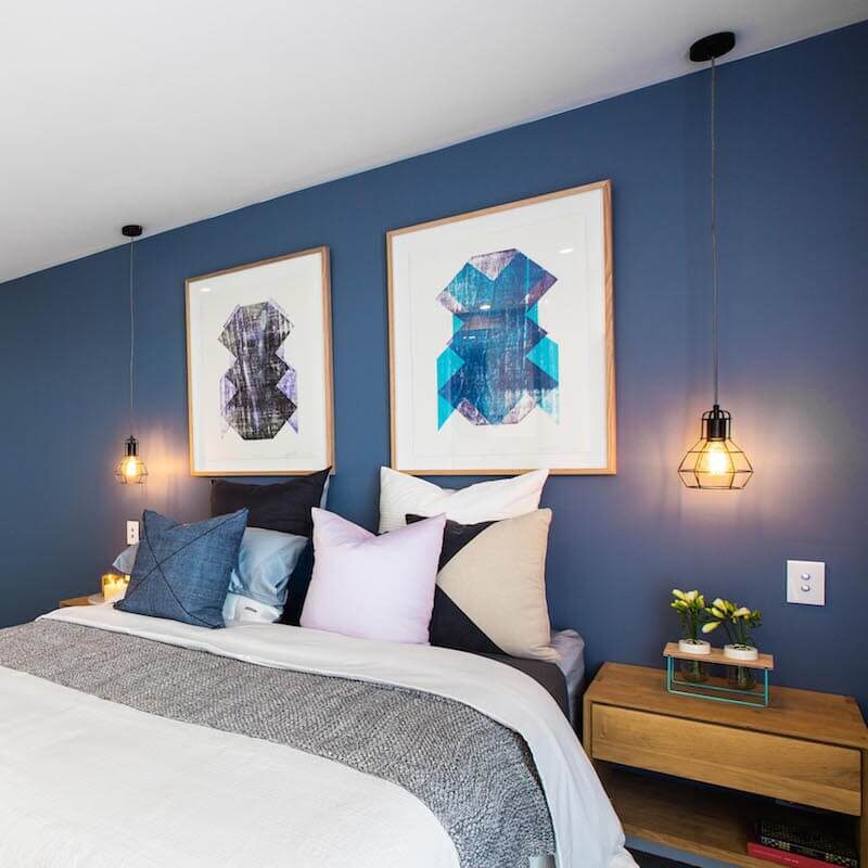
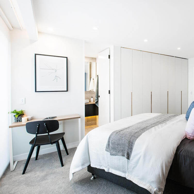
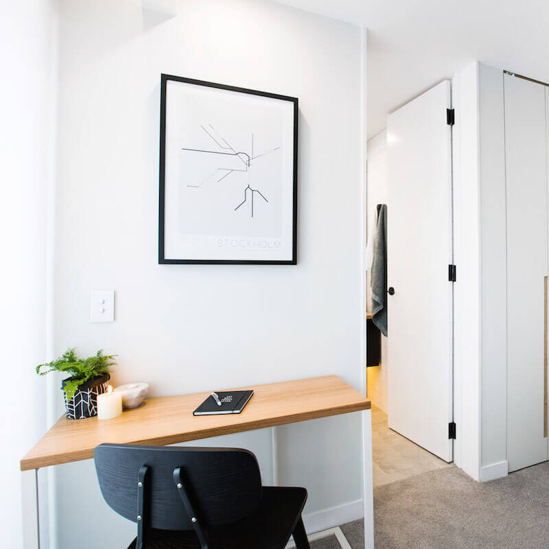
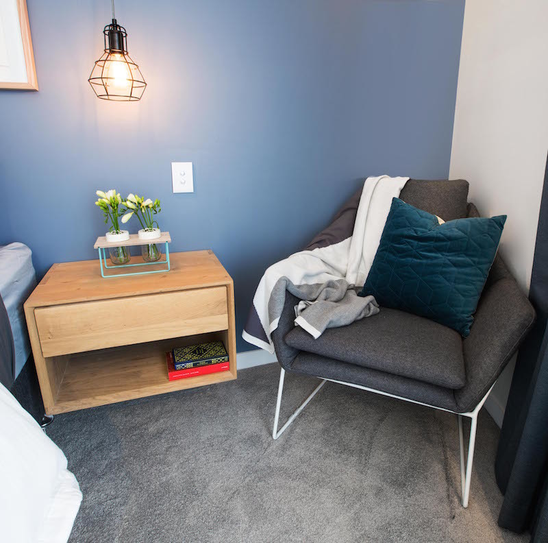
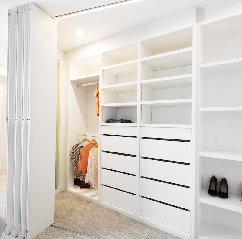
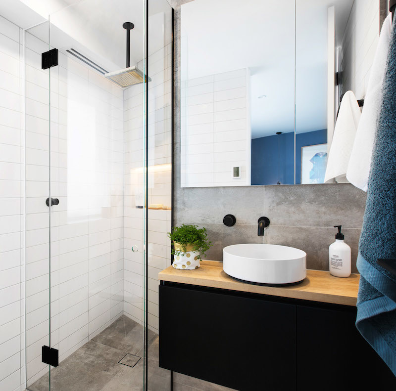
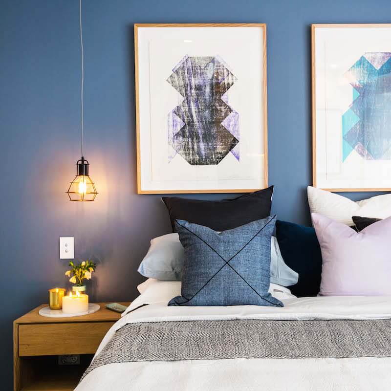
Dean and Shay produced a stunning guest bedroom and ensuite. The judges gave them 28/30 plus another $10,000 cash to add to their budget. I loved the choice of linen and the steel blue/grey feature wall. Their choice of tiles and the black tapware/vanity were spot on. They aren’t trying to break any interior design trends, but are thinking of auction day already by appealing to the majority of people.




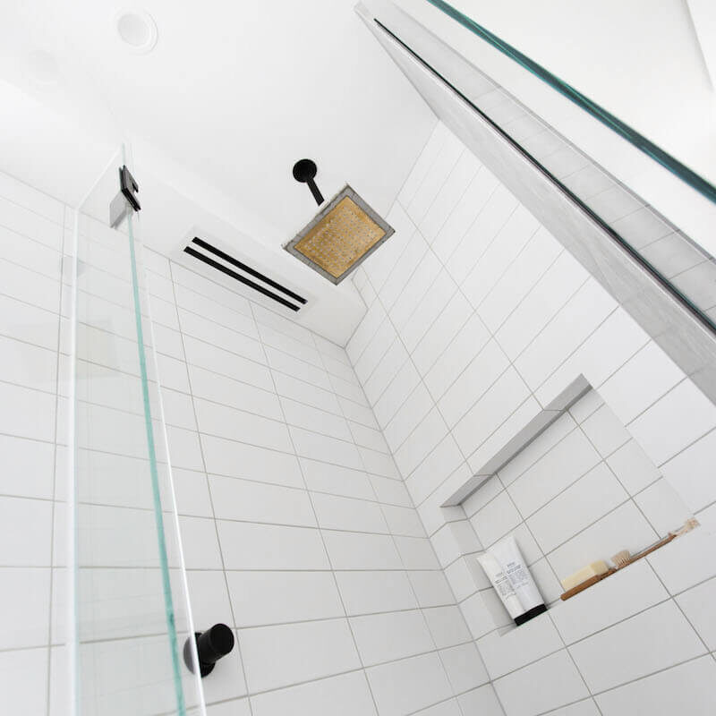
Snatch a good buy with some of Dean and Shay’s items below…[/vc_column_text][vc_row_inner][vc_column_inner width=”1/6″][vc_column_text]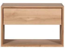
Bedside Tables with Drawer[/vc_column_text][/vc_column_inner][vc_column_inner width=”1/6″][vc_column_text]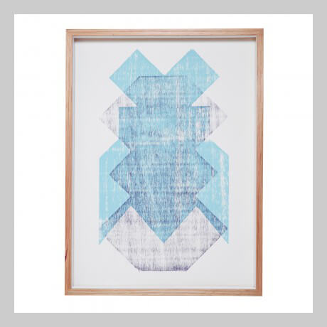
Jessa Print by Lumiere[/vc_column_text][/vc_column_inner][vc_column_inner width=”1/6″][vc_column_text]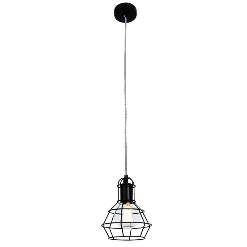
Light Cage Pendant in Black[/vc_column_text][/vc_column_inner][vc_column_inner width=”1/6″][vc_column_text]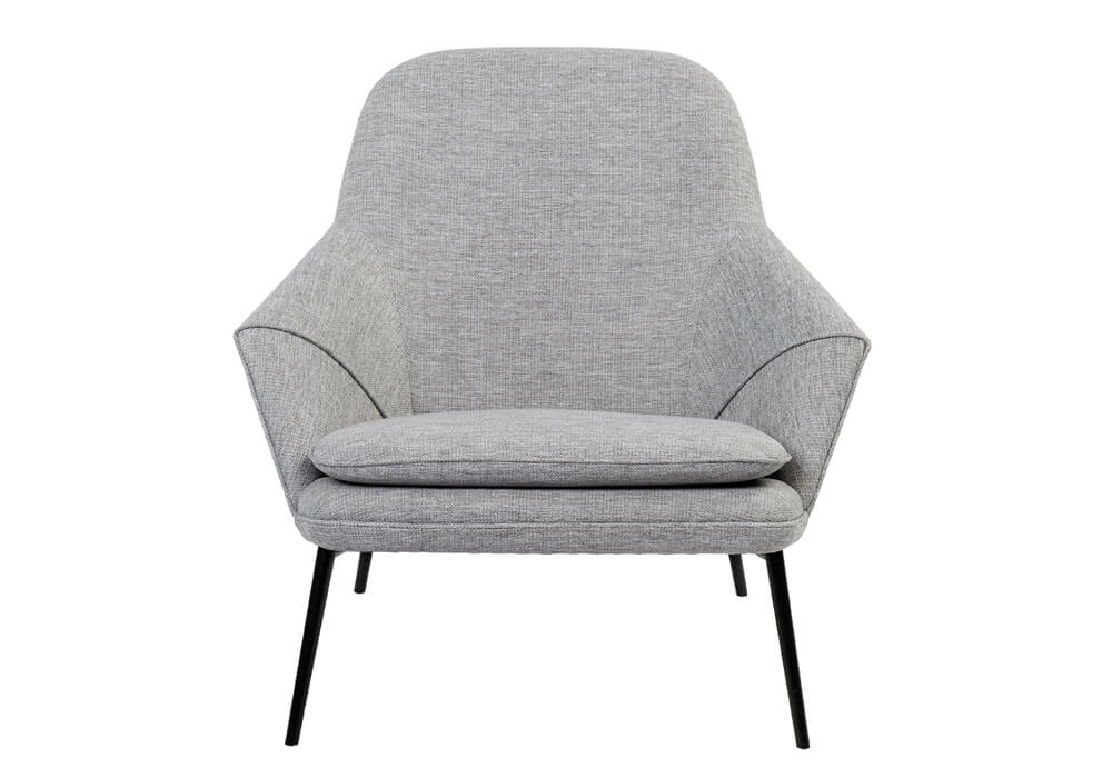
Grey Hug Occassional Chair[/vc_column_text][/vc_column_inner][vc_column_inner width=”1/6″][vc_column_text]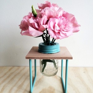
Flower Jar Vase[/vc_column_text][/vc_column_inner][vc_column_inner width=”1/6″][vc_column_text]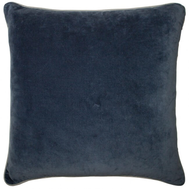
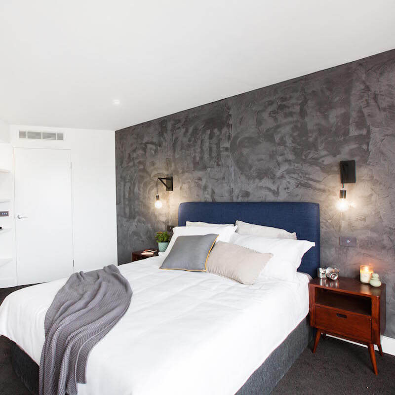
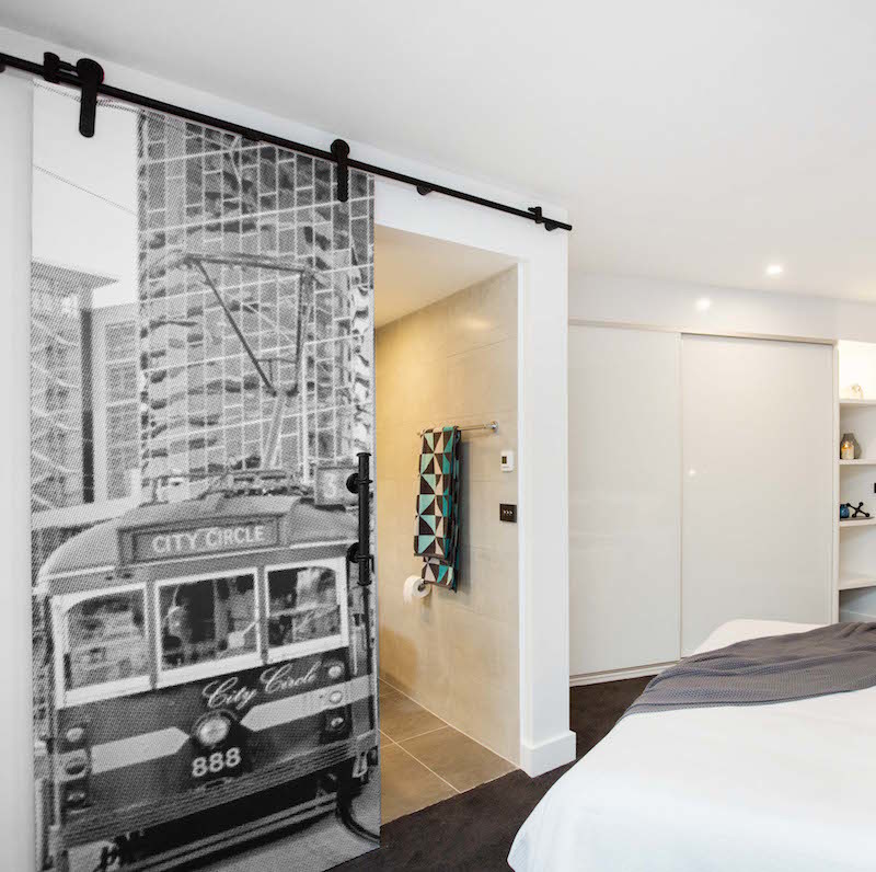
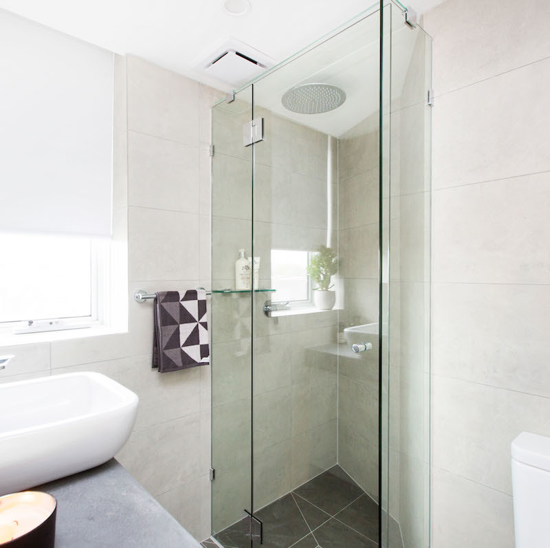
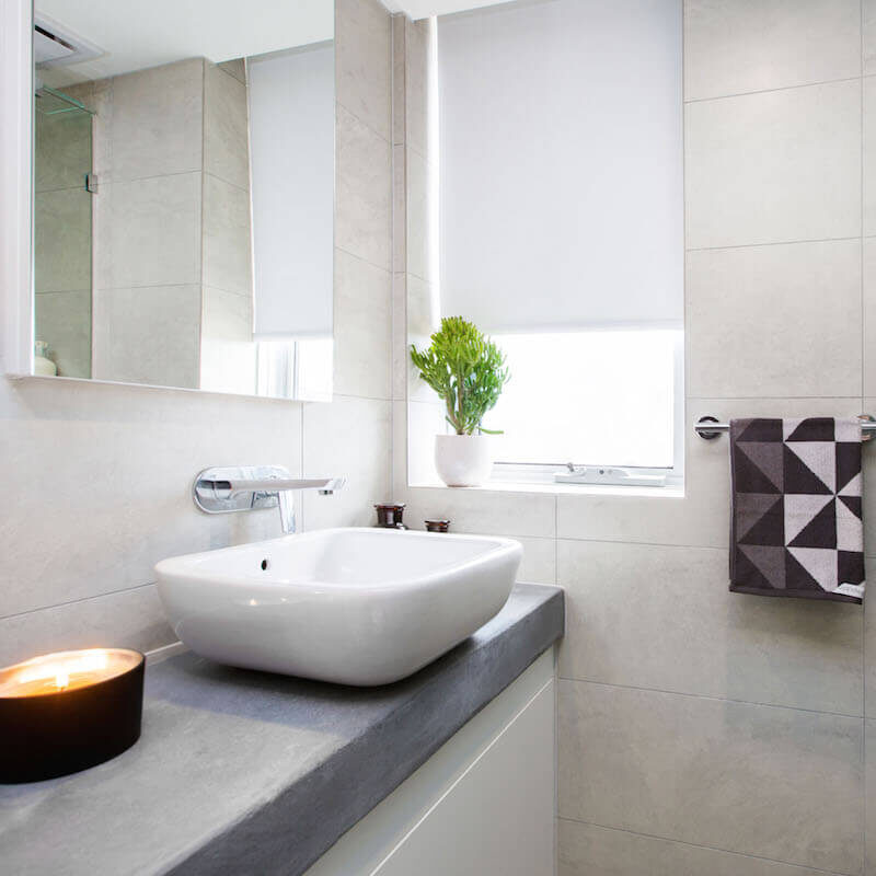
Navy Velvet Cushion[/vc_column_text][/vc_column_inner][/vc_row_inner][vc_separator][/vc_column][/vc_row][vc_row][vc_column][vc_column_text]Next on the score board came Caro and Kingi. The judges gave them 27.5/30 and was in love with their raw and edgy feel. I thought their ensuite door was a nice touch, but this room did nothing for me. If they are going to do their entire house in the “suede effect” render then I am out. To me, they may as well use the suede paint from the 1990s. If you don’t like this look, then all the walls will need to be re-plastered. I hope they just keep this wall look to a minimum throughout the house. And no concealed cistern? The first thing you see is the toilet when you leave the ensuite door open. Bad vibes!
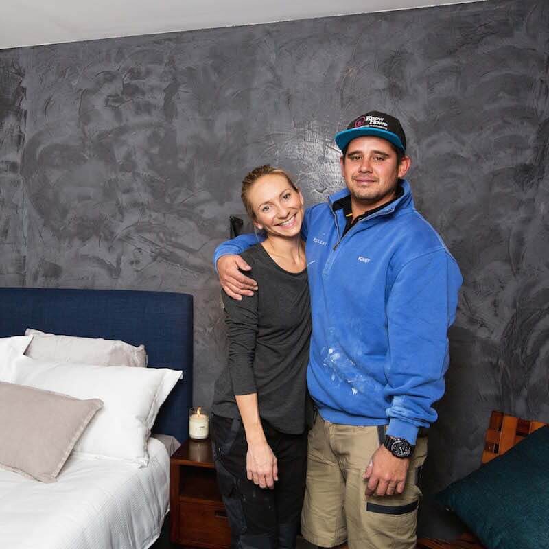
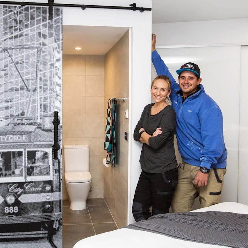
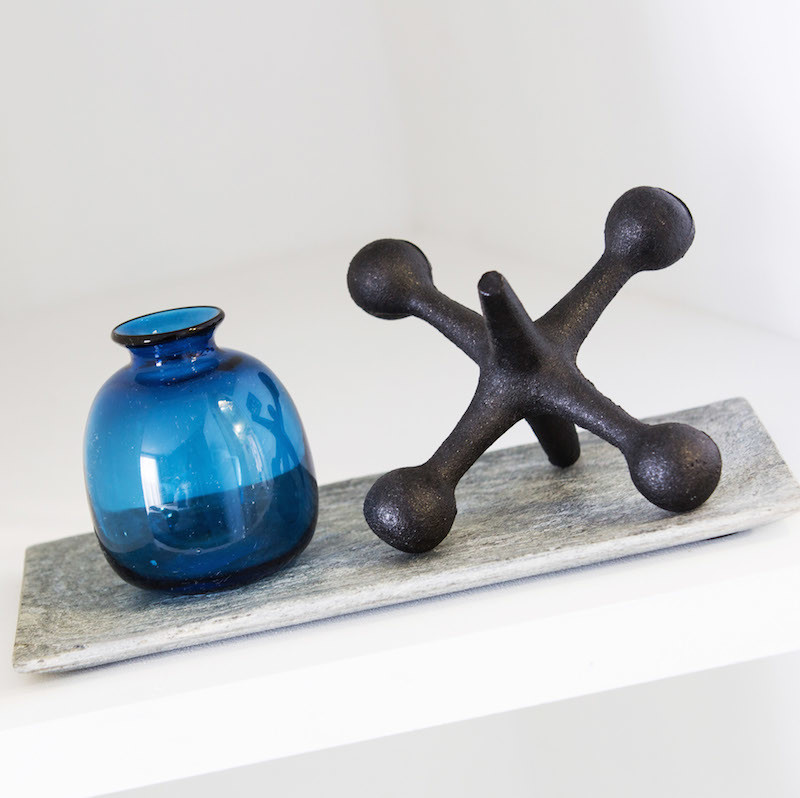

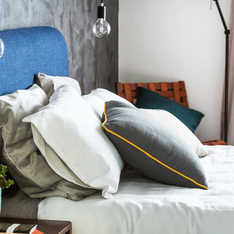
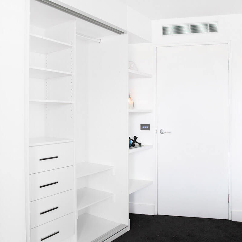
You can shop Kingi and Caro’s look below…[/vc_column_text][vc_row_inner][vc_column_inner width=”1/6″][vc_column_text]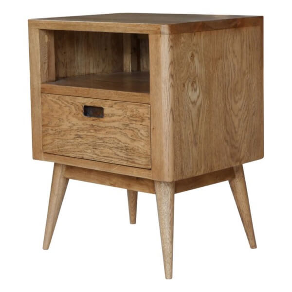
Bedside table[/vc_column_text][/vc_column_inner][vc_column_inner width=”1/6″][vc_column_text]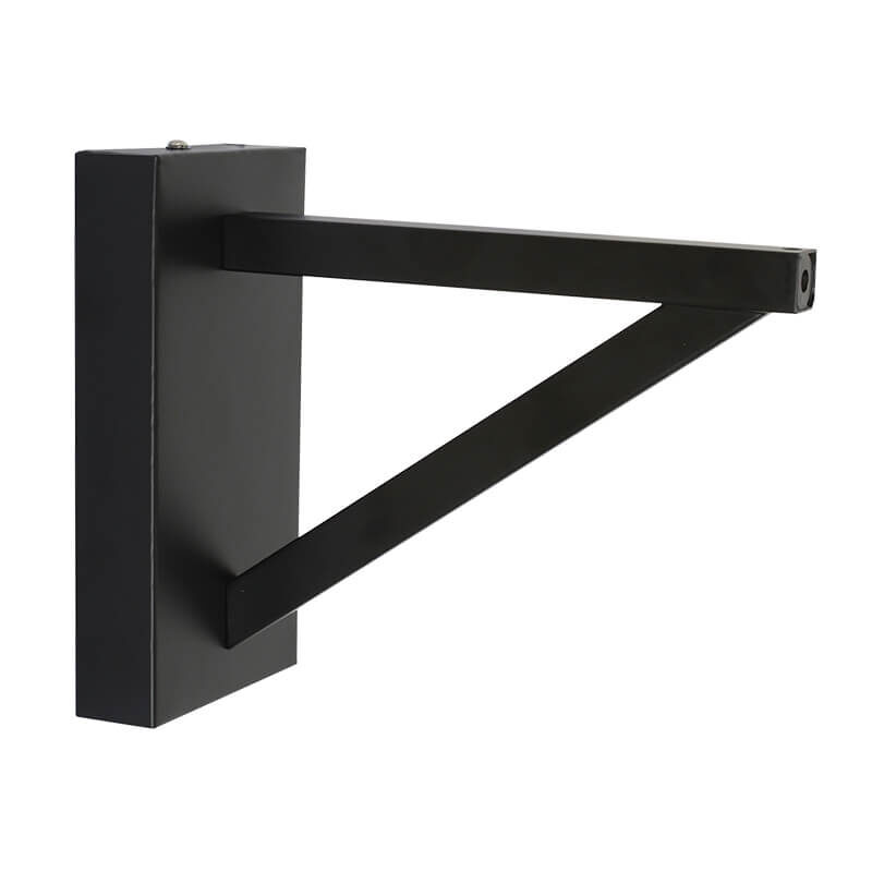
Light wall bracket[/vc_column_text][/vc_column_inner][vc_column_inner width=”1/6″][vc_column_text]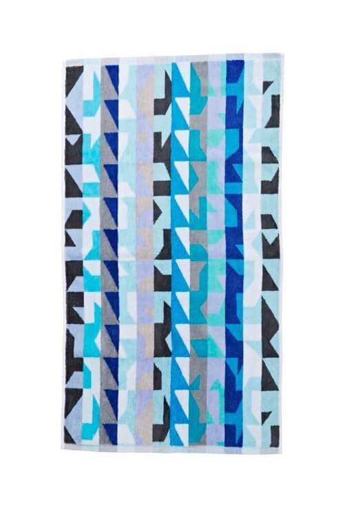
Bath sheet[/vc_column_text][/vc_column_inner][vc_column_inner width=”1/6″][vc_column_text]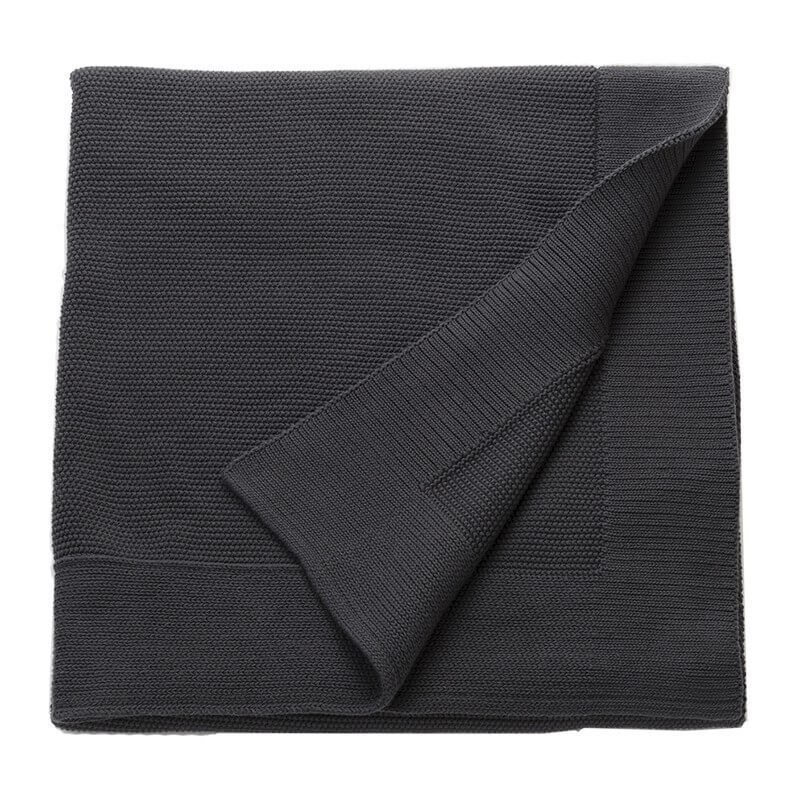
Grey throw[/vc_column_text][/vc_column_inner][vc_column_inner width=”1/6″][vc_column_text]
Floor Lamp[/vc_column_text][/vc_column_inner][vc_column_inner width=”1/6″][vc_column_text]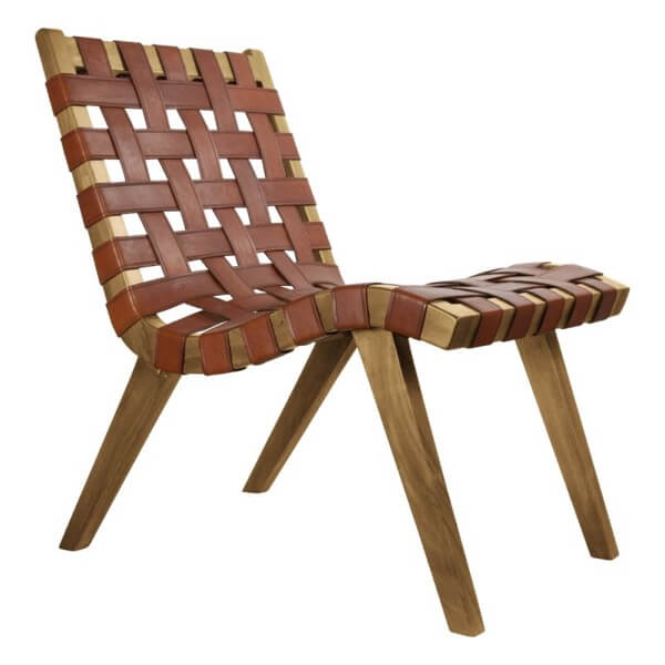
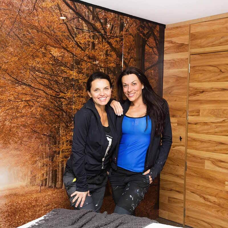
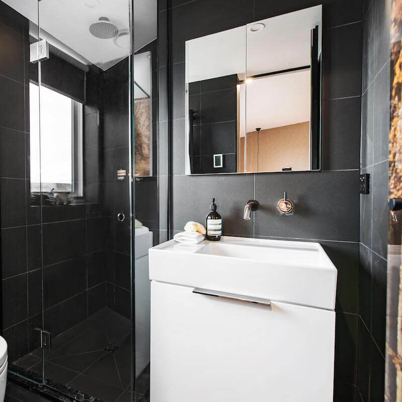
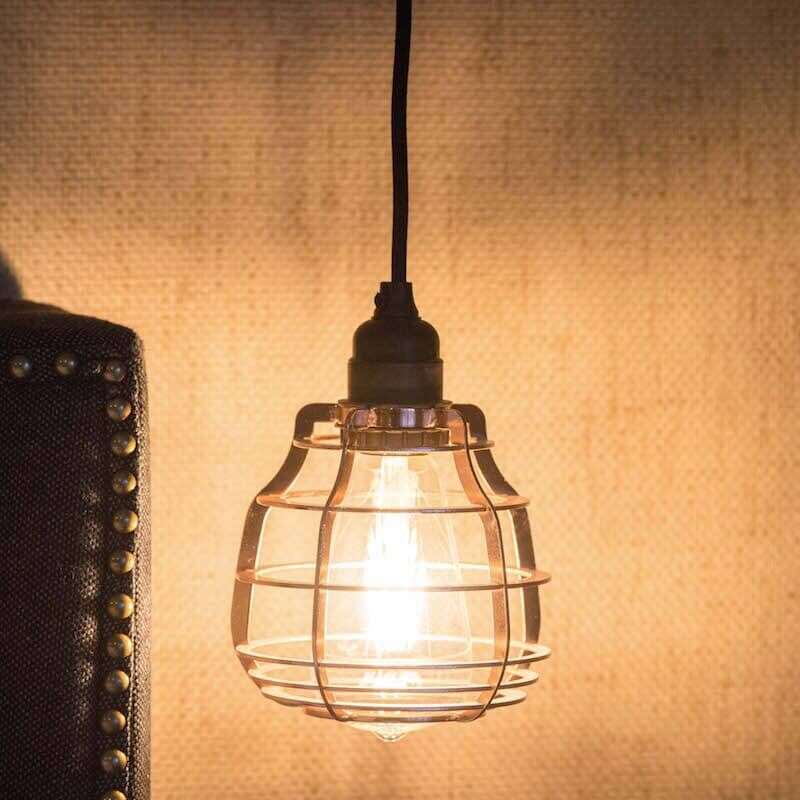
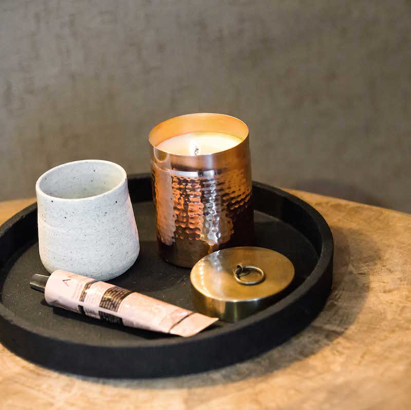
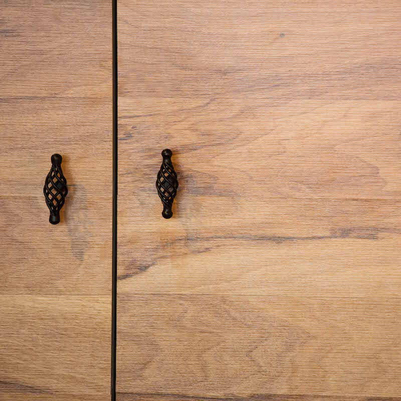
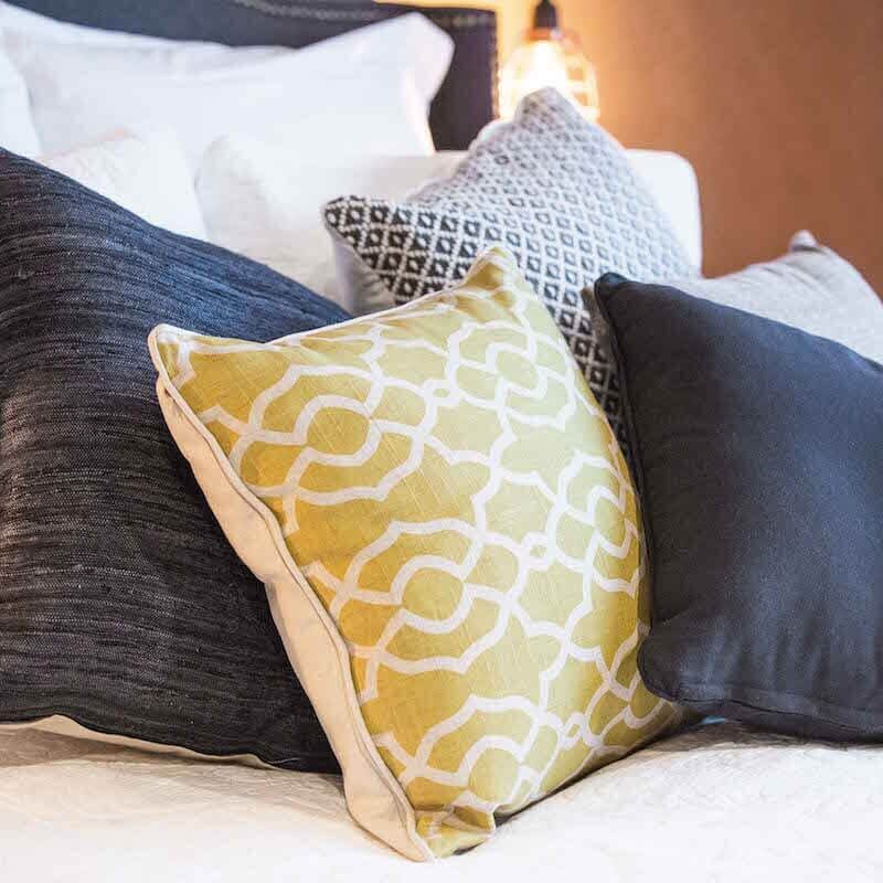
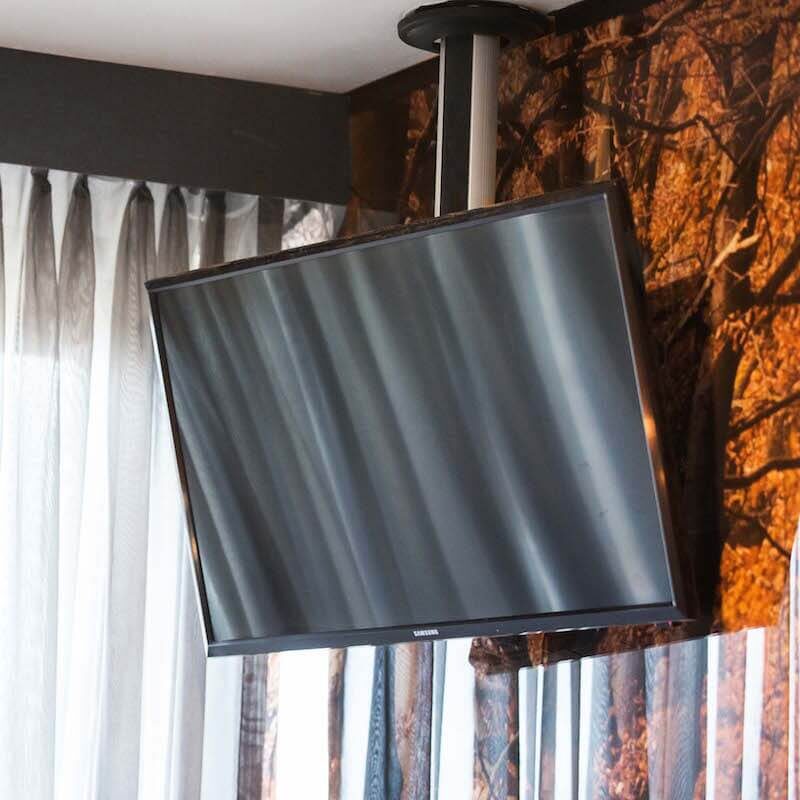
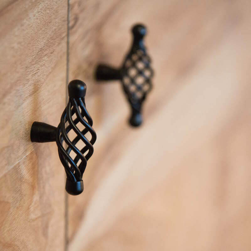
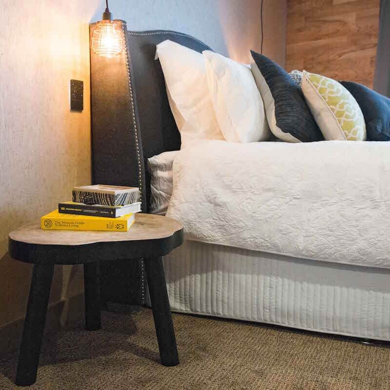
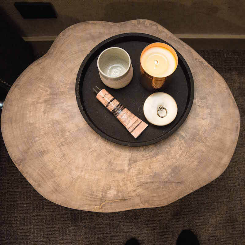
Woven Chair[/vc_column_text][/vc_column_inner][/vc_row_inner][vc_separator][/vc_column][/vc_row][vc_row][vc_column][vc_column_text]Third on the score board this week was Suzi and Vonni. The judges awarded them 23/30. They installed glass panels, featuring a view of nearby Fawkner Park, on an entire wall, concealing the ensuite and the wardrobe. Darren loved it, but Neale and Shaynna weren’t fans. I didn’t mind the colour palette and I am interested to see where their whole appartment ends up. I’m not sure I would have put all those timber doors/walls on the adjacent wall though as the colours were a bit full on. I think we’re also going to have to get used to the fact they will be producing dark and black bathrooms.


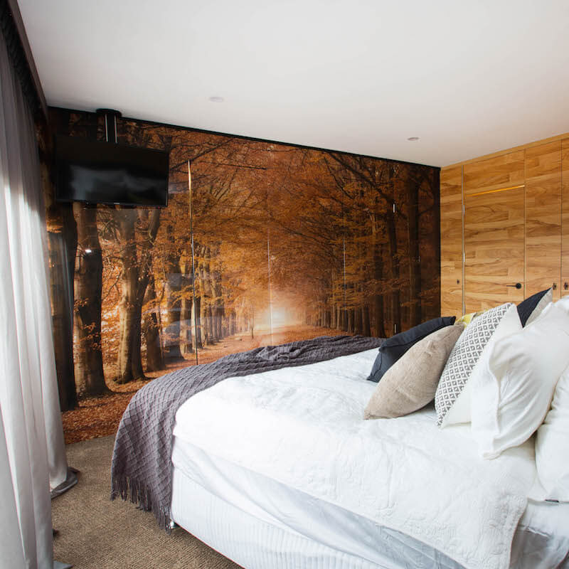
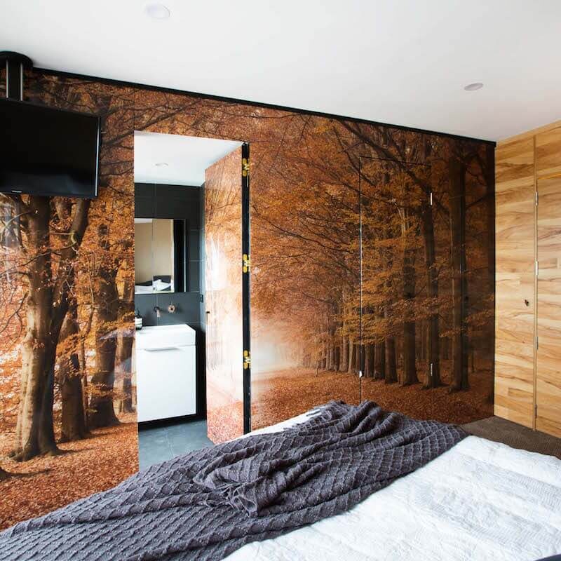
You can shop Suzi and Vonni’s room below…[/vc_column_text][vc_row_inner][vc_column_inner width=”1/6″][vc_column_text]
Bedhead[/vc_column_text][/vc_column_inner][vc_column_inner width=”1/6″][vc_column_text]
Book[/vc_column_text][/vc_column_inner][vc_column_inner width=”1/6″][vc_column_text]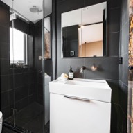
Reece[/vc_column_text][/vc_column_inner][vc_column_inner width=”1/6″][vc_column_text]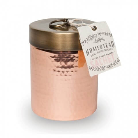
Copper candle[/vc_column_text][/vc_column_inner][vc_column_inner width=”1/6″][vc_column_text]
Concrete Tray[/vc_column_text][/vc_column_inner][vc_column_inner width=”1/6″][vc_column_text]
Throw[/vc_column_text][/vc_column_inner][/vc_row_inner][vc_separator][/vc_column][/vc_row][vc_row][vc_column][vc_column_text]Next came the Tinder love birds Whitney and Andy. They were awarded 18.5/30. They were given low marks because they decided not to put a wardrobe in their bedroom, but rather hang a branch from a tree with a few coat hangers. Ooopsy! However, I did like the painted brick wall and feature bulkhead. The orange chair is cool too. These two have potential, they just haven’t realised it yet!
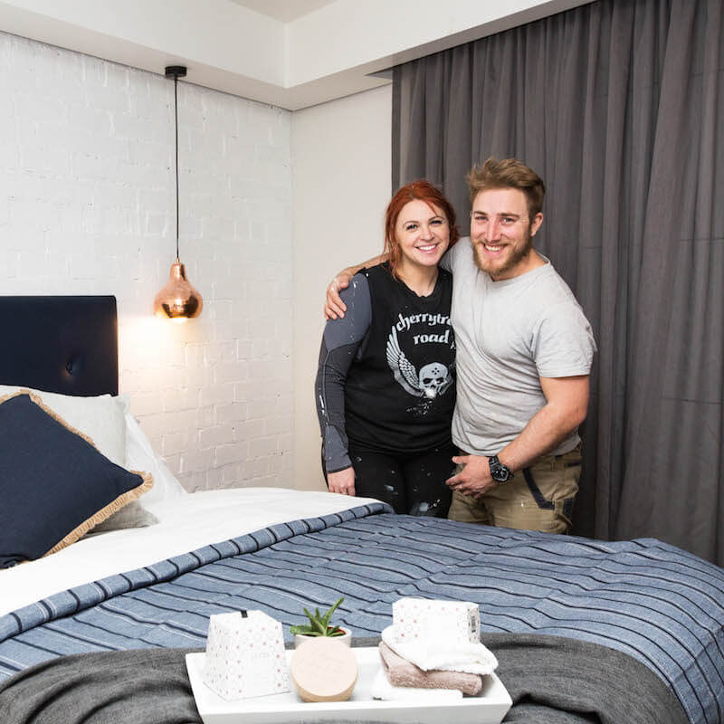
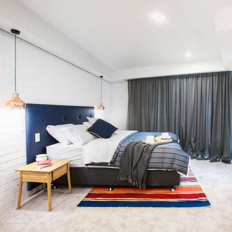
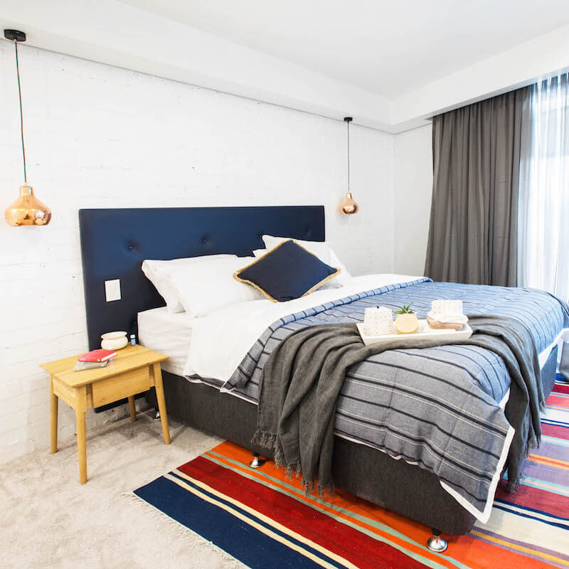
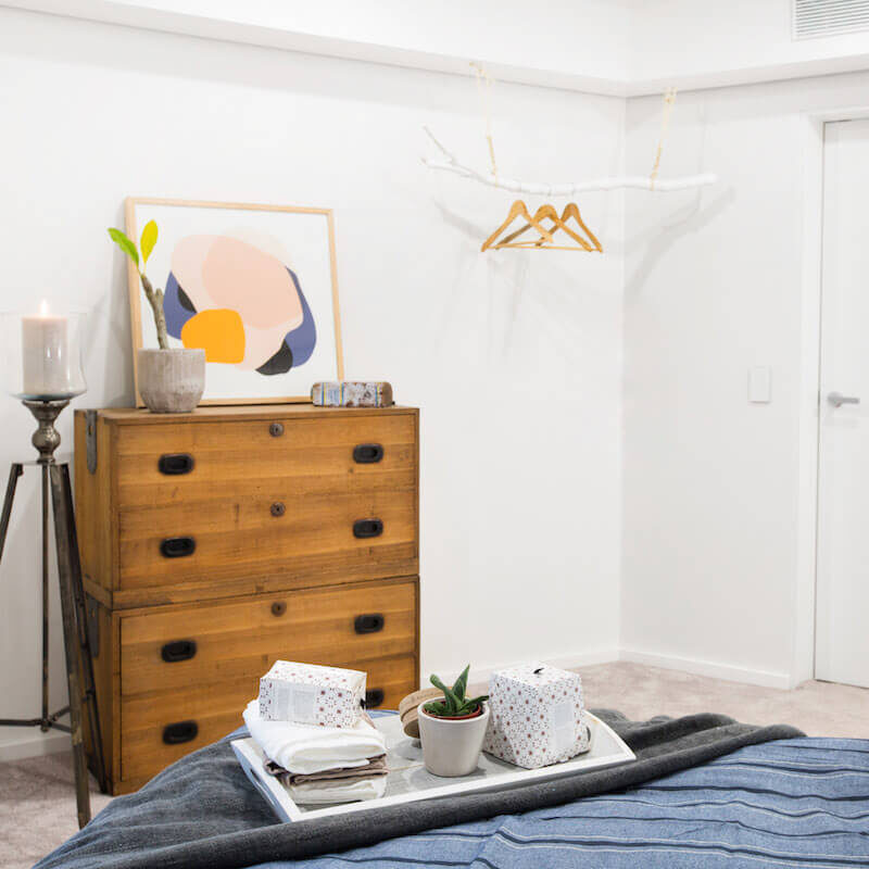
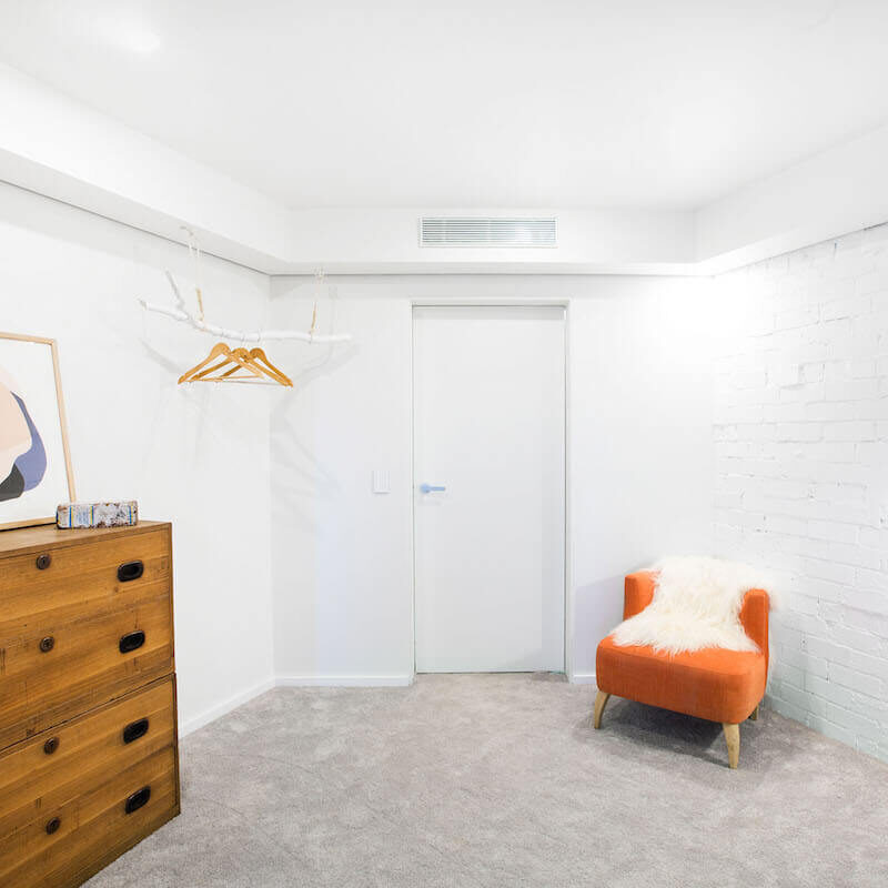
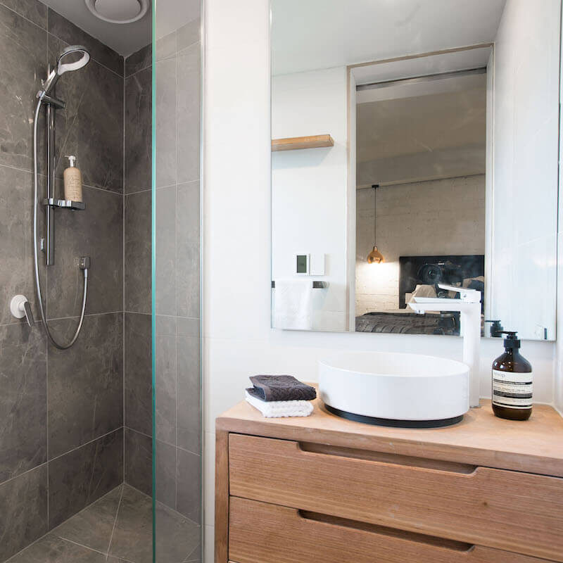
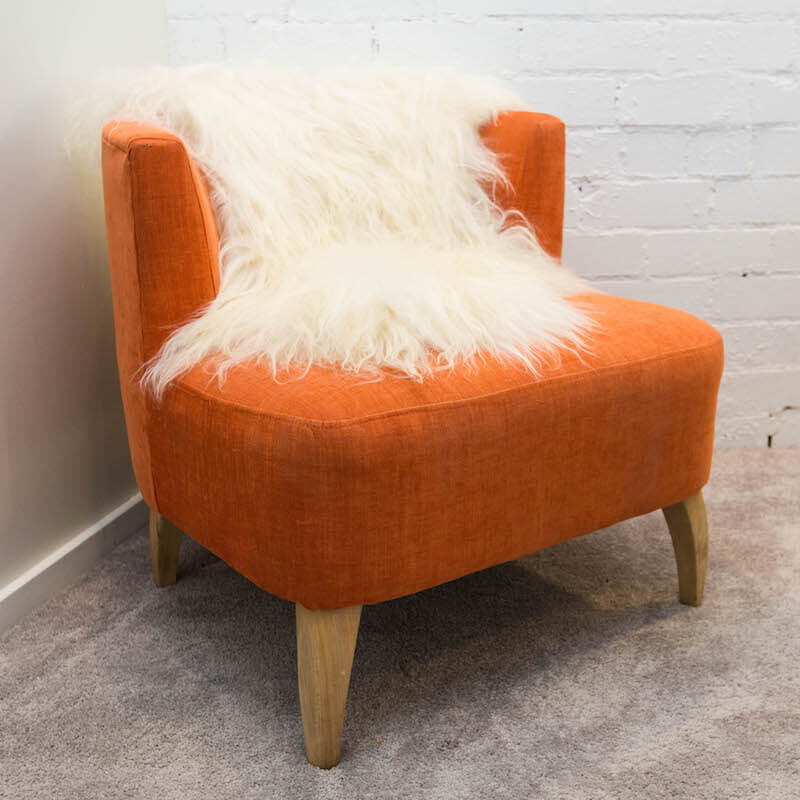
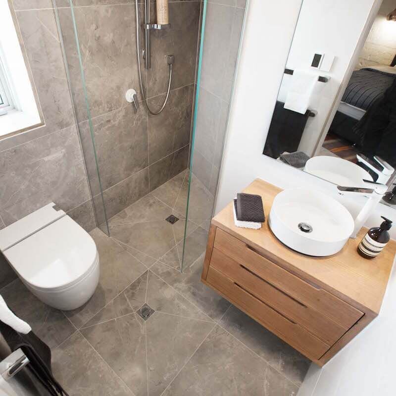
Shop Whitney and Andy’s look here…[/vc_column_text][vc_row_inner][vc_column_inner width=”1/6″][vc_column_text]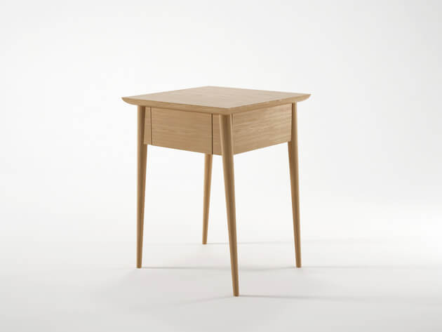
Bedside Table[/vc_column_text][/vc_column_inner][vc_column_inner width=”1/6″][vc_column_text]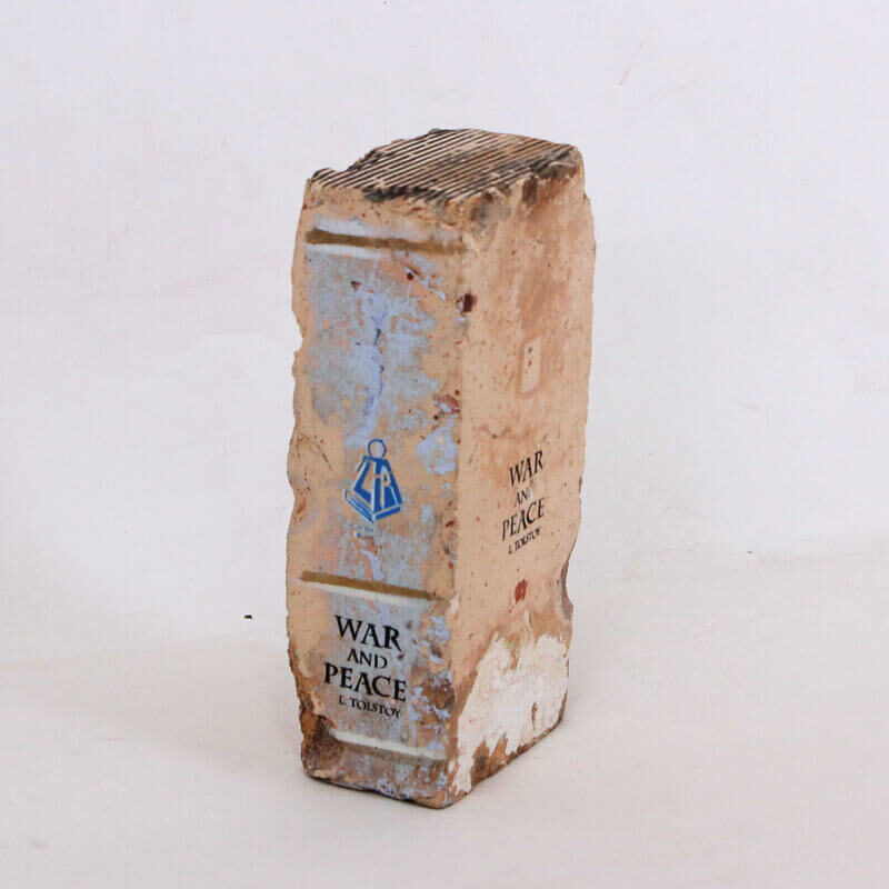
Bookend[/vc_column_text][/vc_column_inner][vc_column_inner width=”1/6″][vc_column_text]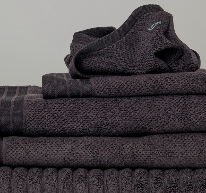
Towels[/vc_column_text][/vc_column_inner][vc_column_inner width=”1/6″][vc_column_text]
Tallboy[/vc_column_text][/vc_column_inner][vc_column_inner width=”1/6″][vc_column_text]
Sheepskin[/vc_column_text][/vc_column_inner][vc_column_inner width=”1/6″][vc_column_text]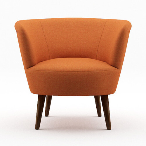
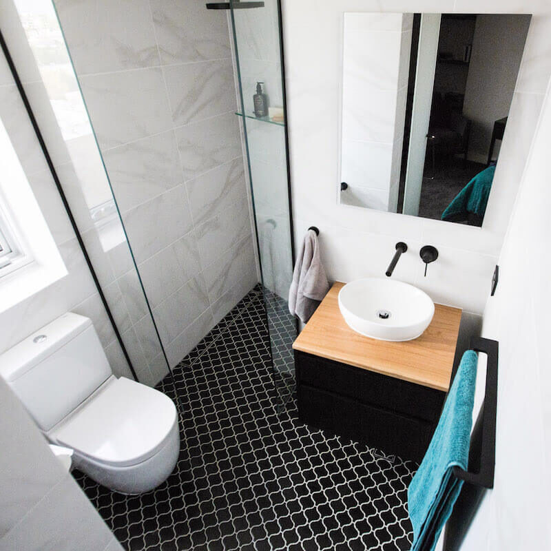
Orange Chair[/vc_column_text][/vc_column_inner][/vc_row_inner][vc_separator][/vc_column][/vc_row][vc_row][vc_column][vc_column_text]Last this week (again!) were the brother and sister duo Luke and Ebony. That’s gotta hurt considering Ebony is an interior designer! They were given 18/30. They were so disappointed. I could see that Ebony was trying to do something cool with the lighting, but it didn’t quite work did it? I am sure it would have looked better in a nook area, or a hallway with a small wall as a feature? I am a big fan or pressed tin, so I hope Ebony uses it somewhere else too. The ensuite was great I thought (although the toilet again with no concealed cistern?!).
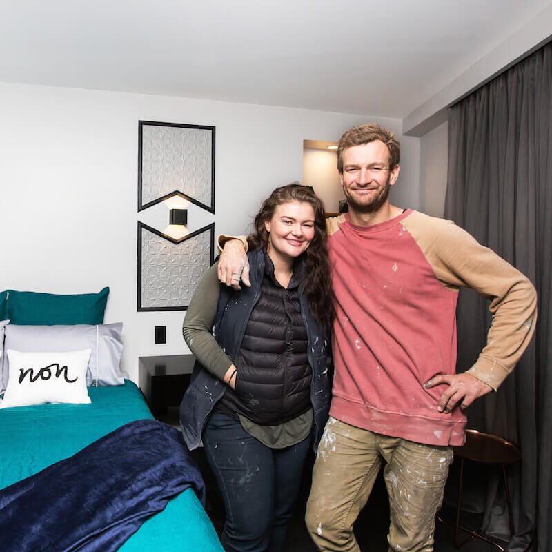
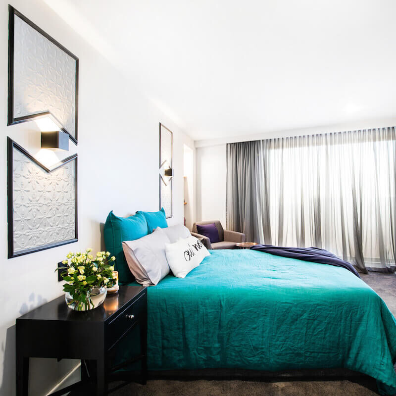

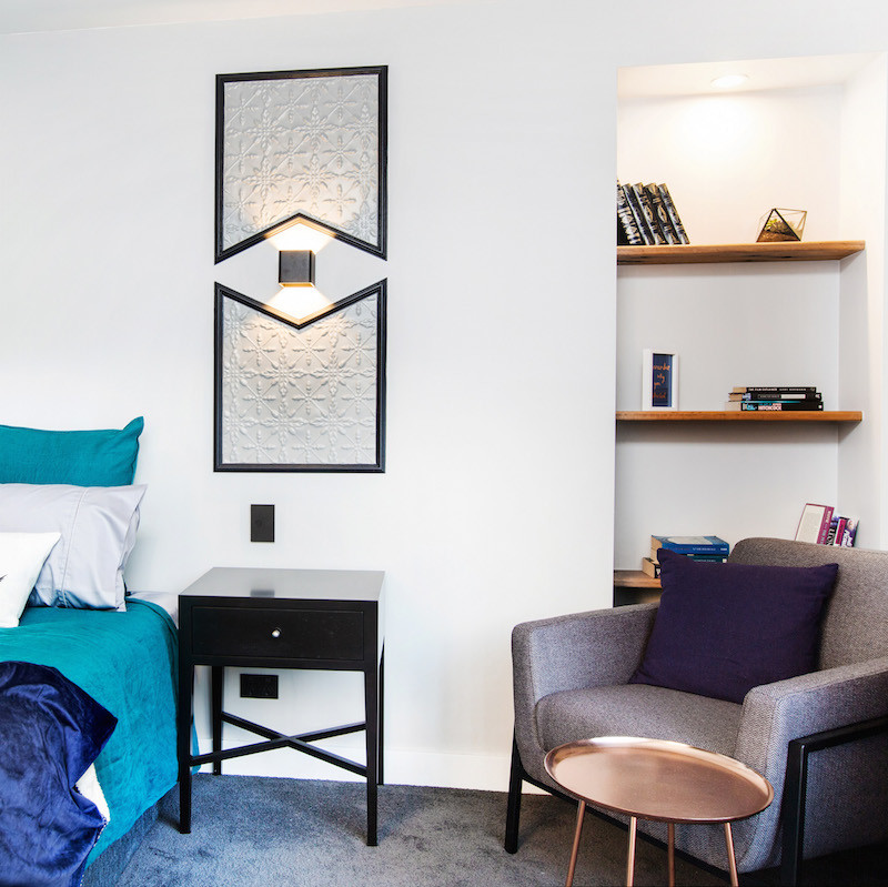
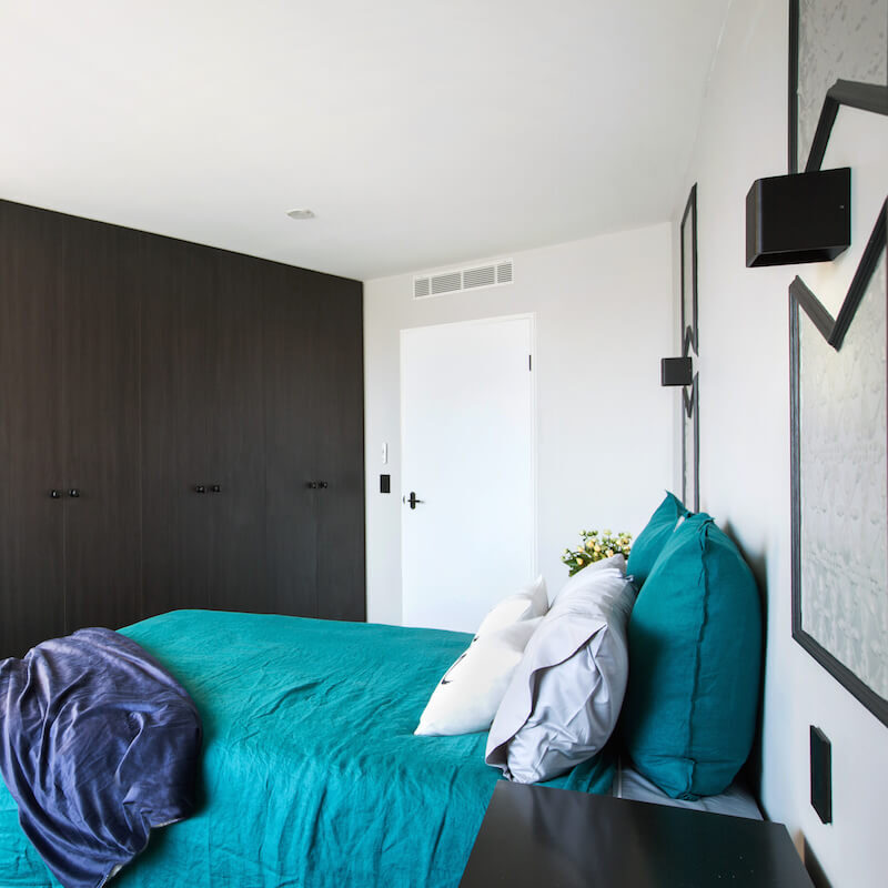
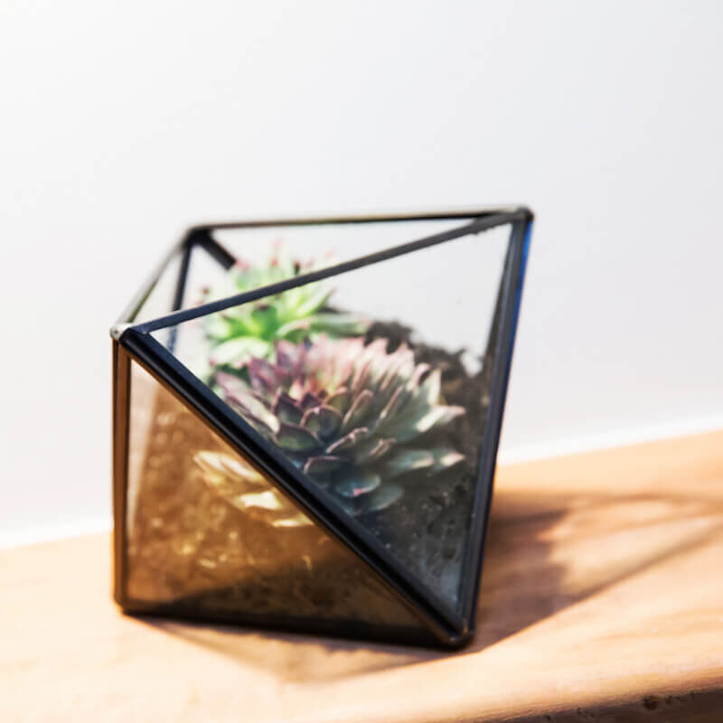
You can shop Luke and Ebony’s room here…[/vc_column_text][/vc_column][/vc_row][vc_row][vc_column width=”1/6″][vc_column_text]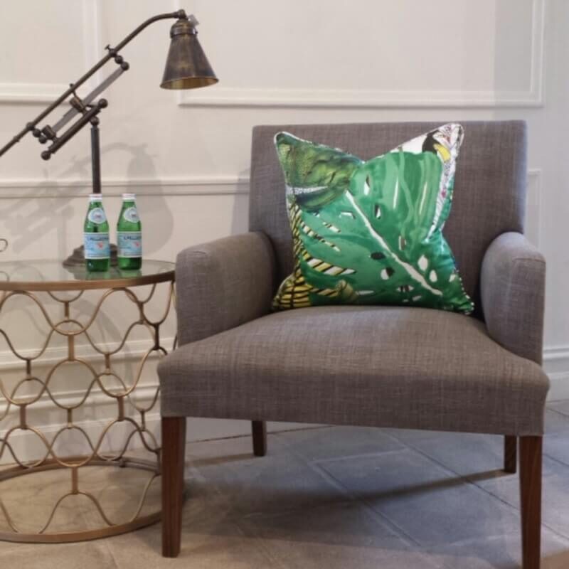
Armchair[/vc_column_text][/vc_column][vc_column width=”1/6″][vc_column_text]
Blanket Throw[/vc_column_text][/vc_column][vc_column width=”1/6″][vc_column_text]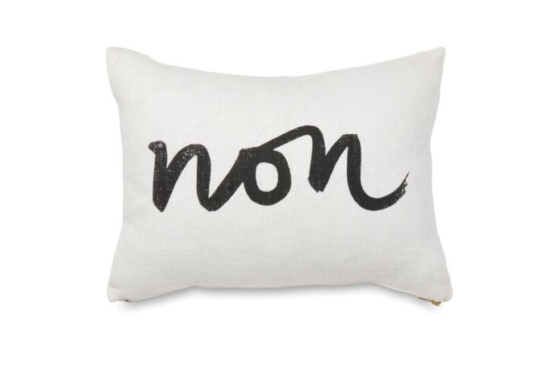
Cushion[/vc_column_text][/vc_column][vc_column width=”1/6″][vc_column_text]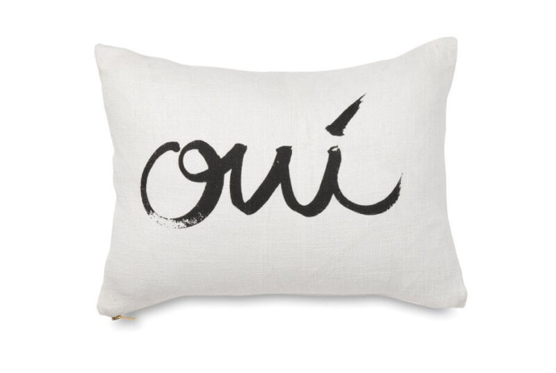
Cushion[/vc_column_text][/vc_column][vc_column width=”1/6″][vc_column_text]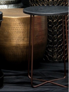
Metal table[/vc_column_text][/vc_column][vc_column width=”1/6″][vc_column_text]
Candle[/vc_column_text][/vc_column][/vc_row][vc_row][vc_column][vc_row_inner][vc_column_inner][vc_separator][/vc_column_inner][/vc_row_inner][vc_column_text]
So what do you think last night?? Can’t wait to see more of the rooms!
[/vc_column_text][vc_separator][/vc_column][/vc_row]
Be the first to read my stories
Get Inspired by the World of Interior Design
Thank you for subscribing to the newsletter.
Oops. Something went wrong. Please try again later.




Comments
Twinkle
I’m not sure why an exposed cistern is a bad thing?
It pains me to see all the time and effort put into these rooms but then they’re let down by such terrible bed-making … for a start, if I was on The Block, I’d be taking my bed linen to the drycleaners and asking them to press it professionally before I made the bed; I’d also spend a lot more time and effort on making the bed properly (and if they weren’t sure how to do that, they could ask a high-end hotel housekeeper to give them a few pointers).
I don’t understand how there aren’t more accidents with those bedside hanging pendant lights … they just look so unsafe!
Katrina
In the land of The Block the judges usually like you to use a good toilet with the top hidden!
WAM Home Decor
Some great ideas, although some not quite well done. But loving we are seeing different styles, at least makes for some interesting TV! Dean and Shay are clearly doing well and will be hard to beat we think!
Debbie
Dean and Shay seem to have an attention to detail and style that is far more resolved than the others, it’s hard to find an element that doesn’t work in the context of their rooms. Caro and Kingy are producing a kind of dated vibe for mine, I’m sure the render is a step up from that suede effect paint of the past but I don’t like it or their colour pallet. The others don’t seem to have a cohesive vision for the end product, I really worry for Whitney and Andy, the scale of that little chair in the corner and the rug under the bed, not to mention “the branch” Lord!
Still amazes me that contestants…………”didn’t know it was going to be THIS hard”………I’ll still be watching to the bitter end though 🙂
Gayle
I’ve seen your house posted 4 hrs ago on Instagram. I love this. Are there any other pictures, who is the builder? ?
I’m not sure if this is the right place to ask. Sorry if it’s not.
Dream house Trish
I love Dean & Shay’s style, they really have it all together for a cohesive apartment.Im with you with Caro & Kingies render, not a fan at all & it may hurt them come auction time. The Gold coast girls have no flow what so ever which surprises seen as though one of them is a real estate agent. Poor Ebony, my heart goes out to her, being an interior designer people’s expectations are high, she isn’t doing her credibility much good at this stage, lets hope its nerves & she shines before the show ends. I can only imagine how tough it is to pull it all together under extreme pressure,I don’t envy them at all!!!
Hamza Asif
That`s really beautiful and amazing architectural work. Bedroom is looking awesome with good combination of color and wall hangings. A professional interior designer can better utilize your space and furniture as we can see in this image. You can see more useful images by visiting http://www.ameradnan.com/work. It is an award winning architectural design firm in Pakistan and working very well all over the world by sharing design and ideas. Your work is also very cool and nice.