Last night we saw the first bathroom reveal for The Block Octagon. The couples really made a miraculous recovery from last weeks challenge disaster! WOW! They stepped up the styling that's for sure. I don't envy them doing the odd shape rooms "like a piece of pizza". :: Dean and Shay stepped it up and …
Last night we saw the first bathroom reveal for The Block Octagon. The couples really made a miraculous recovery from last weeks challenge disaster! WOW! They stepped up the styling that’s for sure. I don’t envy them doing the odd shape rooms “like a piece of pizza”.
::
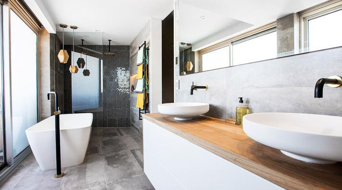
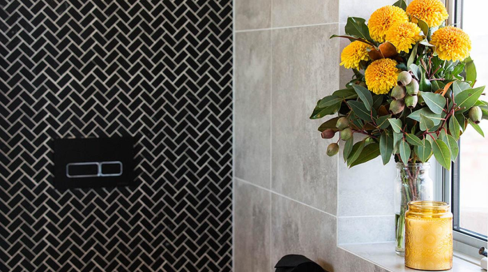
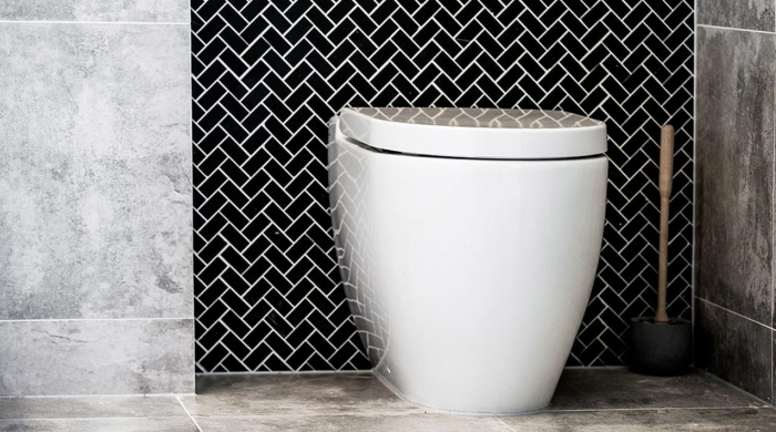
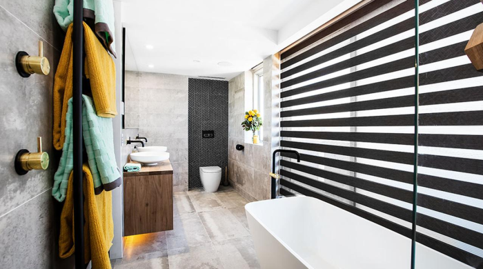
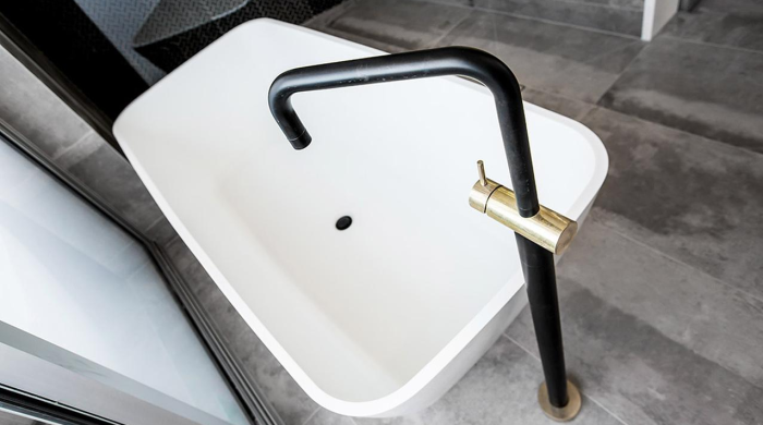
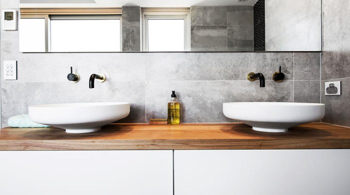
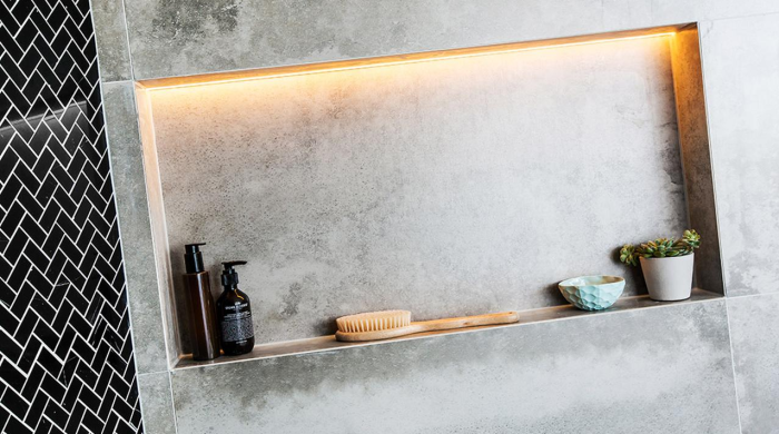
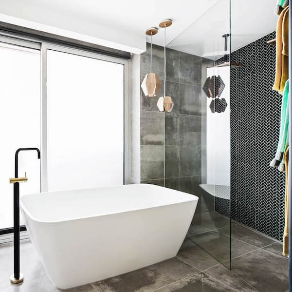
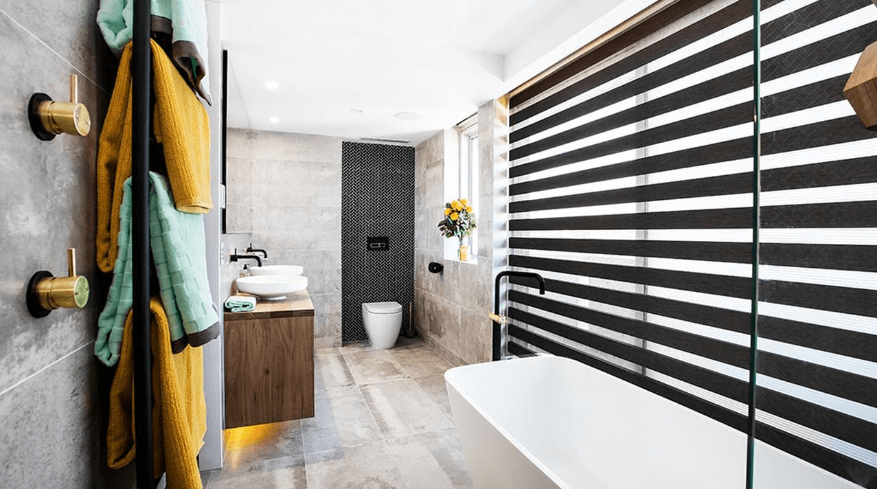
Dean and Shay stepped it up and took out the win with their $40,000 penthouse bathroom. It was impressive (and so it should be!). The judges were blown away and they loved all the detail in the room from the sinks, timber vanity and tapwear. They gave Dean and Shay 28.5/30 plus the $10,000 prize money. Here are the photos…


::
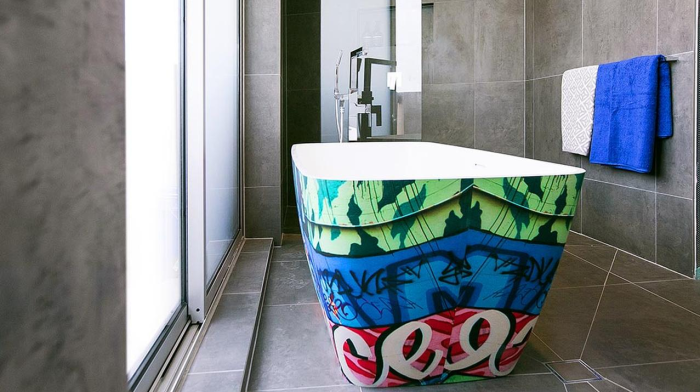
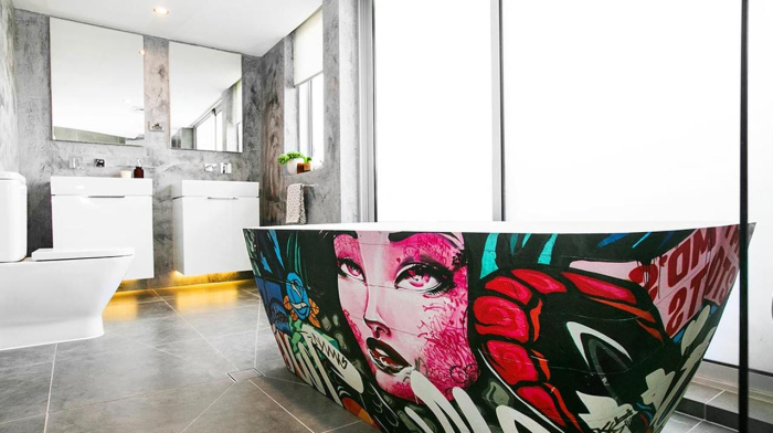
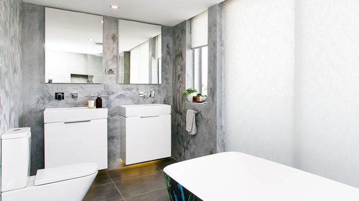
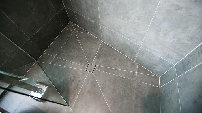
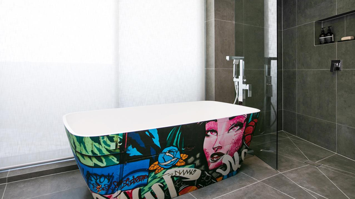
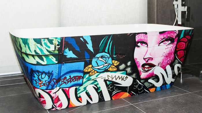
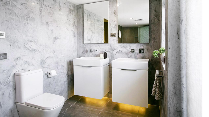
Next up were Kingi and Caro. They came 2nd with a score of 27.5/30. I wasn’t sure how that graffiti bath would turn out. It’s ok, but not my favourite thing. What did you think? The judges called it “exciting” and said Kingi “nailed” the rendered walls. Here are the photos…
::
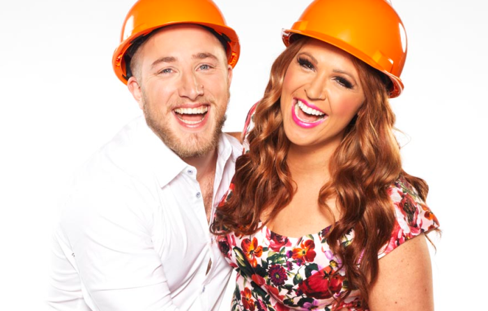
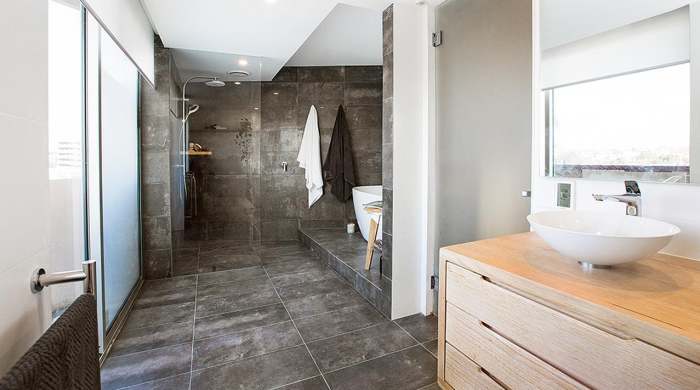
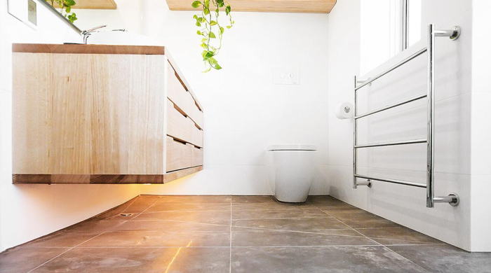
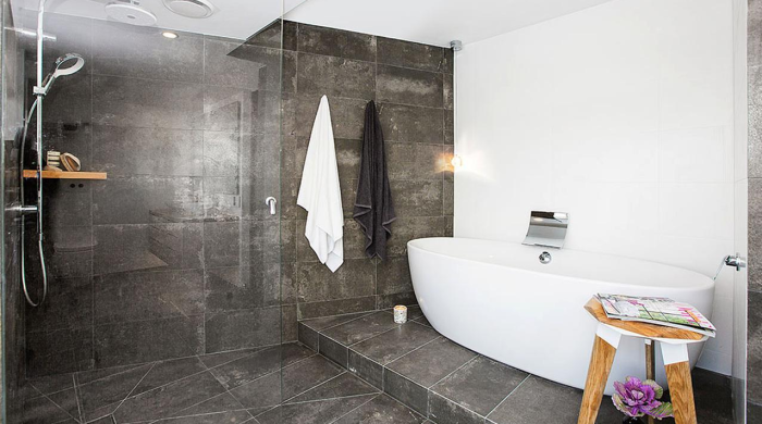
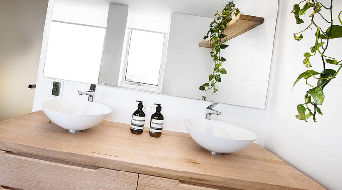
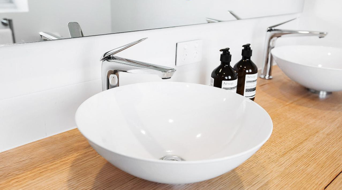
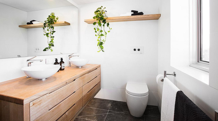
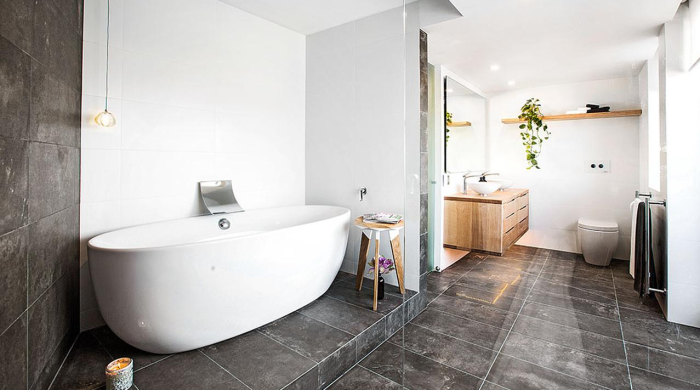
Whitney and Andy produced a fabulous bathroom I thought. They scored 26.5/30. They went “from zeroes to heroes”, impressing the judges with big-ticket items. After last weeks challenge I thought they were doomed. But somehow they managed to smash this bathroom out! The pedestal bath was a great feature. Check out the photos below…
::
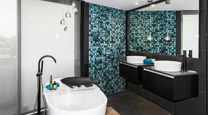
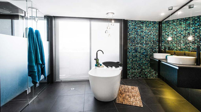
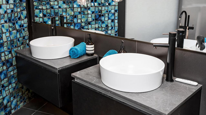
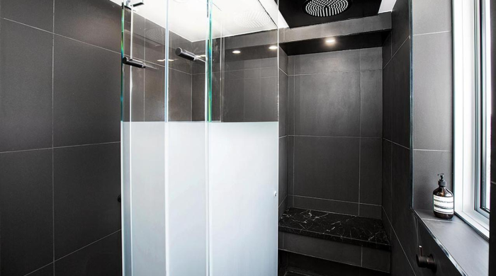
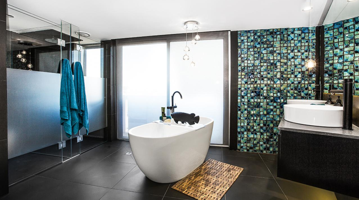
Next in the scoring came the girls – Suzi and Vonni. They received 24/30 and the judges said it was “sexy and had pizzazz” and loved the pendant lights (who has pendants in their bathroom anyway??). I really didn’t like this bathroom at all, but that’s a personal preference thing! The blacks, and those foul tiles did nothing for me. Here are the photos…

::
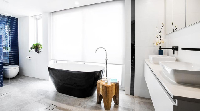
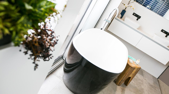
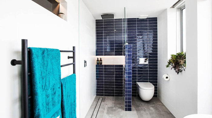
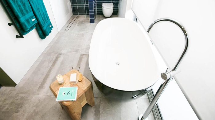
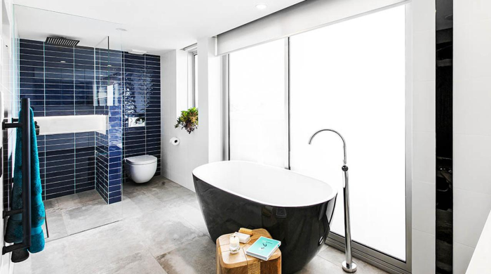
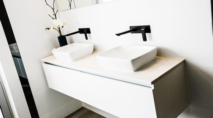
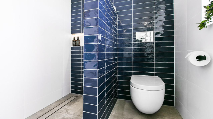
Last on the scoreboard this week was Luke and Ebony. They were given 22.5/30. That’s a shame because I did think their room was much better than Suzi and Vonni’s. I personally liked the blue tiles. The judges did say that individually all their feature items were spot on, but together they got a little wishy washy. I can agree with that, but still on a whole I liked the bathroom. Take a look at the photos below…

::
What did you think of the bathrooms this week? Can you see an early winner amongst them?
Be the first to read my stories
Get Inspired by the World of Interior Design
Thank you for subscribing to the newsletter.
Oops. Something went wrong. Please try again later.



Comments
Twinkle
Dean and Shay’s bathroom deserved to win – WOW, that’s just gorgeous! They did very well squeezing all that into an obscure shape and space … I especially love the sparkly black tiles <3
I feel that Kingi and Cairo are taking too much of a risk with their design. Personally, I loathe the bath; there may be a market for their wacky design ideas but I feel they could've achieved the same effect with some graffiti-themed towels and kept everything else neutral and gorgeous to appeal to the masses.
I like the blue tiles in the last place bathroom … and the way the toilet is separated … I don't think that deserved last place at all.
I love Whitney and Andy's bathroom, and if it wasn't for the bath being placed on what I feel is a too-narrow platform (I could see myself rolling my ankle on that), it would be my favourite.
I don't like the higgeldy-piggeldy placement of the girls' bathtub … other than that though, I love their bathroom (gorgeous tiles included).
Rachel Wood
? I couldn’t look at the girls bathroom. It was awful. And I actually like the girls so far. So I was disappointed.
Siobhan
I agree, the best bathroom won! Luke and Ebony’s wasn’t my favourite – i didn’t like the blue tiles paired with the black bath, i would have preferred the bath & tile to match, whether it be blue or black. Other than that, I liked it! However, I think the judges comments about the proportion of the vanity and basins was odd – they certainly don’t appear to be too small in any of the photos – I hope Luke and Ebony aren’t being targeted, because they have appeared, albeit briefly, on the Block, previously.
rakhi
@Admin
I concur, the best washroom won! Luke and Ebony’s wasn’t my top pick – i didn’t care for the blue tiles combined with the dark shower, i would have favored the shower & tile to coordinate, whether it be blue or dark. Other than that, I preferred it! On the other han..
regards
rakhi
Angela
I loved Dean and Shay’s bathroom! They made an amazing job! My second favourite was Whitney and Andy’s. I love the warmth wood brings into a room! I wasn’t particularly impressed by the other 3 bathrooms.
kent ro care
I like the blue tiles in the last place bathroom … and the way the toilet is separated …
Nataliya
Hello,
Thanks for sharing your innovative ideas.
Regards
Nataliya