After a week filled with the challenging hallways and the much-anticipated Domain buyers' party, the Blockheads might have expected an easier task ahead. However, Scotty had other ideas. The next challenge was the rumpus room—located upstairs in all but one of the homes. Scotty emphasised its importance, describing it as a crucial second living space …
After a week filled with the challenging hallways and the much-anticipated Domain buyers’ party, the Blockheads might have expected an easier task ahead. However, Scotty had other ideas. The next challenge was the rumpus room—located upstairs in all but one of the homes. Scotty emphasised its importance, describing it as a crucial second living space for families and friends on holiday. For two underdog teams, it was a chance to shine, while two front-running teams faced an unexpected setback. So, who created the best space and secured the $10,000 prize? And who left the judges feeling like it was a missed opportunity?
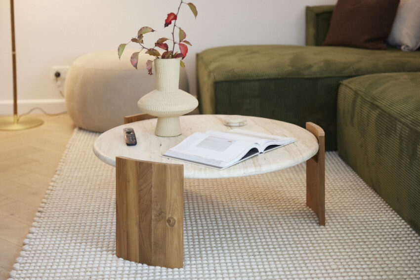
Maddy and Charlotte (Tied for First Place 28/30)
As the judges ascended the stairs, they immediately recognised Maddy and Charlotte’s innovation—something no other Blockheads had considered. They added a second private staircase to their mezzanine, transforming it into a completely separate and marketable living area for guests. “Simply genius,” said Marty, with Darren agreeing, calling it a “game changer.” Shaynna noted how this feature complemented a thoughtfully designed space that was both simple and stylish, appealing to a broad market.
If you’d like to SHOP Maddy and Charlotte’s room head here. This week we’re loving the rug and couch.

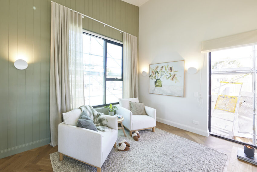

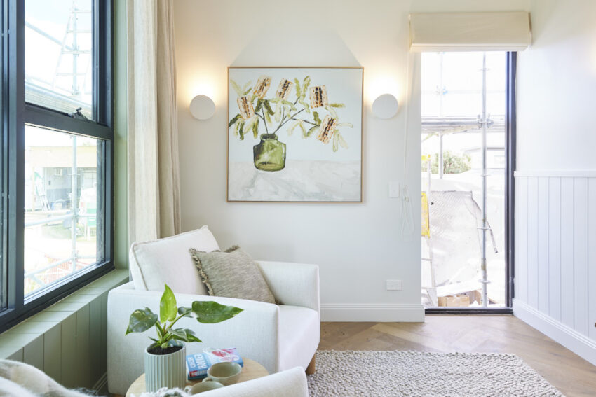

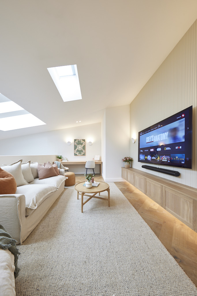
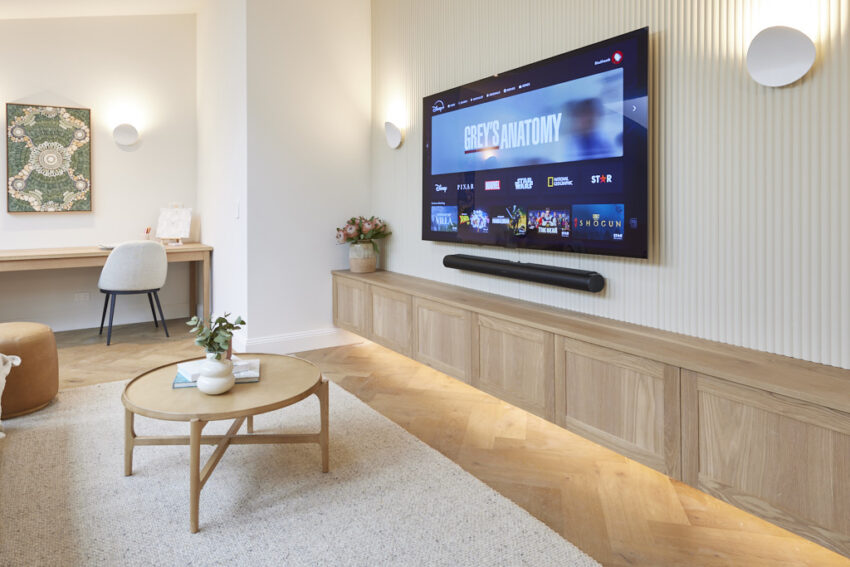


Ricky and Haydn Charlotte (Tied for First Place 28/30)
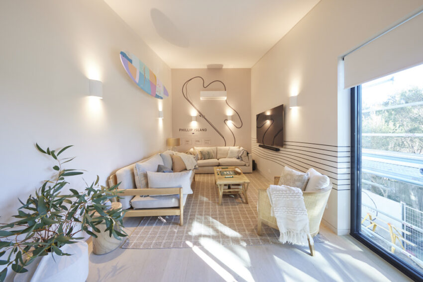
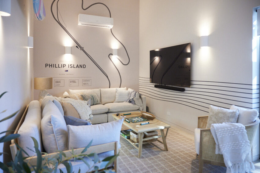
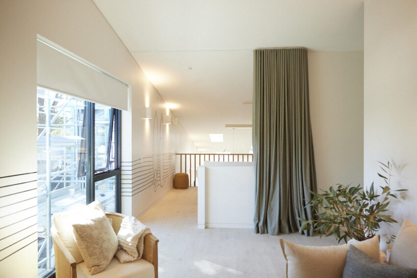
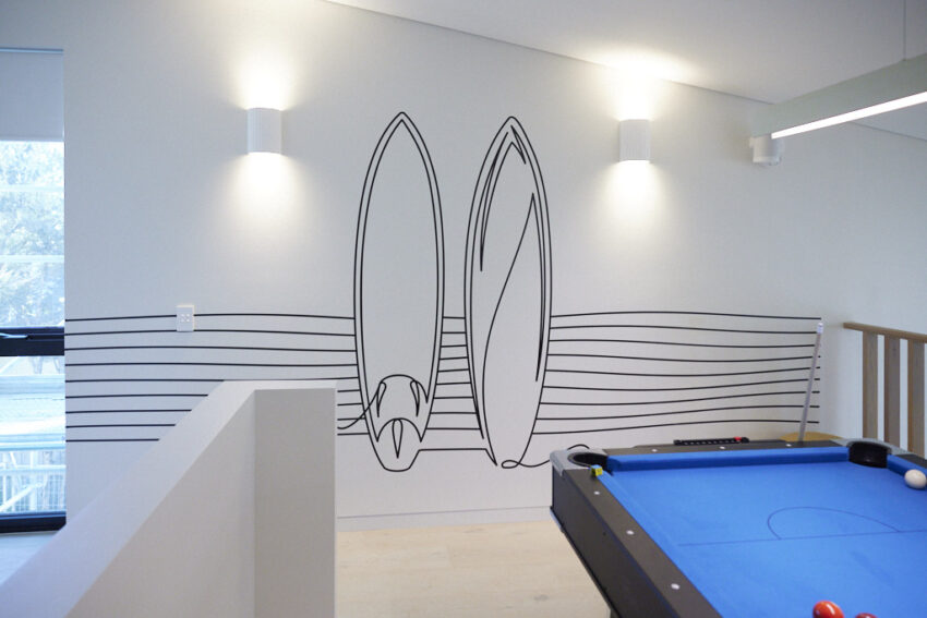
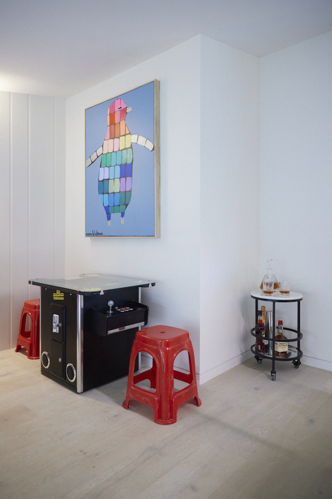
Ricky and Haydn created a fun and playful space designed with younger holidaymakers in mind. The room offered plenty of entertainment options and was designed for relaxation and enjoyment, making it a great retreat for kids. The judges praised the room’s connection to the overall island vibe, noting that it could accommodate more guests, boosting its appeal to investors. The attention to detail and inclusion of various amenities led Marty to call it a “Fun Factory,” predicting it would be a big draw for families.
If you’d like to SHOP Ricky and Haydn’s room head here. This week we’re loving the side table and tub chair.

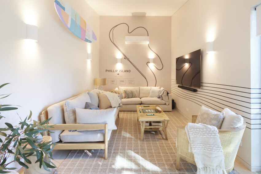
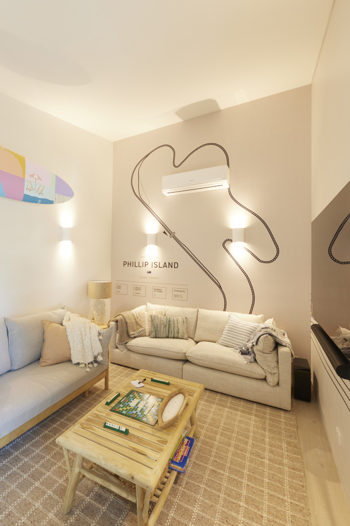
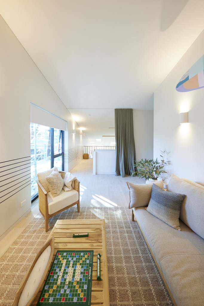
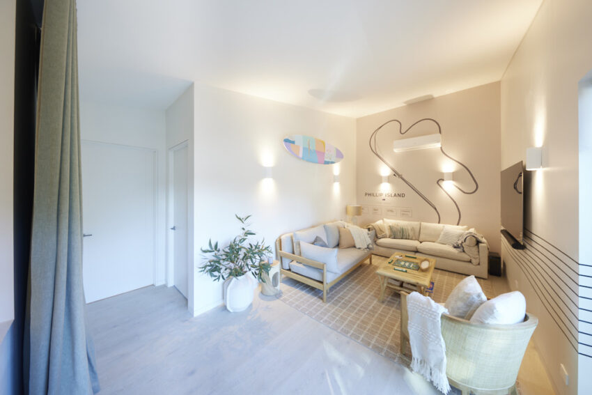


Courtney and Grant (Third Place 23.5/30)
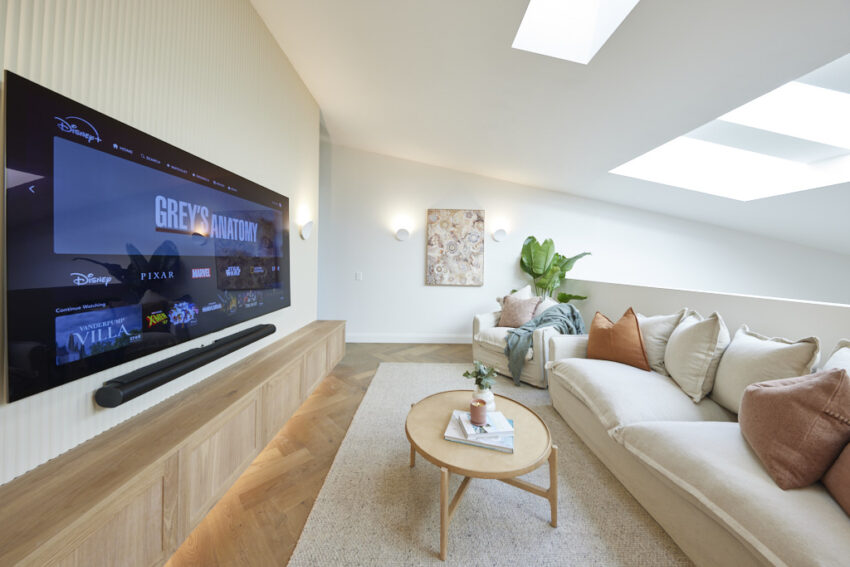
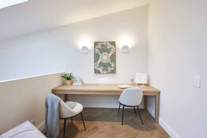
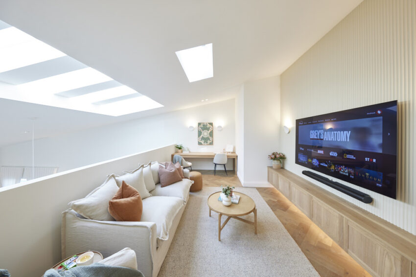
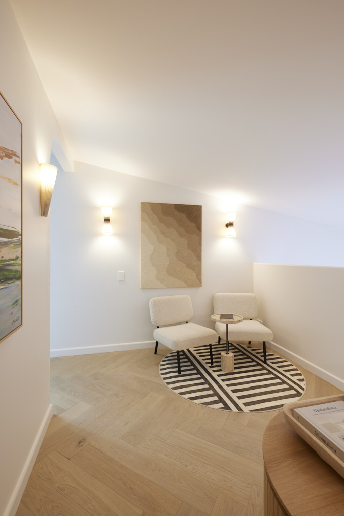
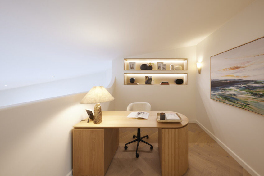
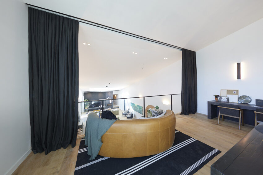
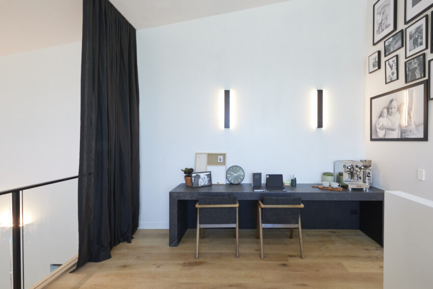
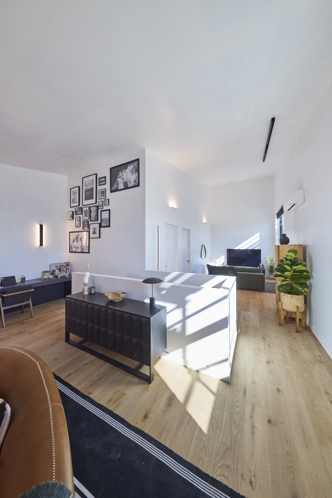
The judges were impressed with the quality of the finishes and styling in Courtney and Grant’s mezzanine office, but questioned whether a business centre was necessary in a holiday home. However, they were won over by the adjoining lounge area, which they agreed was a well-executed and relaxing retreat. While they appreciated the design, they felt the space might have been better utilised for additional accommodation.
If you’d like to SHOP Courtney and Grant’s room head here. This week we’re loving the rug and art.
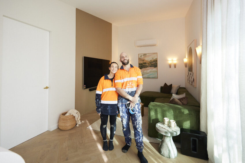

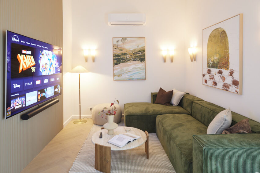

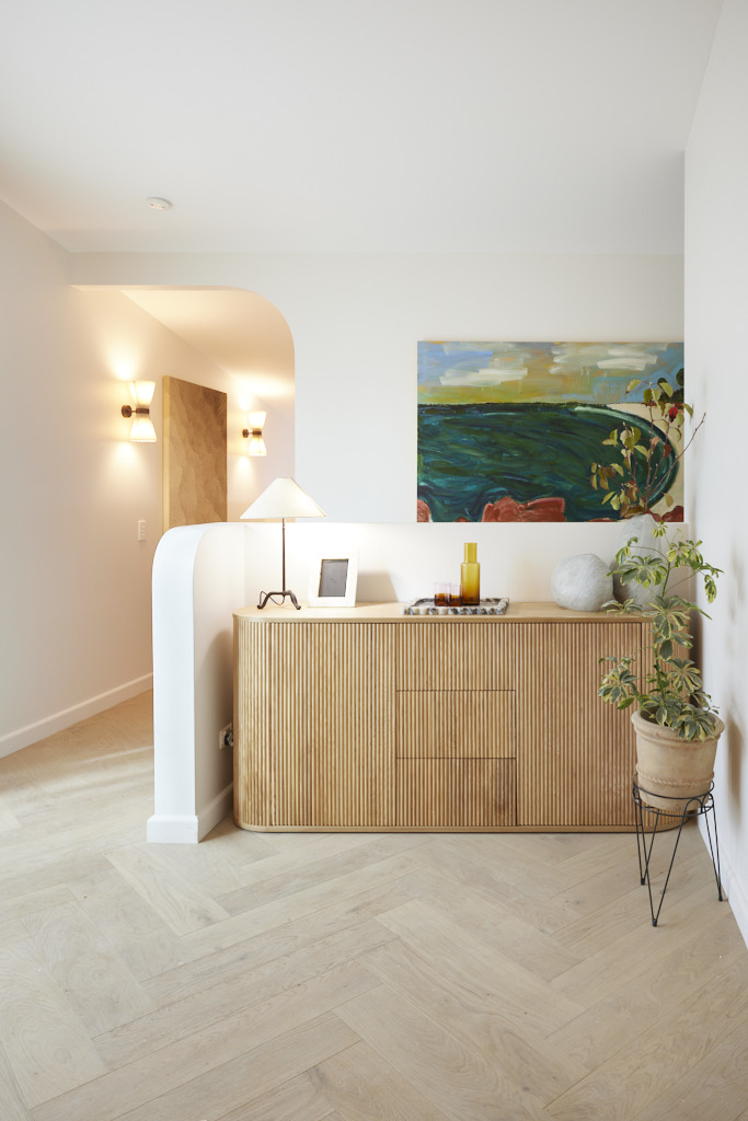
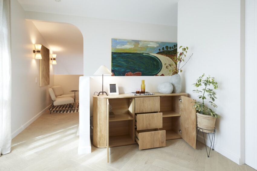



Kylie and Brad Charlotte (Fourth Place 16/30)
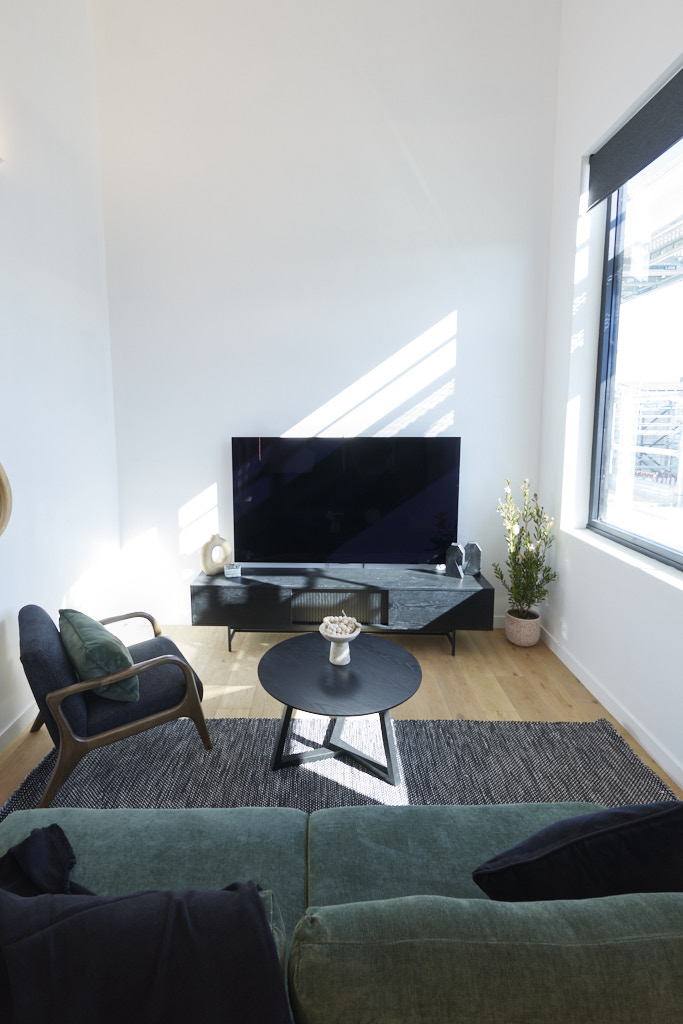
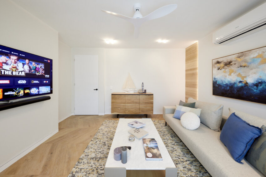
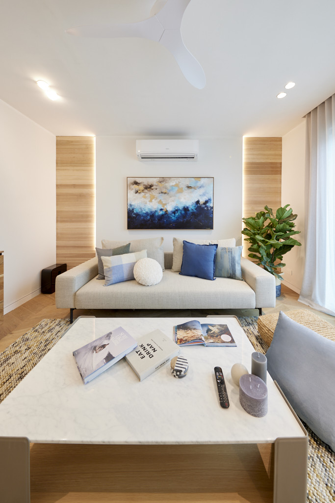
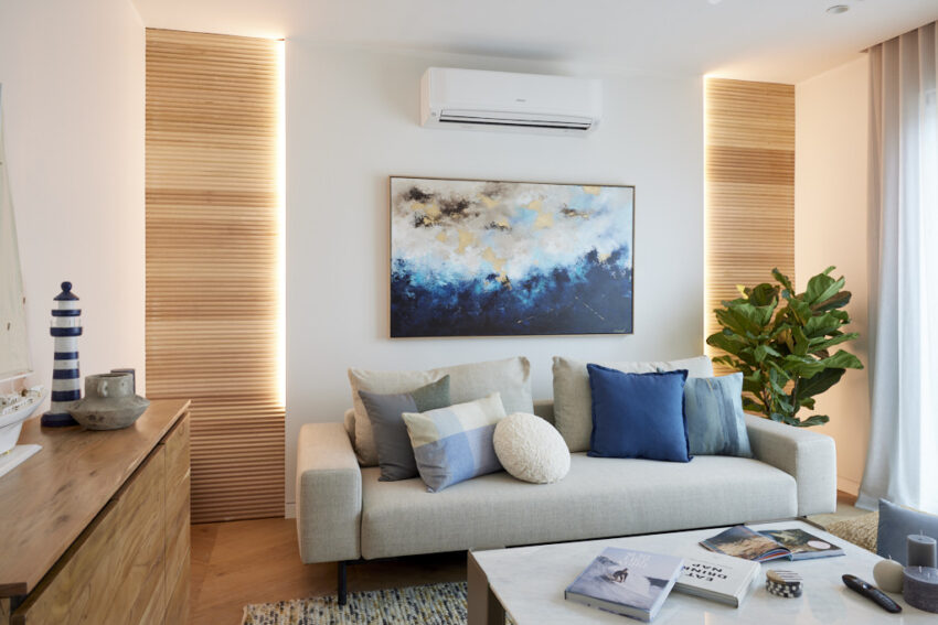
The judges were left confused by the design choices in Kylie and Brad’s room. Marty questioned the layout and styling, which seemed disjointed compared to their previous work. Darren and Shaynna agreed, noting that while individual elements were nice, the overall space didn’t come together and felt underutilised. The room, which only accommodated two people, was seen as a missed opportunity, with the judges hoping this was just a temporary misstep in the competition.
If you’d like to SHOP Kylie and Brad’s room head here. This week we’re loving the sofa and buffet.


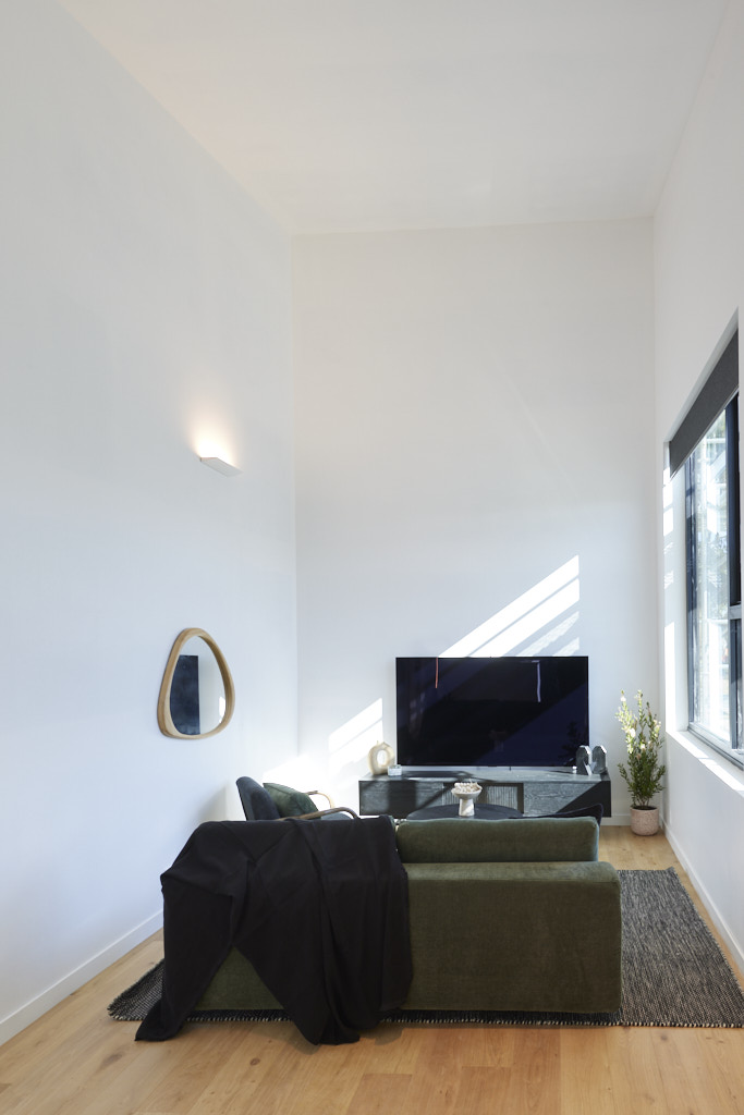
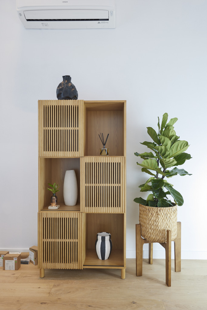
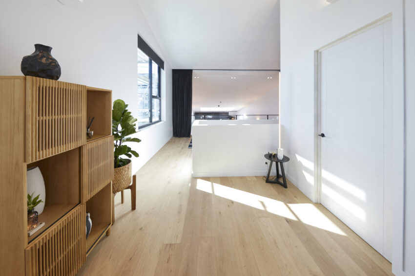
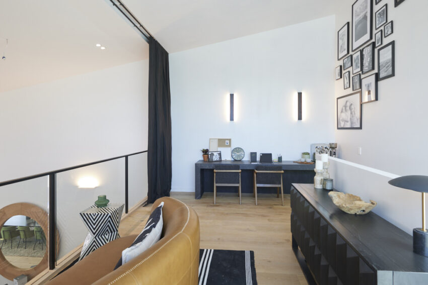


Kristian and Mimi Charlotte (Fifth Place 12.5/30)
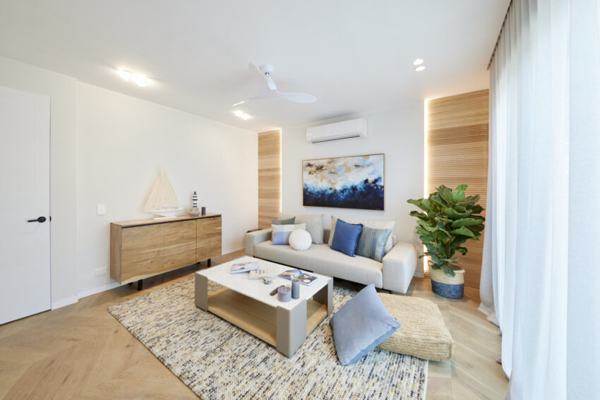
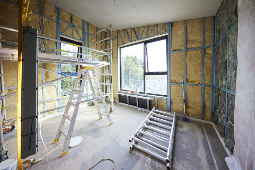
Mimi and Kristian were only able to complete one of the two required spaces, and even that didn’t meet the judges’ expectations. Intended to serve the pool or act as a chill-out area, the room fell short in both functions. As a rumpus room, it lacked necessary amenities, and the absence of a planned bedroom was a missed opportunity. While a few design elements stood out, the judges felt the effort overall was lacking, and the space did not live up to the competition’s standards.
If you’d like to SHOP Kristian and Mimi’s room you can head here. This week we’re loving the sideboard and sofa.

Images owned by the Nine Network Australia, provided by The Block Shop. Photography credits David Cook Photography.
Be the first to read my stories
Get Inspired by the World of Interior Design
Thank you for subscribing to the newsletter.
Oops. Something went wrong. Please try again later.
