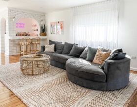
Of all the rooms the Blockheads have created, the living and dining area makes the biggest impression. It’s where homeowners and their guests will gather to unwind, entertain, and embrace the Phillip Island lifestyle, so it needs to be perfect, according to the judges. With a variety of unique interpretations on offer, picking a winner …
Of all the rooms the Blockheads have created, the living and dining area makes the biggest impression. It’s where homeowners and their guests will gather to unwind, entertain, and embrace the Phillip Island lifestyle, so it needs to be perfect, according to the judges. With a variety of unique interpretations on offer, picking a winner wasn’t going to be easy. However, one team clearly stood out… so who would walk away with the $10,000 prize this week?
Kylie and Brad (First place 29.5/30)
From the spacious open-plan layout and smart lighting design to the Christian Cole circular mirror and custom Islay dining table paired with striking green chairs (highlighted by Steph Harris artwork), Kylie and Brad’s living and dining area made an immediate impact. “This room is so impressive, it will be a huge hit with buyers,” Marty remarked. The Stoke fireplace with its Dekton surround, mirroring the kitchen, and details like the Tom Ford book and Darren Palmer candle on the coffee table all came together seamlessly, the judges agreed. Even Darren’s only critique was minor—he wished the stunning Arabella Avenue rug from Rug Addiction had been slightly larger. However, he praised the pair for embracing their moody theme and nailing it this time. Marty added that the way the black TV blended into the black wall was proof that “everything is just right.”
If you’d like to SHOP Kylie and Brad’s room head here. This week we’re loving the couch and the rug.




Courtney and Grant (Second place 26.5/30)
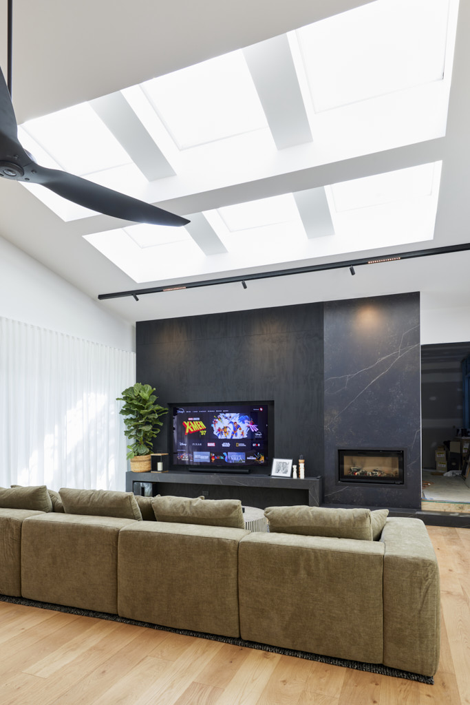
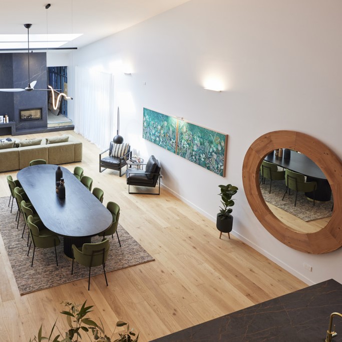
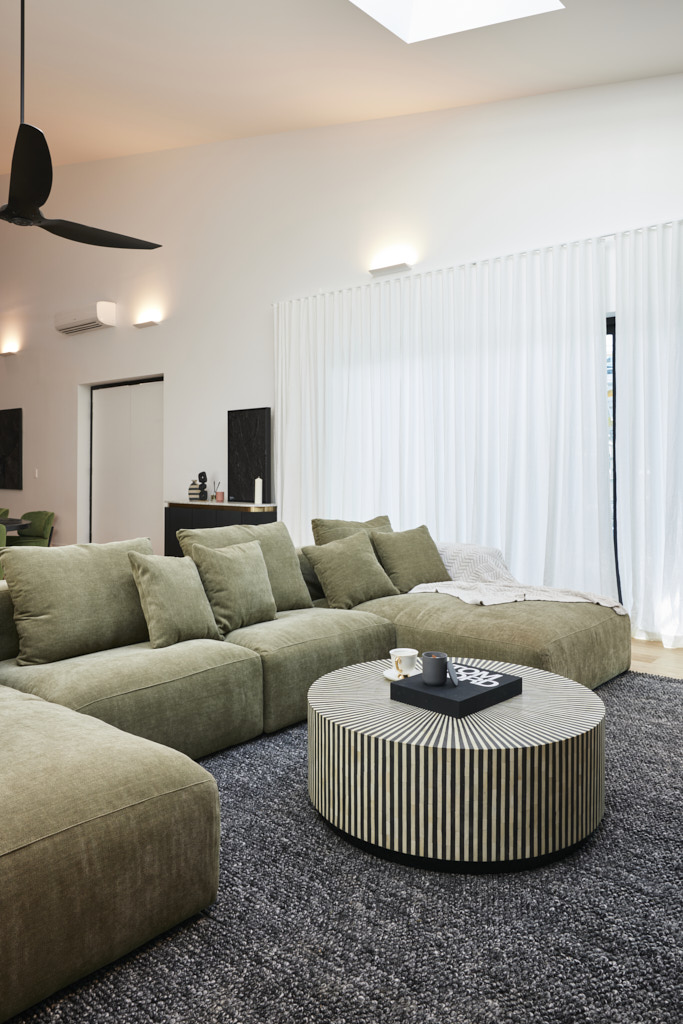
While Shaynna described House 1 as a bit plain, she found Courtney and Grant’s space more like Rum ‘n’ Raisin, with splashes of colour and style woven throughout. Darren was immediately impressed by the Globe West Leon dining set from Courtney’s own Lazy Stylist collection, the plasterwork around the Framing To A T TV niche, and a layout that felt “just right for a holiday home.” Shaynna appreciated the practical details, like well-placed power points and lamps that complemented the lighting plan. Even Darren admired the styling, particularly when he noticed the Darren Palmer-branded candle. The only drawback, according to the judges, was the fireplace location, with Marty wishing it had been positioned on the opposite side of the room. Darren agreed, suggesting the fireplace and shelves should have been switched. However, for Shaynna, this was a minor issue in a room she adored. “The furniture is gorgeous,” she concluded. “The colours are consistent and balanced… overall, a fantastic space!”
If you’d like to SHOP Courtney and Grant’s room head here. This week we’re loving the curve tv mirror and the dining table.


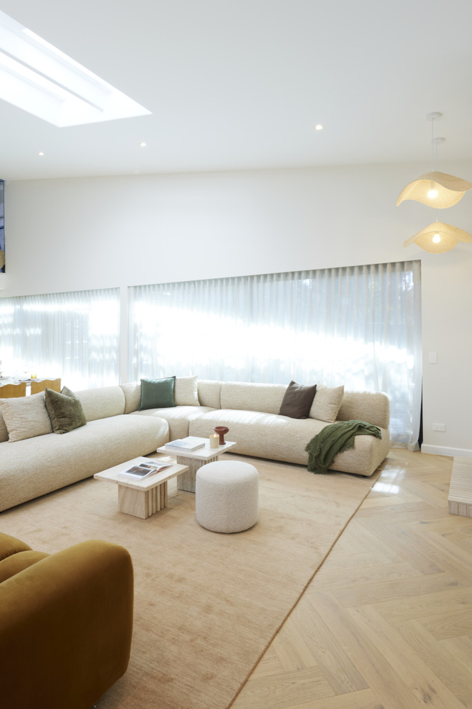
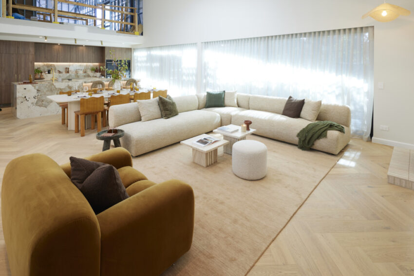
Maddy and Charlotte (Third place 25.5/30)
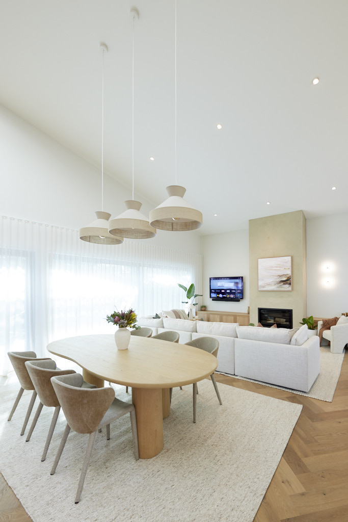
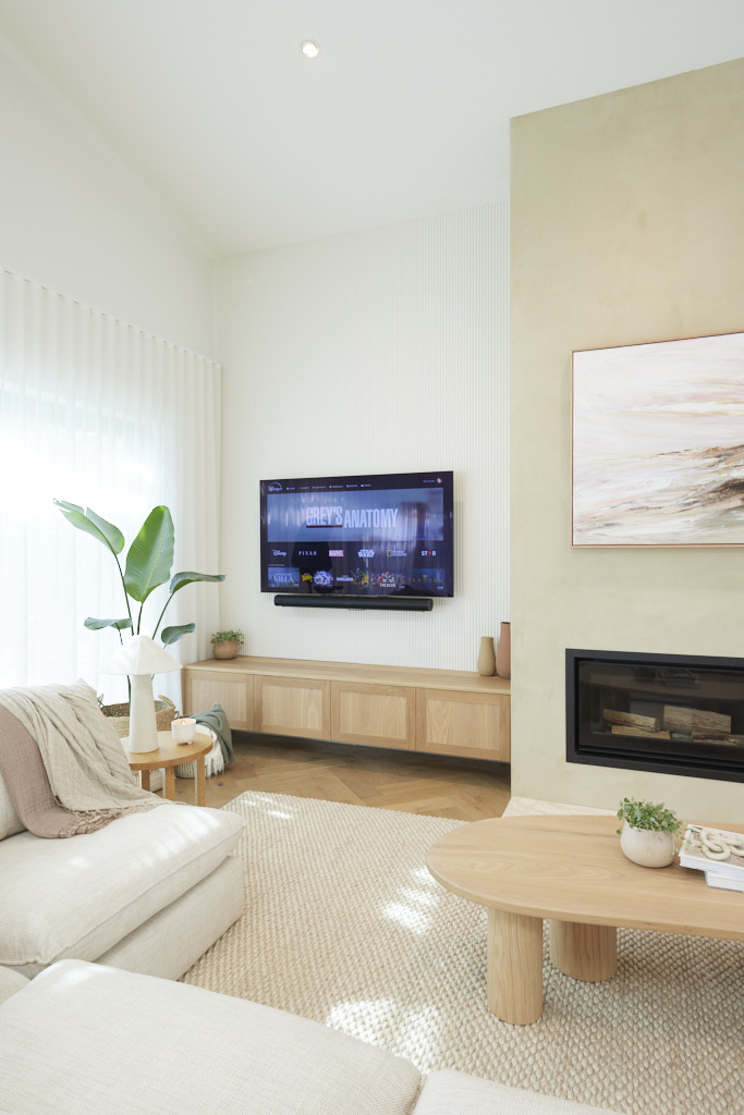
Coming off their first win last week, sisters Maddy and Charlotte were eager to secure another victory, and at first glance, the judges thought they had a strong chance. Shaynna was impressed by the soaring ceiling, Velux skylights, Laminex panelling, and Venetian render, along with the Joel Elliot cabinetry beside the fireplace, echoing the kitchen design. Marty praised the neutral colour palette and the real wood-burning fireplace, ideal for the cold Island nights. However, the judges all agreed that the room’s scale wasn’t quite right. While the surfboard-shaped Seb Curve dining table and Theo Dining Chairs from Globe West were beautiful, Shaynna and Marty felt the table should have seated at least two more people. Darren also wished for a larger coffee table and more dramatic styling. The lighting design left them underwhelmed as well. While the room was appealing to a wide range of buyers, they concluded that it was a bit too “vanilla” overall.
If you’d like to SHOP Maddy and Charlotte’s room head here. This week we’re loving the dining table and the dining chairs.





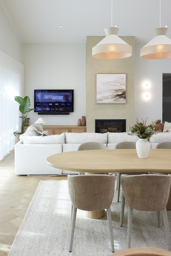
Ricky and Haydn (Fourth place 25/30)
As soon as the judges entered House 3, they were impressed. Shaynna loved how the lowered ceiling created a “cosy and inviting” atmosphere, and Darren praised the well-placed fireplace, calling it the perfect spot to unwind. However, despite the initial positive reaction, they noticed a problem with the room’s layout. The furniture, particularly the Sorrento Modular Sofa from Freedom, was positioned off-centre, creating an “optical illusion” effect. Shaynna remarked that the sofa not only needed straightening but should also have been “doubled in size!” She also pointed out that the Velux skylights appeared out of place but acknowledged there was little that could be done about it. The striking “Wet Season” artwork from the Cungelella Art Collective, which the boys had won in the Block Shop Challenge, against the James Hardie Groove lining brought the judges back onside, along with the Dekton shelf near the fireplace. Despite these highlights, they agreed that the overall styling had let the boys down.
If you’d like to SHOP Ricky and Haydn’s room head here. This week we’re loving the sofa and the dining table.


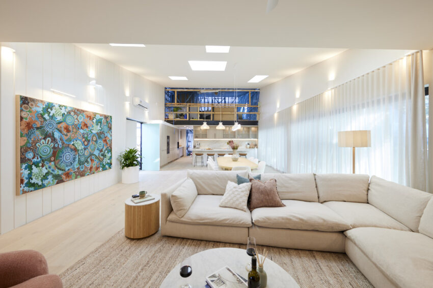

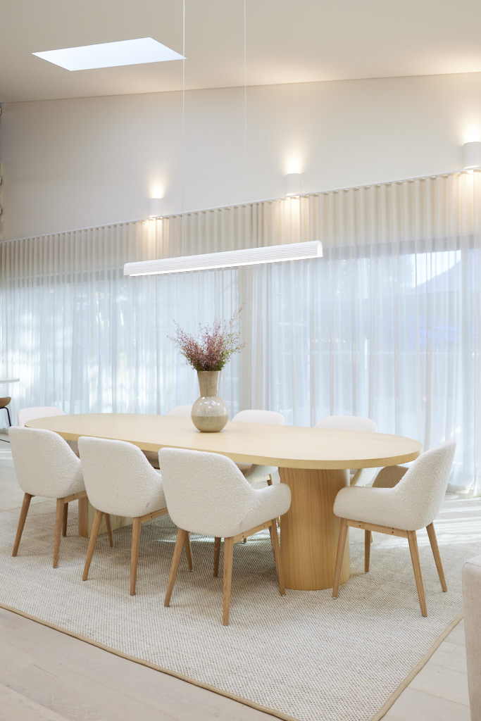
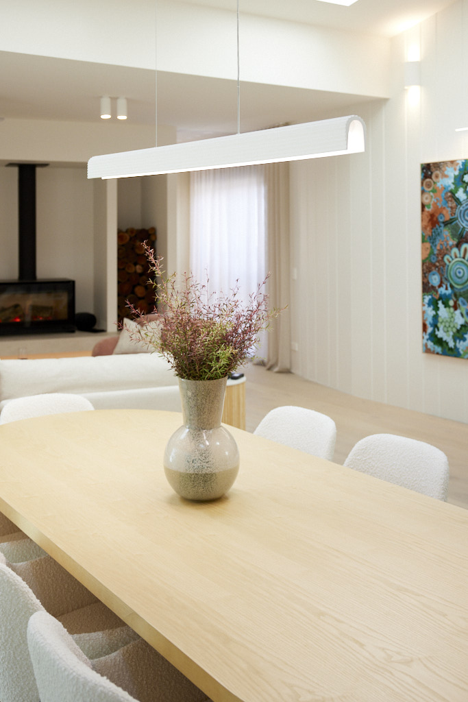

Mimi and Kristian (Fifth place 23.5/30)
The judges agreed that the colour palette, Laminex panel surrounds, and Kamilya Lowana White artwork created a beautiful living and dining area. The generously sized dining table and flawless execution also stood out. However, something felt off. Despite the lovely view just outside, the entire space was focused on the television, including the eye-catching Nina Armchair from Kave Home. In a room meant for social gatherings, this was a significant oversight. The faux chimney without a fireplace was another missed opportunity. The judges suggested adjusting the Magic Wool Rug from Rug Addiction and repositioning the TV, which would open up the space and even allow for an additional couch—solving the room’s issues.
If you’d like to SHOP Kristian and Mimi’s room you can head here. This week we’re loving the wool rug and the pendant.
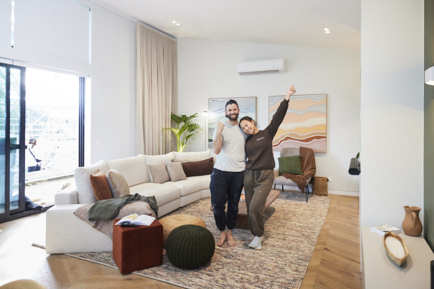


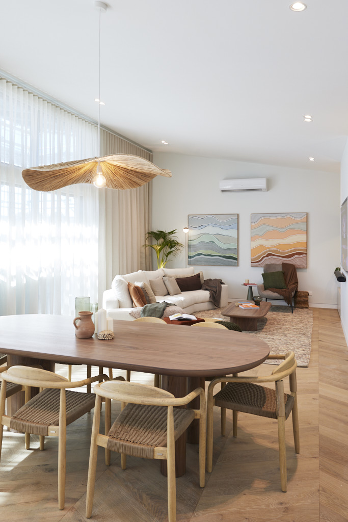


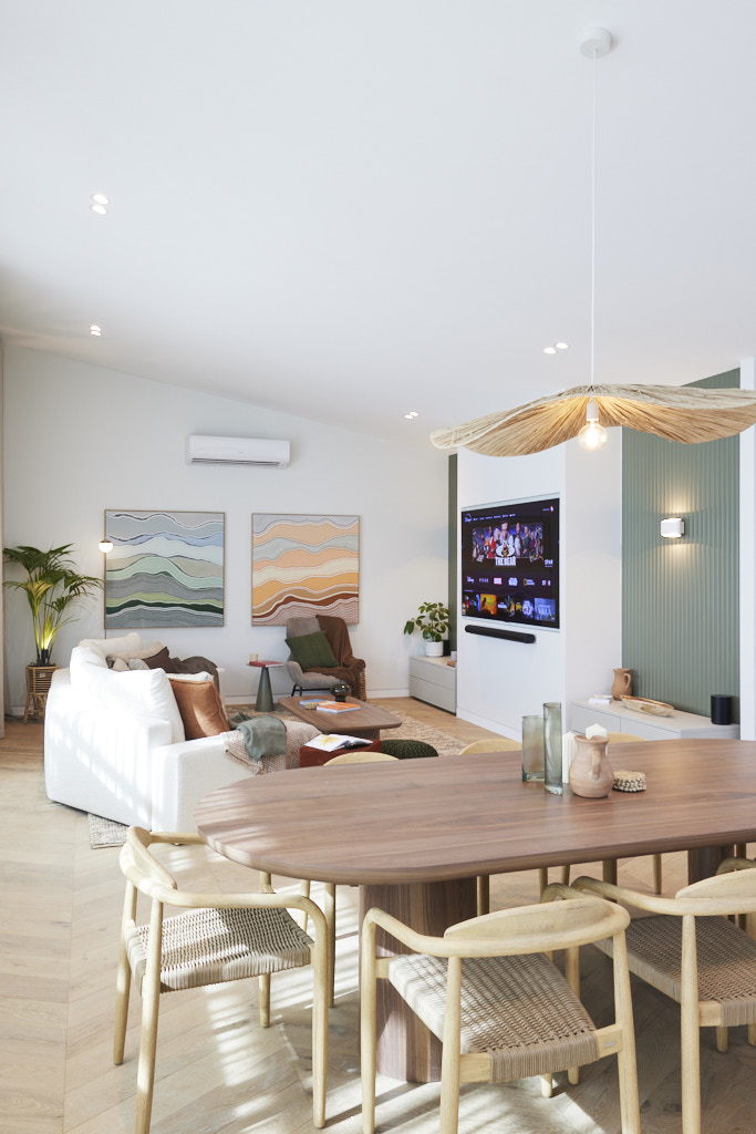
Images owned by the Nine Network Australia, provided by The Block Shop. Photography credits David Cook Photography.
Be the first to read my stories
Get Inspired by the World of Interior Design
Thank you for subscribing to the newsletter.
Oops. Something went wrong. Please try again later.


