The Block contestants have done it! They've finished their last bathroom! From timeless elegance to a daring (and somewhat divisive) tile selection, and with spaces ranging from spacious to snug, the judges had plenty to consider. But would it be a week of consistency that takes the win, or would a bold design steal the …
The Block contestants have done it! They’ve finished their last bathroom! From timeless elegance to a daring (and somewhat divisive) tile selection, and with spaces ranging from spacious to snug, the judges had plenty to consider. But would it be a week of consistency that takes the win, or would a bold design steal the spotlight?
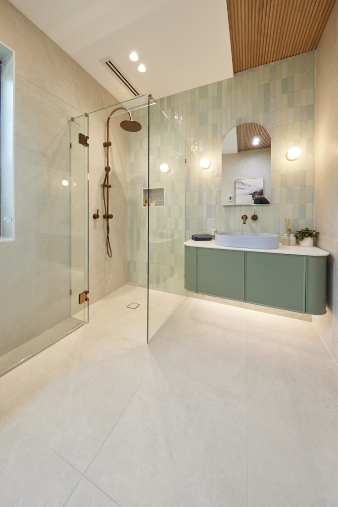
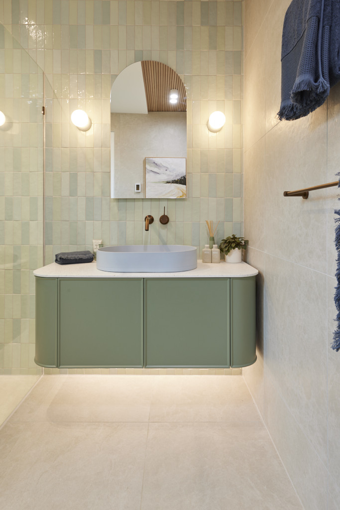
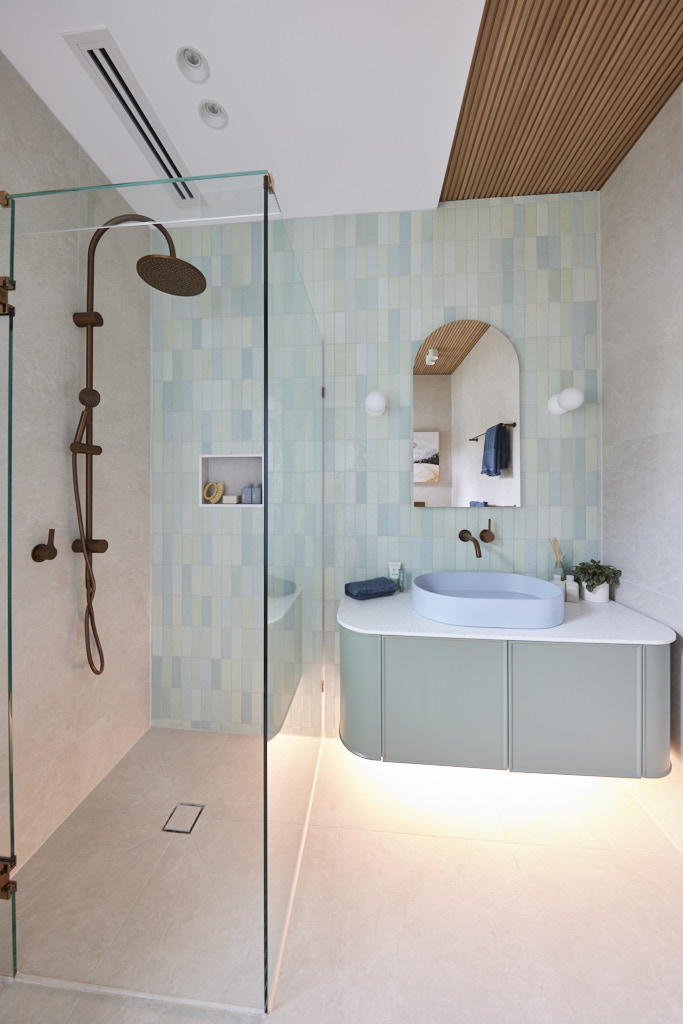
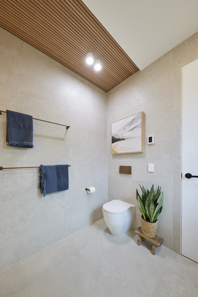
Maddy and Charlotte (First place 27.5/30)
At last, the sisters presented a room they designed and built entirely themselves – and the judges were thoroughly impressed! “This second main bathroom might even surpass the first,” Marty remarked as they admired the Nood Co Mount Olive basin, the bold Cosentino stone on the vanity, and the top-notch craftsmanship throughout. Darren praised the Beaumont tile selections, along with the vanity, mirror, and fixtures from Reece, calling them simple yet elegant. While all three judges questioned the decision to have the toilet in full view, Marty also wished for a more layered lighting scheme, suggesting the girls may have played it a bit too safe. However, Shaynna disagreed. Though it leaned on the safer side, she felt the style they had achieved was undoubtedly “Classic Simplicity.”


Ricky and Haydn (Second place 25/30)
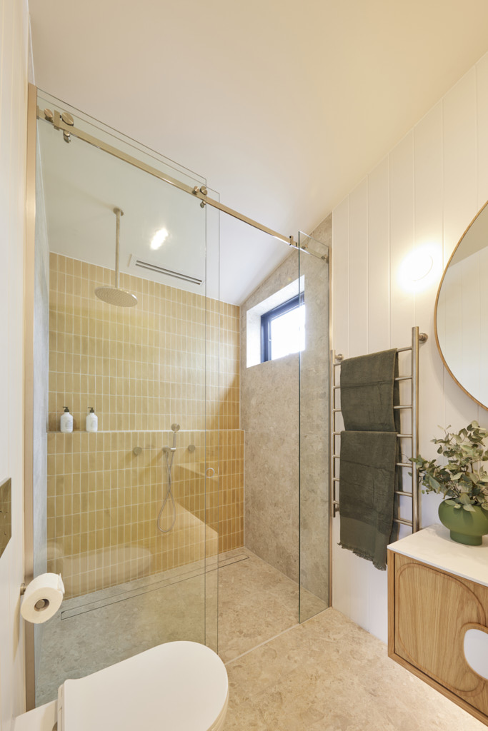
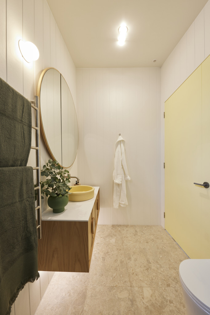
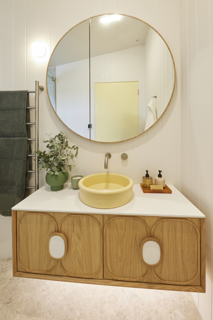
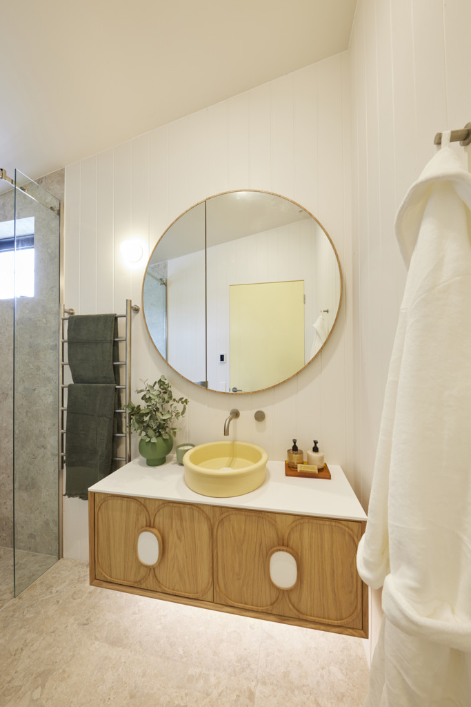
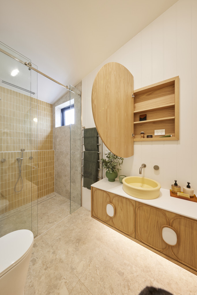
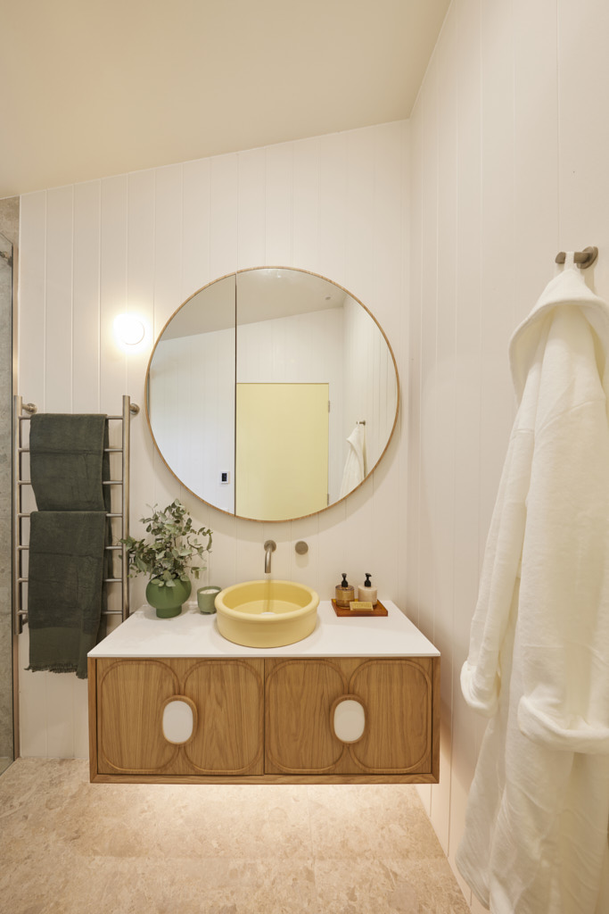
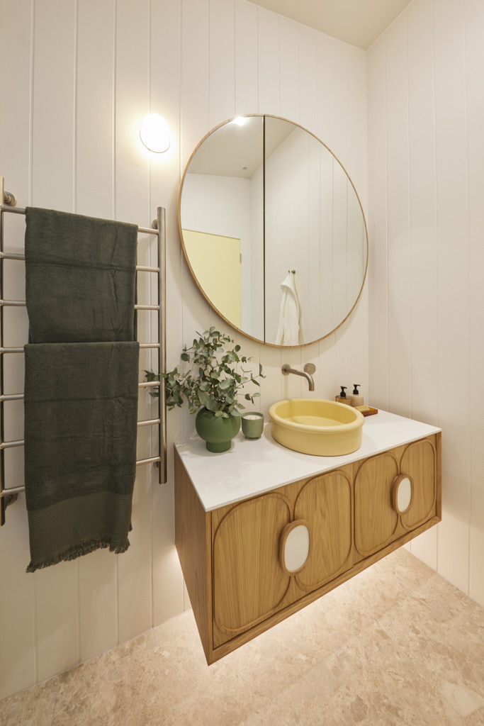
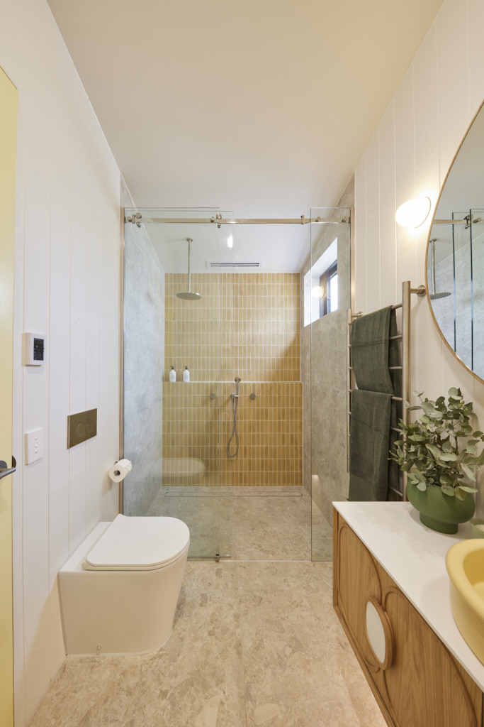
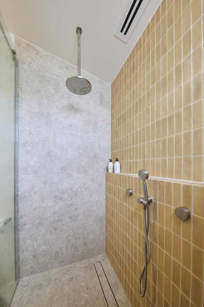
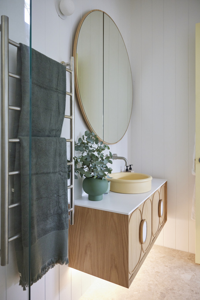
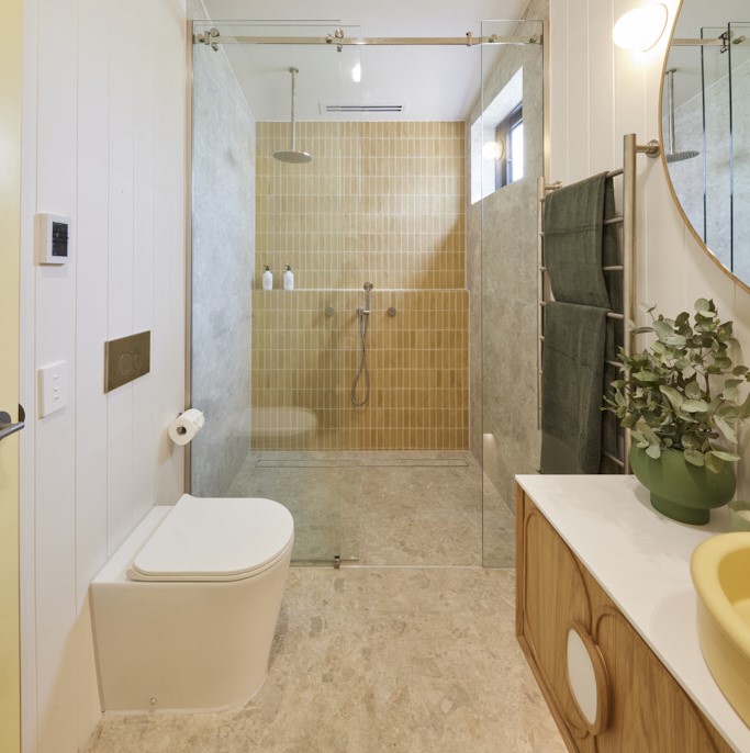
There were no concerns about excess space in Ricky and Haydn’s bathroom, as Shaynna pointed out: “It’s tiny!” But she quickly added, “Tiny’s not a bad thing.” Despite the compact size, Darren praised the clever layout, the custard-coloured Nood Co basin with its terrazzo plug, and the way it worked perfectly with the Beaumont Mustard Handmade Tiles. The use of James Hardie panelling was another smart choice, and best of all, Darren exclaimed, “Finally! A horizontal towel rail!” Shaynna appreciated the face-level storage but felt the styling could be elevated, suggesting they swap out the budget robes and shampoo for something more refined. Overall, though, the judges agreed that Ricky and Haydn had found their stride and were creating a home that truly embodies the essence of Phillip Island – a formula that could lead to success.

Mimi and Kristian (Tied Third place 24.5/30)
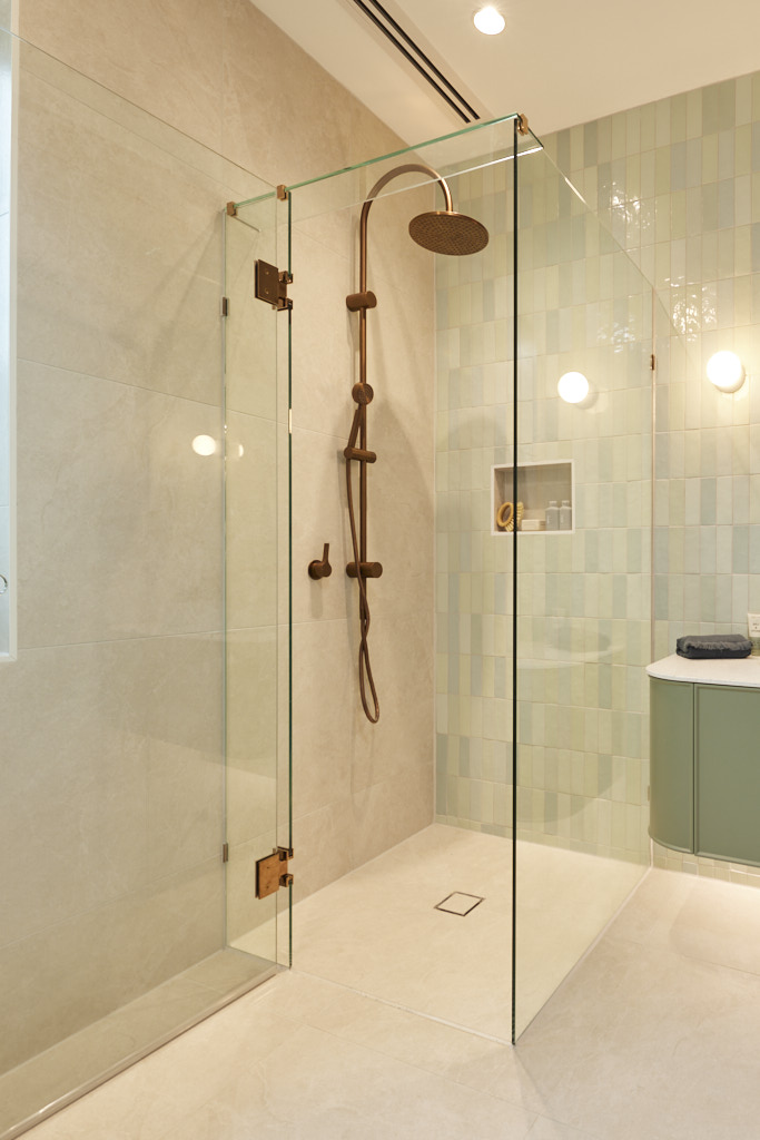
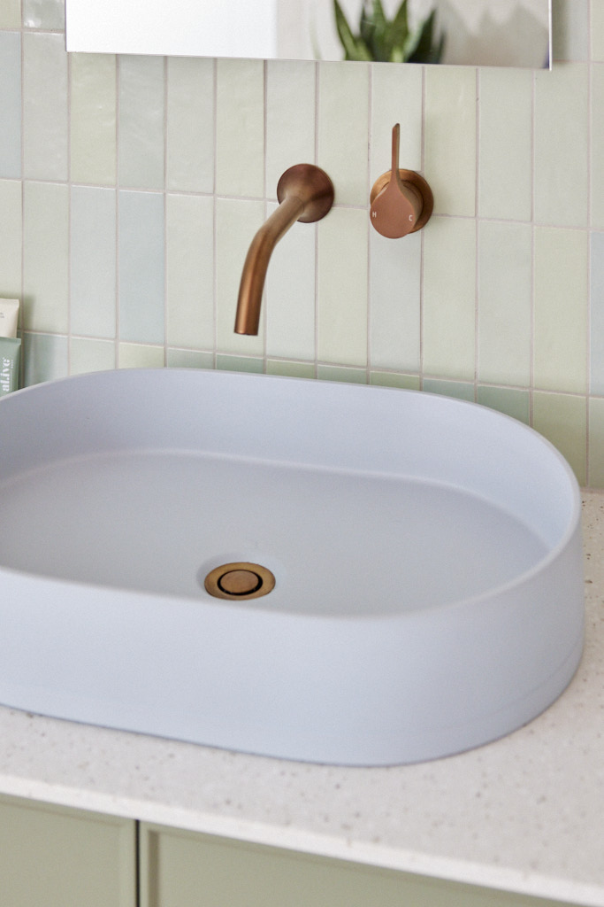
After weeks of earning compliments for their signature Porta timber elements, this time it missed the mark, according to both Shaynna and Darren. “It feels like it’s been added just for the sake of it,” Darren noted, with Shaynna agreeing that the design felt too “formulaic.” Although the Kado Era vanity and Nood Co Pill Sink were beautiful, Darren pointed out they were too small, the mirror wasn’t properly aligned, and the overall look felt like a repeat of previous rooms. Marty, however, had a different view. He appreciated the Sand In My Shoe artwork by Michelle Keighley and the Tyde stool, calling it consistent rather than repetitive, and thought it suited the home perfectly.

Brad and Kylie (Tied Third place 24.5/30)
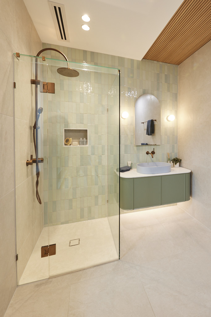
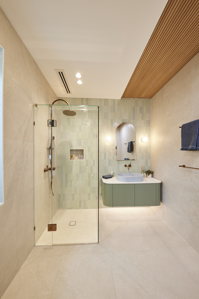
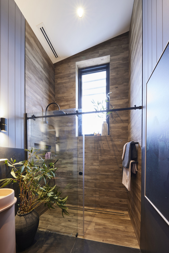
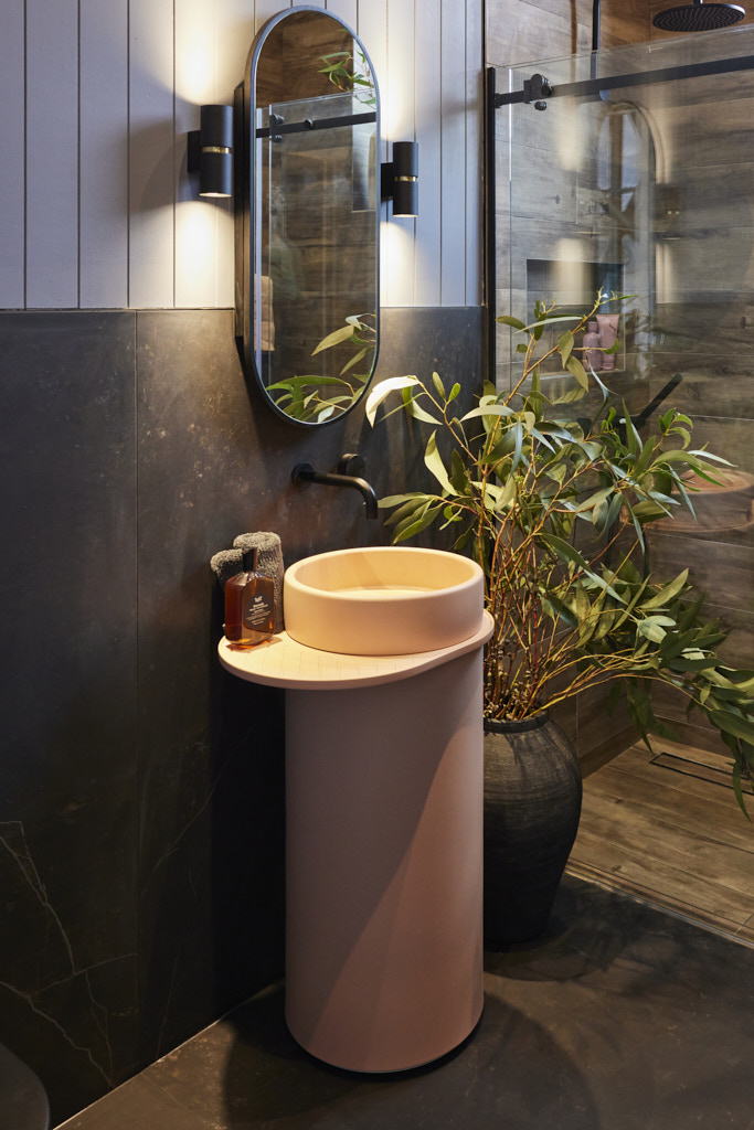
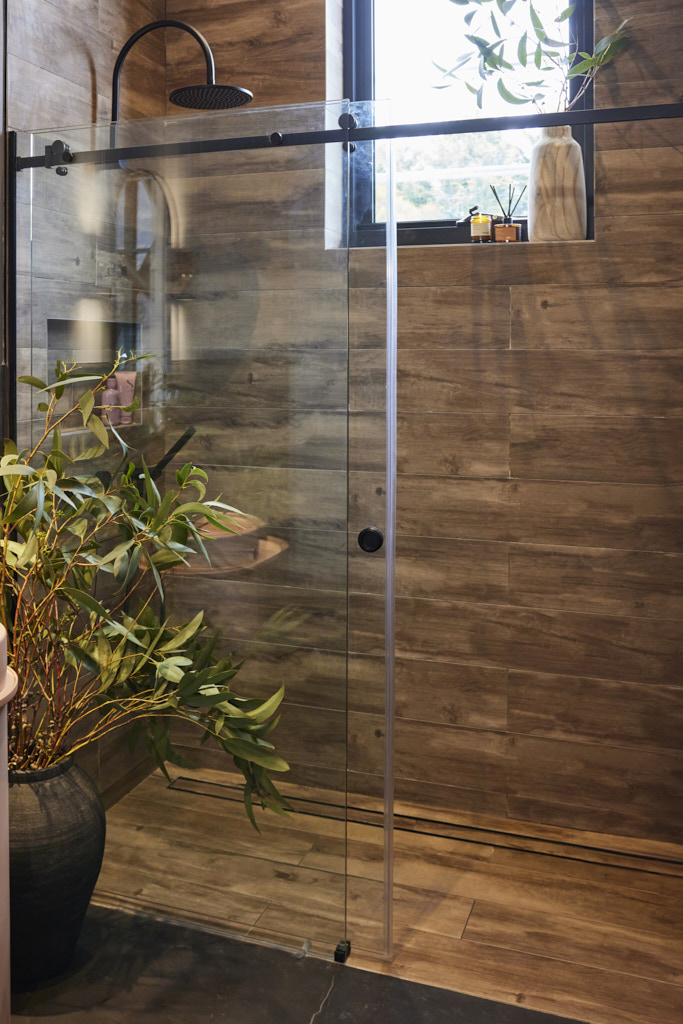
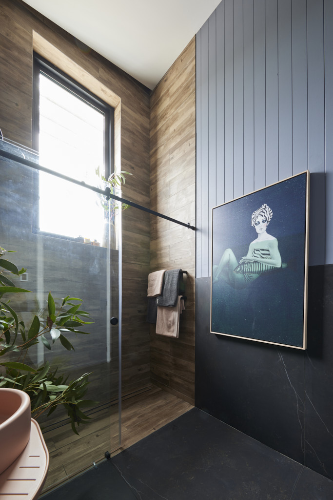
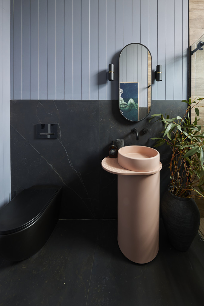
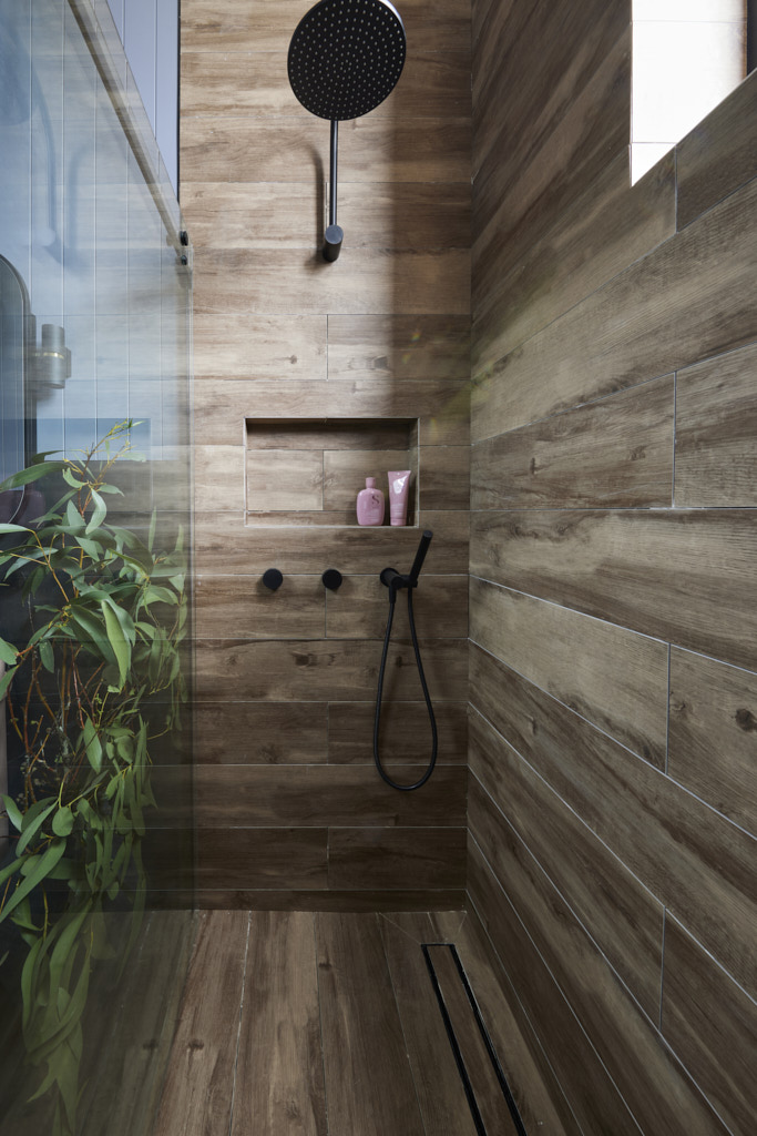
Dark and moody made a return, but this time, Darren felt it all came together perfectly. “This is exactly what I thought Kylie and Brad were aiming for in their first bathroom,” he said, “and it’s fantastic!” The timber-look tiles extending to the ceiling softened the space, Shaynna noted, and paired beautifully with the Dekton Keryla and the “blush pink” Nood Co pedestal basin. Even Marty agreed that the bathroom would photograph well for their Domain listing and would appeal to a specific market. The Night Float Premium Poster Print or Print on Canvas was a standout feature, though Shaynna still hoped for more in terms of styling. She also pointed out some missing grout and caulking, but overall, the room made a strong contribution to the home.


Courtney and Grant (Fifth place 24/30)
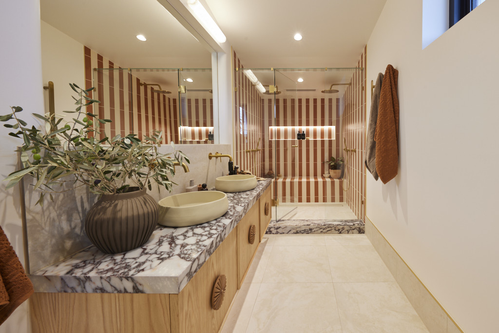
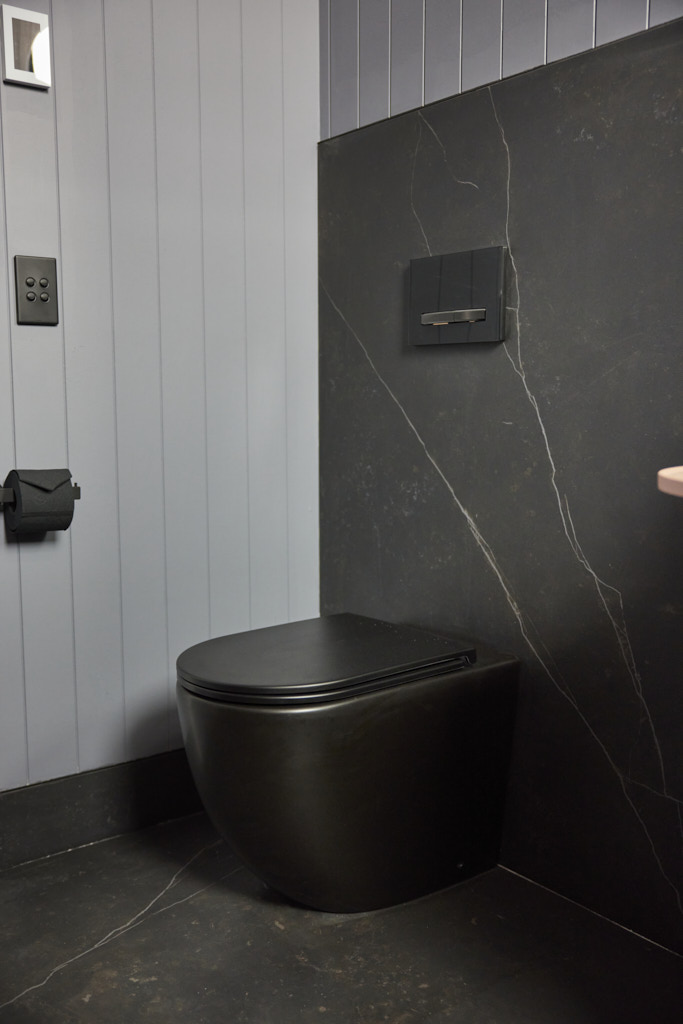
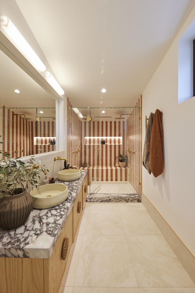
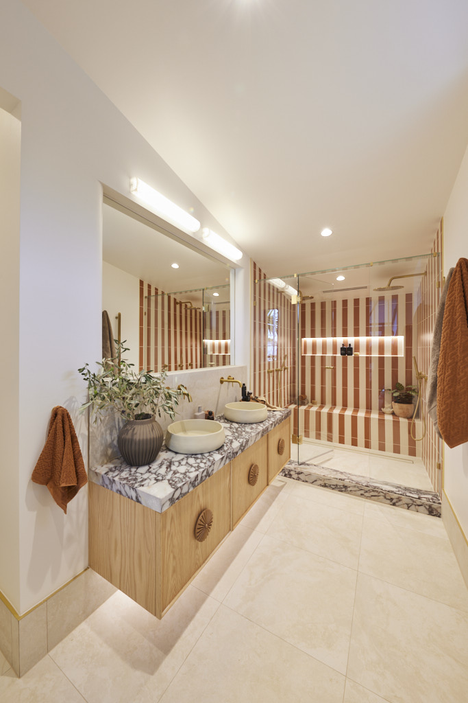
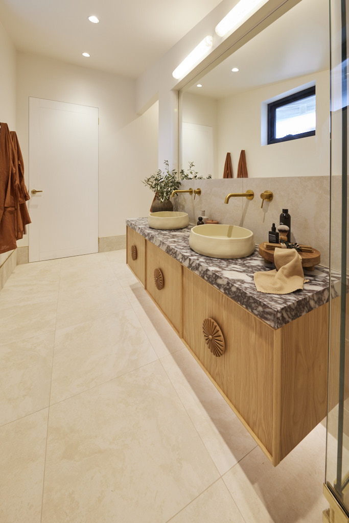
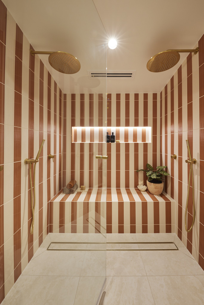
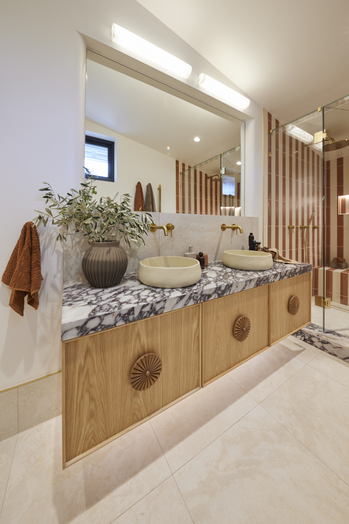
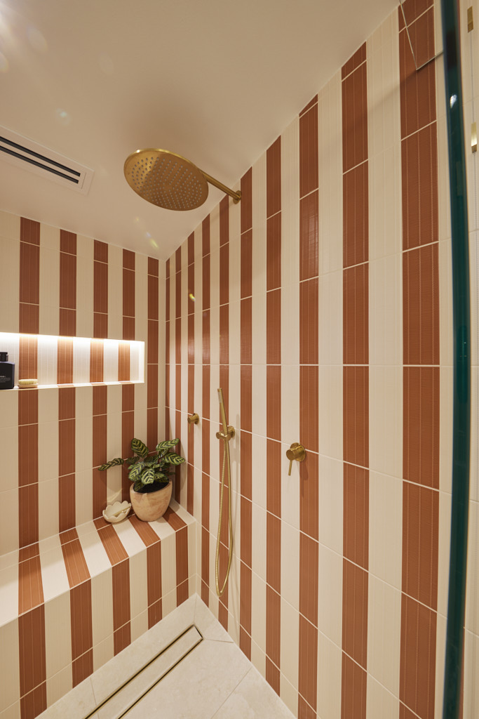
Bold, striking, and undeniably making a statement, Courtney and Grant’s bathroom stirred mixed reactions among the judges, who debated the layout and the standout tiles in the shower. Shaynna loved the mix of Cosentino marble, tiles, and the ISSY Adorn double vanity, calling it a definite success. Marty, however, felt overwhelmed, remarking, “These tiles are going too far!” He also thought too much space had been taken from the rumpus and study areas for minimal gain. Darren agreed that the layout felt off, with the toilet in the tallest section of the room and the shower in the lowest, and noted that the tiles were bordering on excessive. Despite that, he and Shaynna both concluded that they had been won over, describing the bathroom as “gorgeous, dramatic, and impactful.”

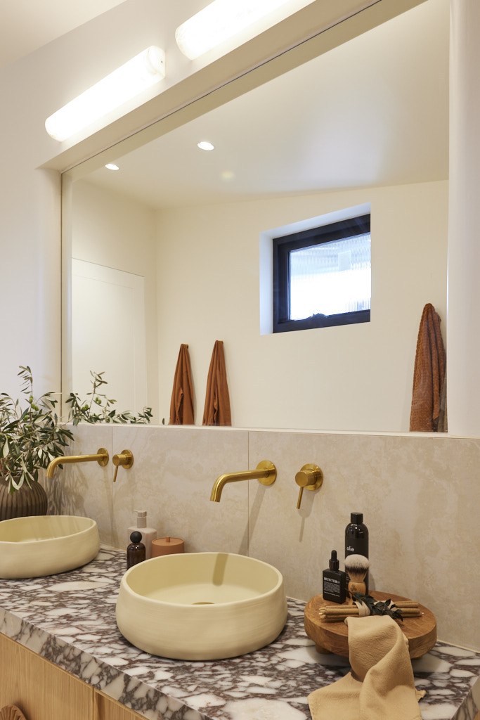

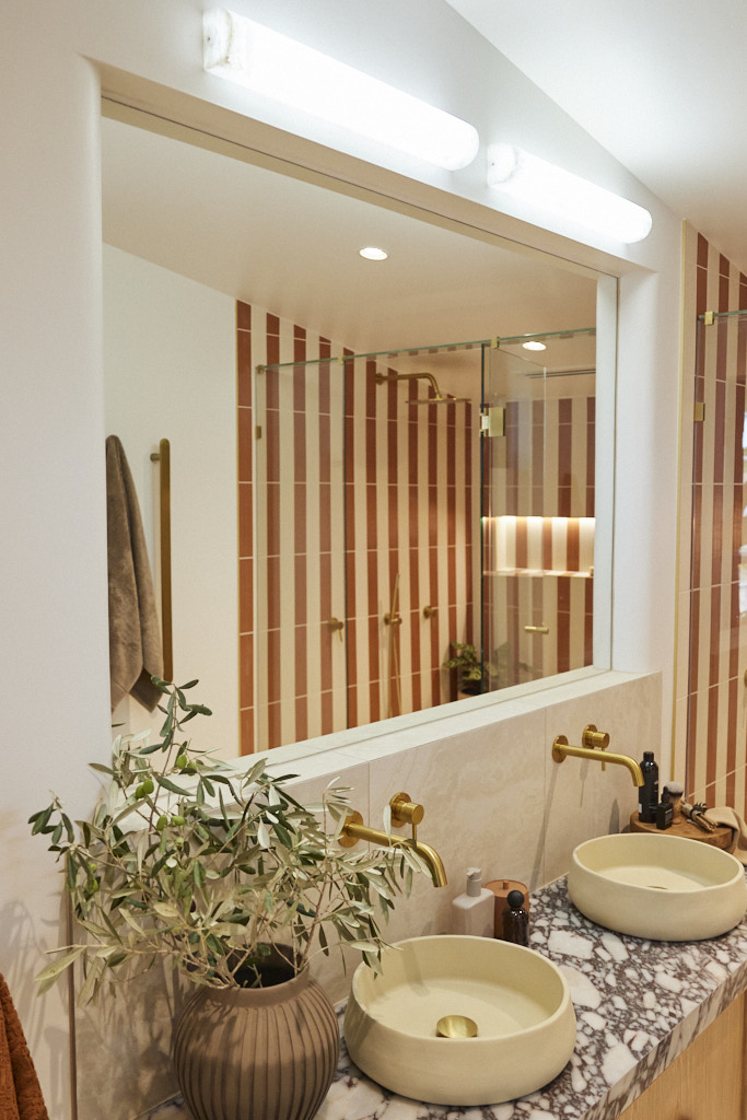
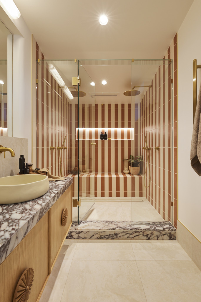
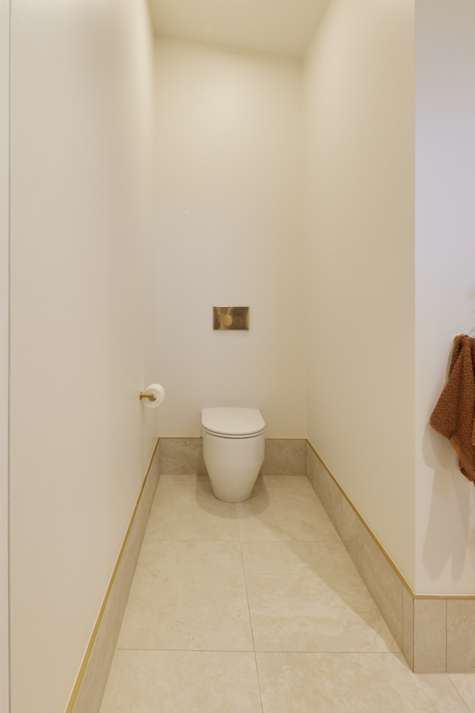
Images owned by the Nine Network Australia, provided by The Block Shop. Photography credits David Cook Photography.
Be the first to read my stories
Get Inspired by the World of Interior Design
Thank you for subscribing to the newsletter.
Oops. Something went wrong. Please try again later.

