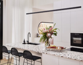
Tanya & Vito Score: 29 ½ /30 Spent: $49,618 Joint First Place Perfectly matched to the overall 1950s feel of this home was Tanya and Vito’s sunken lounge – and the judges fell in love – and into the couches – immediately. “Fun, playful, cool and retro!” gushed Darren, jumping in to see how the …
Tanya & Vito
Score: 29 ½ /30
Spent: $49,618
Joint First Place
Perfectly matched to the overall 1950s feel of this home was Tanya and Vito’s sunken lounge – and the judges fell in love – and into the couches – immediately. “Fun, playful, cool and retro!” gushed Darren, jumping in to see how the living area fit perfectly between the original front feature window with full length sheers and newly installed double-sided fireplace. Next over was the generous dining area, just perfect for a family dinner. And over it all, the “work of art” of five round Velux skylights… “You guys have nailed it!” Shaynna said.

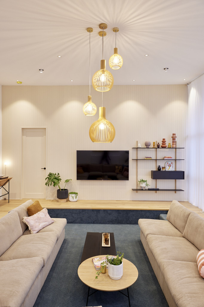


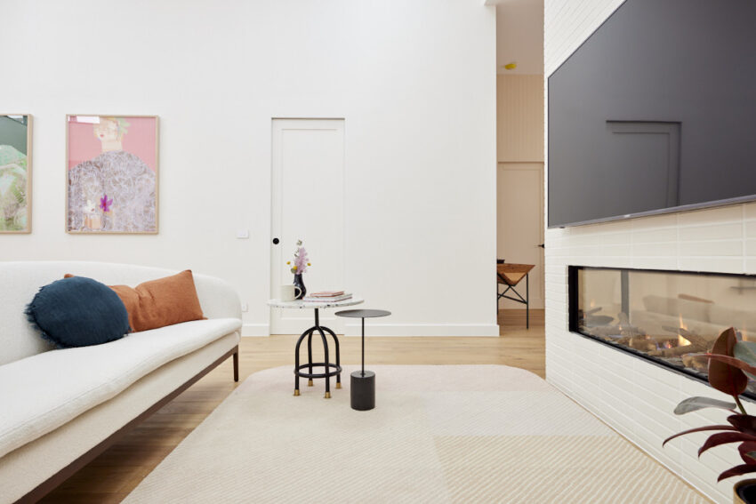

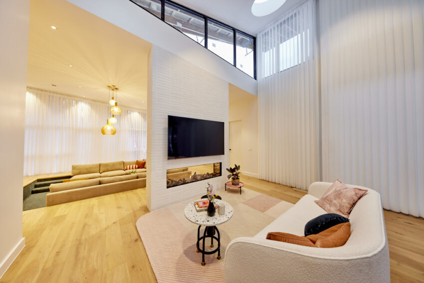

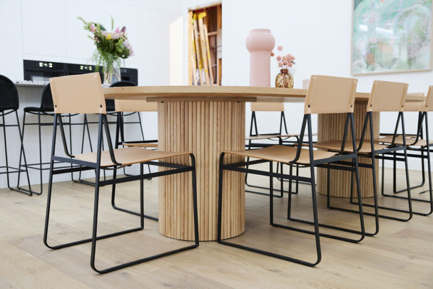

My favourite this week was that stunning dining table and the canvas.
You can SHOP all of Tanya and Vito’s rooms here.
…
Ronnie & Georgia
Score: 28 ½ /30
Spent: $47,001
Joint first place after playing the gnome
Classic, contemporary luxury, Neale said, all combined for a beautiful space for life, well done Ronnie and Georgia! Flipping the usual flow, with lounge and dining rooms before the kitchen somehow just worked for the judges, creating a dining and living area where each room supports the other and all pull towards the central space. A perfectly placed television and fireplace, bar area adjacent to the dining area with lowered ceiling for intimacy and all taking advantage of the soaring roofline of the living area combines for an area that feels spacious but still an intimate area to be used every day.


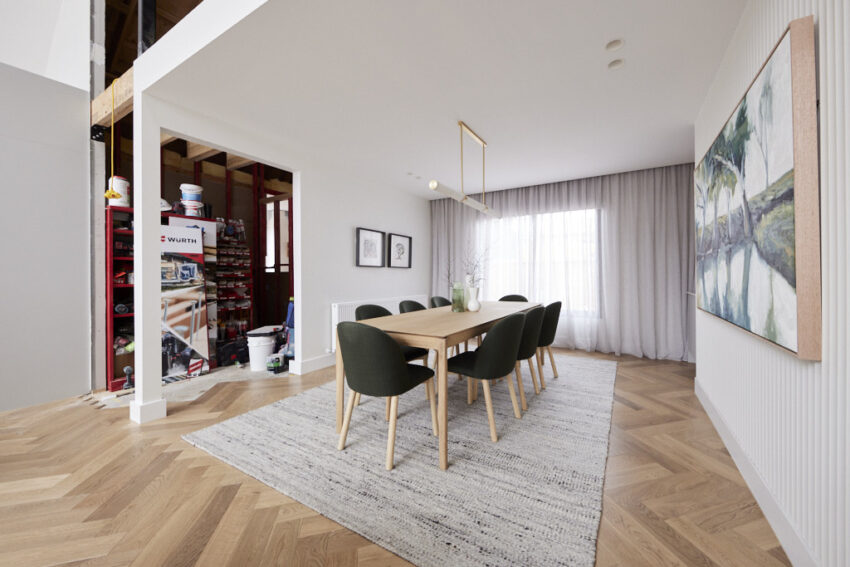
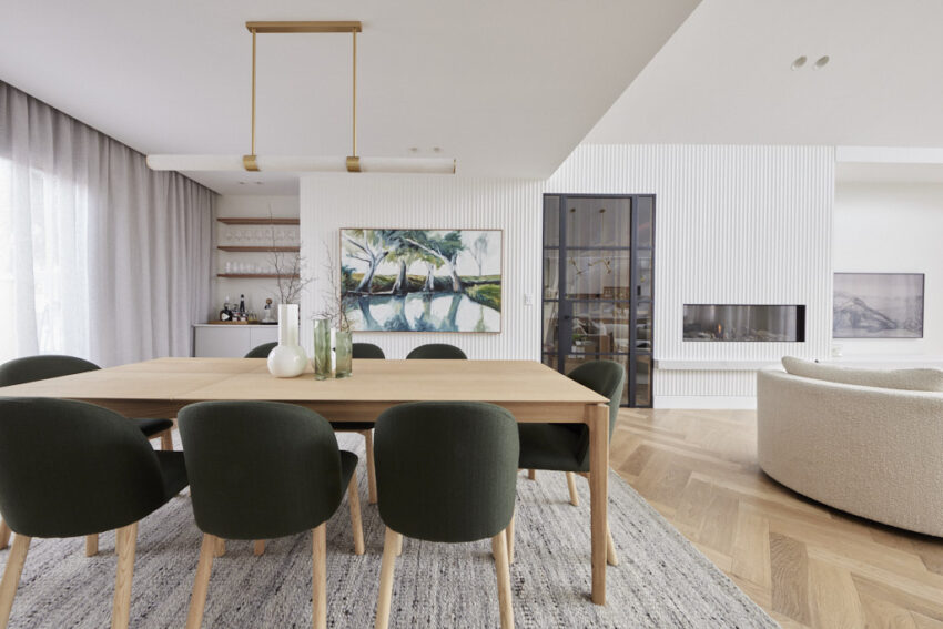
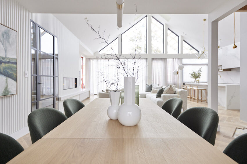


My favourite this week was the slab coffee table and the natural cushions.
You can SHOP all of Ronnie & Georgia’s rooms here.
…
Kirsty & Jesse
Score: 29 /30
Spent: $47,864
Third Place
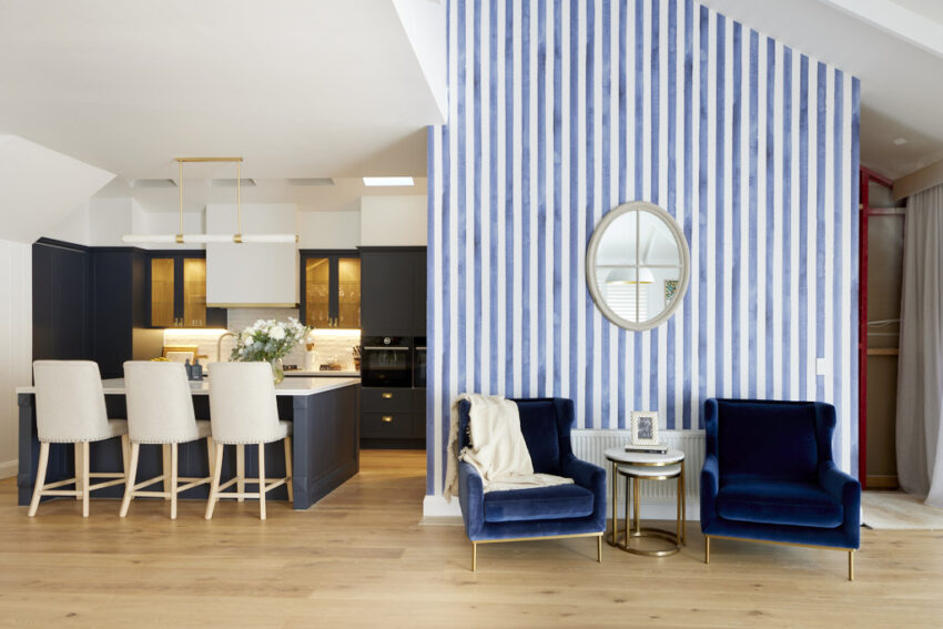
Homely, comfortable and a space that feels like it’s been there forever, Kirsty and Jesse’s dining and living areas immediately put the judges at ease. From the raked ceilings with added rafters over comfortable lounges facing built-ins around the television (including a confusing cushion nook), the nib-wall two-sided fireplace separating a generous but intimate dining area overlooking the yard, this is an area that proves even smaller spaces can be made to feel spacious with the right sense of style.


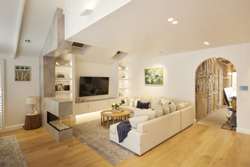

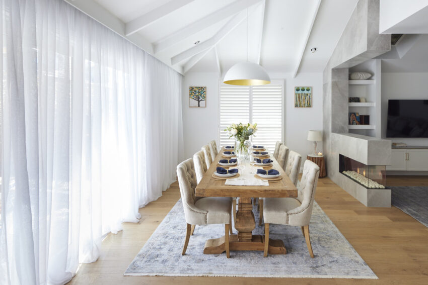


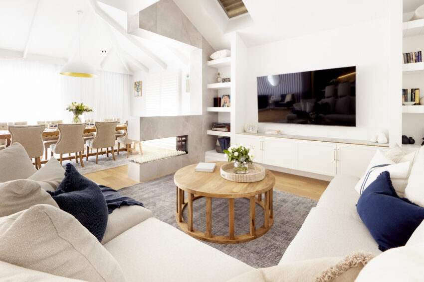


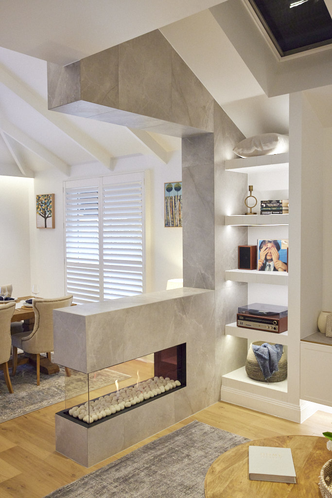
My favourite this week was the dining table and the concrete pears.
You can SHOP all of Kirsty and Jesse’s rooms here.
…
Mark & Mitch
Score: 24 ½ /30
Spent: $37,691
Fourth Place
With striking rows of Velux skylights flooding the huge living and dining area with natural light, this is the wow factor the judges were looking for and a space sure to amaze anyone who walks in the front door. From the beautifully styled dining table: “It looks like a party about to begin!” Neale said, to the clever fans overhead and ample sofa seating facing the television and fireplace, this is a room to excite – with one problem. A partition to create a hallway from the door could help divide the spaces, Shaynna suggested, with better zoning.
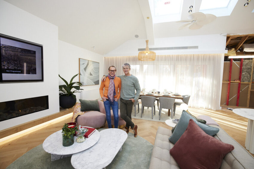


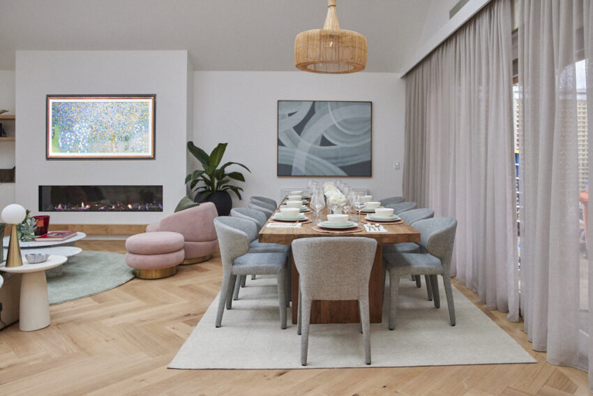


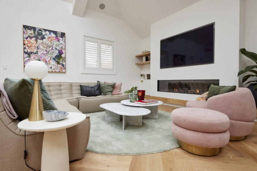


My favourite this week was the pendant and the throw rug.
You can SHOP all of Mitch & Mark’s rooms here.
…
Josh & Luke
Score: 22 ½ /30
Spent: $37,367
Last Place
If it’s space the judges were after, they’d come to the right place, with Josh and Luke’s free-flowing dining and living area taking full advantage of the open plan area the twins have created for a huge heart of the home. From the L-shaped sofa, Christian Cole dining table, bar area and more, this is a space where statement pieces feel right at home. But is it too big? Perhaps, said Neale, who thought it was “aircraft-hanger sized” and filled with design errors he feels might have been caused by confusion over how best to use the space. One solution, Darren says, could be to flip the dining and living areas, an idea that Shaynna whole heartedly supports.


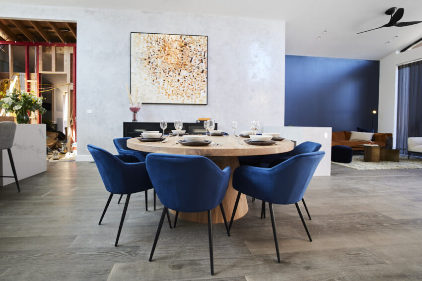

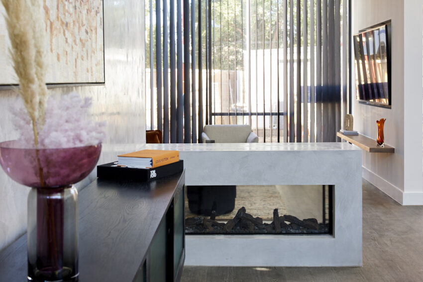

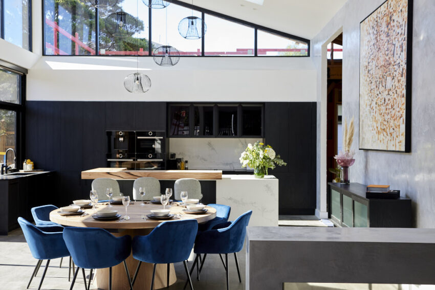


My favourite this week was the sideboard and the tub chair.
You can SHOP all of Josh and Luke’s rooms here.
…
Which was YOUR favourite room this week?
♥ KC. Images thanks to The Block Shop and nine now.
Be the first to read my stories
Get Inspired by the World of Interior Design
Thank you for subscribing to the newsletter.
Oops. Something went wrong. Please try again later.


