[vc_row][vc_column][vc_column_text]What about the twist last night? Where the boys revealed a living space instead of the master bedroom? While I didn't think it was a winning room, it was definitely a risk! Check out their efforts below and tell me what you think...[/vc_column_text][/vc_column][/vc_row][vc_row][vc_column][vc_column_text]Jesse and Mel Score: 22/30 When you’re on to a good thing - …
[vc_row][vc_column][vc_column_text]What about the twist last night? Where the boys revealed a living space instead of the master bedroom? While I didn’t think it was a winning room, it was definitely a risk!
Check out their efforts below and tell me what you think…[/vc_column_text][/vc_column][/vc_row][vc_row][vc_column][vc_column_text]Jesse and Mel
Score: 22/30
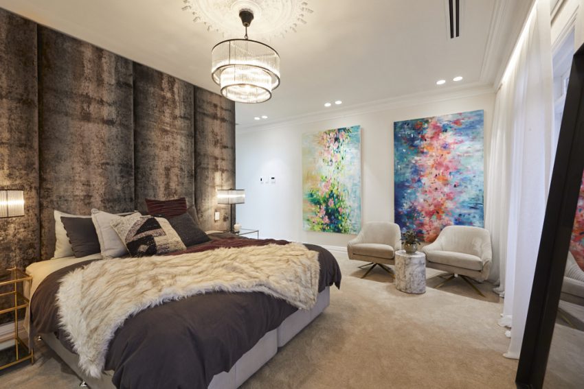
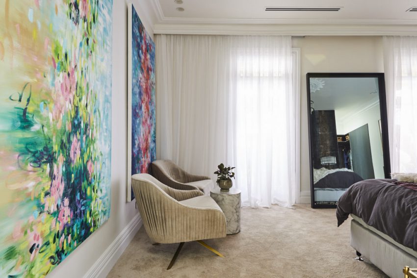
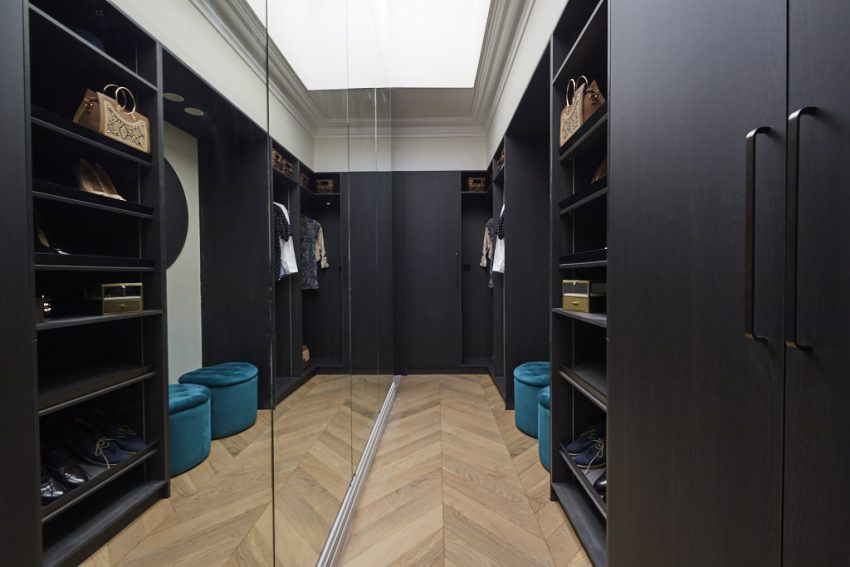
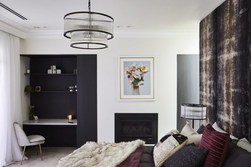
When you’re on to a good thing – replicate it! That was Jesse and Mel’s mantra going into this week’s Master Bedroom reveal, and they made good on their promise, delivering yet another stunning, sophisticated bedroom. The couple chose to reproduce what they did in their winning guest bedroom, opting to once again clad the wall behind their bed with gorgeous velvet panels. This time they chose a darker hue, which complimented perfectly their lilac and burgundy accented bedlinen. The couple, who also included a study-nook-come-dressing-table and gas fireplace, again opted for a sitting area in the room, choosing to place two light-coloured occasional chairs next to a marble table. The mood was further accented by the hanging of two large abstract artworks on the main entry wall – a stunning addition to the room. Opposite the bed was a state-of-the-art smart TV, installed within a beautiful free standing mirror, something Shaynna particularly loved, even if she wasn’t so convinced as to its placement.




[/vc_column_text][/vc_column][/vc_row][vc_row][vc_column][vc_separator border_width=”3″][/vc_column][/vc_row][vc_row][vc_column][vc_column_text]El’ise and Matt
Score: 26/30
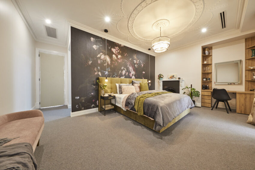
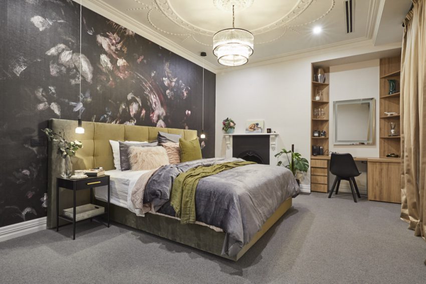
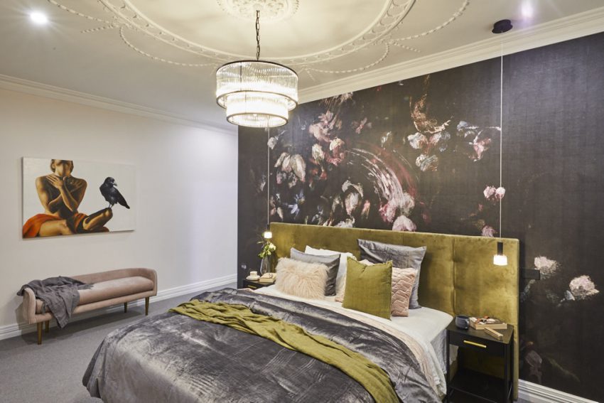
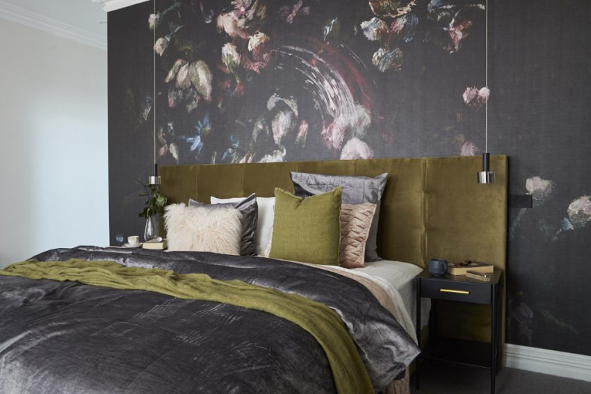
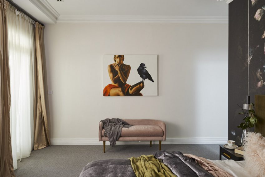
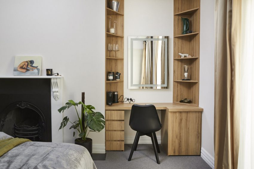
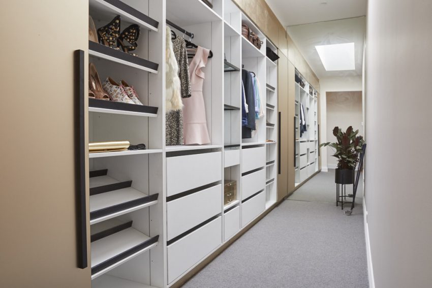
El’ise and Matt created a beautifully elegant Master, which had, as its hero, a stunning Grafico printed wall piece placed behind their pea-green bedhead. The judges all loved it, especially Darren who thought the dark hues went perfectly with the blush pinks and slate-greys of the bed linen and the muted greens of the bed. Along with the wall, the couple also made statements with their blush pink sofa, the large dressing area – complete with built-in coffee station – the large drop pendants and accompanying central light and for window dressings they opted for a lighter tone drape to compliment the wood tones of the dressing area. Arguably, though, the real stand-out of their room was that oversized ceiling rose, which played perfectly with the couple’s use of heritage detail through the rest of the house.

[/vc_column_text][/vc_column][/vc_row][vc_row][vc_column][vc_separator border_width=”3″][/vc_column][/vc_row][vc_row][vc_column][vc_column_text]Andy and Deb
Score: 24.5/30
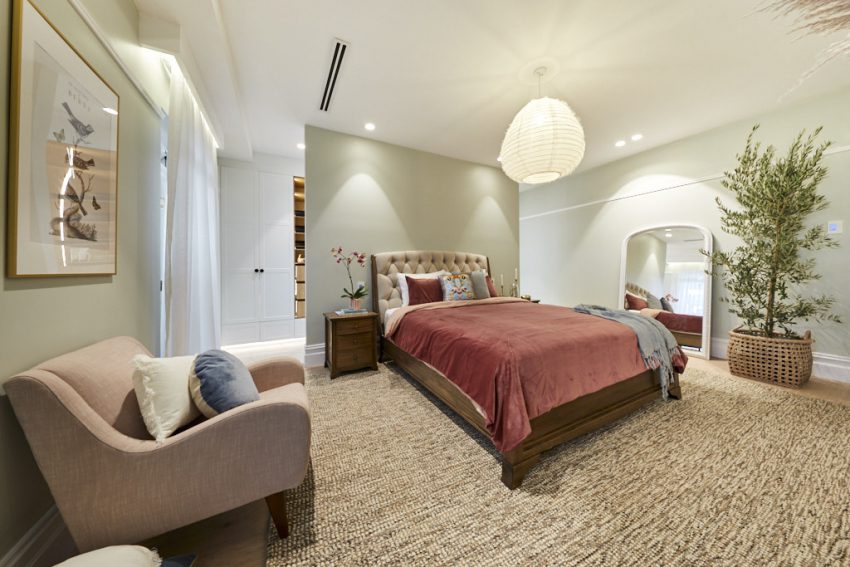
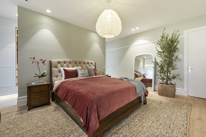
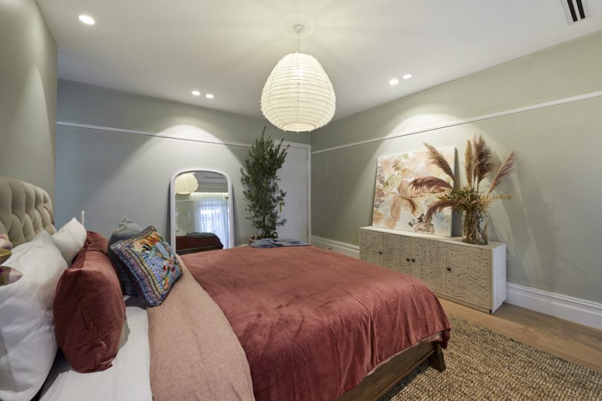
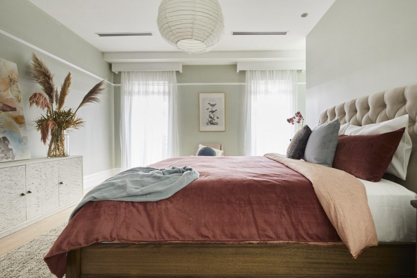
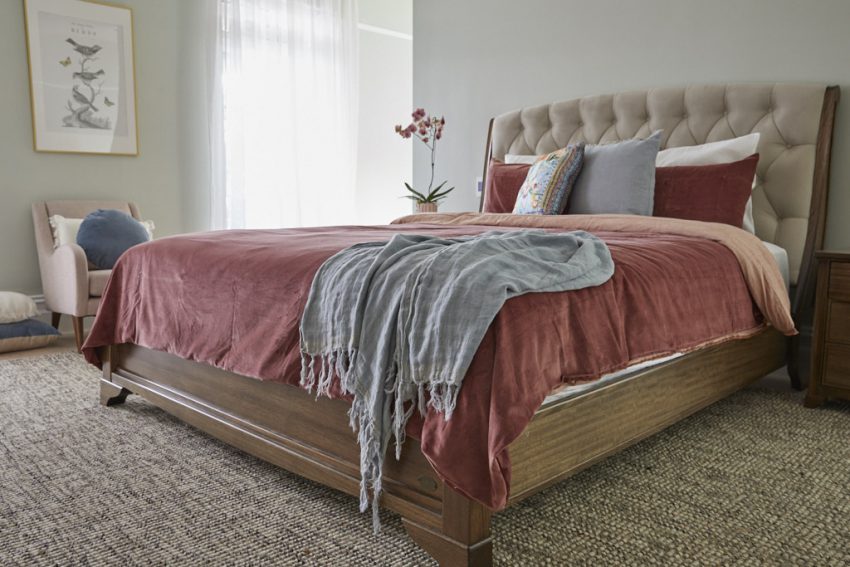
Andy and Deb created a beautiful, fresh, contemporary and “very liveable” Master Bedroom, winning praise from all three judges. It featured green accented walls (as suggested by the Mitre Ten colour consultant), a large wooden bed, oversized woven jute rug, blush pink occasional chair and a large banquet-style dresser. The feeling was coastal luxe, and the choice of diaphanous drapes lent the room a gorgeous sophisticated colonial feel. The large feature plant, nestled inside a woven basket, worked well with the oversized artwork, which in turn worked perfectly with Deb’s choice to dress the room with a gorgeous pampas grass arrangement. While Shaynna wasn’t a massive fan of the couple’s choice of bed – which was dressed in a gorgeous cherry pink – she thought as a whole, that the room worked exceptionally well. All three judges loved the feature artwork in the walk-in robe, which was printed directly onto a wall covering to be a statement in the space. And while they all agreed the functionality of the wardrobe needed work, they were blown away by the look and feel.






[/vc_column_text][/vc_column][/vc_row][vc_row][vc_column][vc_separator border_width=”3″][/vc_column][/vc_row][vc_row][vc_column][vc_column_text]Tess and Luke
Score: 24.5/30
They haven’t had the easiest time so far, but this week our youngest contestants hit their stride, producing a beautiful Master, complete with his-and-hers walk-in robes.
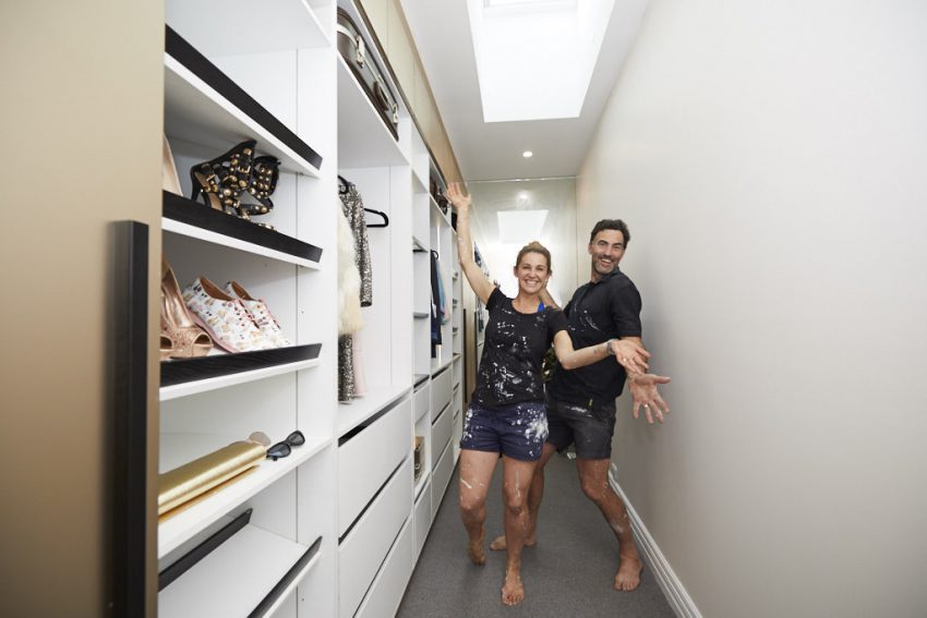
The judges loved the room, but were absolutely blown away by what they achieved in the walk-ins, describing their design choice as the “master stroke to the master bedroom.”
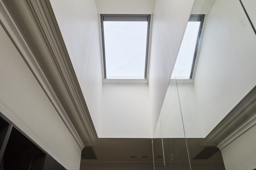
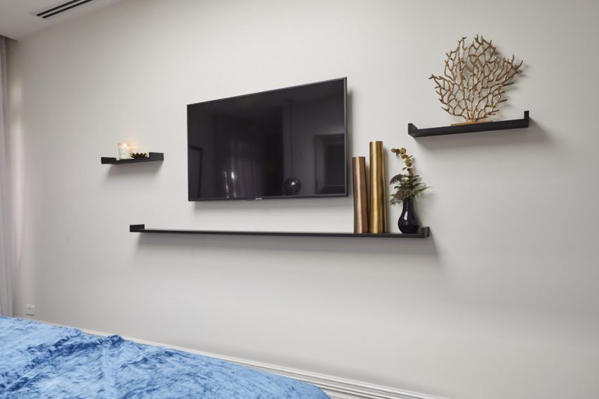
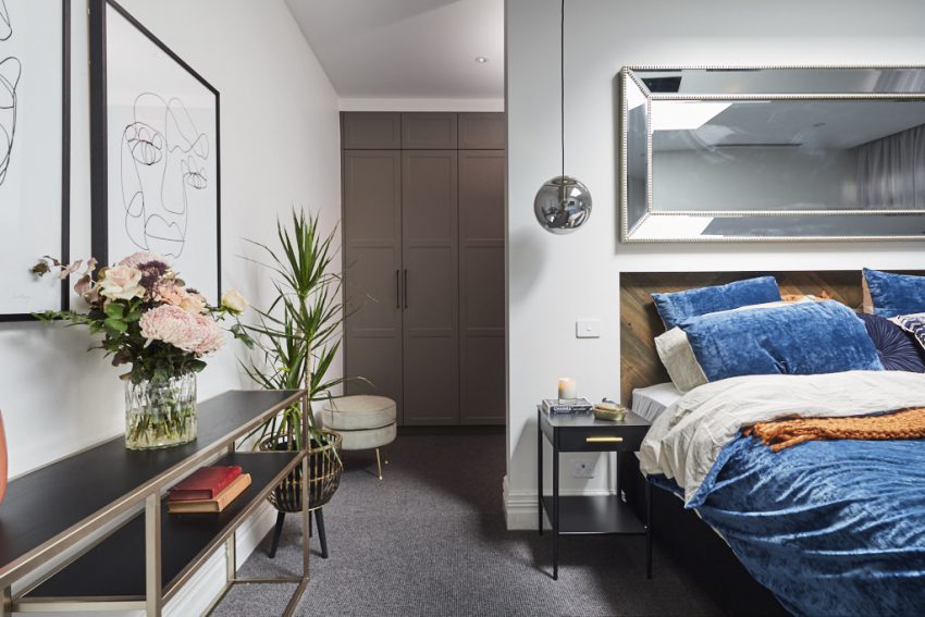
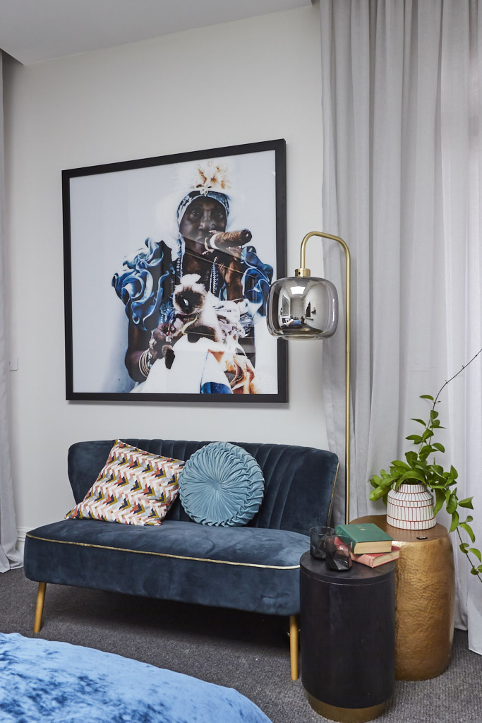
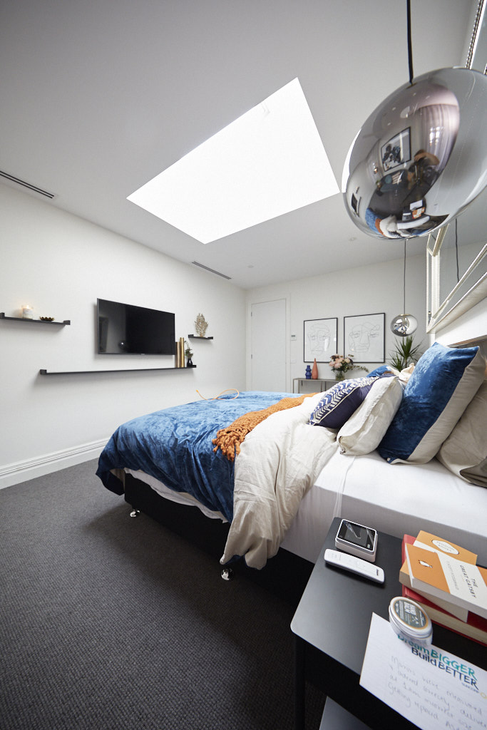
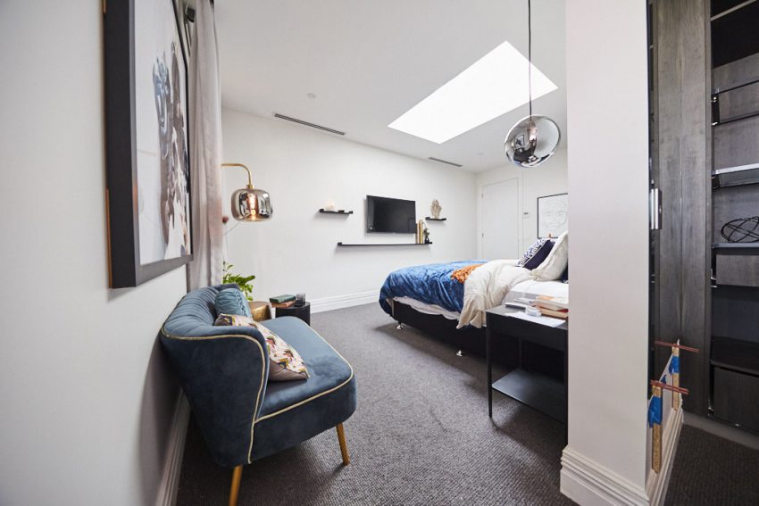
Tess and Luke chose to dress their room in royal blue and burnt orange. The colour palette was actually dictated by the stunning artwork, which Tess admits she sourced first, the hues offset by the colours chosen for their beautifully dressed bed. The statement print set the tone for the room, which also included a custom-made parquetry inlaid bedhead, hanging pendant lighting, abstract art prints above a side table, custom-made shelving and a large statement mirror. Giving the space a sense of lightness and brightness was the fabulous skylight, which the couple ingeniously chose to position above the bed.



[/vc_column_text][/vc_column][/vc_row][vc_row][vc_column][vc_separator border_width=”3″][/vc_column][/vc_row][vc_row][vc_column][vc_column_text]Mitch and Mark
Score: 27/30
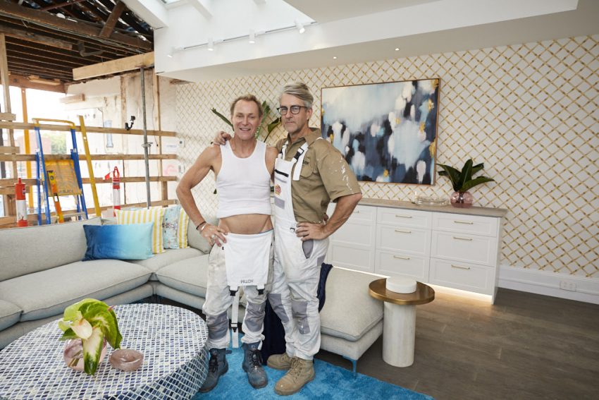
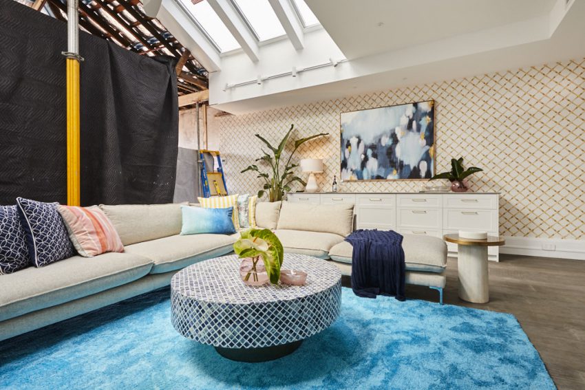
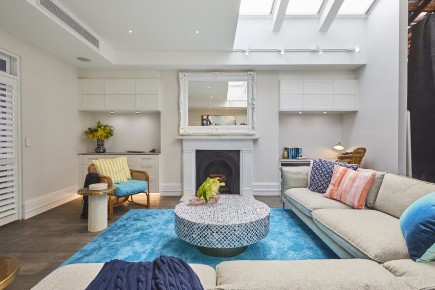
Mitch and Mark took one heck of a gamble deciding to change their Master Bedroom on the third floor into a dedicated entertaining space, complete with cathedral ceiling, kitchen prep area and ensuite. But it was a risk that paid off, the couple taking home a win by one point for their bold design choice.
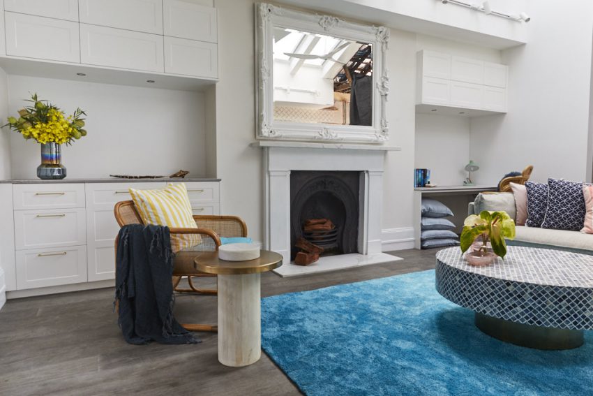
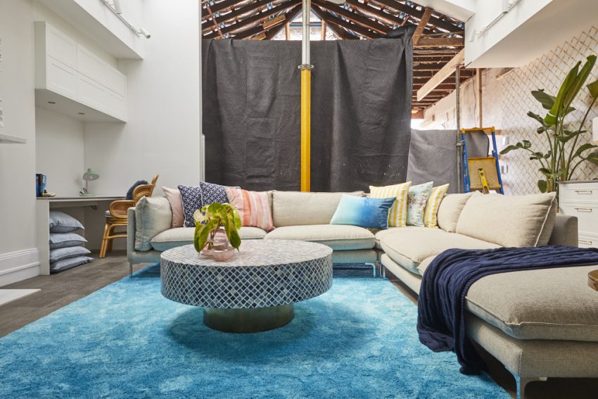
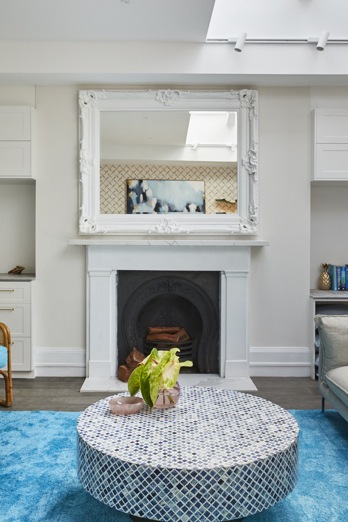
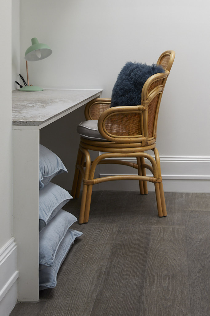
The judges admit they were stunned when they walked in the room. But once the shock wore off, each could see that Mitch and Mark had created an exceptionally executed second living area, complete with hardwood floors, large oversized couch, gorgeous blue rug, fireplace, study nook, and that kitchen and ensuite area.
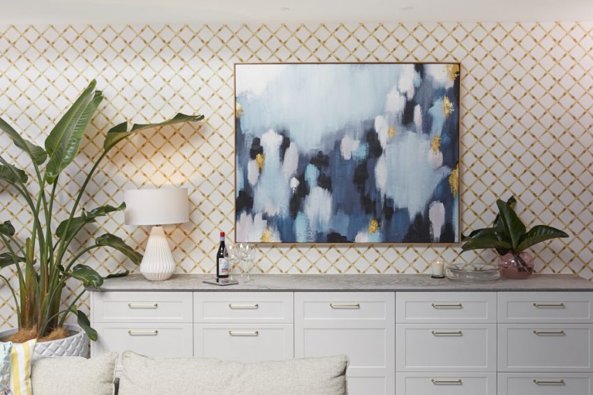
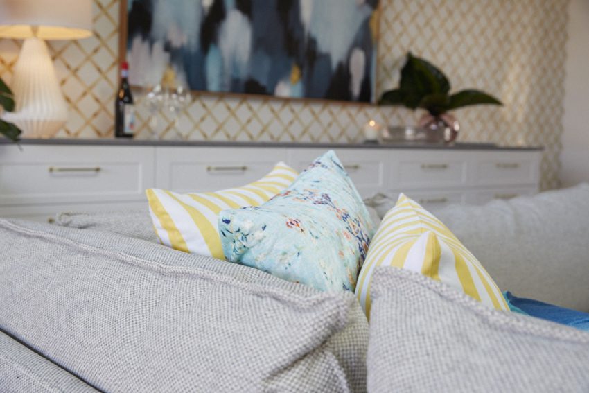
They loved the room’s sumptuous Palm Springs vibe. This was created by the clever use of heritage wallpaper with bamboo print, a large, oversized plant, rattan chairs and yellow striped details in the cushions. A large mosaic table rounded out the look, and the oversized mirror above the fireplace pulled it together beautifully.


[/vc_column_text][/vc_column][/vc_row][vc_row][vc_column][vc_column_text]
What did you think of the rooms this week?
See all the past reveals here.[/vc_column_text][/vc_column][/vc_row]
Be the first to read my stories
Get Inspired by the World of Interior Design
Thank you for subscribing to the newsletter.
Oops. Something went wrong. Please try again later.


