[vc_row][vc_column][vc_column_text]Hi there! Thanks for stopping by today. It was Living and Dining week on The Block. Always one of my fave reveals as I generally want to copy what they've done. Known for lots of cushioning, over accessorising and clever tv storage I was dying to see what they came up with. Here's how the …
[vc_row][vc_column][vc_column_text]Hi there! Thanks for stopping by today. It was Living and Dining week on The Block. Always one of my fave reveals as I generally want to copy what they’ve done. Known for lots of cushioning, over accessorising and clever tv storage I was dying to see what they came up with.
Here’s how the scoring went… Ronnie and Georgia 29.5, Elyse and Josh 29.5 (they used their bonus point towards their final score), Jason and Sarah on 26.5, Hannah and Clint on 23.5 and Sticks and Wombat at 20.
Come and check them out in order of points this week…[/vc_column_text][vc_column_text]
Georgia & Ronnie

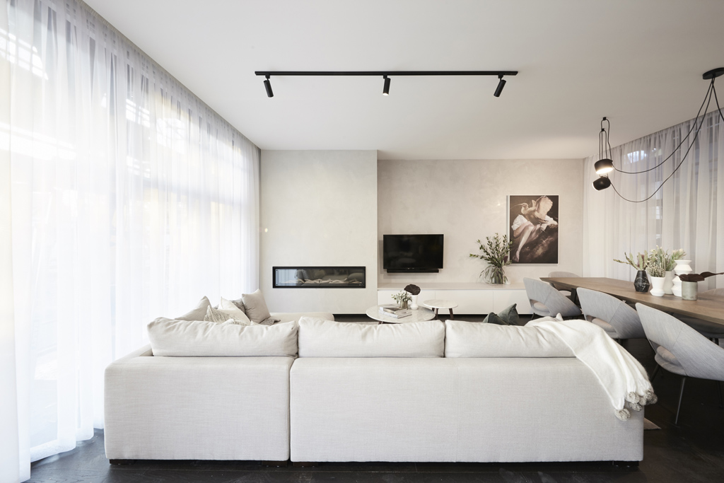


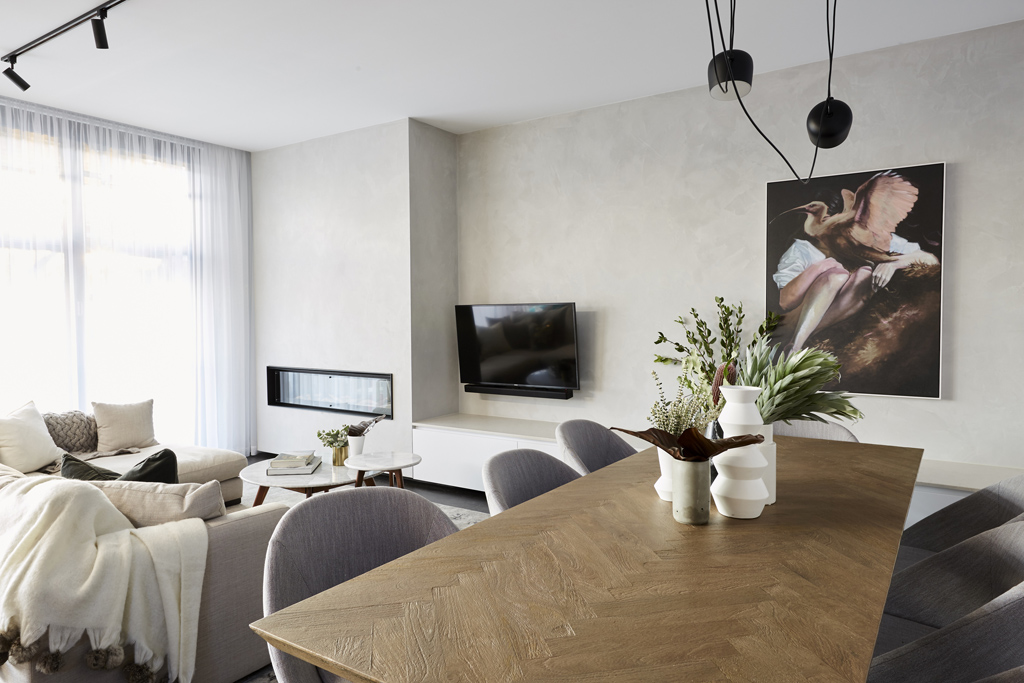
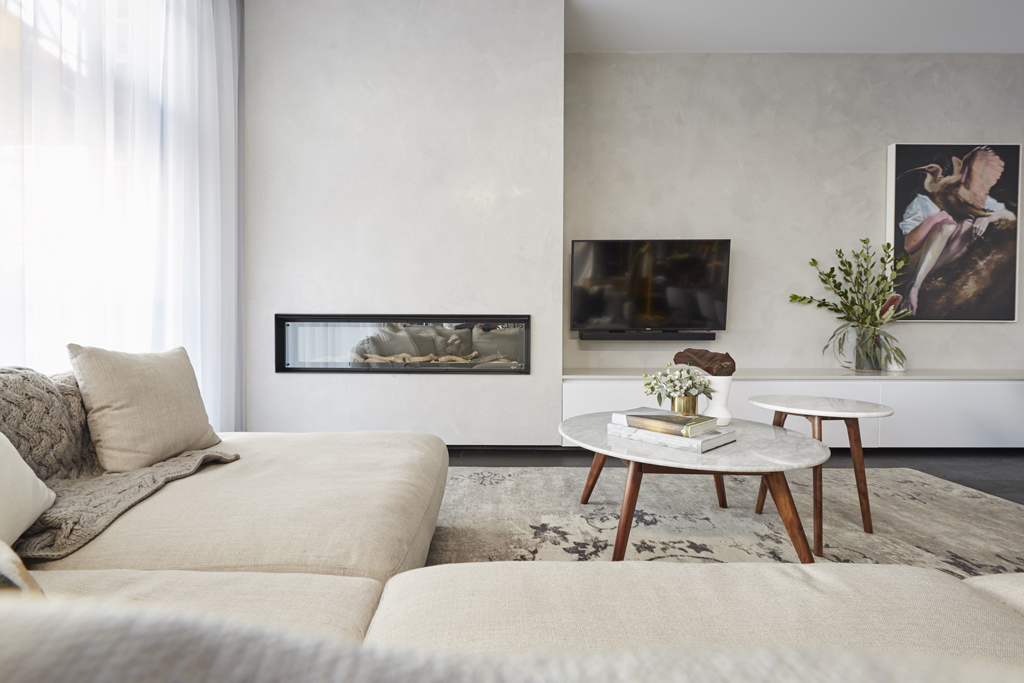


The judges were smitten with Georgia and Ronnie’s room again this week. The couple finished before schedule yet again. How on earth are they doing that?? I liked the room too. But wasn’t blown away. I thought Josh and Elyse’s was better. I didn’t like how the tv was randomly just sitting there. I think that could have been better positioned. I liked the neutral colours and use of natives to tie it all together. It’s a serene room, but nothing is stopping me in my tracks.
You can SHOP some of their room here.[/vc_column_text][/vc_column][/vc_row][vc_row][vc_column][vc_column_text]
Josh & Elyse

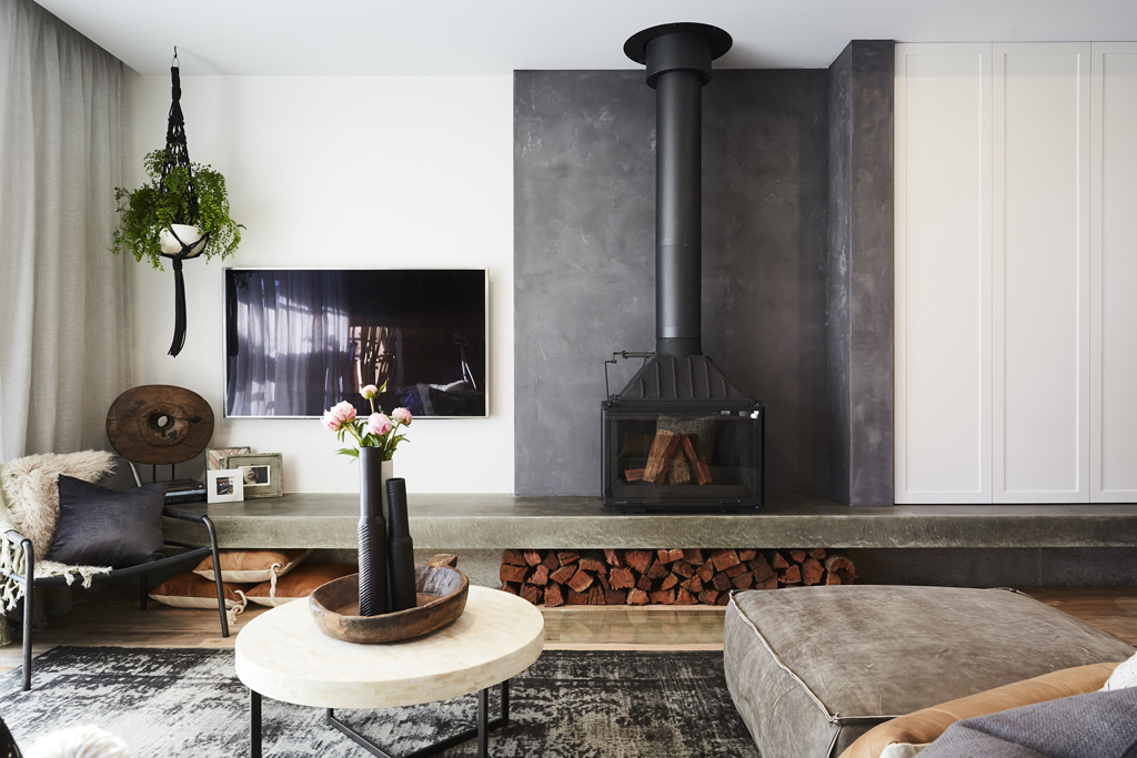


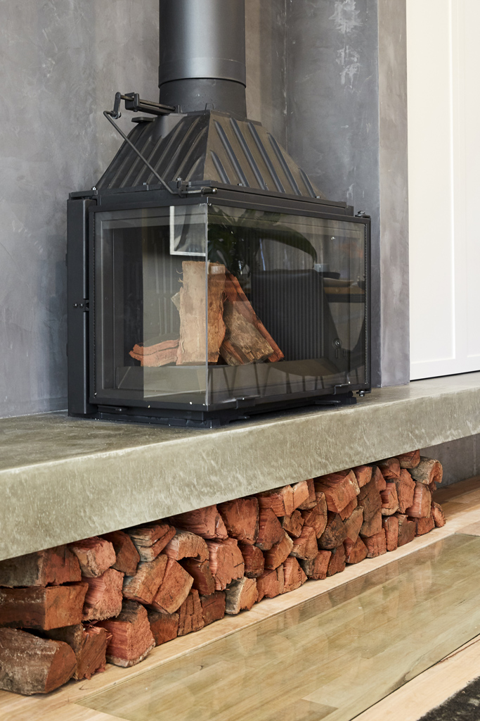


For me, this room was the winner. The overall feel, textures and styling is perfect. There’s also good storage in this space. A hanging plant is a big tick from me and the tv sits in a better spot in this room.
You can SHOP some of Josh and Elyse’s room here.[/vc_column_text][/vc_column][/vc_row][vc_row][vc_column][vc_column_text]
Sarah & Jason

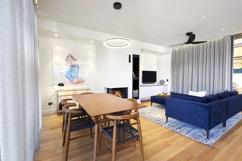
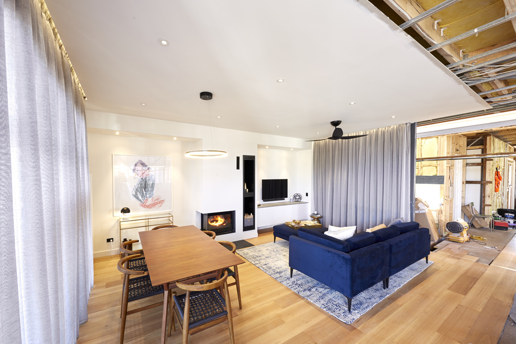


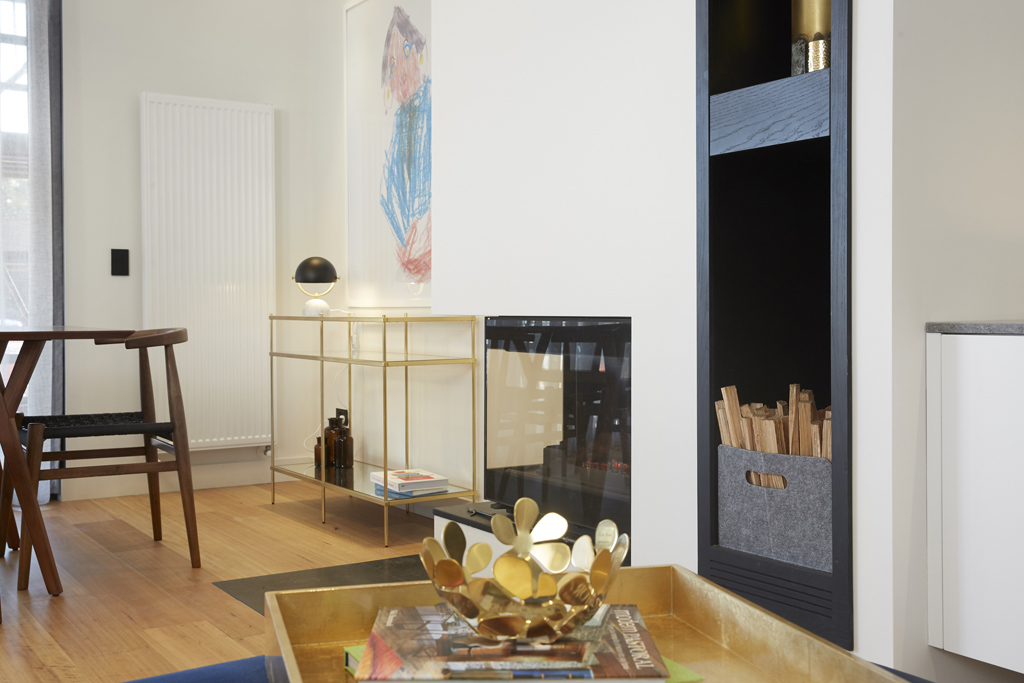

Jason and Sarah did a good job on their living and dining this week. They defined the 2 spaces well and created a welcoming area with good storage too. I like the storage ideas in a living space. I wasn’t a fan of their furniture choices but it will be interesting to see how this meshes with their kitchen coming up.
You can SHOP their room here.[/vc_column_text][/vc_column][/vc_row][vc_row][vc_column][vc_column_text]
Hannah & Clint


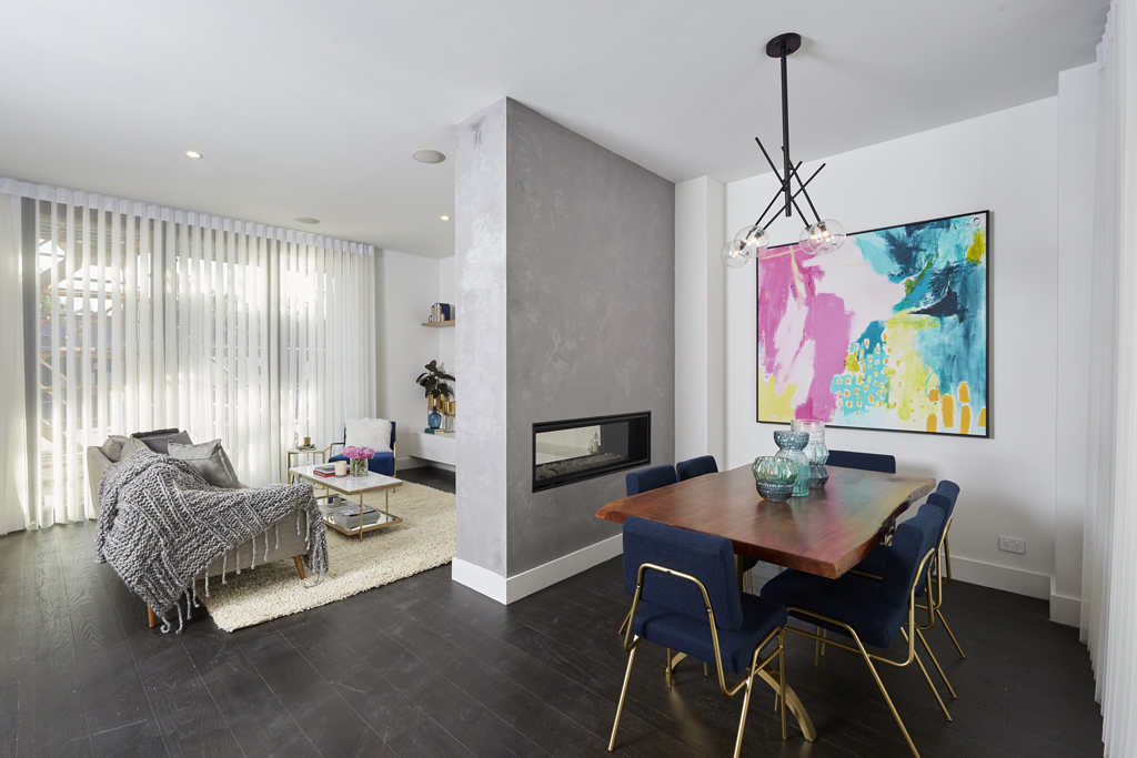
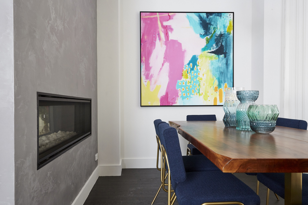

I was hoping for big things from Hannah and Clint. I know they’ve got it somewhere! The judges did not like the wall they put up between the living and dining. I don’t mind it because it gave them a good fire place area. I have a similar thing in my own home. It will be interesting to see how it plays out with the kitchen. I wasn’t a fan of their furniture though. I prefer more natural and warm tones.
You can SHOP some of their here…[/vc_column_text][/vc_column][/vc_row][vc_row][vc_column][vc_column_text]
Sticks & Wombat
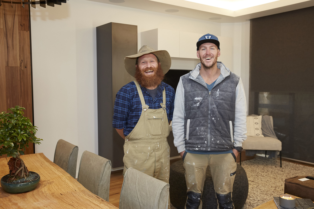
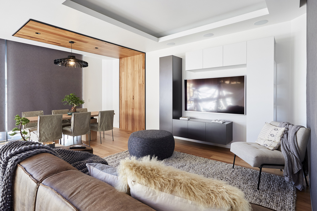


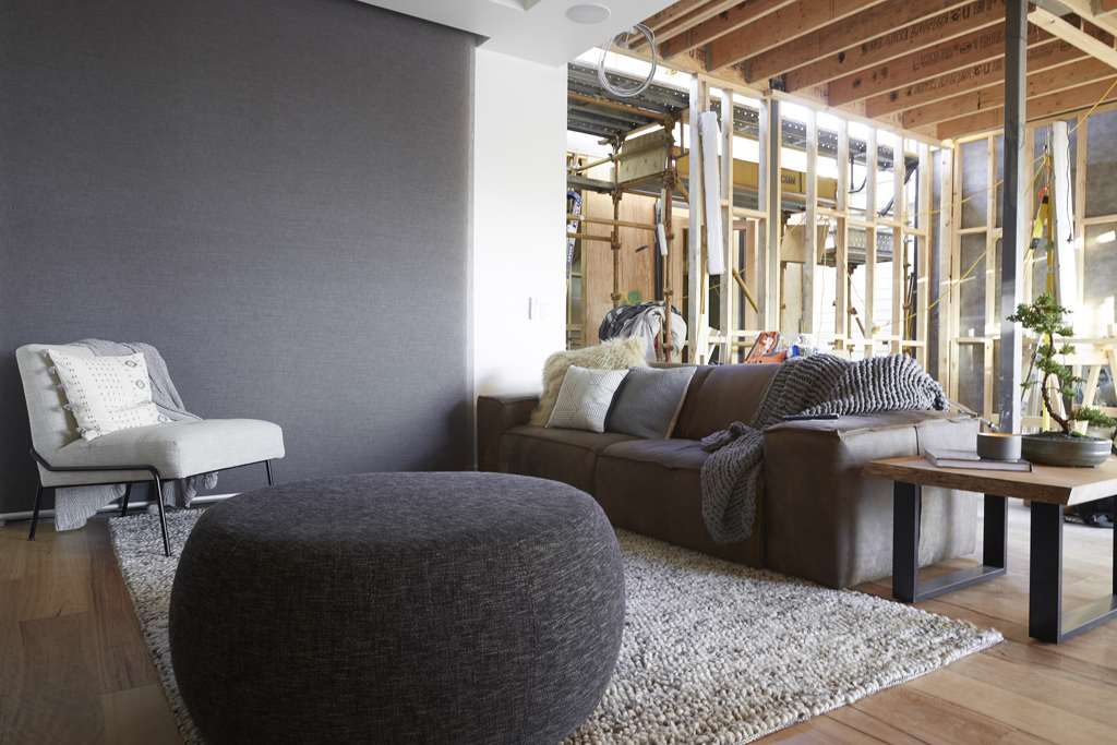
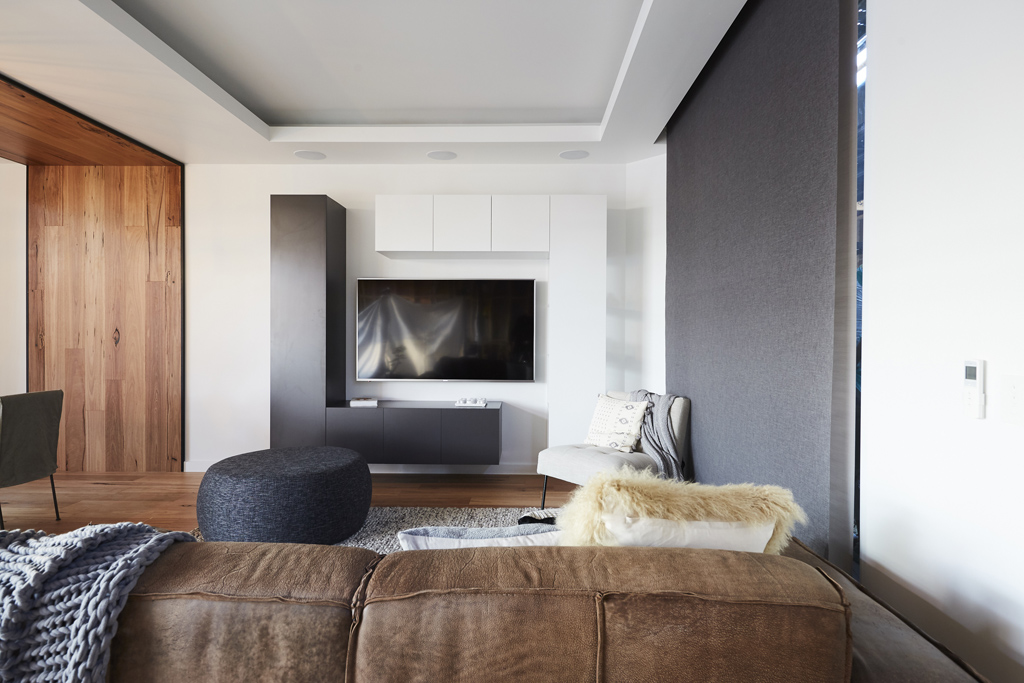


The judges were hard with Sticks and Wombat this week telling them to rethink their choices and use of timber. Oh. I am not with them on that. What’s wrong with this room? Why was Hannah and Clint’s better? Or even Ronnie and Georgia’s for that matter? I like the space. It feels good, is zoned well and has storage. The couch is the best one by far! There’s detail in the ceiling with a bulkhead and downlights too. Hmmmm.
You can SHOP Sticks & Wombat’s room here.[/vc_column_text][/vc_column][/vc_row][vc_row][vc_column][vc_column_text]What did you think of the living and dining spaces this week? Which room did you like?
You can see all the rooms so far over here.
♥ KC.[/vc_column_text][/vc_column][/vc_row]
Be the first to read my stories
Get Inspired by the World of Interior Design
Thank you for subscribing to the newsletter.
Oops. Something went wrong. Please try again later.




Comments
Cathy Camera
I missed this episode but, looking at photos, I tend to agree with your comments. I like Sticks and Wombat’s use of timber – I think the room looks amazing. Ronnie & Georgia’s TV does seem in an odd position too – its like me it’s part of neither room rather than both.
Chrissie Taylor
❤️❤️❤️❤️❤️ Elyse and Josh’s room the best!
Poor Sticks and Wombat they have dropped the ball this week.
Georgia’s on point with her styling ❤️
Louise McKenzie
Loved The boys as well, the timber is amazing. Could not understand Shaynna drooling over Ronnie and Georgia’s artwork. I tnought it was hideous and there room looked cold. Loved Elyse and Josh’s room, especially the rug.
Chelle Houley
I thought Ronnie & Georgia’s room needed some colour and don’t understand the fuss over that artwork!
Colleen Moffat
Agreed with judges on sticks and wombat…but Elyse and Josh was better than Ronnie and Georgia’s.
Lisa McCallum
Sticks and wombats by far is the best!
What was the go with the Light in Sarah and Jason’s room….loomed very off centre. And the TV placing in Georgia and Ronnie ….really bad.
Kellie Parsons
Loved They Boys room timber was amazing
Jo Matheson
Loved Sticks and Wombats and Josh and Elyse’s rooms they are very warm. I agree with the comments on the nib wall in Hannah and Clint’s it closes the room in too much.
Shauna Hollier
Since when is timber classed as cold? I loved the boys room, I think they’re hard done by every week. Neutrals without a scrap of colour is cold
Kirby Cotterill
I hated Ronnie and Georgia’s room it was so white and blah sticks and wombat deserved so much better then they got it was my fav closely followed by Elyse and Josh and Hannah and Clint
Anna Streat
I only watch on Sundays now for the reveal, as I don’t really like the focus on the clash of personalities. When you were on The Block, I loved how, for the most part, it seemed as though everyone got on. I liked the older couple’s room the best, then Ronnie & Georgie’s room.
Nicole Roberts
I liked Jason and Sarah’s then Hannah and Clints. I think Hannah and Clint are a team to watch out for
Patricia Doyle
I loved sticks and wombats, although not a fan of the dining chairs……seen all the others before nothing exciting or new…..
Jennifer Kaye
I agreed with the judges on Hannah and Clints wall. It was a pretty tight space as it was. It just made it even smaller. Nice for a formal living/ dining space but a bit of a fail when it’s their only dining space.
Loved the boys room. I think if they’d gone with some wave-top sheers on the windows instead of the roller blinds it would have just softened it a little. The rollers were too harsh for me.
Maria Stephenson
Loved Elyse and Josh’s room. Loved the art work of the older couple.
Melissa {Suger}
Am I the only one who thinks Georgia and Ronnie’s room looks cramped? Like, squeezing your way in and around that couch and those dining chairs looks like a pain in the butt. The winners were Josh and Elise for me, hands down. That room was stunning.
I love Sticks and Wombat’s room, but it probably didn’t need timber side tables and dining tables. It’s a lot. That said, it’s not even close to as bad as they were making out it is. I mean, come on.
Liza Chapman
Elyse and Josh room was personally my favourite . It was cosier and more family orientated eith a stunning fireplace ans feature wall. Unfortunately the dining table was too small and lost them half a point. Ronnie and Georgia room was nice but on TV it looked posh and not family friendly. The wall tv set up didnt work and art work very odd choice.
Jenny Quld
I missed the show, but from these photos, I think the boys delivered an AMAZING room!
Robyn Elizabeth
I’m pretty sure I spotted a copy of a Three Birds Renovation bathroom in the pics that flashed up on Sunday night, for the next reveals.