Here we are with another bedroom reveal on The Block 2016 - this time with the Master. I was dying to see these rooms finished. I love the ideas they come up with. But the whole art deco thing must be hard for them! Some of the rooms are just so 70s hotel style! Let's …
Here we are with another bedroom reveal on The Block 2016 – this time with the Master. I was dying to see these rooms finished. I love the ideas they come up with. But the whole art deco thing must be hard for them! Some of the rooms are just so 70s hotel style! Let’s take a look at all of the rooms in order of what the judges scored the couples…

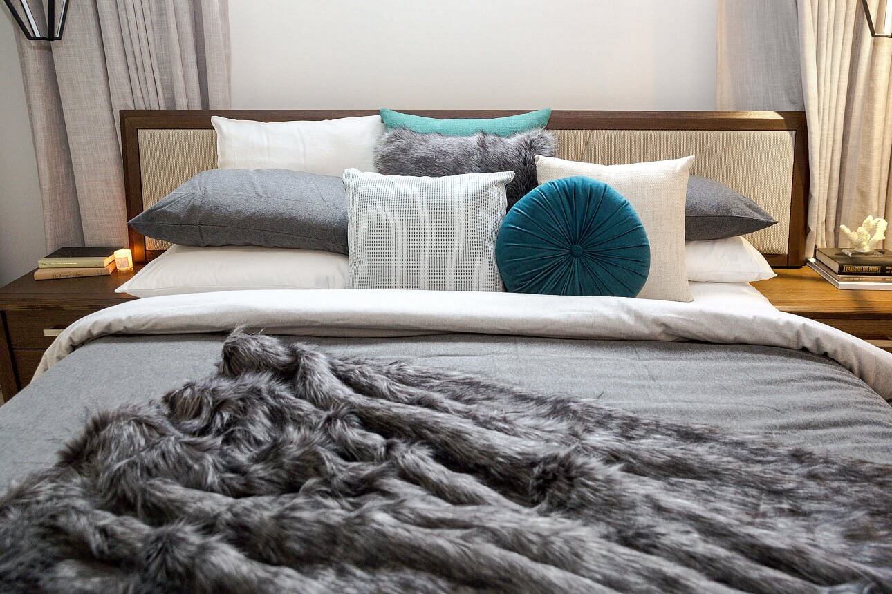


Chris and Kim
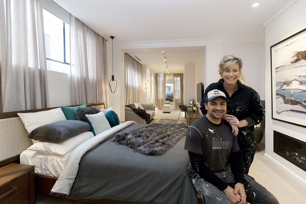
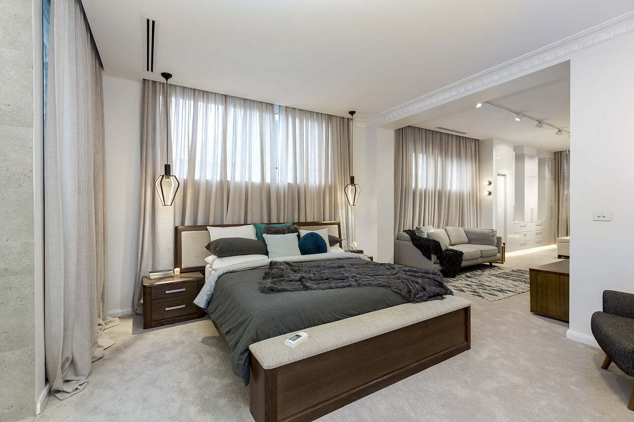
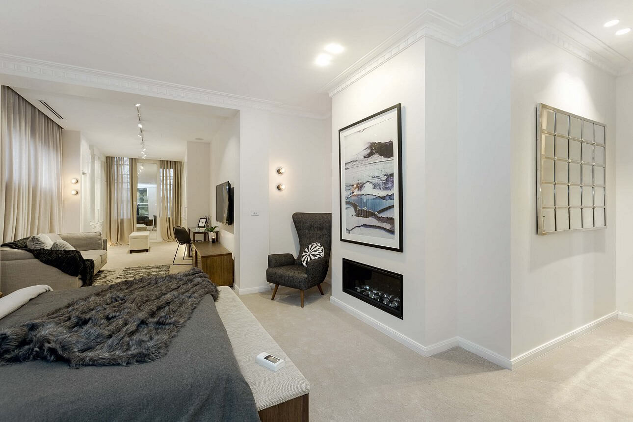
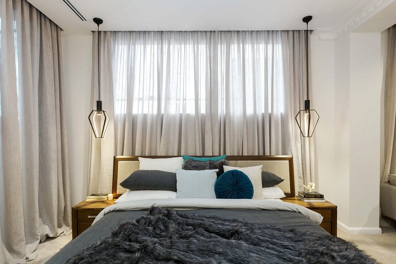
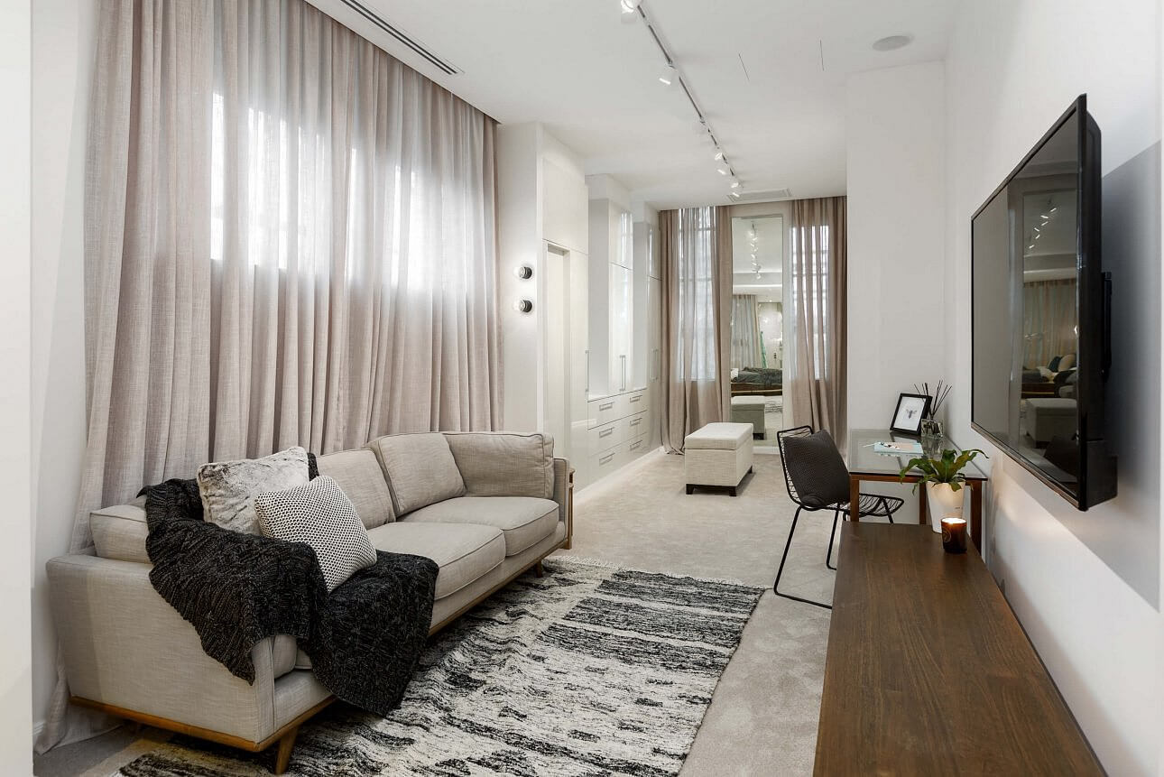
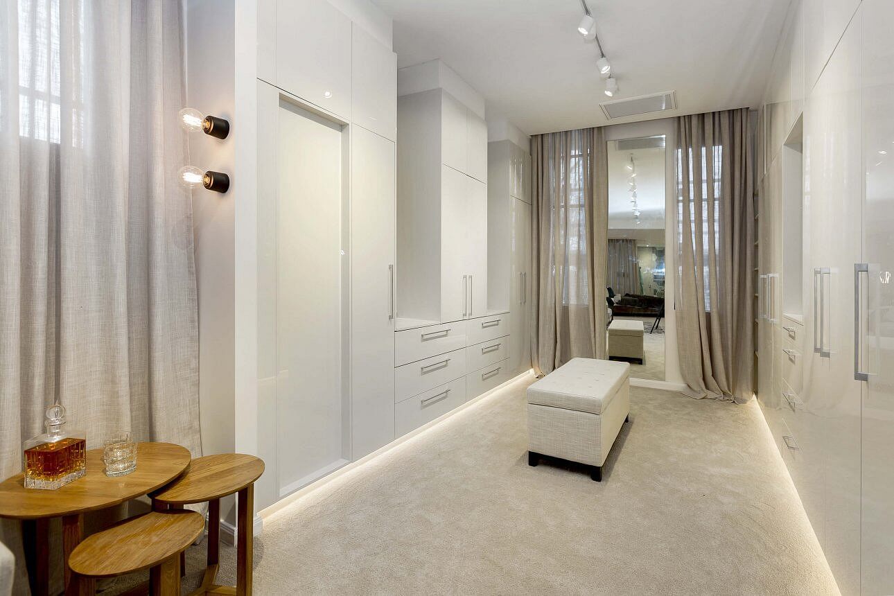
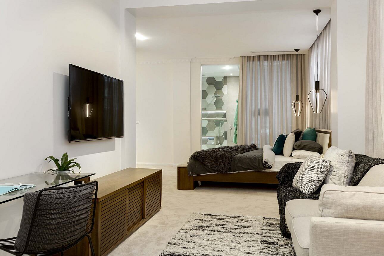
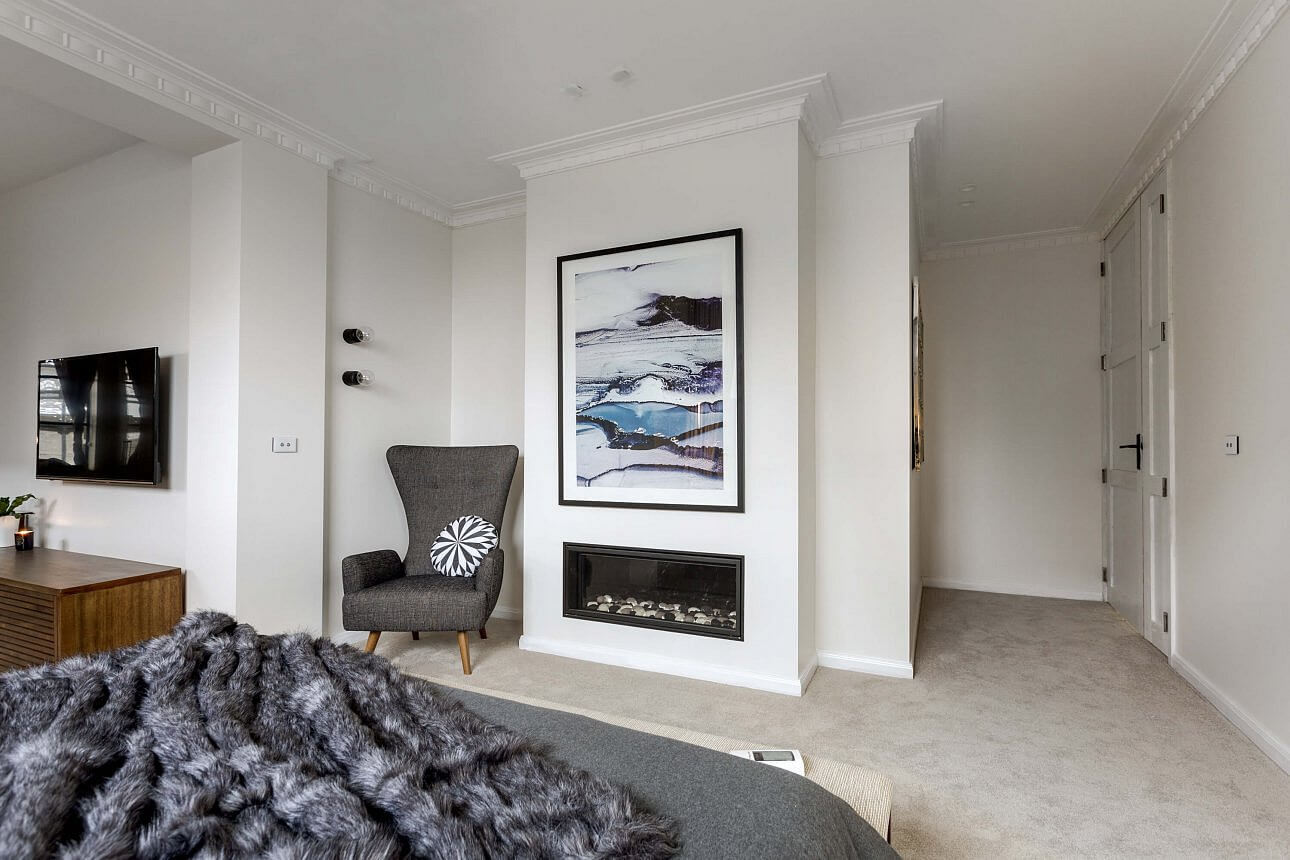
These two were on top this week with a score of 29/30 for their HUGE Master bedroom and retreat. Look at all that space! OMG, they were very lucky to have all of that (it would have killed their budget a bit!). They thought of everything – tv, fireplace, luxurious curtains, good lighting, a desk area, storage. Good on them! But… it’s not a pretty room. I just don’t love that bed at all. Sorry guys. This isn’t my favourite room of the night.
…
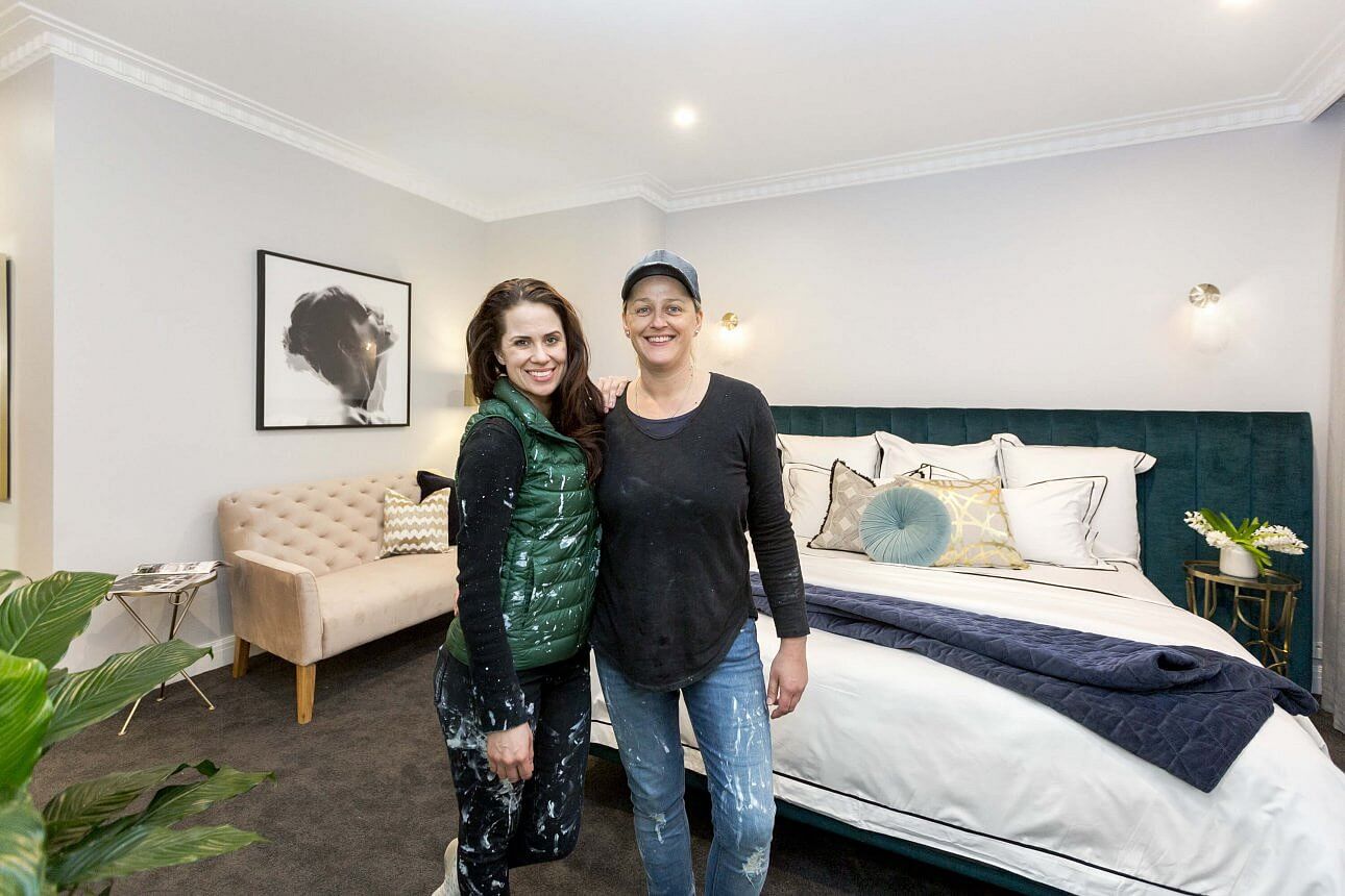
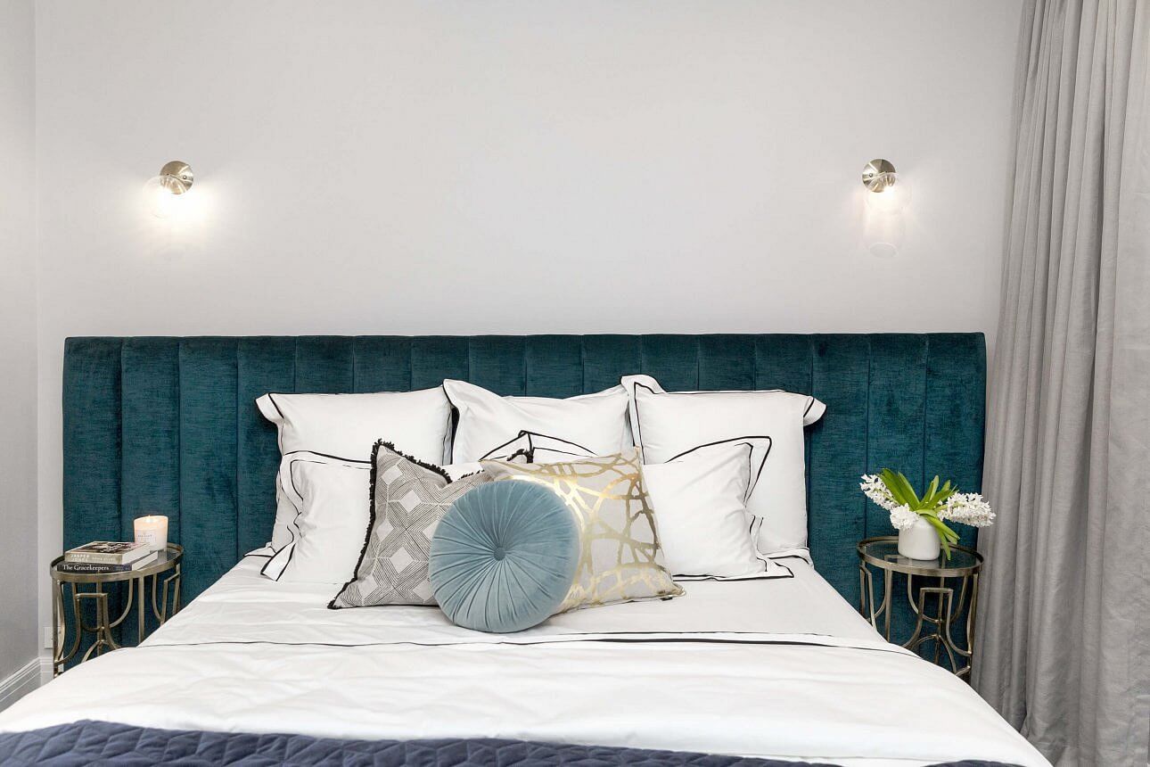
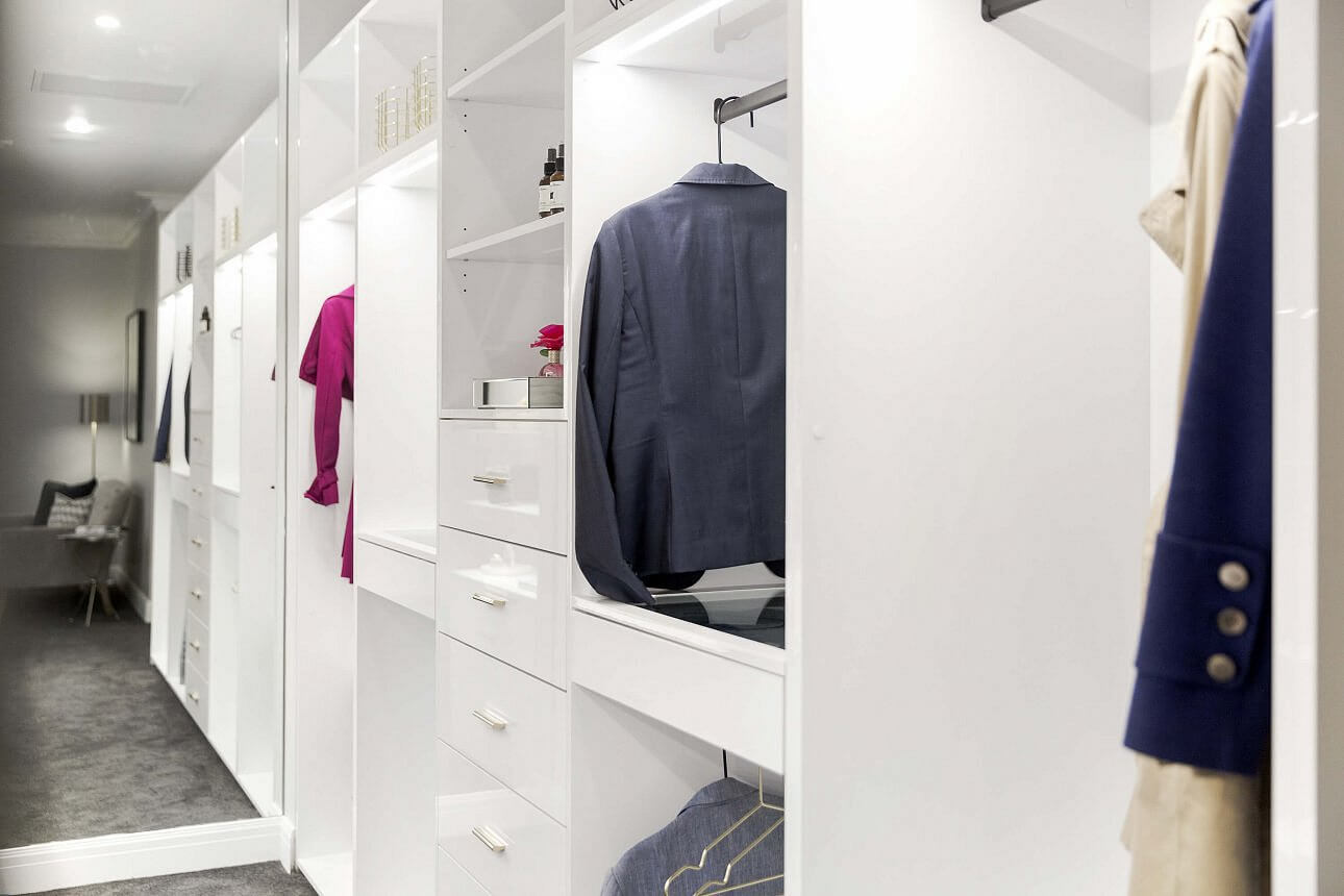
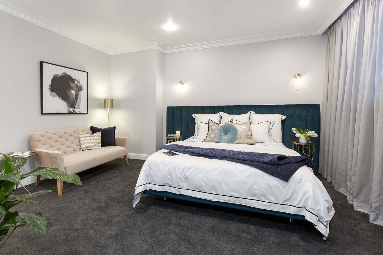
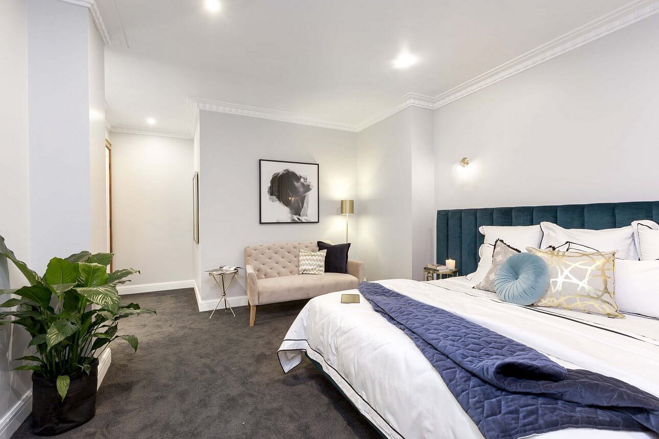
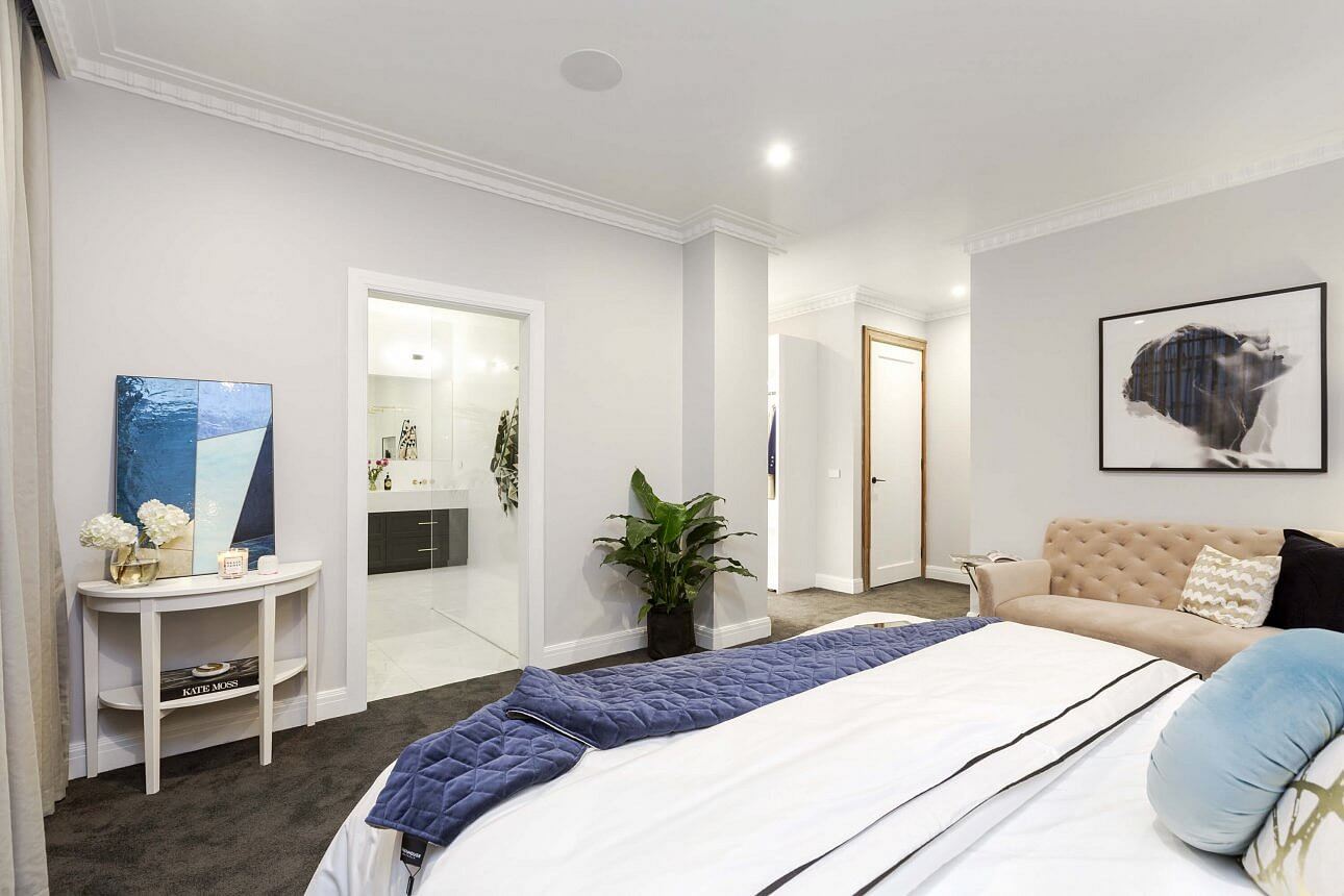
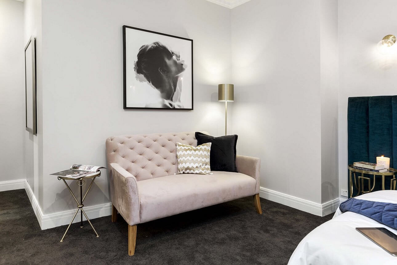
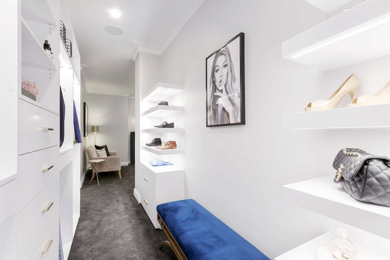
Julia and Sasha
The girls’ style is much more palatable. So soft, pretty and appealing. Their bedding, artwork and general styling is aimed at resale that’s for sure (with the less is more approach). They scored 28.5/30 this week.
…


Will and Karlie
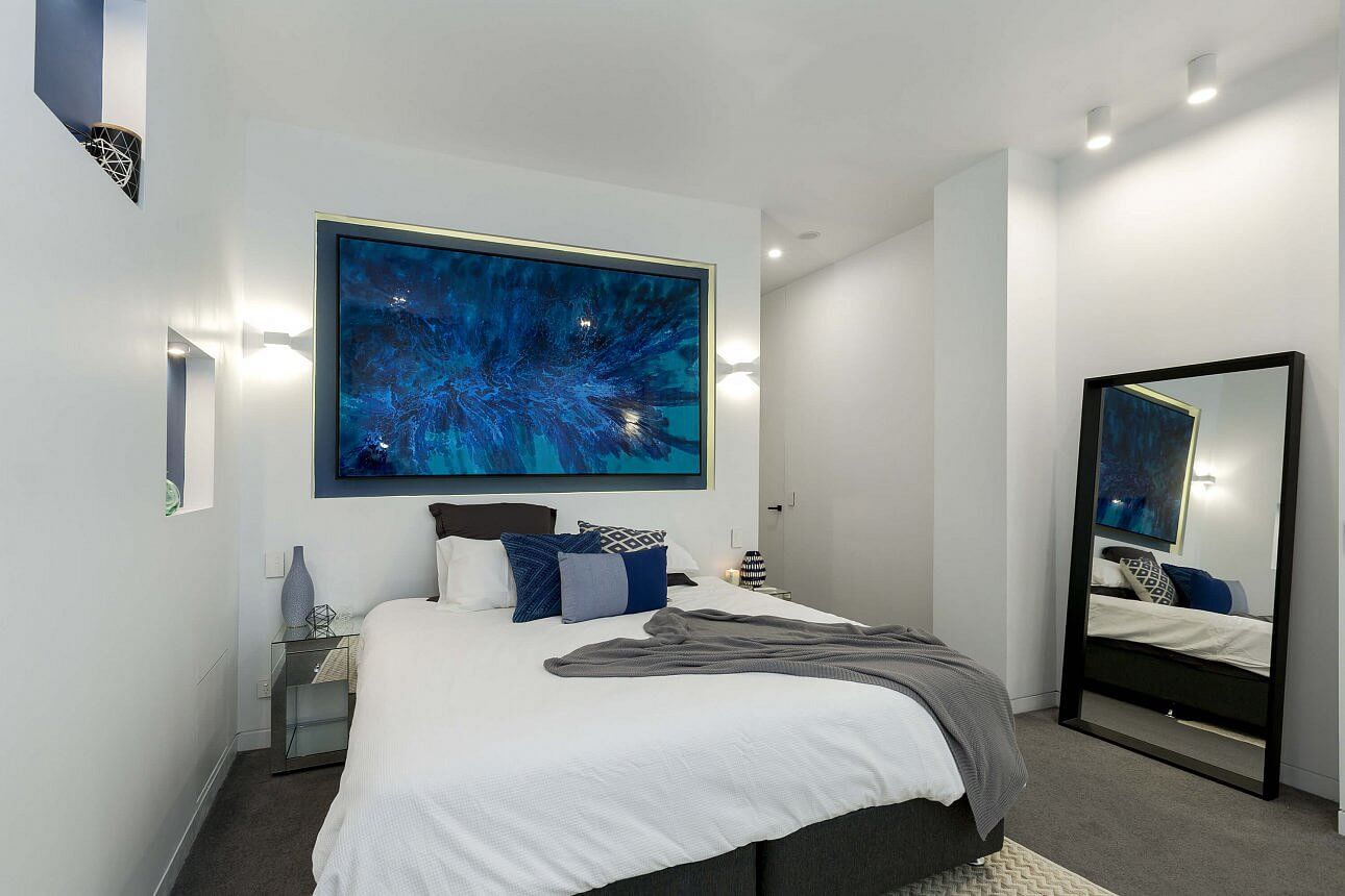
I always hang out to see what these 2 do. I just love their style. They put in BIG efforts every week and try to style up a storm. They seem to put in extra effort in the way of bulkheads, lighting, square set… They scored 26/30 this week. I love the feature wall – it’s different. It will look great in magazine shots. I’m not sure on the resale side of it though – maybe buyers won’t like the ‘fanciness’. Still, I think they are going places in the world of design outside of The Block.
…


Dan and Carleen
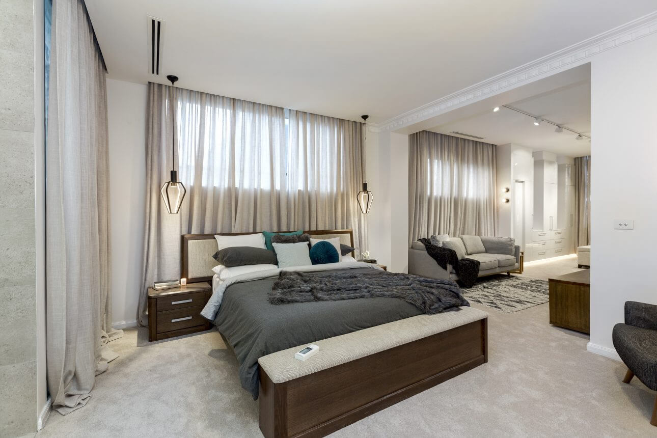
Dan and Carleen scored 24.5/30 this week. They really have stuck with the art deco theme through the home. It’s not my favourite (maybe because it’s just not something I’d chose for myself). I do think they have carefully considered all elements in the room, but I can’t warm to the pendants or bedside tables. Too many bed pillows which give me heart palpitations. And the 2-tone curtains – oh. What do you think?
…
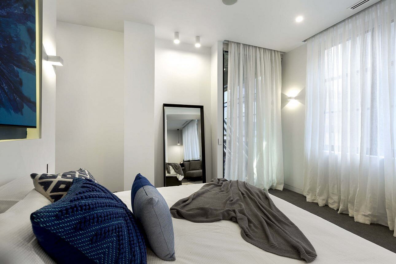
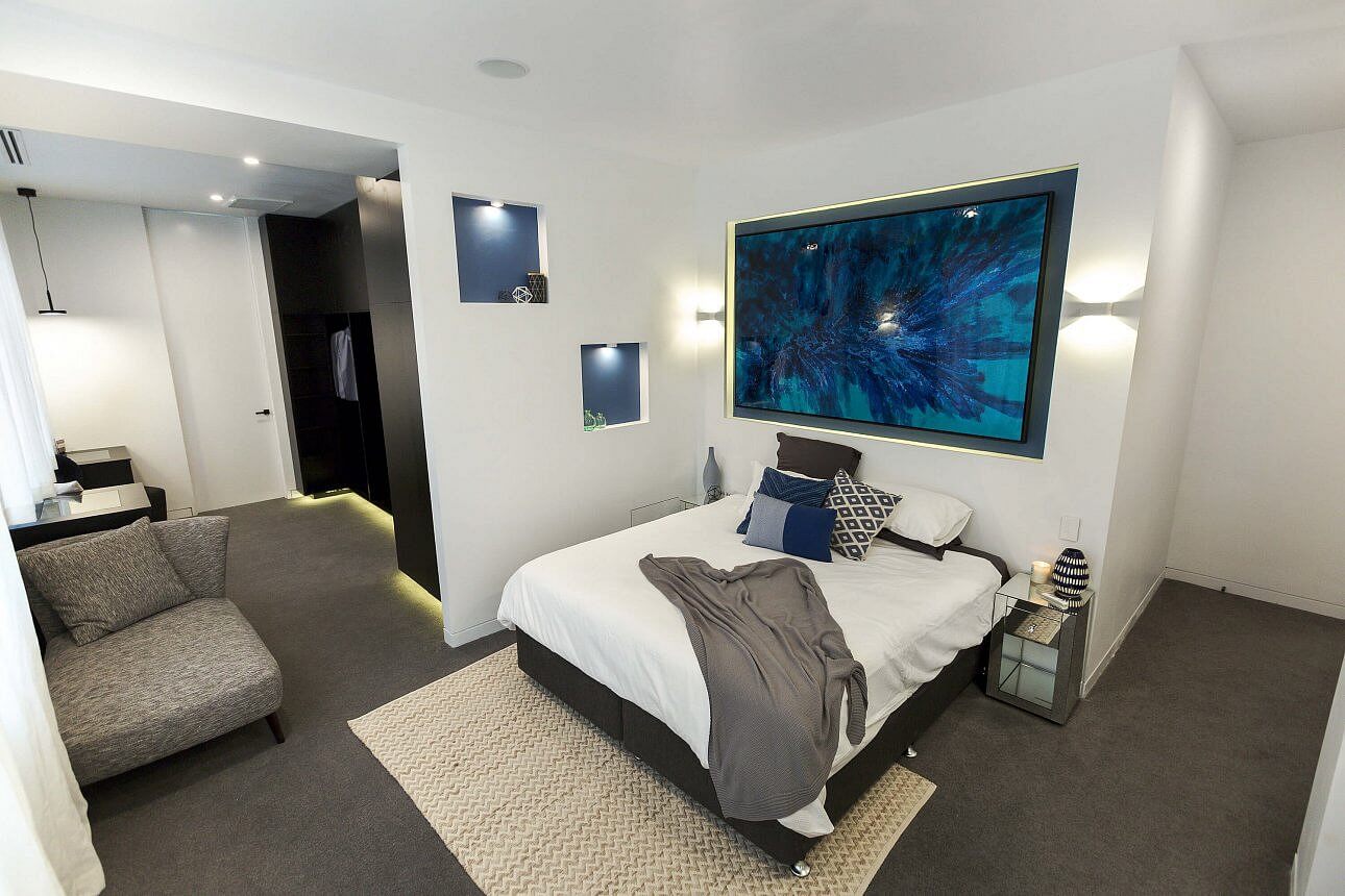
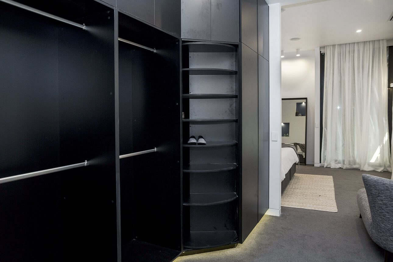

Andy and Ben
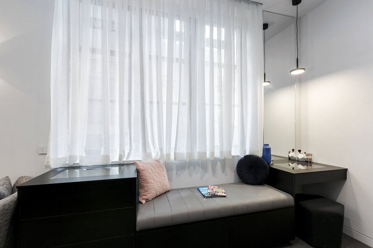
The boys were last this week with a score of 24/30. This room felt very underwhelming and I hated it. Nothing seemed to match at all. The bed was small, the floor rug was wrong and side table were tiny. It doesn’t look like a Master bedroom at all. Shayna was in love with their shoe closet, but what the? Sorry guys, this was a fail for me.
…
What did you guys think of the rooms this week?
I have all the other reveals over here if you missed any.
♥ KC.
Be the first to read my stories
Get Inspired by the World of Interior Design
Thank you for subscribing to the newsletter.
Oops. Something went wrong. Please try again later.



Comments
Jessica Carter Malavin
They were all beautiful 🙂
Kerry Closter
Didn’t like the older couples art deco particularly the lights. thought the boys W’s underdone but no $. loved the timber feature wall and the girls want so pretty.
Cath
Didn’t like Chris and Kim’s room at all – it felt soulless, and yes that bed was hideous. The girls room was faultless so perplexed as to why they didn’t win – but guess Kim and Chris are the only couple that haven’t won to date so the judges need to give them a win along the way.
Kerry Closter
Seriously that older guy is a bit too aggressive and bossy.
Kim
The winning room was so underwhelming, the bed was hideous with its matching blanket box and ugly side tables. The walkin had another awful bench in the middle and the curtains in the walkin look terrible. I did however love the fire place and the space. I think the real winners were the girls, as they made no mistakes. Will and karlie’s bedroom was stunning, love the feature wall and those beautiful doors, the let down was the walkin with no hanging space otherwise I think they would of won.
Kim Susan Buggins
Will and Karli should of won! The winning room was so underwhelming with its ugly furniture?.
Sharon
Tasha and julia there room i felt should have won it was so sensual my type of room. The older couple are arrogant bullies i hope they learn they can’t treat people like that.