Morning bloggers! As the new year began, a lot of bloggers started to ponder and think about what direction they want to take their blog. I've been reading lots of your posts where you talk about new directions, feeling refreshed and excited about your blog for 2012. This is great! But have you thought about …
Morning bloggers!
As the new year began, a lot of bloggers started to ponder and think about what direction they want to take their blog. I’ve been reading lots of your posts where you talk about new directions, feeling refreshed and excited about your blog for 2012. This is great!
But have you thought about your image/brand?
Have you put your best foot forward?
Have you set yourself a blog budget?
Have you asked someone to critique your blog?
Do you wonder if some of your readers have moved on from you because they see you’ve lost sight?
These are questions we all ask ourselves. Don’t worry, it happens to lots of us.
The best blogs have a design that meets the needs of your reader. Uncluttered, directional and purposeful.
The best way to start making changes to your design is to think about your readers. Pick 3 people (real or imaginary) who you think would read your blog. What would they like? If you find it difficult to imagine who reads your blog, then ask some friends.
Critique is hard to take sometimes, but it’s helpful. I promise!
Blog Design Tips
1. Is your page polished and professional? Uncluttered? Do you have a theme of colours?
2. What layout are you using? Is everything grouped together? Do you have a spot for advertising? Or is everything thrown around? If your page is amateur, then unfortunately your blog will look amateur.
3. Don’t run with google images and standard template images. Try to be as creative as you can within your budget.
4. If your blog is a business, then invest the money in a good design that will stand the test of time and tell your readers that you’re serious.
5. Where are your subscribe RSS buttons? Do you want me to be a loyal reader? Then I need to be able to follow you.
6. Give yourself a tagline – it will tell your readers what your blog is about.
7. Do you have a photo of yourself? You must. I won’t read your blog if I don’t know who you are.
8. Does your background blind my eyes? Does your background load slow?
9. Do you have a search field? You must! This drives me mad if you don’t.
10. Do you have categories/labels/tags clear in the sidebar? If not, then you run the risk of losing readers. I may only come to your blog because I want to read about a few topics you write about. More than 25 categories is annoying though.
11. More than 5 photos in a blog post is too much. Most people only stay on a page for 1-2 minutes. This is a fact.
12. Turn word verification off. Self-explanatory. Turn it off people.
13. You’ll lose readers if your sidebar has more content than your posts. Cull it down.
14. Flashing stuff. I can’t read your post and concentrate if stuff is flashing.
15. Contrast your fonts with colours and sizes. It’s appealing and will highlight and point out various parts of your blog.
16. Don’t interrupt all of your posts with advertising.
Phew. Sorry for the overload. But I hope you can take away a few pointers for your blog design.
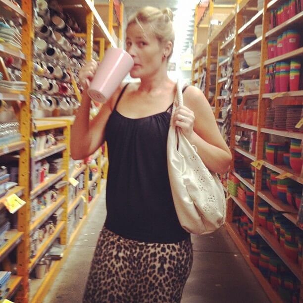
So, today, why don’t you grab a cup of coffee (yes, that’s one heck of a coffee cup!), sit down in front of your blog and go over the layout?
Ask some friends for advice. Ask a stranger for advice. Even ask your husband, mother, brother, what their first impression is…
Have a great weekend x
Be the first to read my stories
Get Inspired by the World of Interior Design
Thank you for subscribing to the newsletter.
Oops. Something went wrong. Please try again later.


Comments
Felicity
Fortunately I had one helluva designer help me with mine = happy days!
Katrina
Ha! Thanks Felicity 🙂
Cathy
Unfortunately, I have zero budget for my blog but will try and take all of the above on board! I’m probably guilty of too many photos in a post every once in a while – I’ve written some epic posts lol.
Katrina
But that’s still ok if you have no budget! You don’t have to have the fanciest blog – just appealing to your readers 🙂
le@third
all very sound 🙂 will go and self critic now 🙂 le xox
Tam
I found it really useful to write down the design features I love in other people’s blog and then incorporate them into my own design. I used online tutorials to learn to do all the tweaking myself so I didn’t have to hire in help. You don’t have to be a pro or have lots of $$ to have a nice looking blog (but I’m sure those things do help too!!)
Katrina
That is a really great idea Tam. That’s how I started out too.
Sarah
My concern is that mine’s too bright, but I really like the colours!! Any chance you might want to have a look & see if you think I’m doing ok design-wise?
Katrina
Hi Sarah, your banner is great. Love the colours. The background is a little busy. Only because when I scrolled quickly the spots made my eyes flicker. 🙂
Sarah
Ooh I see what you mean when you scroll quickly, I didn’t notice that before, do you think it would be better if I remove the little spots?
And thank you for the super quick reply 🙂
Katrina
I probably would. You could put a border around it in one of the colours. Or if you like a background maybe a little more subdued, or a solid colour. X
nellbe
Great tips 🙂 But I think the most important question is where is that coffee cup from?
Katrina
It’s a beauty isn’t it? It’s from Sam’s Warehouse.
nellbe
Great! Thanks for letting us know 🙂
Penny
And that, my love, is why you do all that fabulous stuff for me!! xxx
Katrina
Awww thanks!
Kek
The money I spent on my blog design was well worth it. 🙂
I’m taking your other tips on board….doing some thinking about direction and ideal readership etc at the moment, so they’re going to be helpful.
BB
A little bit stuck on number 11. I do try to keep it to 5, but seriously – totally hard to do!!!
Would love a professional opinion on my place…
🙂
BB
Katrina
hi lovely, your photos are always great. But I am a fan of white all through the middle. Easier on the eye for the majority 🙂
BB
I know, I know. Have had it that way, but the deep grey makes the colours ‘pop’ so nicely… Might try it white again soon.
🙂
Trish Blair
Hey Katrina!
Just found your blog, thanks for the great tips, I definately put too many photos on – whoops! Bit too snap happy!
Katrina
That’s ok! 🙂
A-M
Some of my posts are too photo heavy…. and I need to tidy up my sidebar….food for thought Treens. Great post! A-M xx
Katrina
yours in fine A-M!
Jane
Oh Katrina! I’m so grateful for all the help you’ve given me. Any tips? I’m wondering if we should shrink my banner photo as it’s so huge ‘above the fold’. J x PS Will get back to you soon about adding some extra pages tabs at the top.
Amanda
Great advice Katrina. I too like uncluttered blogs, with simple posts and not too much of a photo overload 🙂
designchic
Now I’m going to have to check and recheck my blog to see what needs to be corrected. Thanks for all the tips!!
kylie
HI Katrina – fantastic tips – thank you – love reading your blog and facebook page – I am constantly looking over my blog and tweeking it – would love to hear some feedback from you – only if thats ok – hope you are feeling well these days xxoo kylie
Loldri
Thanks for that list, there some great tips there.
I have 1 tip for you, the icons you use on the lower left (email/twitter/facebook etc) are really nice additions but they do cover up the text when reading and the text in this box when typing, just something to bear in mind.
Katrina
Thanks Loldri, are you reading me on a phone? You should be able to switch me to mobile mode down the bottom. 🙂
Dagmar ~ Dagmar's momsense
Hi Katrina,
theses are great tips! I think I’m following most of them already, but I’m also currently working with a blog designer to overhaul my blog’s look. I can’t wait to finally reveal it!
I’ll have you take a look at it when it’s finished 🙂 Would love your thoughts.
Dagmar
Jessica
Thanks for that advice! I have definitely done a bit of tweaking especially with the photo and name… no more anonymous blogger for me.
Love reading your posts! X
Janey Smith
Thanks for the info, good blogging tips! like it:)
Faux Fuchsia
This is so interesting. I’m side bar heavy and post photo heavy but won’t be changing either! I used to have categories but dumped them yonks ago. I often think about what makes a blog popular. My personal things I don’t like are lots of writing, regurgitated content and blatant copying of someone else’s “voice”. I LOATHE word verification too. Keep up the good work x