Hello! Thanks for stopping by today. Sadly I don't have any awesome design photos to show you today... Just a few red-hot-mess ones from the final (thank the lord) backyard reveals on House Rules. To be fair, there were a couple of OK design elements here, but mostly I can't even look at them. I …
Hello! Thanks for stopping by today. Sadly I don’t have any awesome design photos to show you today… Just a few red-hot-mess ones from the final (thank the lord) backyard reveals on House Rules. To be fair, there were a couple of OK design elements here, but mostly I can’t even look at them. I know, I am being sooooo mean. I really did try through the show to be nicer, but it’s an actual “design tv show with judging” so really they are asking for us to critique EVERYTHING. Yes I know, I know, they get a renovated house for free and it’s better than what they had, but sttiillllllll…. it’s so hard to stomach all the wasted money and non-design! Anyway, let’s check out the final photos of the backyards and you can make up your own mind…
Kim and Michelle’s Exterior
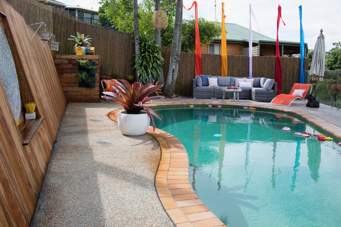
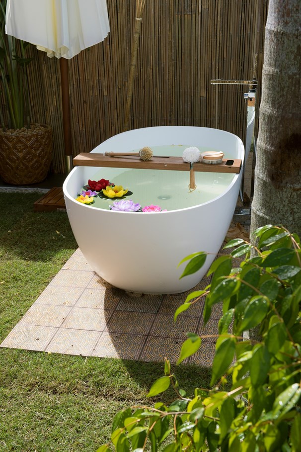
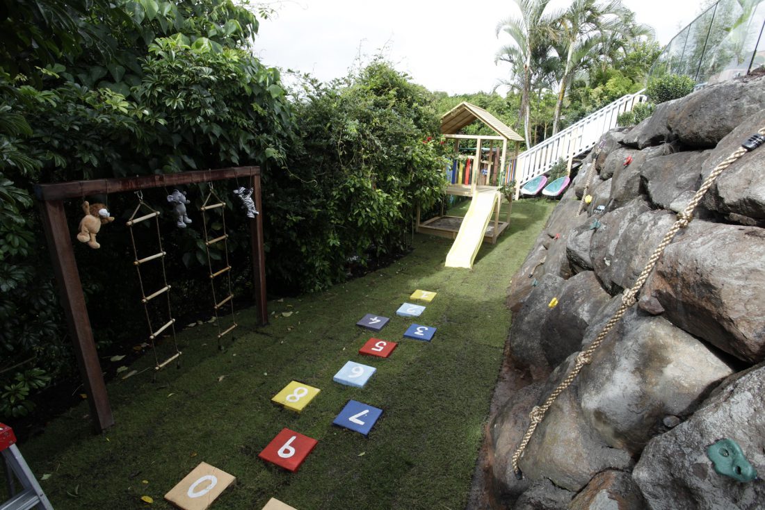
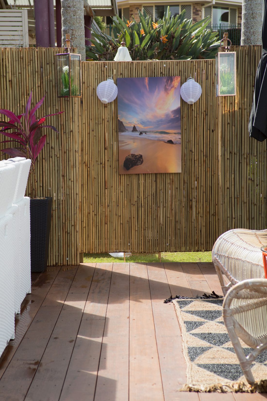
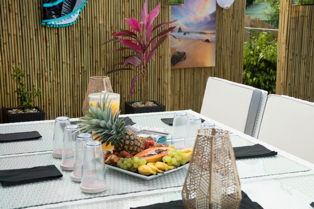
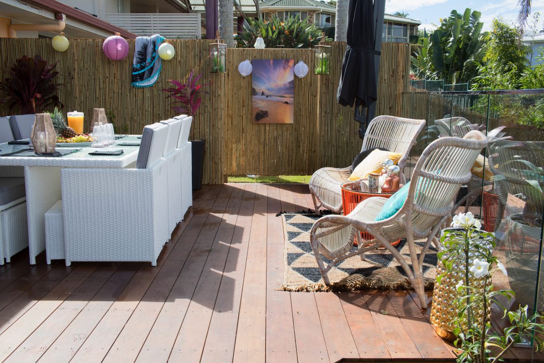
I was a little shocked? What is this space?? Where do I start. It’s actually awful and so tacky. There are so many THINGS everywhere. Flags, chairs, inside artwork (outside), lanterns, rugs…. AND A BATH?? WTF. Sorry, but that’s just wrong. I mean, WHO IS HAVING A BATH OUTSIDE? And do they even sell floating plastic lilies anymore? I am a very practical person and I like things for their intended purpose. SO, I hate plates on the walls, cushions stacked on the ground, indoor furniture outside, chairs in bathrooms (I could go on)…. #intendedpurpose I just like to see things used as they are meant to. There is no WOW factor here with the bath outside. It’s just odd. Every single thing here will get wrecked and damaged. There is a thing called “the weather” and there is no way I’d be interested in putting lanterns/cushions/rugs/artwork in and out every day. And so much bamboo screening. Cheap option I get it. I did it once in a house in 2005 and it lasted 3 months and it was a wreck. Anyway, good luck with it all….







Jess and Jared’s exterior
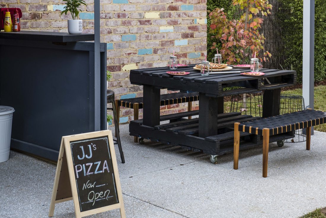
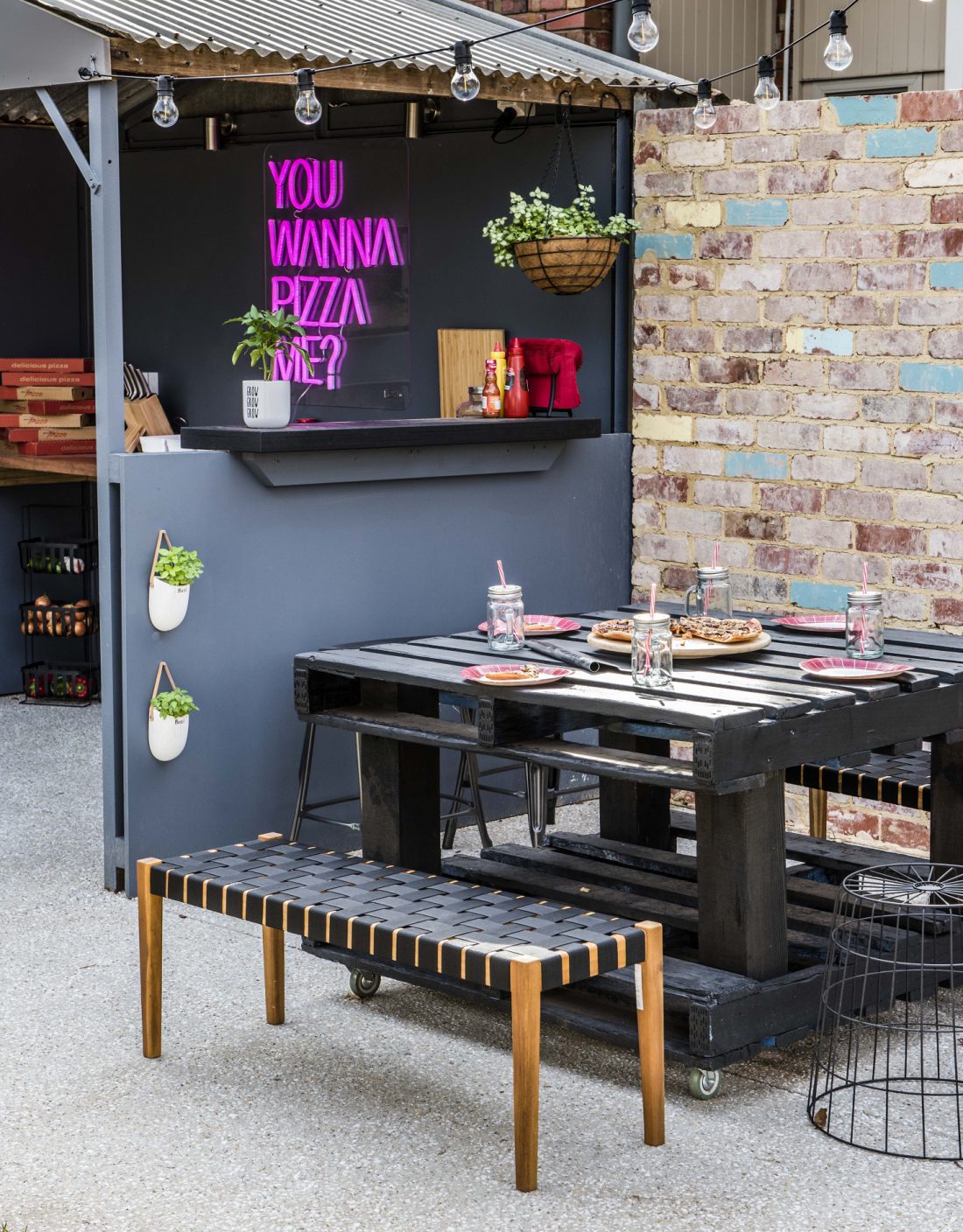
Initially this looks pretty cool doesn’t it? I like the pizza idea and the neon light and the moody colours. The graffiti is awesome too. I like that! But again I have some issues. I cannot even stand the pallet outdoor table. You won’t be able to sit at that comfortably. Your shins will be very unhappy. Don’t forget to lock the castors in place either or you’ll be chasing your pizza around. There is so much use of the decking. I get that it’s more efficient and quicker than pouring concrete, but the maintenance will be horrendous. Again, there’s so many inside pieces of furniture sitting outside (like dining chairs!). Where is the shade?? The raised decking/dining space would never get used at my house unless we all wore hats and sunscreen and the temperature was 21 degrees and there was no rain or wind. Not practical. I do like the fire pit though. I could have one of those at my house. It works well in this space. I also love festoon lighting, so this space overall wasn’t too bad.
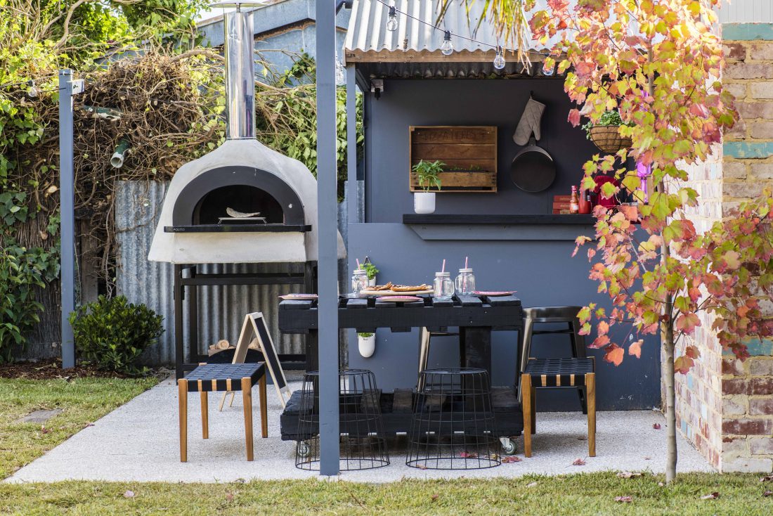

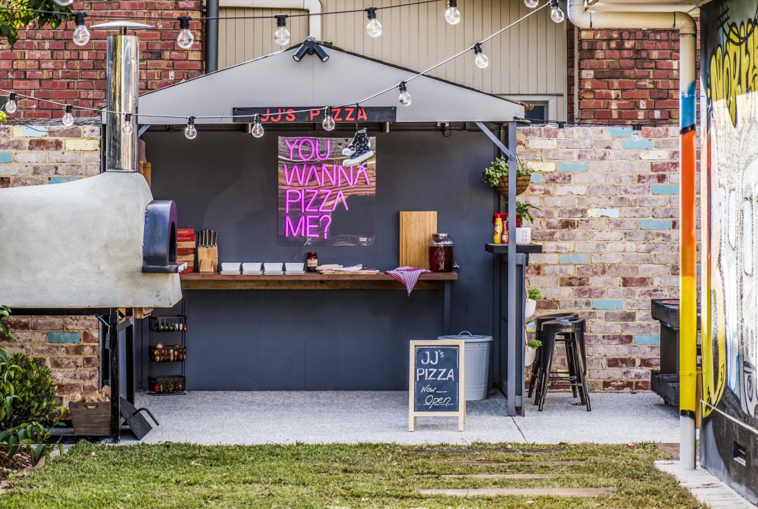
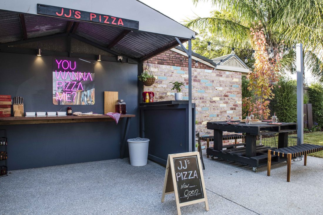
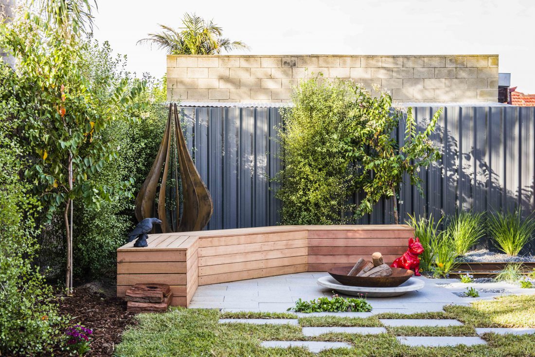
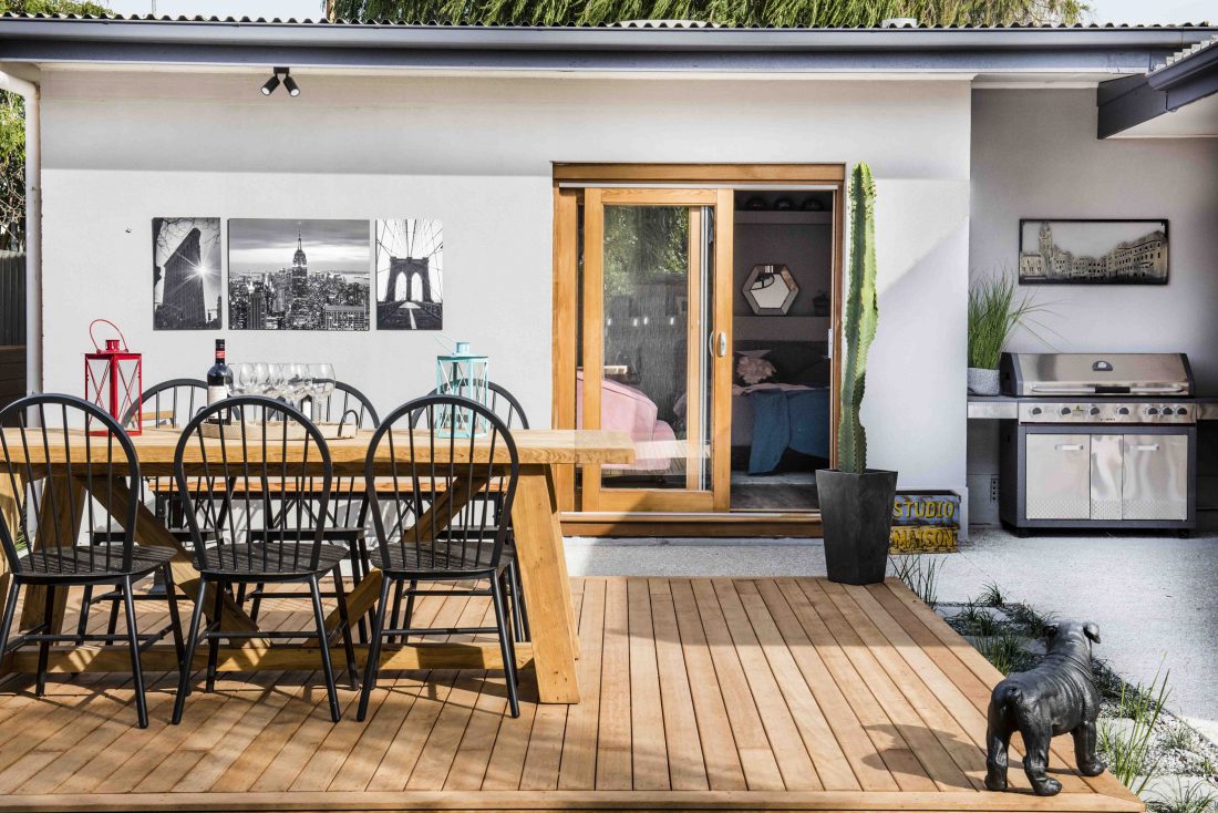
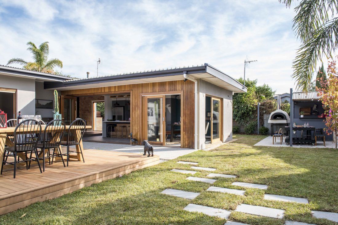

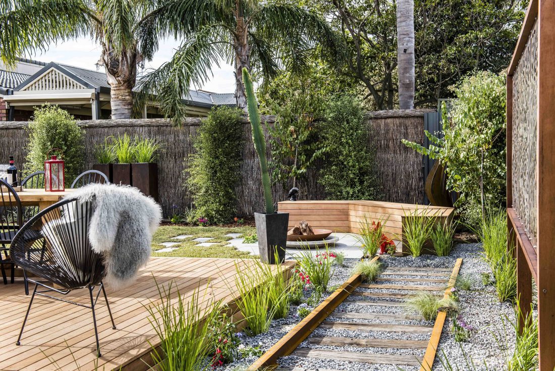

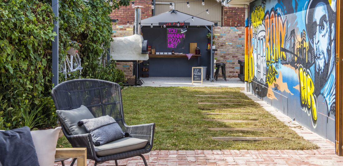

This week really has done me in. That’ll do me. Let it end now pretty please. But hopefully when they go back and fix a few rooms up we’ll see some more practical things.
What did you think??
You can see the previous renos here and meet the contestants here.
♥ KC.
Be the first to read my stories
Get Inspired by the World of Interior Design
Thank you for subscribing to the newsletter.
Oops. Something went wrong. Please try again later.





Comments
Donna
I sooooo Agree. It’s all so bitsy with stuff everywhere and lots not suitable for outdoors. What a waste of time and money. There’s really no excuse when Houzz and Pintrest have thousands of pics to inspire. They needed to spend up on a few quality pieces.
Alison
I so agree. So much crap, looked like they went ballistic at the $2 shop and spotlight.
Who has the time to bring things in and put them back out all the time? I was looking at those clearly indoor chairs wondering how long they are going to last in the weather?
Just not inspired at all
Nicole McDonnell
I can’t believe the judges liked the “Bali inspired” disaster. Only one word for me TACKY!!!!! Just been to Bali….. oh the gorgeous things they could have done!
Alison
And if we’re talking practical, imagine having to power wash the tanon leaching out of that decking wall along the pool. Did you see the mess it’s left already?
rhiannon
I was screaming at the TV when the judges were praising the Bali themed garden. It was horrid! And the only thing the homeowners were unhappy with were the paper lanterns – DID YOU LOOK AT THE REST OF THE HOT MESS??