When I share plans online I get lots of messages about bedroom positions. As in, the comment is to have the master on the back, not the front. This plan might suit? However, I am sure some will hate the kids on the front! Unless you have big land space, then more than likely you'll …
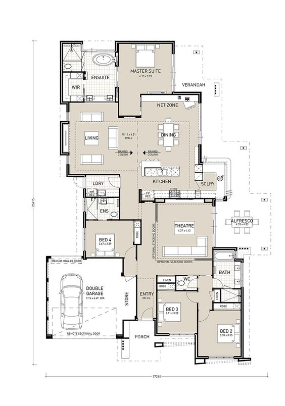
When I share plans online I get lots of messages about bedroom positions. As in, the comment is to have the master on the back, not the front. This plan might suit? However, I am sure some will hate the kids on the front! Unless you have big land space, then more than likely you’ll need some of the bedrooms towards the front of the house.
I really like this plan. I found it here on Pinterest and it links through to this building company but I can’t find it specifically in their list of homes.
It’s a pretty big house. Bedroom 4 has an ensuite. The Alfresco is off the Theatre which is different. You could extend or even move it around to the dining. But the scullery has some cool bi-fold windows.
The raked ceiling in the living would be stunning.
What about the laundry position?
There’s a lot to look at on this plan. Tell me what you think?!
You must check out all of my other favourite floor plans (there’s so many!).
KC.
Be the first to read my stories
Get Inspired by the World of Interior Design
Thank you for subscribing to the newsletter.
Oops. Something went wrong. Please try again later.



Comments
Dan
I quite like this one, I’m pretty sure it is just a variation of the Bel Vue.
https://www.pindanhomes.com.au/home-designs/bel-vue
Antje
Really like this plan, I think it’s even better than the newer version (the Bel Vue at Pindan Homes). Especially the scullery that can double as a bar for entertaining, the door in the master bathroom and the private verandah are beautiful features. I would add a pantry in the scullery though and make the walk in robe in the MBR bigger 😉
Thank you for this plan and Greetings from Germany!
Antje