Oooo don't you just LOVE kitchen week on The Block? Last night the contestants smashed out some amazing work. Looks like black is a winner! I am in love with Will and Karlie's masterpiece. Come and take a look at what they achieved. No expense was spared with the girls having at least $90,000 worth of …
Oooo don’t you just LOVE kitchen week on The Block? Last night the contestants smashed out some amazing work. Looks like black is a winner! I am in love with Will and Karlie’s masterpiece. Come and take a look at what they achieved. No expense was spared with the girls having at least $90,000 worth of appliances alone in their kitchen! Woah!
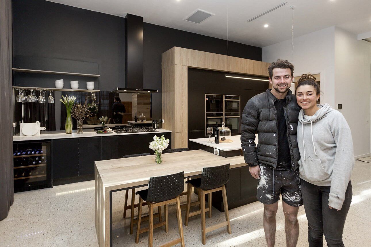

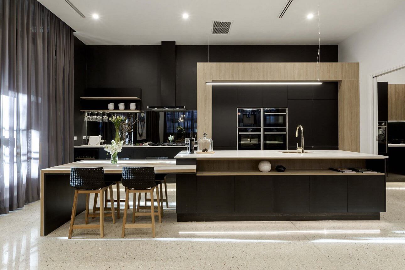

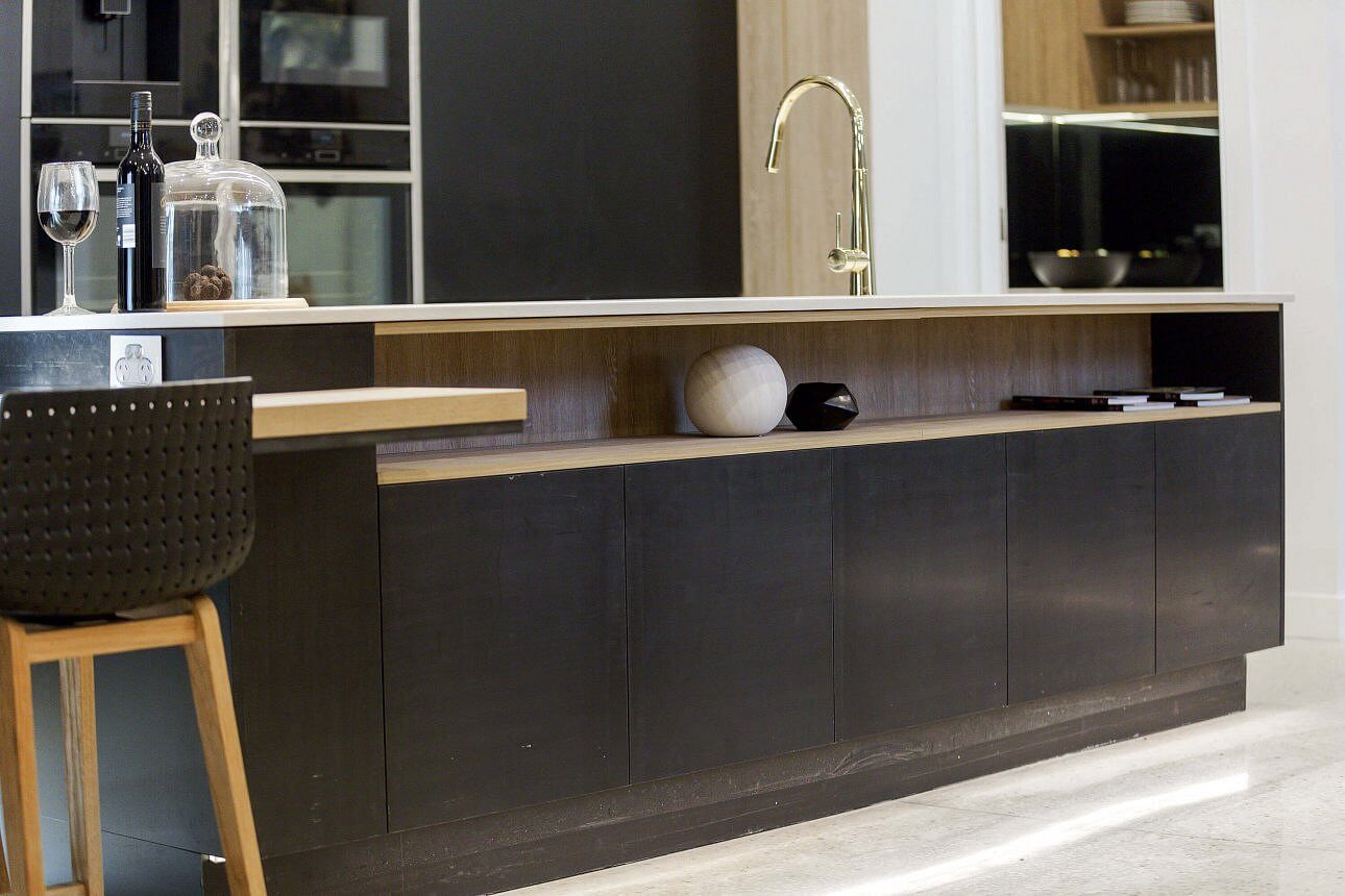
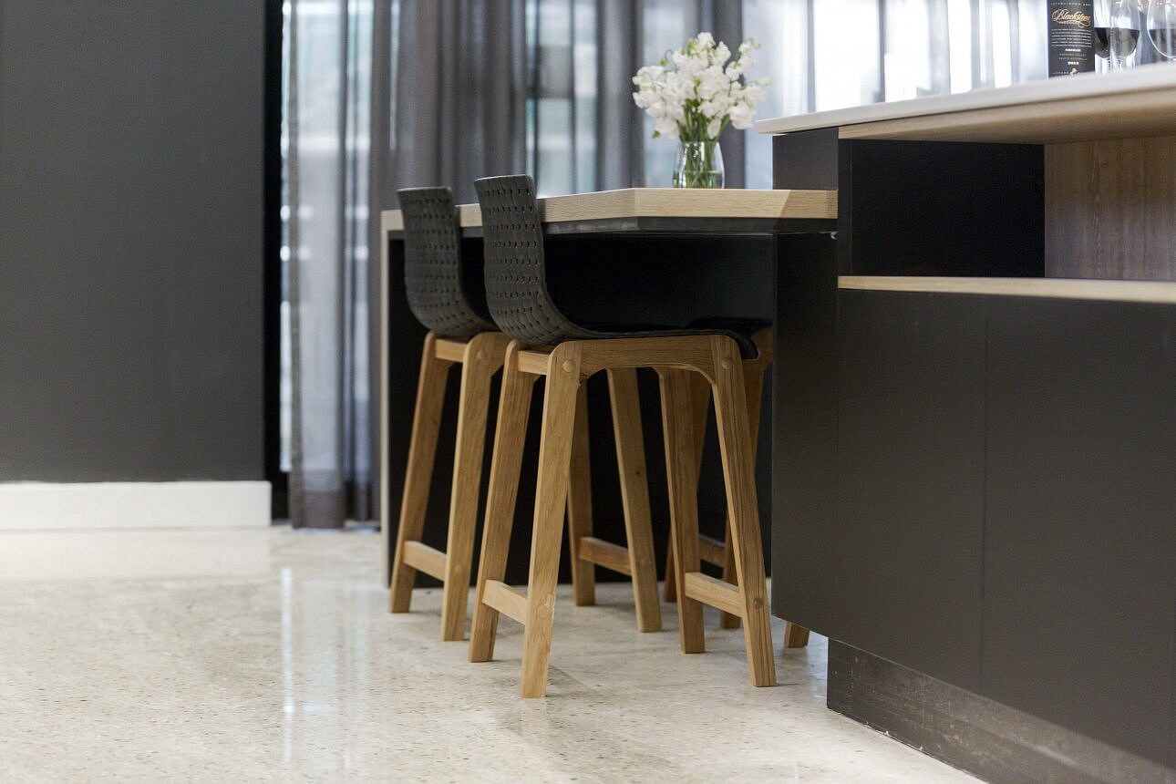

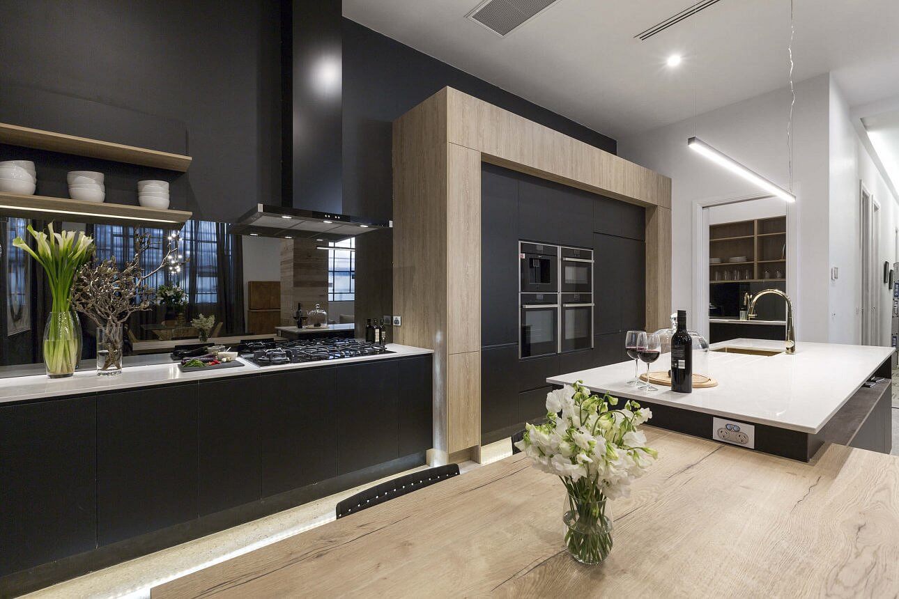
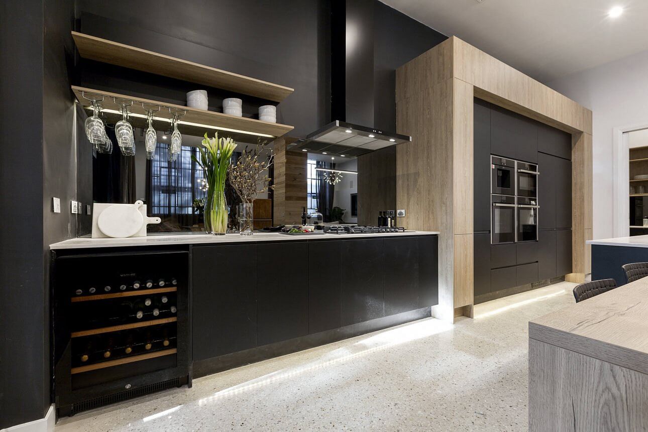
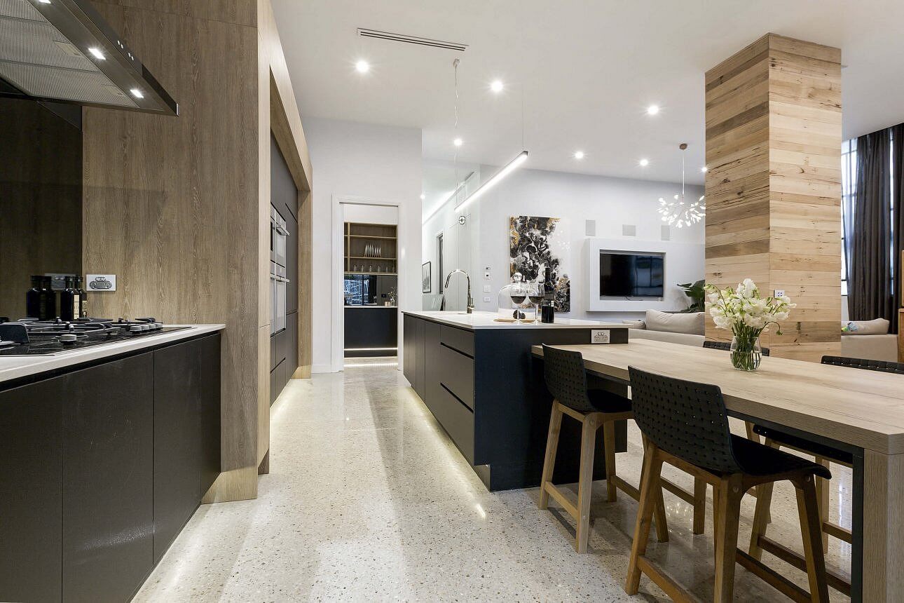
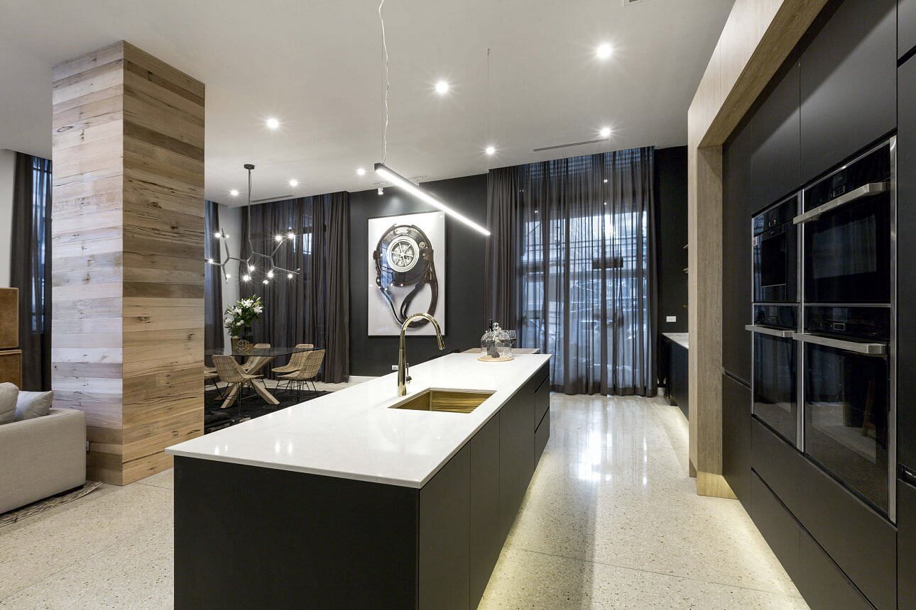
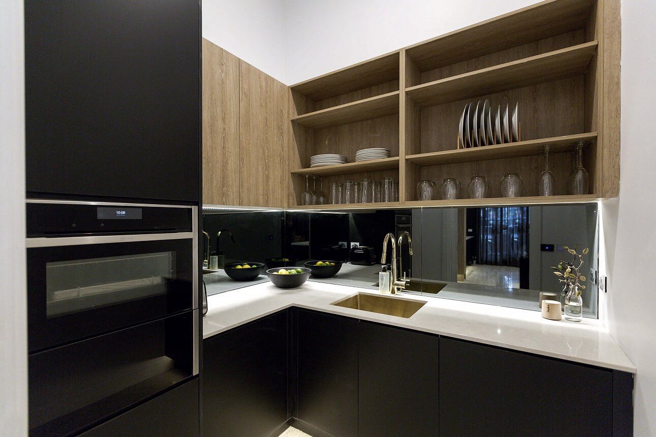
Will and Karlie
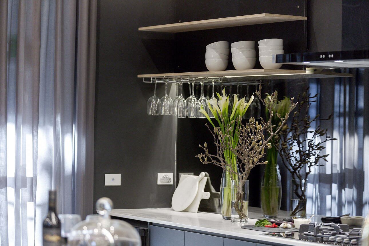
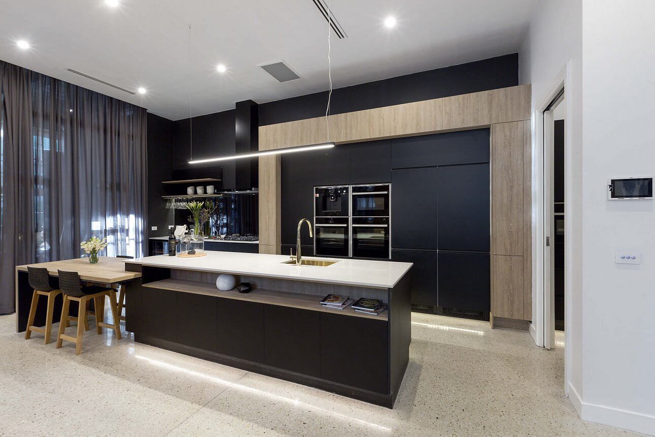
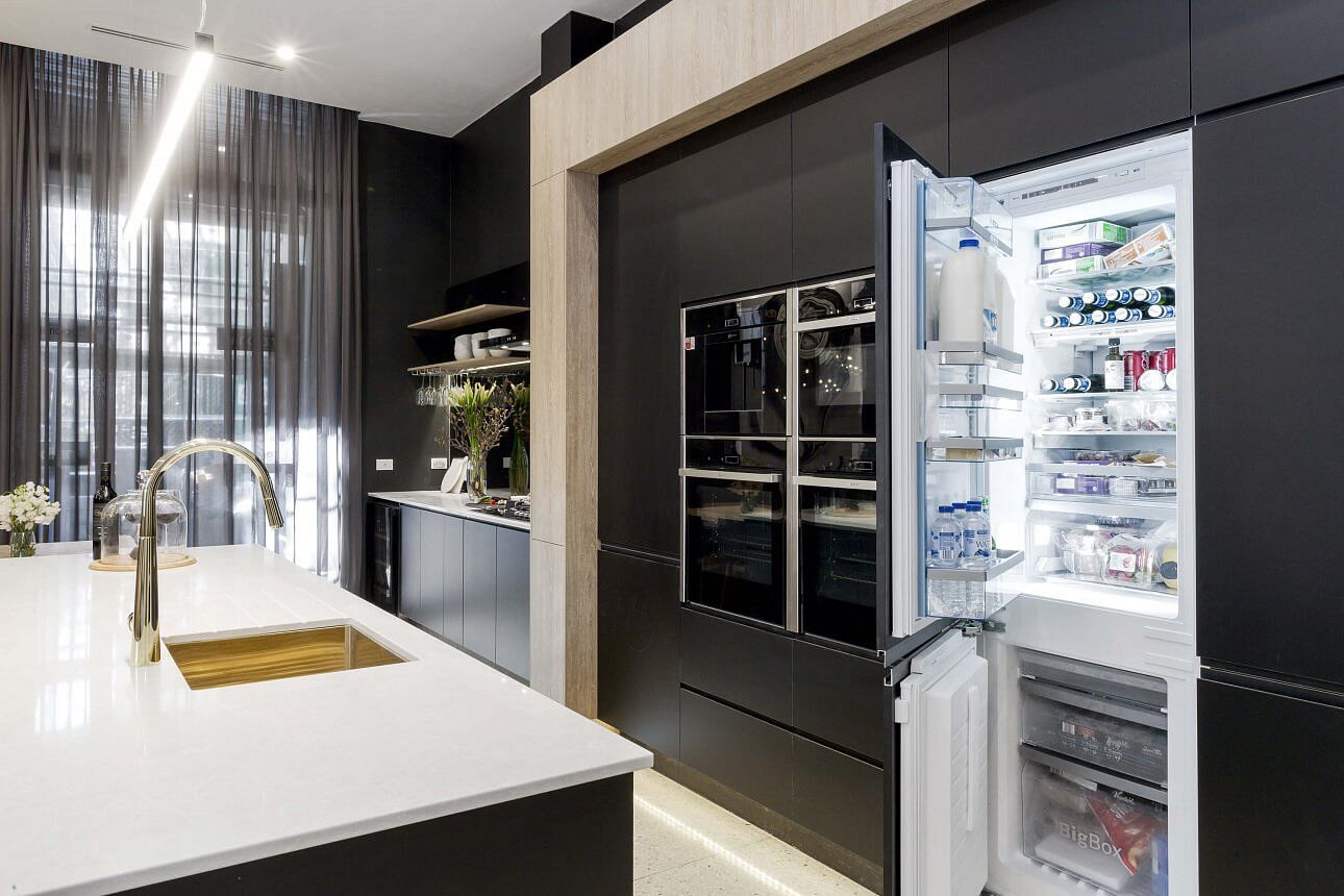
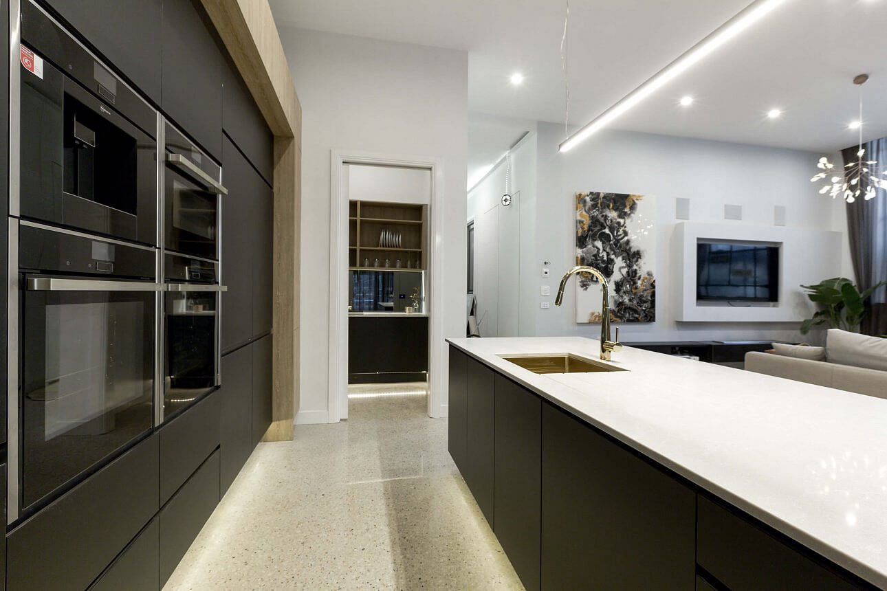
They did not disappoint with a perfect score this week of 30/30. Their trademark dark colours and timber combo came up stunning! I knew their kitchen would work well with the rest of the house. The floor lightens the space and I love it.
…
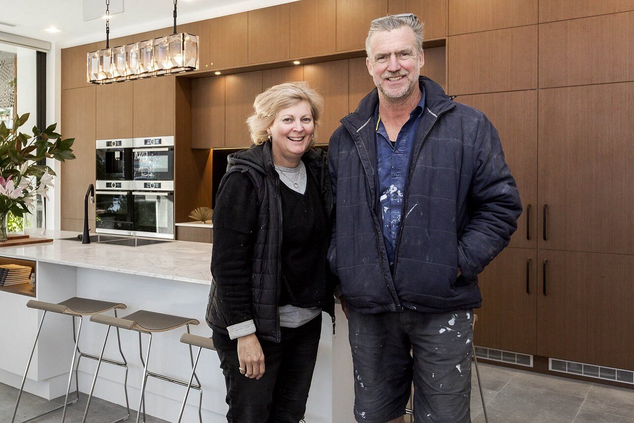
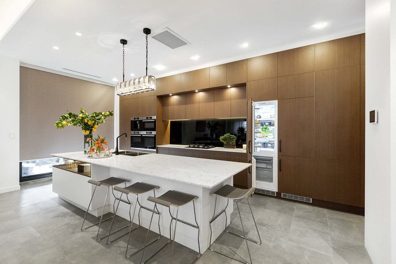
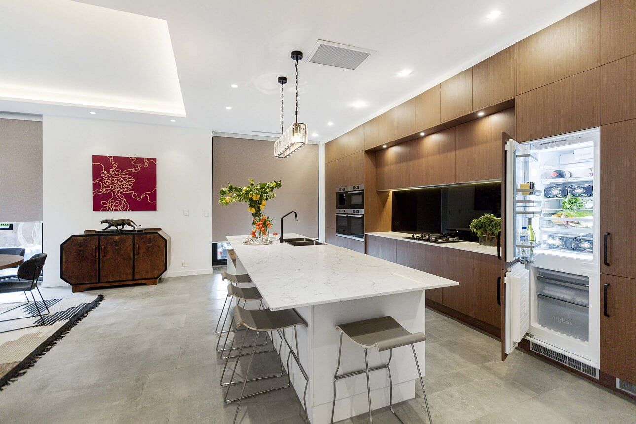
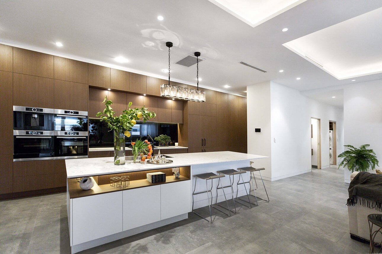
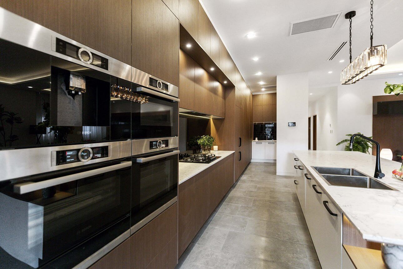

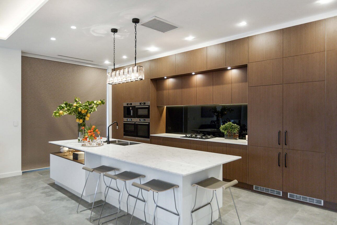
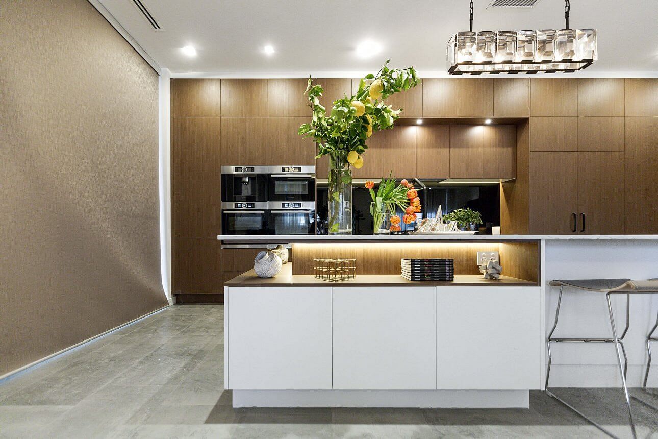
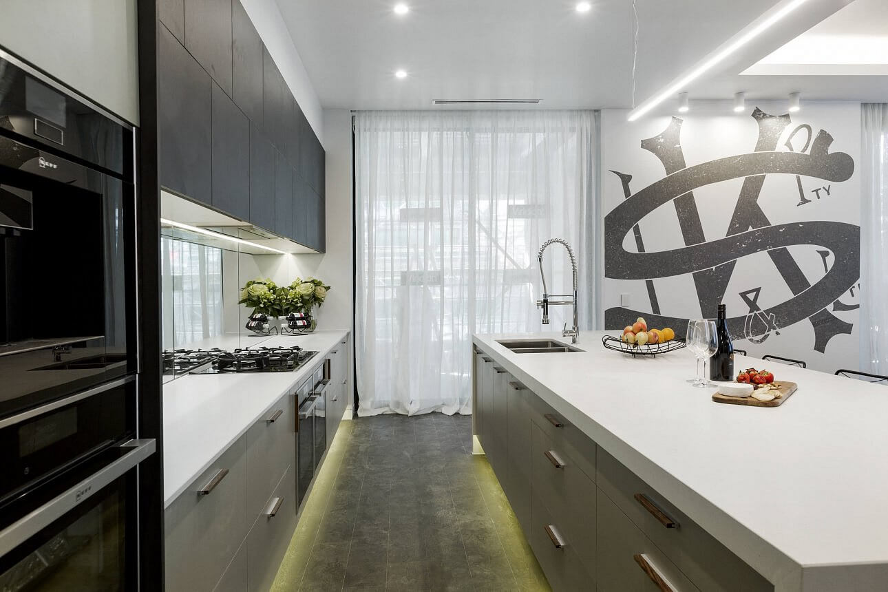
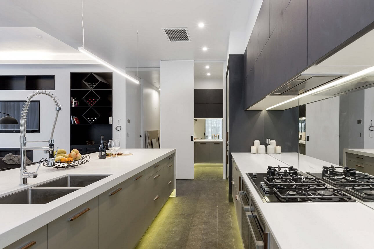
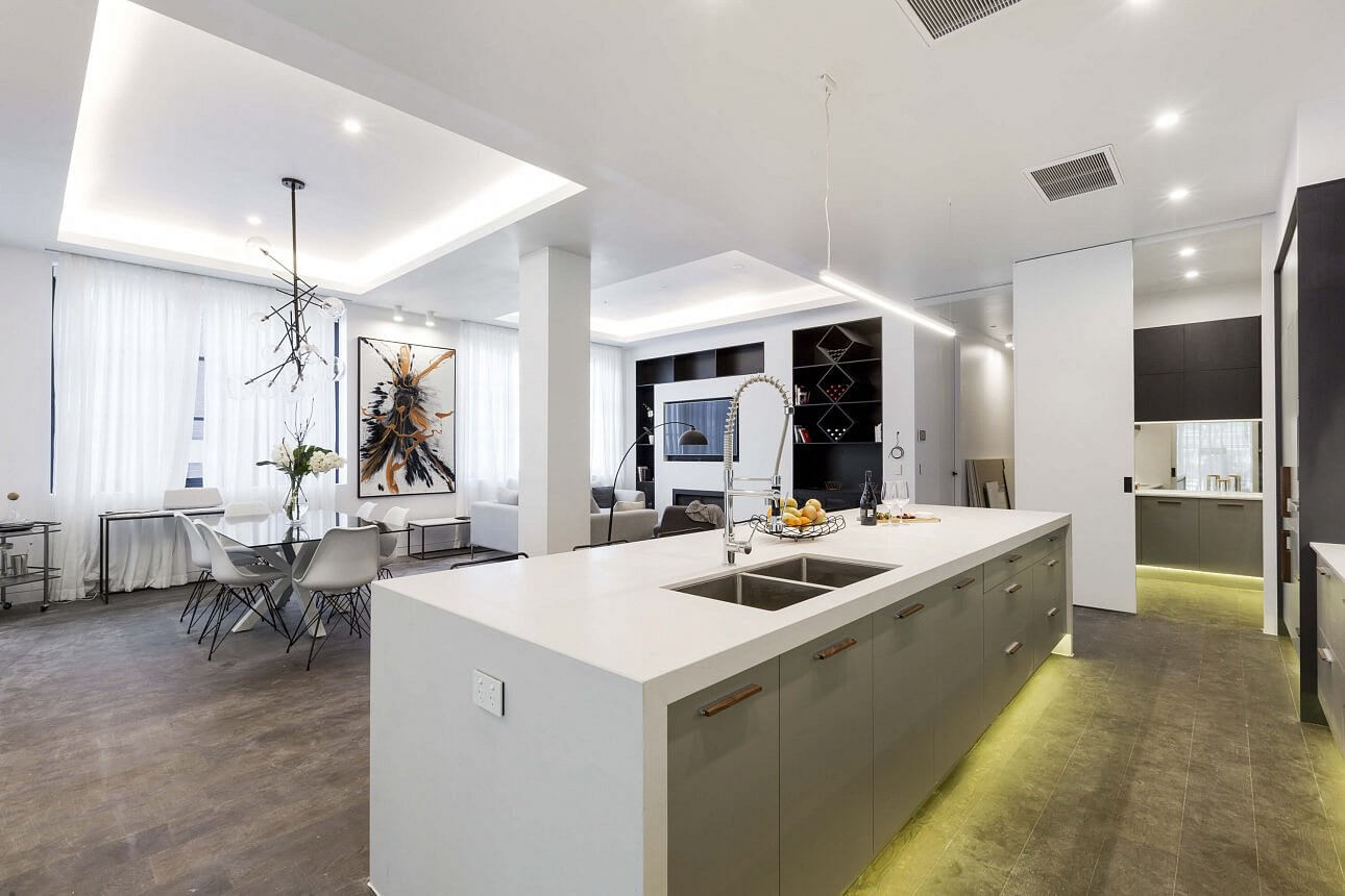
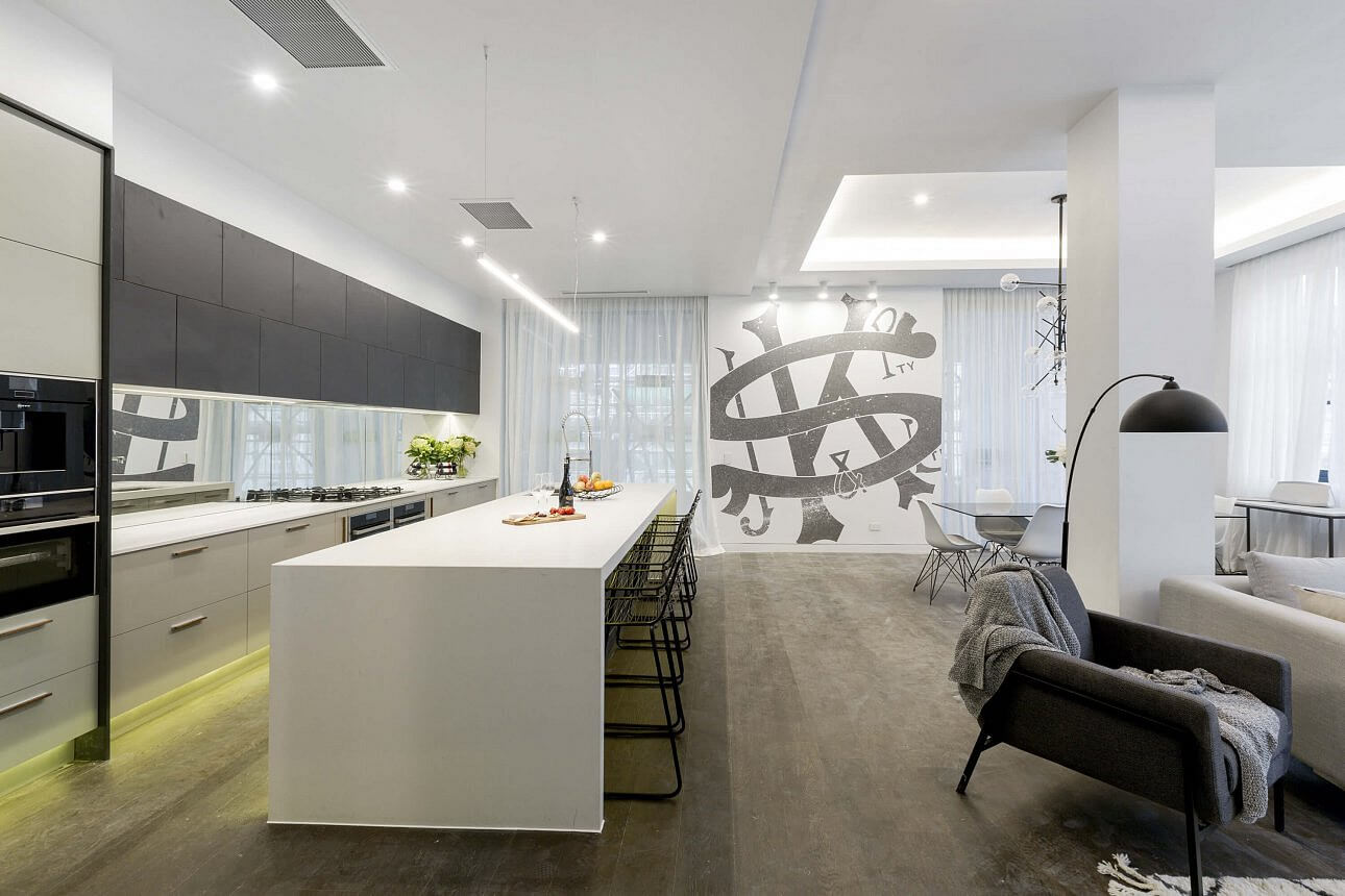
Dan and Carleen
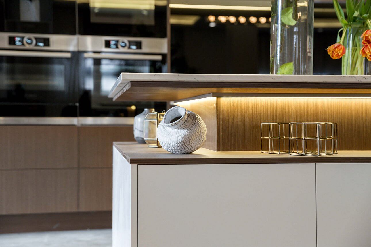
Dan and Carleen also scored 30/30 from the judges. Not my favourite and I just don’t know how they also got a perfect score. I think you’d have to agree when you look at some of the others below? That art deco theme really got them again didn’t it? The grey tiles and the brown cabinetry wasn’t working for me.
…


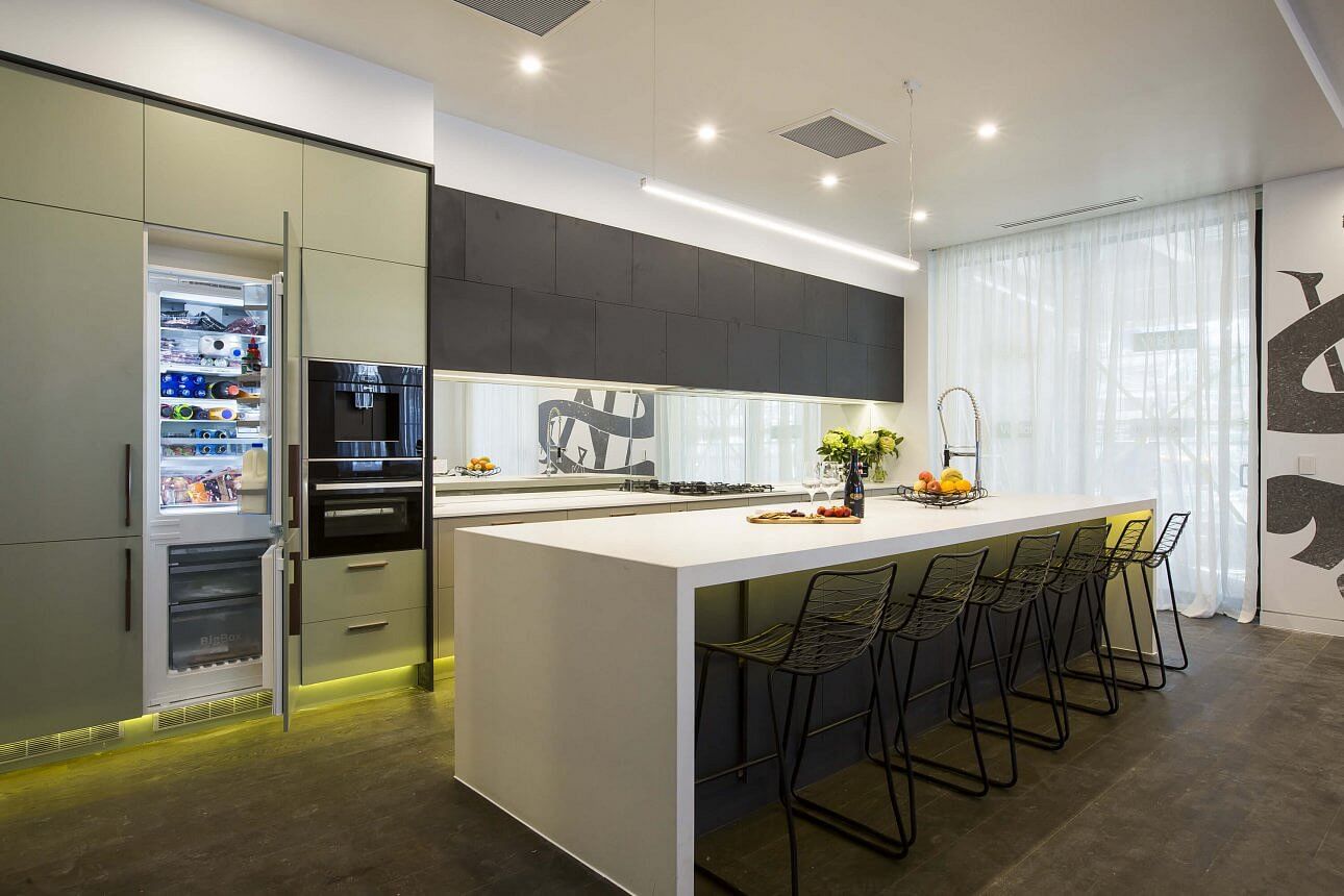
Ben and Andy
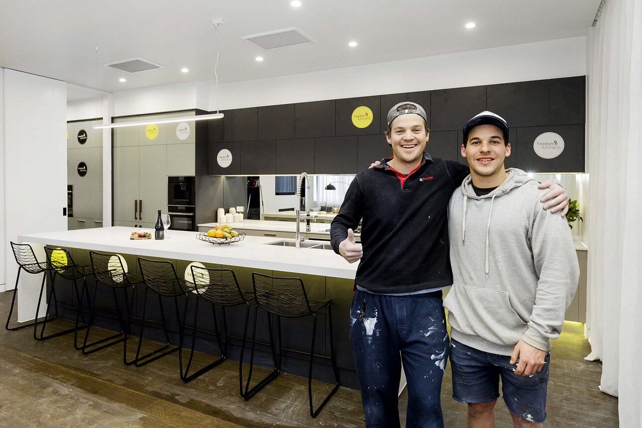
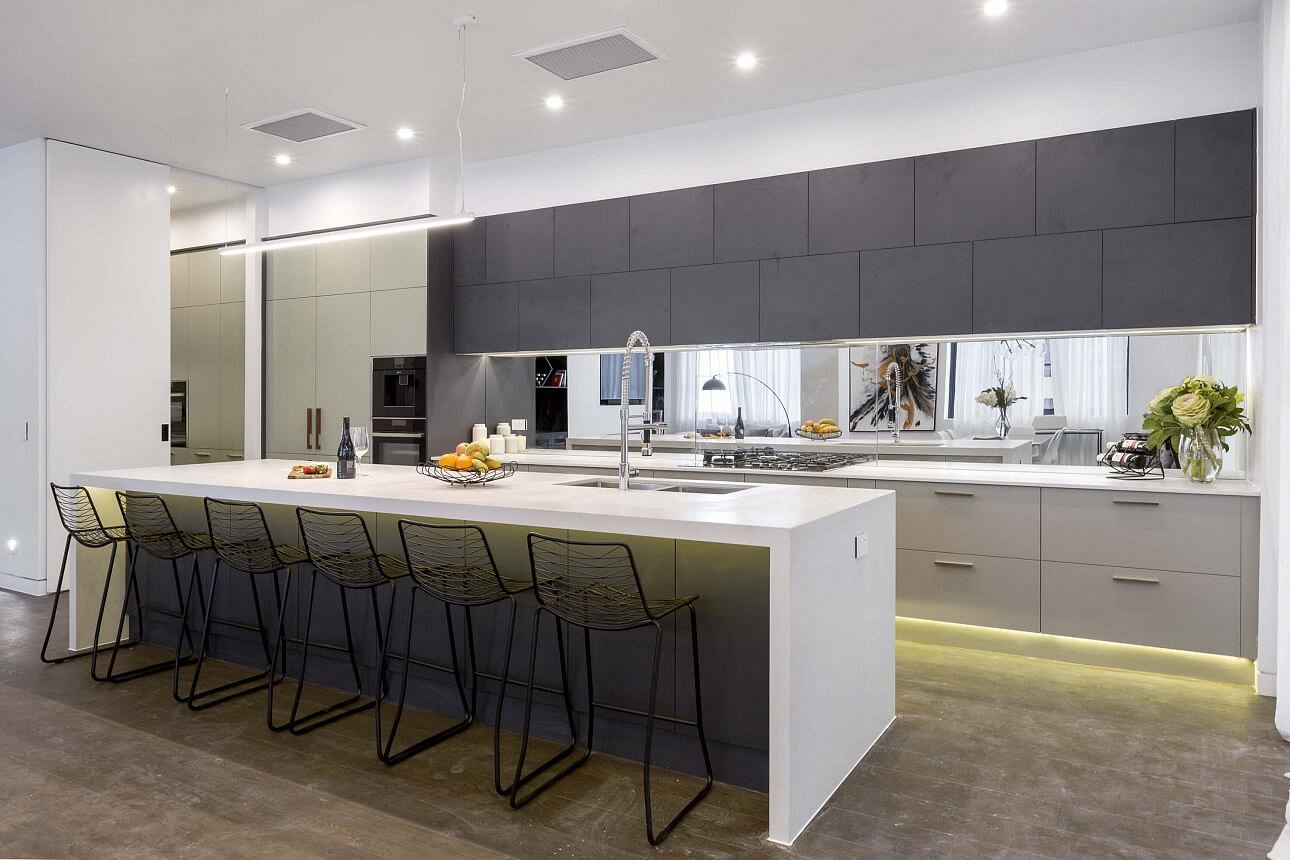
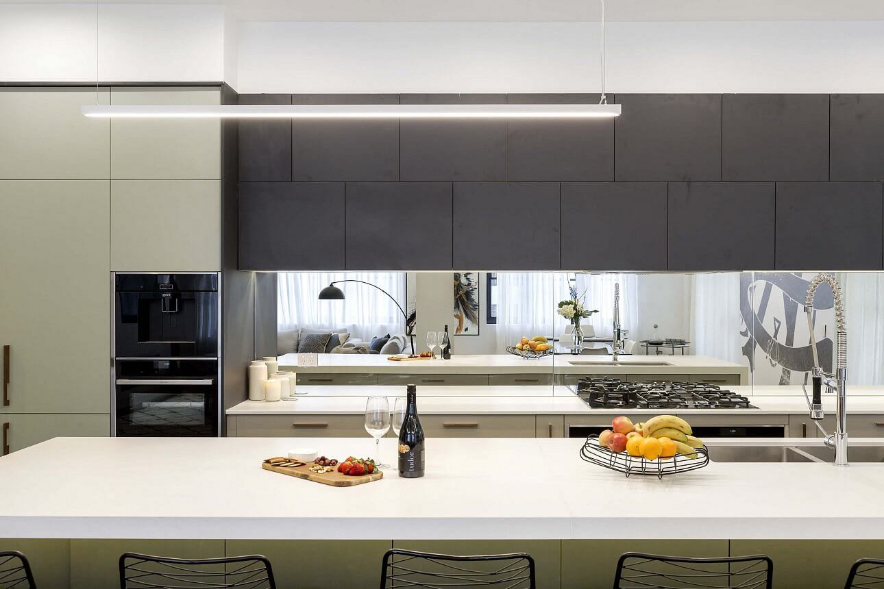
I quite like it. Not too fancy and was a pretty safe layout. I like the overhead cupboards and the mirror splashback is good. I like that they carried the green from the laundry in the the kitchen too. They scored 29/30 (but used their bonus point).
…
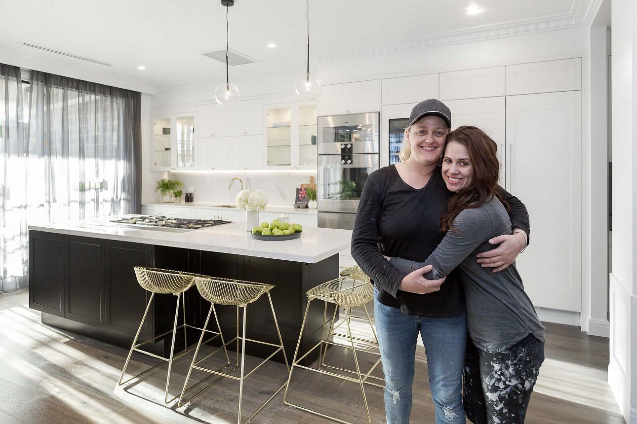
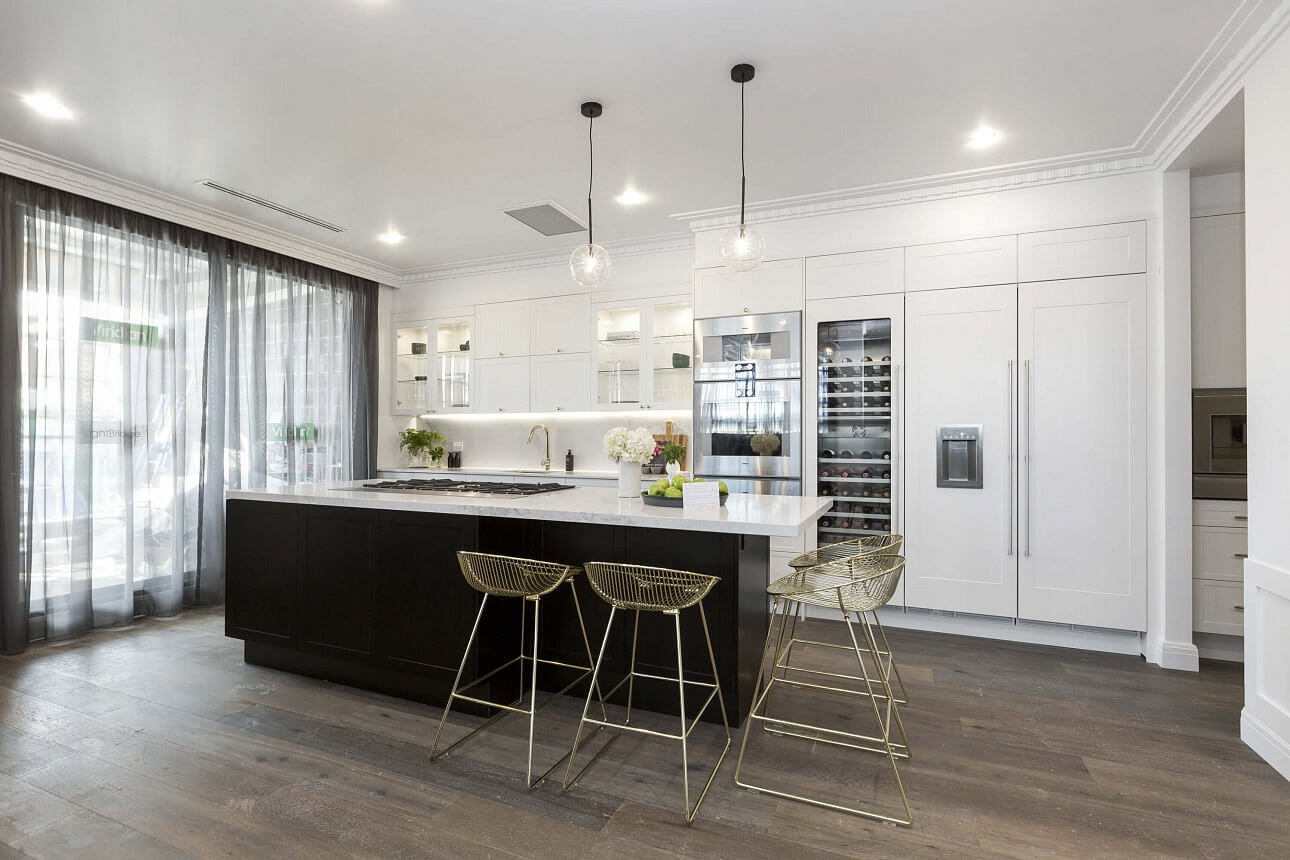
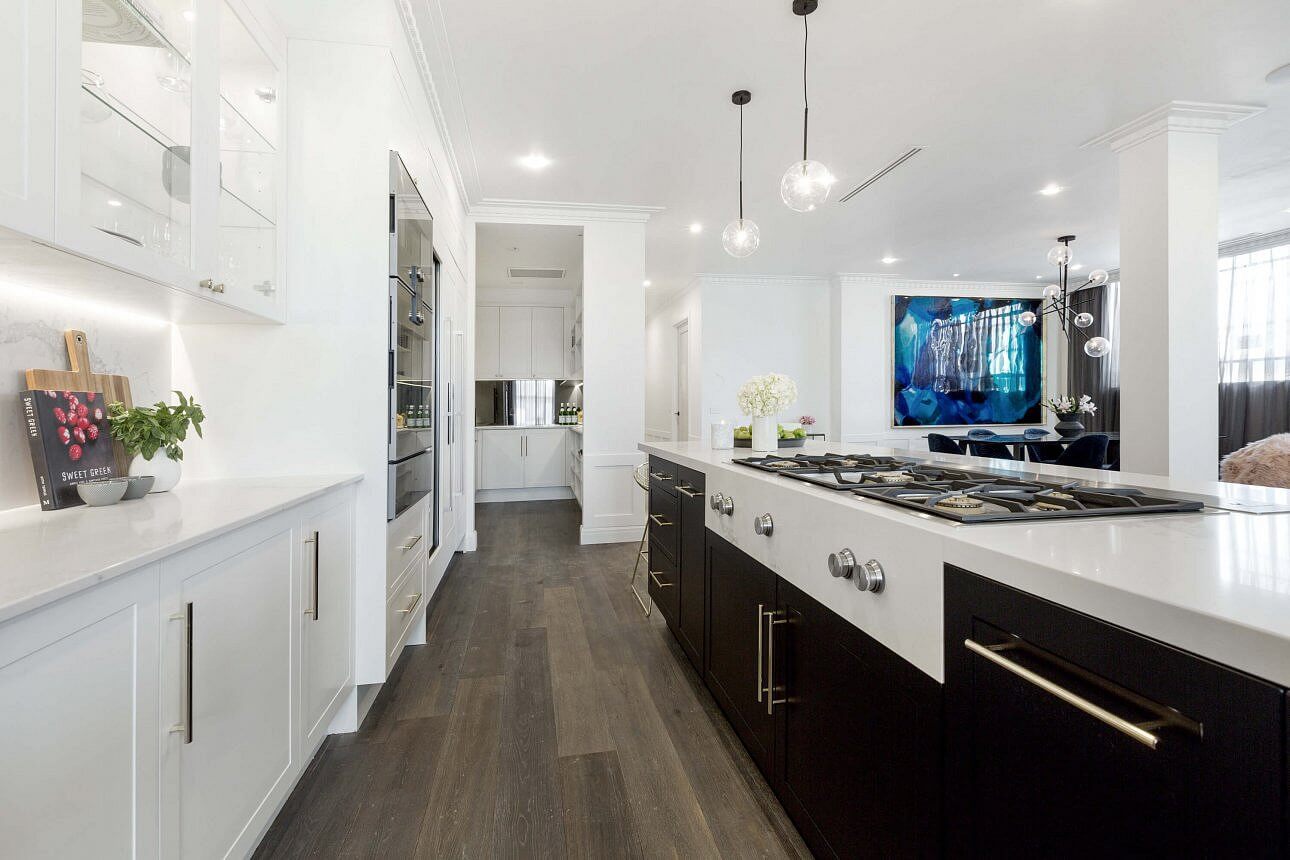
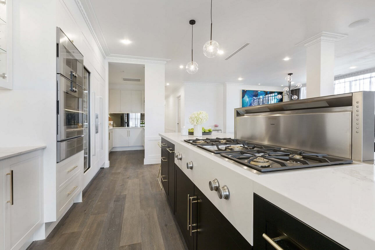
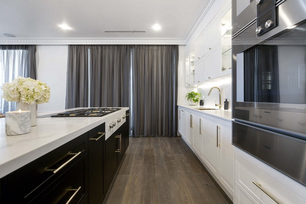

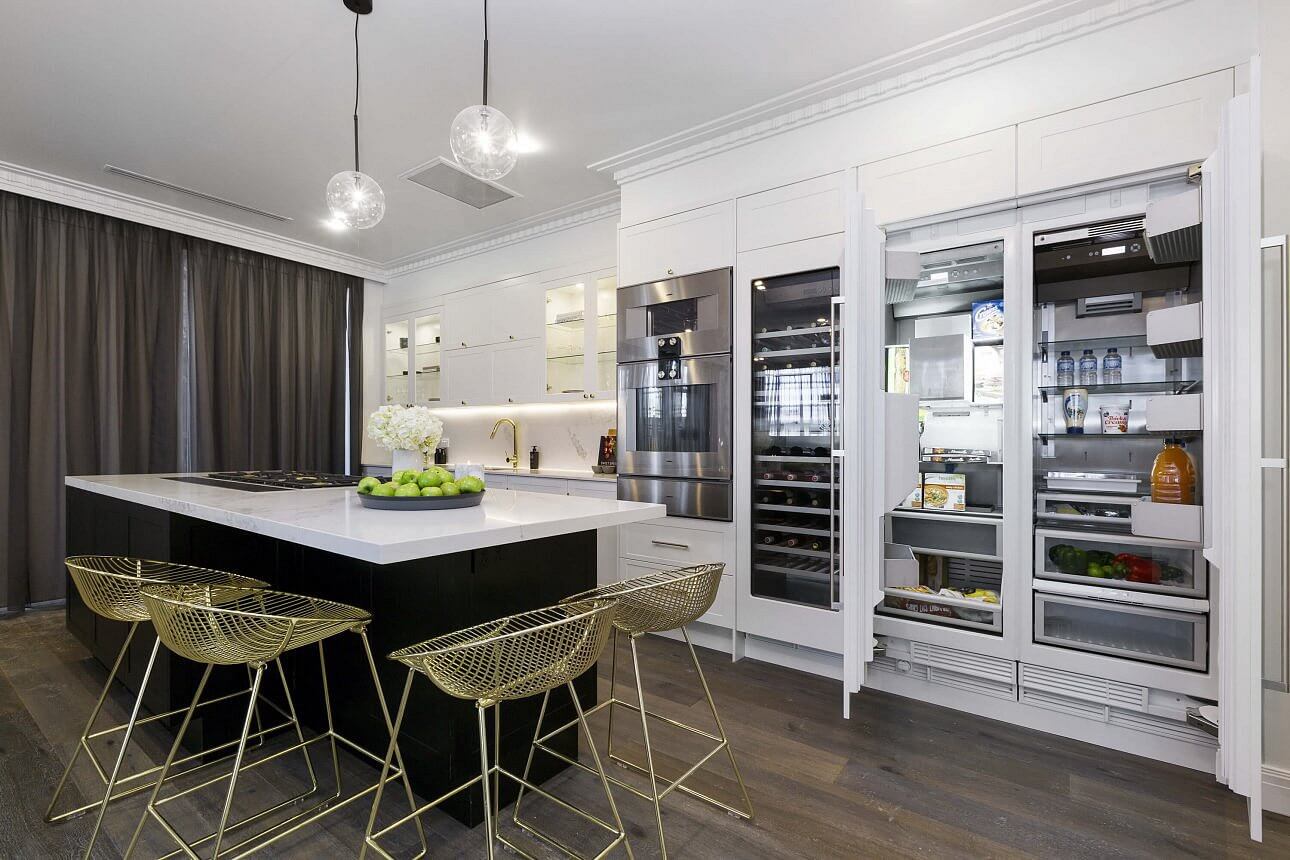
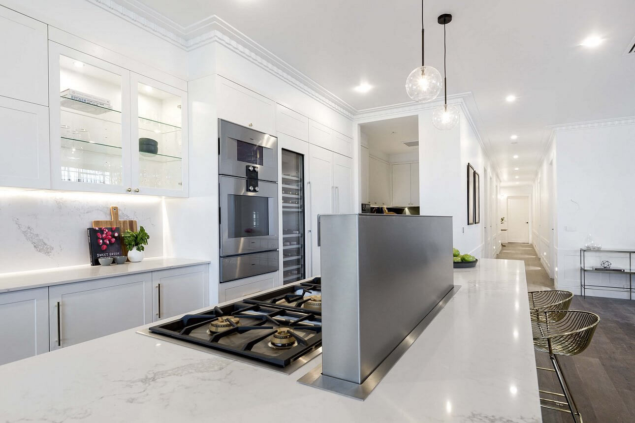
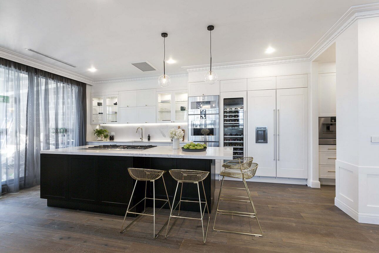
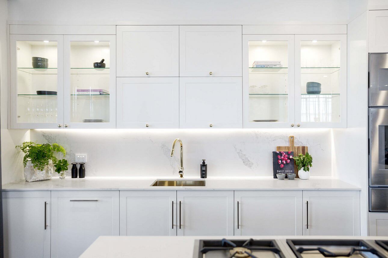
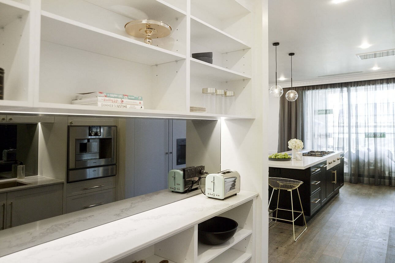
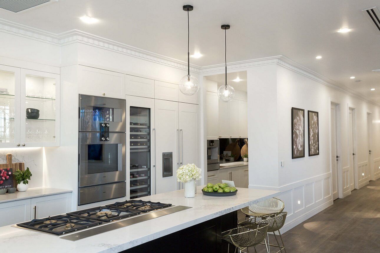
Julia and Sasha
I love the girls. Their style is always right up my alley. I knew they’d do white and marble. It’s so pretty. They scored 28/30 this week. Their appliances were high end and they wrote on social media last night they have $90,000 worth of appliances! Hope that pays off come auction day.
…
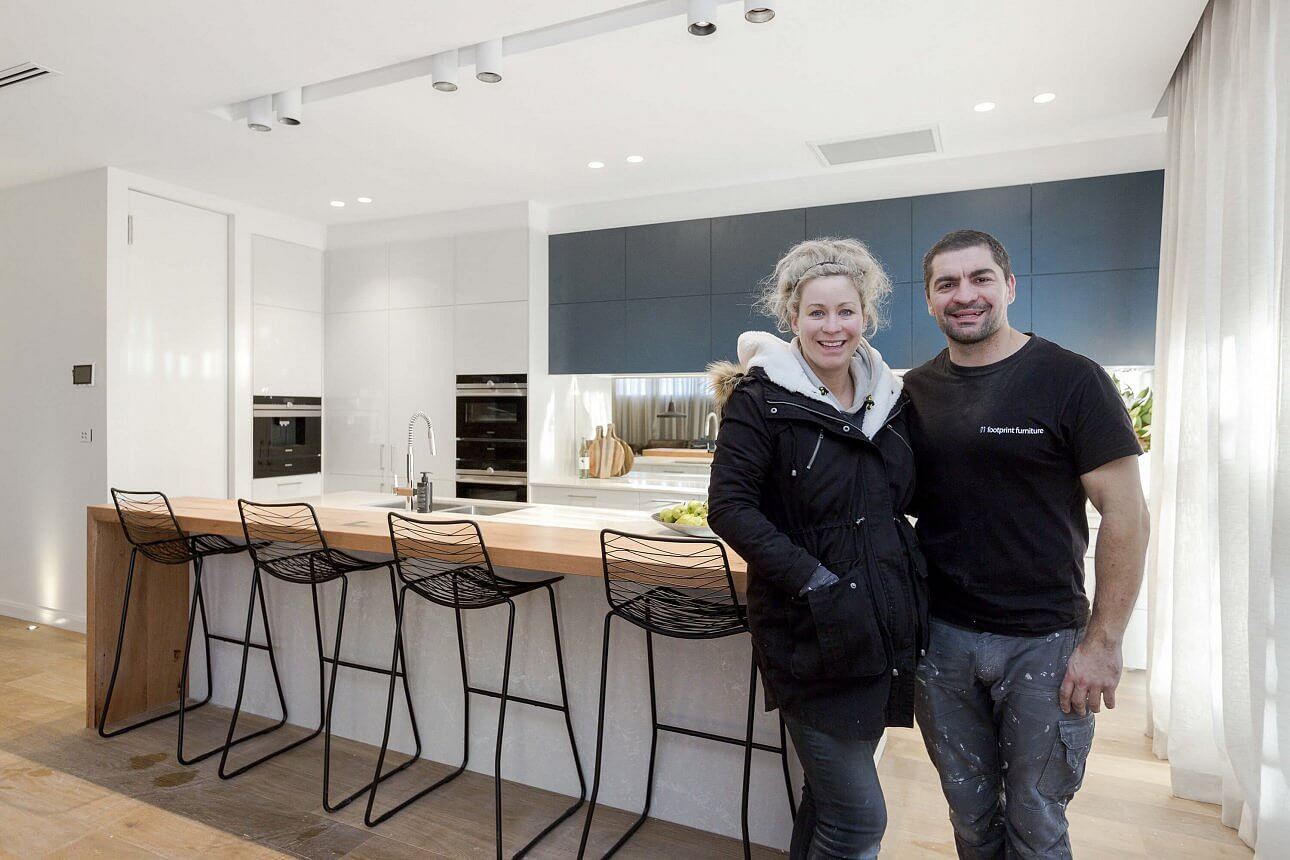
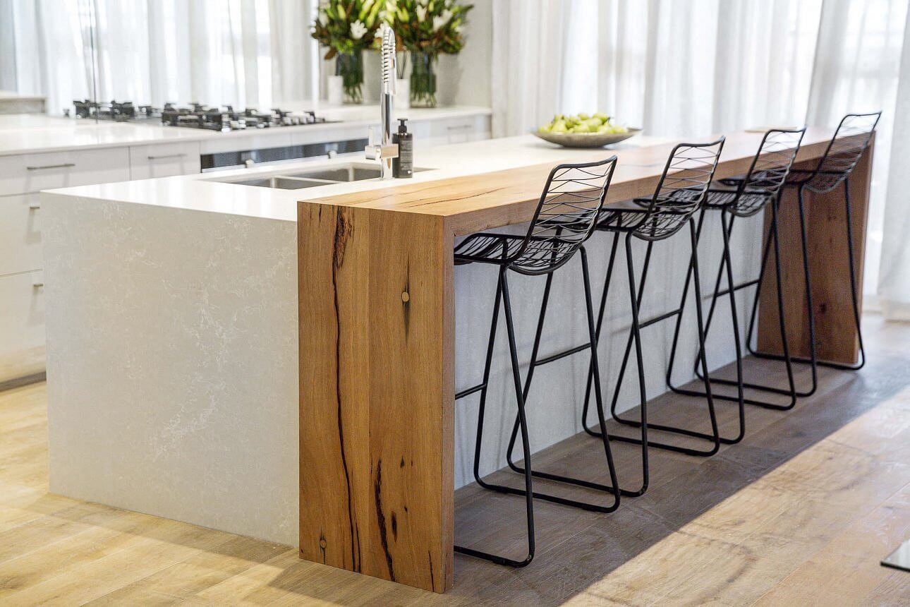
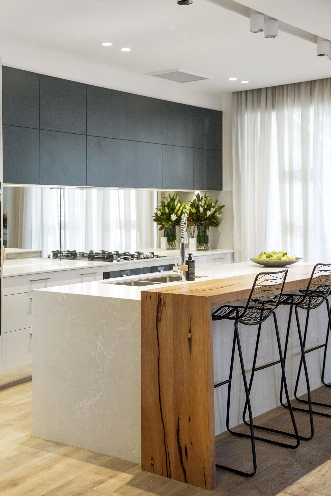
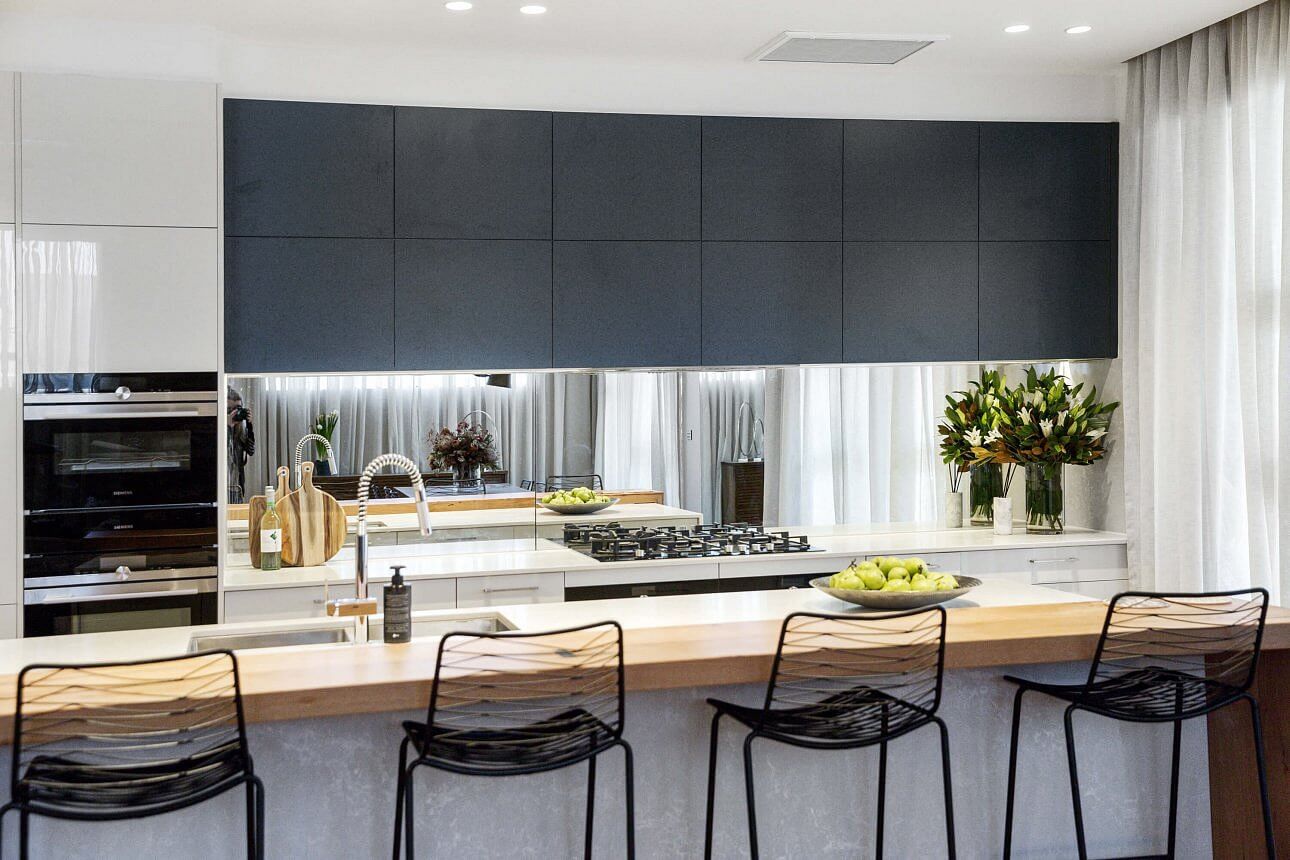
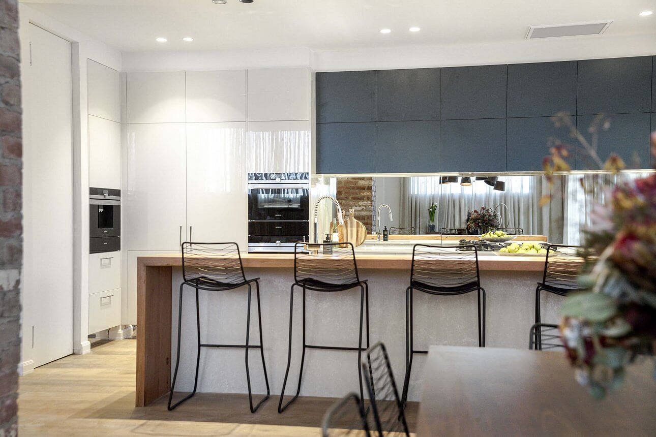
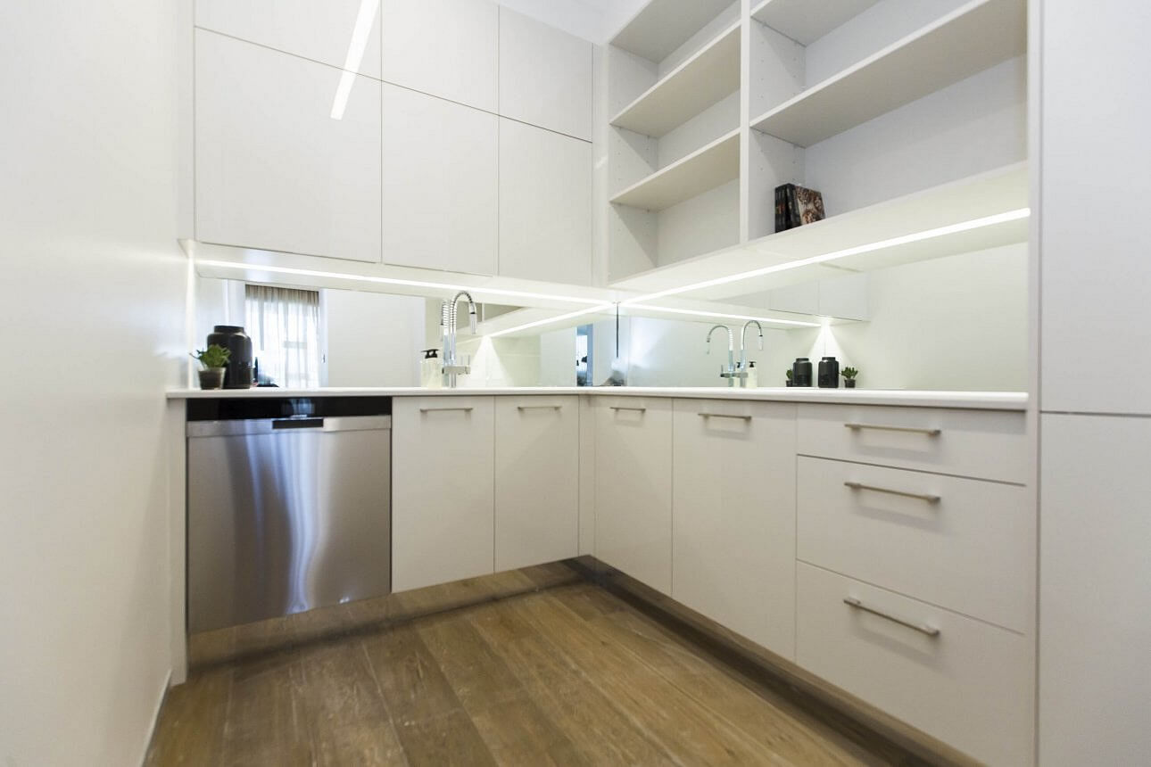
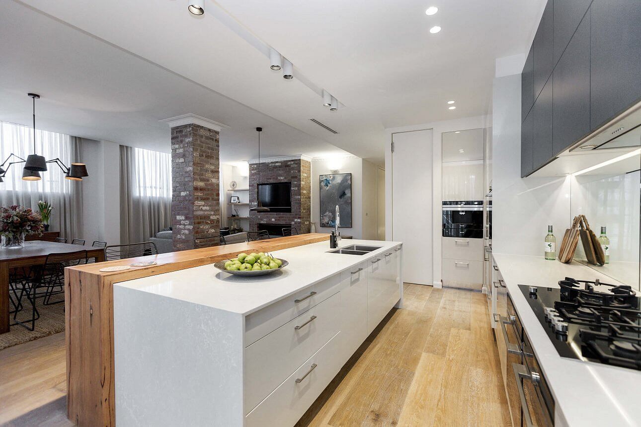
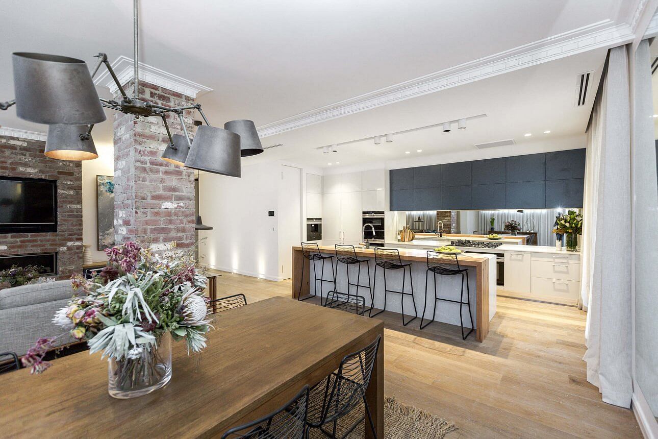
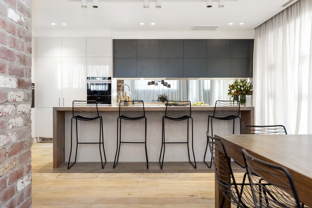
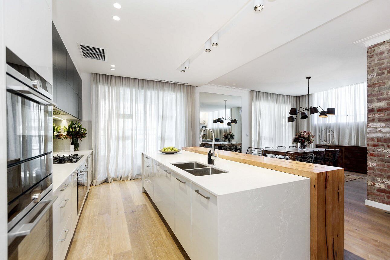
Kim and Chris
This one felt quite similar to the boys for a bit? I got a little mixed up when I was loading in the photos! It suits the rest of the house well, but it isn’t blowing my mind. It’s nice and neat and safe though. The judges gave them 24/30.
…
What did you think of the reveals?
The houses are pretty much finished and now we move on to the outside. Which is your favourite so far??
You can see all the other rooms here if you missed some.
♥ KC.
Be the first to read my stories
Get Inspired by the World of Interior Design
Thank you for subscribing to the newsletter.
Oops. Something went wrong. Please try again later.




Comments
Vivienne Russell
Loved Will and Karlies and the boys and the girls, lol. Kim and Chris not so much and definitely did not like Dan and Carleen’s, it was depressing. The judges do my head in, lol.
Katrina you should be a judge
Chelle Houley
Will & Karlie’s was my fav, didn’t like Dan & Carleen, also loved the boys. Julia & Sasha’s was nice But i agree with judges about that steam oven being dangerous.
Megan Reading
Will and Carly was the stand out for me. Agree not sure why Dan and Carleen also got perfect scores
Kiri Moran
I loved Julia and Sasha’s and would have been my pick for the win – though the height of the steam oven would be an issue for me.
Will and Karlie did very well. I love the bench space they offered. The black was confronting for me at first but the more I look at it the more I like it.
Ingrid
Love kitchen week. All the contestants delivered great kitchens, hard to pick a winner. I love the girls white and marble kitchen, with pop up rangehood.
Also loved Will and Carlies black kitchen with Timber eating area. Dan and Carlenes breakfast bar was a winner for me. Glad I’m not a judge on the Block. ????
Roxanne Catchlove
I want Julia & Sasha’s Kitchen as I want all those gadgets & integrated white goods! But Dan & Carleen’s was the winner of the night for me.
Louise McKenzie
I still get annoyed that the judges are not consistent with commenting on the art deco issue. Only kitchens who had art deco were Dan and Carleen and the boys. Will and Karli had diddlysquat.
Narelle Howell
Will and Karlie for me, by far. I loved it. I did like Dan and Carleens, especially the seamless look in to the pantry. The girls – nice but I was irritated that the ovens were wider than the wine fridge and fridges – stupid I know. I also thought the front of their cooktop was too chunky. Minor details though!
Dnna
Hi Katrina, I waited for your photos of the kitchens to get a good look. I agree with all your comments. What is amazing is how the kitchen, living, lounges are all coming together!
Thx
D
Melissa Boswell-Happ
I hate the timber laminate in Dan & Carleens, and didn’t like Kim & Chris’ at all. Loved Julia & Sasahs, the boys was ok but didn’t love the colours, Will & Karlis was too dark for me but still well dine
caroline
The lighting is a miss on all of them – too many downlights paired with some attempt at a feature light which is hung way too high.