Howdy! Last week I didn't get around the blogging about The Block and the bathrooms. I wasn't sure I felt like I could commit to it all, but then after seeing all the comments on how no one liked the bathrooms and now these bedrooms I felt like I had to check it out! Woah, …
Howdy! Last week I didn’t get around the blogging about The Block and the bathrooms. I wasn’t sure I felt like I could commit to it all, but then after seeing all the comments on how no one liked the bathrooms and now these bedrooms I felt like I had to check it out!
Woah, though. Back up. How come everyone is saying the bathrooms and guest rooms are boring, bland and same-same? The teams are still finding their feet. I’ve actually liked a lot of them. I would kill to have their budgets! In real life and when I was back on the show. I am giving these new contestants lots of credit and praise. It ain’t easy. Plus I don’t think the show should always be about “coming up with new ideas”. I just want to see appealing and functional rooms. I don’t need to be blown out of the water with new ideas all the time. They aren’t designers, just regular people who like renovation. So I think I’ll go back to the ensuites and add that to my blog and keep updating with the new reveals.
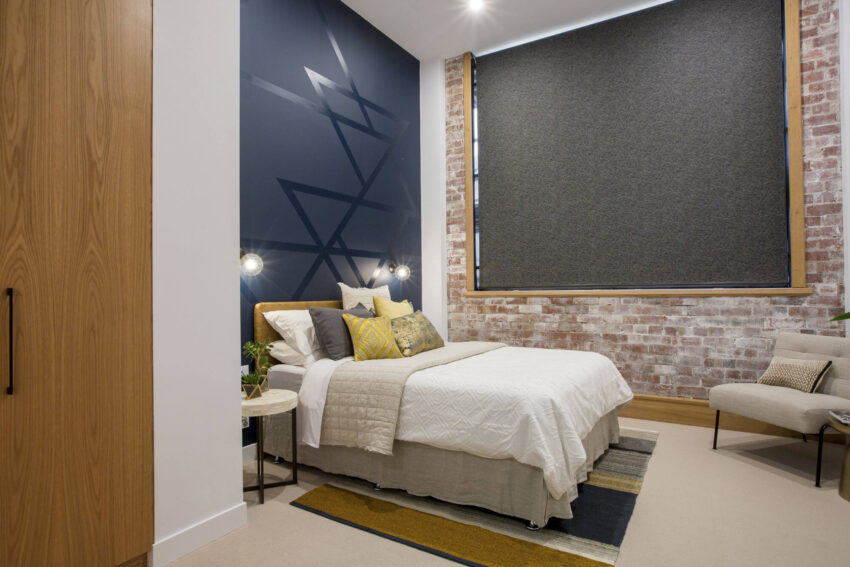
I’m still learning about the couples, but here are the winners from the guest room reveals Karlie and Will…


This is a great guest room. Love the style. The natural elements, that feature wall and the deep yellow tones are gorgeous. The exposed brick wall is great. The blind may have needed a touch of softening, but overall I’d be happy if this room was in my house!
…


This is Chris and Kim. I can see where they are heading with the overall styling of their house. I like the subtleness and indirect styling. Not everything has to be ‘wow’. The brick wall is good. Love that. The bedhead is on trend for 2017 (as they say). I am not keen on the glass top desk, but glass always crates an illusion of bigger space and a solid one would have taken up more space visually.
…


Here is Ben and Andy’s guest room. Straight away I knew it was their room before I saw the tags on the photo – very masculine… haha! Their room looks smaller than some of the others so they must have been struggling to get everything in. Love the sheer curtains and while I am not a fan of the diamond boxes, I could see they were trying to create a feature and open up the space. Not my favourite room, but the art deco feel is coming through in here. I’ll wait to see how they bring the rest of the house together.
…


Julia and Sasha produced a pretty safe room this week. Which is not bad at all. They didn’t push the boundaries in here. The bedhead is gorgeous and so are the karate-chopped cushions. Love that. Some soft flowing curtains would be be fabulous though. Can’t wait to see what else the girls do.
…


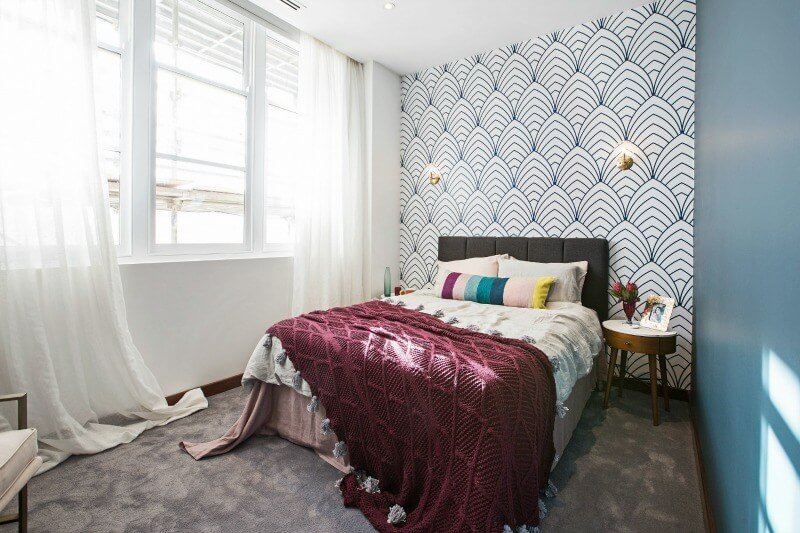
Dan and Carlene were last on the scoreboard this week. I didn’t think it was so bad. I love the sheer curtains, I really like the wallpaper and the burgundy throw – that is cute! I probably would have not painted the wall that colour, and I would have taken off the wall sconces and the big bed pillow. The room would have been more easy on the eye.
…
There you go! What do you think so far? Let me know in the comments below…
Be the first to read my stories
Get Inspired by the World of Interior Design
Thank you for subscribing to the newsletter.
Oops. Something went wrong. Please try again later.


Comments
Alexandra Wilson
Yours was the best season they did!, loved watching you guys, i actually cried over the disappointment at the auction, so not fair!
I haven’t watched the last two seasons the formats gotten a bit boring I think, not so much the rooms
wendy bartlett
Agree with you Katrina “I just want to see appealing and functional rooms. I don’t need to be blown out of the water with new ideas all the time.” Love watching The Block but judges can be irritating. Really didn’t like Dan & Carlene’s room – Shaynna was harsh but I think the room could do with a makeover………..
Maria Stephenson
Only watch the reveals. Not my styles but too hotel styles for me.
Kerrie Moore
I don’t think they are bland at all. I loved the winning room but hated Dan and Carlene’s room. I have been watching your block Katrina on the Life channel, boy the budget has improved
Katrina Chambers
Hasn’t it?!
Ann Watson
Thanks Katrina I’m overseas for a couple of weeks & cant get the Block here so was great to read your post.
Kerry Closter
I agree, although I didn’t like Dan and Carleen’s room either, just thought the wallpaper, throw and cushion were barely OK individually, but bloody .awful together. Overall I think they’re all doing an amazing job so early in the show.
Kylee
I liked half of Dan & Carlene’s room. I agreed with Neal that if you look back at the wall opposite the bed the colour of the wall, the artwork and the styling looks great (apart from the stock photo left in the frame lol). I really didn’t like the wallpaper, bedding, sconces – really nothing about the other side. That said I do think that Shayna was really harsh with her comments.
Karlie & Will’s room was easily my favourite – those bricks are to die for. The other rooms I liked however the boys is just a little too OTT for me.
I do miss the old episodes on the block – it’s like it’s moved from houses/apartments that the everyday person could afford to crazy designer stuff that is well out of anyone’s price range. That’s what I preferred to watch.
I have to say I am enjoying watching you and Amie back on the screen again.
Libby
Hi Katrina,
Thanks for blogging again about the block. I love anything with a before/after story. Also love your Stunning Sunday section. Keep up the good work!
Libby
Jen
Lost interest in the block – compared to when you were on Katrina when it was more about the materials and the renovation now its more about the tears and tantrums! Its a no from me – occasionally check in for the reveals but thats an effort too- although looking at the photos above I like the winners and the lads