Did you guys watch the challenge apartment reveal (part 1) on The Block last night? I didn't get a chance, so I am only going off the photos today. The winner of last night was Kim and Chris who were lucky enough to have $20,000 taken off their reserve. Bonus! Take a look at the …
Did you guys watch the challenge apartment reveal (part 1) on The Block last night? I didn’t get a chance, so I am only going off the photos today. The winner of last night was Kim and Chris who were lucky enough to have $20,000 taken off their reserve. Bonus!
Take a look at the photos below. Do you agree with the judges scores?
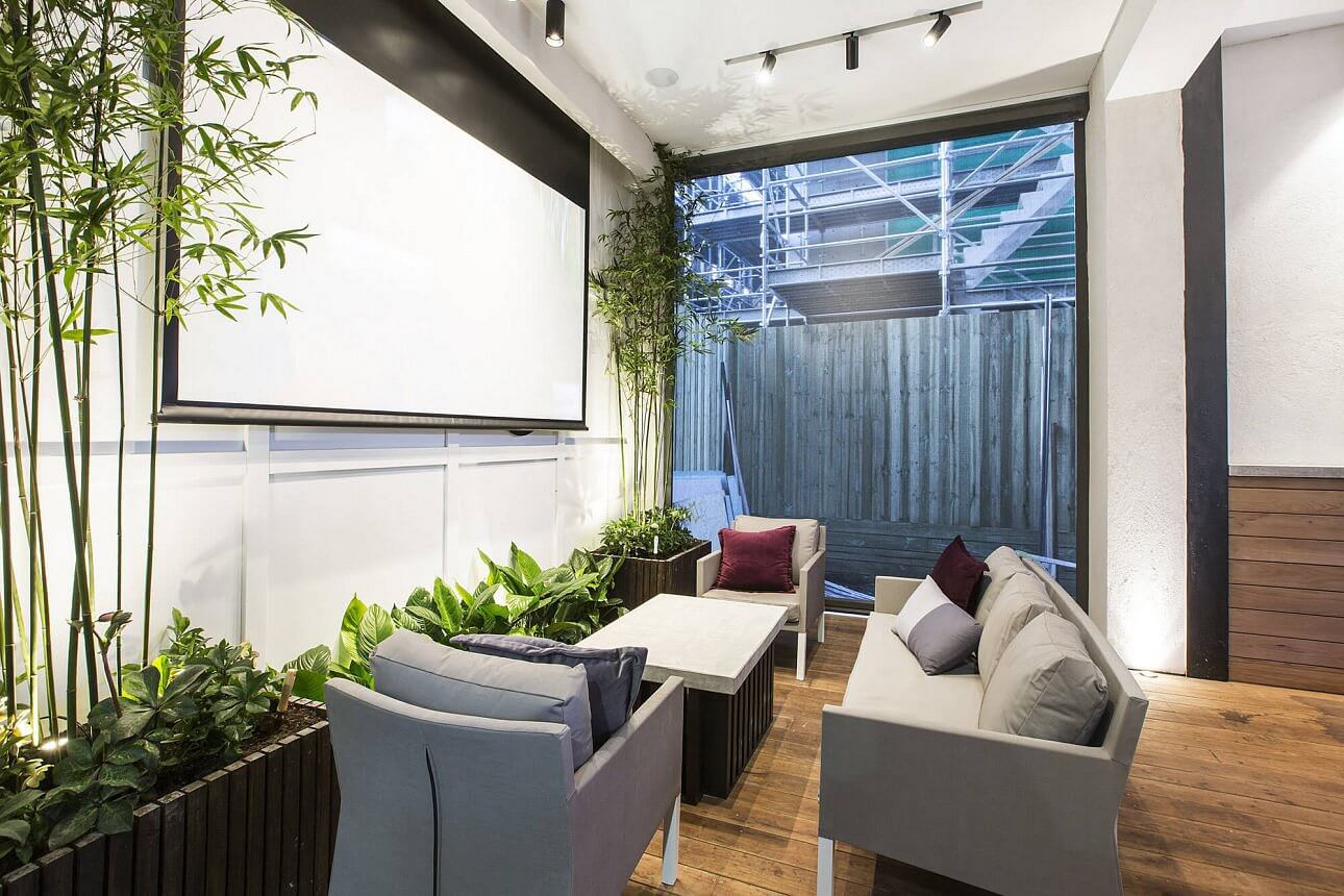
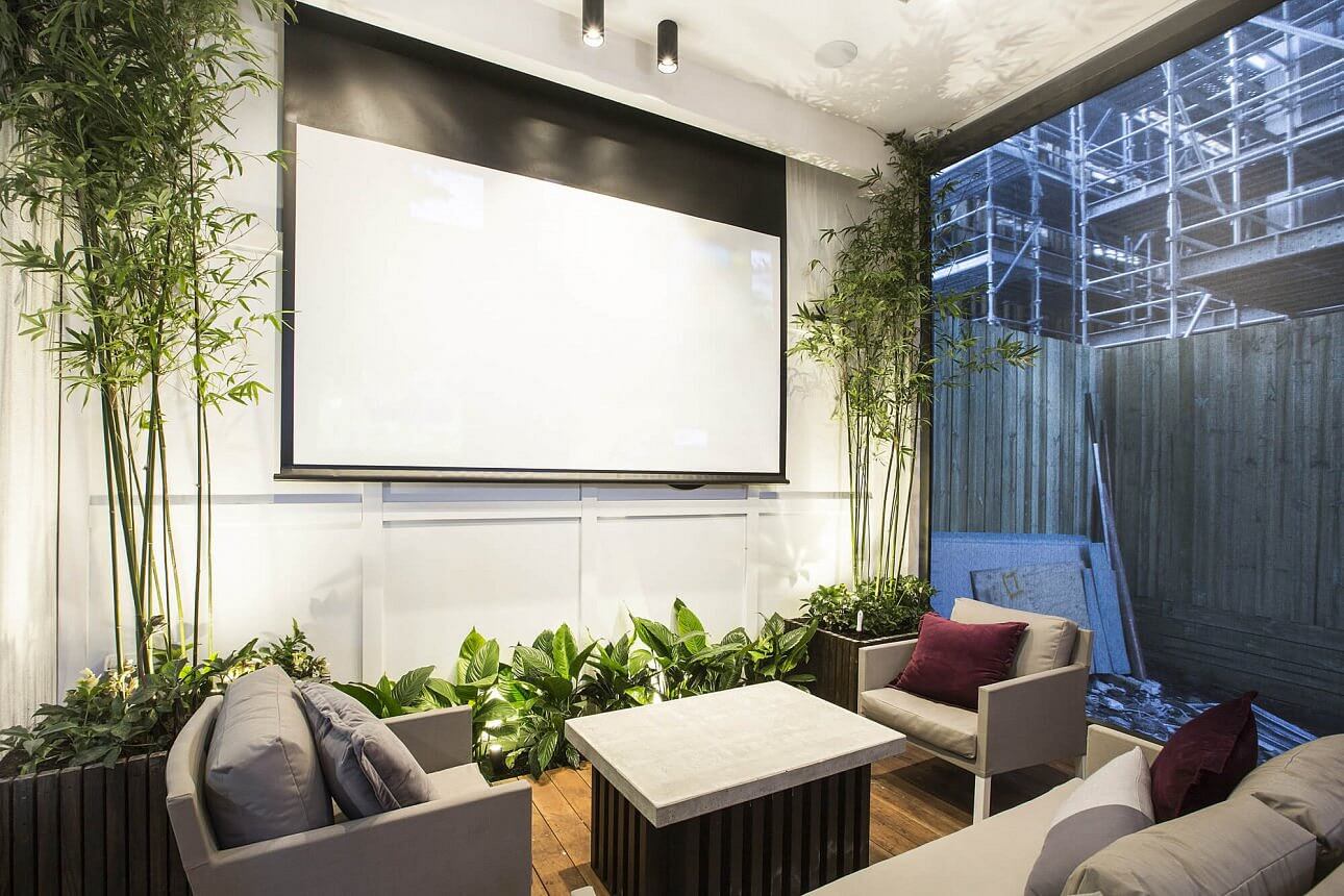
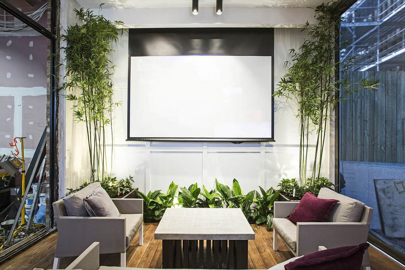
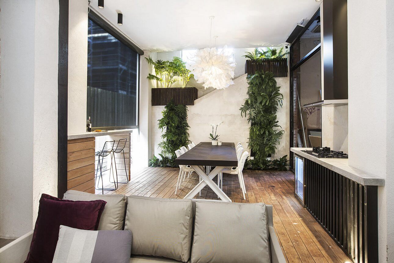
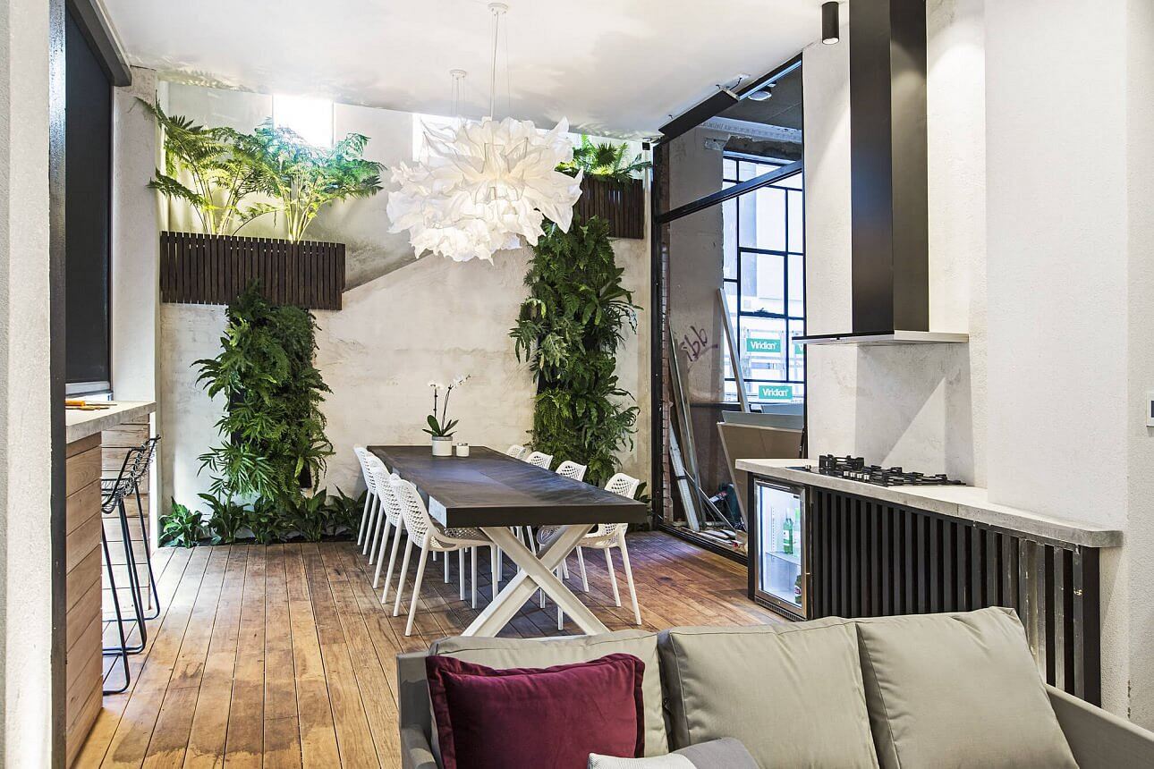

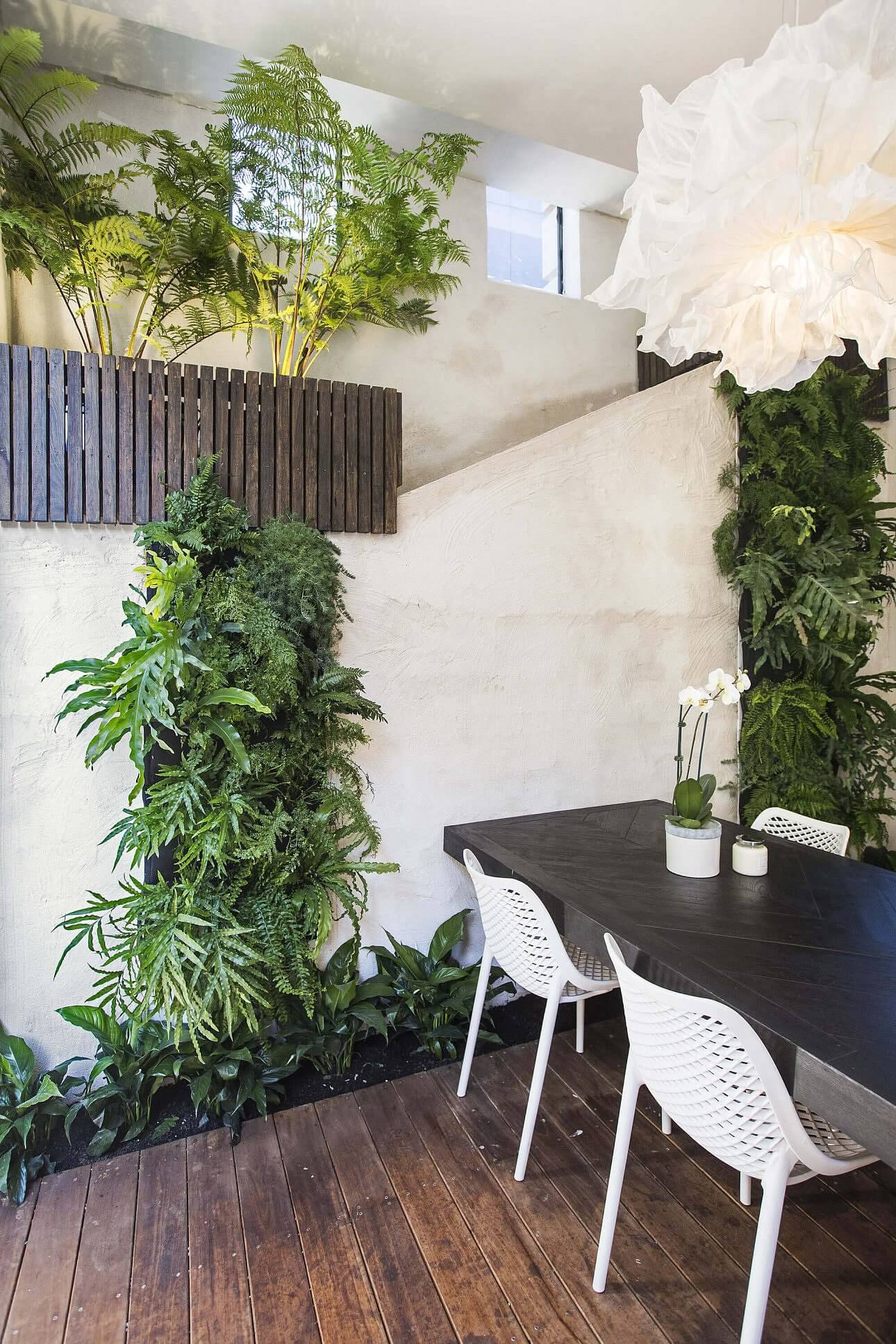
Kim and Chris
They topped the score board with 28.5/30 for their high-tech outdoor area. It was good! But I am not sure it was the best. What did you think?
…
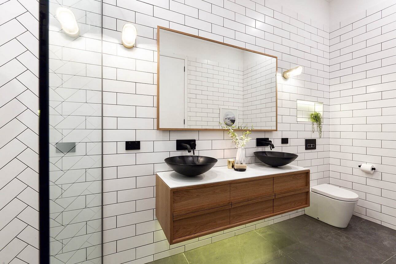
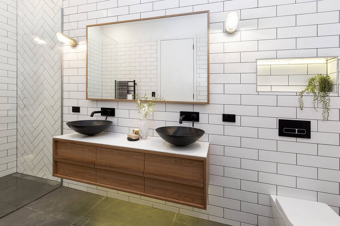
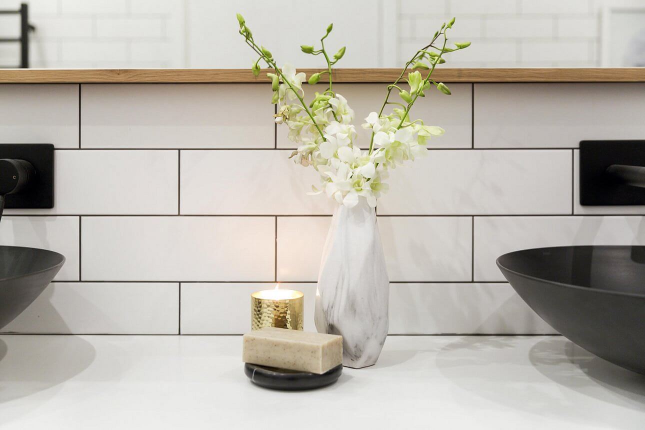
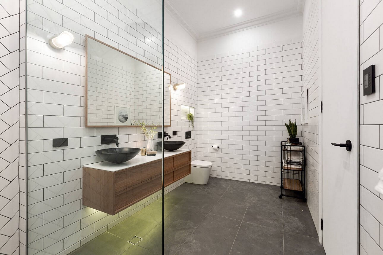
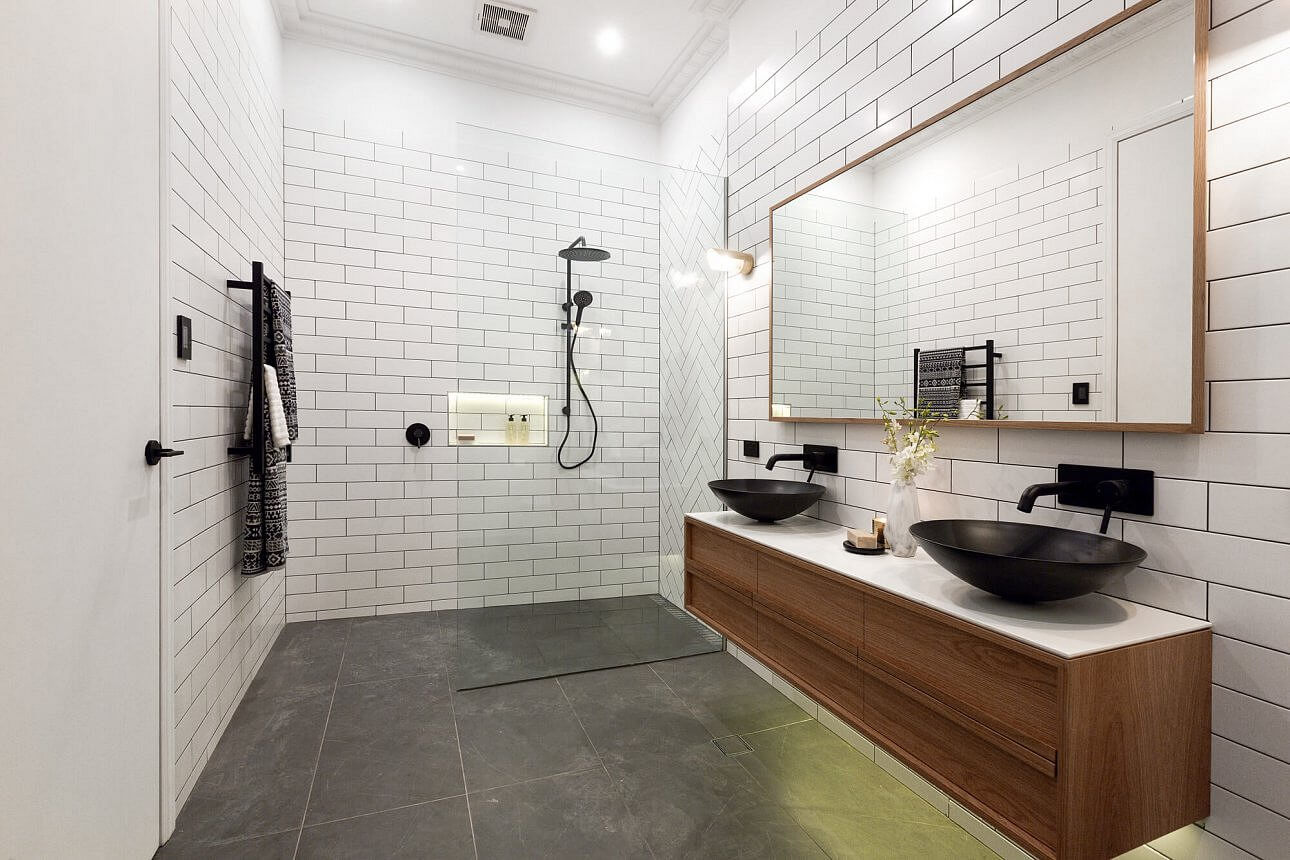
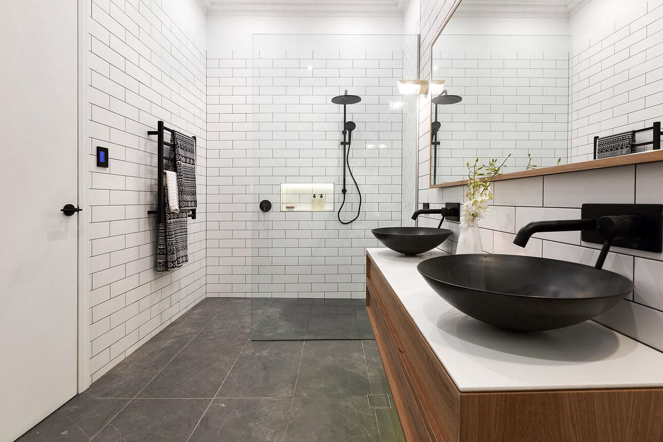
Dan and Carleen
This was their best bathroom from the whole series. It’s very on-style. They scored 27.5/30.
…
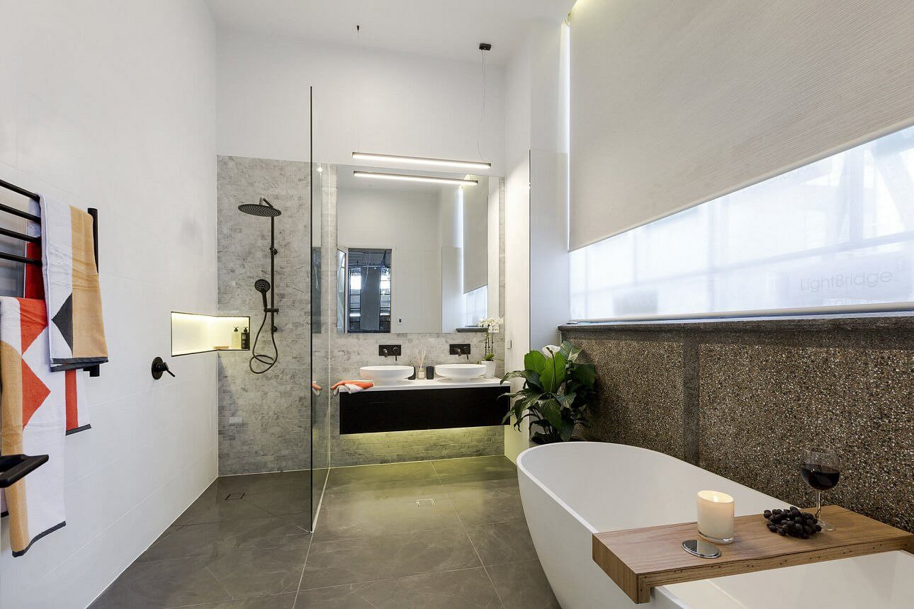
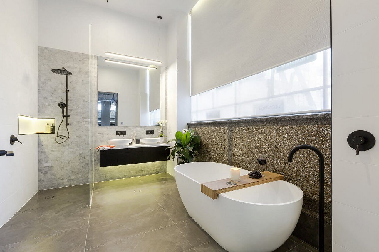
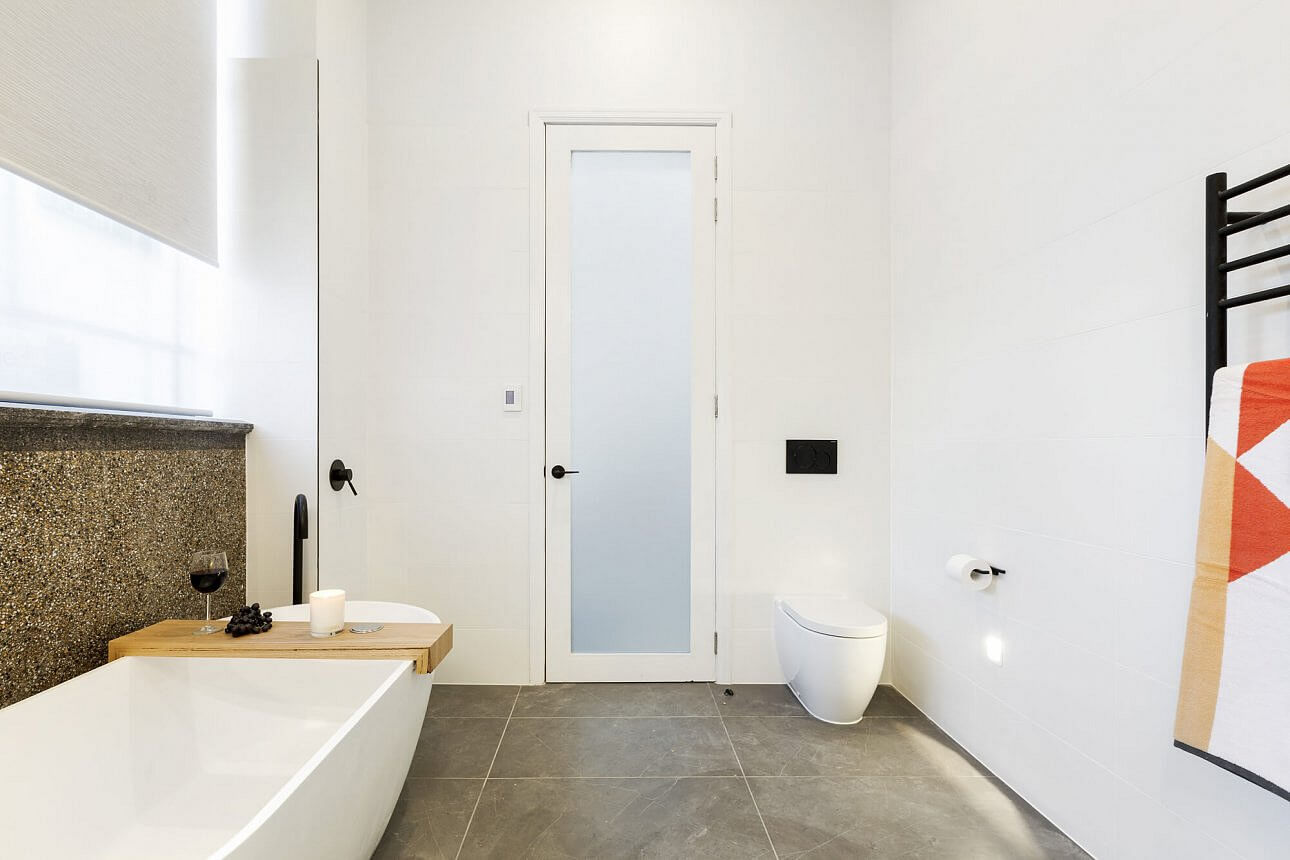
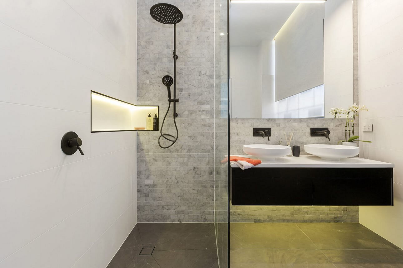
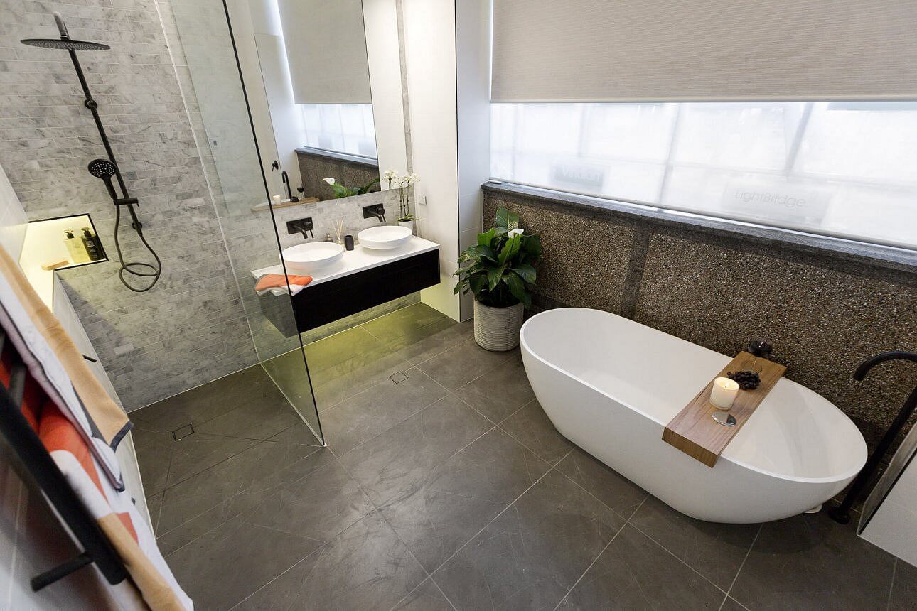
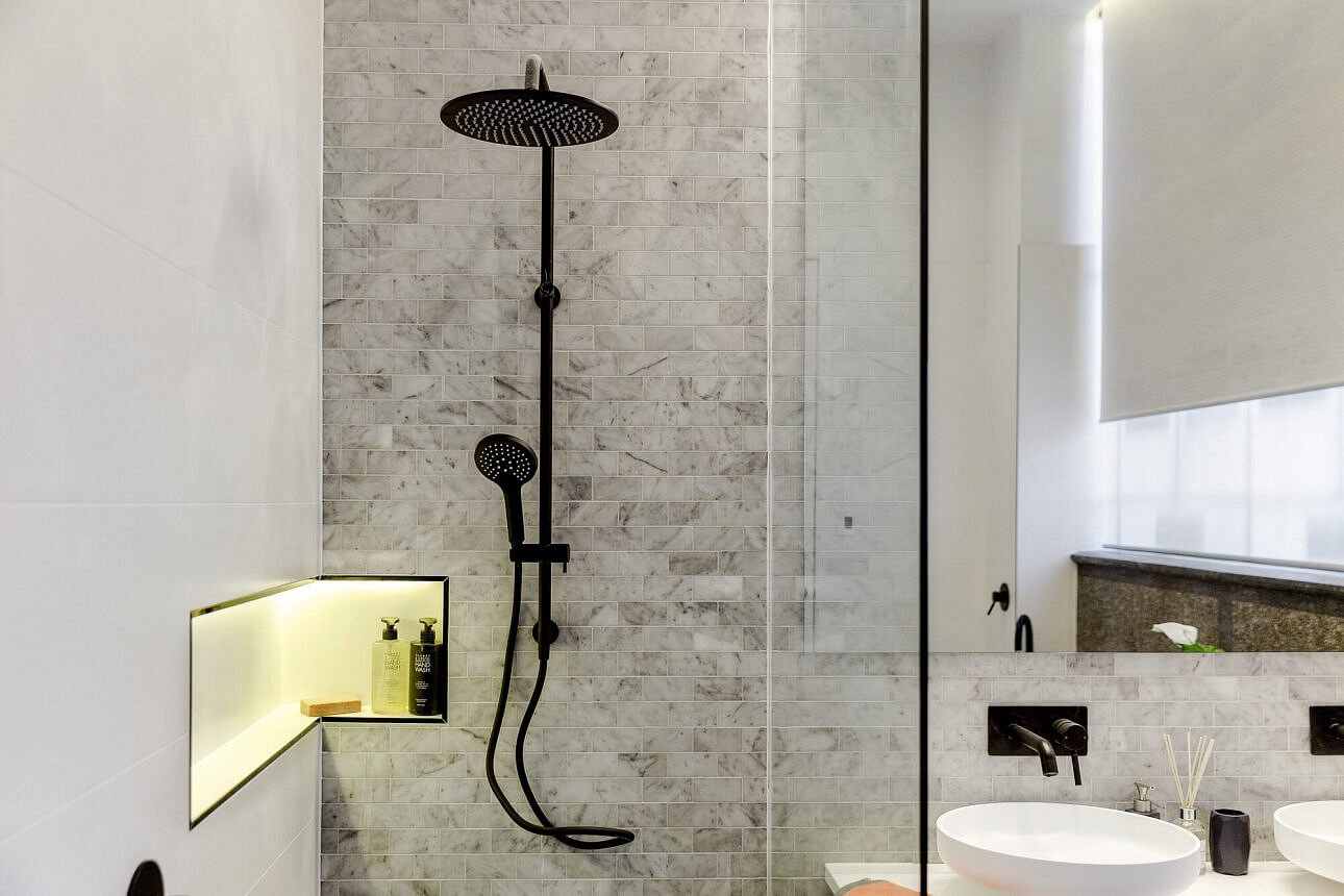
Ben and Andy
They scored 26/30. It’s good, but probably not “matching” enough with Dan and Carleen’s considering they are inside the same house.
…
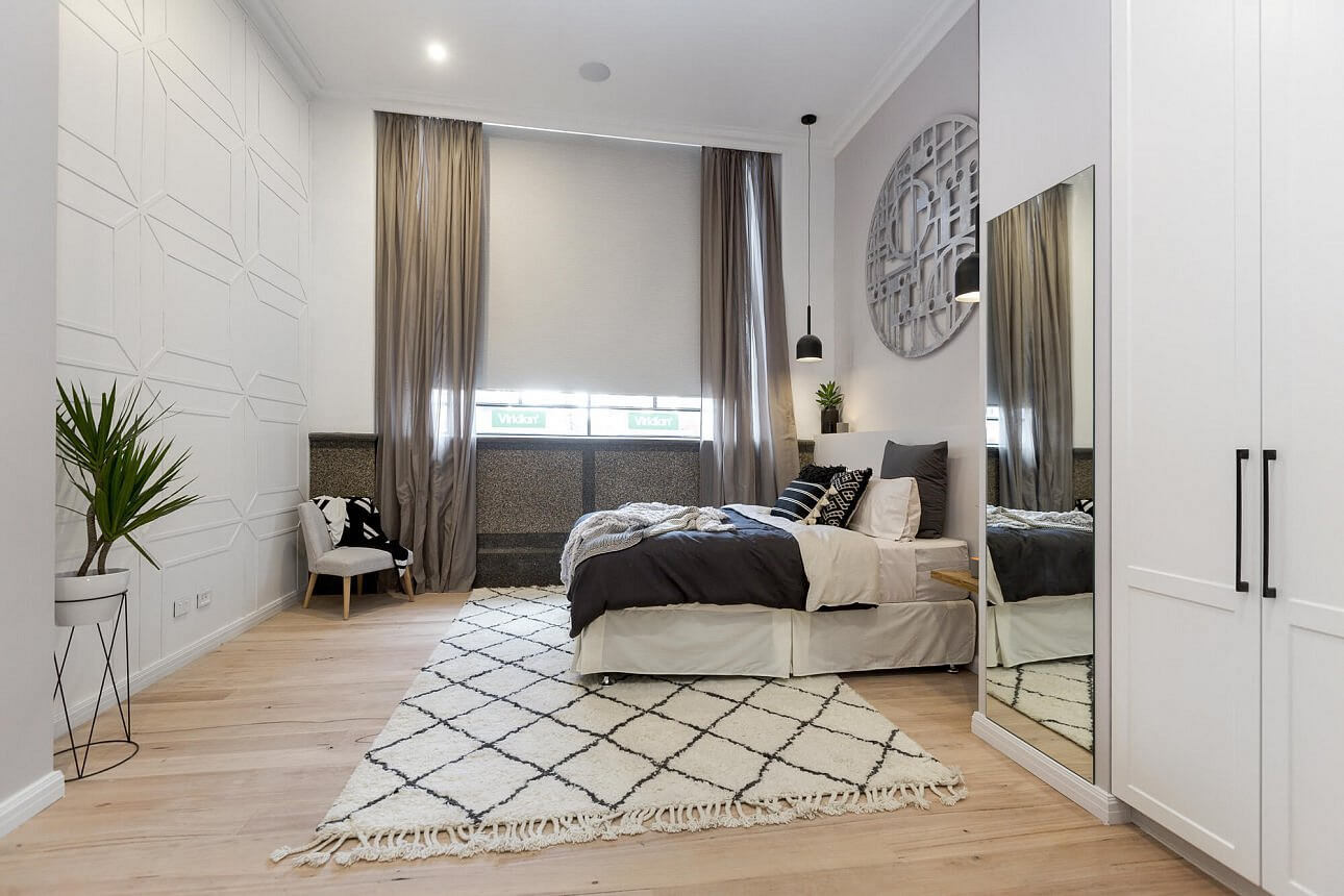
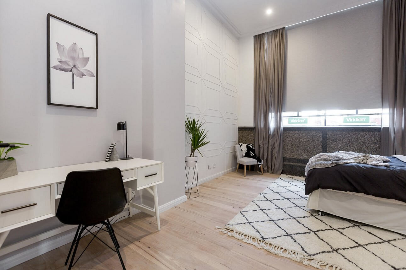
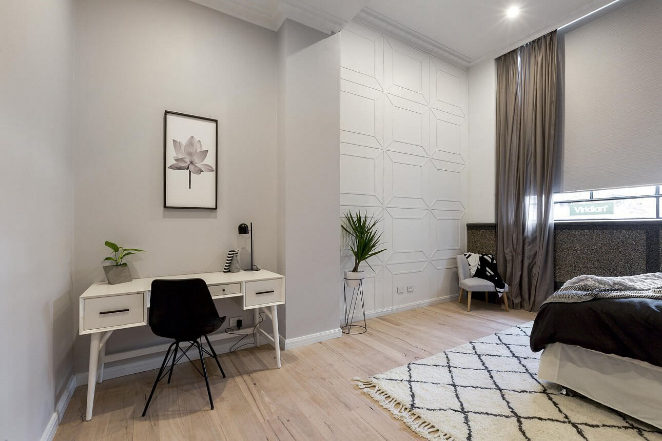
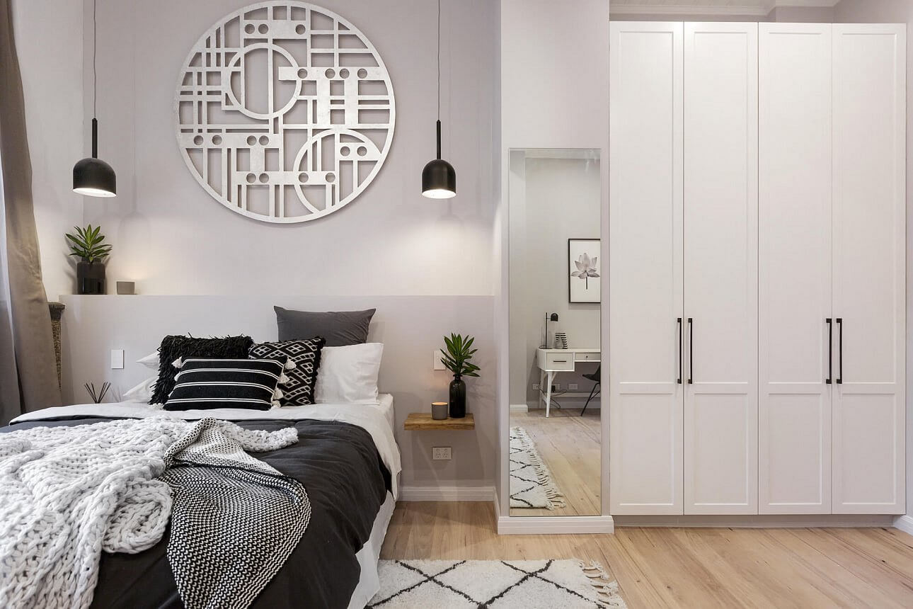
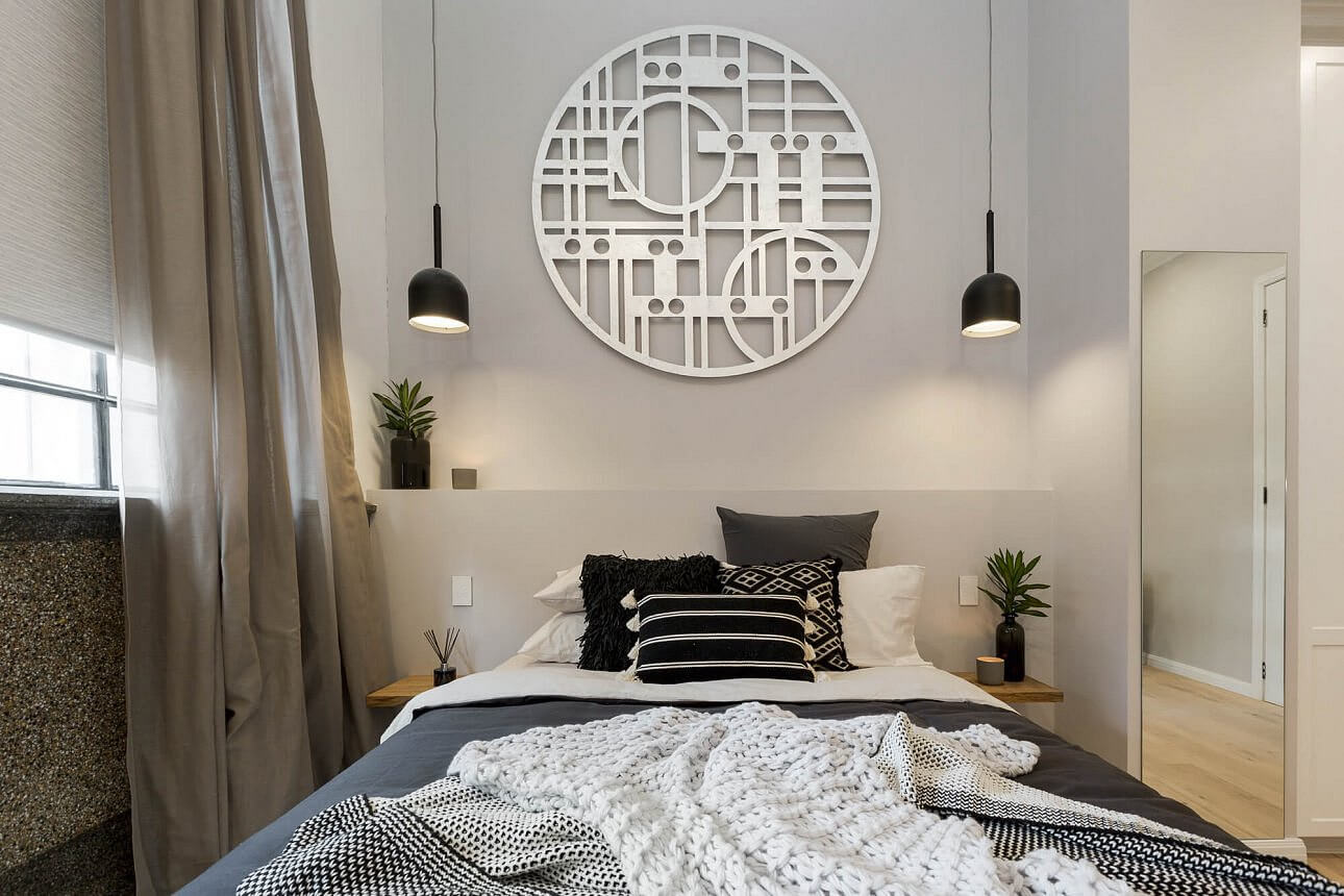
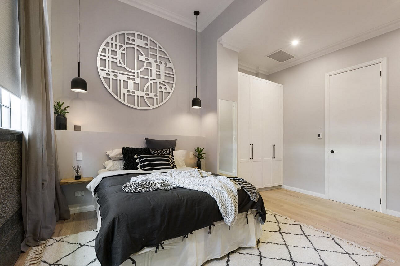
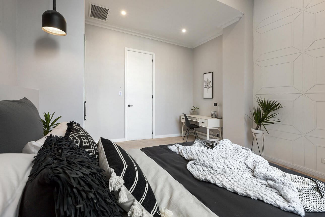
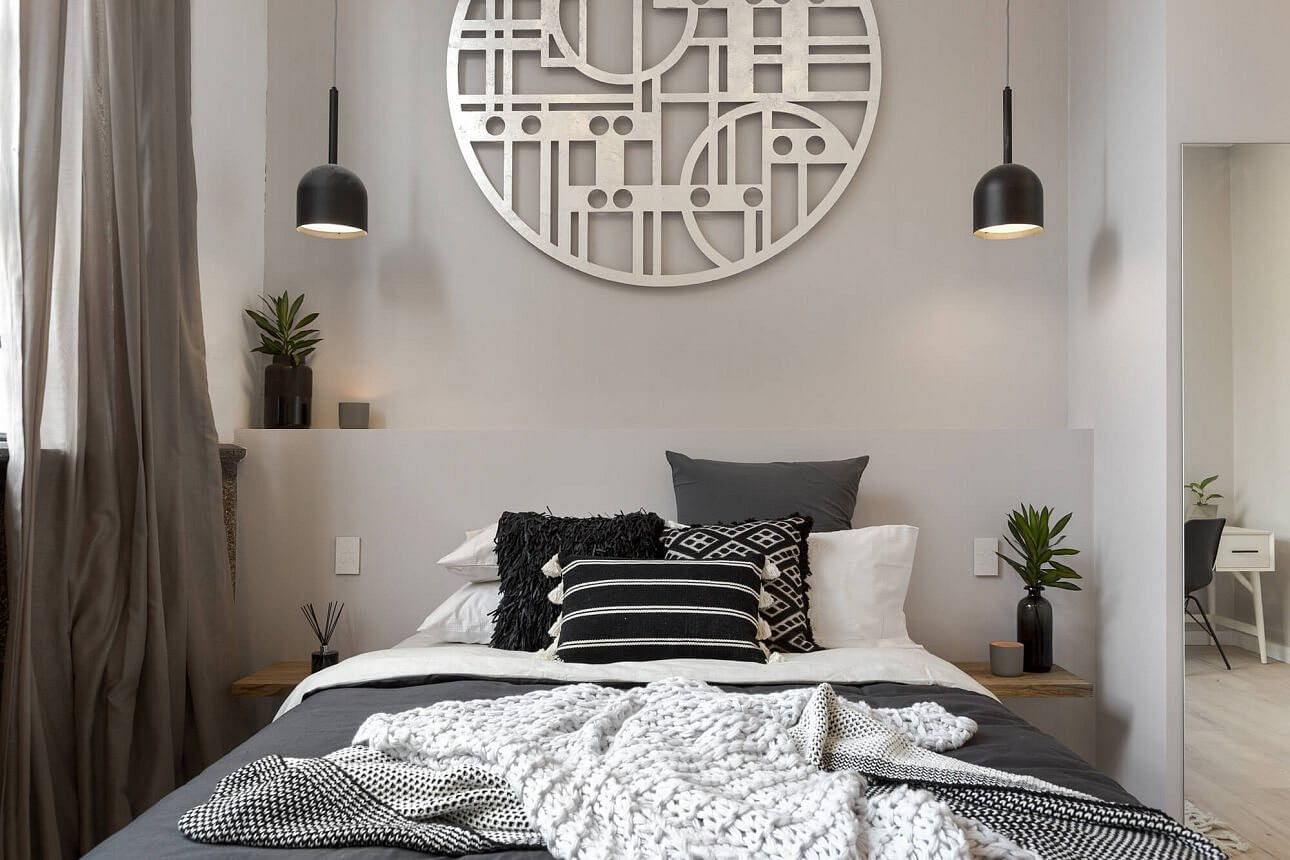
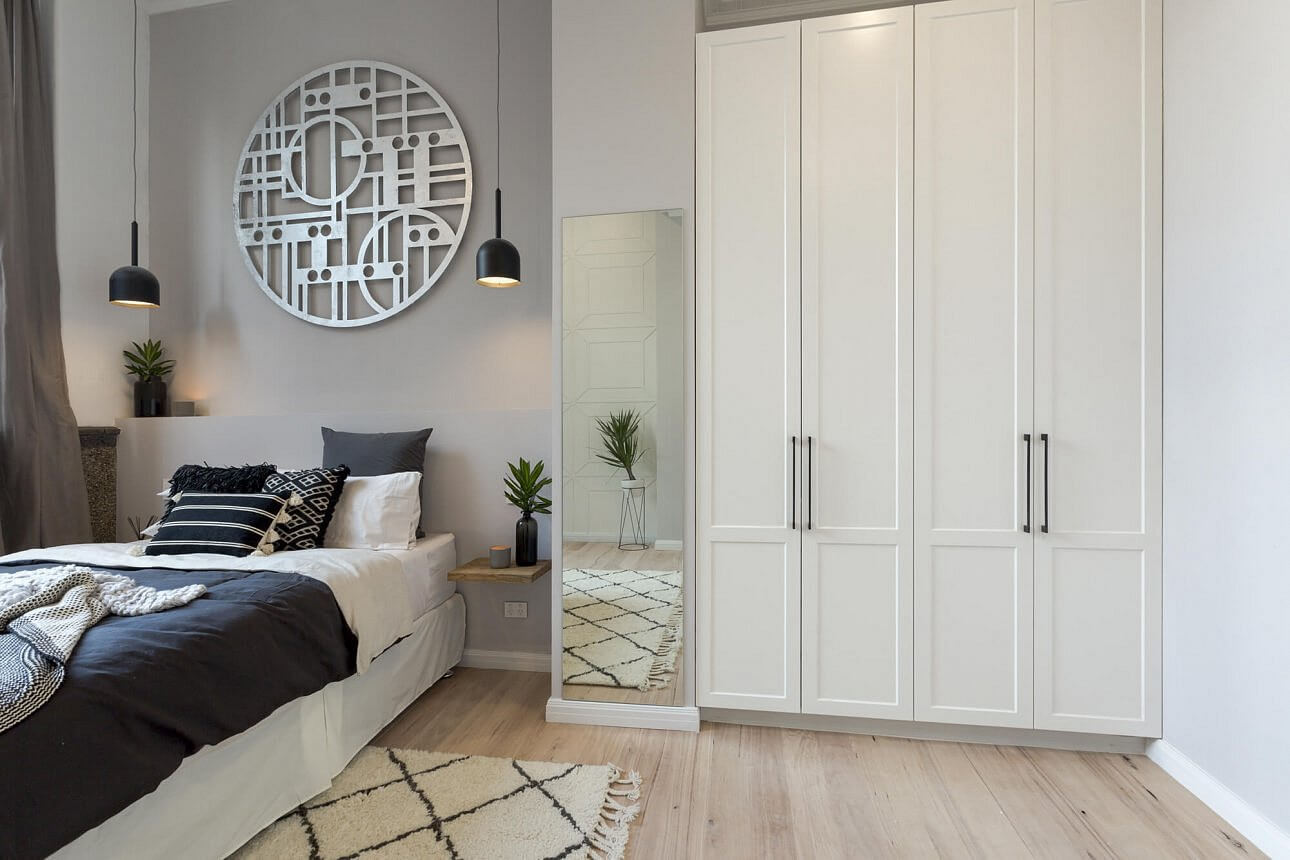
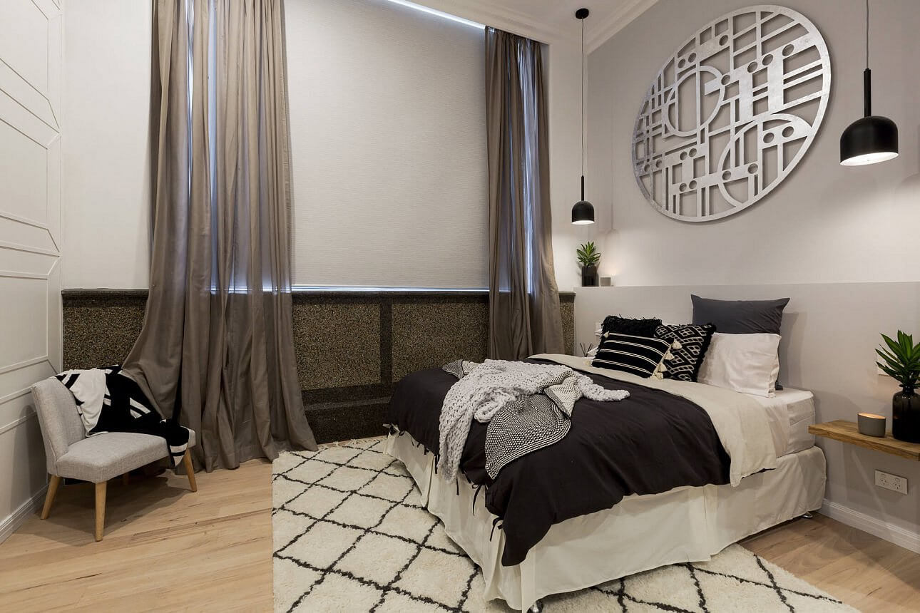
Will and Karlie
These two should have won. I just love it! Great detail and the colours are perfect. I am a big fan of these 2. Will and Karlie came 4th with a score of 24/30.
…


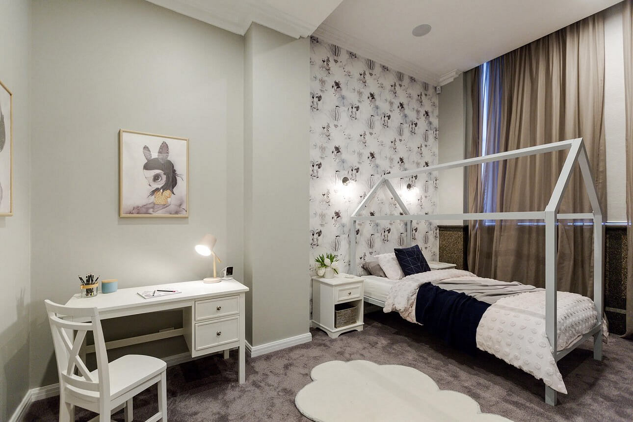
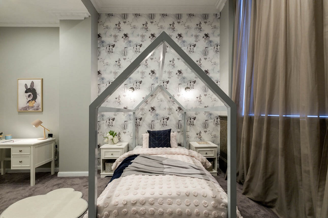

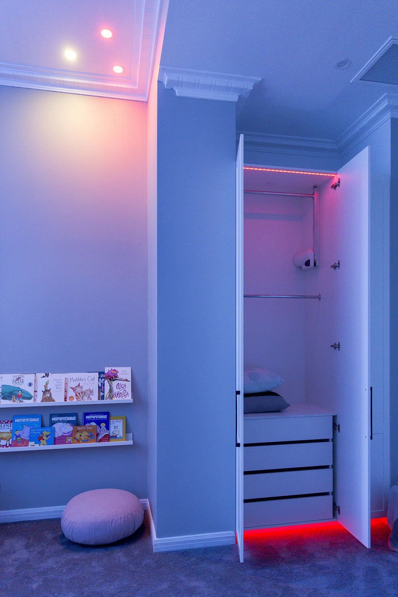
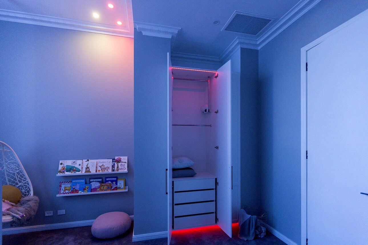
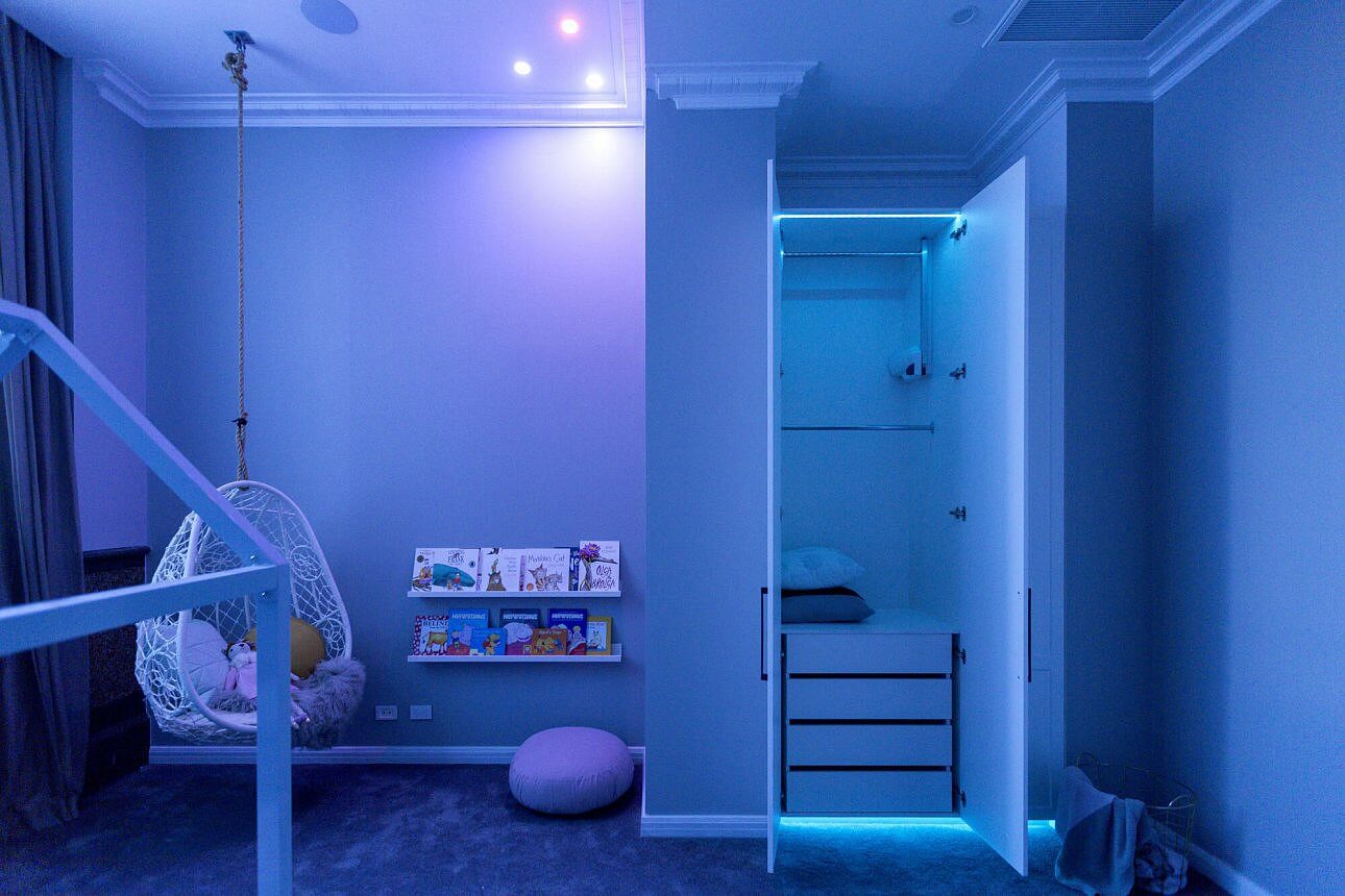
Julia and Sasha
The girls nailed it. I think Neale is off his rocker if he things a nursery shouldn’t be grey. He needs to hang out on my Instagram feed for a while. Julia and Sasha ended up with a score of 23/30. Bad luck girls!
…
So part 2 is next week. Stay tuned! ♥ KC.
Be the first to read my stories
Get Inspired by the World of Interior Design
Thank you for subscribing to the newsletter.
Oops. Something went wrong. Please try again later.





Comments
Jay Kaye
Totally agree. I said the same thing last night – what planet has Neale been on to think grey in a kid’s room is awful. All of my favourite interior stylists use grey! I think the girls should have been second with Will and Karlie first. They both achieved amazing rooms with a very tight budet. I didn’t like the outdoor terrace much at all. Why put art like that in a terrace? The panelling on the walls reminded me of our old fibro garage where they covered the sheeting joins with timber. The rendering was a bit slap-happy and that projector screen will be too high to view comfortably from those lounges. You’d end up with a crook neck after 15 mins.
Vivienne Russell
Totally agree! I did not like the terrace at all, it was boring.
Louise McKenzie
The lights on the terrace got me. Bugger cleaning those!!! Agree with you Jay on the crook neck watching a movie. All the terraces were the same with this problem and no mention from the judges as the did on the interiors. Loved the kids room and the bathrooms. Gor once agreed with judges on the chair in Will and Karli’s olace.
Louise McKenzie
That should say for once agree with judges about the chair in Will and Karli’s place or room. Whoops
Kate
IMO Should have been :
1st – Will & Carlie’s Bedroom. Apart from that chair o.O Surely you’d hit the second hand or retro stores before settling for a mini haha
2nd – The girls’ Kid’s room. (I am a paint expert at the big shed hardware and I am selling SO MUCH grey for nursery and kids spaces atm!! I thought it was a darling room. The bed height criticism was crap too! It had more head height than our boys’ bunks and we’ve managed to read them a bedtime story every night for the past 4.5 years without knocking ourselves out!!)
3rd – The boys Bathroom. Simply because I preferred the tiles in theirs over Dan & Carleen’s. I thought it was a nice space.
4th – Kim & Chris Deck. It was a nice space. No real Wow for me (Those pendants were ok, but NOT for an outdoor space)
5th – Dan & Carleen – It was nice.
I think all the rooms should have been closer, they were all quite nice really. Just a few little bits n pieces that didn’t work for me.
I am LOVING the tech side of the appt! So, so coooool!!