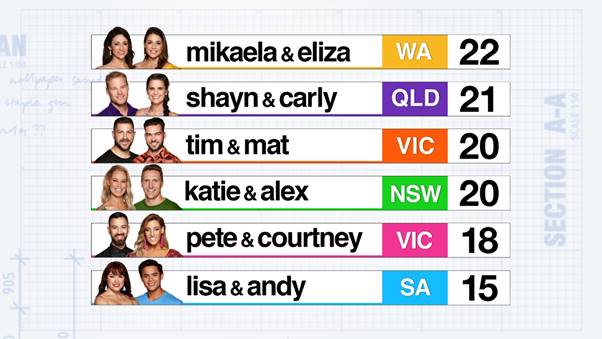
The first challenge has just been completed on House Rules 2019. It was a mega warehouse transformation of the first floor. The 6 couples got straight to it. The sisters Mikeala and Eliza took out the win (they aren't sure what that means yet), but they head in to the first house reno (Pete and …
The first challenge has just been completed on House Rules 2019. It was a mega warehouse transformation of the first floor. The 6 couples got straight to it. The sisters Mikeala and Eliza took out the win (they aren’t sure what that means yet), but they head in to the first house reno (Pete and Courtney’s) on top of the leader board.
Check out all the final photos below…

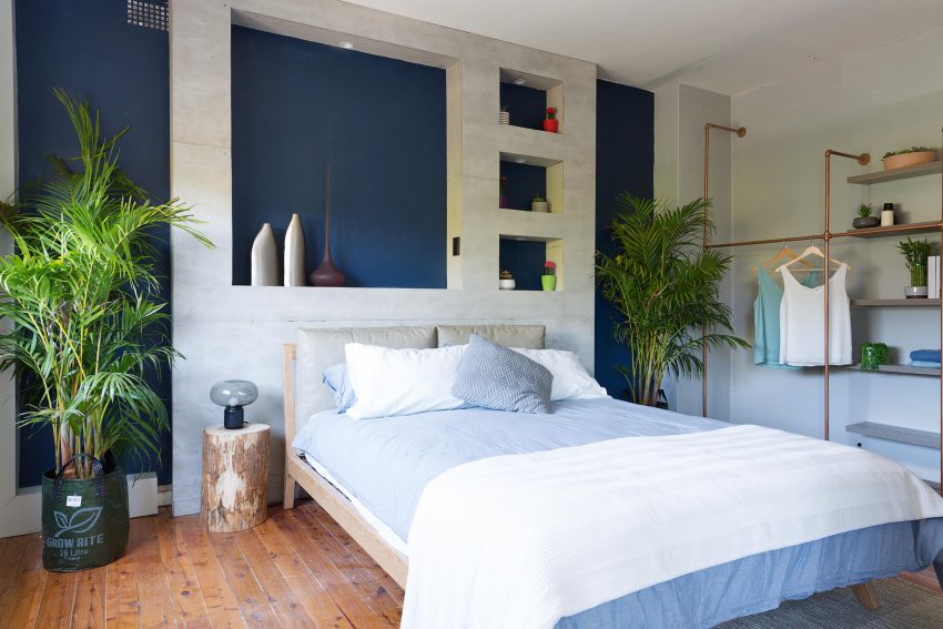
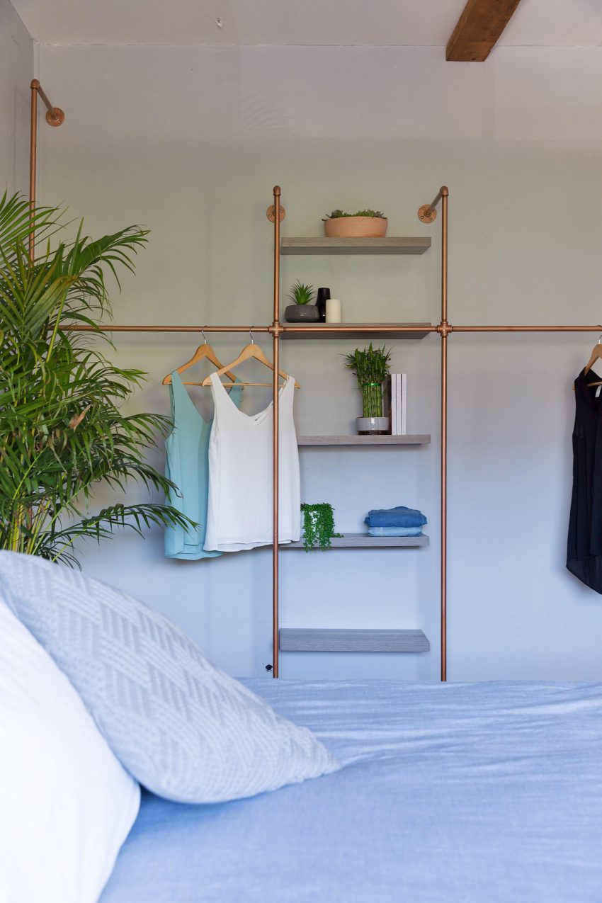
MIKAELA & ELIZA (WA) – Bedroom 3 took out first prize. They scored 22/30.
I’m glad they retained the warehouse vibe with the fibre cement sheeting. It was pretty good and added some depth to the room. I’m personally a bit over navy, but I expect to see lots of it. I wished they’d put those plants in some baskets!
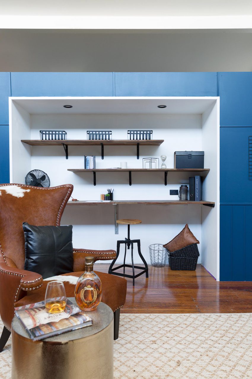
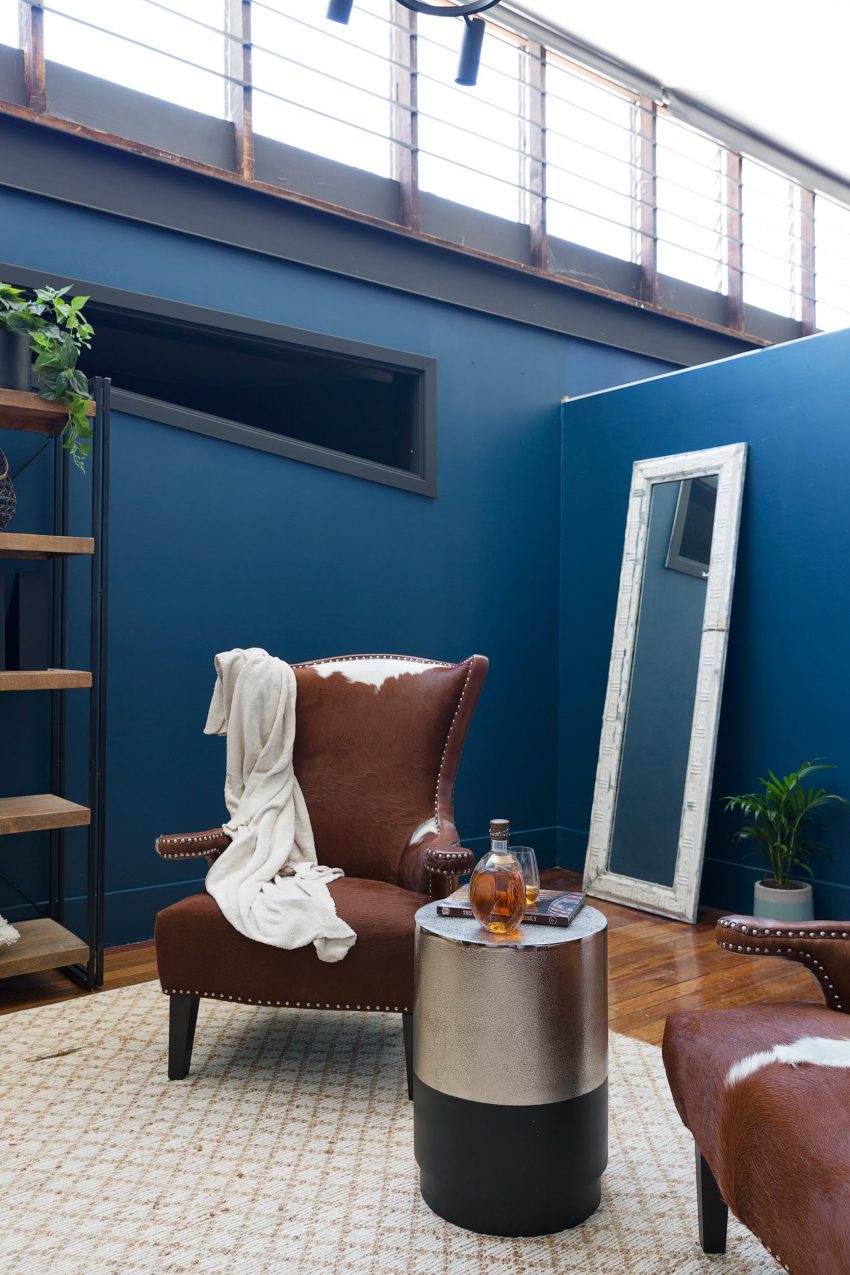
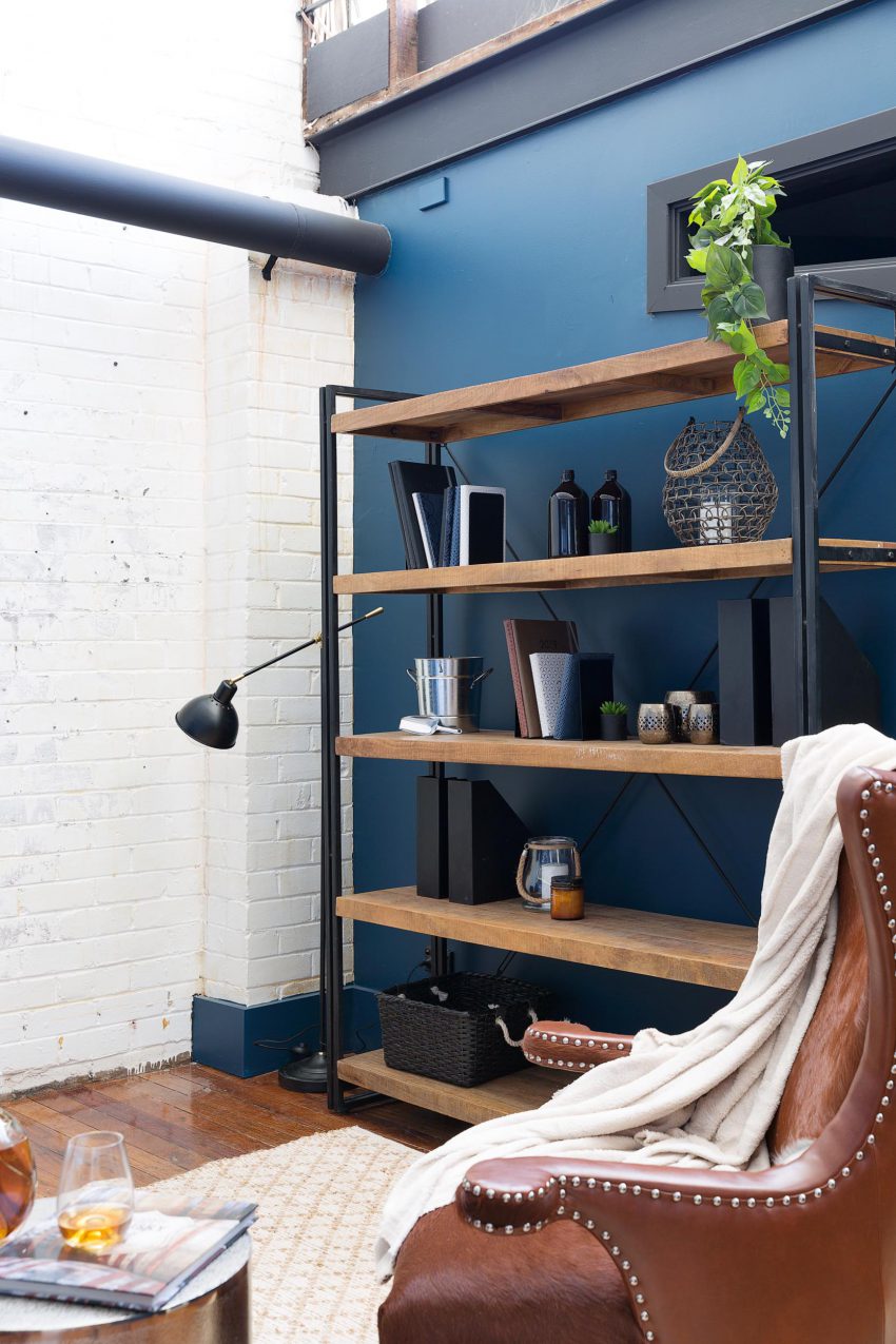
SHAYN & CARLY (QLD) – Study. They scored 21/30.
Big spaces are hard to work with. The office nook shelves aren’t good for my eyes (I prefer symmetry!). There’s a lot of plonked stuff here. It’s oooookkkk, but not not overly exciting.

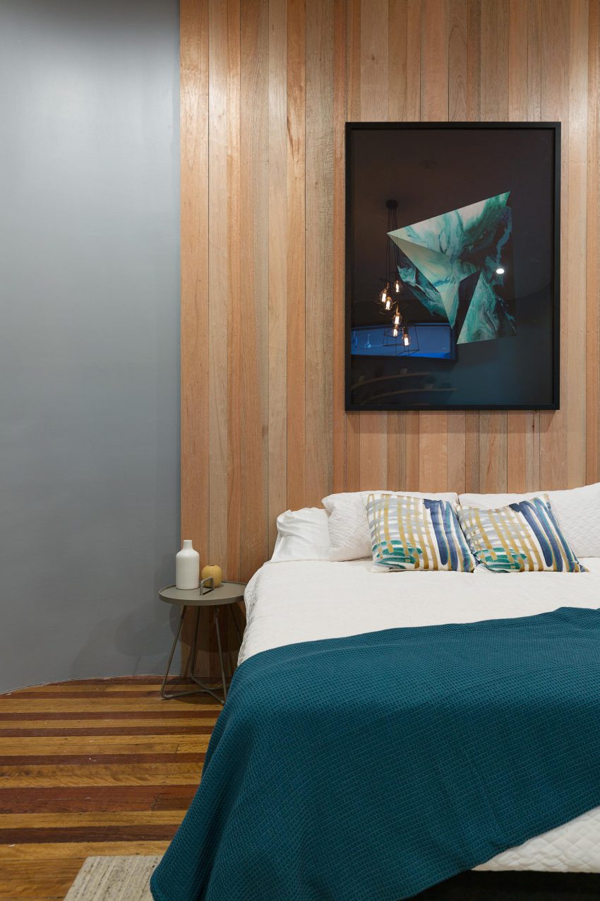
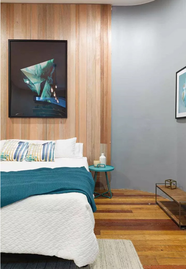

TIM & MAT (VIC) – Bedroom 1. They scored 20/30.
I like the bedhead wall and the colours. I don’t know what the shelving set-up is though?? The mirror is far too small to be sitting in the corner of a massive warehouse.
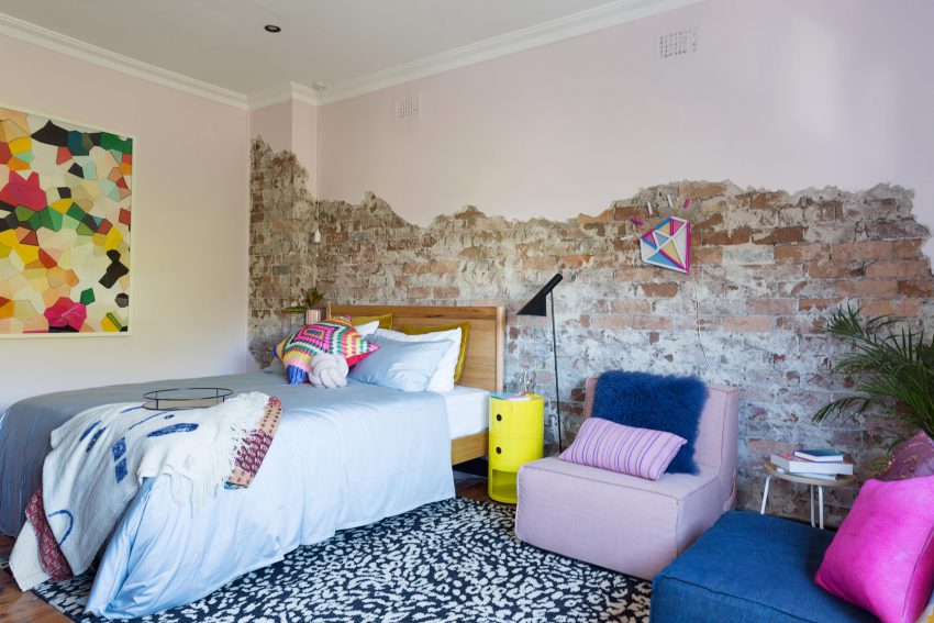
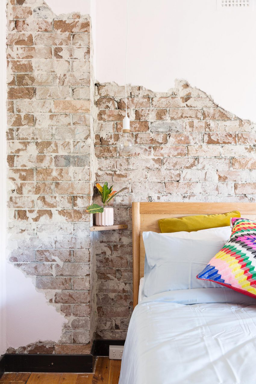
KATIE & ALEX (NSW) – Bedroom 2. They scored 20/30.
Who doesn’t love a bit of exposed brick?? I really do like this look. Especially for a warehouse/industrial theme. They definitely have the bones right. The furniture placement and floor rug wasn’t right though.
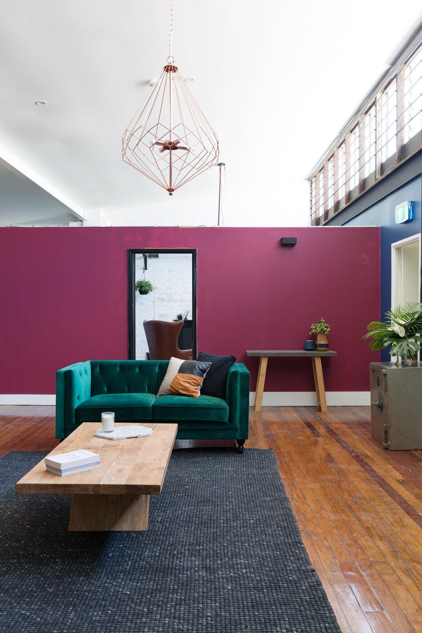
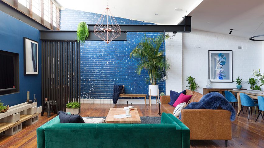

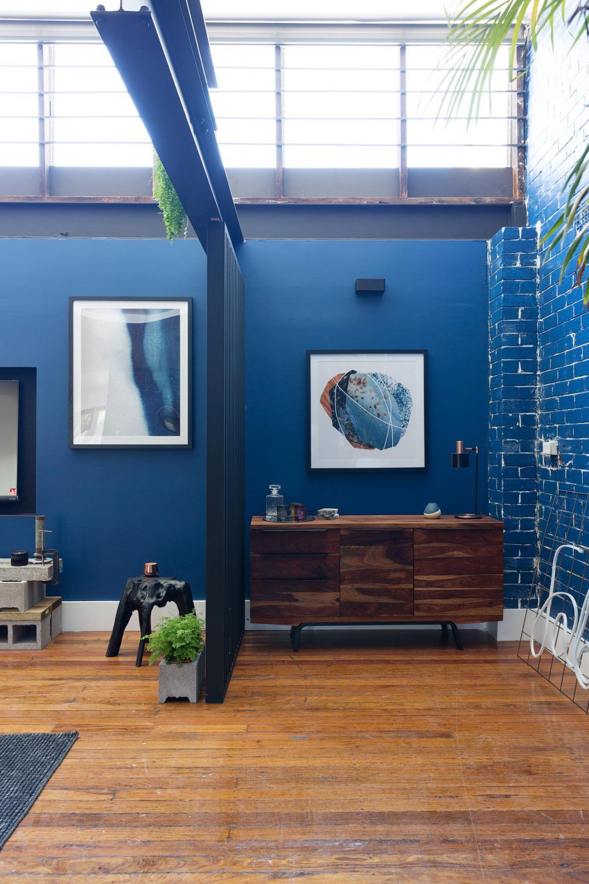
PETE & COURTNEY (VIC) – Lounge Room. They scored 18/20.
Oh, there’s a lot of themed colours going on in here. Not at all done well. I told you, BIG spaces might seem like a good idea at the time, but they can be frightening. Everything just floats around and there’s a tendency to fill every corner.
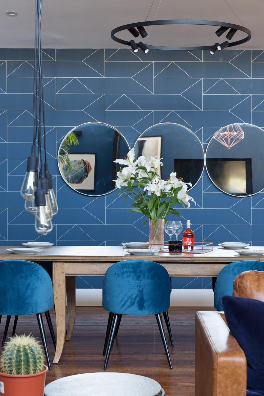
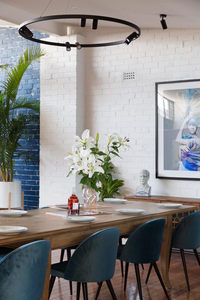
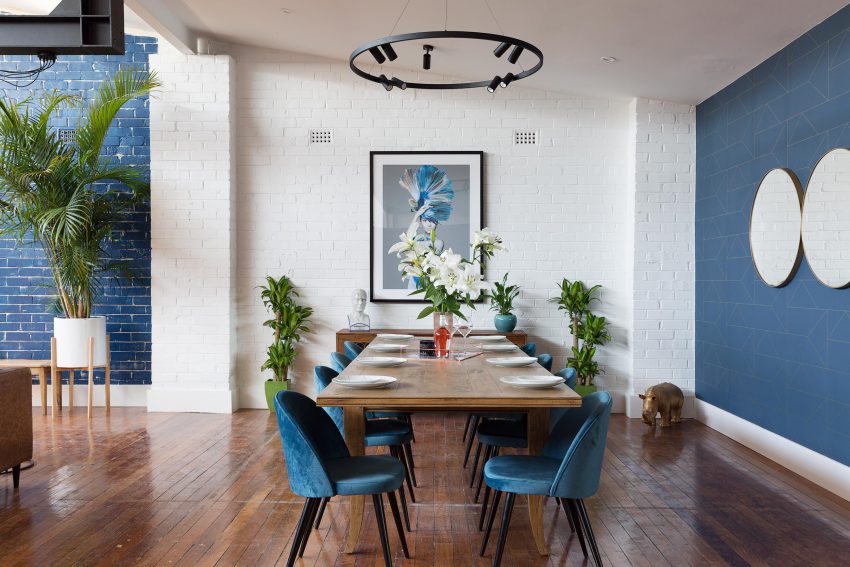
LISA & ANDY (SA) – Dining Room. They scored 18/30.
I didn’t mind the dining, minus the mirrors. The white painted brick is much better than all than blue. The overuse of plants though wasn’t great. They actually could have put 2 sideboards together in the recessed area and worked with that better.
Time will tell! These shows always get progressively better as they go along. I do like House Rules for their practical and budget ideas.
If you haven’t met the couples yet, go here.
♥ KC.
Be the first to read my stories
Get Inspired by the World of Interior Design
Thank you for subscribing to the newsletter.
Oops. Something went wrong. Please try again later.


Comments
Eric Costa
I just love how the homeowners incorporate the sunrise and plants into the homes. It create good vibes and positivity during morning especially if the sun rays are in your house. Nature plus modern house combined with Cane-line Furniture is definitely a haven that everyone wants to go home to. Thanks.