I can't even believe I was loading these photos in to my blog to discuss.... why???? I am horrified. This is bad isn't it? I feel really embarrassed. Let's get this straight though - this is a design TV show, where the contestants get a score and the winner gets a prize. Their rooms are …
I can’t even believe I was loading these photos in to my blog to discuss…. why???? I am horrified. This is bad isn’t it? I feel really embarrassed. Let’s get this straight though – this is a design TV show, where the contestants get a score and the winner gets a prize. Their rooms are encouraged to be discussed openly on social media. Sooooooo, why is it all so bad? Who let this happen? I have so many questions for the producers of this show! Why do these judges even exist?
I know the rules were horrible. And I can’t even blame the contestants entirely because they only had rubbish to work with. I don’t even blame David and Chiara for these vomitous rules. I will go as far to say there’s some strange producers egging everyone on! I think maybe David and Chiara weren’t overly sure on what rules they’d create so the producers used some design “buzz words” to really get them all going. Who says “bling with glam luxe style”??? WHAT IS THAT?
Some of the home was mid-century, some was provincial… It was confusing!
Here were the rules…
David & Chiara’s rules:
1. Bring the bling with glam luxe style
2. Be passionate with red, gold and silver
3. Turn the lounge room in to a swanky cinema
4. Do something dramatic in a sparkly kitchen
5. Make the master suite like an OTT 6 star hotel
Ok, so let’s check out all the photos…
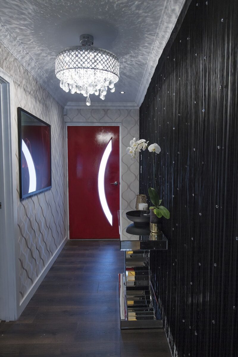
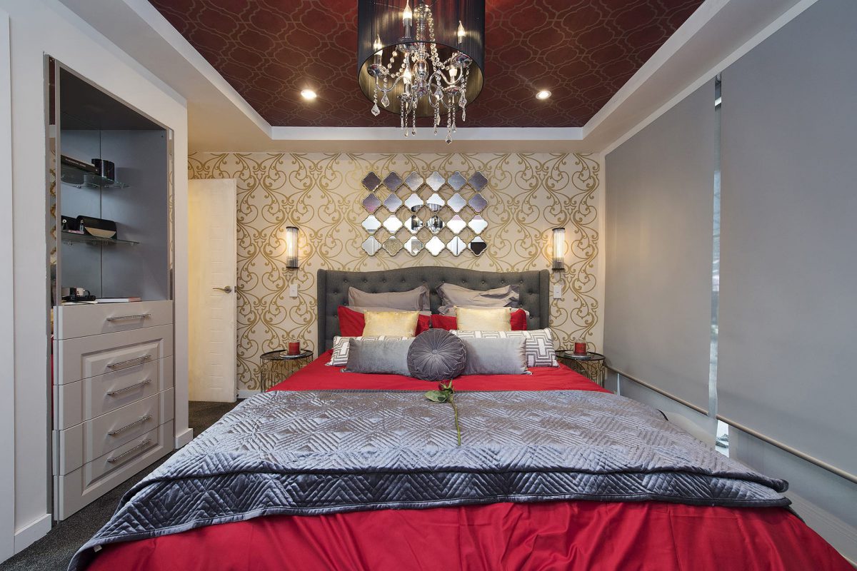
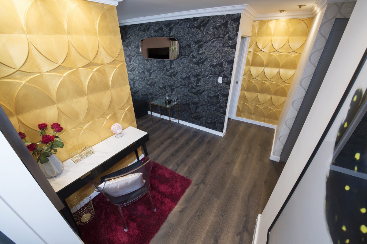
Jess & Jared (Entry and Master Bedroom)
I just don’t know what to say. They didn’t get this right did they? The master bedroom was horrendous. Nothing matched, and there were so many sparkly things. If you’re going to style using black, red and silver you need to make sure the base is WHITE and then comes the black, followed by a bit of mirror/silver and then MAYBE a bit of red (which I can’t even deal with anyway).


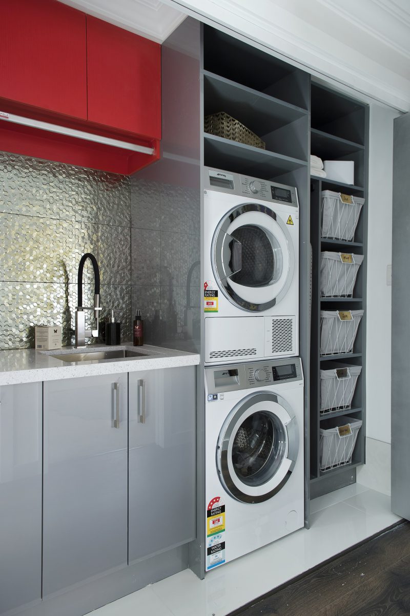
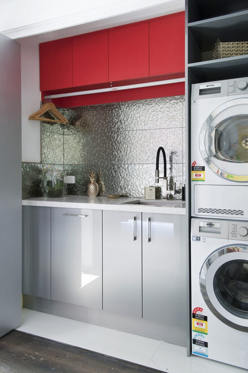
Josh & Brandon (Girls room and Laundry)
Look, it was passable. The laundry was ok in comparison to the rest of the house. It wasn’t good, but I know they had to stick to the rules!


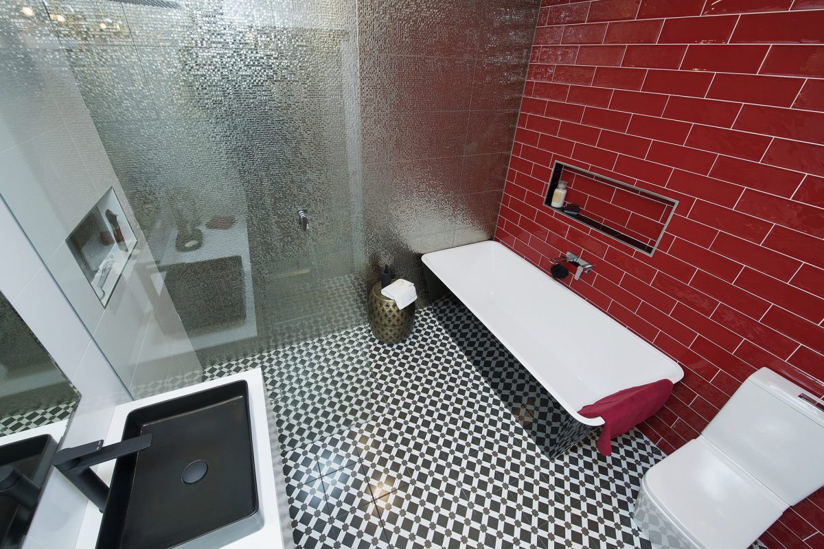
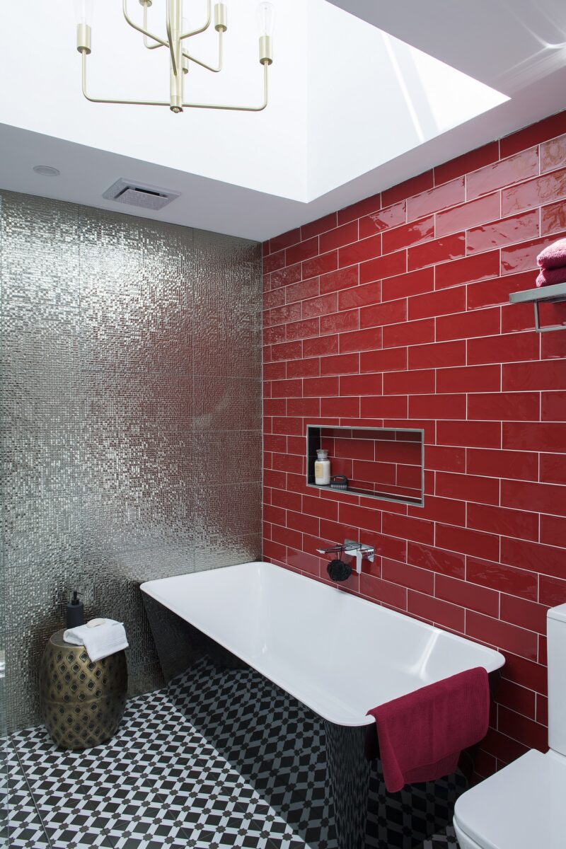
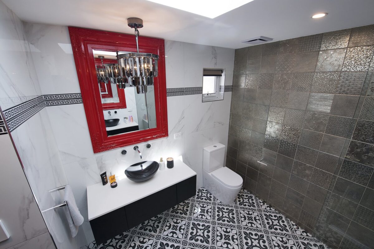
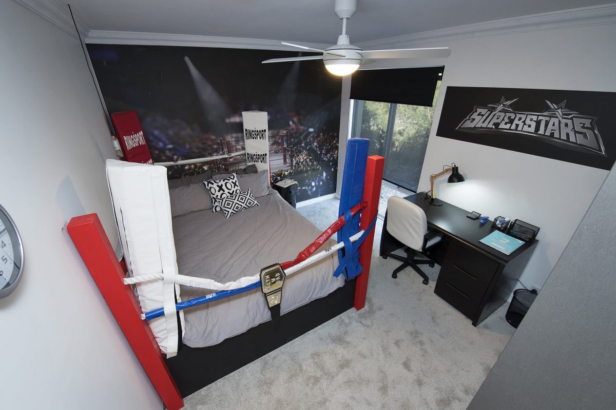
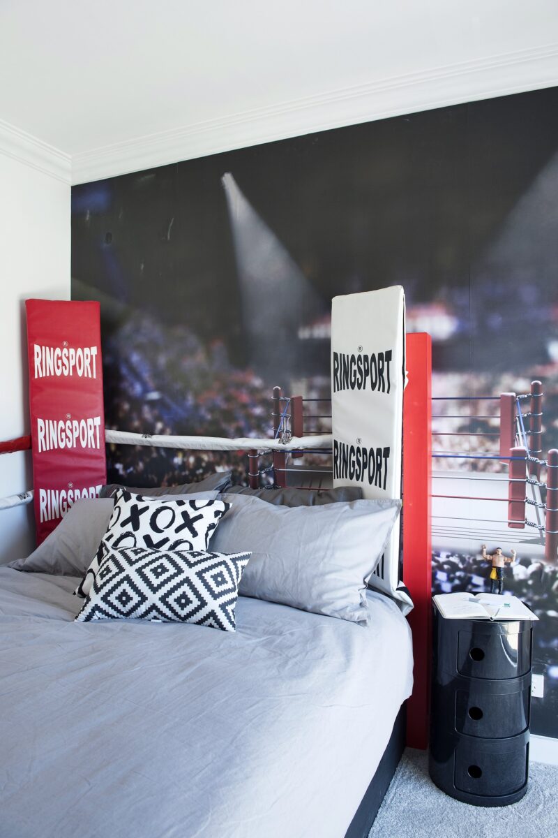
Toad & Mandy (girls room and Bathroom)
I’m not criticising the little girls room, because she will love it, and that’s what the show is about. Making those little faces smile and I’m ok with that. BUT the bathroom. I am yelling! WHAT THE? I like the black bath and sink. I also like the floor tiles. But then they had to stop. Just add one single red towel! Resale isn’t going to be easy for this house. LOVE the skylight though.





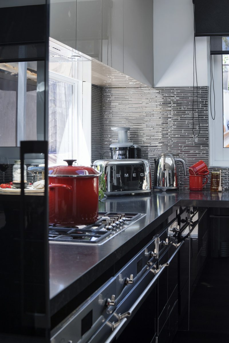
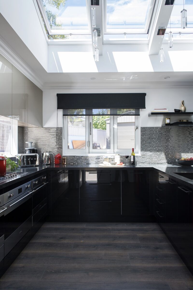
Mel & Dave (Kitchen and Hallway)
Why did they pick shiny gloss black? I suppose you have to when the rule is “Do something dramatic in a sparkly kitchen”. The only things saving this space are the skylights and the bar stools. Did they really add yellow to the hallway with wallpaper??? That was bad.



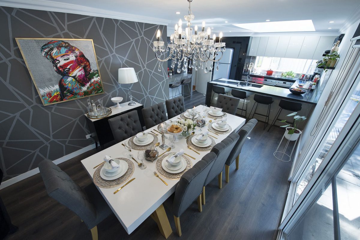
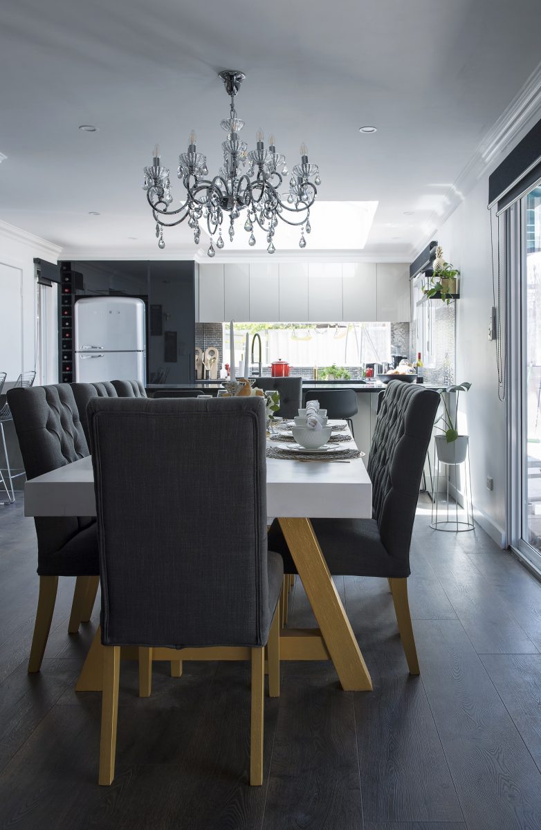
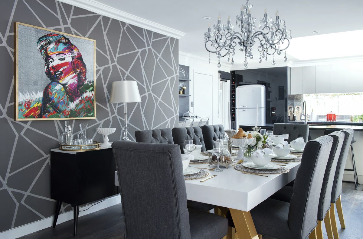
Leigh & Kristie (Ensuite, dining room and bonus boys room)
If anything, I can handle the dining table this week. Because it matches! Yay! I even like the wallpaper (minus the print OVER the wallpaper). That ensuite wasn’t fantastic either. Too many tile clashes. I could (minutely) deal with the red mirror if I had to (because the rules said so), and even the floor tiles. But then that needed to stop right there.



Kim & Michelle (Living room and coffee zone)
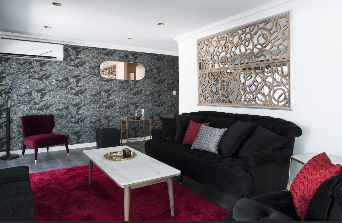
I think the coffee zone was the only good part in the house! That was ok and works best considering the rules given. BUT the lounge room… the furniture placement was wrong. Throw out the red shaggy rug and wasn’t it supposed to be a cinema room? That didn’t happen did it? Why is that mirror so high?


This house would have to be the worst I’ve ever seen. Sorry I am being very unkind here, but I really hope next season (because there is a next as I see them calling for applicants!) there are some people guiding them, some better rules and some new judges!
What did you think??
You can see the previous renos here and meet the contestants here.
♥ KC.
Be the first to read my stories
Get Inspired by the World of Interior Design
Thank you for subscribing to the newsletter.
Oops. Something went wrong. Please try again later.





Comments
Lesley
I will have to agree not the best re sale for this place it’s all over done.
Just a few simple pieces would have change the whole out look. Just to much in each room if not wall paper then tiles is was all over the place this week..
I feel for the contestants those RULES where just so wrong..
What where they thinking who knows but you feel for all that got the Rules this week..
jodi
My eyes are bleeding… I think I would die if i walked into my home and saw this.
Sonya
OMG I have words, it looks like a strip club circa 1998 in King St, Melbourne. This is why I would never go on this show
Clp
It’s all so delightfully hideous isn’t it? (And don’t feel bad, I just called the 3birds laundry a dog’s breakfast and that was much better than this monstrosity).
I smell a rat here. The producers have realised they could get safe predictable spaces which will offend no one but rather they are likely to rate better with these horrors. It’s like how they are now casting villains on cooking shows.
You’ll get more comments showing ugly spaces than safe ones.
Beautiful spaces would rate even better but with the talent they have on offer that’s not an option.
I haven’t watched this show at all but how have the judges reacted? Because of its positive that’s their credibility shot to pieces.
But the reality is even though everyone likes nice spaces most people have pretty shit taste (judging by the family rooms people stick on Houzz with their brown leather couches, sticks in a vase in the corner, matching objects on coffee table and red accent cushions!
Julia
My pinterest feed is full of the most horrific rooms with a little icon with your face in it. I thought you had lost your mind or your boys had taken over your pinterst feed as a joke. This house would never sell but I bet lots of people would attend the open house!
debbie
No, just no
Sophie
Katrina I think you did well to write a whole article and commentary on this house. Yes the producers surely need to be held to account. Wrong on so many levels…
Elisabeth
Totally agree. Honestly I’ve always thought the idea of House Rules was, in itself, an absolute winner. Even if you don’t win the contest, you still get your home renovated completely. Win win. However! If I walked into my home, and it looked like this, I’d be crying. Still, as you say, them’s the rules! Chiara and Dave are pretty flamboyant people, so whether it suits us, or really is, in any way, aesthetically beautiful to us, clearly…. ‘beauty lies in the eye of the beholder’.
I do agree that obviously people, events and rules are being manipulated for drama for the show; why?? We don’t want or need drama, people! We just want a renovation show! (If I wanted to see so many dysfunctional relationship issues I’d watch Dr Phil!). I guess the bottom line is, the contestants are not people with a keen sense of design, but are just in there having a go and doing the best with what they get.
I would love to know what their budgets are each week. It’s all very well telling us how much value has been added to the property, but how much was spent to add that?
It’s been crushing watching them destroy the charm of Toad and Mandy’s home. Fingers crossed all will be well!
Maureen Ellis
Honestly I could not bring myself to watch this show and only see your blog reports. I never make nasty comments, as I feel it is better to say nothing at all. However, I will make an exception this time. It is totally horrendous and looks like a bordello!