[vc_row][vc_column][vc_column_text]Whitney and Andy took out the win on The Block Octagon last night with the reveal of their dining and foyer area. They scored 26/30. It was difficult to judge the rooms last night as only 2 teams really finished, so I personally don't think the scores really showed the real winners this week. Whitney and …
[vc_row][vc_column][vc_column_text]Whitney and Andy took out the win on The Block Octagon last night with the reveal of their dining and foyer area. They scored 26/30.
It was difficult to judge the rooms last night as only 2 teams really finished, so I personally don’t think the scores really showed the real winners this week.
Whitney and Andy’s room did nothing for me. Sorry guys! I really didn’t like any of it. I know their budget was low this week and you can really tell with the under-styling.
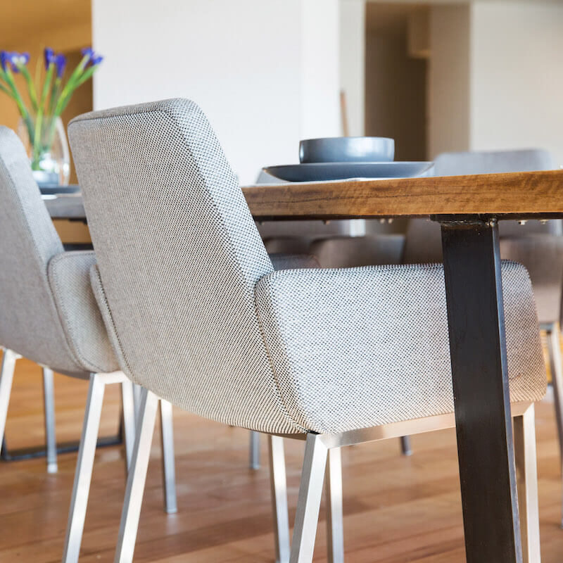
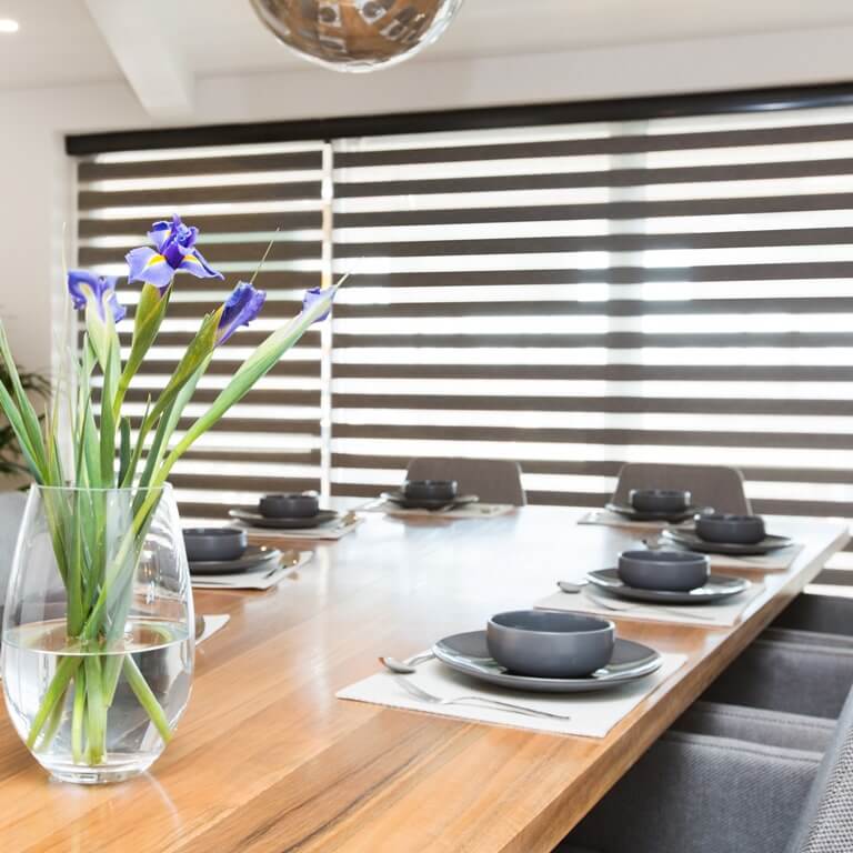
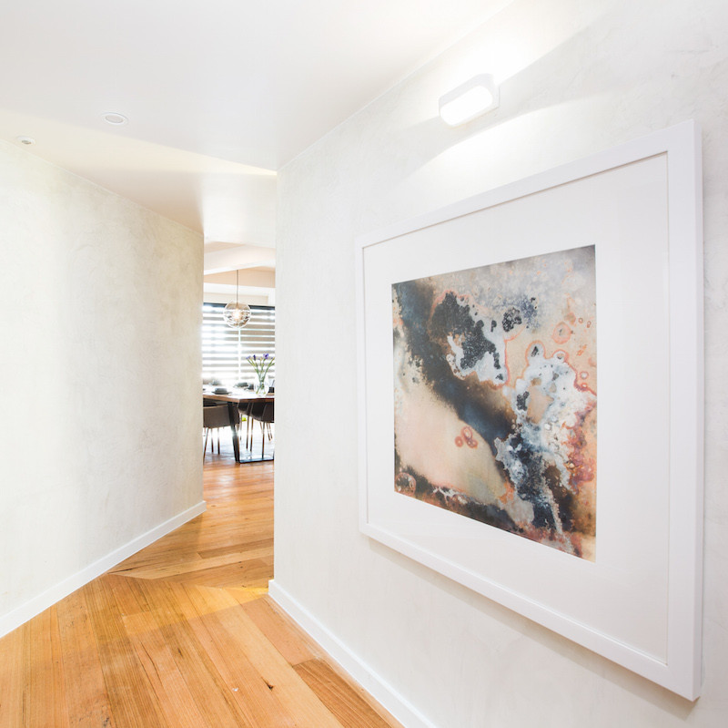
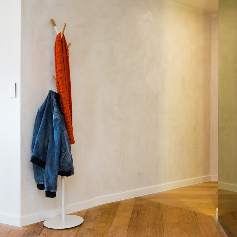
Shop Whitney and Andy’s look here…[/vc_column_text][vc_row_inner][vc_column_inner width=”1/4″][vc_column_text]
Artwork[/vc_column_text][/vc_column_inner][vc_column_inner width=”1/4″][vc_column_text]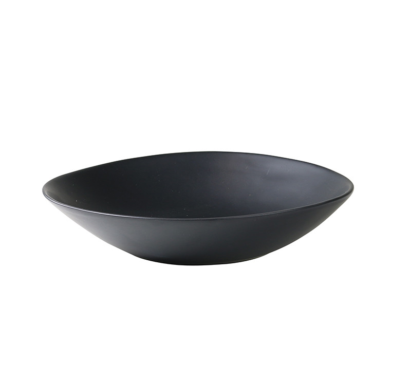
Bowl[/vc_column_text][/vc_column_inner][vc_column_inner width=”1/4″][vc_column_text]
Dining[/vc_column_text][/vc_column_inner][vc_column_inner width=”1/4″][vc_column_text]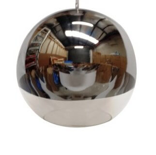
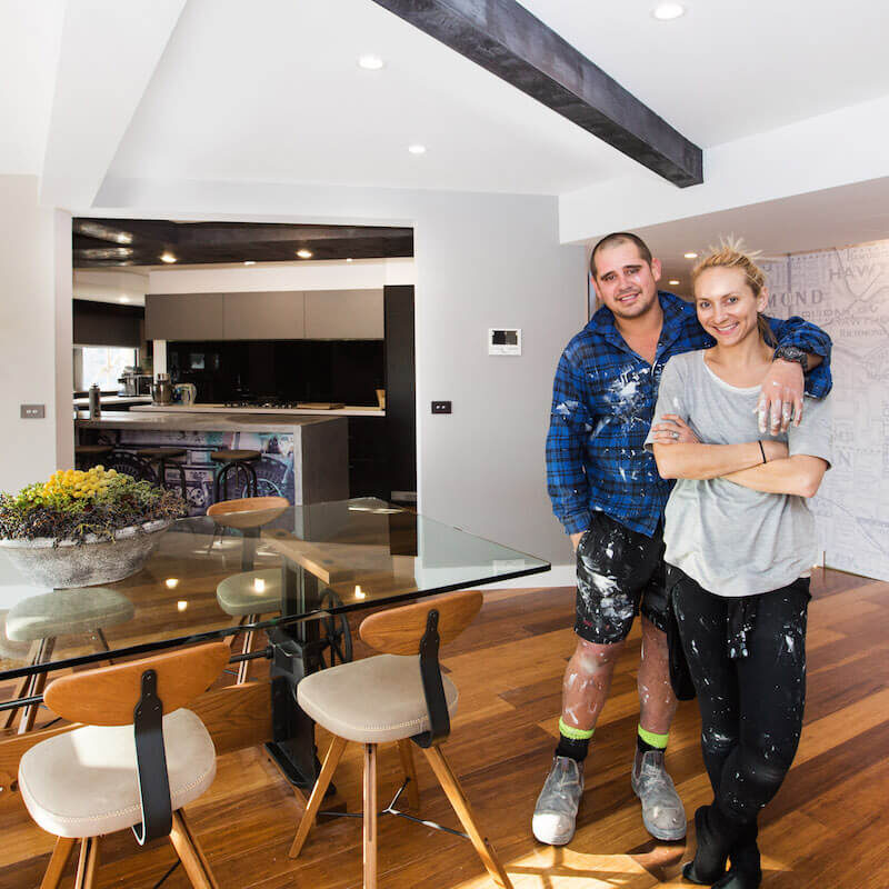
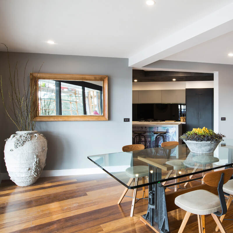
Pendant[/vc_column_text][/vc_column_inner][/vc_row_inner][/vc_column][/vc_row][vc_row][vc_column][vc_separator][vc_column_text]Caro and Kingi were 2nd place with 25.5/30. They did manage to finish their rooms and as usual they stuck to their industrial-render-wallpaper feel.
The table was cool – I liked that. The singer sewing machine style console wasn’t my favourite. Didn’t like the mirror and that pot was weird!
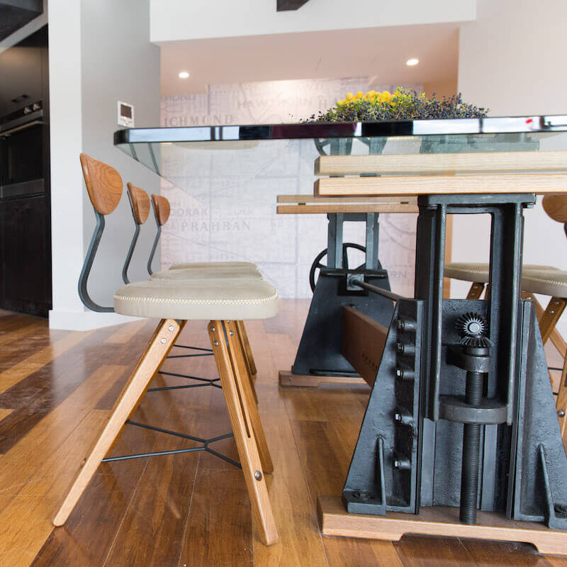
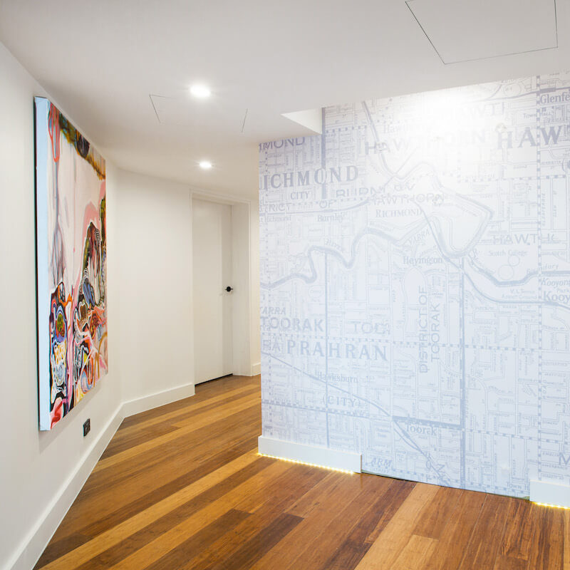
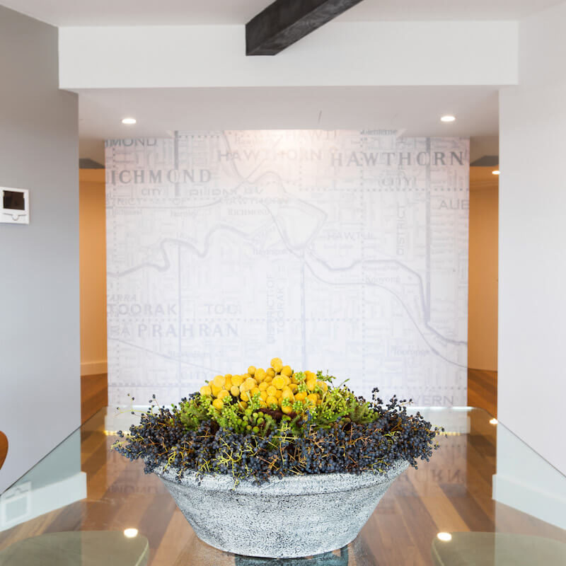
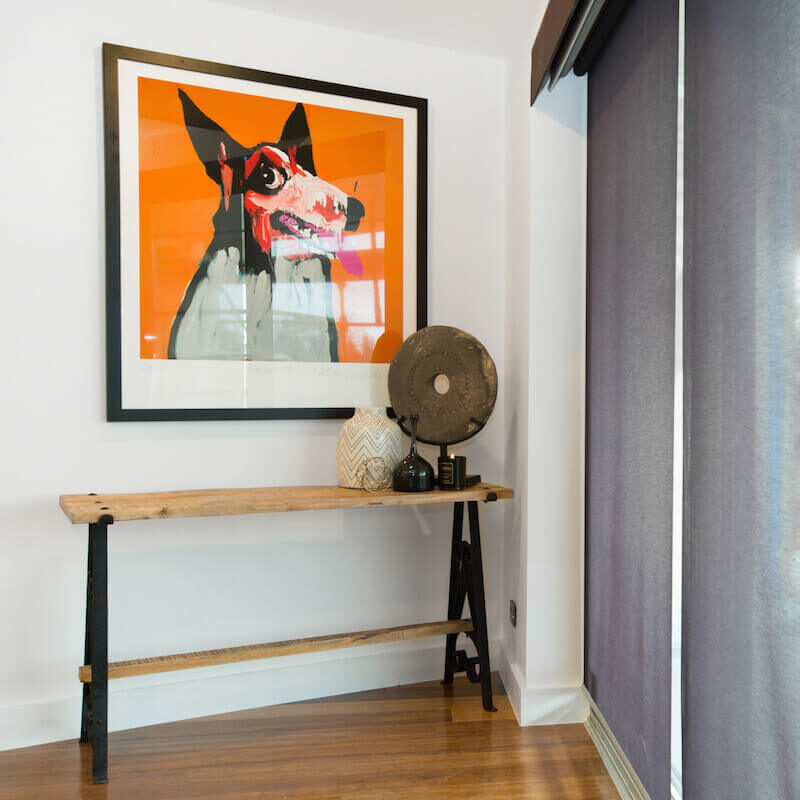
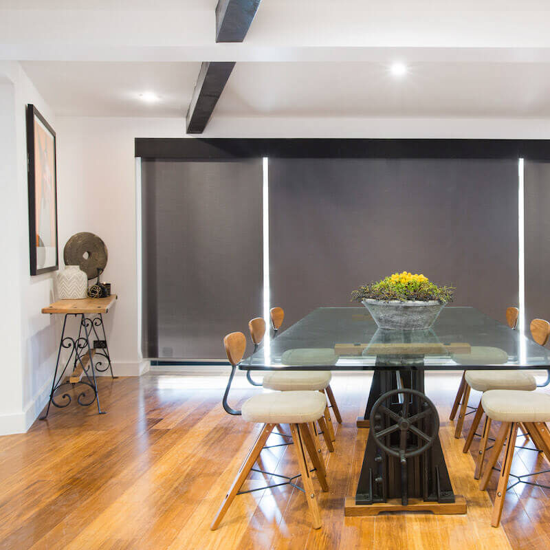
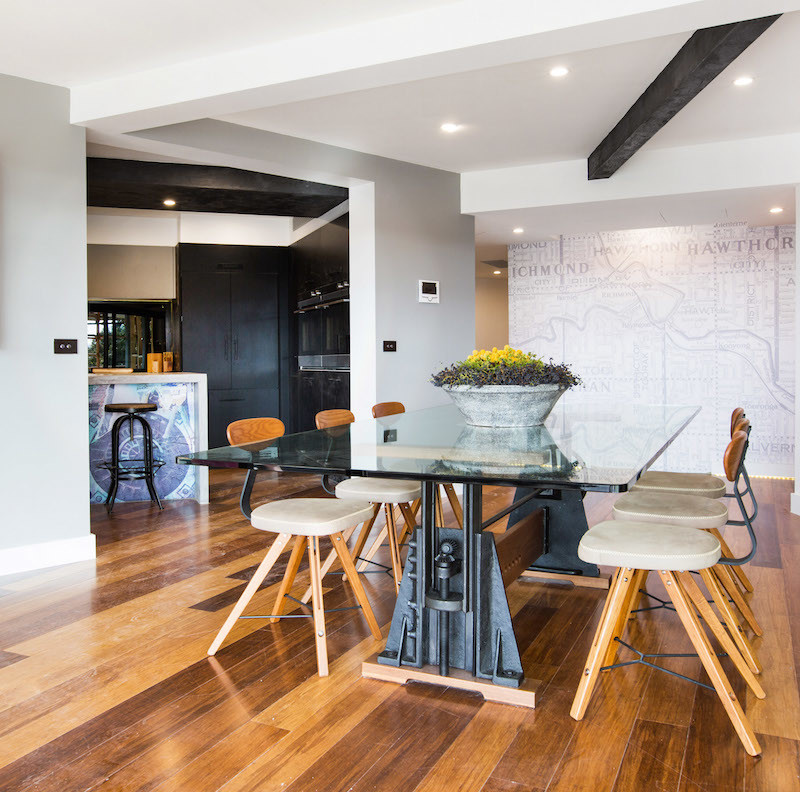
You can shop Kingi and Caro’s look below…[/vc_column_text][vc_row_inner][vc_column_inner width=”1/4″][vc_column_text]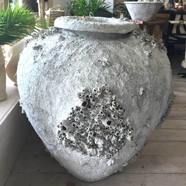
Pot[/vc_column_text][/vc_column_inner][vc_column_inner width=”1/4″][vc_column_text]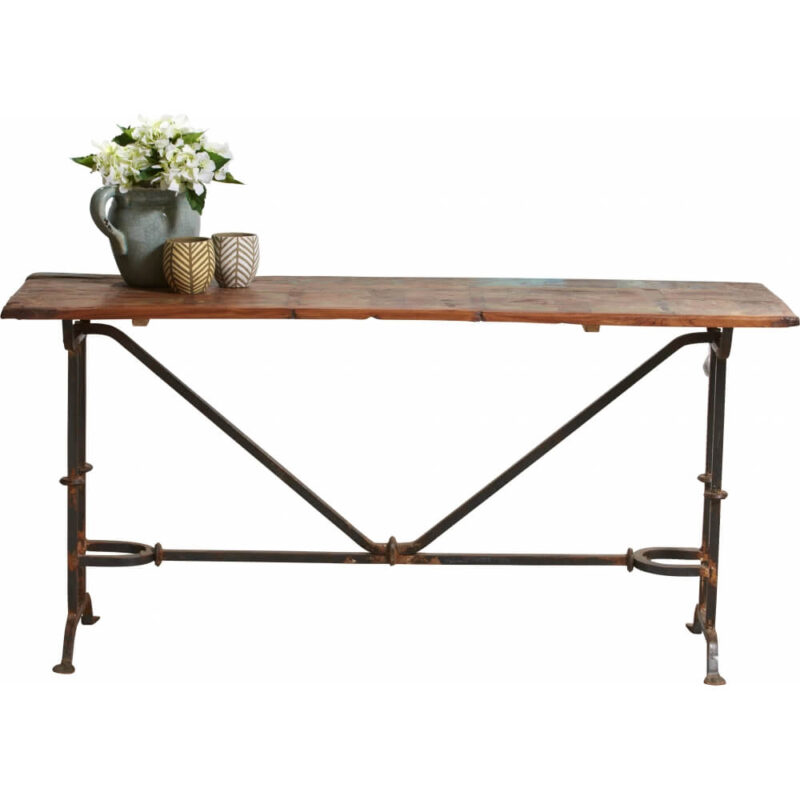
Console[/vc_column_text][/vc_column_inner][vc_column_inner width=”1/4″][vc_column_text]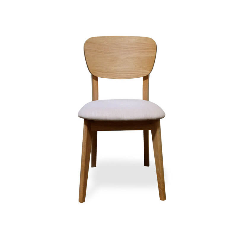
Dining Chair[/vc_column_text][/vc_column_inner][vc_column_inner width=”1/4″][vc_column_text]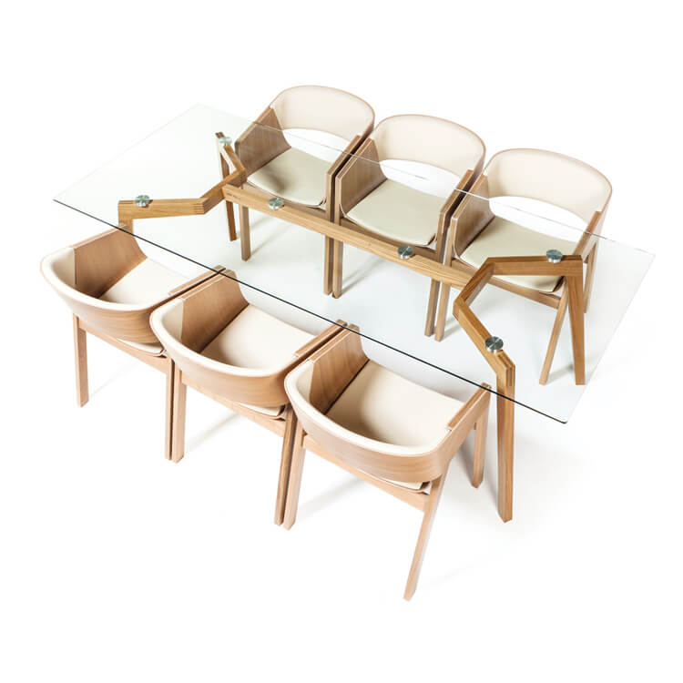
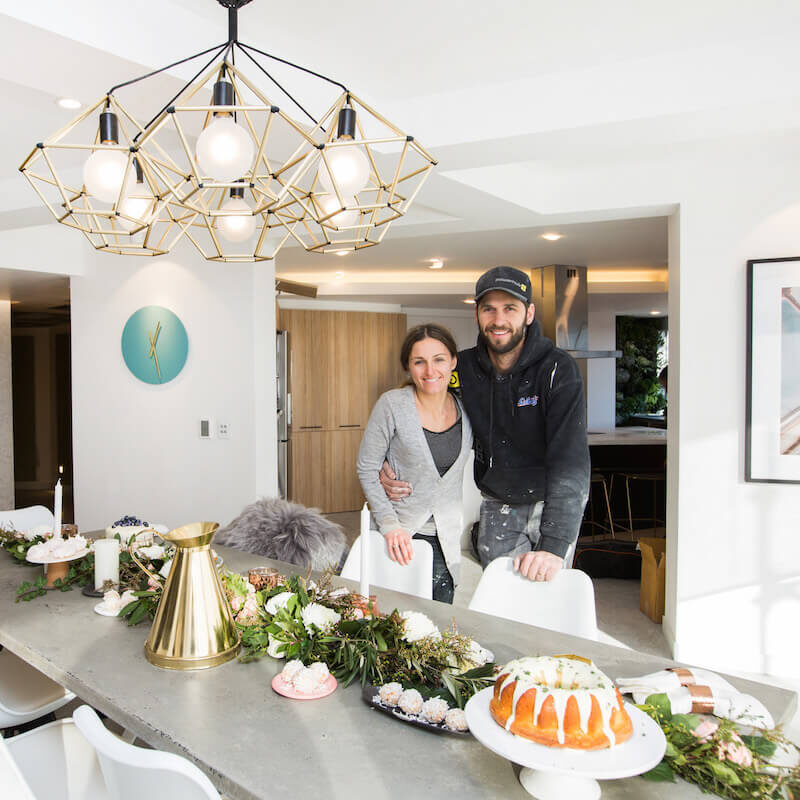
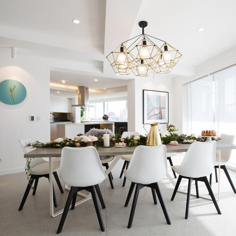
Table[/vc_column_text][/vc_column_inner][/vc_row_inner][vc_separator][/vc_column][/vc_row][vc_row][vc_column][vc_column_text]Dean and Shay should have been the winners I think. But they didn’t manage to quite finish so they were awarded 3rd place with 21/30.
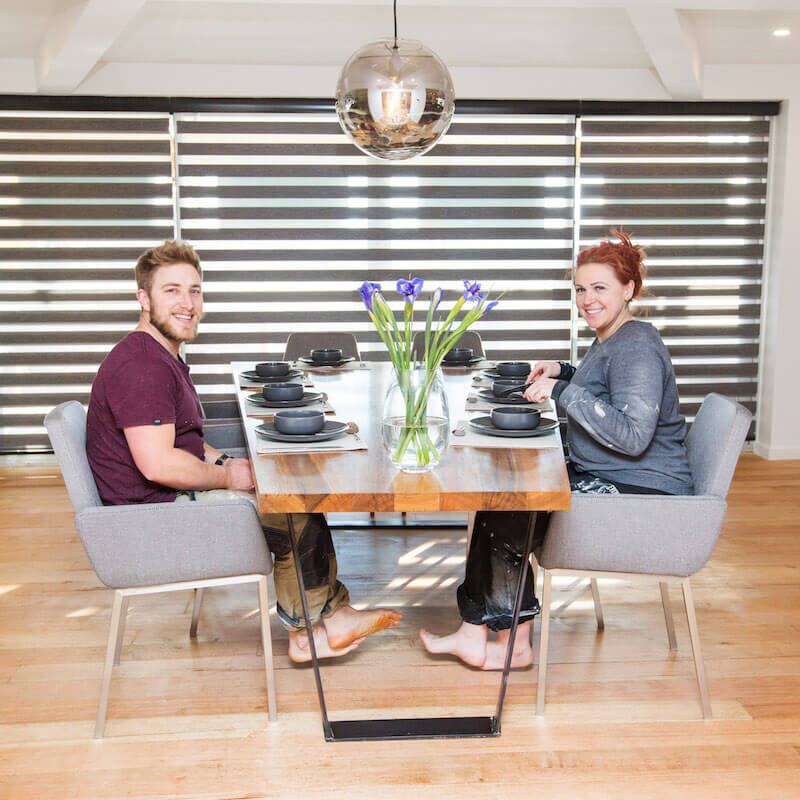
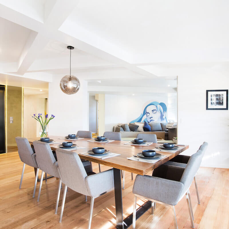
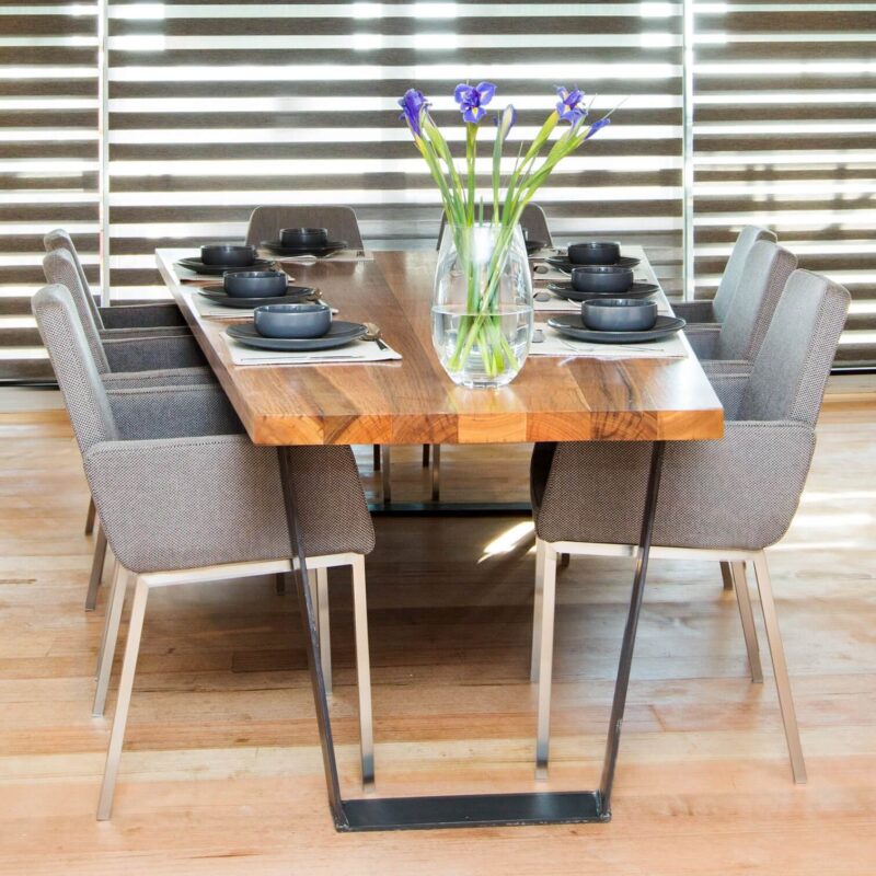
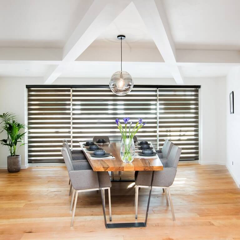
It was understated, appealing and fresh. Their table was a winner. So was the chandelier.
Table styling was awesome – loved it!
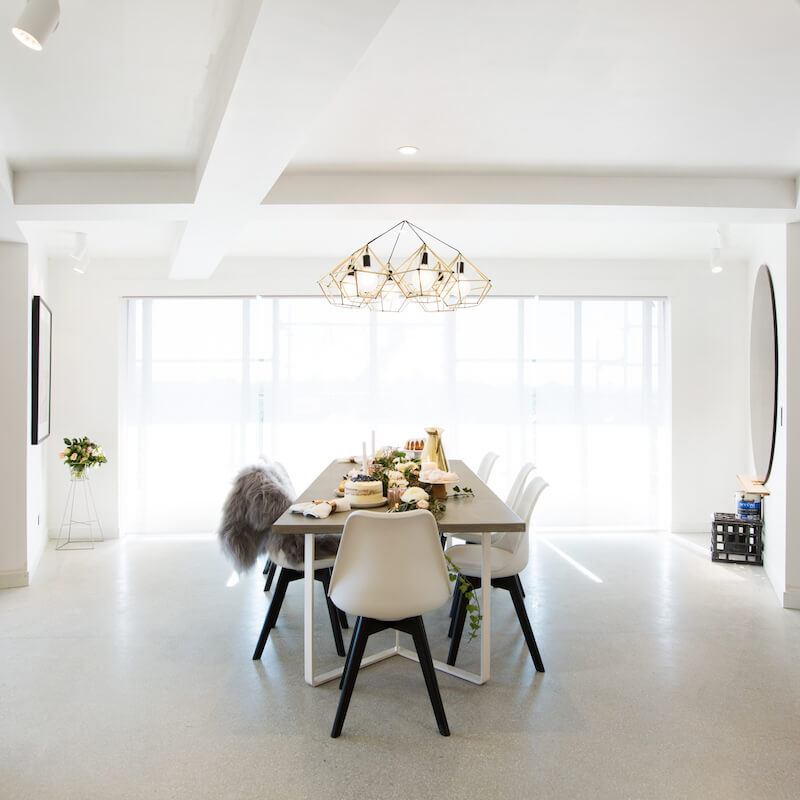

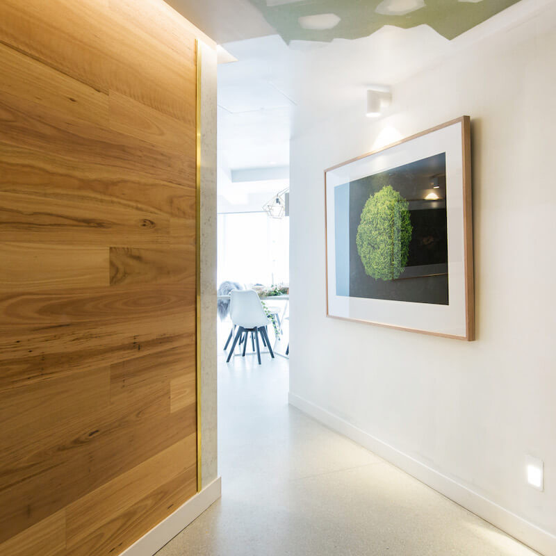
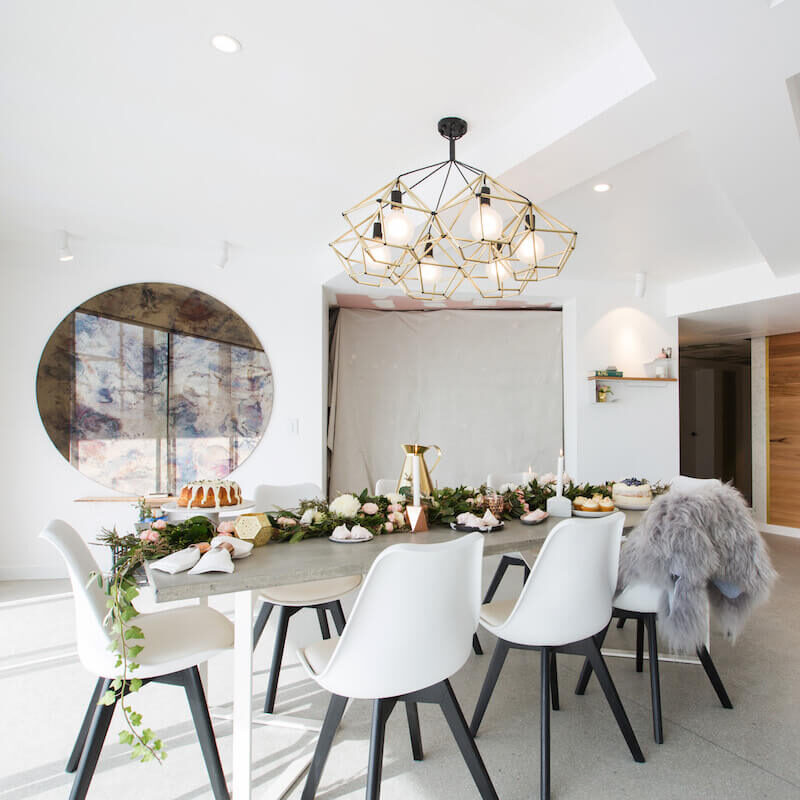

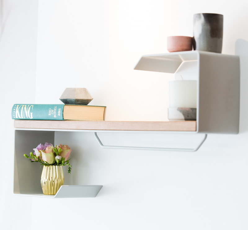
Snatch a good buy with some of Dean and Shay’s items below…[/vc_column_text][vc_row_inner][vc_column_inner width=”1/4″][vc_column_text]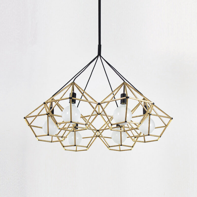
Chandelier[/vc_column_text][/vc_column_inner][vc_column_inner width=”1/4″][vc_column_text]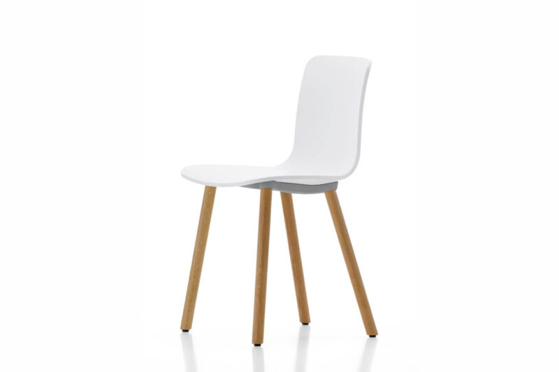
Chair[/vc_column_text][/vc_column_inner][vc_column_inner width=”1/4″][vc_column_text]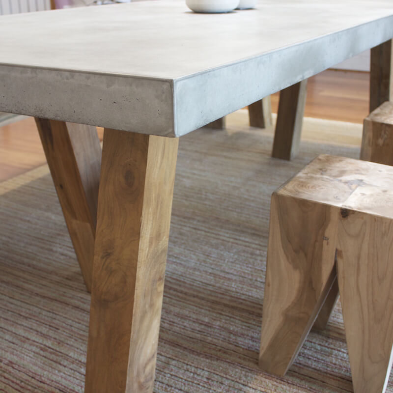
Table[/vc_column_text][/vc_column_inner][vc_column_inner width=”1/4″][vc_column_text]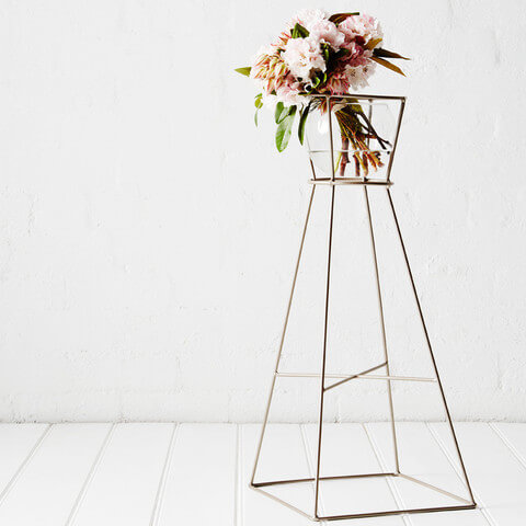
Plant stand[/vc_column_text][/vc_column_inner][/vc_row_inner][vc_separator][/vc_column][/vc_row][vc_row][vc_column][vc_column_text]Luke and Ebony scored 19/30. The judges loved it and said they probably would haven won if they’d finished. I didn’t like it much though. Did you?
However, the artwork is great and I the pendant was cool.
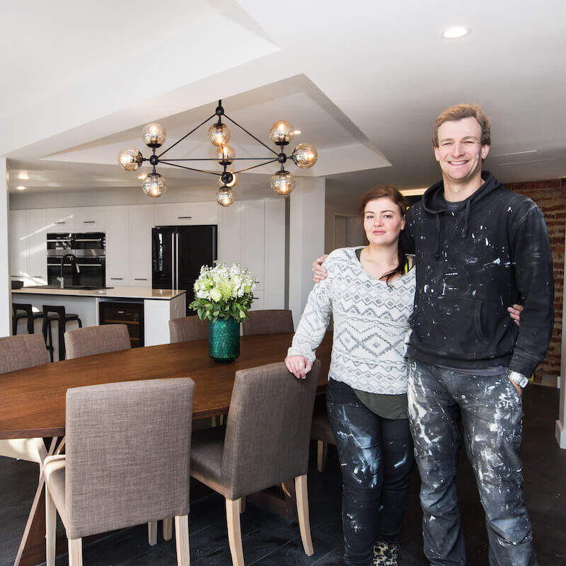

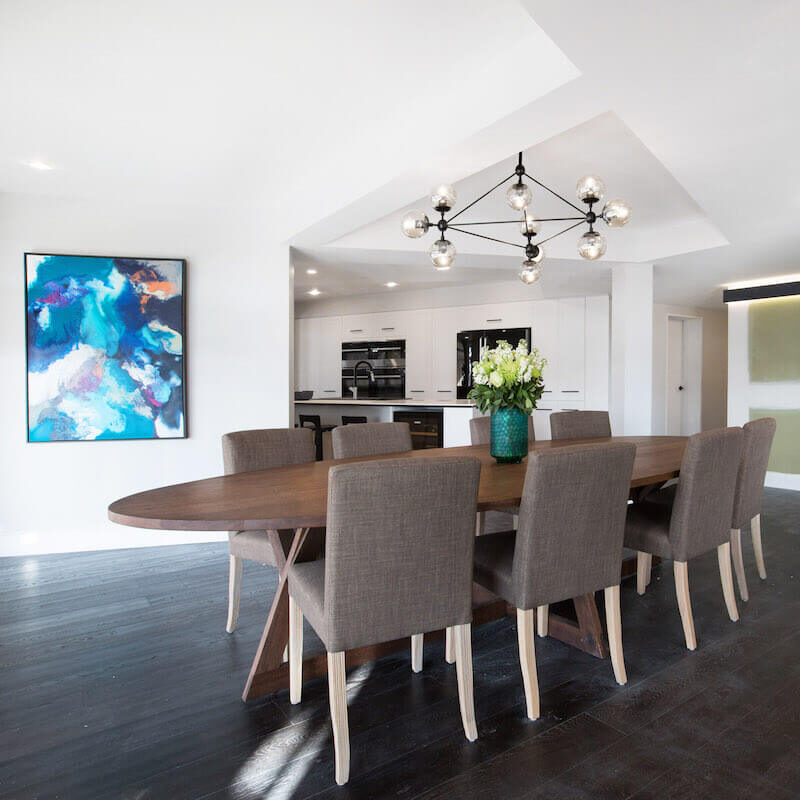
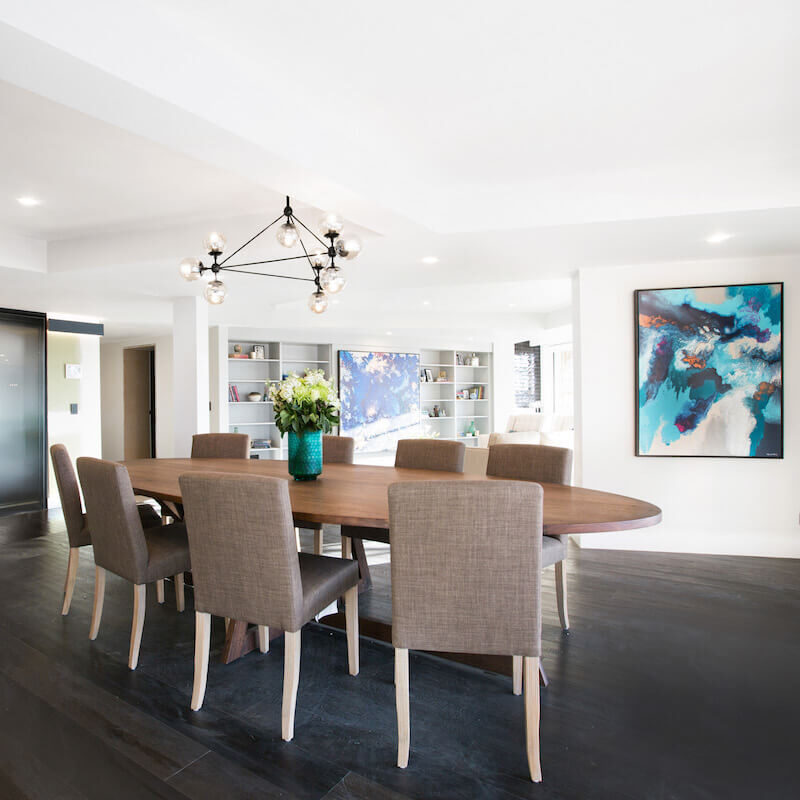
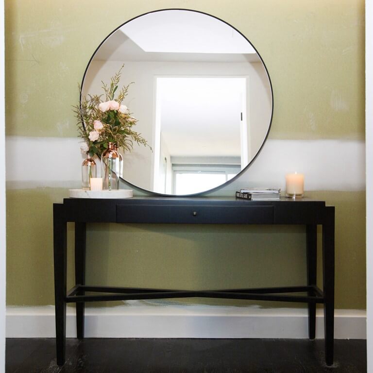
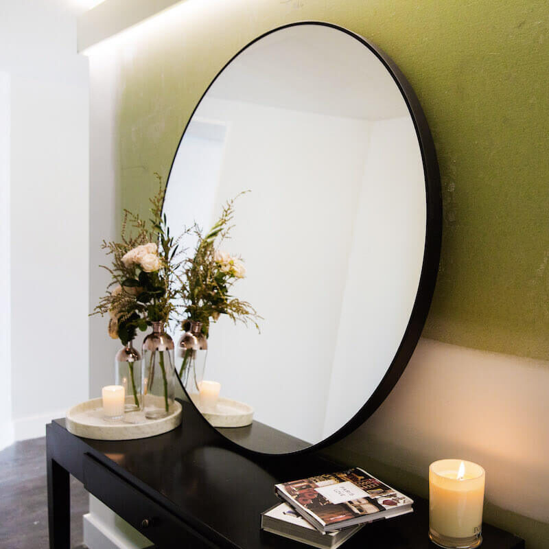
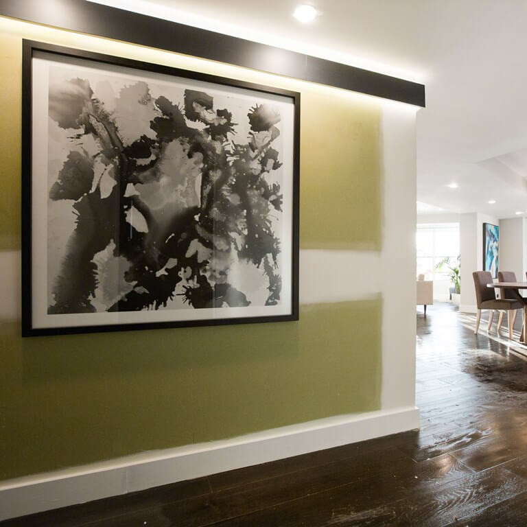
You can shop Luke and Ebony’s room here…[/vc_column_text][/vc_column][/vc_row][vc_row][vc_column width=”1/4″][vc_column_text]
Artwork[/vc_column_text][/vc_column][vc_column width=”1/4″][vc_column_text]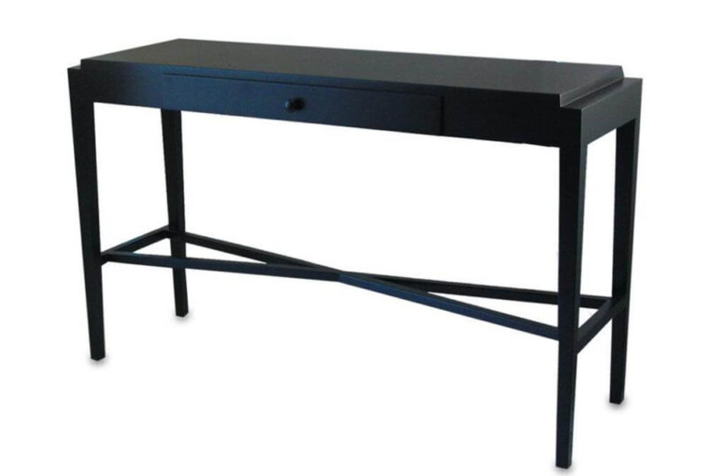
Console[/vc_column_text][/vc_column][vc_column width=”1/4″][vc_column_text]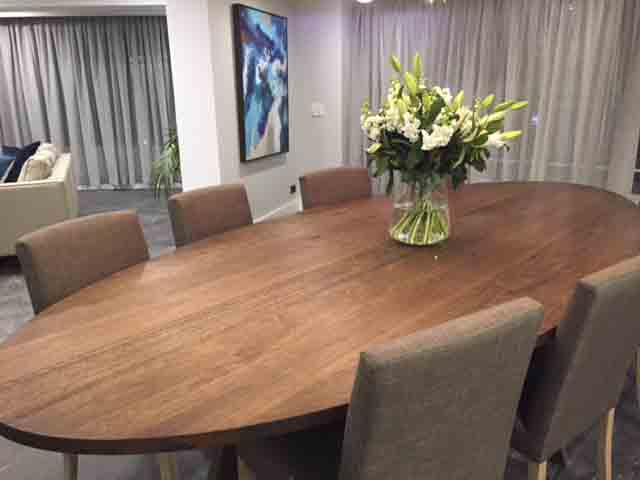
Dining Table[/vc_column_text][/vc_column][vc_column width=”1/4″][vc_column_text]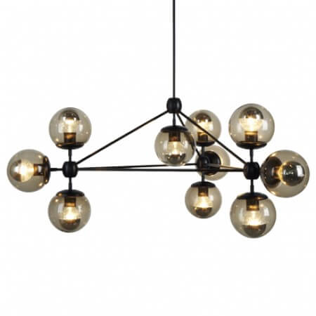
Chandelier[/vc_column_text][/vc_column][/vc_row][vc_row][vc_column][vc_column_text]
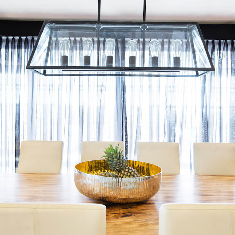
[/vc_column_text][vc_column_text]Suzi and Vonni were last this week with a scored of 16/30. The judges were not sure where their styling is heading as it’s getting a little wishy-washy. I love the pendant, but that’s South Hampton’s style, so not sure where that fits in to their casino feel?
But I didn’t think the room was as bad as the judges thought. It was better than the winners I think! The table was amazing! Would the position of the table worry you? The judges thought having it horizontally was bad because some people won’t see the view? I thought aesthetically for the room it worked better.
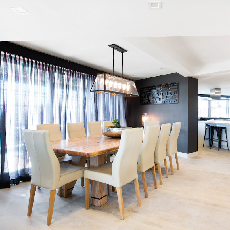

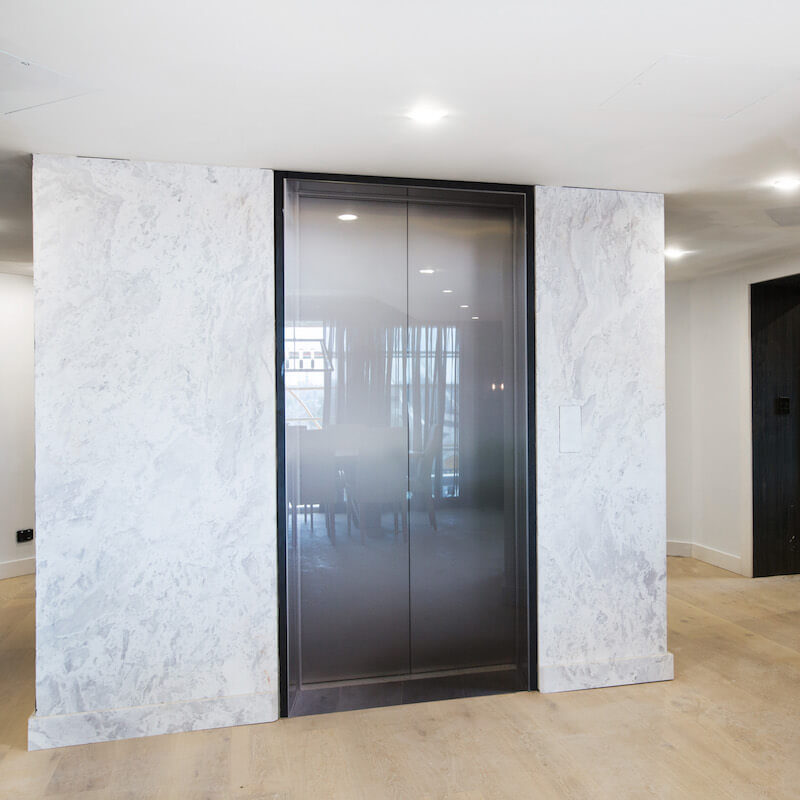

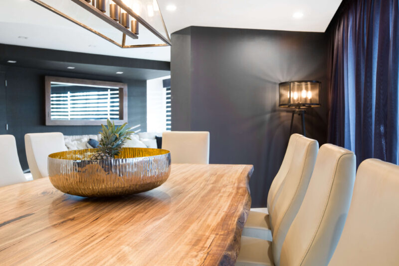
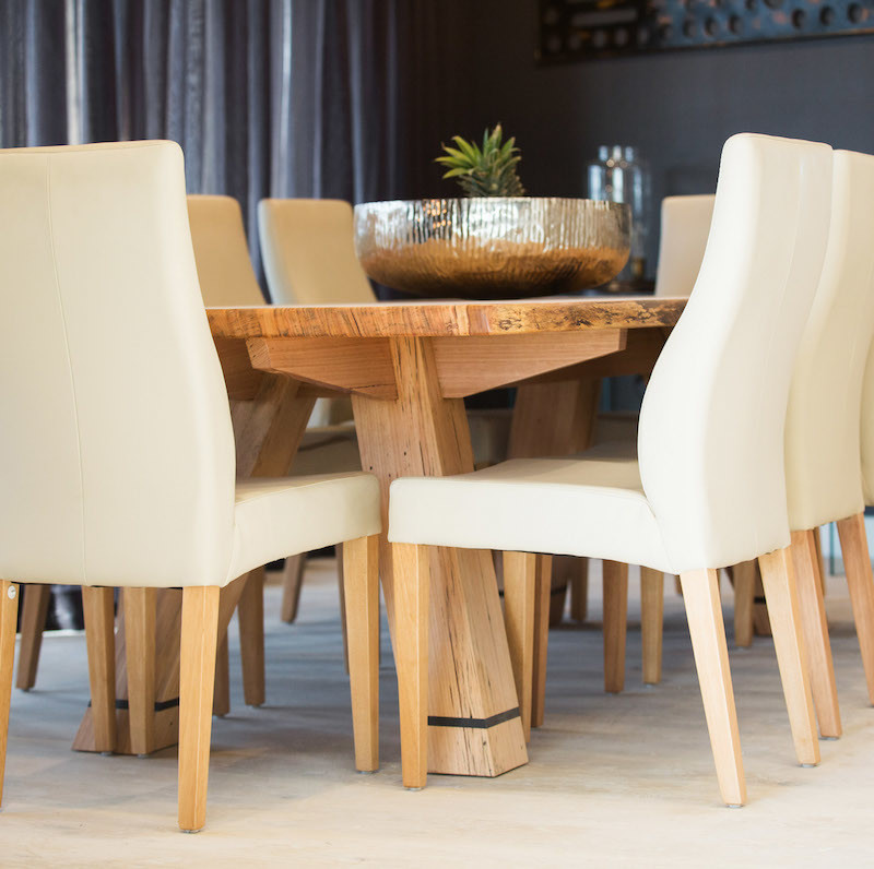
You can shop Suzi and Vonni’s room below…
[/vc_column_text][vc_row_inner][vc_column_inner width=”1/4″][vc_column_text]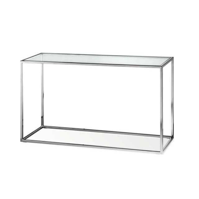
Console[/vc_column_text][/vc_column_inner][vc_column_inner width=”1/4″][vc_column_text]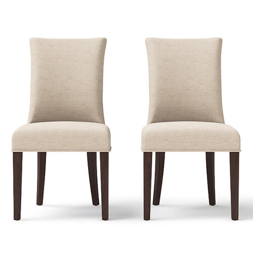
Dining Chairs[/vc_column_text][/vc_column_inner][vc_column_inner width=”1/4″][vc_column_text]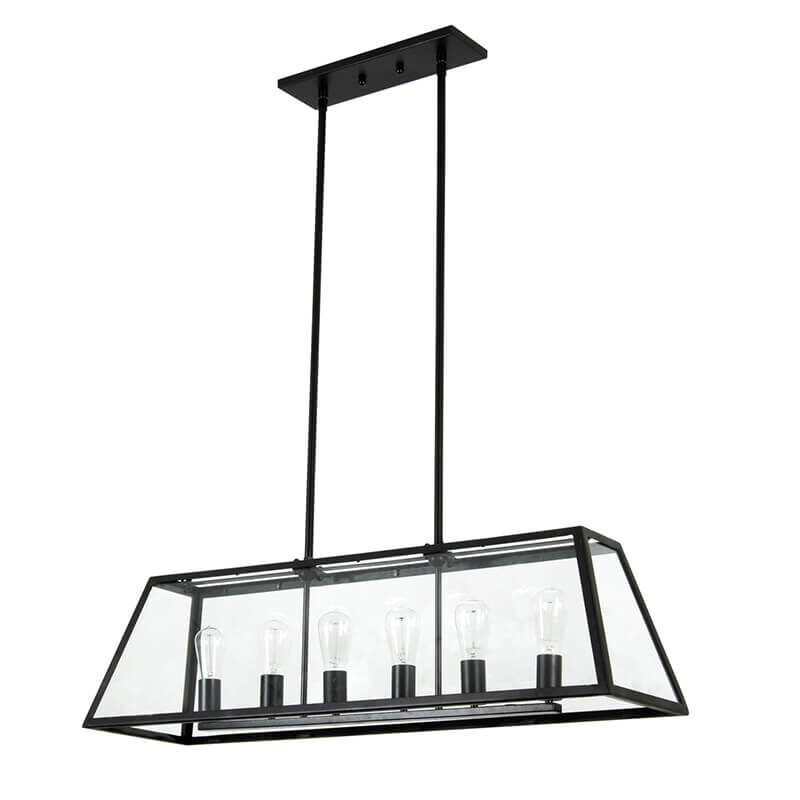
Pendant[/vc_column_text][/vc_column_inner][vc_column_inner width=”1/4″][vc_column_text]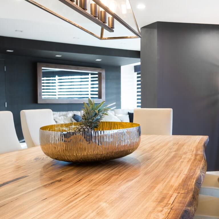
Table[/vc_column_text][vc_column_text]
[/vc_column_text][vc_column_text]
[/vc_column_text][/vc_column_inner][/vc_row_inner][vc_separator][/vc_column][/vc_row][vc_row][vc_column][vc_column_text]
Tell me what you liked and didn’t like about the rooms from last night?
[/vc_column_text][vc_separator][/vc_column][/vc_row]
Be the first to read my stories
Get Inspired by the World of Interior Design
Thank you for subscribing to the newsletter.
Oops. Something went wrong. Please try again later.




Comments
Inge
The dining rooms were a little underwhelming, I think. IMO dining rooms are becoming redundant. A meals area combined with a family room might be a better option. I did like Luke and Ebonys table and chairs. And you and Witneys chairs were also nice and looked comfortable. Suzi and Vonnie also had a lovely table and chairs.