The kitchen is the heart of the home, where everyone gathers to meet, chat, and prepare meals, so it needs to be just right. With sleek appliances and well-designed spaces, what could possibly go wrong? Quite a bit, as the Blockheads found out during this challenging week full of unexpected twists. It was tough, but …
The kitchen is the heart of the home, where everyone gathers to meet, chat, and prepare meals, so it needs to be just right. With sleek appliances and well-designed spaces, what could possibly go wrong? Quite a bit, as the Blockheads found out during this challenging week full of unexpected twists. It was tough, but did any team manage to pull it off? One did, walking away with a $10,000 prize—but who was it?
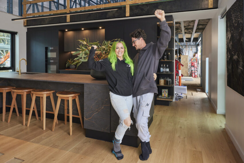
Kylie and Brad (First Place)
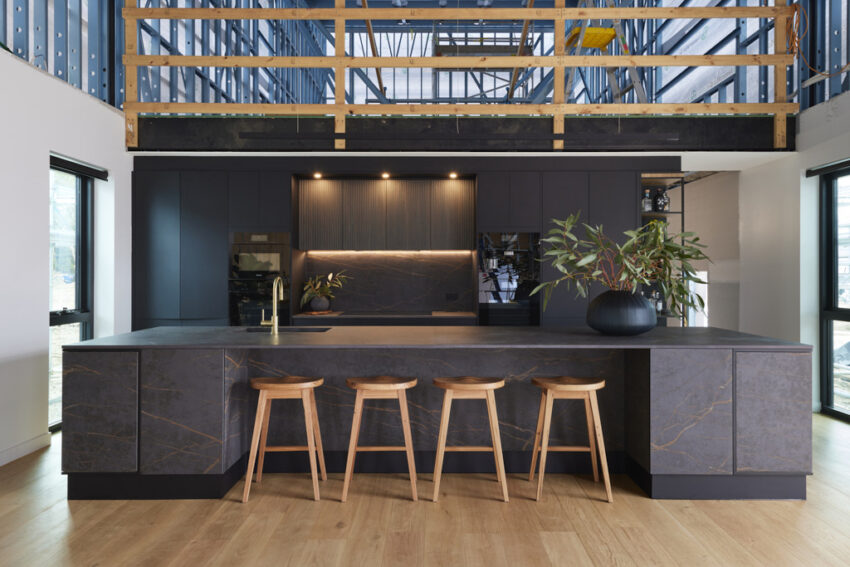
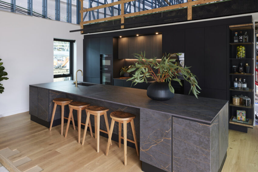
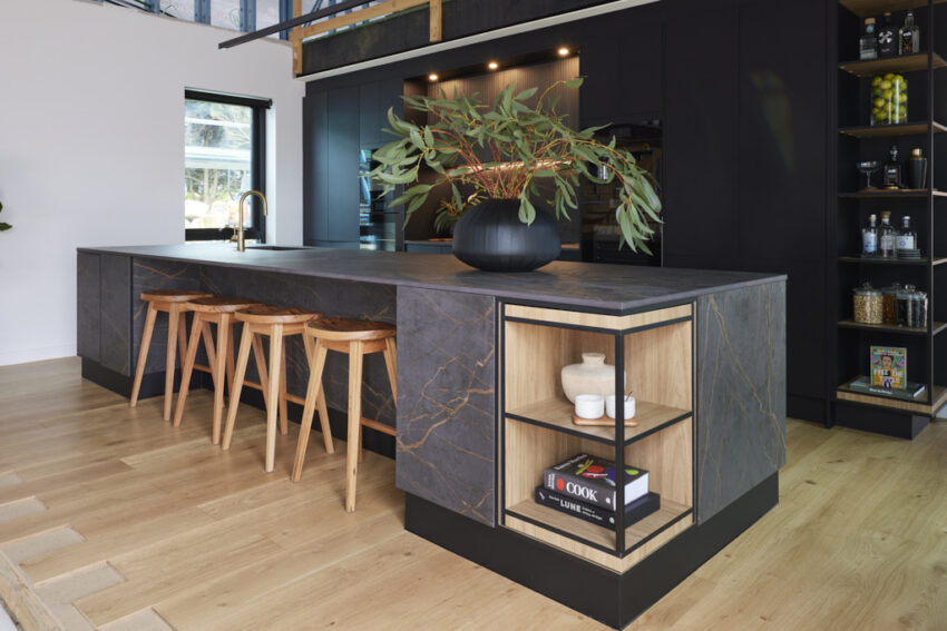
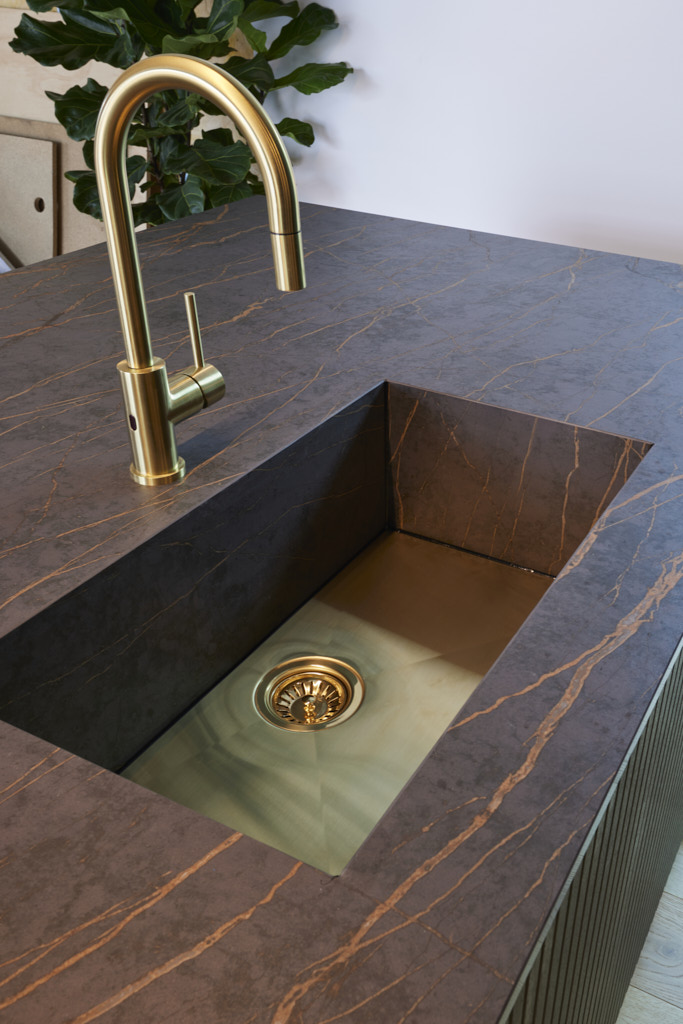
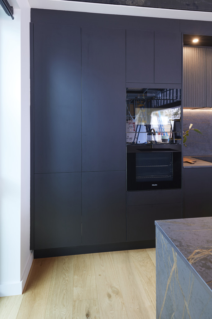
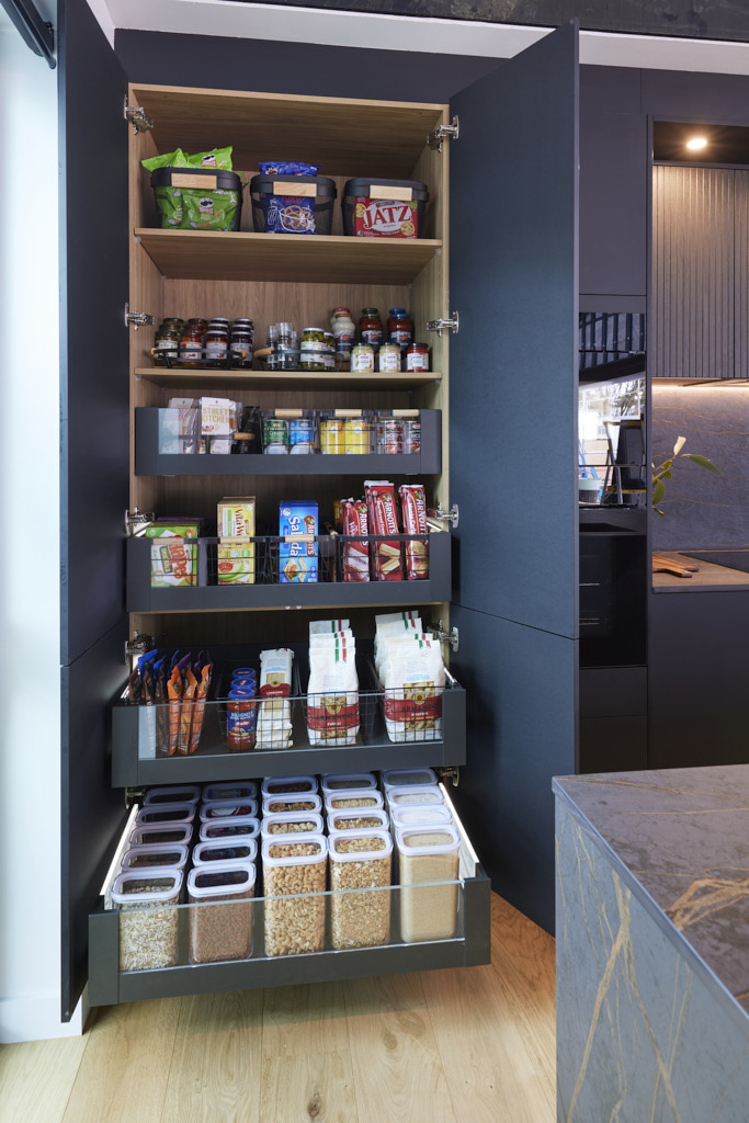
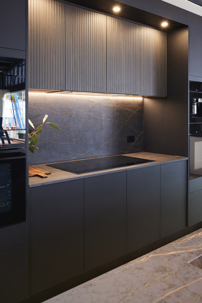
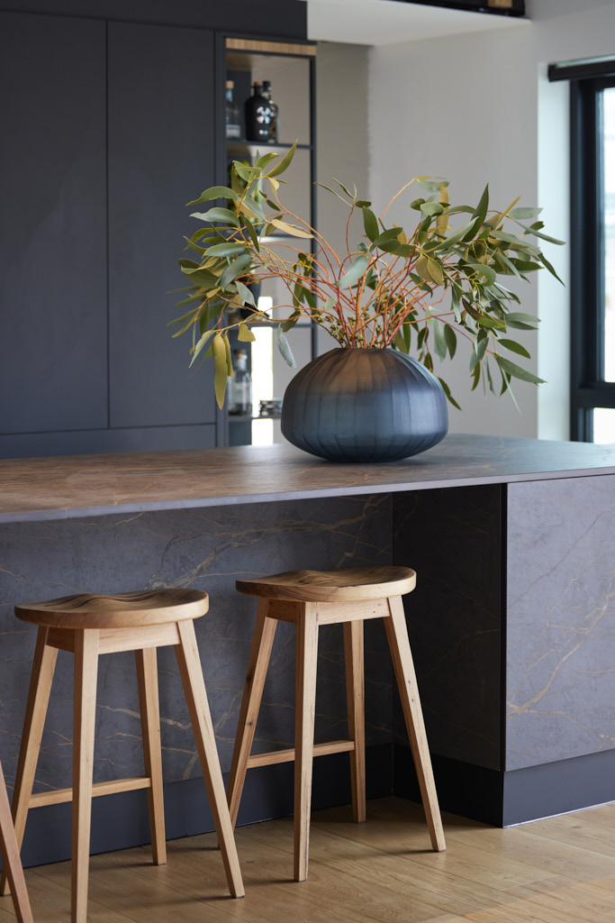
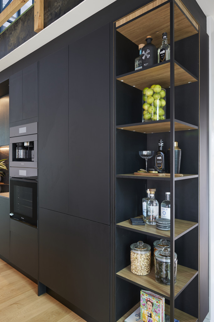
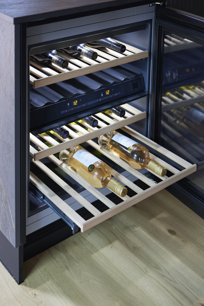
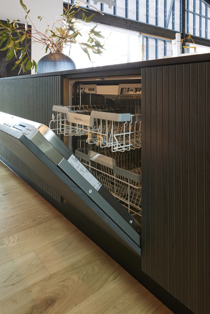
“Sultry, moody, and sexy,” Shaynna said as she stepped into Kylie and Brad’s dark-accented kitchen. “And expensive!” Marty added, initially sceptical of the unique colour palette but now calling it “totally superb.” With sleek black appliances blending seamlessly into matte black cabinetry, no handles, minimal styling, and a striking brushed brass sink, it made a bold statement. Darren was impressed by the clever storage solutions and hidden functionality beneath the island. “Space is a luxury,” Darren said, “and this kitchen is so refined.” Marty agreed, calling it a sophisticated and luxurious design that’s hard to top.
If you’d like to SHOP Kylie and Brad’s room head here. This week we’re loving the kitchen stools and tapware.
Maddy and Charlotte (Second Place)
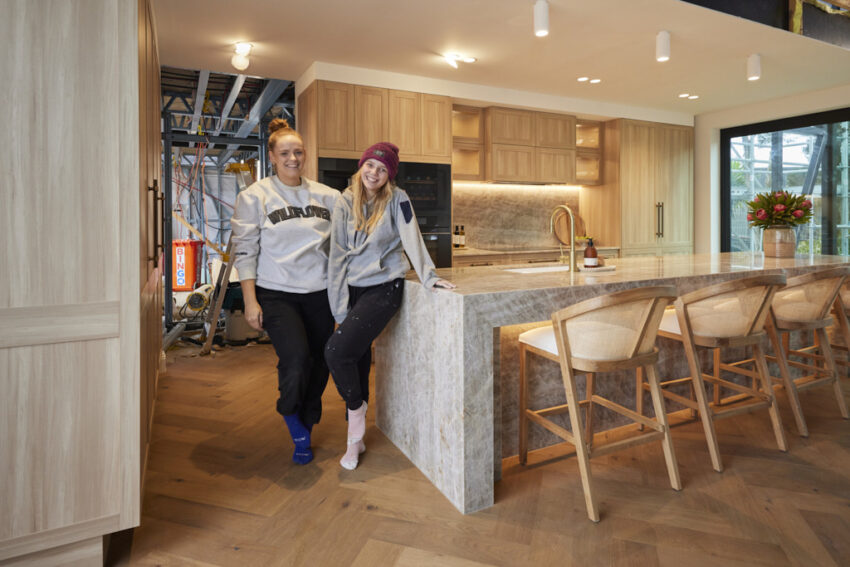
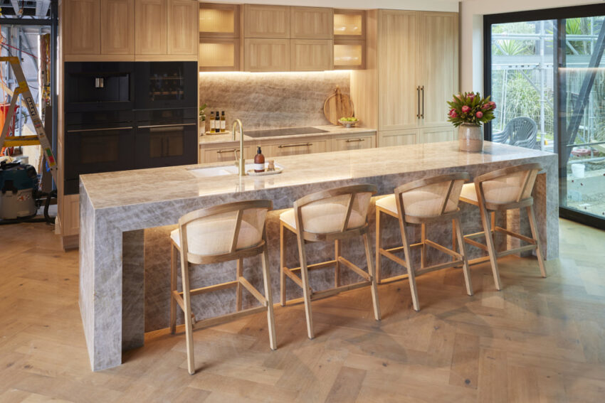
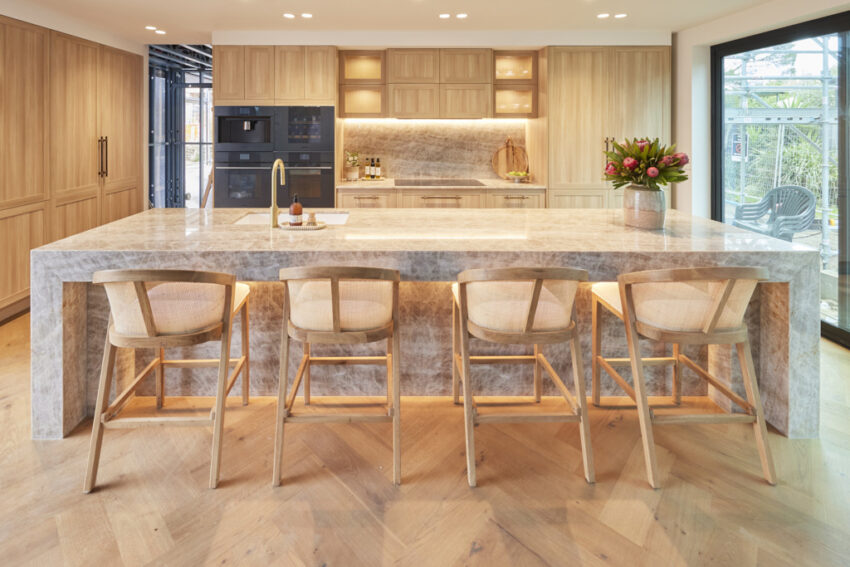
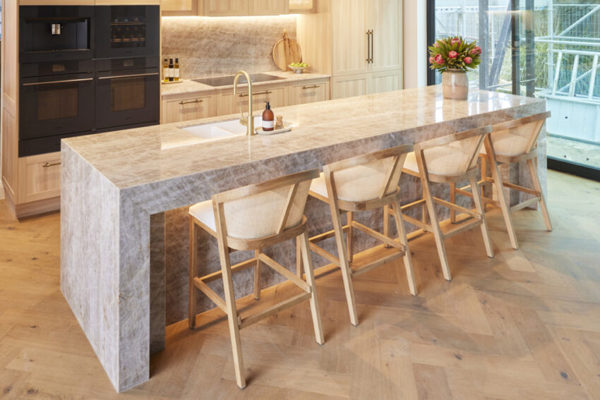
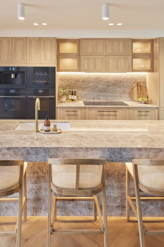
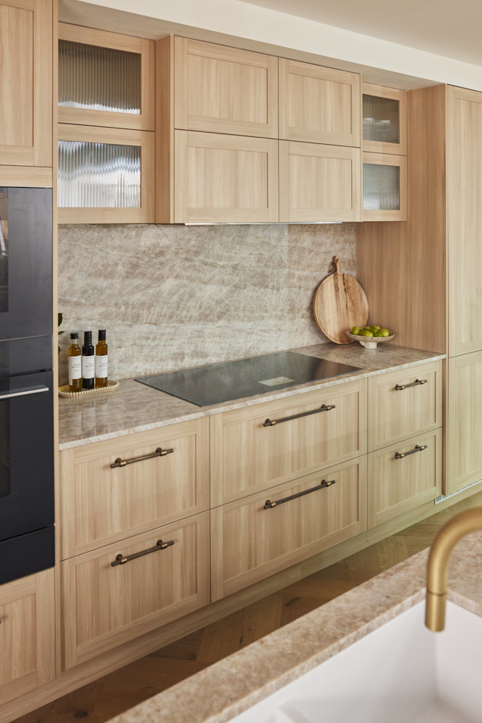
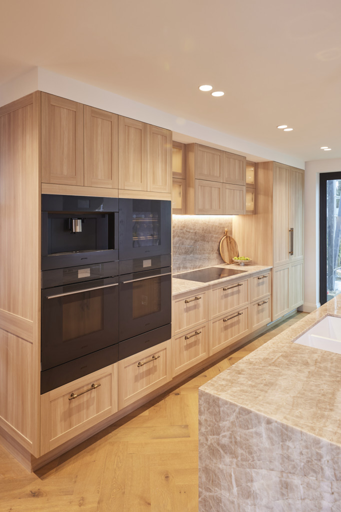
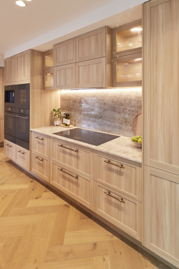
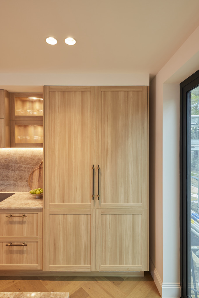
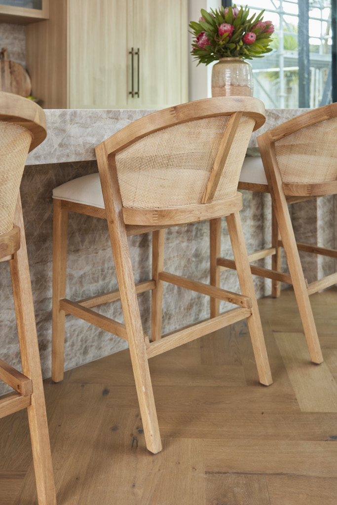
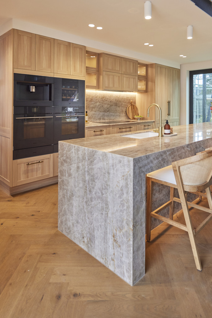
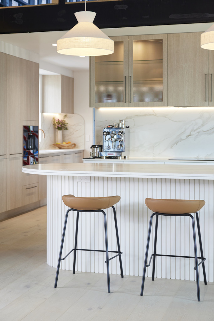
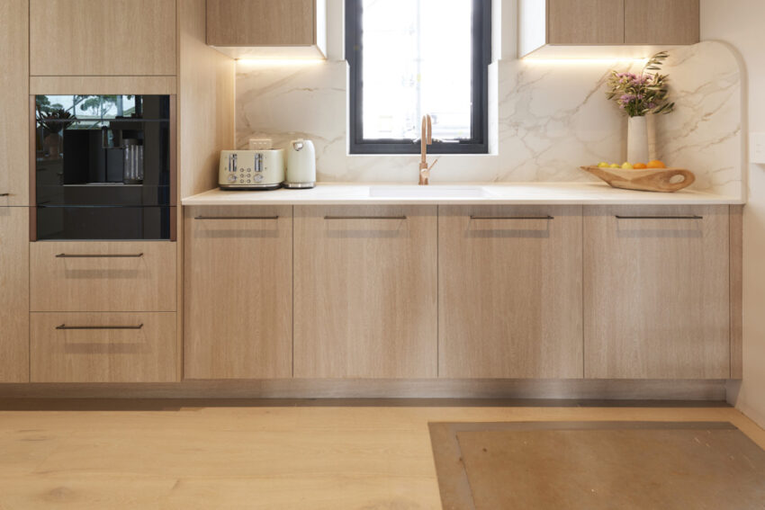
From the stunning herringbone flooring to the Taj Mahal stone on the impressive island bench, this kitchen immediately caught the judges’ attention. The layout was practical, with power points cleverly hidden but easily accessible, making it ideal for a holiday home, as Marty noted. Shaynna was captivated by the styling, particularly the oak counter stools, which she felt were striking yet subtle enough to let the kitchen shine. The decision to forgo a butler’s pantry showed thoughtful design, proving it wasn’t always necessary. Inherited from Jesse and Paige but with Maddy and Charlotte’s unique touch, Darren summed it up as “perfectly sized for the house and beautifully finished.”
If you’d like to SHOP Maddy and Charlotte’s room head here. This week we’re loving the stools and oven.

Courtney and GrANT (Third Place)
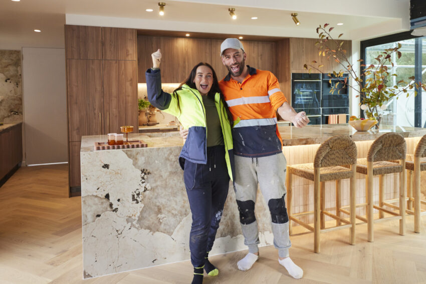
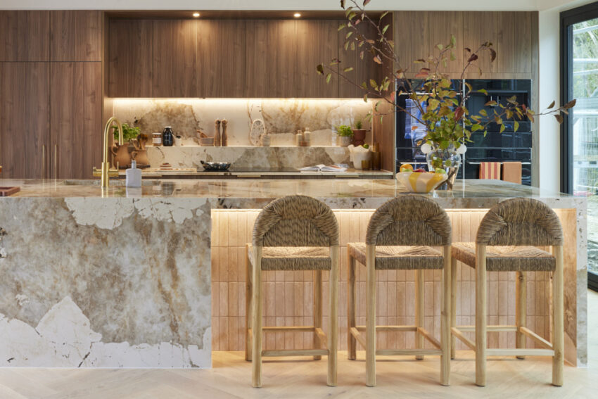
The expansive Dekton Khalo surface, with its sleek, minimal grout lines, immediately caught the judges’ attention as they entered the kitchen. “Next level and divine!” they exclaimed. Darren praised the flawless pairing of appliances with the colour scheme, noting that the walnut cabinetry was right on trend. The Hettich drawer inserts added a nice touch of functionality. However, Marty wanted more drama, suggesting a continuation of the marble used elsewhere, additional bar stools at the island, and perhaps a different lighting setup. Despite these critiques, he acknowledged the excellent craftsmanship and agreed that the curved ceiling beautifully tied the space together.
If you’d like to SHOP Courtney and Grant’s room head here. This week we’re loving the stools and cute tray.
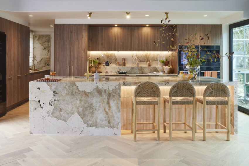
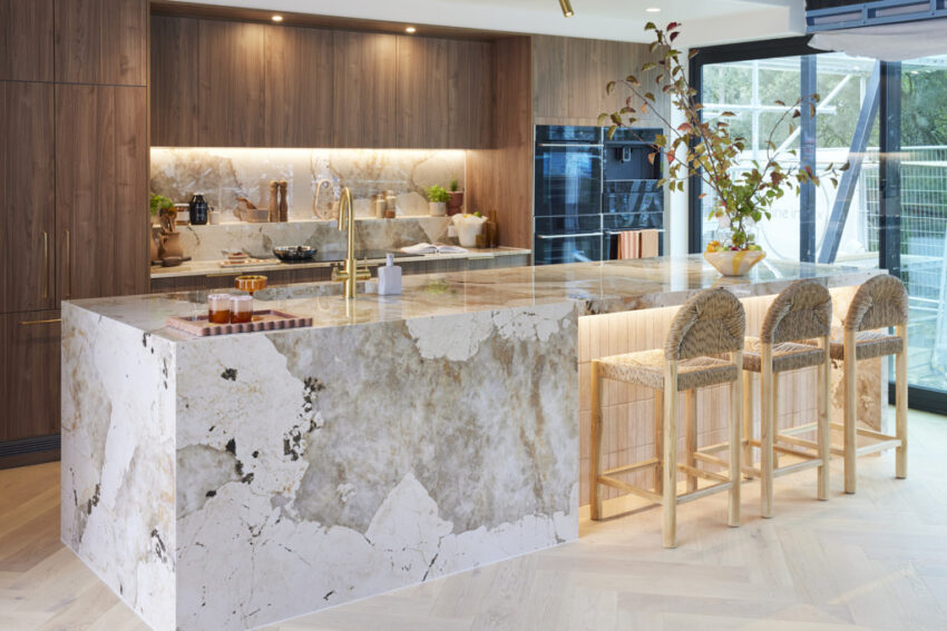
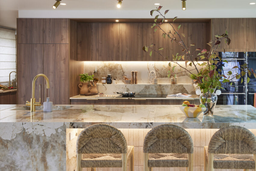
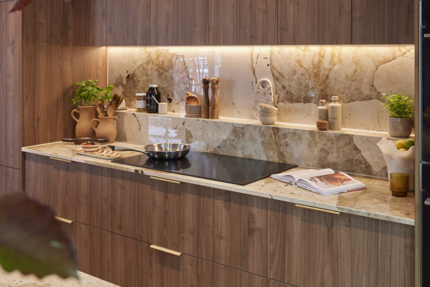
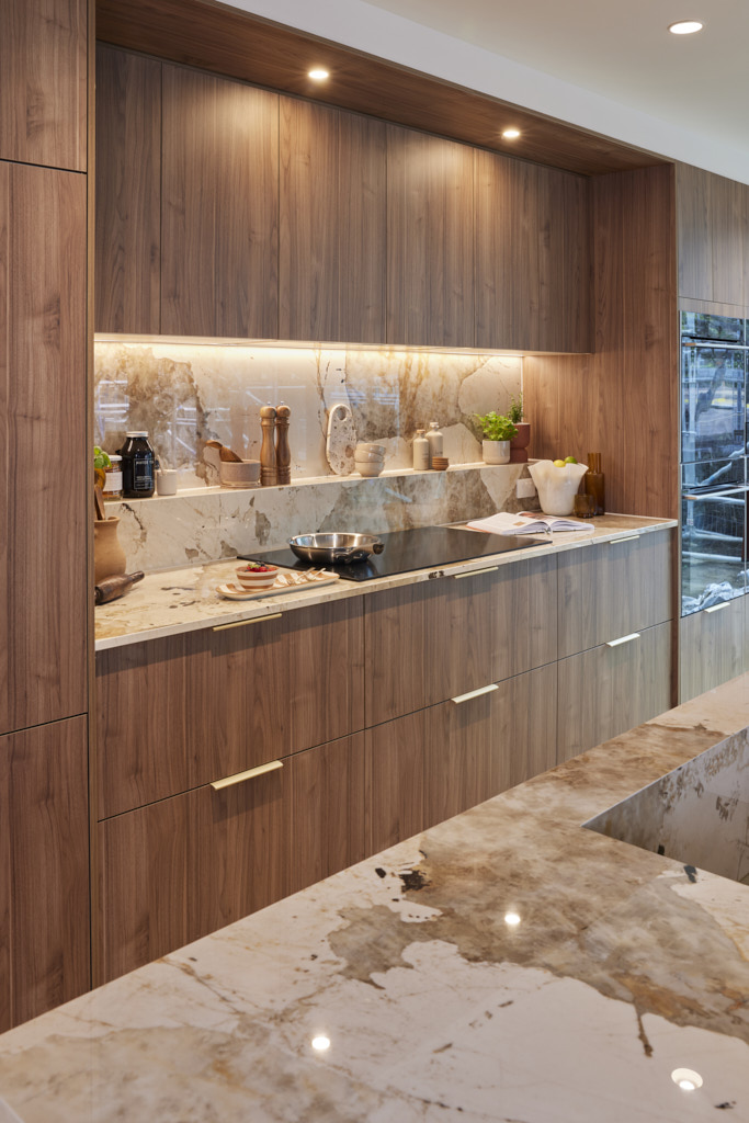
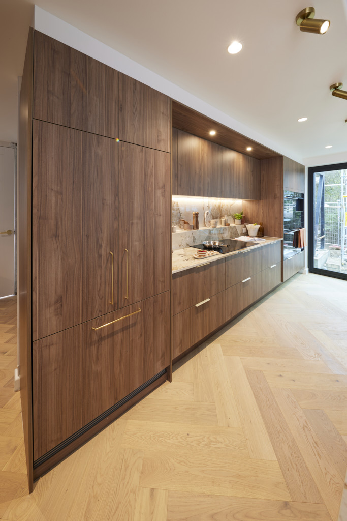
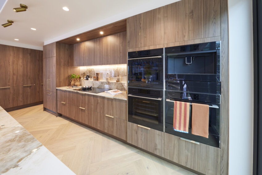
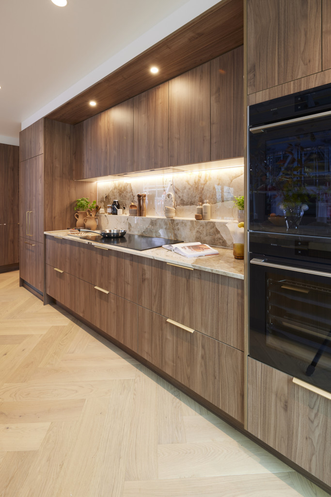
Kristian and Mimi (Fourth Place)
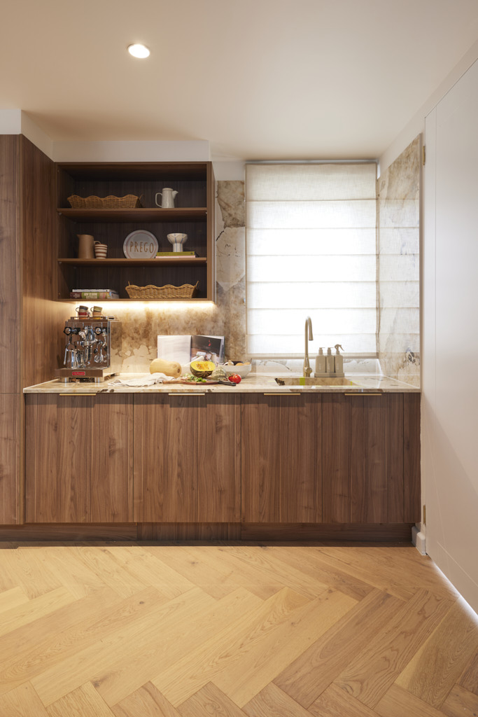
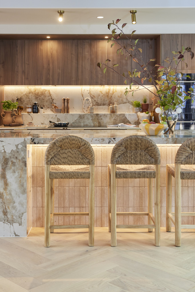
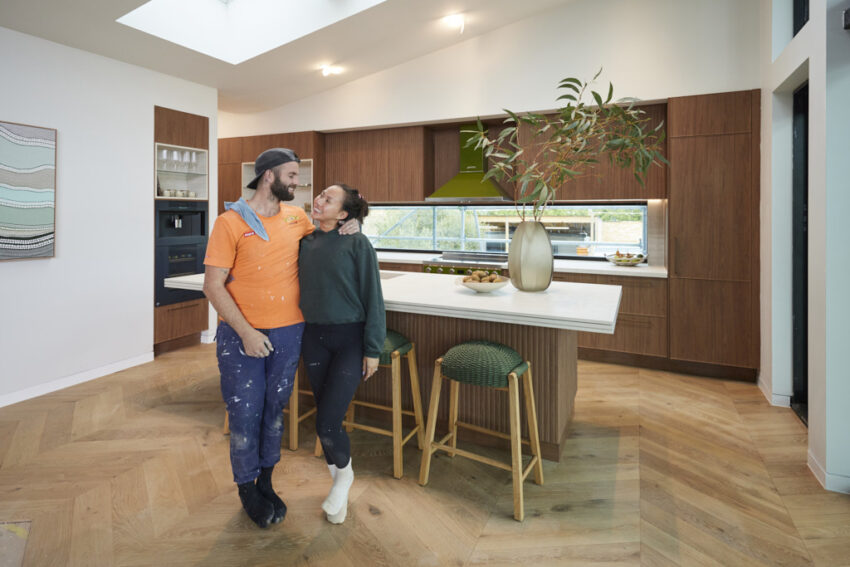
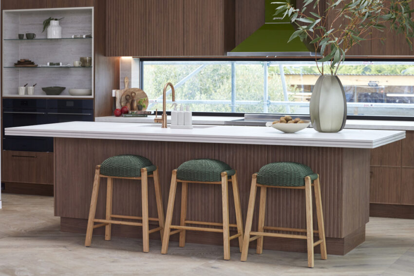
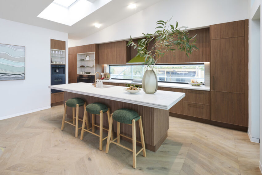
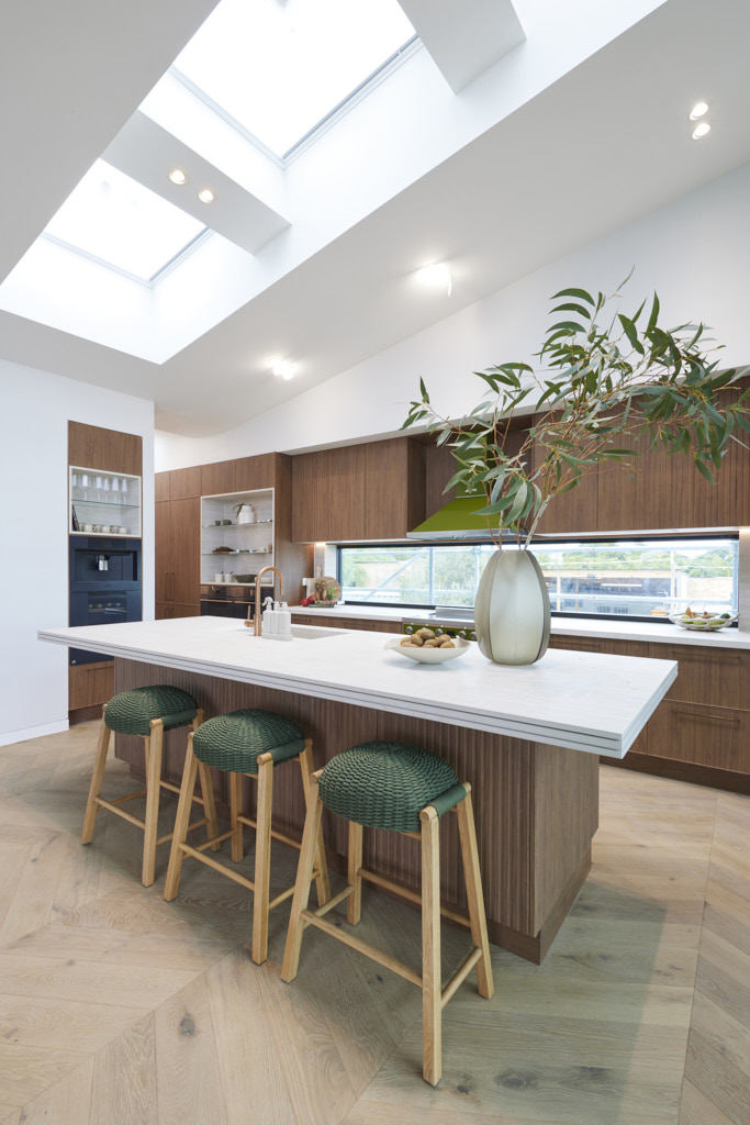
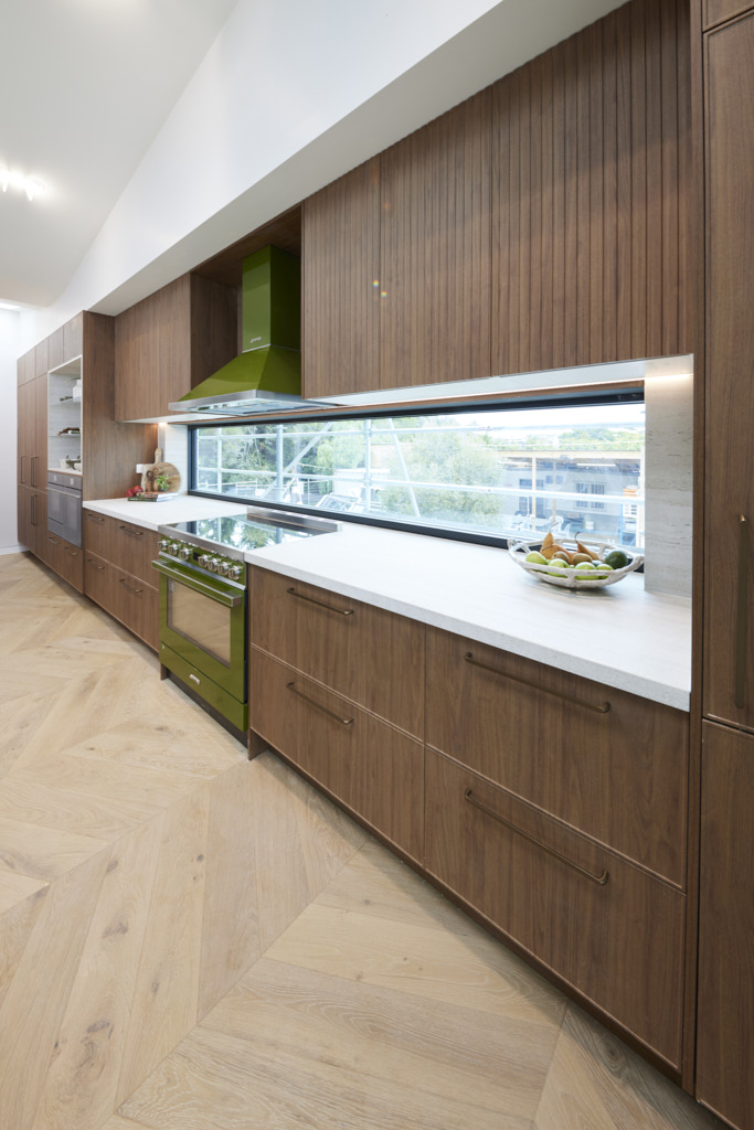
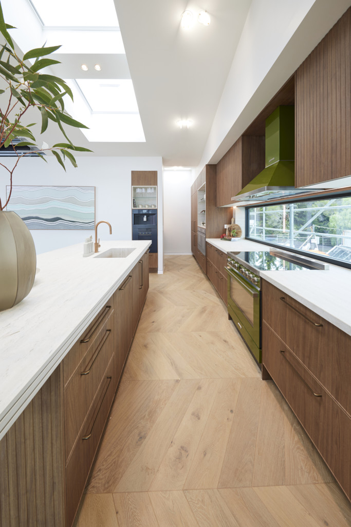
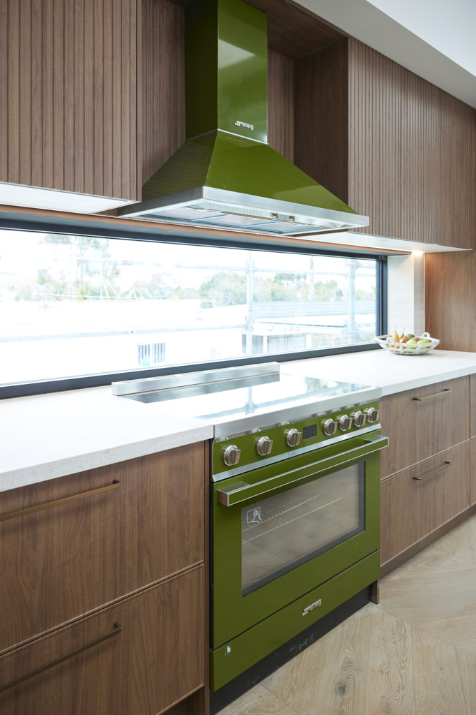
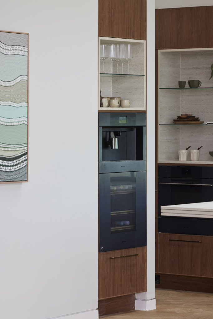
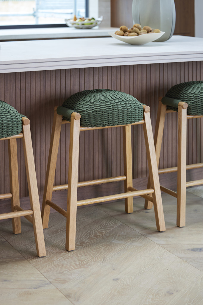
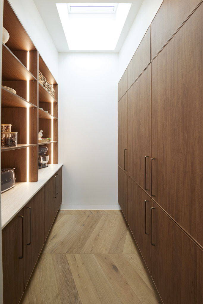
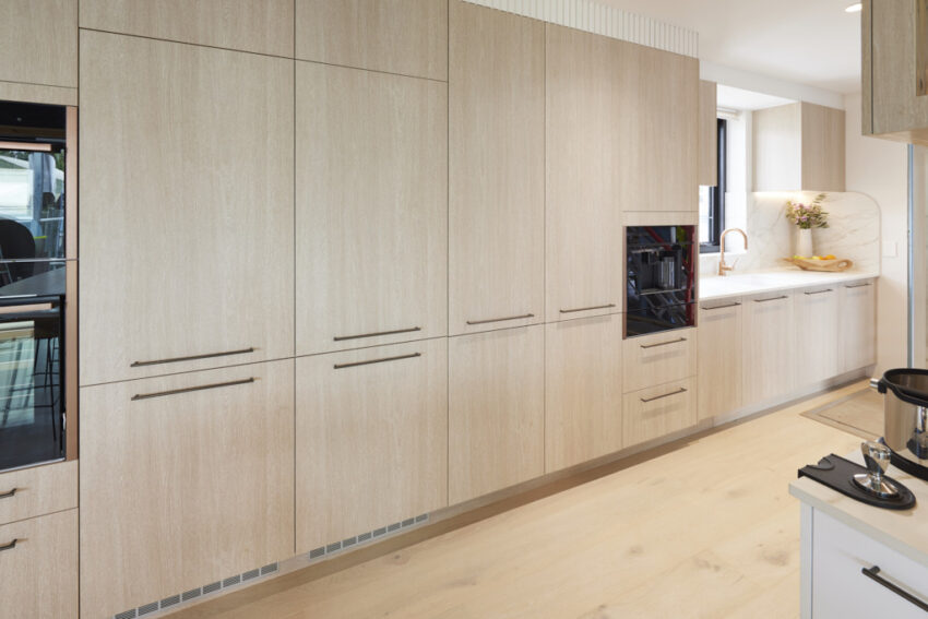
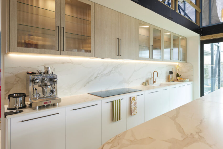
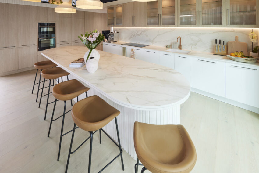
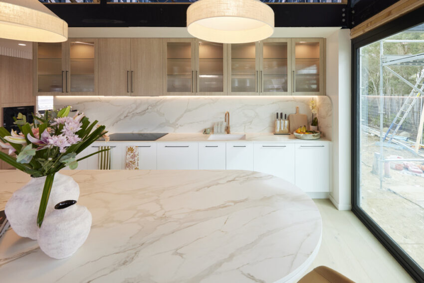
With Marmorino Dekton stone, Tuscan Woodmatt joinery, and an Olive Green oven and rangehood, Mimi and Kristian’s kitchen was full of impressive features. The chevron flooring and Velux skylights added extra charm, making it a standout in many ways. However, the judges noted some small yet significant details that held it back. The lack of a power point on the island bench, stools that didn’t quite match the oven, and a beautiful aesthetic that Marty felt didn’t fully align with the rest of the house left them conflicted. While both style and functionality were excellent, the overall cohesion of the space was in question.
If you’d like to SHOP Kristian and Mimi’s room you can head here. This week we’re loving the canvas print and stool.


Ricky and Haydn (Fifth Place)
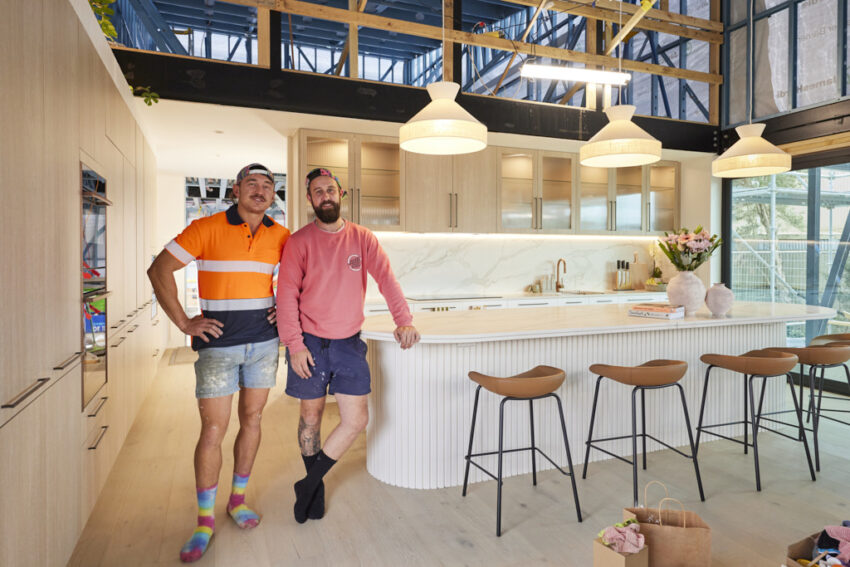
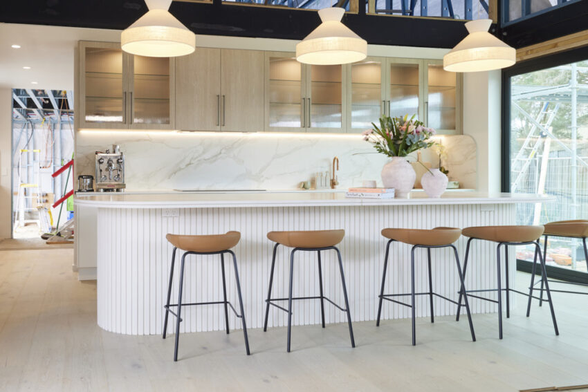
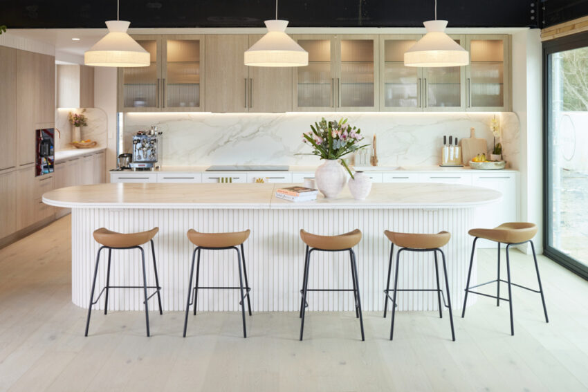
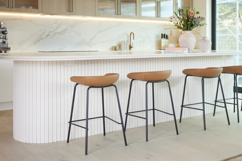
“A finished room from the boys,” Marty said upon entering Ricky and Haydn’s kitchen. “And the biggest kitchen we’ve seen so far!” However, his initial excitement faded as the sheer size of the space began to overwhelm him. Were the Neff appliances, including the combi-steam oven, placed too far apart? Did the pursuit of size compromise the kitchen’s intimacy? While Darren appreciated the Nelson stools and Coastal Oak cabinets, praising the coastal theme they created with the flooring and lighting, and Shaynna admired the shadow line through the grey and white Morpheus Dekton and brass strip in the benchtop, the judges ultimately agreed with Marty – it could have been better. Shaynna summed it up, “This styling is not selling the dream.”
If you’d like to SHOP Ricky and Haydn’s room head here. This week we’re loving the light shades and stools.


Images owned by the Nine Network Australia, provided by The Block Shop. Photography credits David Cook Photography.
Be the first to read my stories
Get Inspired by the World of Interior Design
Thank you for subscribing to the newsletter.
Oops. Something went wrong. Please try again later.


