Josh & Luke Score: 27/30 Spent: $19,830 First Place One of the most controversial choices of The Block so far, Josh and Luke were always heading for controversy when they flipped the original intent and placed their master suite where the double garage had been aimed, but did it work? Oh yes! Spacious, light soaked, …
Josh & Luke
Score: 27/30
Spent: $19,830
First Place
One of the most controversial choices of The Block so far, Josh and Luke were always heading for controversy when they flipped the original intent and placed their master suite where the double garage had been aimed, but did it work? Oh yes! Spacious, light soaked, separated from the rest of the house with it’s own view to the courtyard, the judges finally saw why the twins had put themselves through so much. Architecturally clever enough to forgive the obvious styling flaws (fake flowers, guys? Really?), it’s fresh, sophisticated and puts the pair back in the game, Neale said.



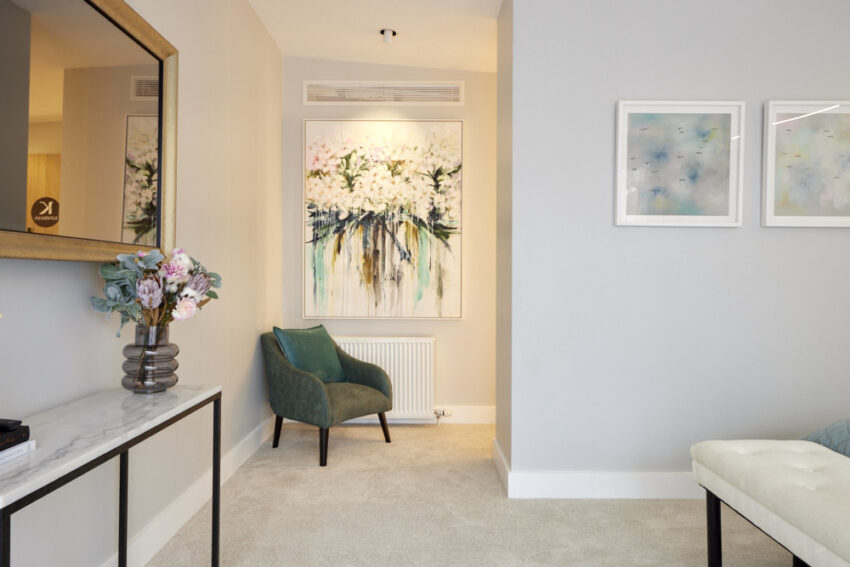


You can SHOP all of Josh and Luke’s rooms here. My favourite this week is the cashmere throw and the artwork.
…
Mitch & Mark
Score: 26 ½/30
Spent: $20,376
Second Place
With its generous walk-in robe, balcony hinting at a secluded outdoor sanctuary and beautiful finish, Mitch and Mark’s master bedroom retreat showed the judges they’ve well and truly moved on in style and execution from their first Block! A traditional, yet contemporary room, they decided, with features such as ceiling a standout, drawing the eye to perfectly place pendants over ample tables franking a bed so beautifully styled Neale was left asking for tips. Foy Shaynna it was the artwork – matched to the bed – and colour palette that combined to scream Luxe!
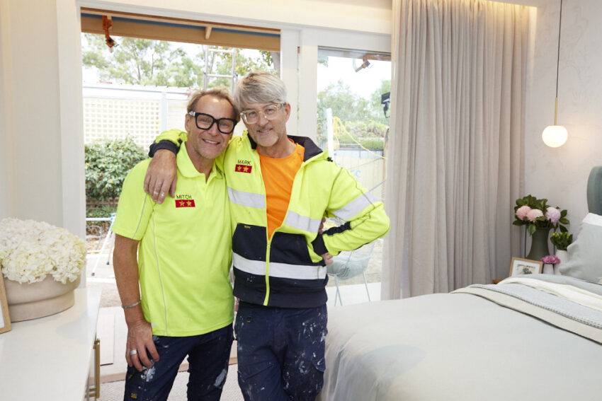
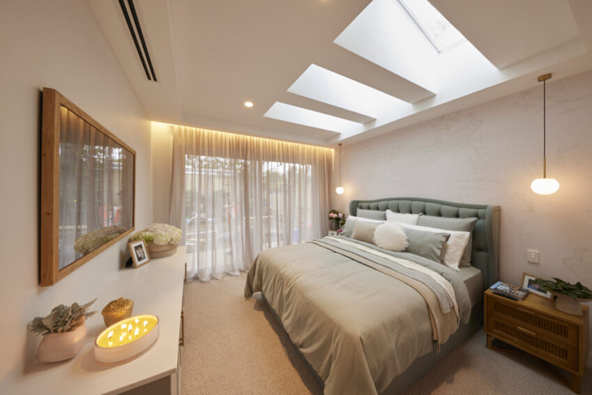


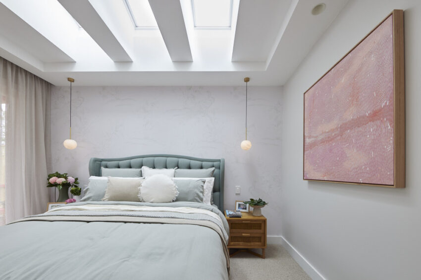
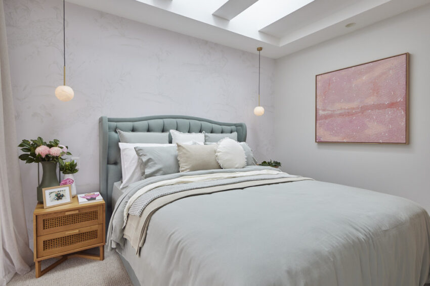

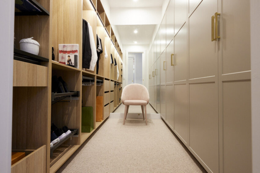
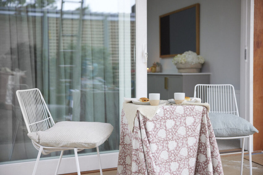

You can SHOP all of Mitch & Mark’s rooms here. My favourite this week is the fringed cushion and the wallpaper.
…
Tanya & Vito
Score: 24 /30
Spent: $25,649
Third Place
Light bright and colourful, Tanya and Vito’s master bedroom was the “Goldilocks room” for the judges this week – not too big and not to small, but just right. Bringing the Moroccan feel of the guest ensuite into the space, the pair created a haven away from the house but still connected. Shaynna immediately fell for the bedhead, the side tables, the wallpaper and the artwork – including another Tanya original – with Darren warming to the quirky styling touches. The Kinsman wardrobe too, united them all, with Darren declaring they had the best storage solution he’d seen all day.
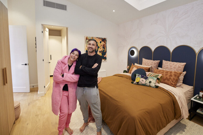

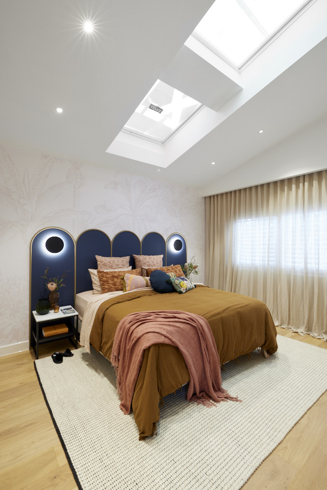


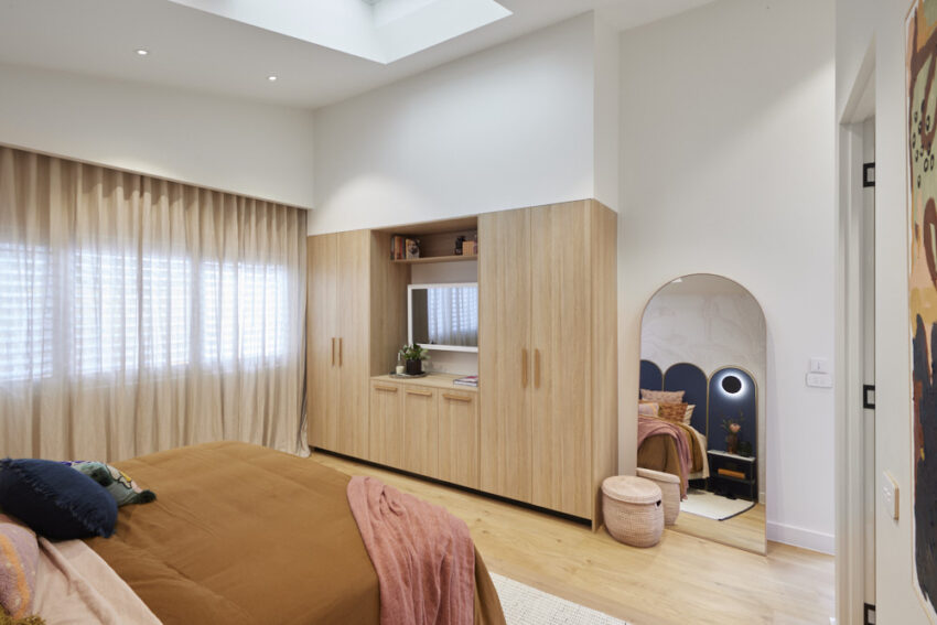
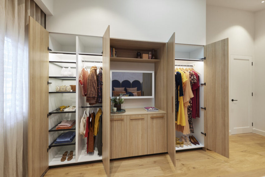
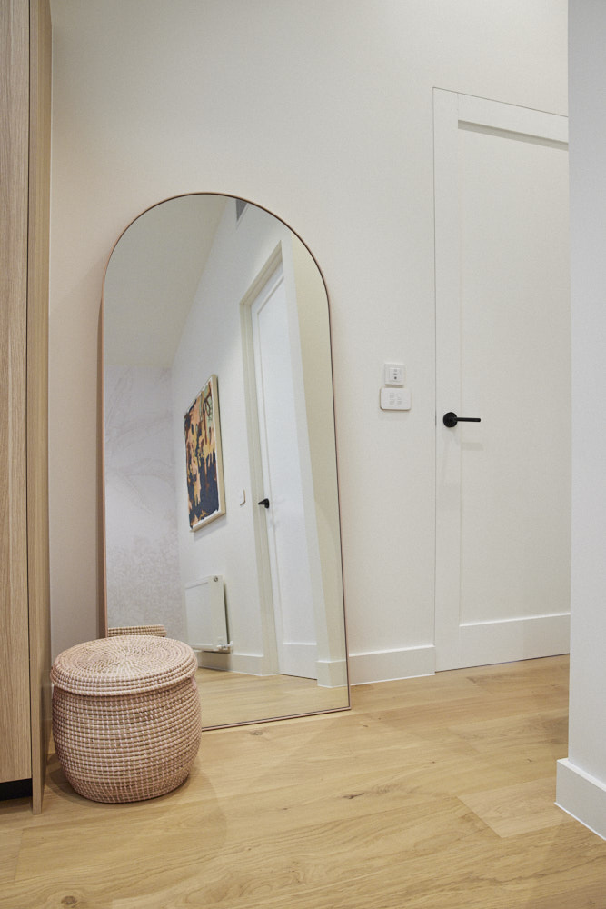

You can SHOP all of Tanya and Vito’s rooms here. My favourite this week is the artwork.
…
Ronnie & Georgia
Score: 23 ½ /30
Spent: $24,500
Fourth Place
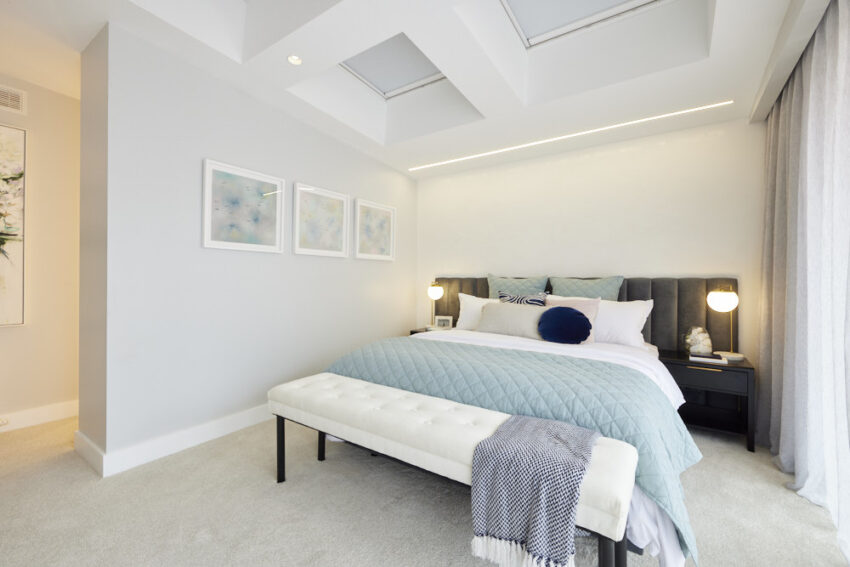
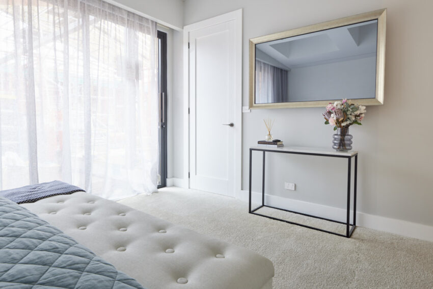
“Enormous, Vast, Cathedral-like” and more – Ronnie and Georgia’s master bedroom certainly stopped the judges in their tracks and it’s easy to see why. With its soaring sloped ceiling leading up to Velux skylights, a massive floor to ceiling window, chic Laminex panelling, disguised television and more this was a statement room. All agreed the walk-in robe could have been more generous, a fact Ronnie and Georgia might want to remember when it comes to make-over room time, but overall, said Neale, with this room, the team stamped themselves as “the masters of sophisticated subtlety”.
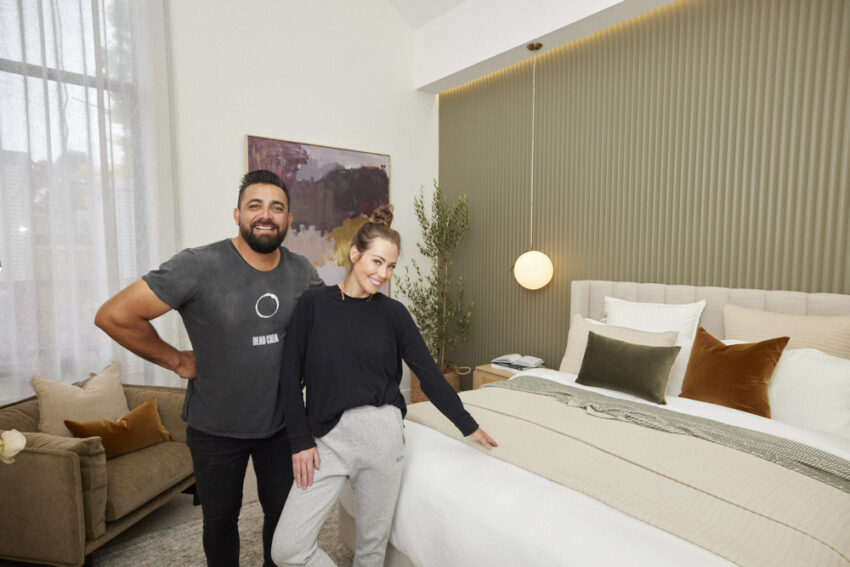


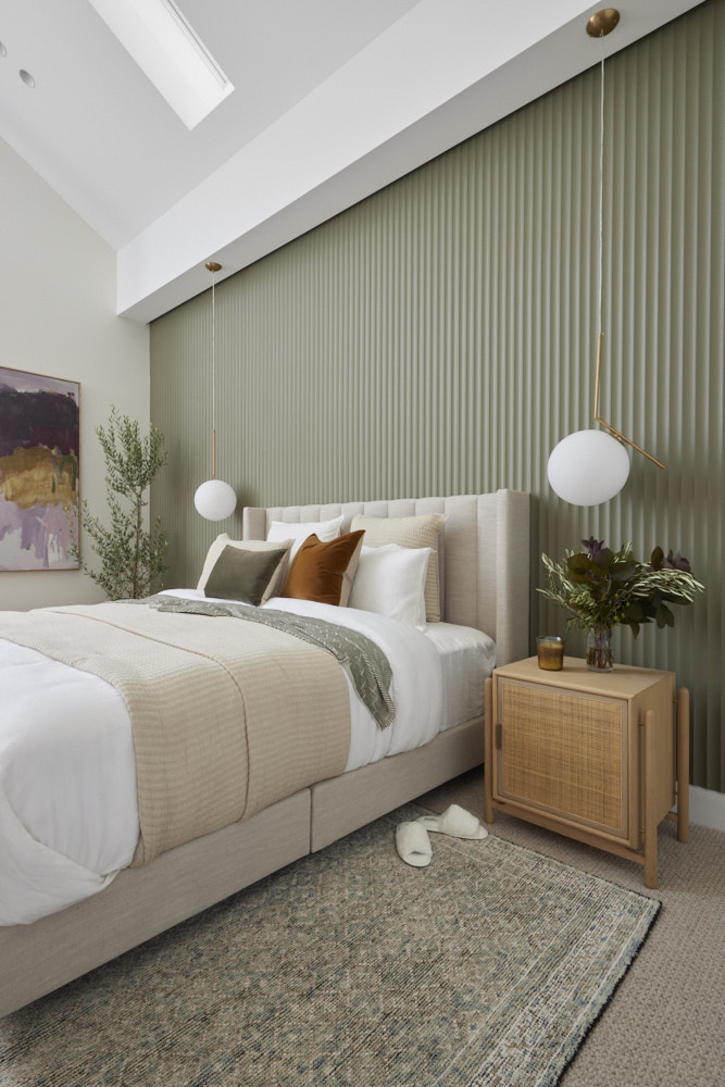
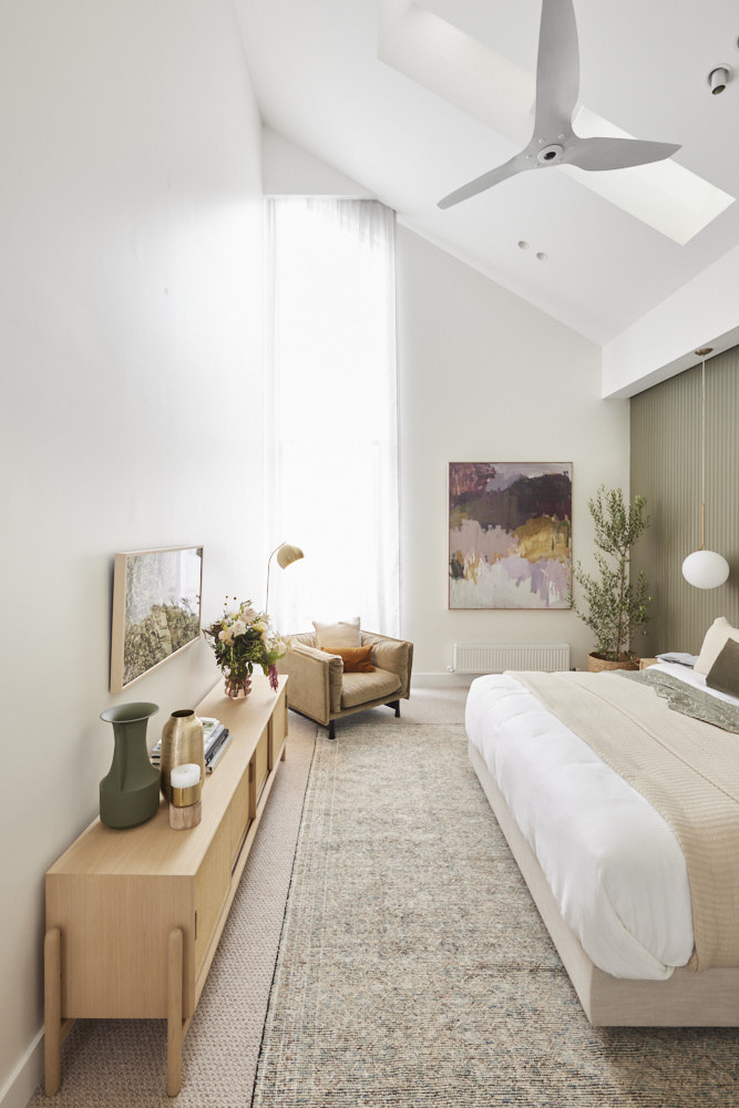
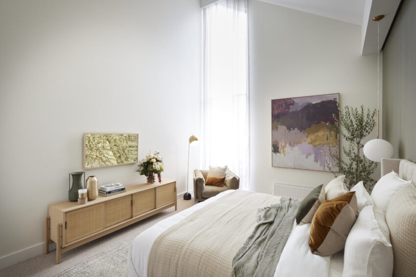
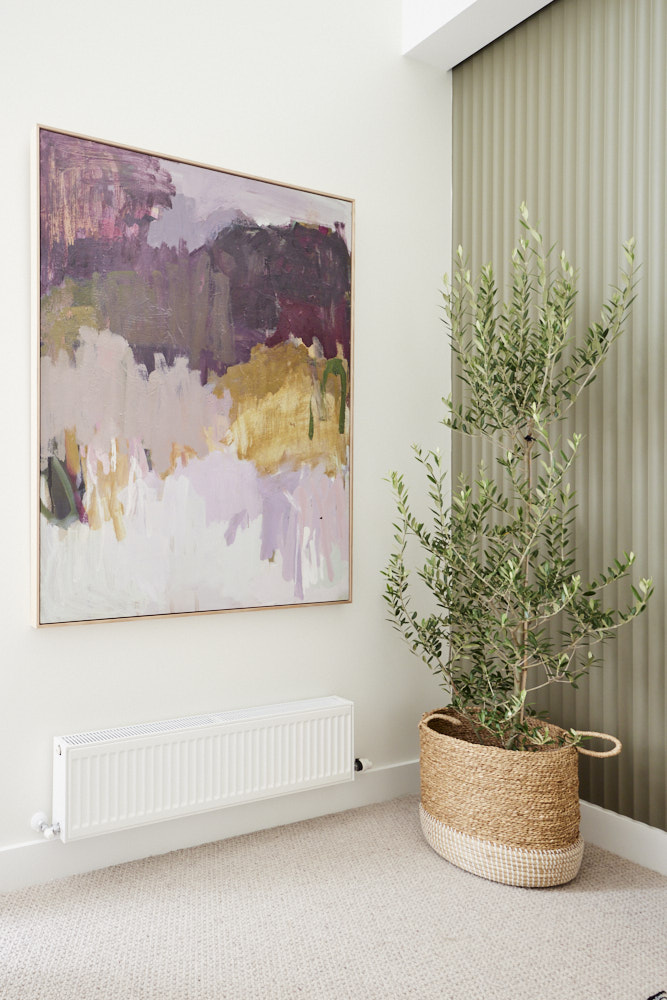
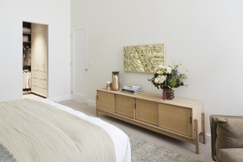

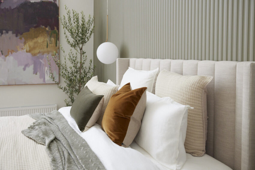
You can SHOP all of Ronnie & Georgia’s rooms here. My favourite this week is the sideboard and the toffee coloured cushion.
…
Kirsty & Jesse
Score: 22 1/2 /30
Spent: $24,920
Last Place
With wide North-facing windows, a generous layout that draws focus to the beautifully styled bed, arches adding a softness and warm tones from the rich carpeting to the walls, the judges were immediately impressed by Kirsty and Jesse’s master bedroom. A closer look however revealed a few problems – the artwork wasn’t exactly what Shaynna would have liked to see, the Tallboy looked out of place and in general there seemed to be a clash between the contemporary and classic styles. Add in a beautiful, but undersized walk-in robe and the country couple were left wondering if the pluses the judges found would outweigh the negatives.
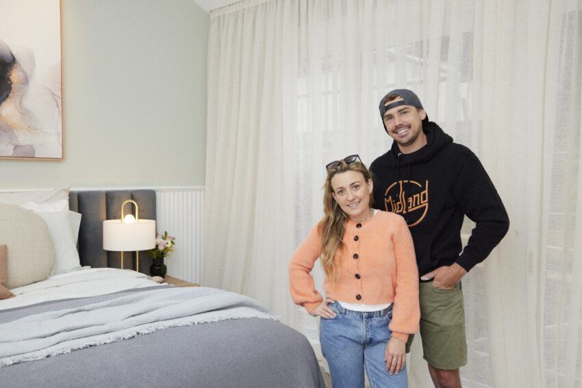
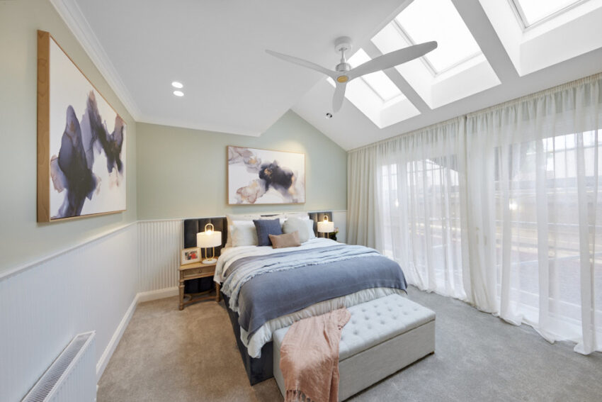
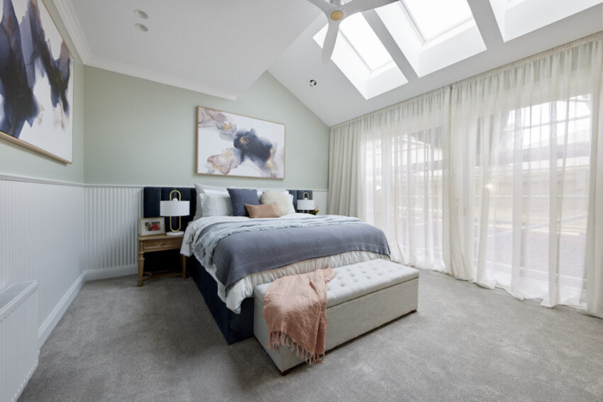

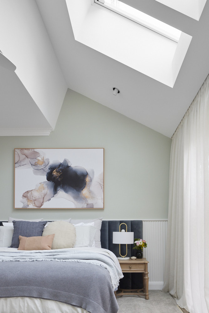


You can SHOP all of Kirsty and Jesse’s rooms here. This week I love the blanket box and the oval mirror.
…
Which was YOUR favourite room this week?
♥ KC. Images thanks to The Block Shop and nine now.
Be the first to read my stories
Get Inspired by the World of Interior Design
Thank you for subscribing to the newsletter.
Oops. Something went wrong. Please try again later.
