The Block 2019 Oslo: Media Room Reveals >> MITCH AND MARK SCORE: 26/30 Mitch and Mark once again wowed the judges with their exceptionally executed hallway and guest bedroom, proving they truly are a force to be reckoned with - and they might just have what it takes to win The Block. All three judges …
The Block 2019 Oslo: Media Room Reveals >>
MITCH AND MARK
SCORE: 26/30
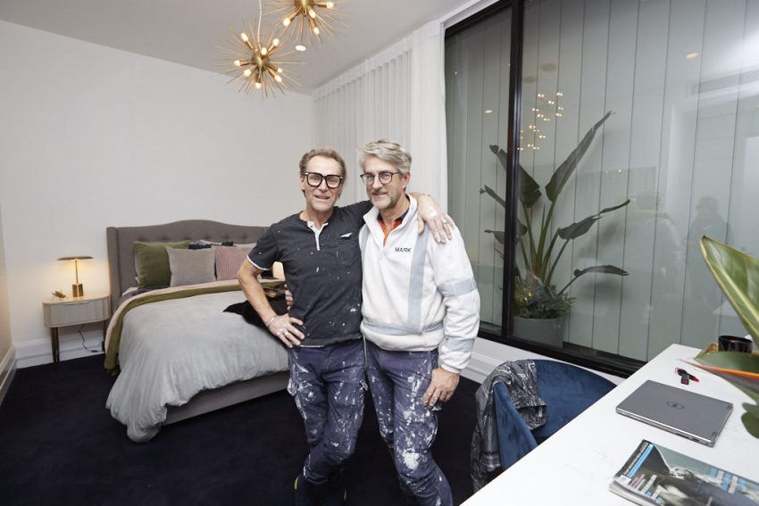
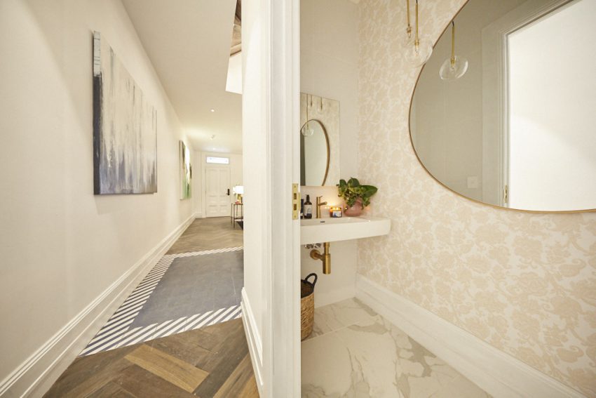
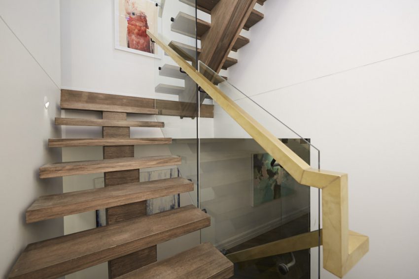
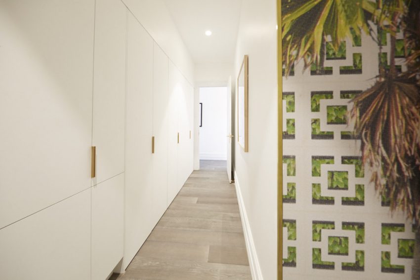
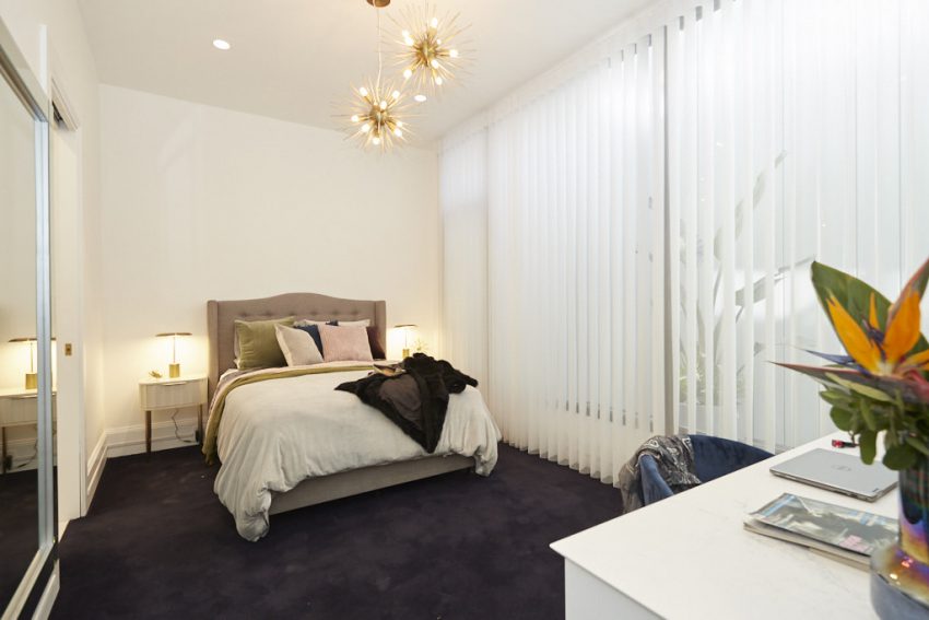
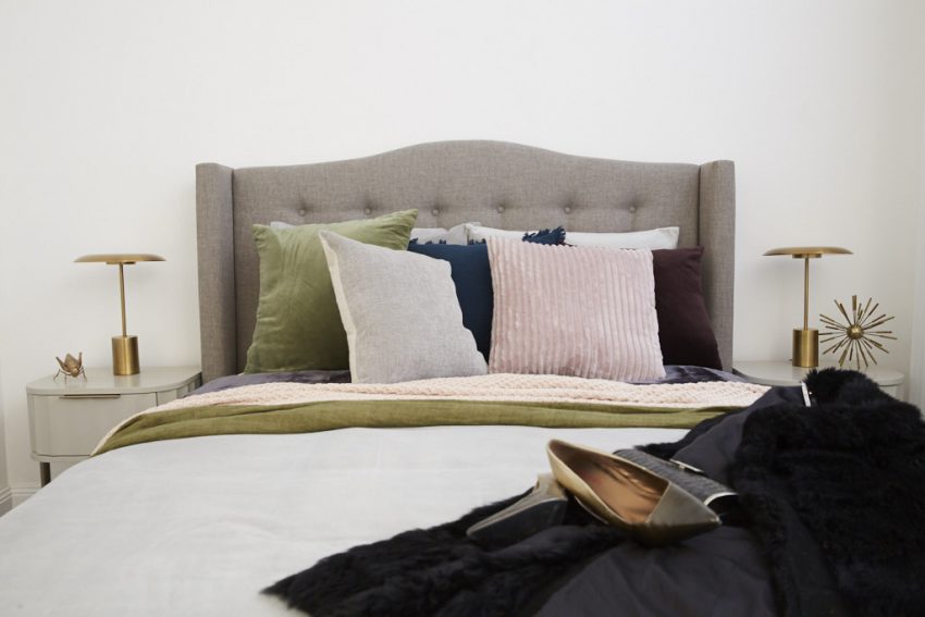
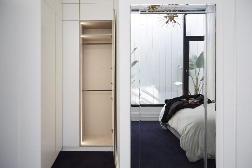
Mitch and Mark once again wowed the judges with their exceptionally executed hallway and guest bedroom, proving they truly are a force to be reckoned with – and they might just have what it takes to win The Block.
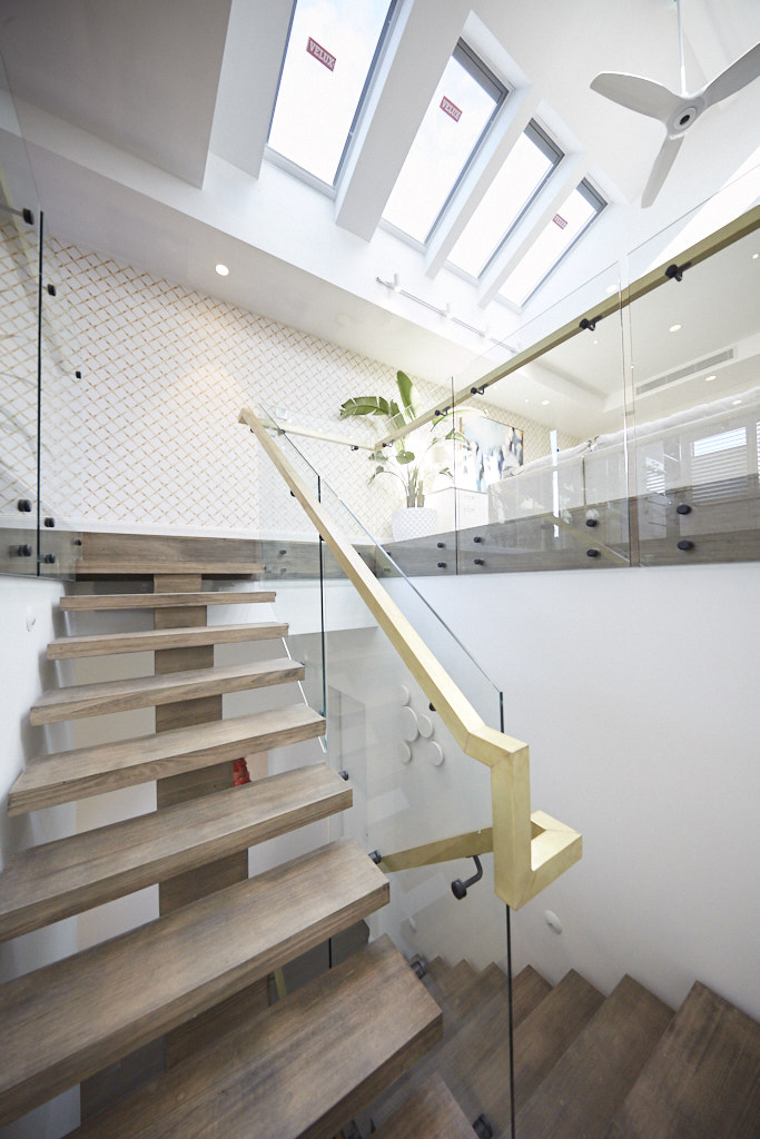
All three judges were awed as they walked through the front door, noting how well the house flowed through communal areas. Downstairs, Mitch and Mark chose a feature tile at the base of their stairway, then continued their light-oak flooring up the stairs, which also featured a thick wooden handrail and glass panels. Large statement artwork hung in their stairwell, with other large pieces upstairs in the hallway. Completing the look were statement lights – back-lit circles in the stairwell and stunning mid-century-inspired spiked pendants hanging from above – which all three judges.
As well as being impressed with their staircase and hallways, the judges also liked what the couple had done with their third all-important guest bedroom space. The simple, yet stylish, room featured a taupe bedhead, linen in greens, pinks and creams, two simple side tables, copper lights and a study desk – complete with Kate Moss print above!







…
SCORE: 25.5/30
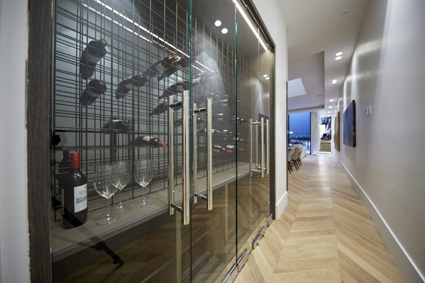
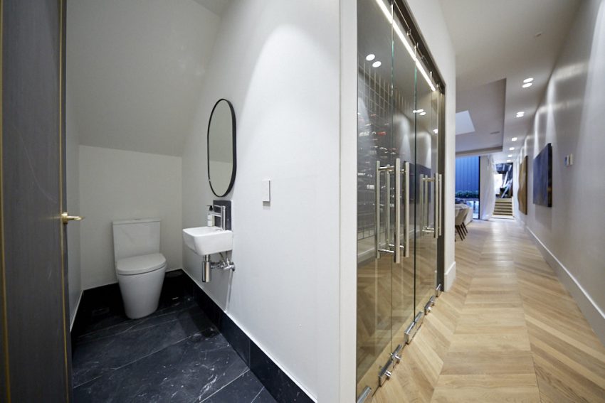
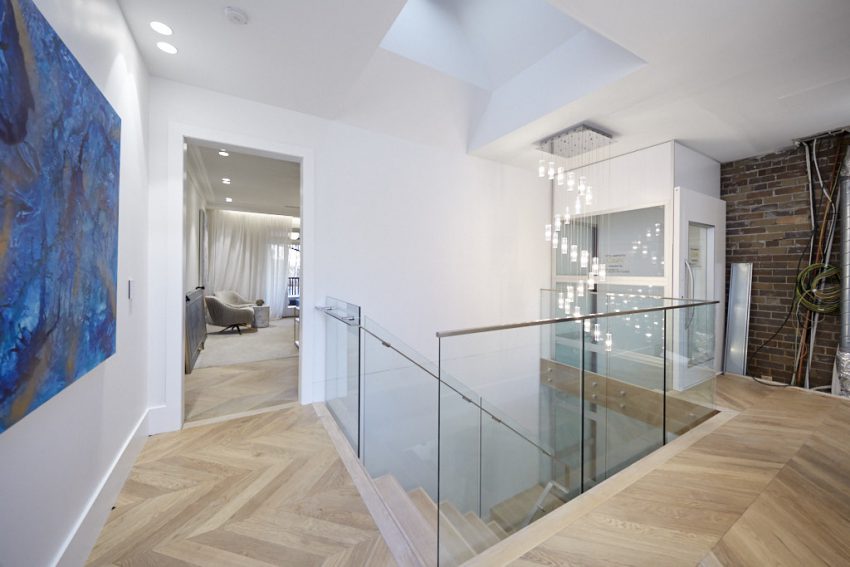
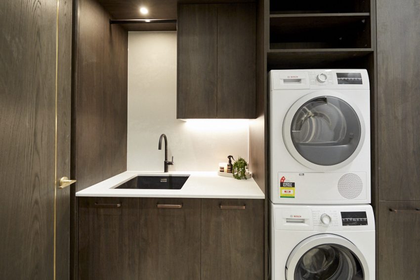
Jesse and Mel had their work cut out for them this week, presenting a media room, study and hallway. But their biggest challenge was arguably moving their laundry from Level One to Level Two, and the fact that their closed off formal living area meant they had the most surface area to work with by far. Never one to shy away from a challenge, the energetic couple gave it their all, producing several gorgeous, stylish spaces – and even including an amazing wine cellar on Level One.
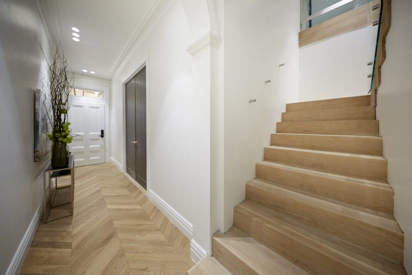
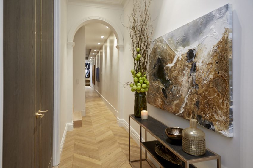
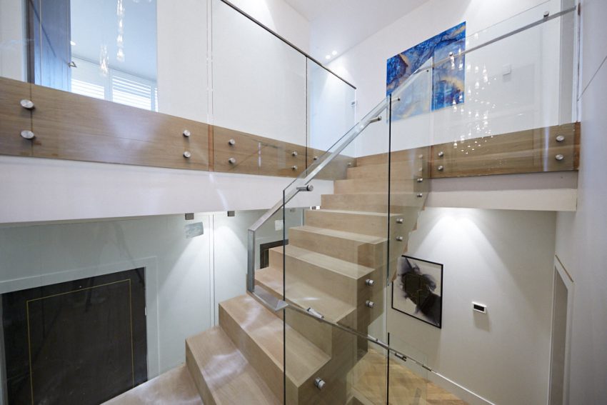
The judges all thought the couple had done exceptionally well this week, and fell in love with that amazing chevron timber floor…hand laid by Jesse! This flooring worked perfectly with the brushed steel highlights of the stairwell, that large abstract art in the entrance, the hall table and the more modern choice of art they continued up the stairs and into the level two hallway.
They were left speechless to find the wine cellar, with all three agreeing that it would be a huge drawcard come auction day.
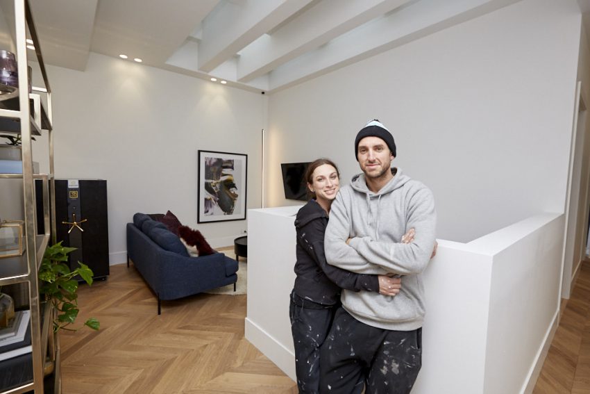
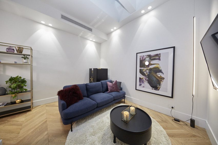
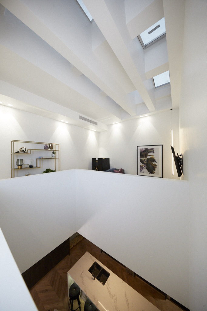
Upstairs, they thought the chandelier was a nice touch and they loved the media room, which featured a plush velvet couch, wall unit, large abstract art, circular coffee table and that huge safe they won in Week One. They also thought moving the laundry to Level Two was a good touch.

SCORE: 23/30
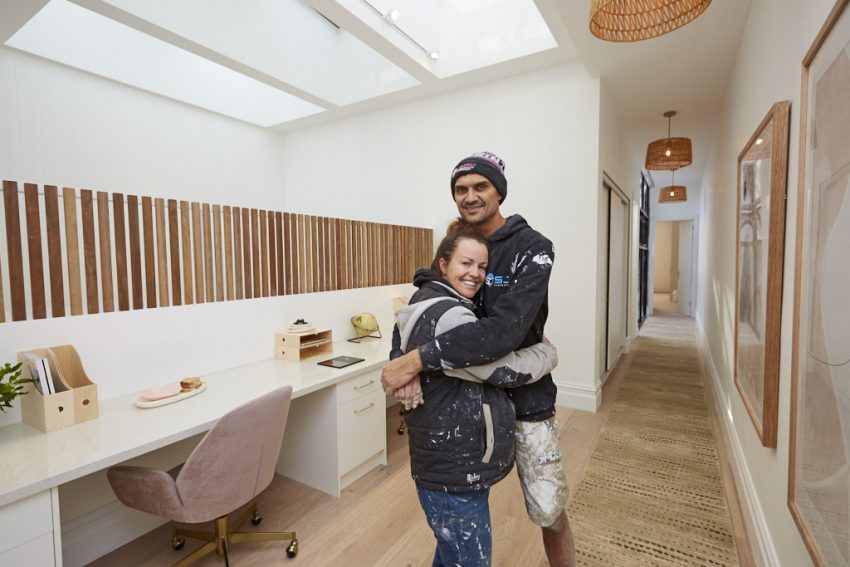
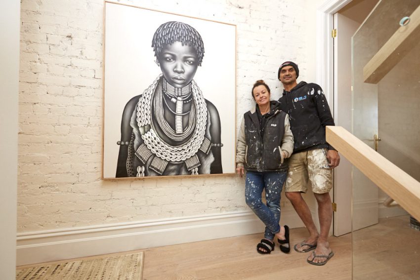
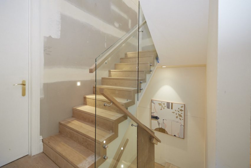
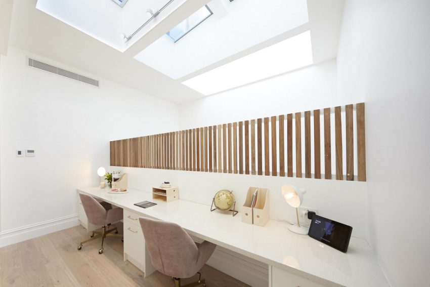
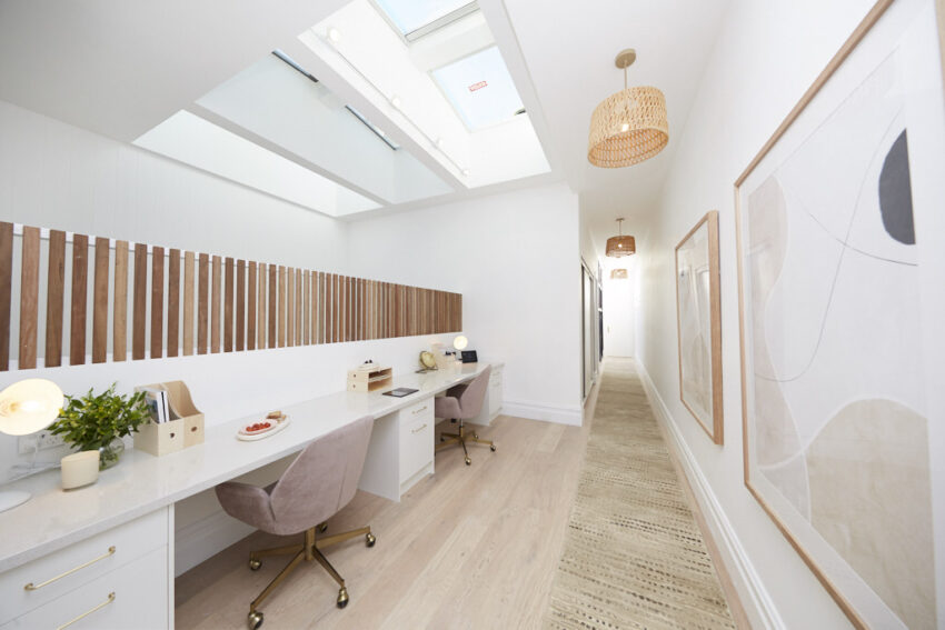
This week Andy and Deb chose to deliver a number of spaces – a level two study, two toilets and hallway spaces in every level of their home. They ran out of time to finish, but, true to form, what they did present was impeccably finished.
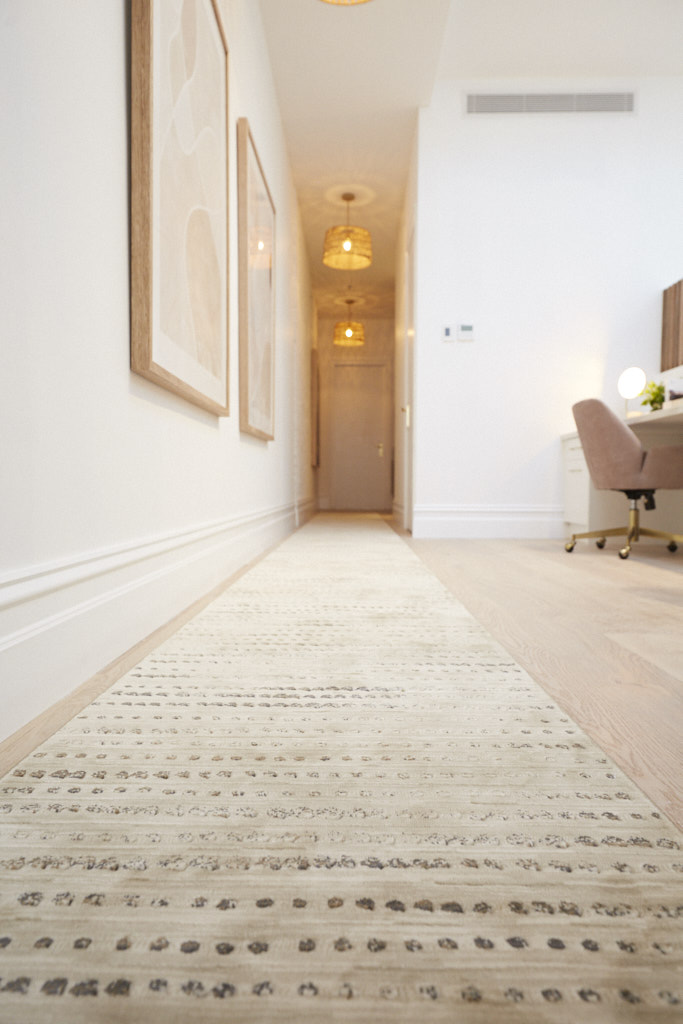
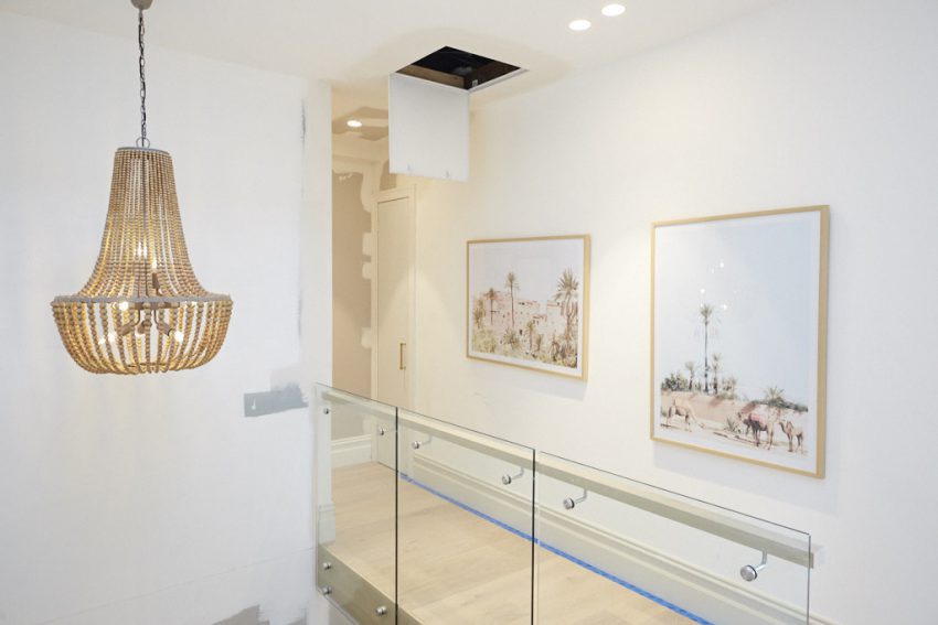
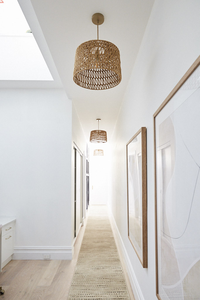
In the hallways on Level Two and Three, Deb chose to place beautiful statement art, more of those lovely rattan pendant lights, a gorgeous cream-coloured hall runner, and an amazing African artwork at the base of Level Two.
Andy and Deb chose to soften their spaces and add extra interest by including different wall treatments, installing more of that lovely VJ wall panelling, and deciding to paint one of their brick walls white – something the judges thought was a nice touch.
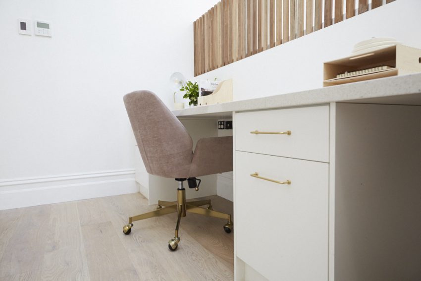
As well as these elements, the couple chose to include plenty of timber accents in their spaces, particularly in their study nook, which featured a long terrazzo bench, slatted timber balustrade, timber office organisers and was offset by two delightfully plush office chairs.



SCORE: 21/30
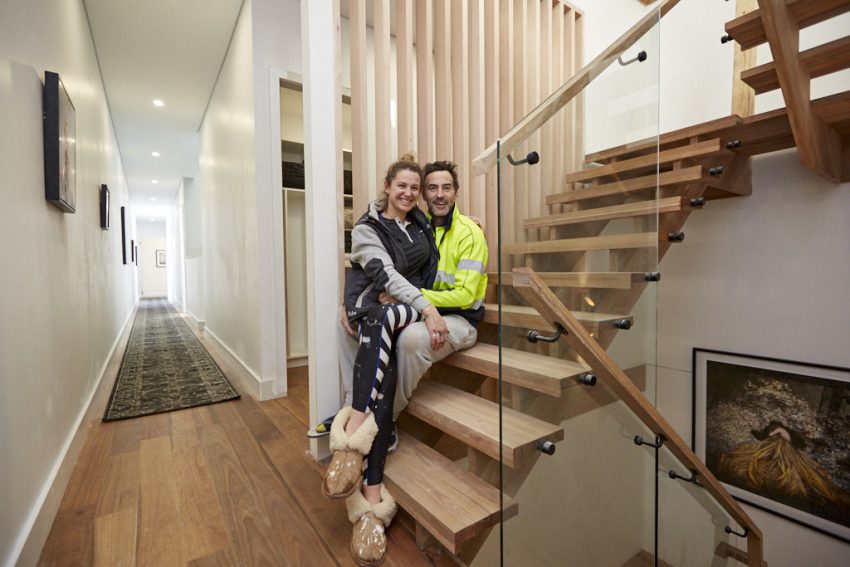
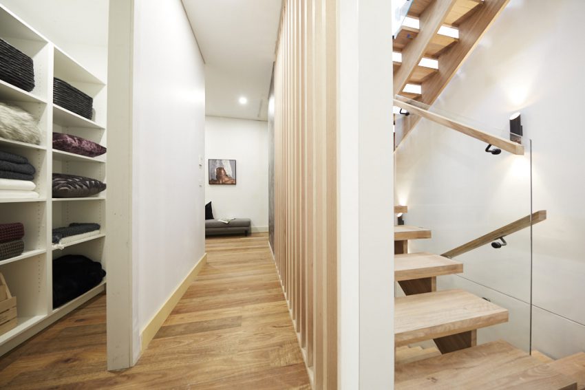
Matt and El’Ise chose to present their stairway and hallway this week as well as a powder room and laundry and self-contained study space upstairs.
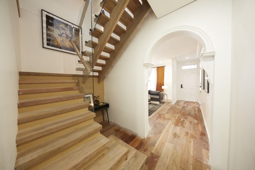
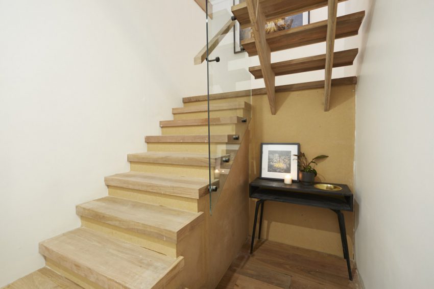
Shaynna, Neale and Darren started out on Level One and were instantly impressed by the couple’s grand stairwell, which featured timber slats and gorgeous artwork in the landing of level one. They also loved their Level One powder room, which featured slate-grey mosaic tiles, a gorgeous black concrete sink, modern pendant light and shiny floor tiles.
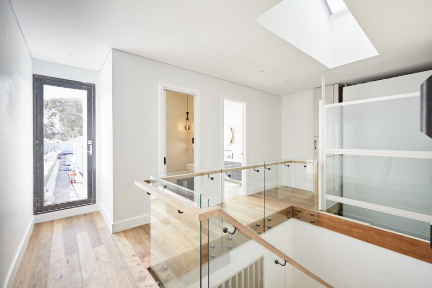
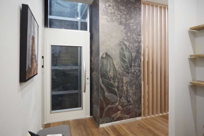
Up on Level Two, the judges liked the couple’s use of wall sconces and their oversized hall runner. Their statement timber slats and wallpapered art wall were met with approval, and Shaynna was particularly impressed with the inclusion of their controversial laundry chute.
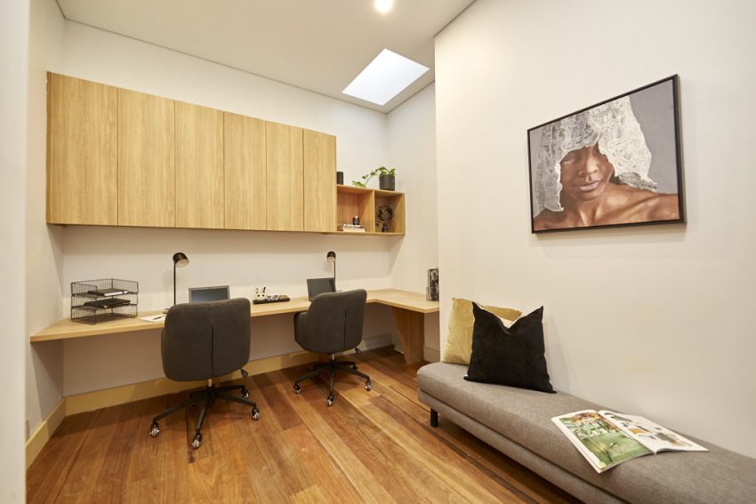
But the big hit was that generous home office area, which featured timber cabinetry, gorgeous timber floors, a bench seat and more artwork.
All three also thought it was clever to include a skylight in this tucked-away area, allowing light into what would have been an otherwise dark corner of the home.


SCORE: 20.5/30
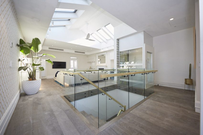
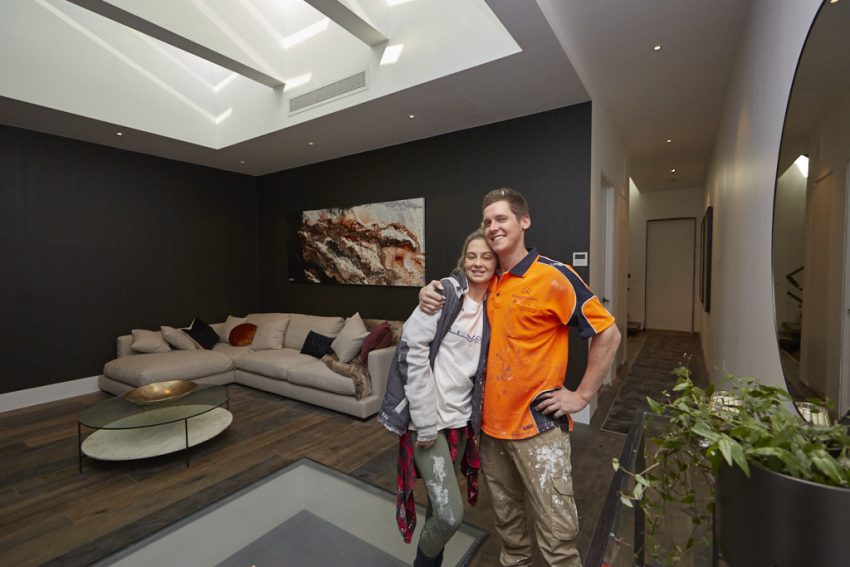
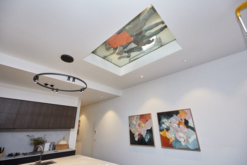
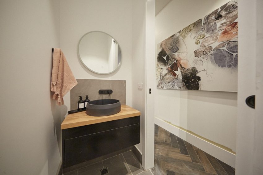
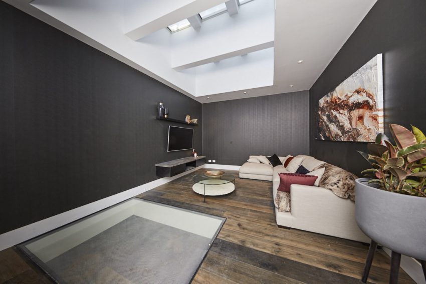
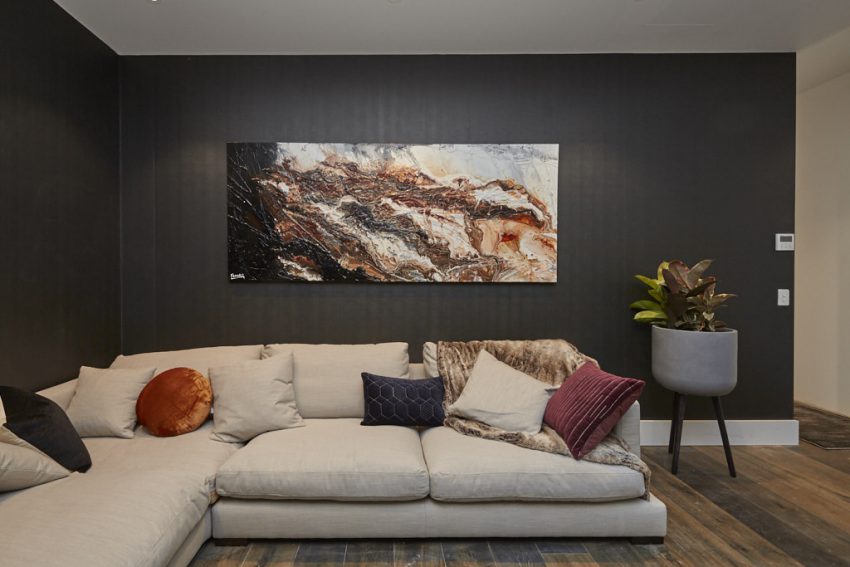
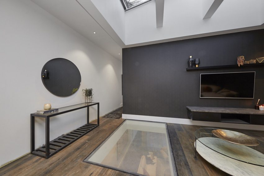
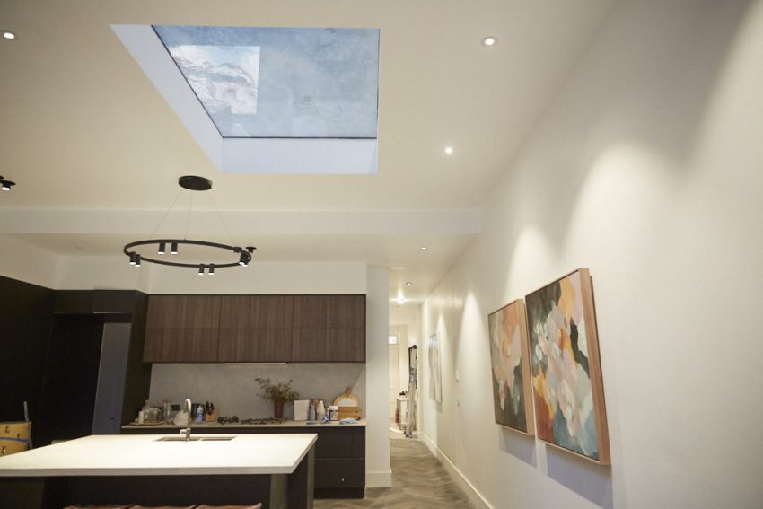
Tess and Luke chose to concentrate their efforts this week, delivering just their upstairs media room and a revamped formal living space – now changed to be a fully-functional formal dining area. But the biggest change was the inclusion of that enormous light well, and transparent ‘Viridian’ pane in their upstairs area, allowing light to pour into their kitchen/living area on the first floor.
All three judges loved the huge light well, which Darren thought allowed the house to “breathe again.”
They all also loved how much better the kitchen/living area flowed now Tess and Luke had chosen to move their formal dining setting to the front of the house.
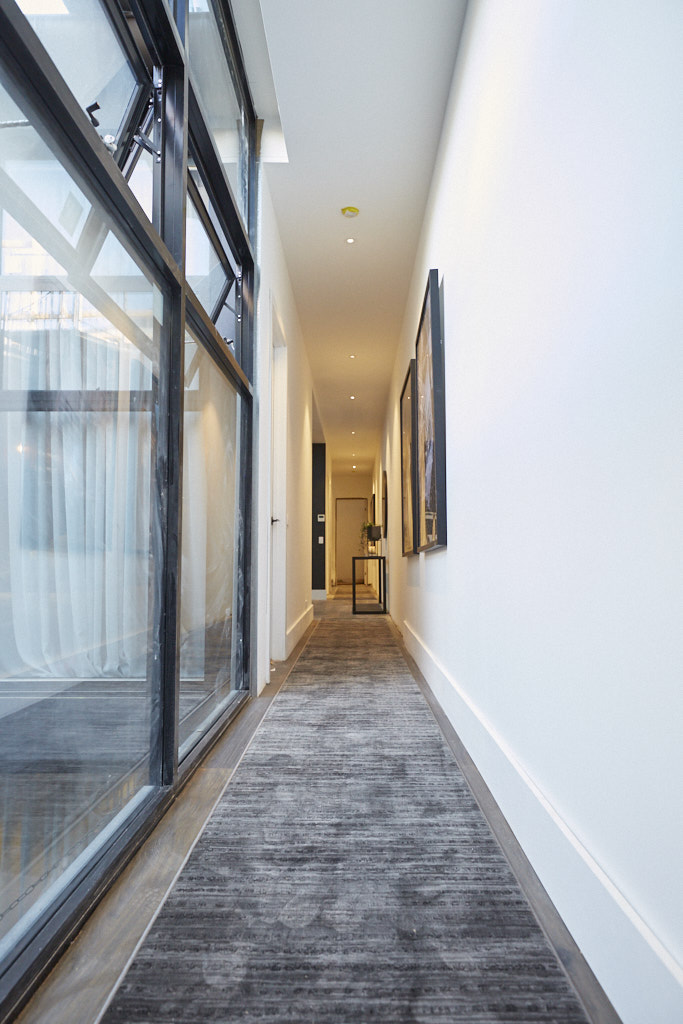
With limited budget, Tess did exceptionally well furnishing all the rooms, including a large white overstuffed couch, large abstract artwork, circular coffee table, side table and bookshelf in the media area upstairs. A huge concrete table and plush chairs completed the new look in their front room. And though they were strapped for time to finish their stairway and hallway, the judges could see what they were trying to achieve, liking the large abstract art and dark hall runner rug they’d placed upstairs. They also loved their media room.
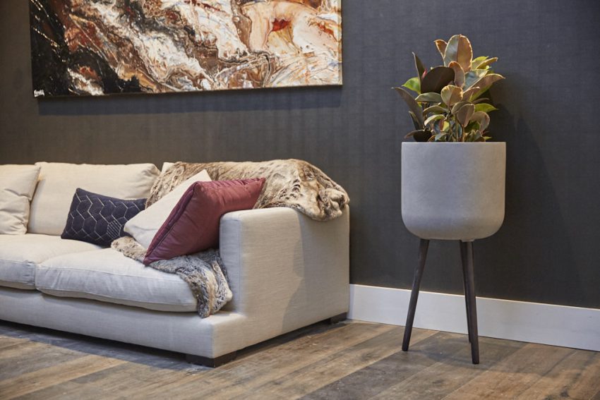
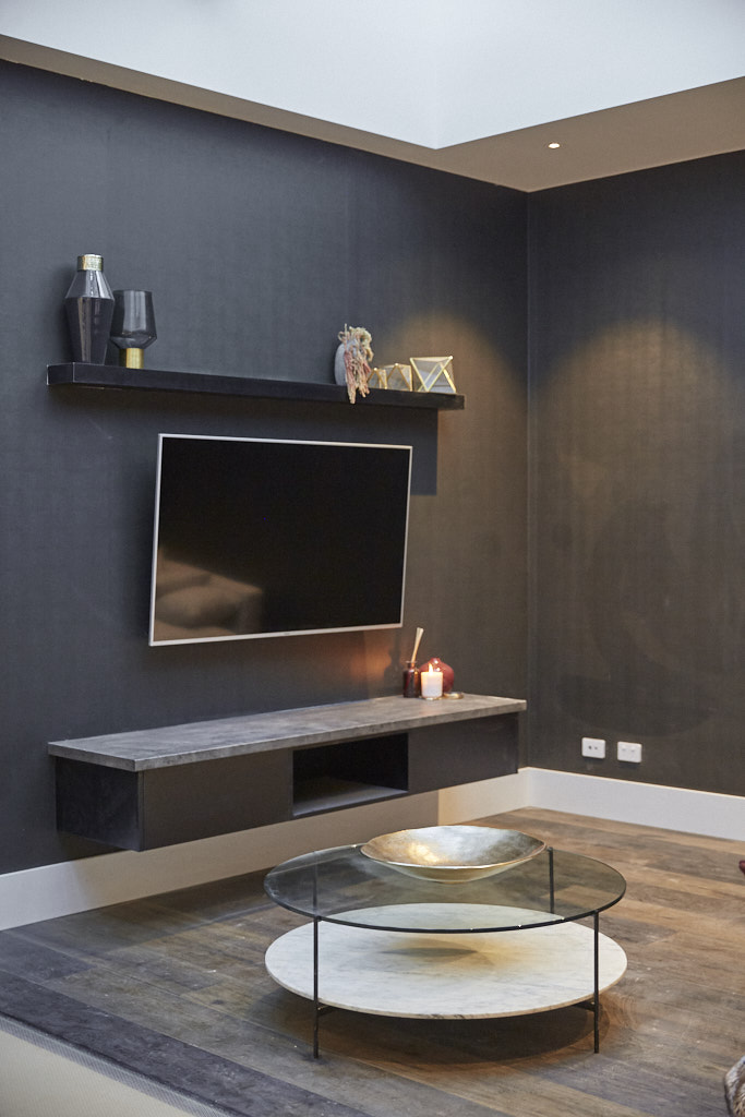
What did you think of the media space this week?
See all the past reveals here.
Be the first to read my stories
Get Inspired by the World of Interior Design
Thank you for subscribing to the newsletter.
Oops. Something went wrong. Please try again later.


