[vc_row][vc_column][vc_column_text]Did you see the guest bedrooms last week? Only 2/5 actually finished. Was hoping to see the finished rooms as well this week, but not to be. I really really liked Deb and Andy's bathroom. I picked that as the winner. I need those tiles!! Check out their efforts below and tell me what you …
[vc_row][vc_column][vc_column_text]Did you see the guest bedrooms last week? Only 2/5 actually finished. Was hoping to see the finished rooms as well this week, but not to be.
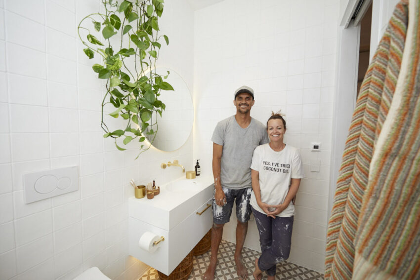
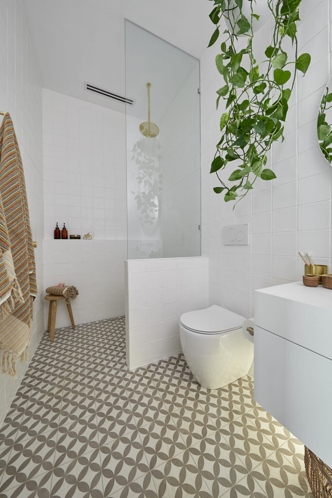
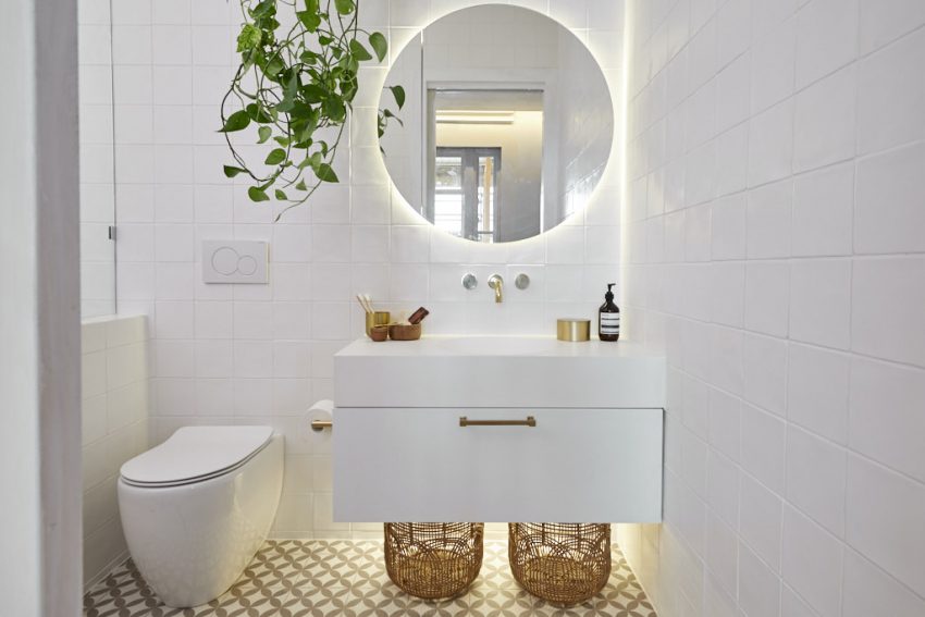
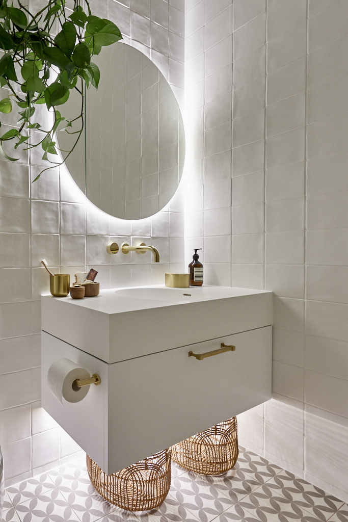
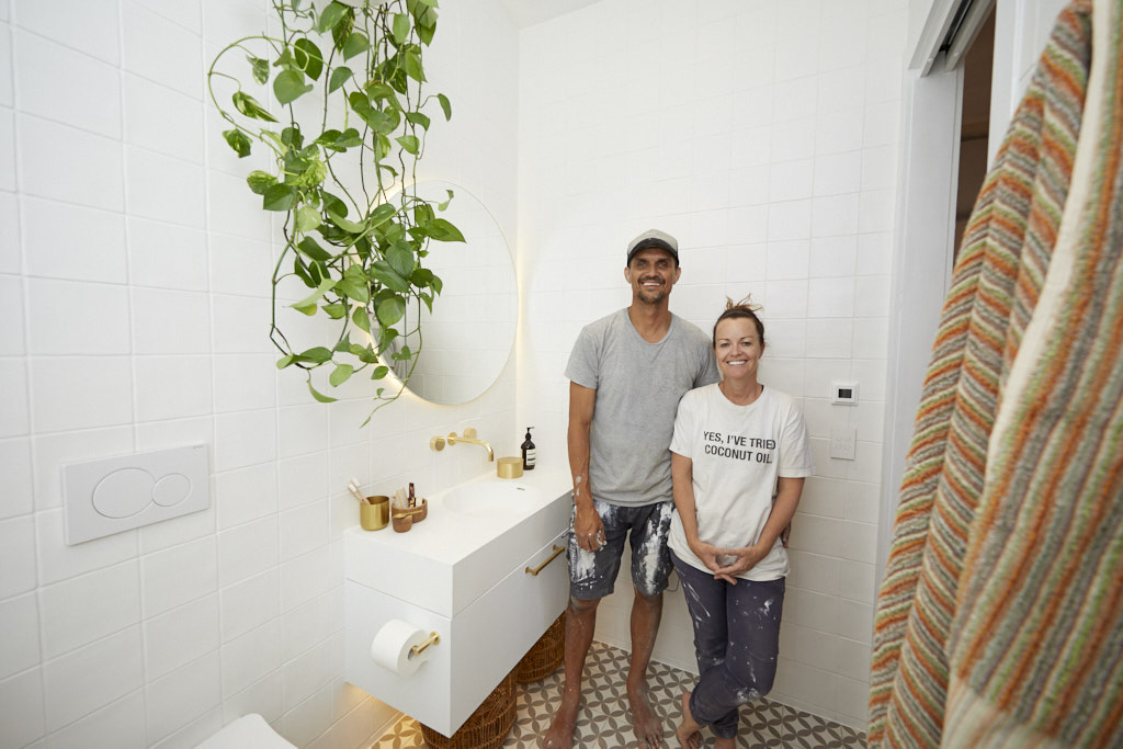
I really really liked Deb and Andy’s bathroom. I picked that as the winner. I need those tiles!!
Check out their efforts below and tell me what you think…[/vc_column_text][/vc_column][/vc_row][vc_row][vc_column][vc_column_text]JESSE & MEL ENSUITE
SCORE: 14/30
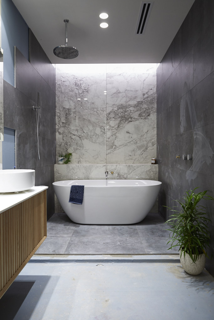
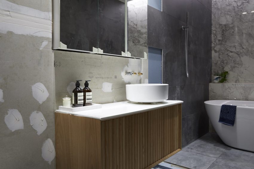
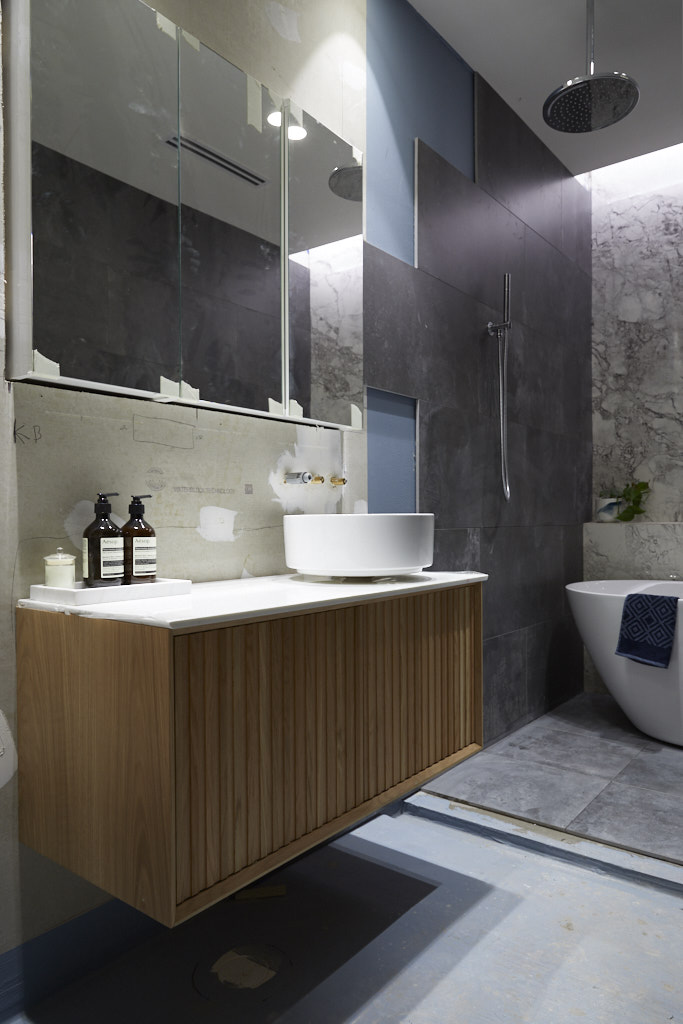
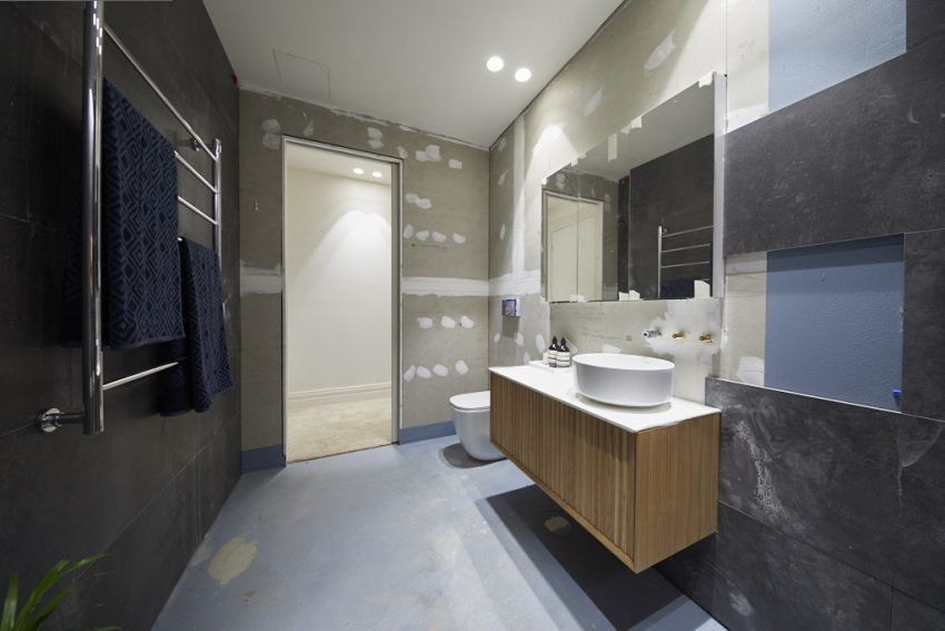
They absolutely wowed the judges with their near-perfect guest bedroom. But unfortunately due to an unforeseen situation with their floor, Jesse and Mel were unable to complete their ensuite bathroom – and the judges were not impressed. Had they managed to finish their room, they would have presented a bathroom with a central bath situated beneath a grey-tinged marble feature wall.

[/vc_column_text][/vc_column][/vc_row][vc_row][vc_column][vc_separator border_width=”3″][/vc_column][/vc_row][vc_row][vc_column][vc_column_text]TESS & LUKE ENSUITE
SCORE: 20/30
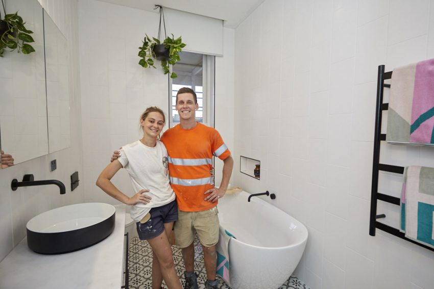
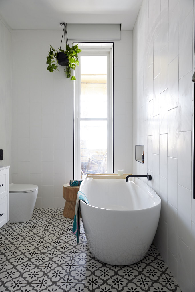
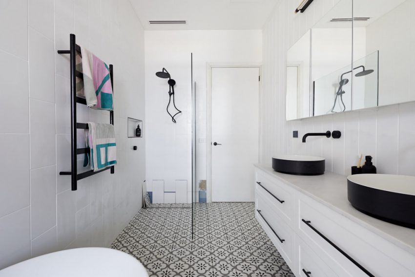
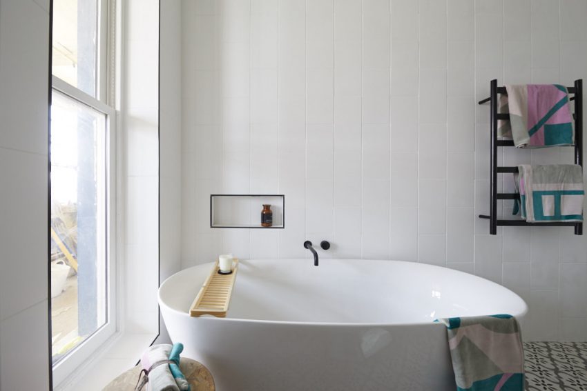
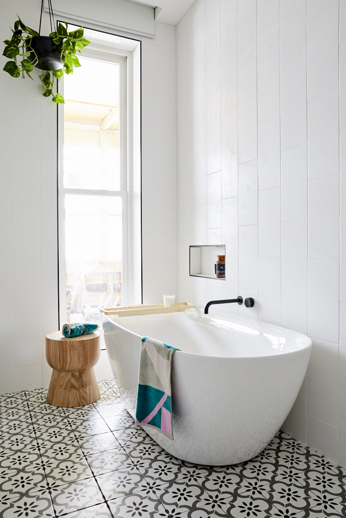
Like their guest bedroom, the couple ran out of time to properly complete their guest ensuite – but only just. Despite failing to properly finish all their tiling, they still managed to present a beautiful, simple, yet stylish ensuite space which worked well with the heritage era of the home. Darren was a particular fan. “I love it,” he said. “I think it’s really appropriate, and it works well with the colour scheme we saw next door. I think it feels like the same kind of mood as the bedroom and I really love a feature tile like this against something that is otherwise so white.”


 [/vc_column_text][/vc_column][/vc_row][vc_row][vc_column][vc_separator border_width=”3″][/vc_column][/vc_row][vc_row][vc_column][vc_column_text]MATT & ELISE ENSUITE
SCORE: 22/30
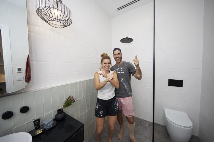
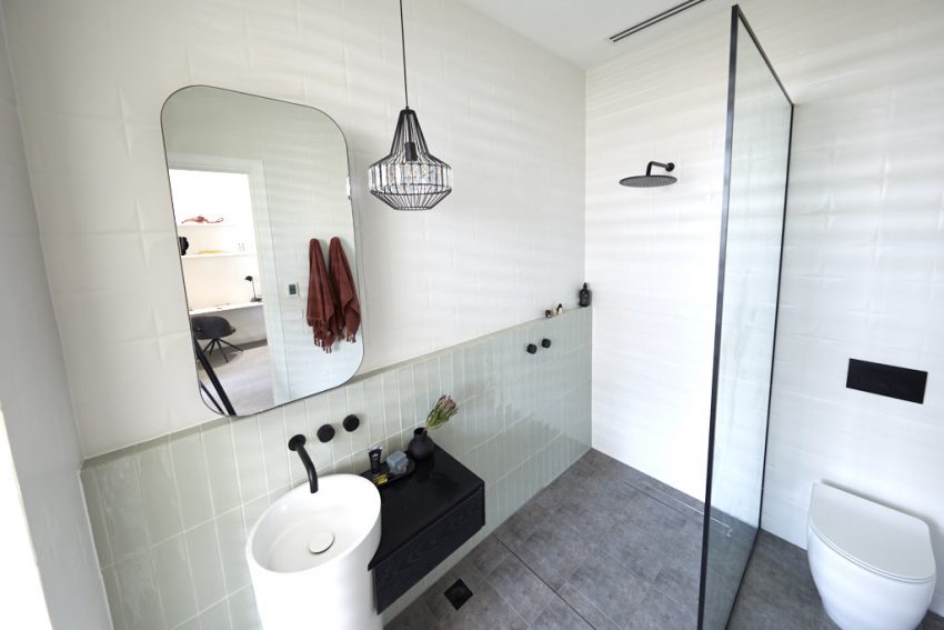
Like their stunning guest bedroom, El’ise and Matt presented a luxurious deco-inspired ensuite, which featured white “vaguely mid-century” wall tiles, a grey floor, black fittings and fixtures and another beautiful pendant light. Although the space was small, it had everything needed to make it both functional and visually pleasing. The hero of the room was undoubtedly the pedestal basin, which had been positioned central to the room, complete with its own custom-made wooden drawers.


[/vc_column_text][/vc_column][/vc_row][vc_row][vc_column][vc_separator border_width=”3″][/vc_column][/vc_row][vc_row][vc_column][vc_column_text]MITCH & MARK ENSUITE
SCORE: 27.5/30
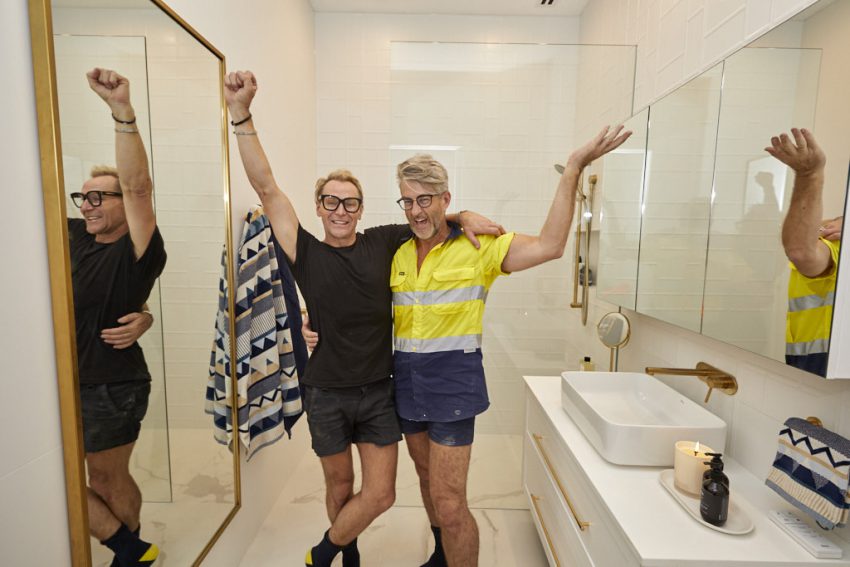
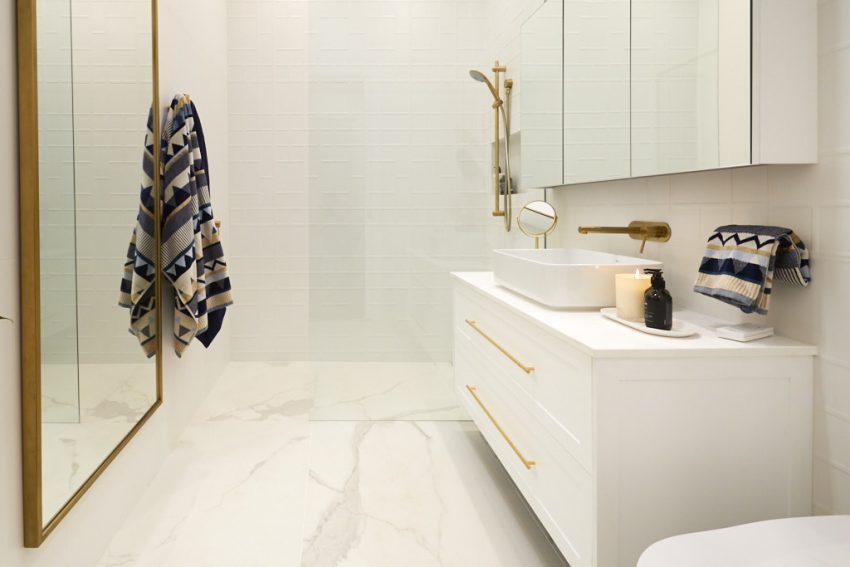
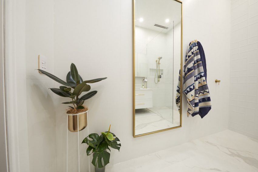
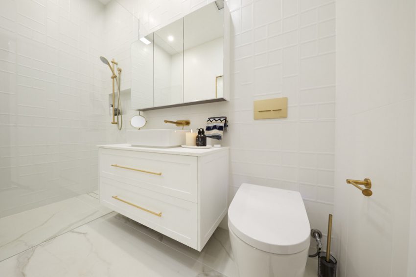
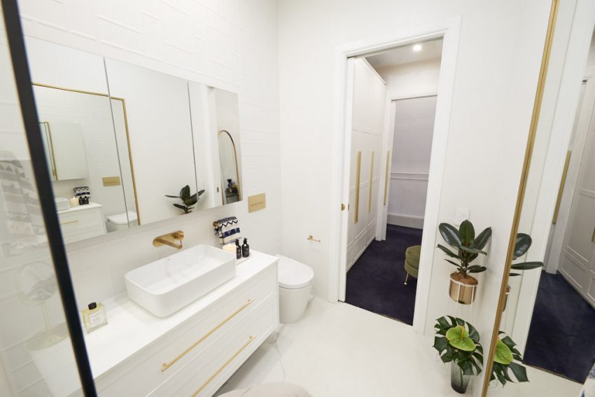
Mitch and Mark hoped to deliver a beautifully understated yet luxe guest ensuite – and boy did they deliver. All three judges loved the simple yet stylish space, which featured several different white tiles all working beautifully together in the pared-back space. Little touches like the use of blue patterned towels added the pop of colour the space needed, and it all added up to create a near-perfect guest bathroom.

[/vc_column_text][/vc_column][/vc_row][vc_row][vc_column][vc_separator border_width=”3″][/vc_column][/vc_row][vc_row][vc_column][vc_column_text]ANDY AND DEB ENSUITE
SCORE: 28/30
Deb wasn’t sure the judges would love her simple, elegant guest ensuite – but they did, awarding the couple their first win of the series. In fact, Neale loved their room so much he said he wanted to “pick it up and put it in my home!” And you can’t get higher praise than that. All three judges particularly loved that the couple had finished everything to an extremely high standard, and that the design was on-point and simple, yet mature and elegant.


[/vc_column_text][/vc_column][/vc_row][vc_row][vc_column][vc_column_text]
What did you think of the bathrooms this week?
See all the past reveals here.[/vc_column_text][/vc_column][/vc_row]
Be the first to read my stories
Get Inspired by the World of Interior Design
Thank you for subscribing to the newsletter.
Oops. Something went wrong. Please try again later.




Comments
Riverina Plantation Shutters
What is amazing about these pictures is the stark contrast in lighting given to the rooms with the windows! The natural lighting pops! We especially love the pre-planning by Tess and Luke to conceal their roller blinds into the ceiling. An amazing finish that has to be implemented in planning stage and that design feature is worth it.
-RPShutters
http://Www.riverinaplantationshutters.com.au