[vc_row][vc_column][vc_column_text]Did you watch the master bedroom reveals on The Block last night? Again I still think Bianca and Carla are acing it. I am not a fan of all the spewy bedroom colours the other couples chose. That red, blue, pinky stuff. It's foul if you ask me. I don't care that the judges thought …
[vc_row][vc_column][vc_column_text]Did you watch the master bedroom reveals on The Block last night? Again I still think Bianca and Carla are acing it. I am not a fan of all the spewy bedroom colours the other couples chose. That red, blue, pinky stuff. It’s foul if you ask me. I don’t care that the judges thought Bianca and Carla’s master was too masculine. I’d take that any day! Hayden and Sara’s was bearable. But all that dark black/brown robe in melamine is just depressing! At least the girls added some gold and had great floors to balance it out! I’d even much prefer the textures on Jess and Norm’s bed.
Check out their efforts below and tell me what you think…[/vc_column_text][/vc_column][/vc_row][vc_row][vc_column][vc_column_text]
Hayden and Sara
Score: 26.5 /30


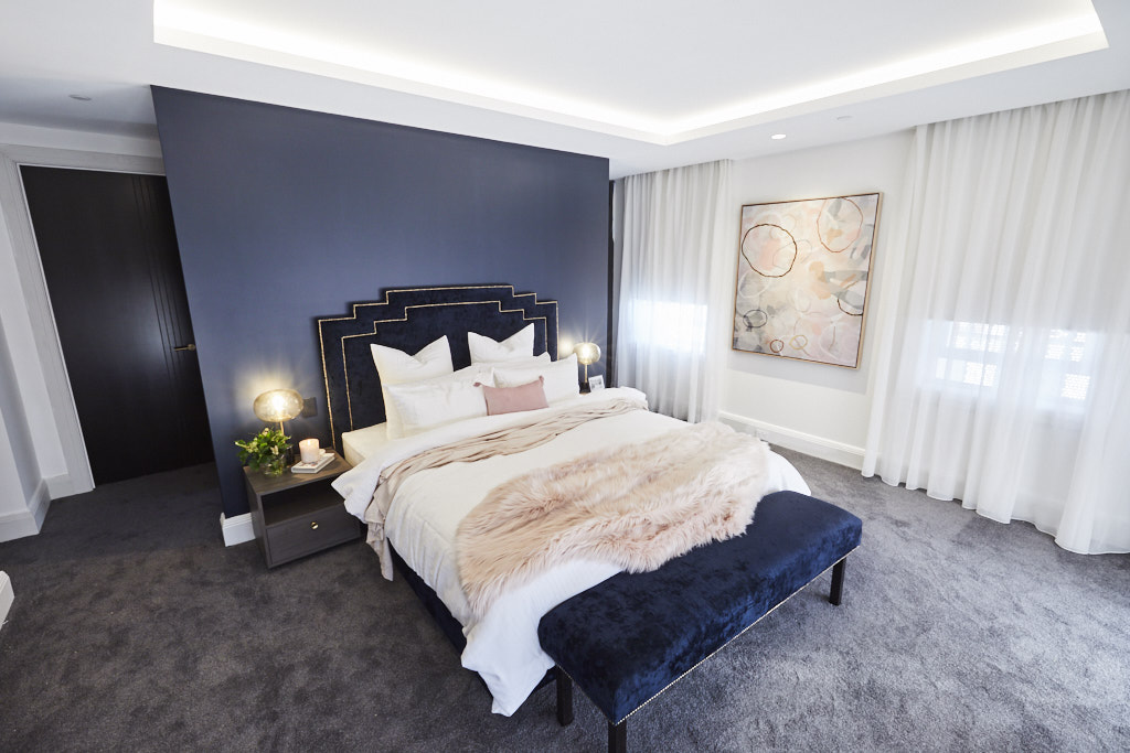


Talk about a comeback! Sara and Hayden finally broke their three-week losing streak, presenting a simply stunning deco-inspired main bedroom. They achieved their luxe, high-end look by painting a gorgeous blue-grey charcoal feature wall, including a stunning art deco-inspired upholstered bedhead with gold stud details, two deco bedside lamps, a pink fur throw and a lovely contemporary artwork in shades of blues and pinks.
You can shop Hayden and Sara’s room here.[/vc_column_text][vc_row_inner][vc_column_inner width=”1/4″][vc_single_image image=”55822″][/vc_column_inner][vc_column_inner width=”1/4″][vc_single_image image=”55821″][/vc_column_inner][vc_column_inner width=”1/4″][vc_single_image image=”55820″][/vc_column_inner][vc_column_inner width=”1/4″][vc_single_image image=”55819″][/vc_column_inner][/vc_row_inner][/vc_column][/vc_row][vc_row][vc_column][vc_column_text]
Kerrie and Spence
Score: 24/30

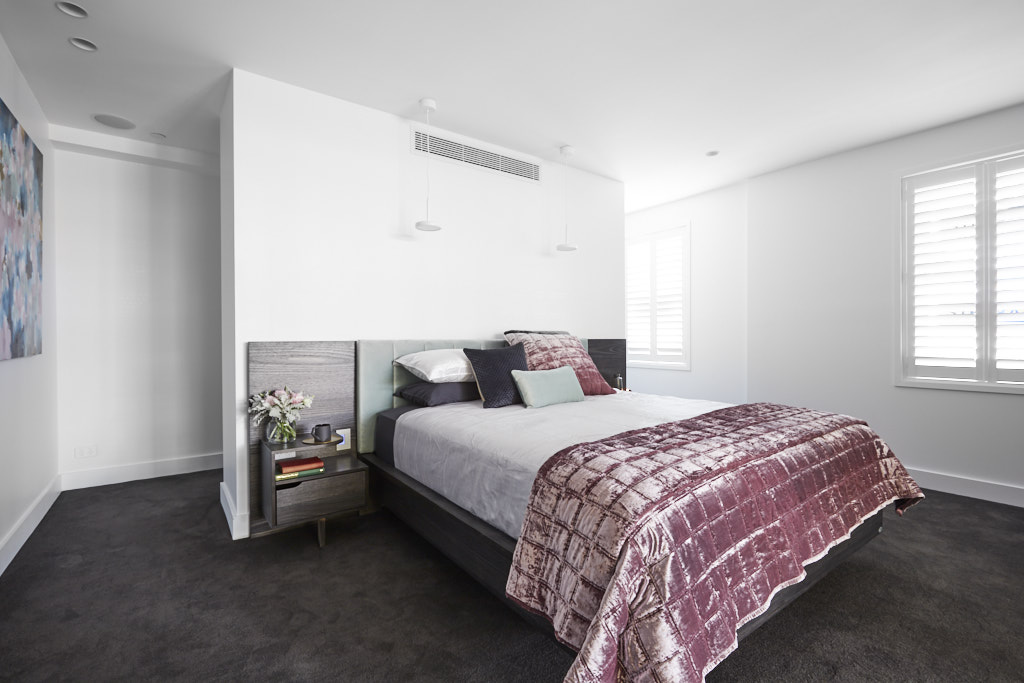

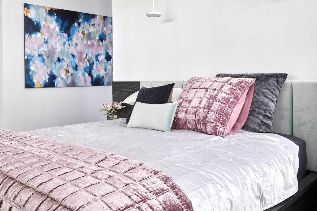


Kerrie and Spence used luxurious velvets and a soft, romantic colour palette to create a sumptuous main bedroom, which featured dark drapes, a custom-built bedhead with seafoam fabric inlay, and those stunning ‘his-and-hers’ walk-in robes.
You can shop Kerrie and Spence’s room here.[/vc_column_text][vc_row_inner][vc_column_inner width=”1/4″][vc_single_image image=”55776″][/vc_column_inner][vc_column_inner width=”1/4″][vc_single_image image=”55775″][/vc_column_inner][vc_column_inner width=”1/4″][vc_single_image image=”55774″][/vc_column_inner][vc_column_inner width=”1/4″][vc_single_image image=”55773″][/vc_column_inner][/vc_row_inner][/vc_column][/vc_row][vc_row][vc_column][vc_column_text]
Bianca and Carla
Score: 22.5/30


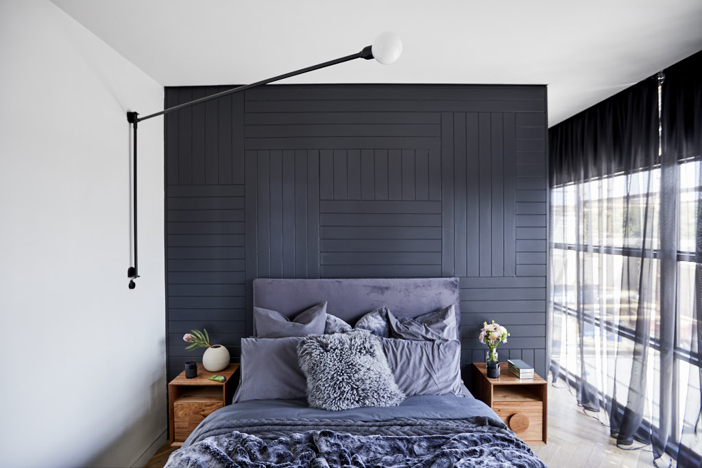
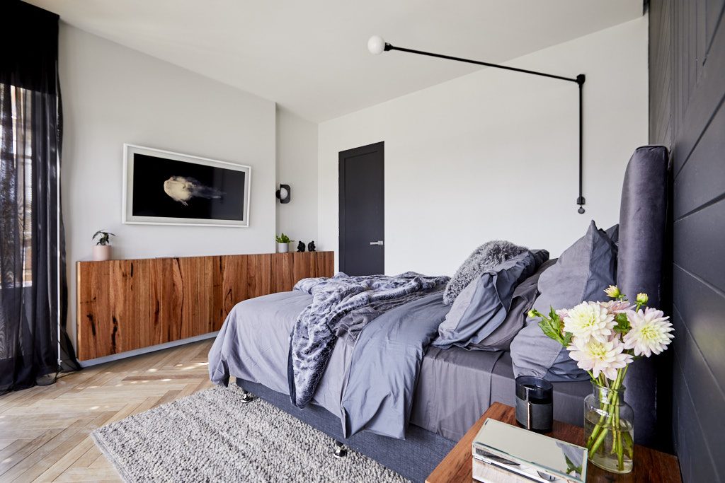

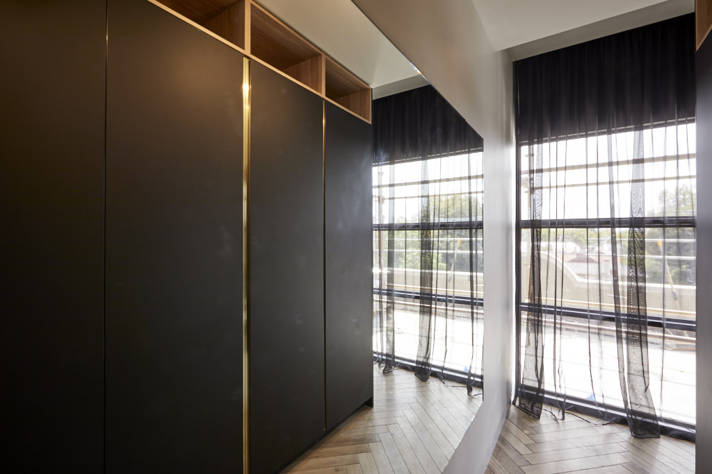

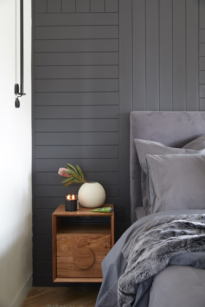

You can shop Bianca and Carla’s room here.[/vc_column_text][vc_row_inner][vc_column_inner width=”1/4″][vc_single_image image=”55780″][/vc_column_inner][vc_column_inner width=”1/4″][vc_single_image image=”55779″][/vc_column_inner][vc_column_inner width=”1/4″][vc_single_image image=”55778″][/vc_column_inner][vc_column_inner width=”1/4″][vc_single_image image=”55777″][/vc_column_inner][/vc_row_inner][/vc_column][/vc_row][vc_row][vc_column][vc_column_text]
Jess and Norm
Score: 22.5/30

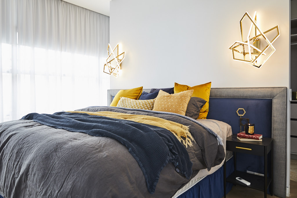

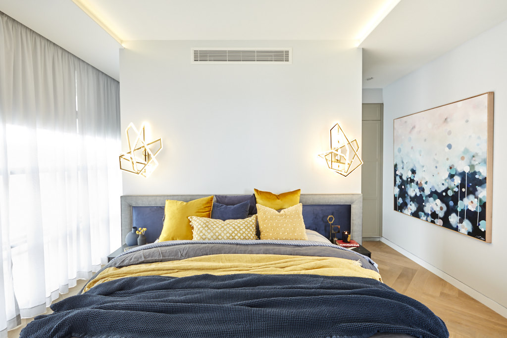


They might have only had a small space to work with, but Jess and Norm dialed up the luxe to eleven, presenting a room that featured marble, parquetry, a beautiful luxe bedhead, bespoke neon lights and a walk-in robe space that had all three judges singing its praises.
You can shop Jess and Norm’s room here.[/vc_column_text][vc_row_inner][vc_column_inner width=”1/4″][vc_single_image image=”55809″][/vc_column_inner][vc_column_inner width=”1/4″][vc_single_image image=”55808″][/vc_column_inner][vc_column_inner width=”1/4″][vc_single_image image=”55807″][/vc_column_inner][vc_column_inner width=”1/4″][vc_single_image image=”55806″][/vc_column_inner][/vc_row_inner][/vc_column][/vc_row][vc_row][vc_column][vc_column_text]
Courtney and Hans
Score: 22/30
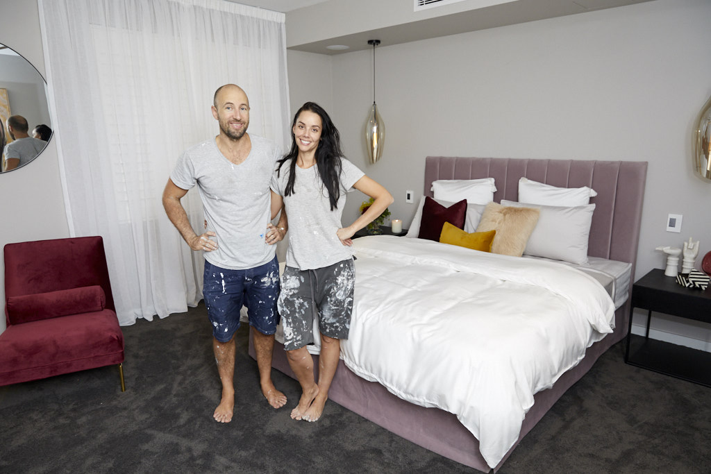


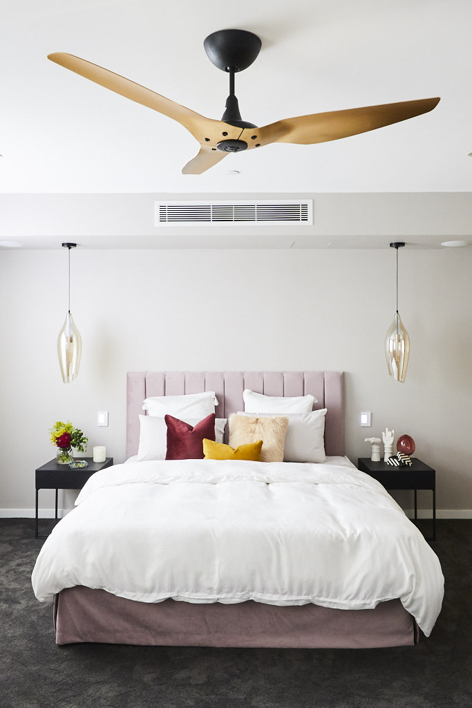


Courtney and Hans managed to execute a stunningly simple, yet stylish, main bedroom, featuring a plush pink bedhead, a large ‘statement’ fan, a round mirror, two dark pink velvet chairs and a copper table as seating area, and THAT controversial artwork. Their deluxe walk-in robes, featuring that last minute marble stone bench, was an instant hit with the judges.
You can shop Courtney and Hans’ room here.[/vc_column_text][vc_row_inner][vc_column_inner width=”1/4″][vc_single_image image=”55795″][/vc_column_inner][vc_column_inner width=”1/4″][vc_single_image image=”55794″][/vc_column_inner][vc_column_inner width=”1/4″][vc_single_image image=”55793″][/vc_column_inner][vc_column_inner width=”1/4″][vc_single_image image=”55792″][/vc_column_inner][/vc_row_inner][/vc_column][/vc_row][vc_row][vc_column][vc_column_text]
What did you think of the master suites this week?
Check out the other room reveals and meet the couples here.[/vc_column_text][/vc_column][/vc_row]
Be the first to read my stories
Get Inspired by the World of Interior Design
Thank you for subscribing to the newsletter.
Oops. Something went wrong. Please try again later.




Comments
Nicole
Bianca & Carla’s Bedroom is absolutely by far the better room love the colours, love their styling. They have nailed it. Not sure what the other contestants are thinking.
Sara
Love the first room with the navy blue headboard and the room with the pink one !
Sara
http://www.thefrenchcountryliving.com
Ingrid
Kerrie and Spence’s bedroom was my favourite, followed closely by Bianca and Carla’s bedroom. I thought the others were all good, but Norm and Jess’s bedroom was too small for a penthouse.
Toby
Hits:
I love the pairings of pink with navy, or mustard and navy. Clever combos.
All WIRs look great. Simple but effective.
Luxe/Velvet is obviously the feel, the age of velvet/luxe is gorgeous is upon us and makes any room feel glam and luxurious paired with gold and black metal. The combos that everyone has come up with looks great, love the colours…
Although I’m not a grey person, I love Bianca and Carla’s room… although I like cluttery British frilly things, their room has grit and edge and very Melbourne.
Beautiful pendant lights across the board.
Miss:
Too many karate chopped cushions and pillows across the board, not a fan of the pillow/cushion karate chop.
Sara and Hayden’s head board is lovely but too matchy matchy on the blue velvet with the bench.
Everyone is too afraid to place art above the head of the bead.
Most couples were too afraid to use actual lampshades and chose pendants instead. Lampshades give the buyer and option to change things up.
Jess and Norm’s pillows are too messy, nice colours but need more order.
Kerry and Spence’s square themed throw and matching pillow look a bit stodgy.
Liz
Does my head in when contestants focus more on the styling of the furniture than the room itself. Give me architectural details and charm over a blush headboard ANY day!!