[vc_row][vc_column][vc_column_text]The kitchens were revealed on The Block last night. What did you think? I must admit I didn't get to watch hardly anything this past week. I do remember from my time of The Block that kitchen week is a little less stressful than the other weeks because you choose everything so early in the …
[vc_row][vc_column][vc_column_text]The kitchens were revealed on The Block last night. What did you think? I must admit I didn’t get to watch hardly anything this past week. I do remember from my time of The Block that kitchen week is a little less stressful than the other weeks because you choose everything so early in the show and there’s not a lot of shopping and accessorising when it’s just the kitchen. I normally love looking at the kitchen reveals, but nothing really took my fancy. Maybe Jess and Norm’s was the best pick? Just because it wasn’t black and grey!
Check out their efforts below and tell me what you think…[/vc_column_text][/vc_column][/vc_row][vc_row][vc_column][vc_column_text]
Kerrie and Spence
Score: 30/30

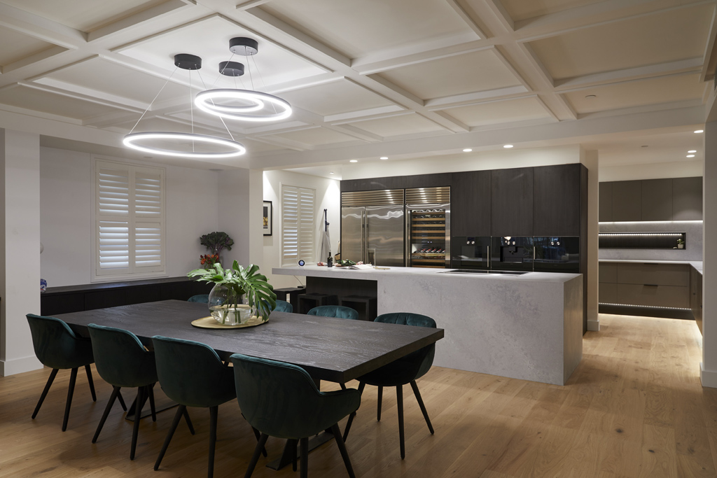


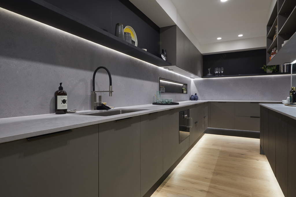
Kerrie and Spence wowed the judges with their perfect score kitchen, tricked up to the nines with with top-of-the-range Gaggenau appliances, a hidden rangehood, those amazing Sub Zero fridges, and an exceptionally executed Butler’s Pantry.
You can shop Kerrie and Spence’s room here.[/vc_column_text][vc_row_inner][vc_column_inner width=”1/4″][vc_single_image image=”56099″][/vc_column_inner][vc_column_inner width=”1/4″][vc_single_image image=”56098″][/vc_column_inner][vc_column_inner width=”1/4″][vc_single_image image=”56097″][/vc_column_inner][vc_column_inner width=”1/4″][vc_single_image image=”56096″][/vc_column_inner][/vc_row_inner][/vc_column][/vc_row][vc_row][vc_column][vc_column_text]
Hayden and Sara
Score: 28.5/30
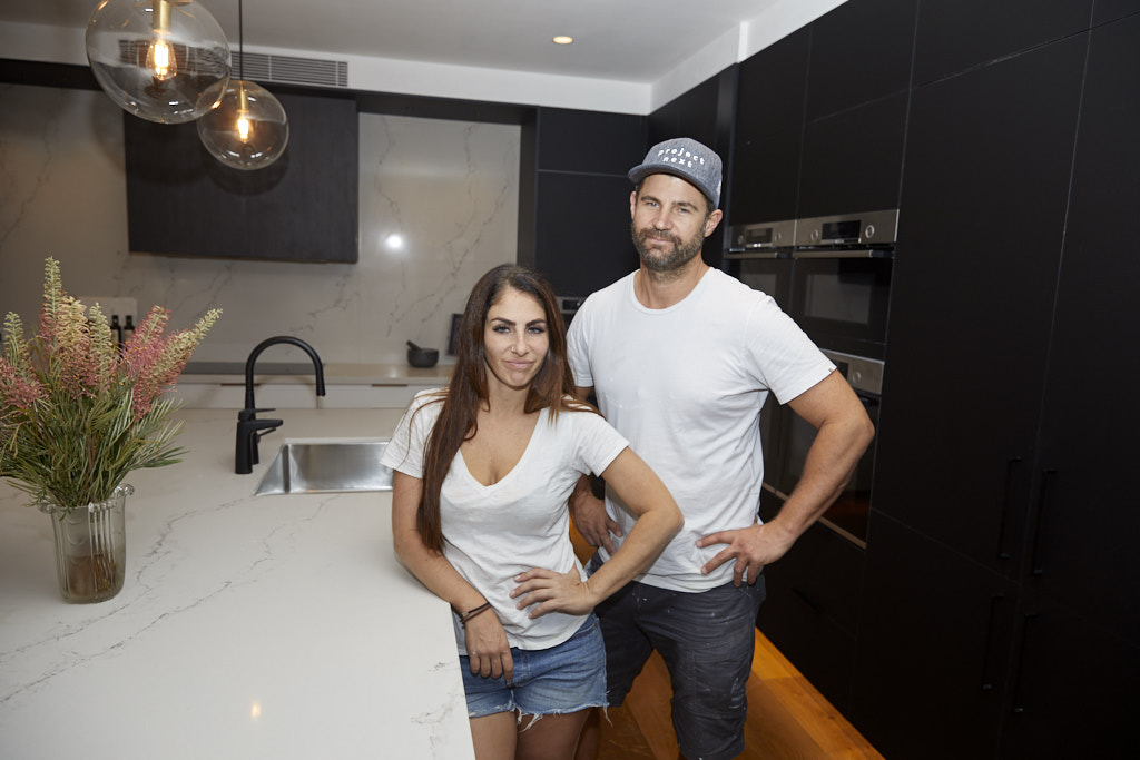


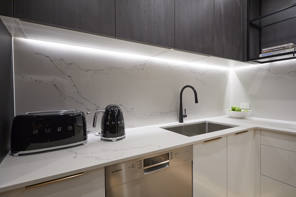


The judges loved Sara and Hayden’s stunning black and white kitchen, which featured a beautiful sculptural range hood, large white stone feature wall, black cabinetry, black wire stools, a bench seat – and that ridiculously awesome hidden butler’s pantry.
You can shop Hayden and Sara’s room here.[/vc_column_text][vc_row_inner][vc_column_inner width=”1/4″][vc_single_image image=”56129″][/vc_column_inner][vc_column_inner width=”1/4″][vc_single_image image=”56126″][/vc_column_inner][vc_column_inner width=”1/4″][vc_single_image image=”56128″][/vc_column_inner][vc_column_inner width=”1/4″][vc_single_image image=”56127″][/vc_column_inner][/vc_row_inner][/vc_column][/vc_row][vc_row][vc_column][vc_column_text]
Bianca and Carla
Score: 26.5/30


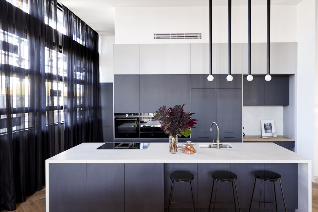

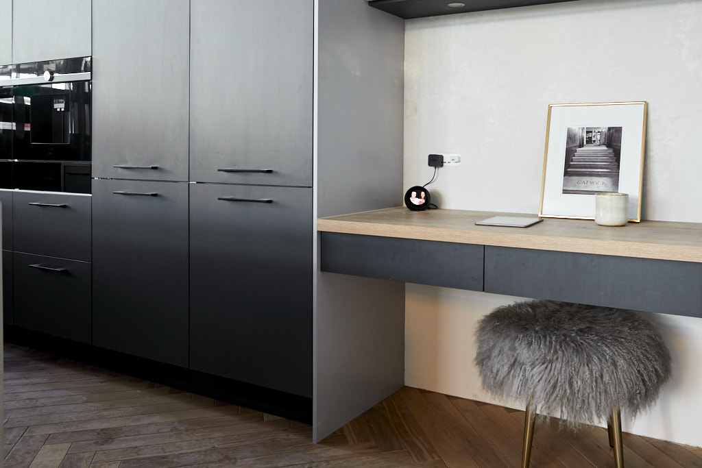
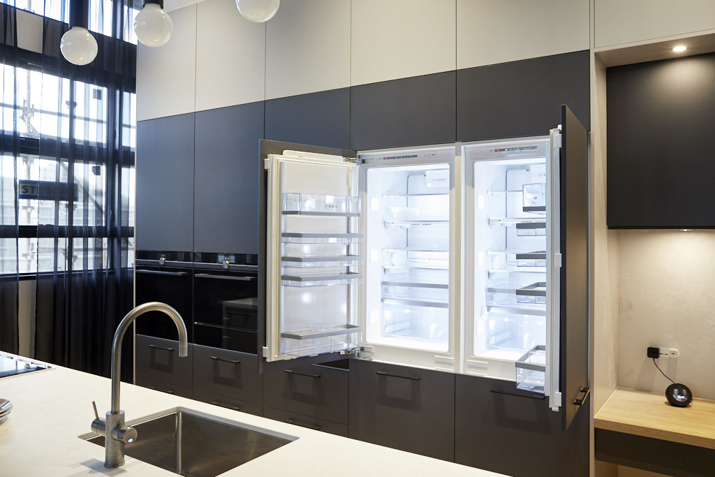


You can shop Bianca and Carla’s room here.[/vc_column_text][vc_row_inner][vc_column_inner width=”1/4″][vc_single_image image=”56085″][/vc_column_inner][vc_column_inner width=”1/4″][vc_single_image image=”56084″][/vc_column_inner][vc_column_inner width=”1/4″][vc_single_image image=”56083″][/vc_column_inner][vc_column_inner width=”1/4″][vc_single_image image=”56082″][/vc_column_inner][/vc_row_inner][/vc_column][/vc_row][vc_row][vc_column][vc_column_text]
Jess and Norm
Score: 26.5/30


Norm and Jess impressed with their stunning kitchen, producing what the judges called “one of the most beautiful kitchens ever produced on The Block.” They included floor-to-ceiling cabinetry with a shaker profile, a beautiful marble bench top, black tapwear, and an enormous butler’s pantry with another double sink and wooden shelf detail. Oh, and who could forget that state-of-the-art voice activated plumbing!
You can shop Jess and Norm’s room here.[/vc_column_text][vc_row_inner][vc_column_inner width=”1/4″][vc_single_image image=”56114″][/vc_column_inner][vc_column_inner width=”1/4″][vc_single_image image=”56113″][/vc_column_inner][vc_column_inner width=”1/4″][vc_single_image image=”56112″][/vc_column_inner][vc_column_inner width=”1/4″][vc_single_image image=”56111″][/vc_column_inner][/vc_row_inner][/vc_column][/vc_row][vc_row][vc_column][vc_column_text]
Courtney and Hans
Score: 24/30


Courtney and Hans took a risk positioning their kitchen across the hall. They also decided to include a hidden Butler’s pantry, effectively cutting their room in half. But despite this the couple still produced a beautiful space, which featured stone benchtops and splashbacks, gorgeous champagne-coloured metallic cabinetry, matte black floor-to-ceiling cupboards, and an island bench, situated at the centre of the room.
You can shop Courtney and Hans’ room here.[/vc_column_text][vc_row_inner][vc_column_inner width=”1/4″][vc_single_image image=”56081″][/vc_column_inner][vc_column_inner width=”1/4″][vc_single_image image=”56080″][/vc_column_inner][vc_column_inner width=”1/4″][vc_single_image image=”56079″][/vc_column_inner][vc_column_inner width=”1/4″][vc_single_image image=”56078″][/vc_column_inner][/vc_row_inner][/vc_column][/vc_row][vc_row][vc_column][vc_column_text]
What did you think of the kitchens this week?
Check out the other room reveals and meet the couples here.[/vc_column_text][/vc_column][/vc_row]
Be the first to read my stories
Get Inspired by the World of Interior Design
Thank you for subscribing to the newsletter.
Oops. Something went wrong. Please try again later.



Comments
Michelle
I loved Kerrie & Spence’s kitchen. The way the butlers pantry just wraps around & is tucked away will work beautifully. And that is also what I loved with Norm & Jess’s kitchen. I also loved the lightness Norm & Jess created with their cabinetry & drapery colour. I didn’t expect to love Hayden & Sara’s as much as I did but I loved that they spun the orientation around to take full advantage of their windows. Which is what Hans & Courtney should have done – knock down that wall & have a big long island running down the middle of the room, inbetween their windows. I did like their cabinetry choices though. Bianca & Carla’s was beautiful and their light choices were awesome. Oh and their bench top was to die for!
I have had a look at the apartment listings online & there are two that stand out – Bianca & Carla and Kerrie & Spence. I just love them both so far & think they will both so really well come auction day.