I was so looking forward to this week. I love the living and dining room reveals. Bust was anyone else doing the double take on the scoring?? What the? I just don't know what style any of the judges like anymore. It confuses me! I feel like I look at a room and know the …
I was so looking forward to this week. I love the living and dining room reveals. Bust was anyone else doing the double take on the scoring?? What the? I just don’t know what style any of the judges like anymore. It confuses me! I feel like I look at a room and know the judges will like it, but then they don’t? What’s up with Will and Karlie scoring the lowest this week? I wasn’t expecting that. Anyway, come and take a look at the rooms (in order of scoring) and let me know what you think in the comments below…
Dan and Carleen
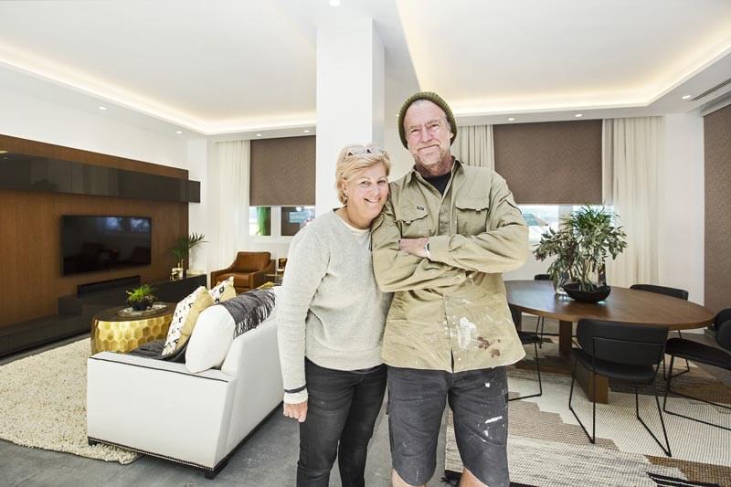
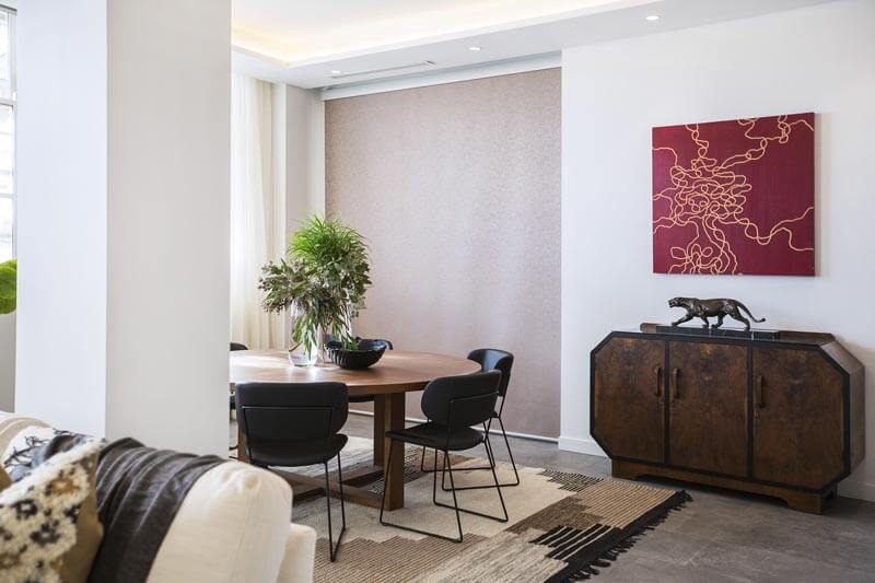
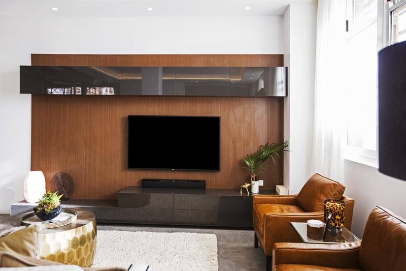
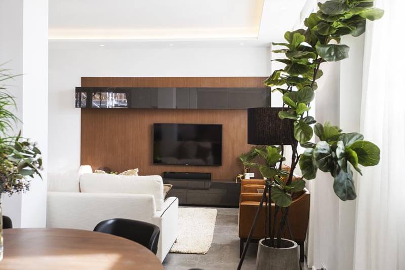
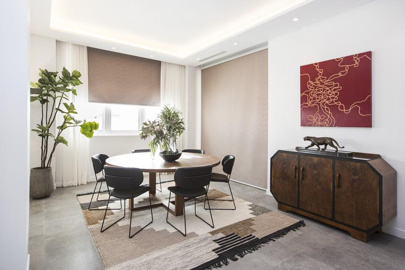
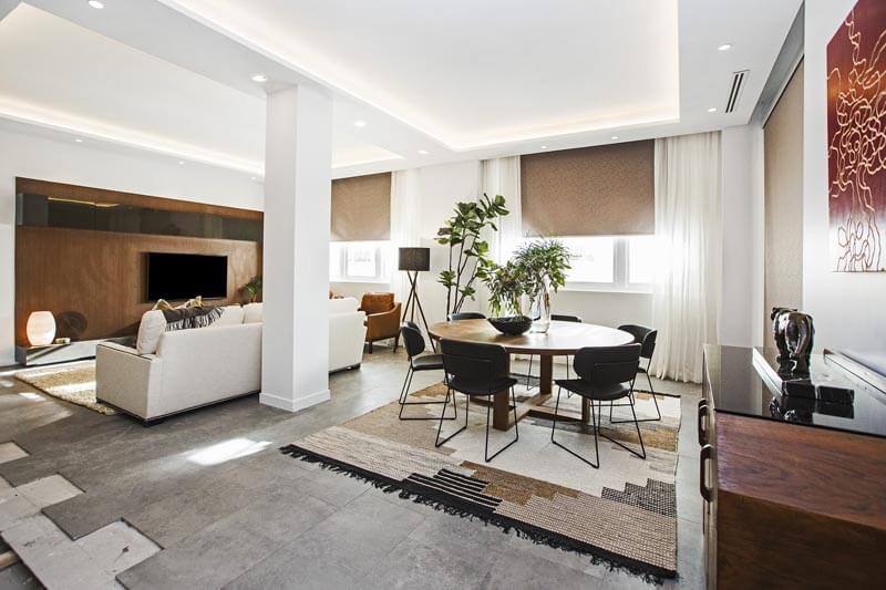
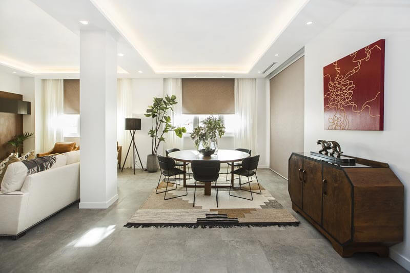
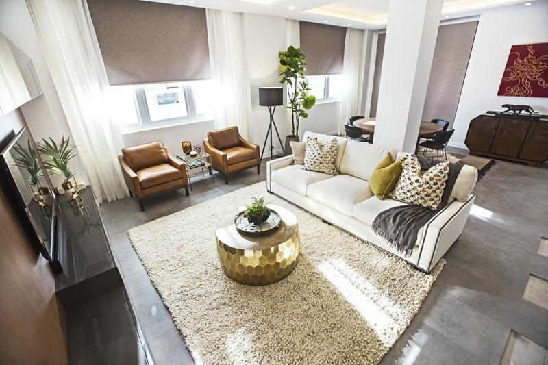
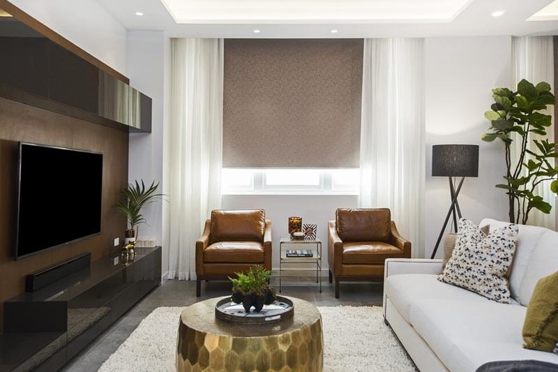
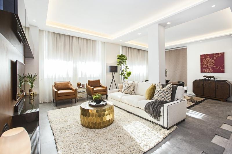
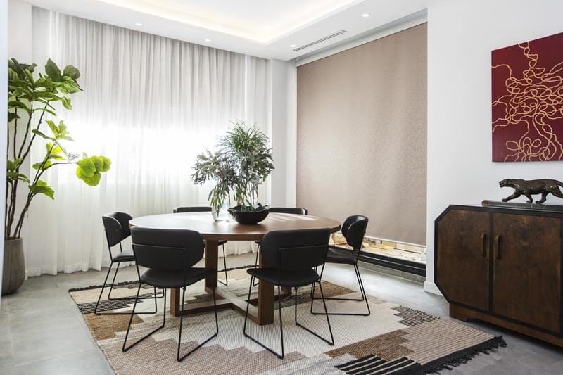
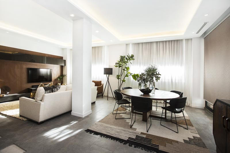
Dan and Carleen took home equal first prize this week with a score of 25.5/30. It wasn’t my favourite I’m afraid. I didn’t hate it, but I wasn’t in love with it. All the brown just doesn’t get me going. I like the round table, but the console and artwork wasn’t a hit with me. Nor were the 2 floor rugs. I like that they put effort into the tv area, but again the brown wasn’t the best. The couch and rug don’t match well enough in my books.
…
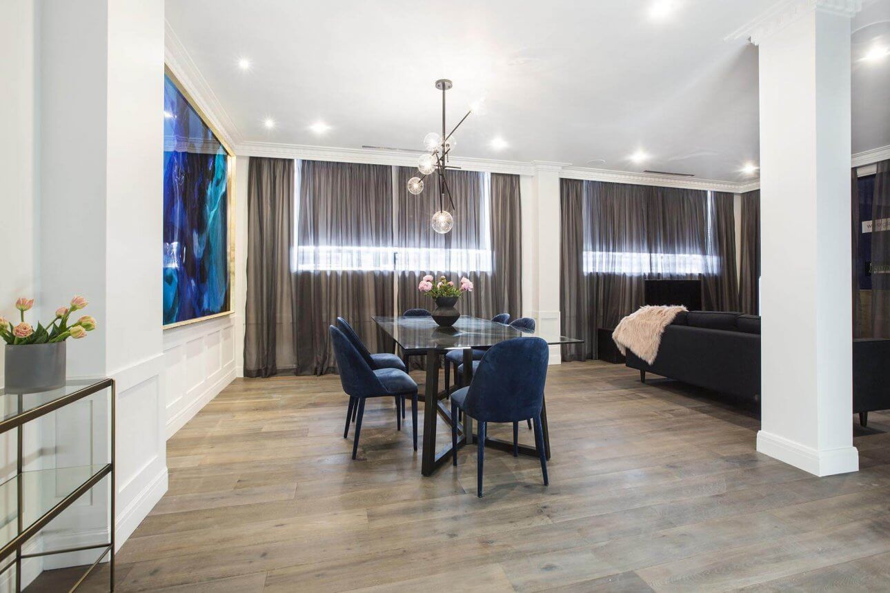
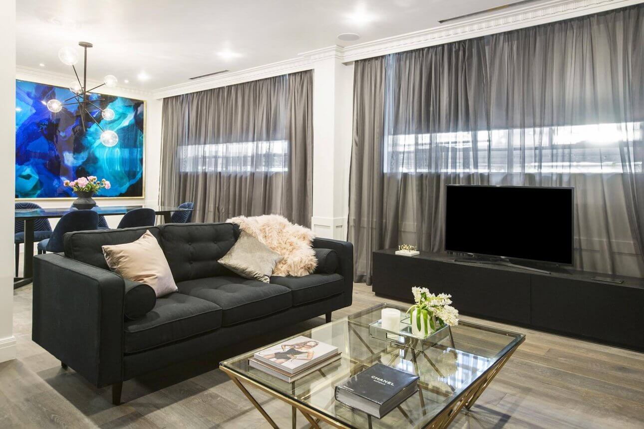
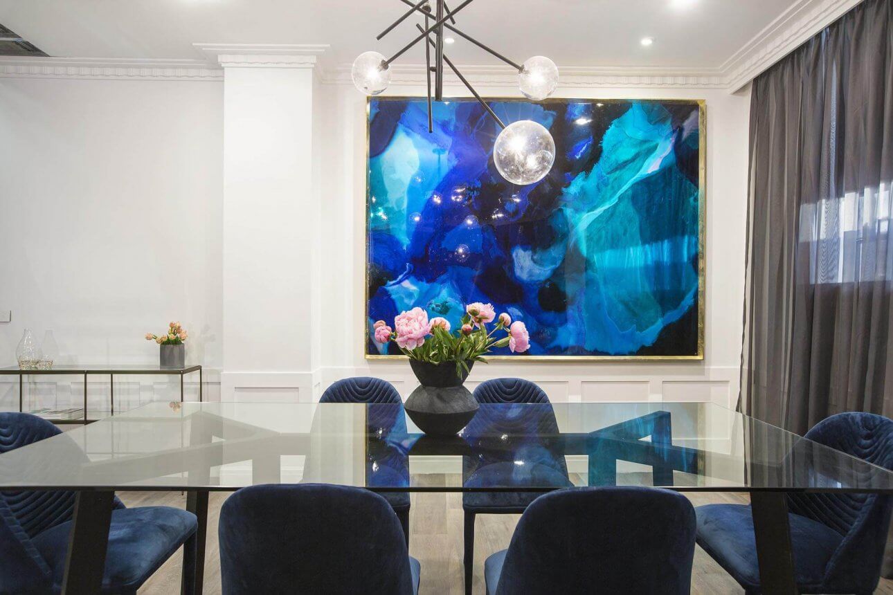
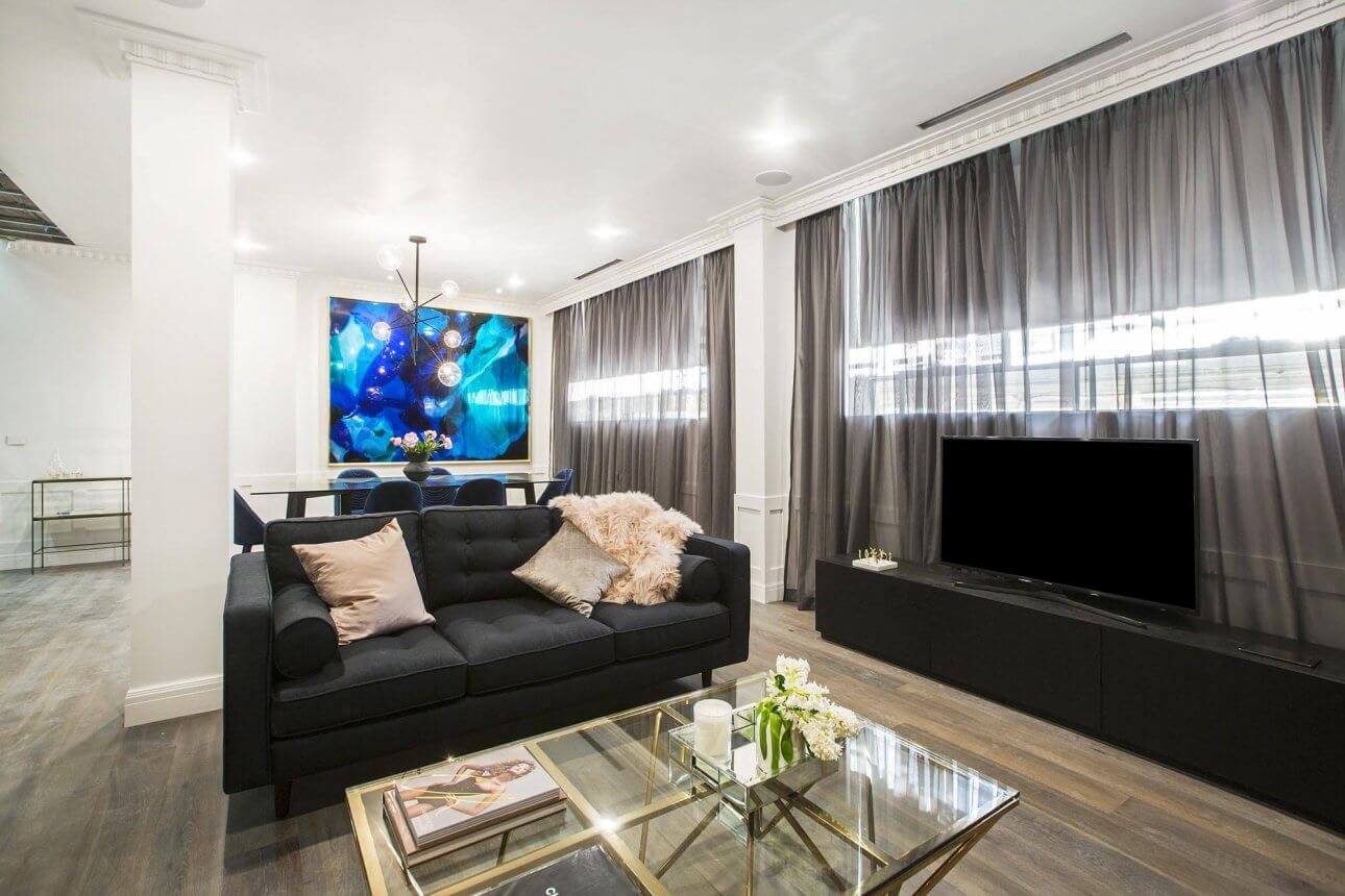
Julia and Sasha
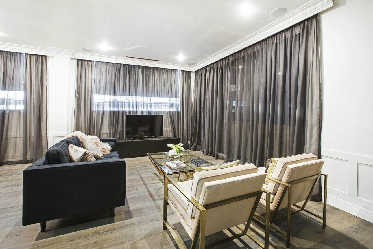
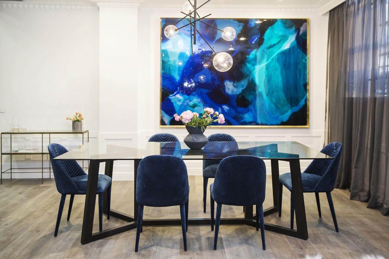
Oh, they came equal first? Also with a score of 25.5/30. Now we all love the girls, but I thought the room was unfinished? I love the glamour in here and those navy dining chairs are divine, but everything was plonked in the space with no floor rugs, hardly any decorating goodies, and the tv stand? Where’s the built-in stuff so you can hide cords and watch Netflix?? Too rigid for me and doesn’t feel warm enough. But I bet they smash the kitchen and then it’ll all flow beautifully.
…

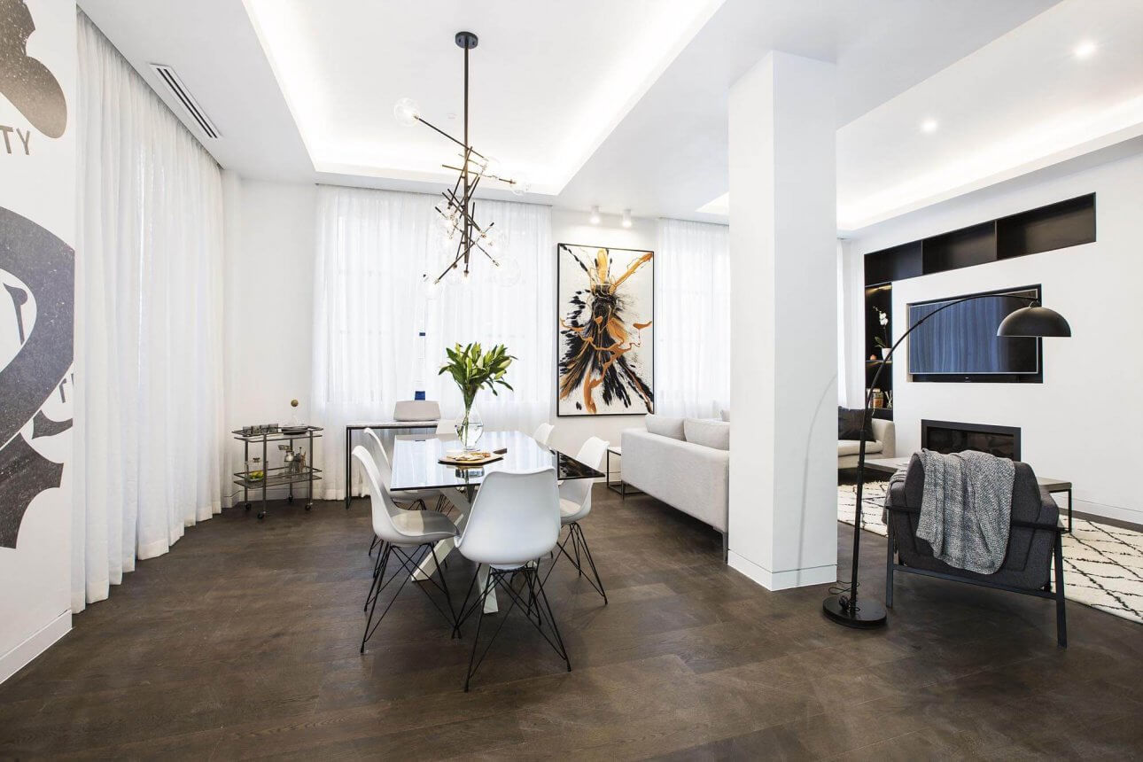
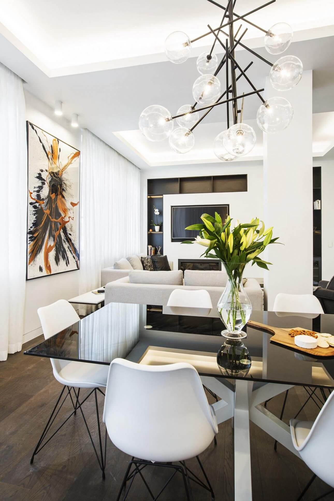
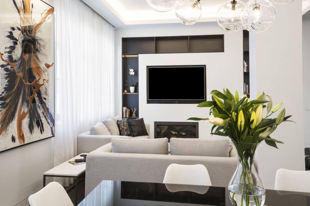
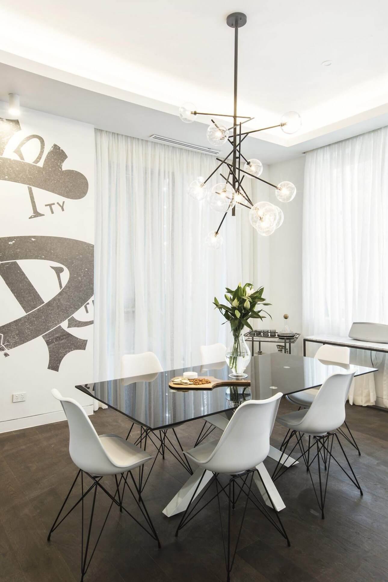
Ben and Andy
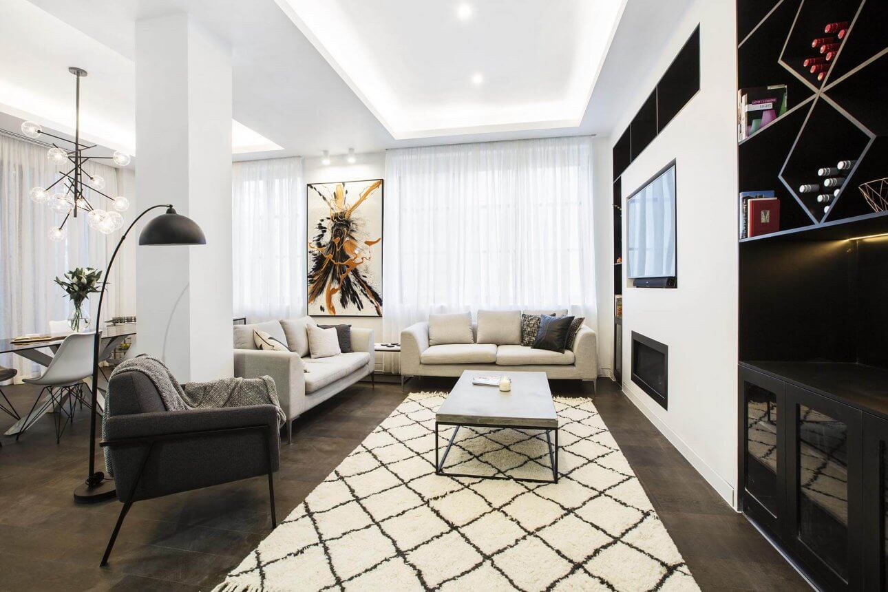
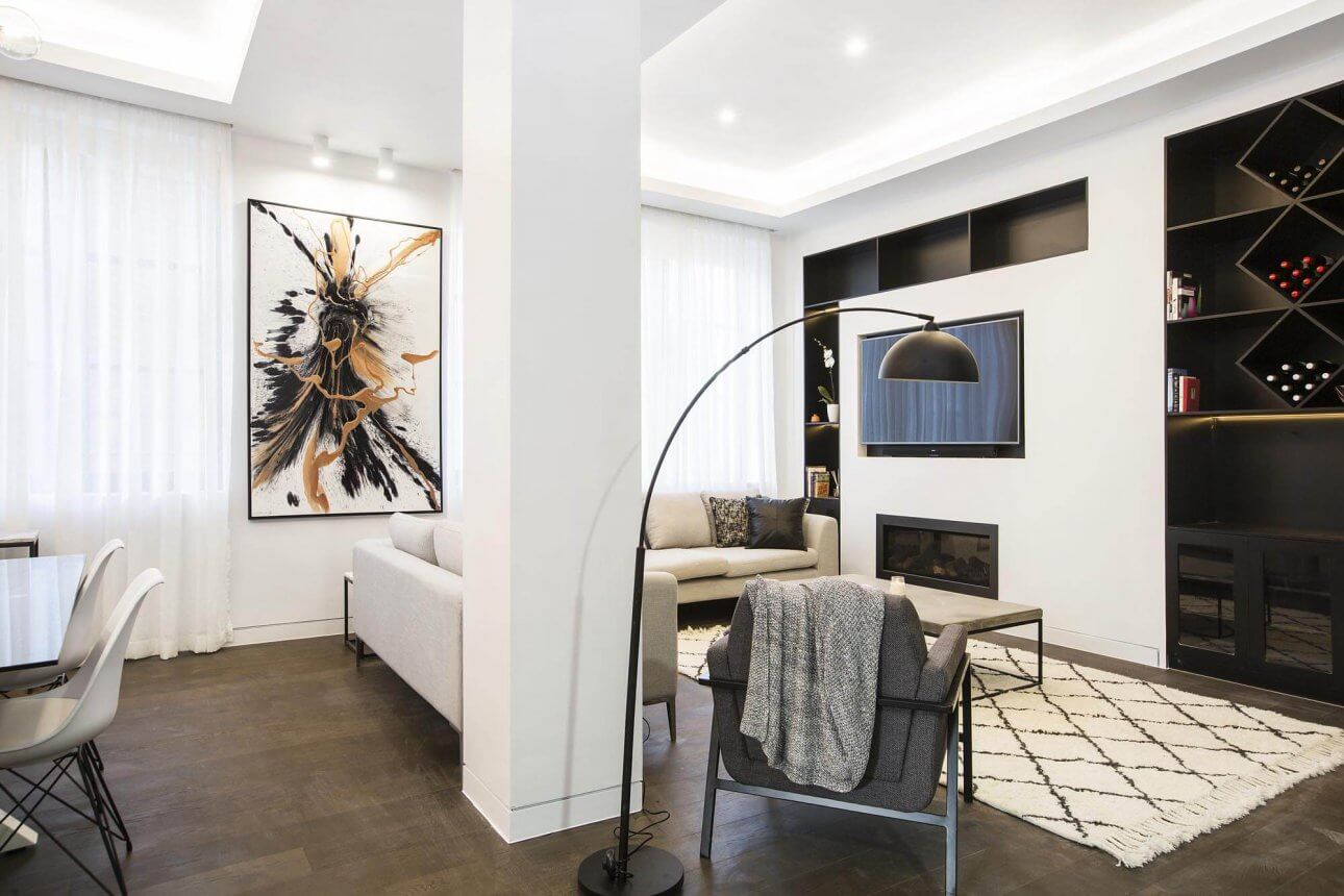
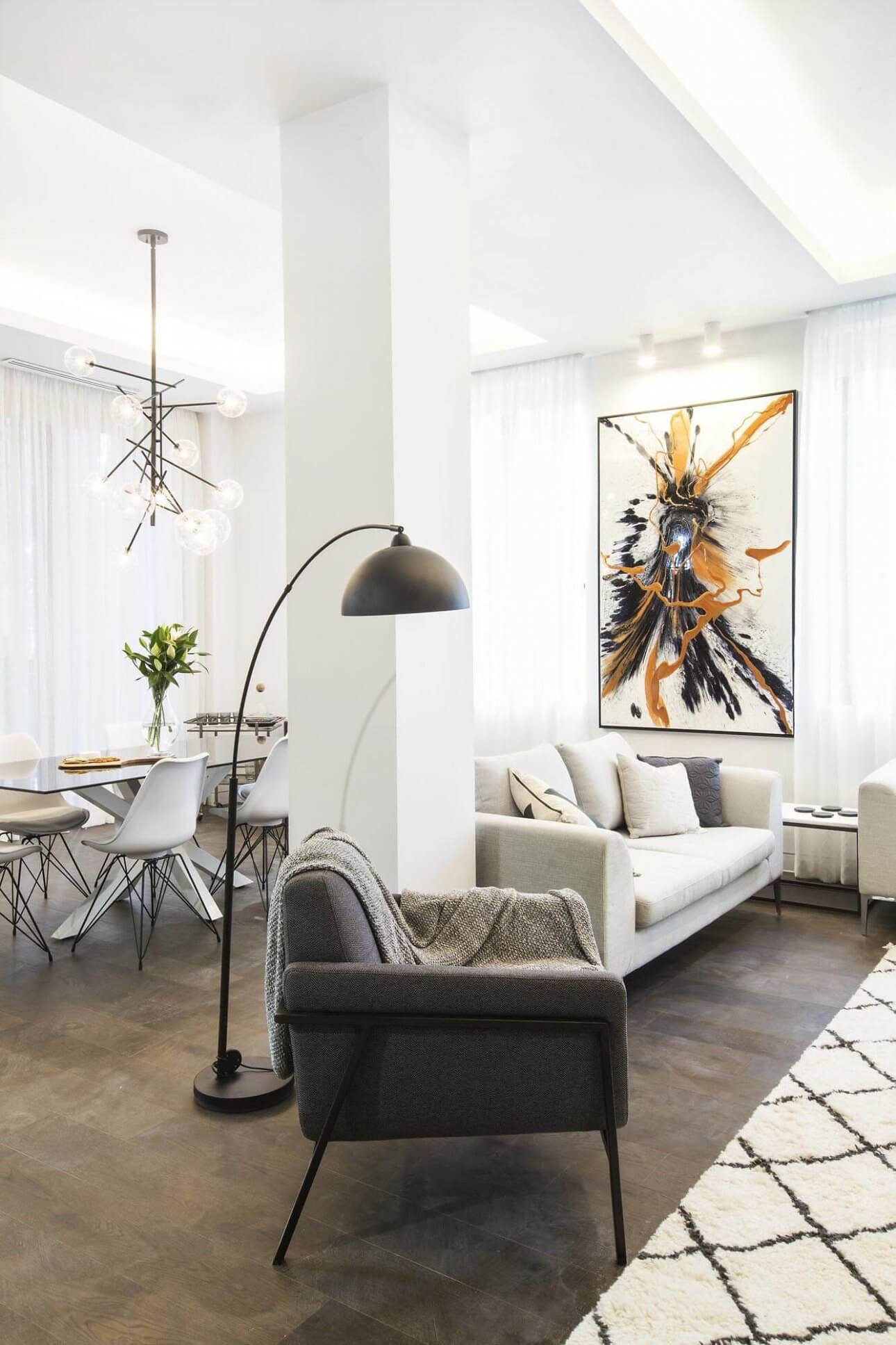
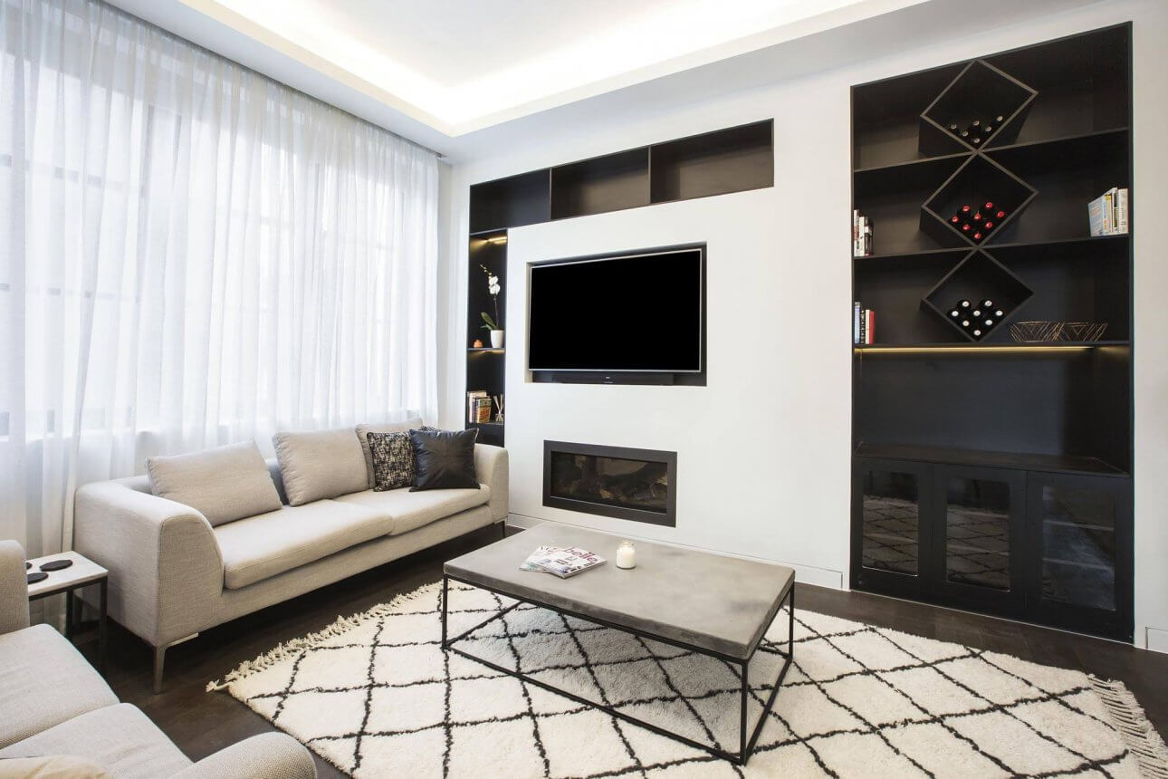
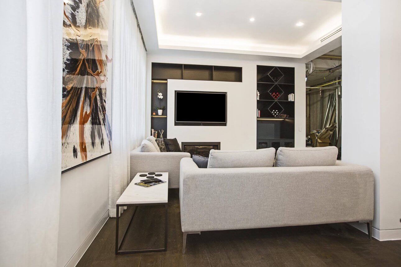
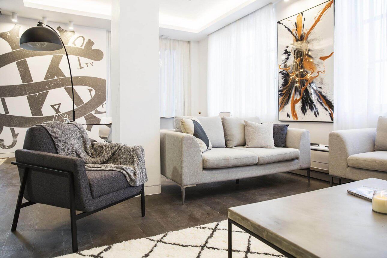
The boys scored 23/30 this week and it wasn’t a bad room. The couch squished in between the pillar wasn’t the best move. I know they had to work around it, but I didn’t love that. A big yes for the built in cabinetry around the tv. Loved the hanging pendant too, but the bar cart wasn’t right. I like their simple tones and colours though. The coffee table was my favourite.
…
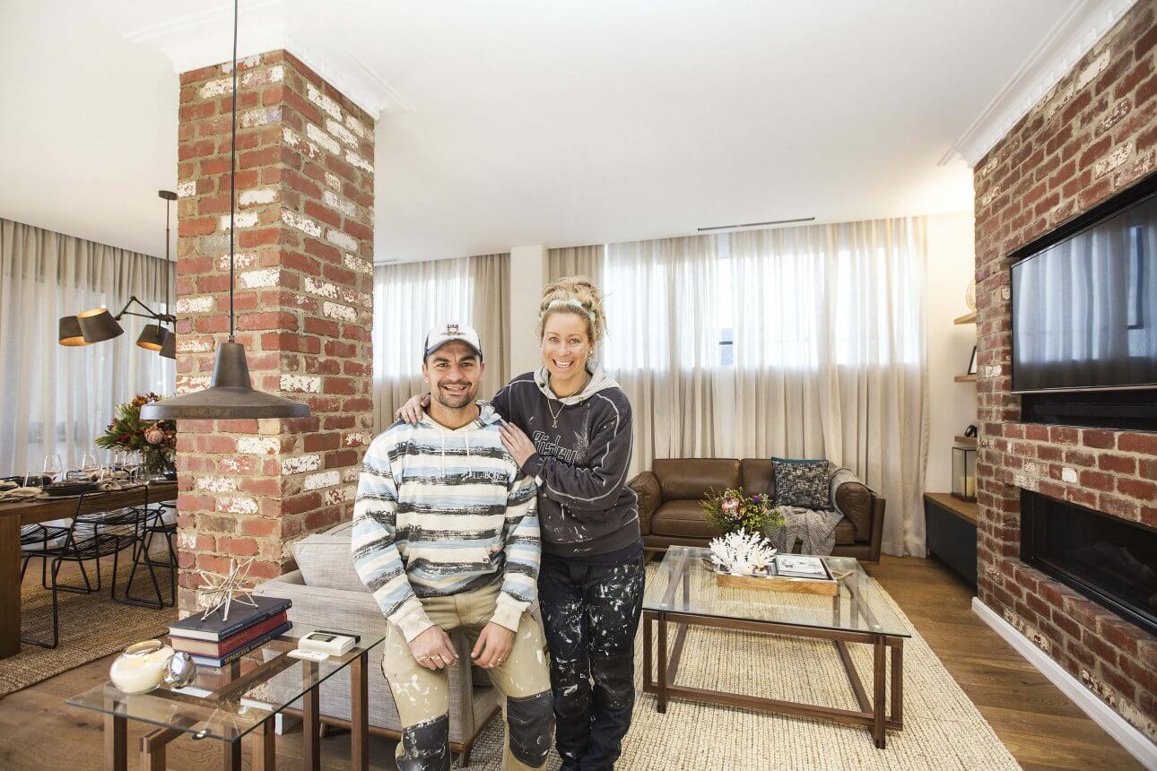
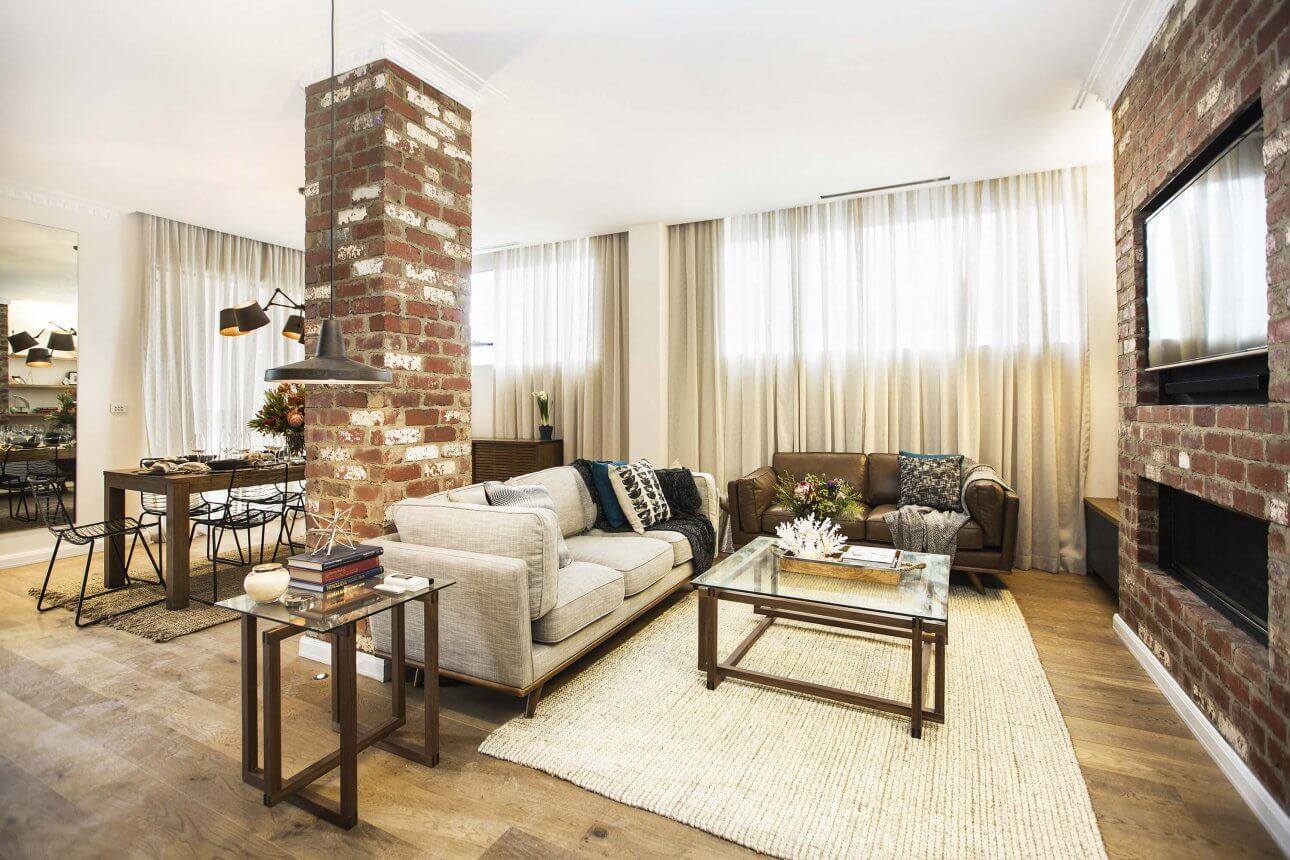
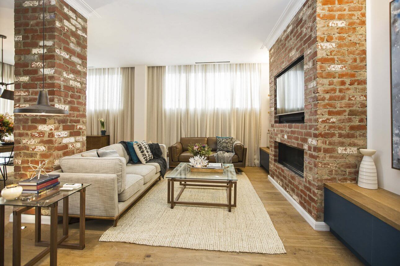
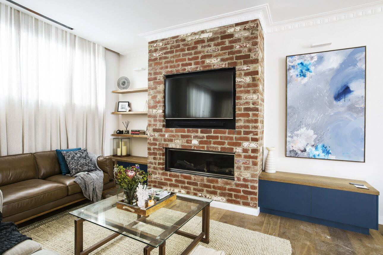
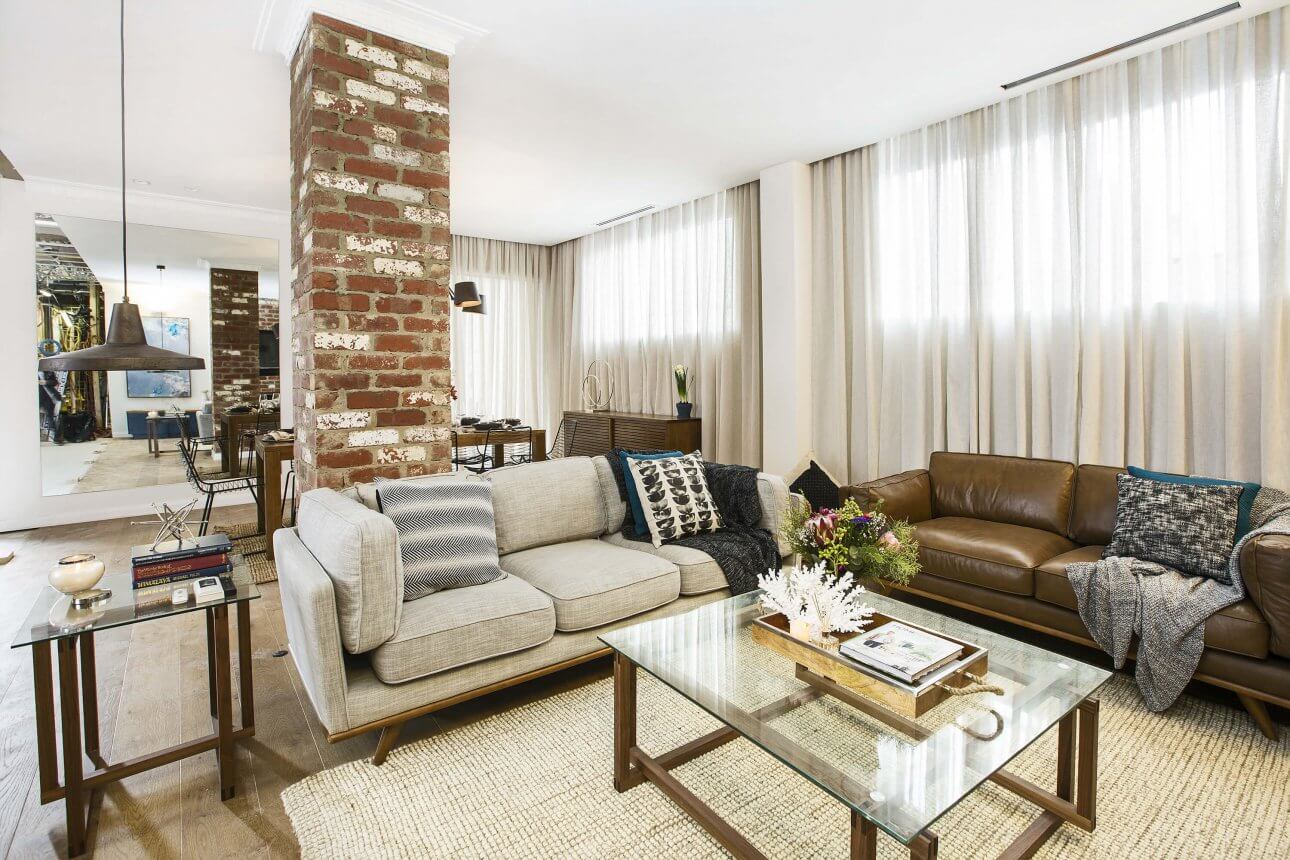
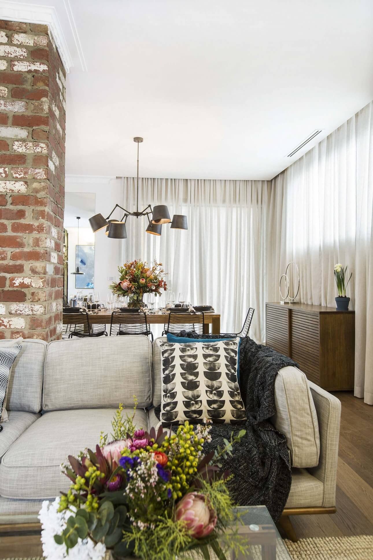
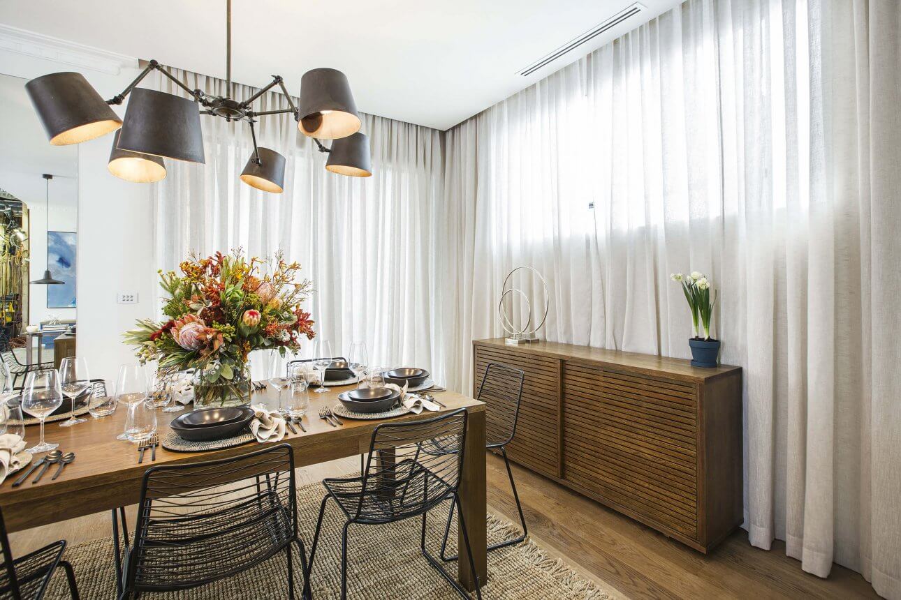
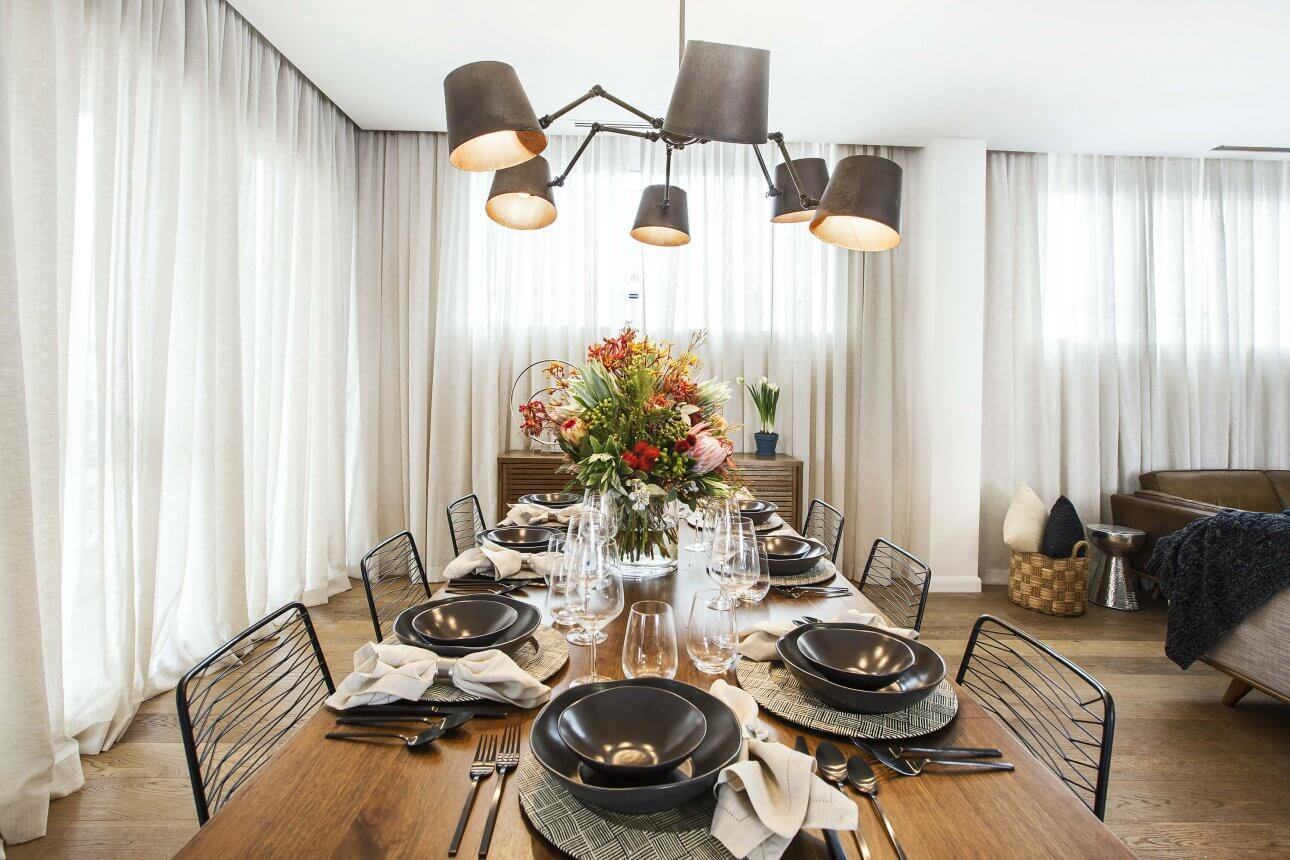
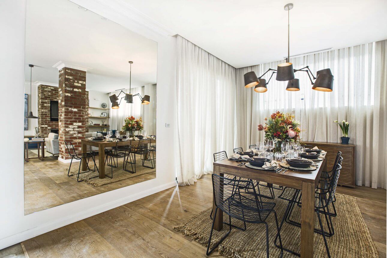
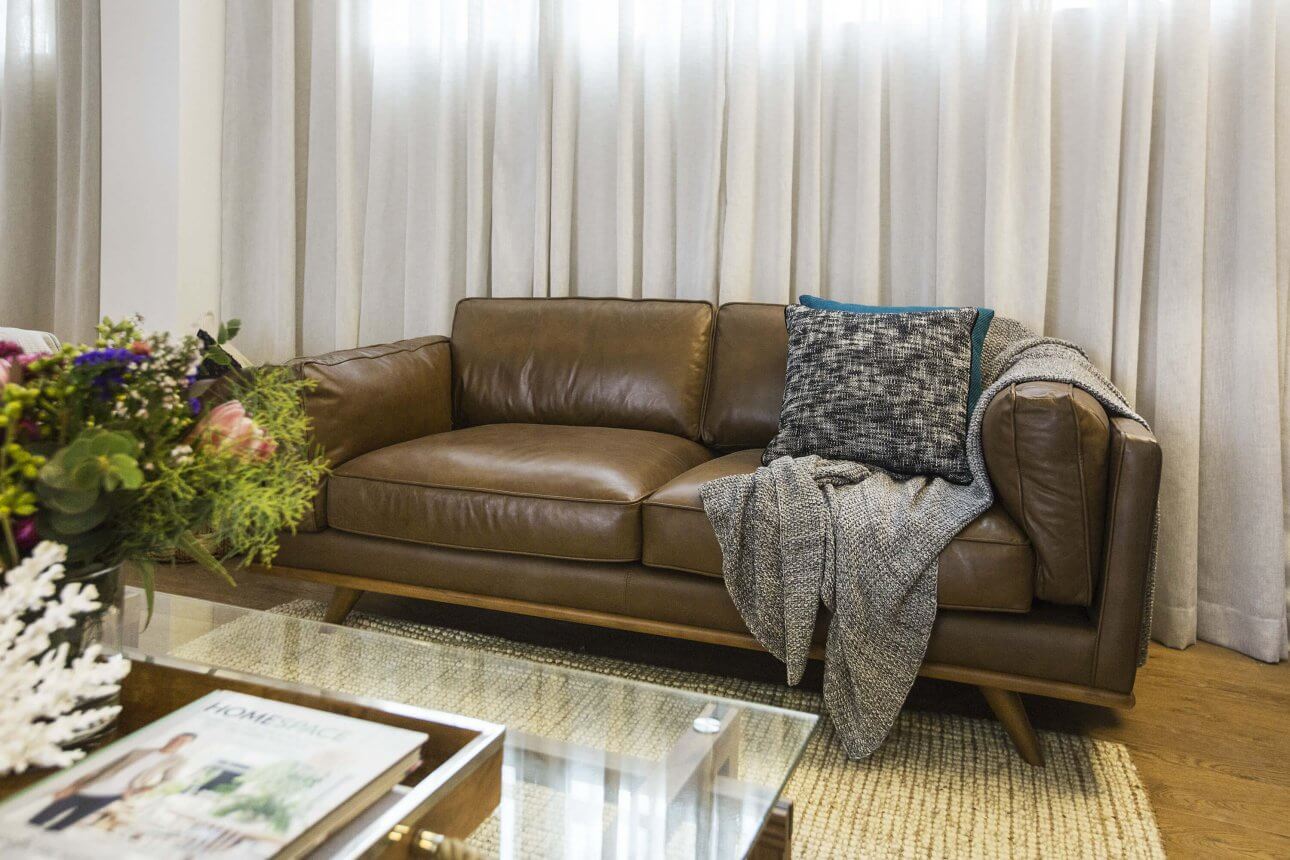
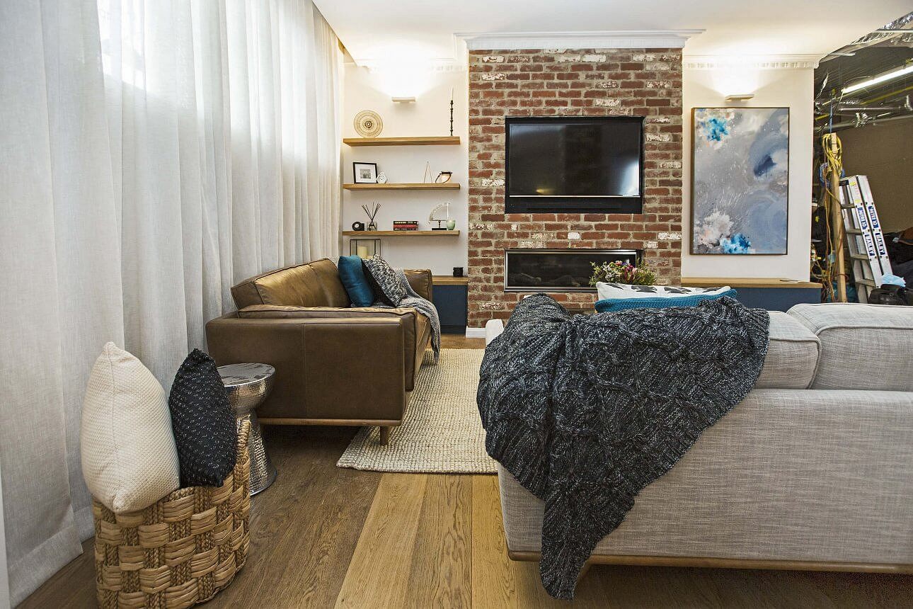
Kim and Chris
4th place today with 21/30. It wasn’t a bad room at all. Lovely and warm and should look good when teamed with the kitchen area. I probably wouldn’t have gone with so much exposed brick, but it still works. Again a little bit too much brown for my taste, they probably didn’t need the dining console table, but the mirror is a positive. The rug under the couches works well, but I prefer no rug under the dining (and this one looks a little bit too small).
…

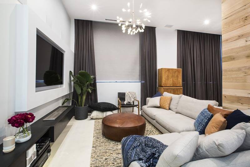
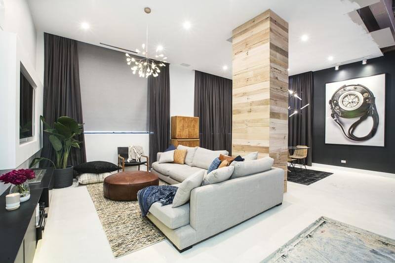
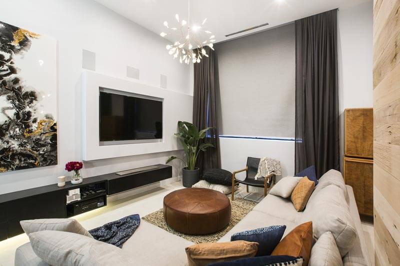
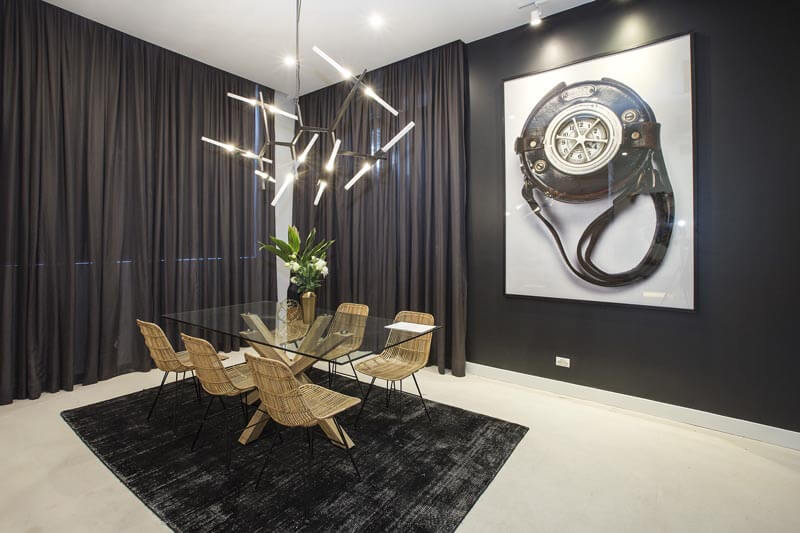
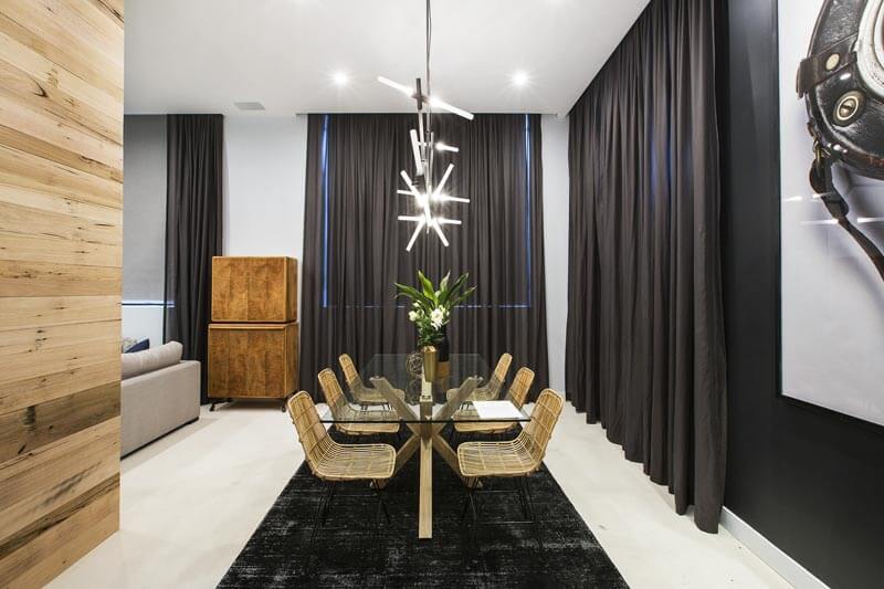
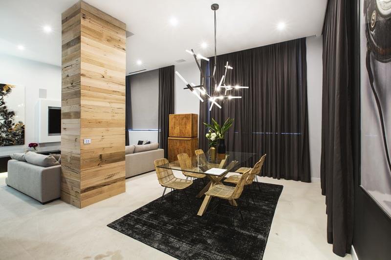
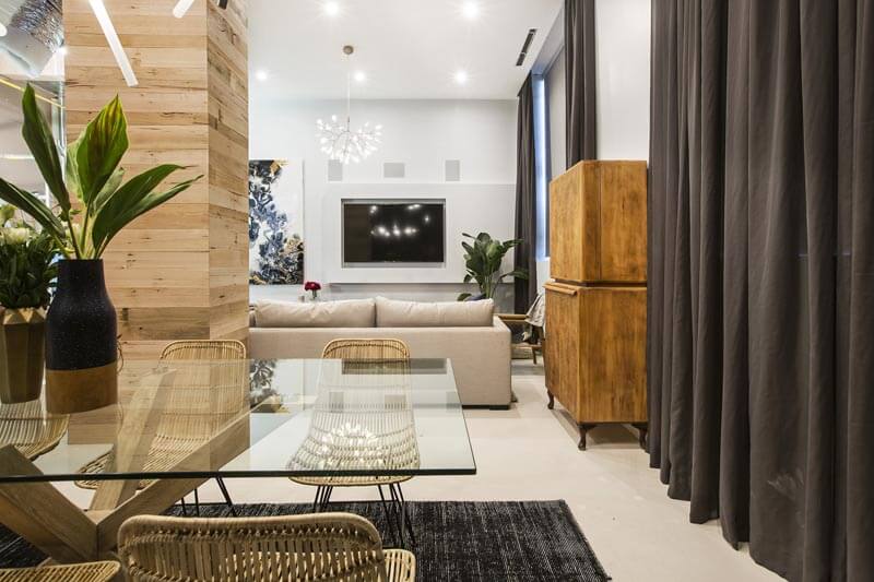
Will and Karlie
Robbed? In my opinion! Ha! They were last this week with a score of 20.5/30. I thought they had this in the bag for sure. This room is my favourite. I do agree with Neale that they could pull a few things out of this room (the floor cushions, single chair and the cupboard), but they have definitely put more effort into this room than some of the other couples. Yes to the tv niche. That’s a must-have I think. The colours are gorgeous, and the curtains are so grand. The black wall and artwork screams style. I think the dining table was a little small for the area, but I can’t wait to see the kitchen in this house.
…
What did you think this week? Agree or disagree with the judges?
Be the first to read my stories
Get Inspired by the World of Interior Design
Thank you for subscribing to the newsletter.
Oops. Something went wrong. Please try again later.





Comments
Kerrie Moore
Disagree I didn’t ‘love’ any of the rooms tonight, but will and Karlie should not have come last. Dan and Carlene’s wasn’t as bad as I thought it would be although it didn’t deserve to win. I thought it was amusing that Sasha styled the room and got better comments than Julia does
Jen Quirk-Moss
Right! I really liked that room, Sasha did a great job. Poor Julia needed to stop over thinking it & back herself. She clearly put a lot of pressure on herself even before it all started.
Vivienne Russell
I think the judges have lost the plot, lol. Maybe they need to watch what they have said and scored in previous rooms, before they judge each week. They are so inconsistent with their scoring and feedback. None of the rooms really grabbed me this week but the winning room was certainly not number one for me. I think last and the girls should have been in the top two
Cheryl Lucas
Yep Will and Karlee was robbed it was the best room the need new judge they comments doesn’t match the score .and I think Kim and Chris should have come second .
Shauna Hollier
I didn’t really love any of them either, but the boys room was great and I love there wall art that references the building. Kim and Chris’s room was nice, too much brick work but you can tell they’re parents they had plenty of storage for DVDs etc lol and they’re from Newcastle so I gotta support them
Linda Schraven
None grabbed any of us in this house this week but parts of each reveal was good maybe put the good bits together and then you would have a great room, W/K lost marks for not finishing they couldn’t expect to win when the floors not done sorry guys D/C hate the brown plywood behind the tv well that’s what it looks like and no heating should not of come first S/J only got extra because of the view but S did a great job the boys yes the table and more styling and K/C yes a bit too much but that’s easy to fix
Agree judges need to be consistent if nothing else
Inge
I liked al the living dining rooms, but agree that Will and Carlie should have scored higher. The sofa was a little too big for the space, it doesn’t need the chaise section. I also loved the girls room, but it needed rugs. I’m surprised that the judges didn’t pull them up on that.
Dan and Carlene’s room was also beautiful. Very elegant. I liked the boys room, but the sofa should be repositioned.
debbie
Disagree, don’t understand the judging at all. Will & Karlie had a lovely room, just needs a cull and a larger dining table. Dan and Carlene had the best sense of scale and placement, too earthy for me though. Sasha and Julia had some beautiful pieces desperately needs to be pulled together with rugs etc. The Boys room didn’t look very comfortable to live in and Kim and Chris, I don’t know, just not high-end is it? Really don’t know why some of the couples chose to make a feature of those structural columns makes them even more obtrusive. Photos are great thanks Katrina, you don’t get a good look on the night.
Kellie Naylor
Sue Fuller I just caught up on last night thanks to Katrina! I think I’m on the same page.
Sue Fuller
Katrina should be a judge on The Block I think. Lengthy message coming at you a bit later Kellie Naylor 😉
Cellini
Wow! It is really nice! Thanks Katrina for sharing this post 🙂