Bedrooms and bathrooms. That's all we've seen so far on The Block! Hurry up and bring us a study, or living area. :) Last night we saw another guest bedroom served up. Here's what the contestants scored and what I thought about them... Ben and Andy Ben and Andy go from the bottom of the …
Bedrooms and bathrooms. That’s all we’ve seen so far on The Block! Hurry up and bring us a study, or living area. 🙂 Last night we saw another guest bedroom served up. Here’s what the contestants scored and what I thought about them…

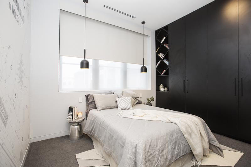
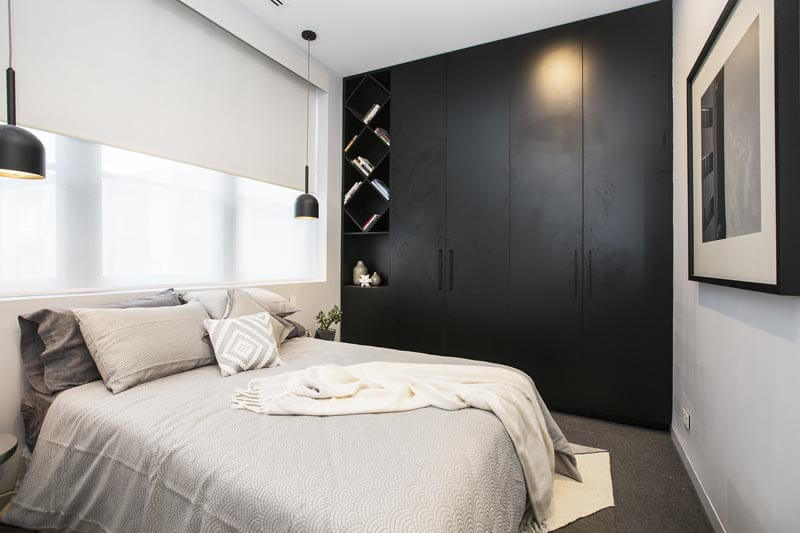
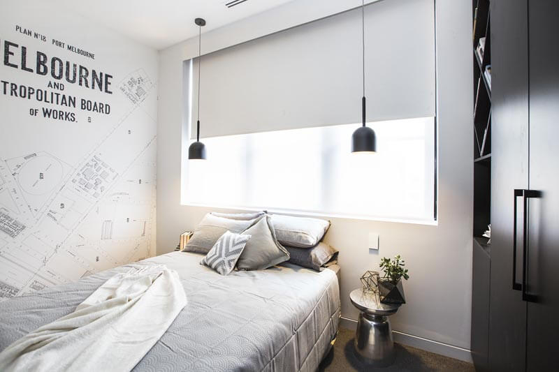

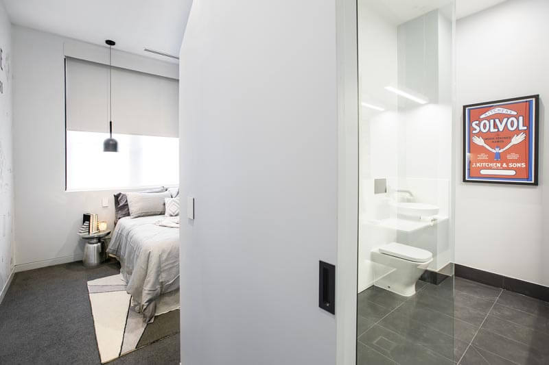
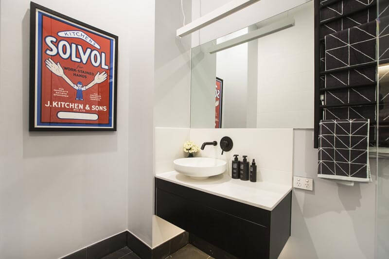
Ben and Andy
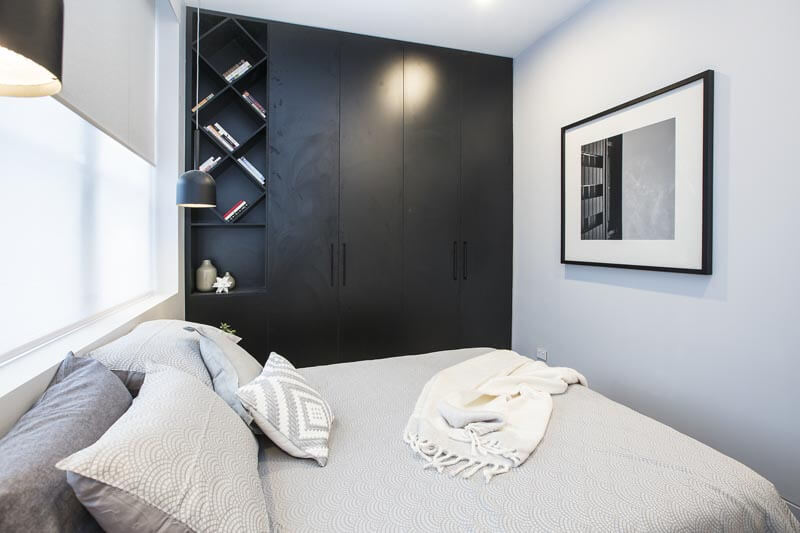
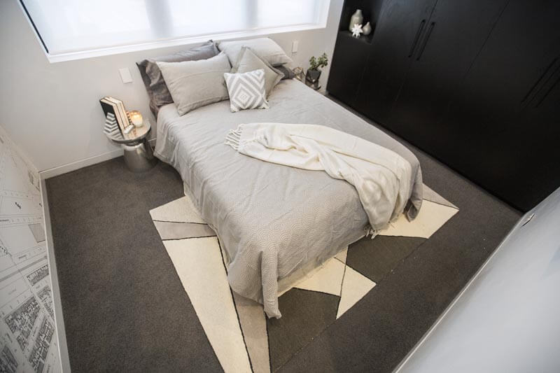
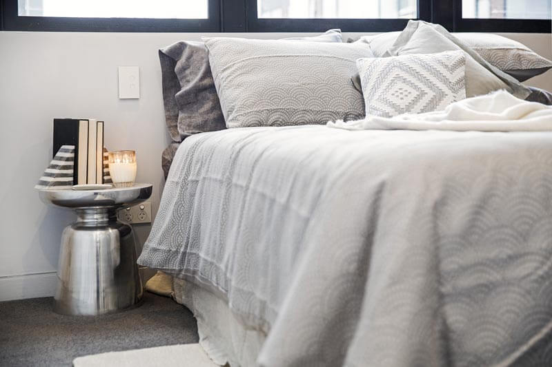
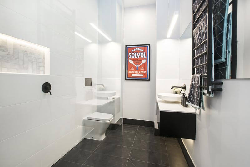
Ben and Andy go from the bottom of the ladder to the top with a perfect score of 30/30 for that surprise ensuite they added to their guest bedroom. Good on them! I like how the decided to use some space to create a bathroom rather than a huge walk-in-robe. They’ve got the right idea for resale there. I would have ironed the bedding though 😉
…
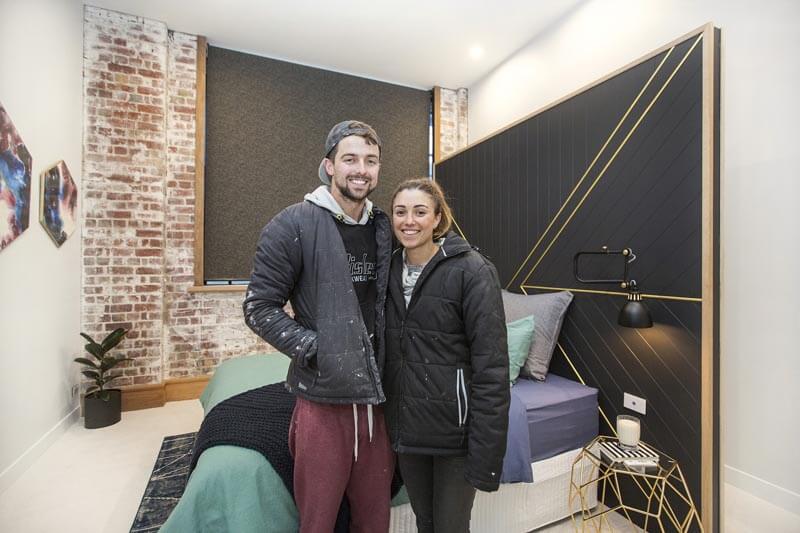
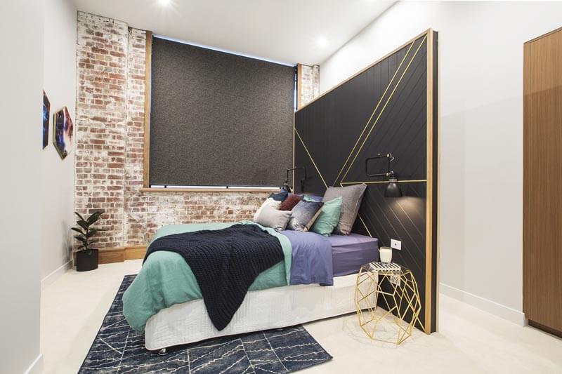

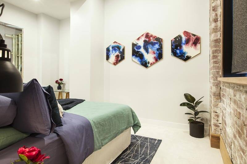
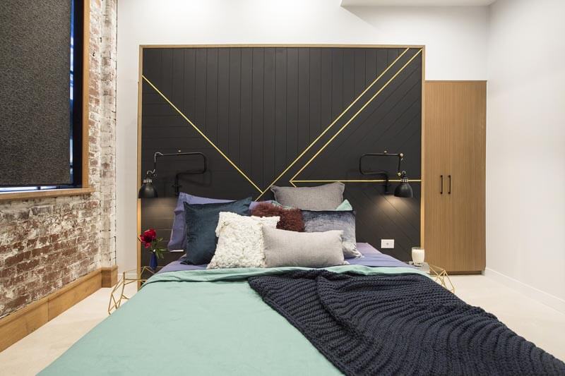
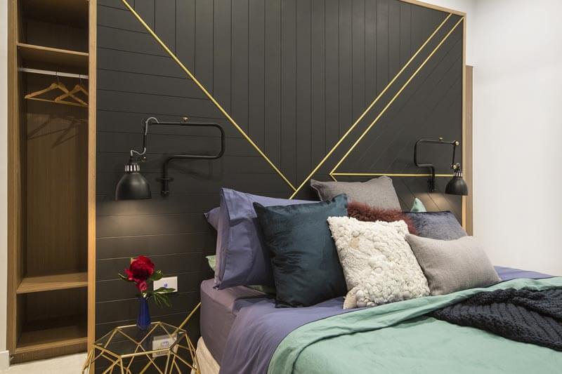
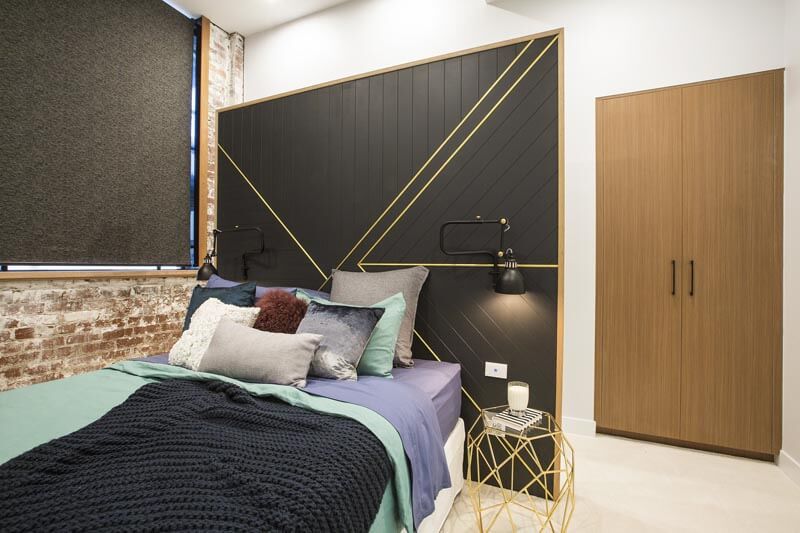
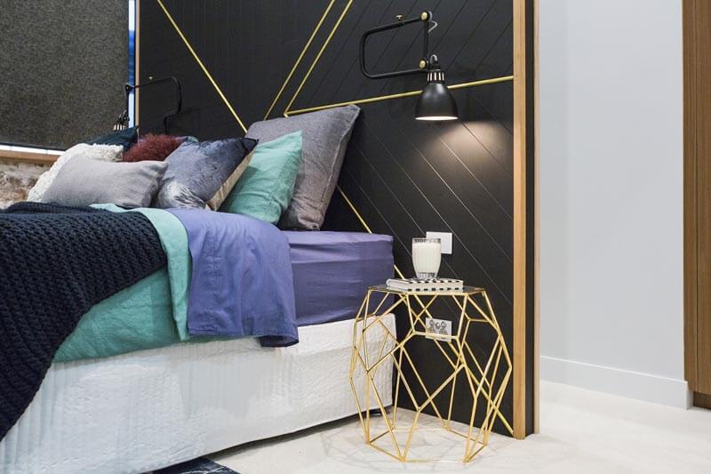
Will and Karlie
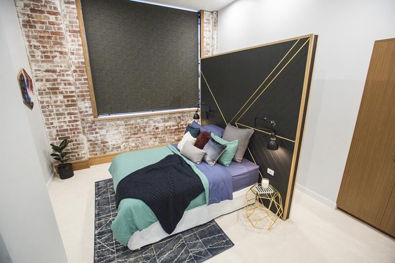
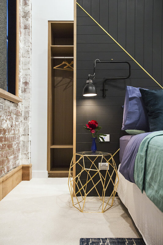
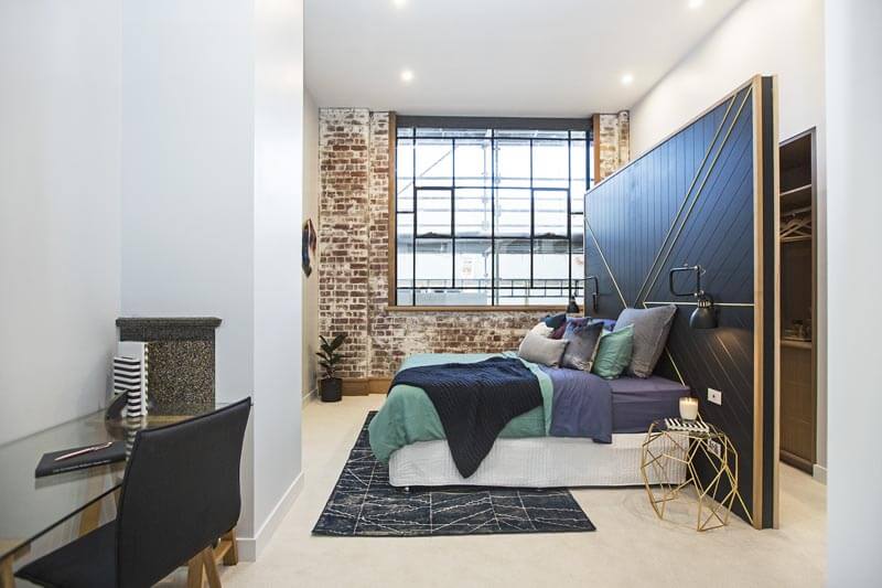
Karlie and Will scored 26.5/30. I’m on the fence with this one. I agree with Neale though, there is too much cushioning, but the wall is a showstopper! I don’t think it’s in the right spot though. It seems to cut the room in half. The rug is a bit small and so is the quilt cover. The valance is too white also. I think little shelves or something less bulky would have been better for the bedside tables. I don’t think they needed the hexagonal prints, but I love the exposed brick wall.
…
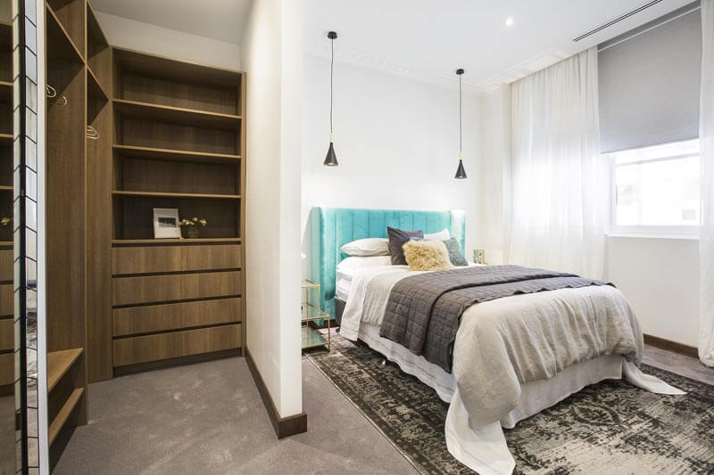
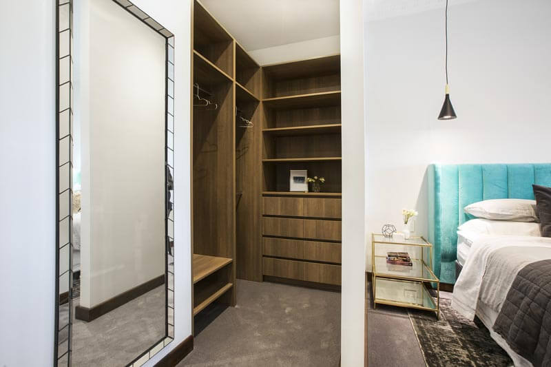
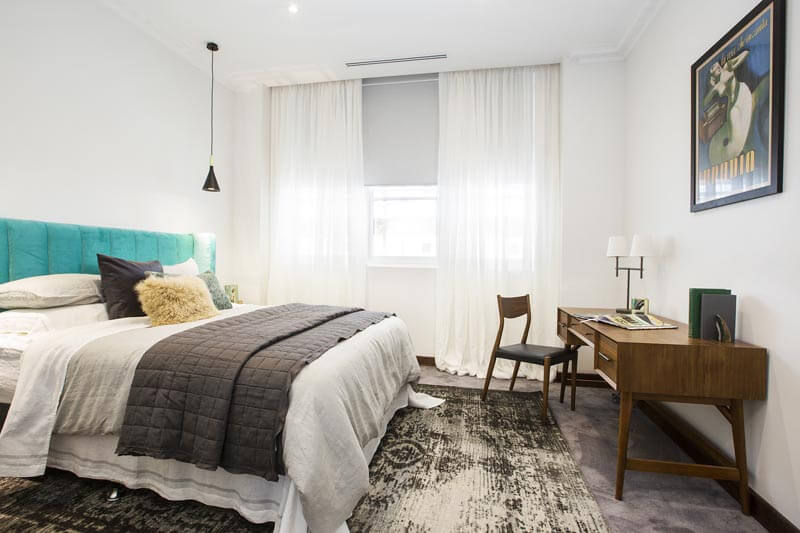
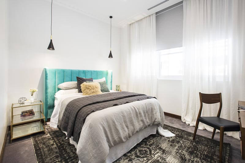
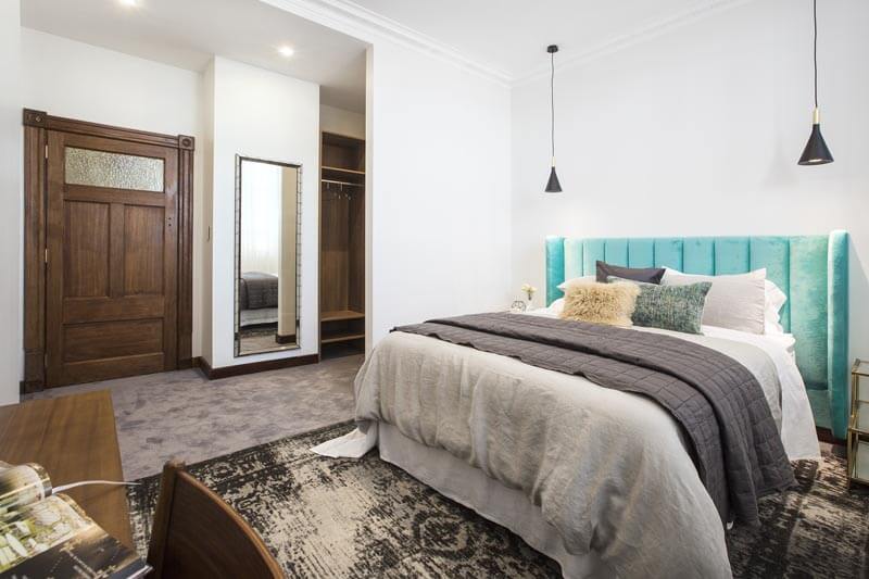
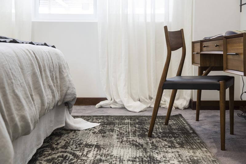
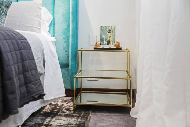
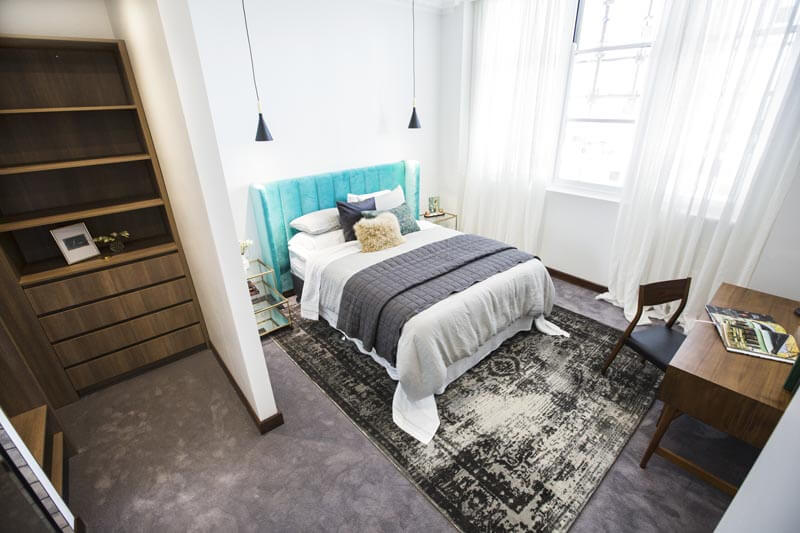
Dan and Carleen
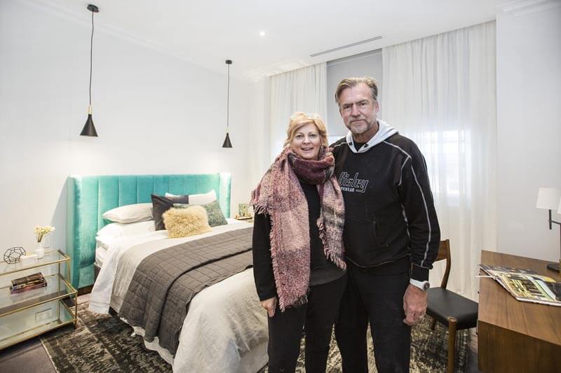
Dan and Carleen received a score of 26/30. Hmmmm not my favourite. Not sure about this room at all. The bedhead and the floor rug seem to be just thrown there and don’t really have much to do with each other. I love velvet, don’t get me wrong, but this colour is a bit random.
…
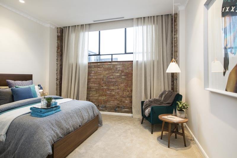
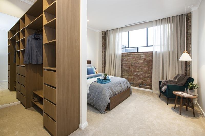

Kim and Chris
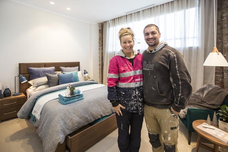
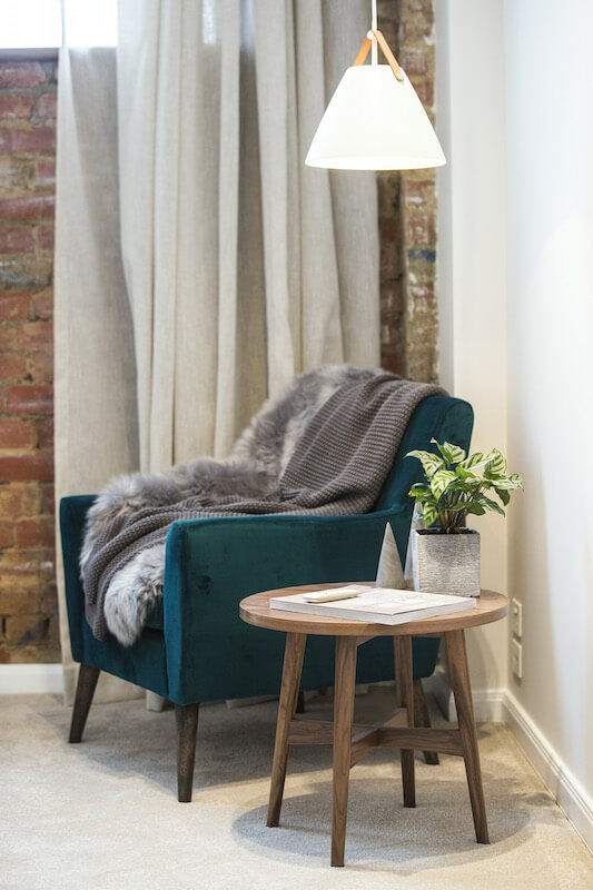
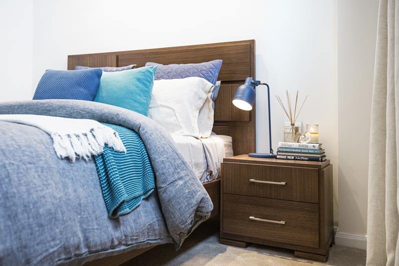
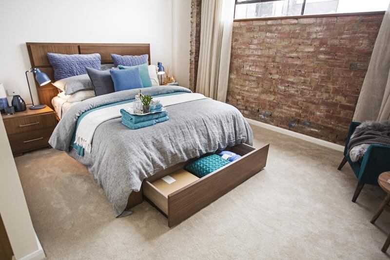
Kim and Chris scored 24.5/30 for the guest bedroom. It feels like it’s out of a timber furniture catalogue with no style or personality. I love the exposed bricks and those sheer curtains are gorgeous though. The room feels nice and spacious. Towels on beds? Uh, nope, not for me. But overall this room has a nice “guest” feel.
…
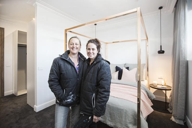
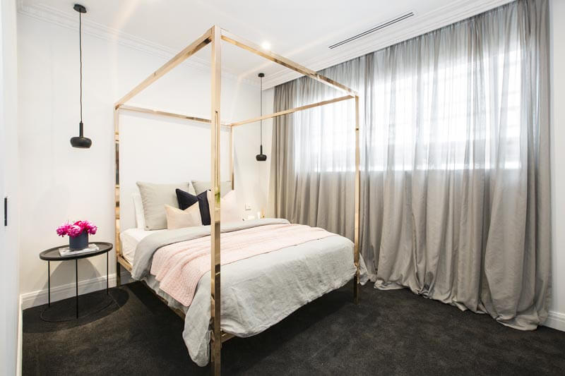
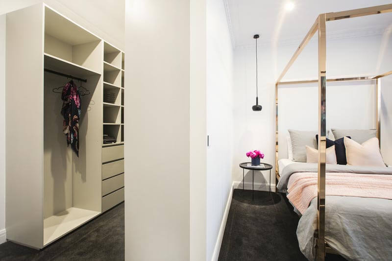
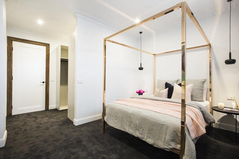
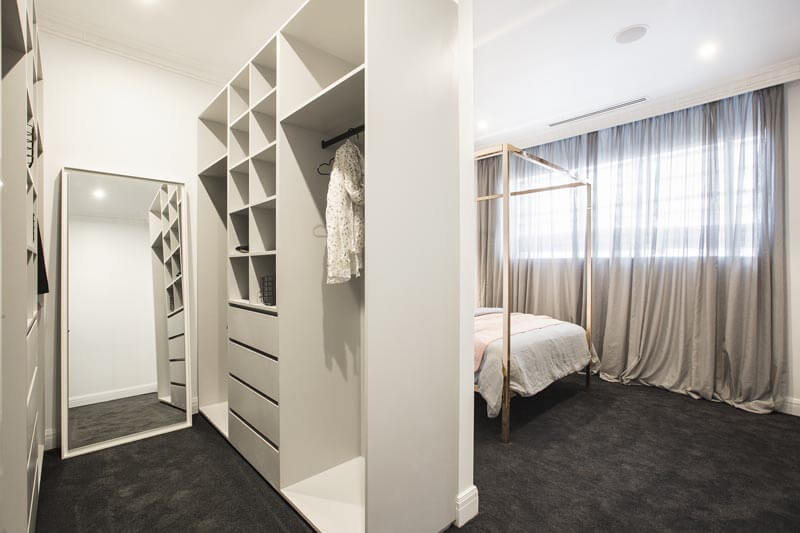
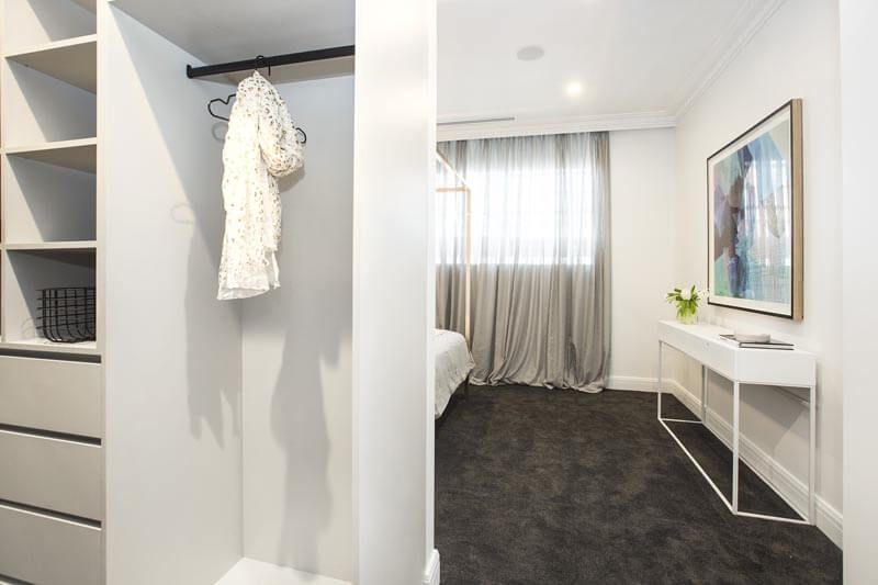
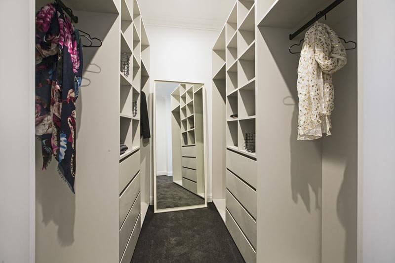
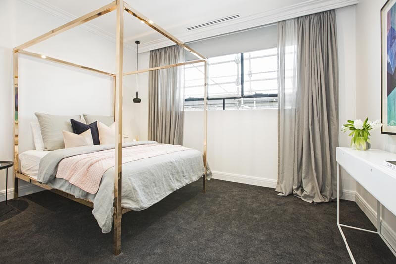
Julia and Sasha
The girls came last this week with a score of 24/30. The judges thought it lacked a little bit of personality, but it’s a guest room and they weren’t aiming for anything too bold. A few more personal pieces on the bedside or console may have appeased the judges. The bed is divine and so are the curtains. Not sure how they came last! The soft colours definitely tickle my fancy.
…
What did you think of the rooms?
Be the first to read my stories
Get Inspired by the World of Interior Design
Thank you for subscribing to the newsletter.
Oops. Something went wrong. Please try again later.



Comments
Ellie
How on earth did Julia and Sasha come last? Their room is lovely, soft and seems to be very on trend at the moment! I’m with you on Kim and Chris’ room and all that bland timber. Not loving the velvet bead head in Dan and Carleen’s room either. Not sure what they’re doing in this room but it looks a little out-dated already!?
I haven’t been following along this season so your re-caps are fab! Thanks Katrina x
Micheala Donohoe
I agree with all your comments.. The boys needed to iron the bedding! Previous years, contestants have been slammed for that! And the girls room was gorgeous, it was styled to perfection. Not sure how the other bedrooms beat them!
Cheryl Lucas
I don’t think the boys is worthy 30 don’t like theirs , maybe it was because they added a extra on suite .as for the girls for a stylist she is not doing a very good job she needs to look outside of the square don’t like the four poster bed .all the furniture looks cheap .
Kelly McClure
See I really liked the boys. The girls is way too “now” trend with the rose gold.
Kate
I quite liked the boys and think I would have given them the win … 2nd for me is Kim & Chris (minus the towels lol) I think it had a nice feel … Next for me was the girls, I love the rose gold bed, wish those pendants were rose gold too tho. Beyond that it wasn’t souless, just a little “beige/boring”. The other two were pretty forgettable for me. I liked Will and Karlie’s wall but as a whole the room just felt off … and I liked the oldie’s rug, it was a good size.
I think they were unfair to the girls and feel bad for Julia. However, imo she needs to take a shot of concrete, toughen up and start being decisive and backing herself!!
Kate
“… the boys ROOMS” that was meant to read lol
Kerry Closter
I didn’t like the older couples at all, loved all the others, but couldn’t see the perfect score for the boys either.
Inge
The boys room was my favourite, fabulous wallpaper, love the linen on the bed and the ensuite was a great idea and well done to them. I really liked the girls room too, especially the bed and bedding.
Maureen
I have yet to like anything Dan and Carleen have done from Day 1 and I am of their generation.
www.houseseek.com.au
I love the Block. This art deco style is hard to understand but it is starting to grow on me. Go boys!!