An artfully arranged shelf is a thing of beauty – and the make or break element is art. Whether large or small, colourful or graphic, art adds character and personality to your vignette. When paired with books, plants and the things that matter to you, it tells your story in a stylish way. Temple & …
An artfully arranged shelf is a thing of beauty – and the make or break element is art. Whether large or small, colourful or graphic, art adds character and personality to your vignette. When paired with books, plants and the things that matter to you, it tells your story in a stylish way.
Temple & Webster’s Adam Powell has some great tips on how to style three different types of shelving.
The Shadow Box
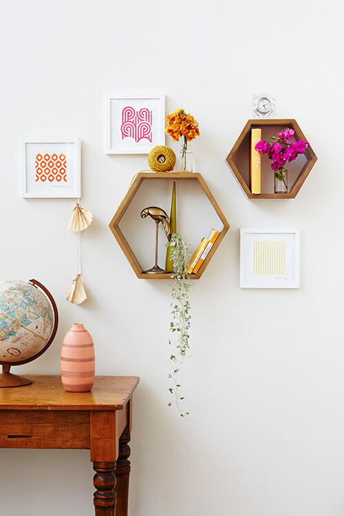
• Small wall shelves are more about decoration than practicality. Here, Adam hung art around them and treated the whole display like a gallery wall.
• Draw and repeat the colours from your art or décor to create a cohesive look. Adam chose orange books and flowers to tie in with the art, and the warm colour also works beautifully with the timber shelves.
• Add flowers or foliage from your garden for a budget-friendly styling device with impact. A trailing plant is a nice contrast to all the straight lines on display.
• Edit often – stand back often to assess how your styling is going. If it feels wrong, take something out and try again. It’s all about finding a balance of sizes, heights, colours and textures.
The Floating Shelf
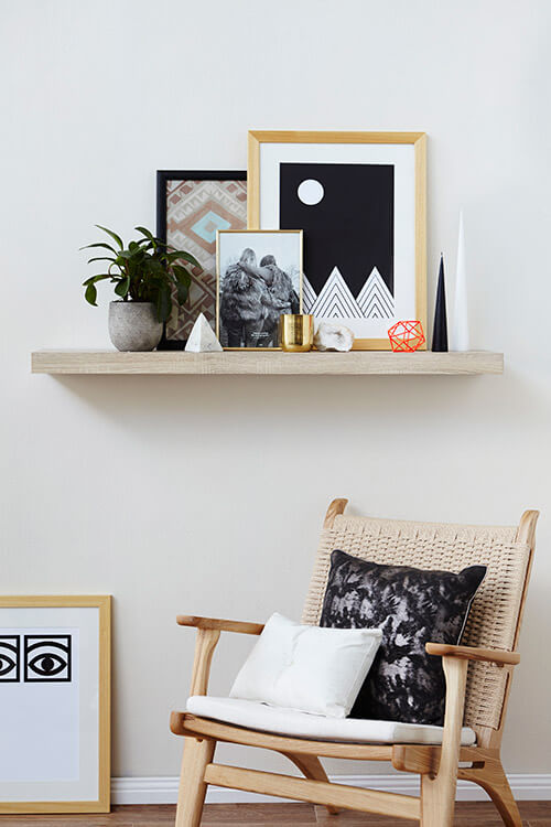
• Leaning or propping art against the wall allows you to layer several pieces for a casual yet collected feel. Include your own photographs with art acquired over time.
• Pull out a shape, texture or motif to repeat. Adam picked up on the triangle motif from the largest artwork and repeated it with the marble pyramid and candles. He also repeated the stone texture several times – in the planter, the marble and the geode.
• Add a finishing touch – here the high contrast geometric ball adds a welcome pop of colour. Add, subtract, keep styling until you’re happy.
The Freestanding Shelf
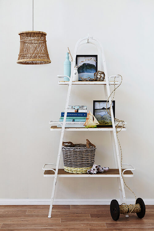
• Balance the size / weight of your options, and move larger items to the bottom shelves. This basket fits in with the other styling choices, and it’s also a useful storage option.
• Pick a colour palette and stay within the same colour family. Adam picked books with blue, green and neutral coloured spines to work with the art.
• Look at the unit as a series of shapes. Adam broke up the vertical lines of the book stack and frame with the vintage ceramic boat for a slightly more organic feel.
• Box frames work best on freestanding units, as they can stand alone.
• Include a mix of textures to keep your display interesting – here sleek frames and glass are contrasted against sculptural driftwood, rope and barnacles.
… For even more tips watch this great video!
Now hop to it, you have new shelf styling tips to work with. Let me know how you go! ♥︎ KC!
Be the first to read my stories
Get Inspired by the World of Interior Design
Thank you for subscribing to the newsletter.
Oops. Something went wrong. Please try again later.

