Just a quick tip today! Ever walked into a room and thought 'Wow, this space looks amazing", or flipped through a home magazine and a particular image stops you and take a moment to study it before you flip on thinking "There is no way I can do that…"?? Well I am here today to …
Just a quick tip today!
Ever walked into a room and thought ‘Wow, this space looks amazing”, or flipped through a home magazine and a particular image stops you and take a moment to study it before you flip on thinking “There is no way I can do that…”??
Well I am here today to tell you, you can! And it all comes down to making sure your art work is sized correctly.
An amazing piece of art will bring a room together and finish it off. Get the sizing right and BAM, it all comes together. Get the sizing wrong, and you’ll be scratching your head wondering what else you can do. So, what is it the magical formula for art?
2/3
Yep, remember 2/3 and you will be fine. If you are placing art over your couch, bedhead, hall table etc to ensure it looks correct, your art should be 2/3 the width of the furniture you place it above. This makes the art an interesting focal point of the room.
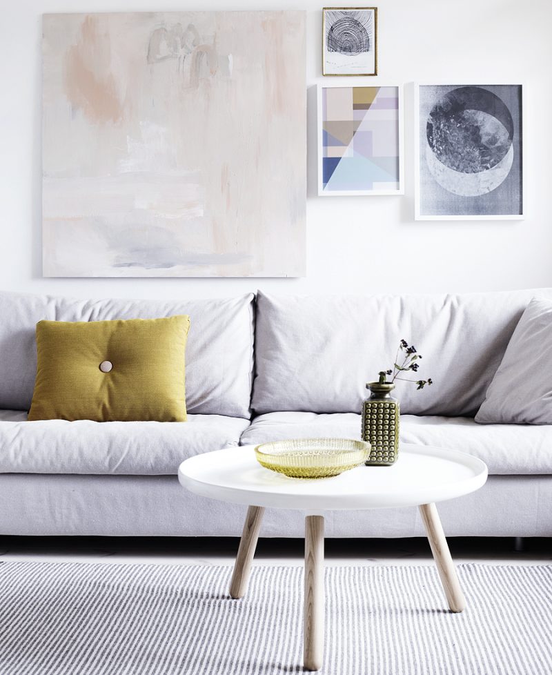
Keep this in mind for multiple pieces of art as well. 2, 3 or even 4 frames should not be more than 2/3 the width of the furniture below it.
Pretty easy to remember! Here are some pics to demonstrate what I mean.
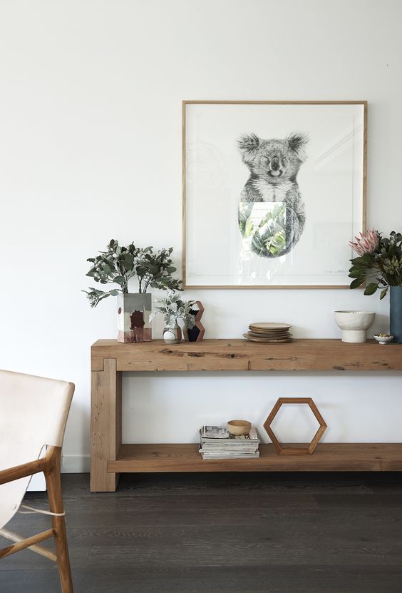








images 1 / 2 / 3 / 4 / 5 / 6 / 7 / 8 / 9
♥ KC.
Be the first to read my stories
Get Inspired by the World of Interior Design
Thank you for subscribing to the newsletter.
Oops. Something went wrong. Please try again later.





Comments
Ahaan
Never know that art should be 2/3 of the width of the furniture. This is really interesting to read.
Cherylle
I find art really hard to buy, especially if buying for a certain space. I think it would be great (and smart commercially) for an artist to think “I will use this size canvas because it’s the right size for above a Queen bed” etc. it seems like a lot of beautiful pieces are too big for many homes.
Ali Huntir
Hi Katrina
My Dad had ulcerative colitis for many years (ghastly) when I was young & he ditched it completely by taking huge doses (initially before tapering down) of slippery elm bark. He hasn’t had it for 30+ years.
I love the black wall look. Very classy.
Sincerely
Ali H.