[vc_row][vc_column][vc_row_inner][vc_column_inner][vc_column_text]Hi there! I am impressed with some kitchens from last night's Reno Rumble house reveals. Glad to see the contestants improving! The RED team scored a total of 86/120 and the BLUE team scored a total of 88/120 which means they are the winners this week. This week saw Jim and Hayley packing as they were sent home. Check …
[vc_row][vc_column][vc_row_inner][vc_column_inner][vc_column_text]Hi there! I am impressed with some kitchens from last night’s Reno Rumble house reveals. Glad to see the contestants improving!
The RED team scored a total of 86/120 and the BLUE team scored a total of 88/120 which means they are the winners this week. This week saw Jim and Hayley packing as they were sent home.
Check out the rooms below…[/vc_column_text][/vc_column_inner][/vc_row_inner][vc_row_inner][vc_column_inner][vc_column_text]
RED TEAM
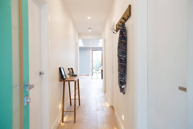
The communal room this week was the hallway…
 [/vc_column_text][/vc_column_inner][/vc_row_inner][vc_column_text]
RED TEAM: Dane and Leanne, mother and son from SA. This week they renovated the kitchen, the master and a guest bedroom. Comments from judges are below…
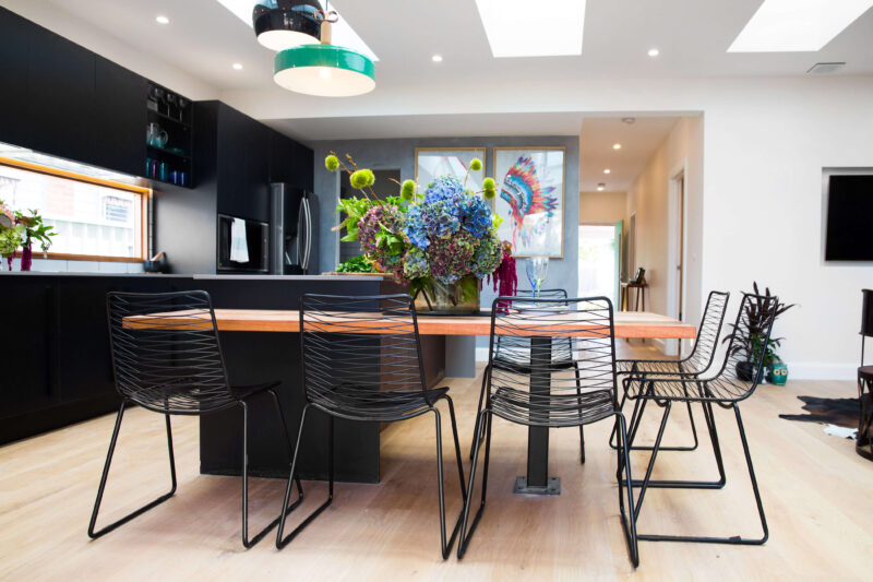
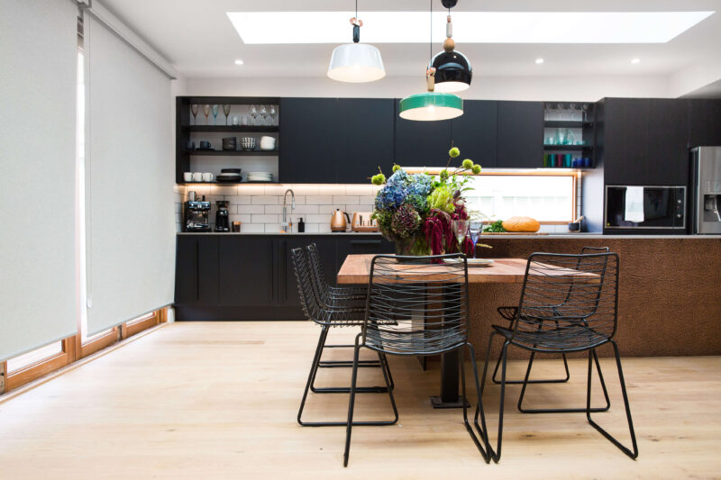
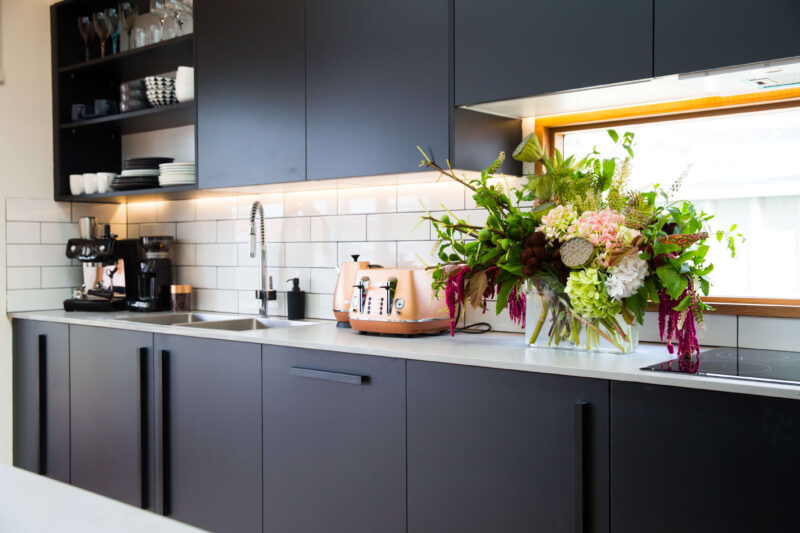
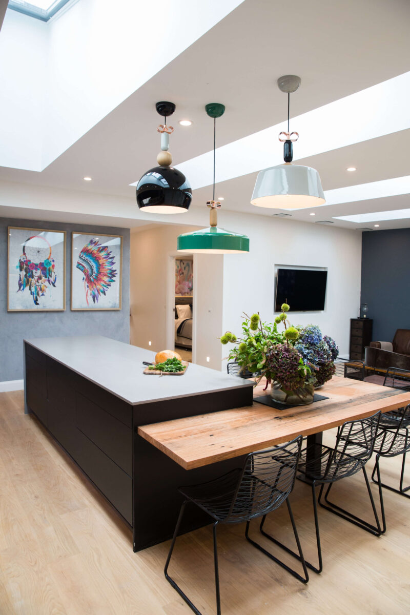
Justin thought Dane and Leanne’s kitchen was stunning, praising the combination of finishes and cabinetry with the pendant lights adding the final “zing” to the room. Colin couldn’t believe the size of the space and loved the laundry/butler’s pantry.
Colin’s score: 9/10 Justin’s score: 10/10 Total: 19/20
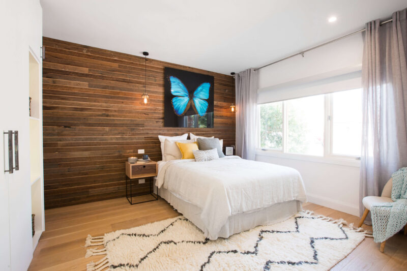
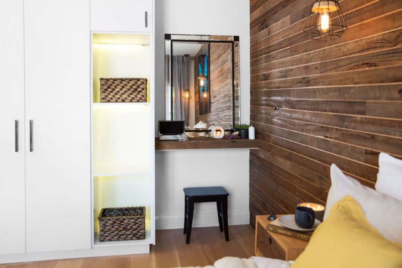
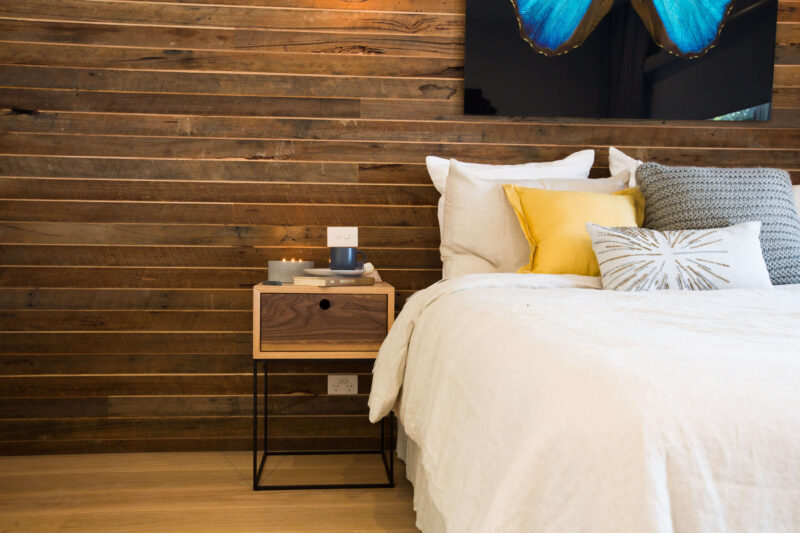
Justin felt that the elements in Dane and Leanne’s bedroom were nice but didn’t work well together. He also felt the position of the desk threw off the balance of the room leaving the bed oddly positioned, suggesting an alternative position under the mirror.
Colin’s score: 6/10 Justin’s score: 6/10 Total: 12/20
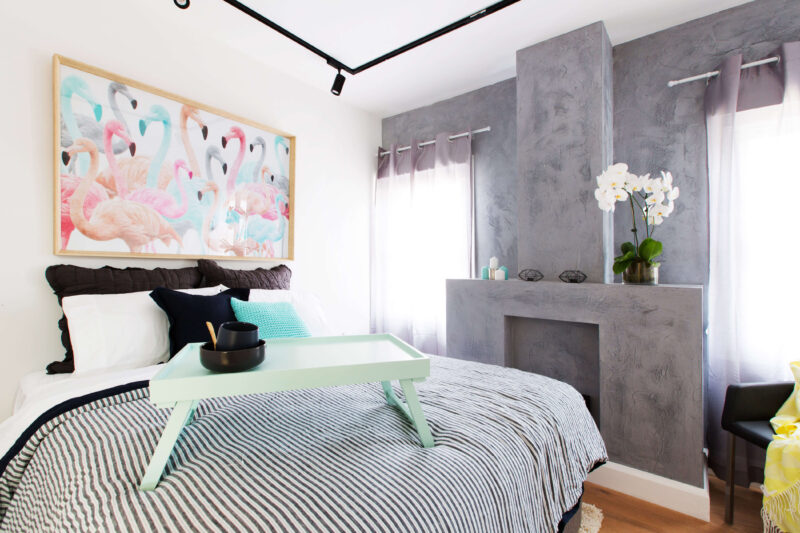
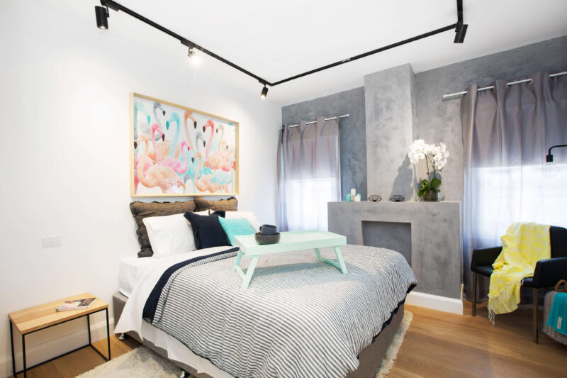
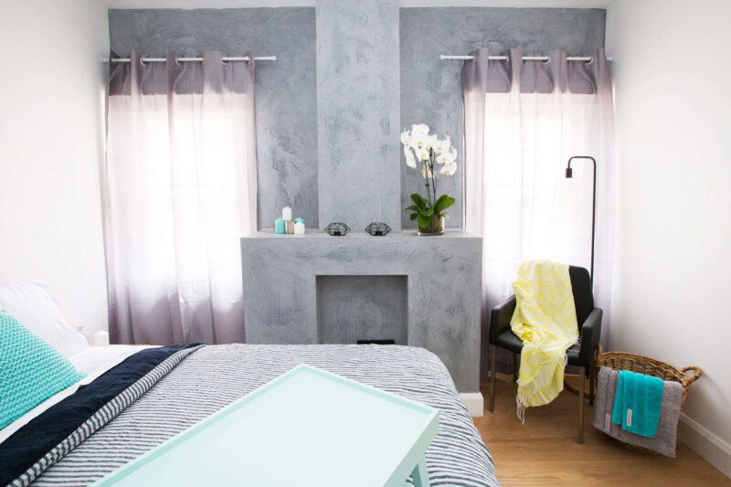
Colin felt Dane and Leanne’s bedroom was a simple and elegant space that wasn’t overthought. Justin loved how the existing fireplace was used as a rendered shelving unit.
Colin’s score: 8/10 Justin’s score: 8/10 Total: 16/20
Shop the look here…[/vc_column_text][vc_row_inner][vc_column_inner width=”1/3″][vc_single_image image=”42474″][vc_column_text]
[/vc_column_text][/vc_column_inner][vc_column_inner width=”1/3″][vc_single_image image=”42475″][vc_column_text]
[/vc_column_text][/vc_column_inner][vc_column_inner width=”1/3″][vc_single_image image=”42476″][vc_column_text]
[/vc_column_text][/vc_column_inner][/vc_row_inner][vc_separator border_width=”2″][/vc_column][/vc_row][vc_row][vc_column][vc_column_text]
RED TEAM: Jim and Hayley, recently engaged from SA. This week they renovated a bathroom, the living and a guest room. Judges comments below…
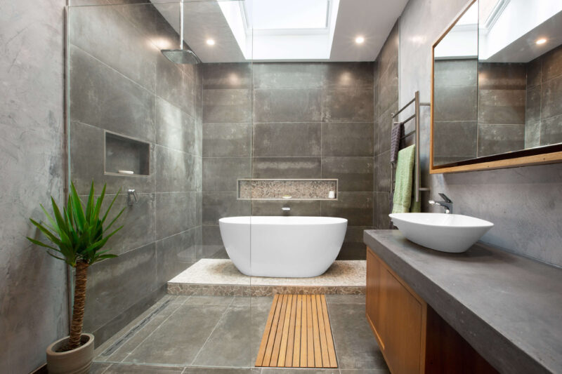
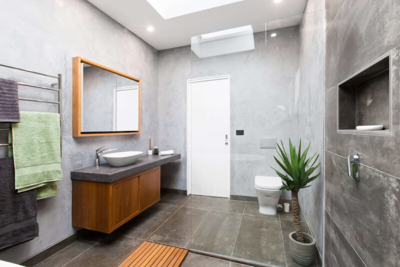
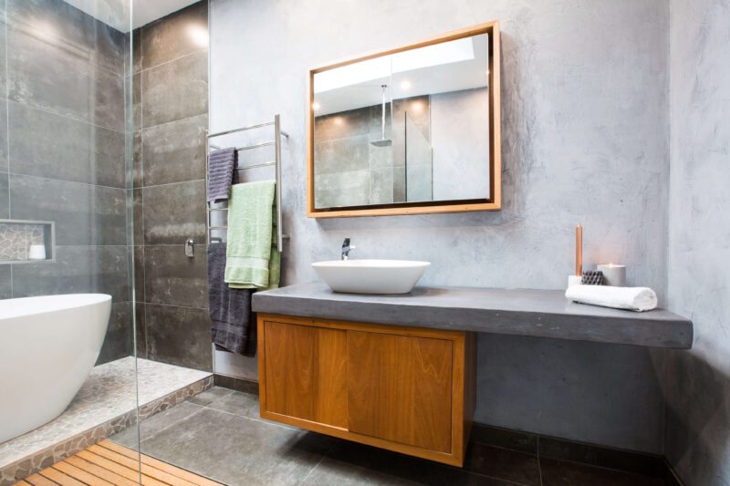
Justin loved how the bath was a big focal point in Jim and Hayley’s bathroom as soon as you walked in. He thought it worked well and gave the space a sense of joy and purpose. Colin felt the colour scheme should have been brighter. Overall Justin said the bathroom felt like a “sumptuous spa”.
Colin’s score: 7/10 Justin’s score: 8/10 Total: 15/20
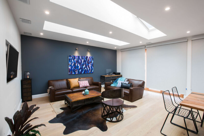
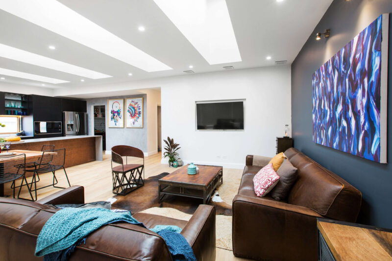
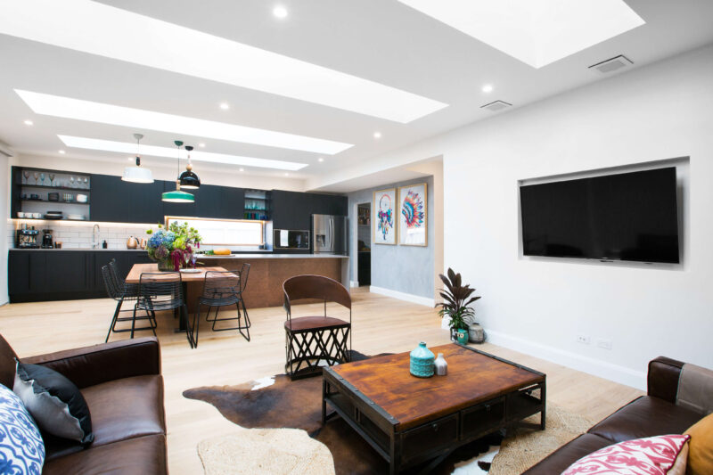
Colin loved the atmosphere of Jim and Hayley’s living area, noting the record player as the key. Justin loved the choice of a brown leather sofa, but felt two of them were too much coupled with the hard brown metal coffee table and chair. He suggested a few fabric chairs would have helped balance the space more.
Colin’s score: 6/10 Justin’s score: 6/10 Total: 12/20
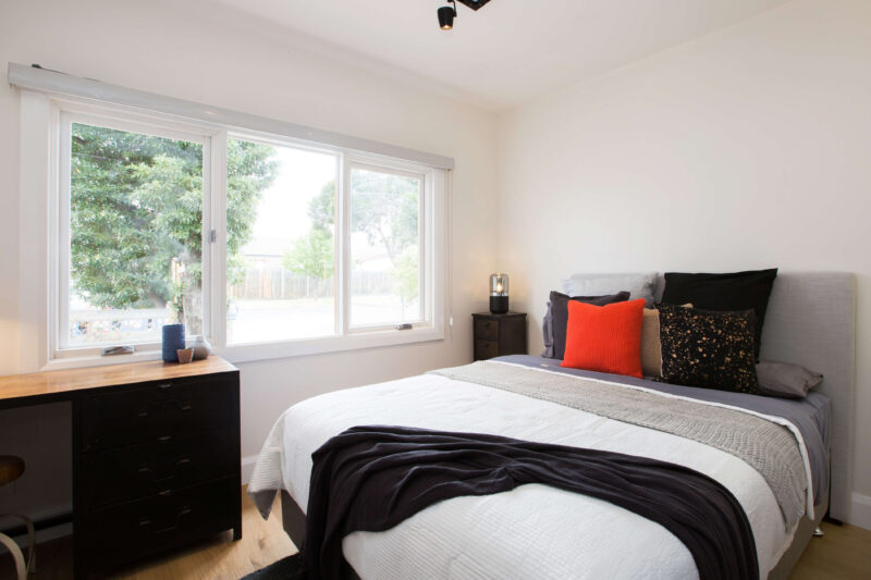
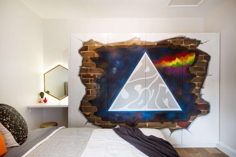
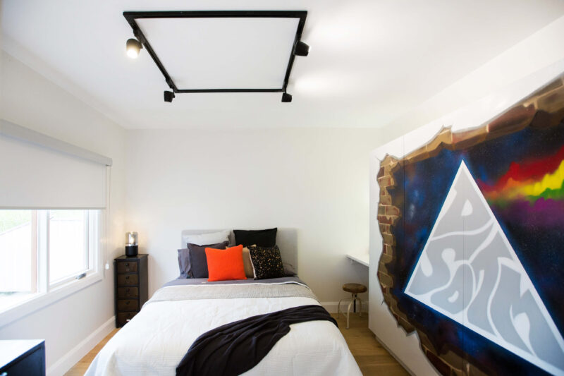
Justin thought the wardrobe mural had big impact and brought a lot to Jim and Hayley’s bedroom. But Colin felt the mural dominated the room and made the rest of it feel bare and suggested hanging guitars on the walls to add a personal touch.
Colin’s score: 6/10 Justin’s score: 6/10 Total: 12/20
Shop the look here…[/vc_column_text][vc_row_inner][vc_column_inner width=”1/3″][vc_single_image image=”42477″][vc_column_text]
[/vc_column_text][/vc_column_inner][vc_column_inner width=”1/3″][vc_single_image image=”42478″][vc_column_text]
[/vc_column_text][/vc_column_inner][vc_column_inner width=”1/3″][vc_single_image image=”42479″][vc_column_text]
[/vc_column_text][/vc_column_inner][/vc_row_inner][vc_separator border_width=”2″][/vc_column][/vc_row][vc_row][vc_column][vc_column_text]
BLUE TEAM
This week the communal room was the hallway…
 [/vc_column_text][vc_column_text]
BLUE TEAM: Lisa and John, married from NSW. This week they renovated a bathroom and bedroom.
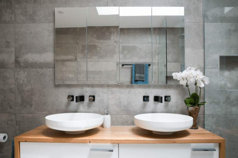
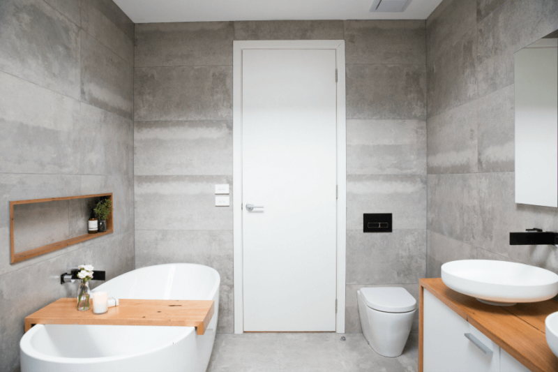
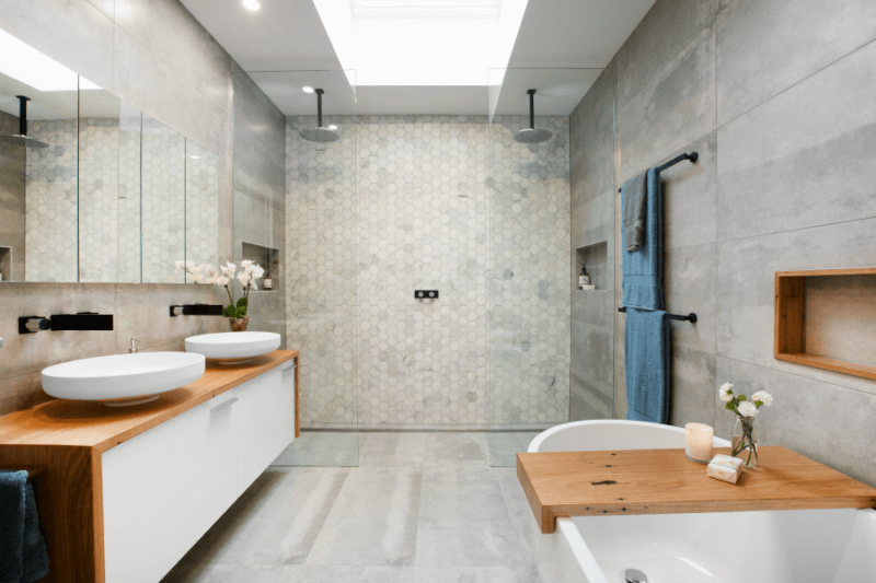
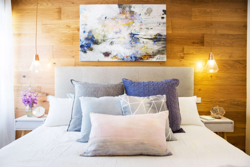
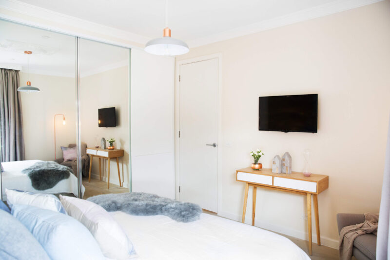
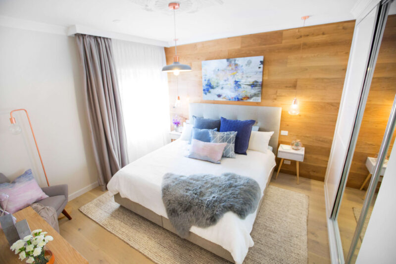
Justin felt that every part of Lisa and John’s master bedroom screamed well planned and comfortable through the detail and texture in the space. Colin praised the pair for deciding to reduce the window size, giving them more wall space to work with. Justin did feel the artwork about the bed should have been longer.
Colin’s score: 8/10 Justin’s score: 8/10 Total: 16/20
Shop the look here…[/vc_column_text][vc_row_inner][vc_column_inner width=”1/3″][vc_single_image image=”42480″][vc_column_text]
[/vc_column_text][/vc_column_inner][vc_column_inner width=”1/3″][vc_single_image image=”42481″][vc_column_text]
[/vc_column_text][/vc_column_inner][vc_column_inner width=”1/3″][vc_single_image image=”42482″][vc_column_text]
[/vc_column_text][/vc_column_inner][/vc_row_inner][vc_separator border_width=”2″][/vc_column][/vc_row][vc_row][vc_column][vc_column_text]
BLUE TEAM: Sarah and Renee, besties from QLD. This week they renovated a girls bedroom and the living. Comments from the judges are below each room…
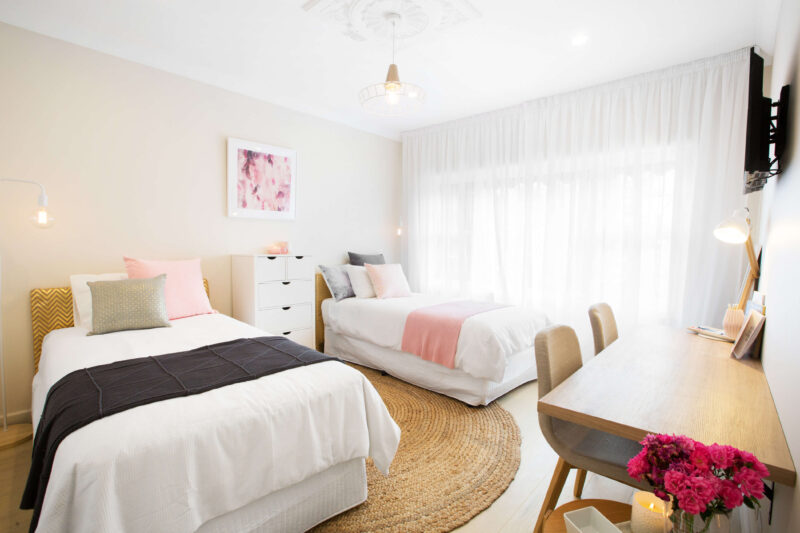
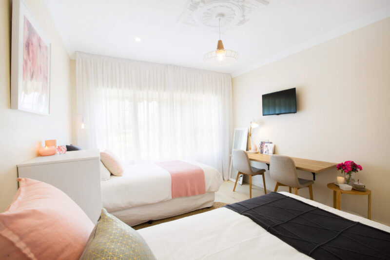

Colin and Justin were divided on the position of the tallboy between the two beds in Sarah and Renee’s bedroom. Colin loves a bedside table he can put things on, but Justin said the placement provided privacy. Justin loved the how the rug complemented the beds. Colin stressed on the importance of functionality after closer inspection of bed heads.
Colin’s score: 6/10 Justin’s score: 7/10 Total: 13/20
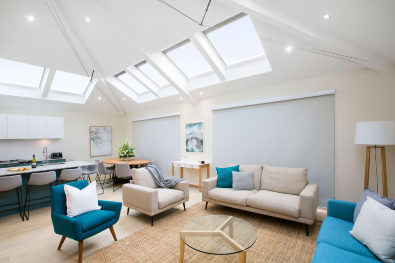
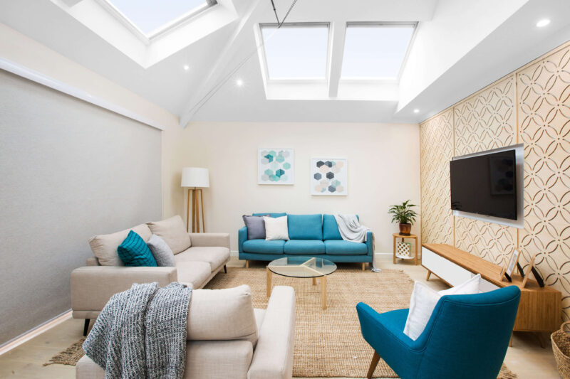
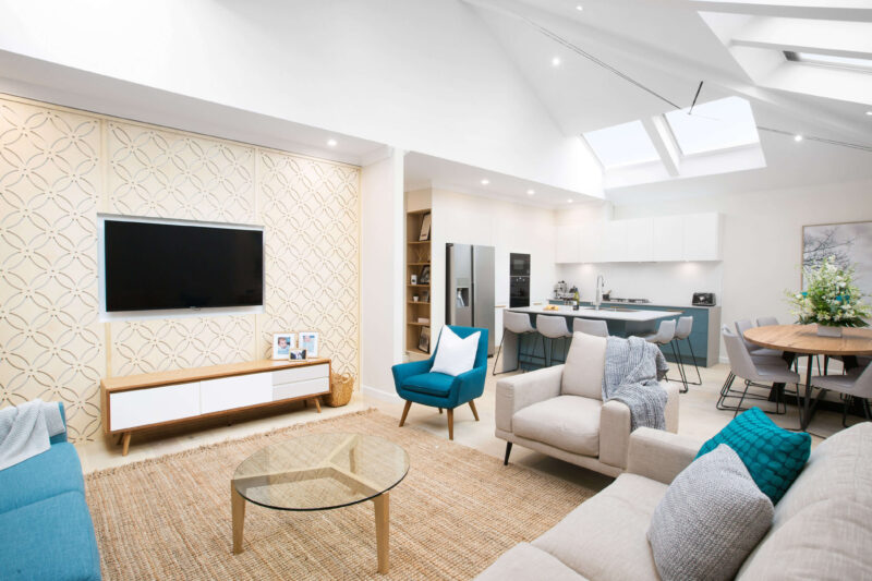
Colin loved the volume the skylights added to Sarah and Renee’s living area, creating a visible connection to the outdoors. Justin loved how well the colour scheme worked between the couches and artwork, but felt the finishing on the feature wall let them down.
Colin’s score: 7/10 Justin’s score: 7/10 Total: 14/20
Shop the look here…[/vc_column_text][vc_row_inner][vc_column_inner width=”1/3″][vc_single_image image=”42483″][vc_column_text]
[/vc_column_text][/vc_column_inner][vc_column_inner width=”1/3″][vc_single_image image=”42486″][vc_column_text]
[/vc_column_text][/vc_column_inner][vc_column_inner width=”1/3″][vc_single_image image=”42485″][vc_column_text]
[/vc_column_text][/vc_column_inner][/vc_row_inner][vc_separator border_width=”2″][/vc_column][/vc_row][vc_row][vc_column][vc_column_text]
BLUE TEAM: Scott and Nadia, married with kids from VIC. This week they renovated the kitchen/dining and a bedroom.
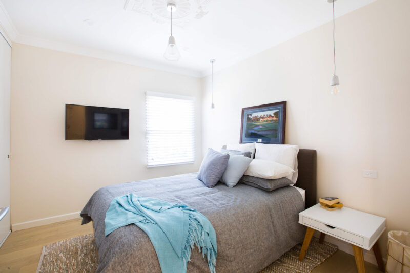
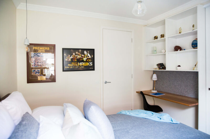
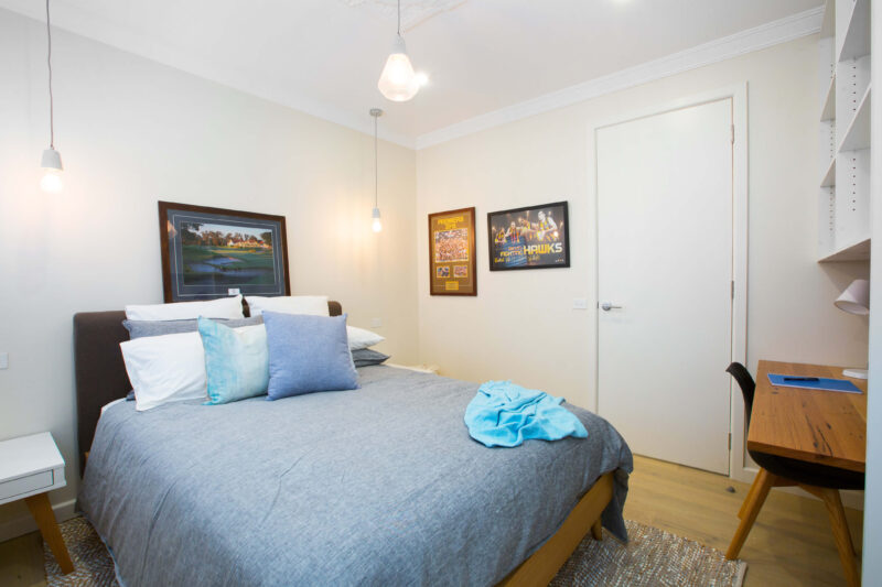
Justin was concerned about the position of the desk in Scott and Nadia’s bedroom, questioning its functionality next to a door. Colin felt the room was missing personality and in need of more layers, Justin agreed saying “it is quite bare”.
Colin’s score: 5/10 Justin’s score: 5/10 Total: 10/20
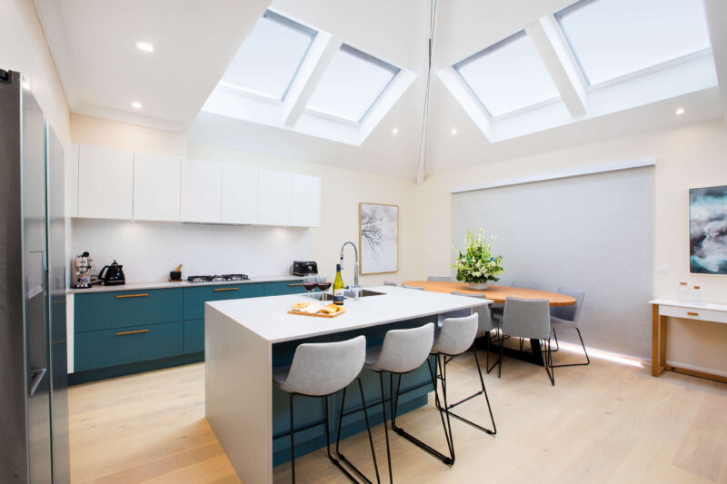
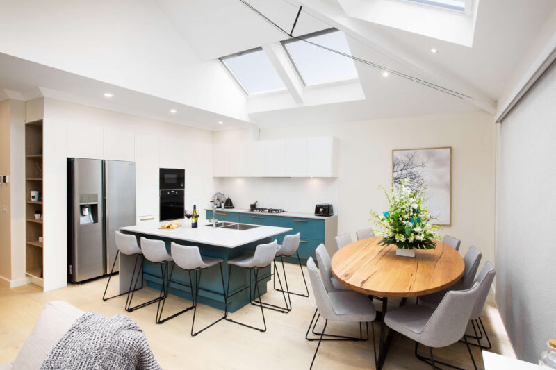
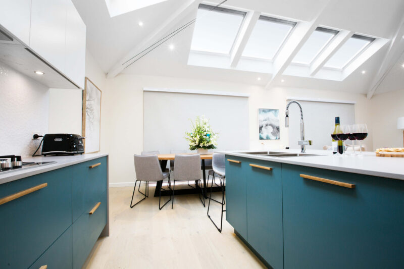
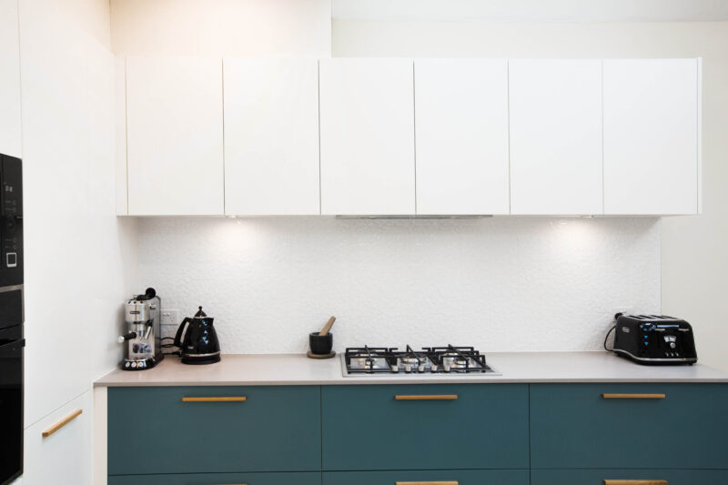
Teal makes Justin squeal… with pleasure. He loved Scott and Nadia’s colour choice for the cabinets, and how well they worked with the similar colours in the living area. Justin felt there were too many chairs in the space, taking attention away from the framework of the dining table.
Colin’s score: 8/10 Justin’s score: 8/10 Total: 16/20
Shop the look here…[/vc_column_text][vc_row_inner][vc_column_inner width=”1/3″][vc_single_image image=”42487″][vc_column_text]
[/vc_column_text][/vc_column_inner][vc_column_inner width=”1/3″][vc_single_image image=”42488″][vc_column_text]
[/vc_column_text][/vc_column_inner][vc_column_inner width=”1/3″][vc_single_image image=”42489″][vc_column_text]
[/vc_column_text][/vc_column_inner][/vc_row_inner][vc_separator border_width=”2″][/vc_column][/vc_row][vc_row][vc_column][vc_column_text]
What did you think of the finished houses?
[/vc_column_text][/vc_column][/vc_row]
Be the first to read my stories
Get Inspired by the World of Interior Design
Thank you for subscribing to the newsletter.
Oops. Something went wrong. Please try again later.




Comments
Donna
Thanks Katrina for again putting together a good range of reveal photos.
I’m not sure about the looks this season. Although as the owner of a half renovated house – anything finished would be much appreciated.
The bathrooms just seem too much grey. And I know it must be hard shopping in such a short time with defined suppliers but the rooms just seem sooooooooo bland.
Katrina
I’d love some white bright bathrooms with some stone maybe?!
Cheryl Kennedy
Narelle Oehm black kitchen yours looks so much on trend and a lot nicer ????