Morning bloggers! As the new year began, a lot of bloggers started to ponder and think about what direction they want to take their blog. I've been reading lots of your posts where you talk about new directions, feeling refreshed and excited about your blog for 2012. This is great! But have you thought about …
Morning bloggers!
As the new year began, a lot of bloggers started to ponder and think about what direction they want to take their blog. I’ve been reading lots of your posts where you talk about new directions, feeling refreshed and excited about your blog for 2012. This is great!
But have you thought about your image/brand?
Have you put your best foot forward?
Have you set yourself a blog budget?
Have you asked someone to critique your blog?
Do you wonder if some of your readers have moved on from you because they see you’ve lost sight?
These are questions we all ask ourselves. Don’t worry, it happens to lots of us.
The best blogs have a design that meets the needs of your reader. Uncluttered, directional and purposeful.
The best way to start making changes to your design is to think about your readers. Pick 3 people (real or imaginary) who you think would read your blog. What would they like? If you find it difficult to imagine who reads your blog, then ask some friends.
Critique is hard to take sometimes, but it’s helpful. I promise!
Blog Design Tips
1. Is your page polished and professional? Uncluttered? Do you have a theme of colours?
2. What layout are you using? Is everything grouped together? Do you have a spot for advertising? Or is everything thrown around? If your page is amateur, then unfortunately your blog will look amateur.
3. Don’t run with google images and standard template images. Try to be as creative as you can within your budget.
4. If your blog is a business, then invest the money in a good design that will stand the test of time and tell your readers that you’re serious.
5. Where are your subscribe RSS buttons? Do you want me to be a loyal reader? Then I need to be able to follow you.
6. Give yourself a tagline – it will tell your readers what your blog is about.
7. Do you have a photo of yourself? You must. I won’t read your blog if I don’t know who you are.
8. Does your background blind my eyes? Does your background load slow?
9. Do you have a search field? You must! This drives me mad if you don’t.
10. Do you have categories/labels/tags clear in the sidebar? If not, then you run the risk of losing readers. I may only come to your blog because I want to read about a few topics you write about. More than 25 categories is annoying though.
11. More than 5 photos in a blog post is too much. Most people only stay on a page for 1-2 minutes. This is a fact.
12. Turn word verification off. Self-explanatory. Turn it off people.
13. You’ll lose readers if your sidebar has more content than your posts. Cull it down.
14. Flashing stuff. I can’t read your post and concentrate if stuff is flashing.
15. Contrast your fonts with colours and sizes. It’s appealing and will highlight and point out various parts of your blog.
16. Don’t interrupt all of your posts with advertising.
Phew. Sorry for the overload. But I hope you can take away a few pointers for your blog design.
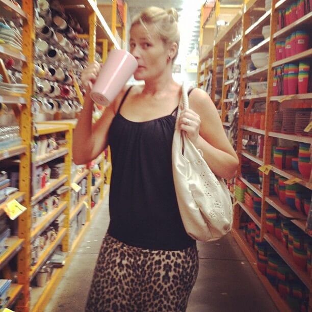
So, today, why don’t you grab a cup of coffee (yes, that’s one heck of a coffee cup!), sit down in front of your blog and go over the layout?
Ask some friends for advice. Ask a stranger for advice. Even ask your husband, mother, brother, what their first impression is…
Have a great weekend x
Be the first to read my stories
Get Inspired by the World of Interior Design
Thank you for subscribing to the newsletter.
Oops. Something went wrong. Please try again later.


Comments
fromthekiwigirl
Hi Katrina
I change my blog like the weather. Not content. Trying new things.
Fussy..maybe. Visually stimulated..yes. Sometimes it comes to time spent there..so much time and I get fed up. Don’t to pigeon hole..probably not much chance of that. Thank you for the advice. Very helpful. 🙂
Serena {Pretty Fluffy}
These are such great tips Katrina! I initially popped over to read your post on how to back-up your blog, and am delighted to find this whole treasure trove of design/blog tips and eye candy. Awesome blog! x
Katrina
Awww thank you!