Colour harmony is all about creating a space where colours work together beautifully. It’s not just about picking pretty colours but finding combinations that make a room feel balanced and inviting. By understanding how colours interact, you can set the mood and enhance the overall vibe of your space, making it both visually appealing and …

Colour harmony is all about creating a space where colours work together beautifully. It’s not just about picking pretty colours but finding combinations that make a room feel balanced and inviting. By understanding how colours interact, you can set the mood and enhance the overall vibe of your space, making it both visually appealing and emotionally engaging.
The Essence of Colour Harmony
Creating a harmonious colour scheme goes beyond simply choosing colours that look good on their own. It’s about finding the right balance and combination that makes a space feel cohesive and inviting. The right colour harmony can evoke specific emotions, influence the mood, and even affect the perception of the room’s size and shape. By mastering the principles of colour harmony, you can transform any interior into a welcoming and aesthetically pleasing environment.
The Colour Wheel Basics
The colour wheel is your best friend when it comes to achieving colour harmony. This essential tool shows the relationship between different colours, helping you understand how to combine them effectively. Here’s a quick breakdown of the colour wheel basics:
- Primary Colours: Red, blue, and yellow. These are the foundational colours from which all other colours are derived.
- Secondary Colours: Green, orange, and purple. These are created by mixing primary colours.
- Tertiary Colours: These are combinations of primary and secondary colours, such as red-orange or blue-green.
By understanding these relationships, you can create harmonious colour schemes that work well together. For example, complementary colours (opposite each other on the wheel) provide a vibrant contrast, while analogous colours (next to each other on the wheel) offer a more subtle, cohesive look. Triadic schemes (three colours evenly spaced around the wheel) create a balanced and dynamic palette.
Applying Colour Harmony Across Styles
Colour harmony isn’t limited to one particular design style—it’s a versatile concept that can be adapted to various aesthetics. Here’s how you can apply it to different interior design styles:
- Modern Design: Use a monochromatic scheme with different shades and tones of a single colour to create a sleek and sophisticated look.
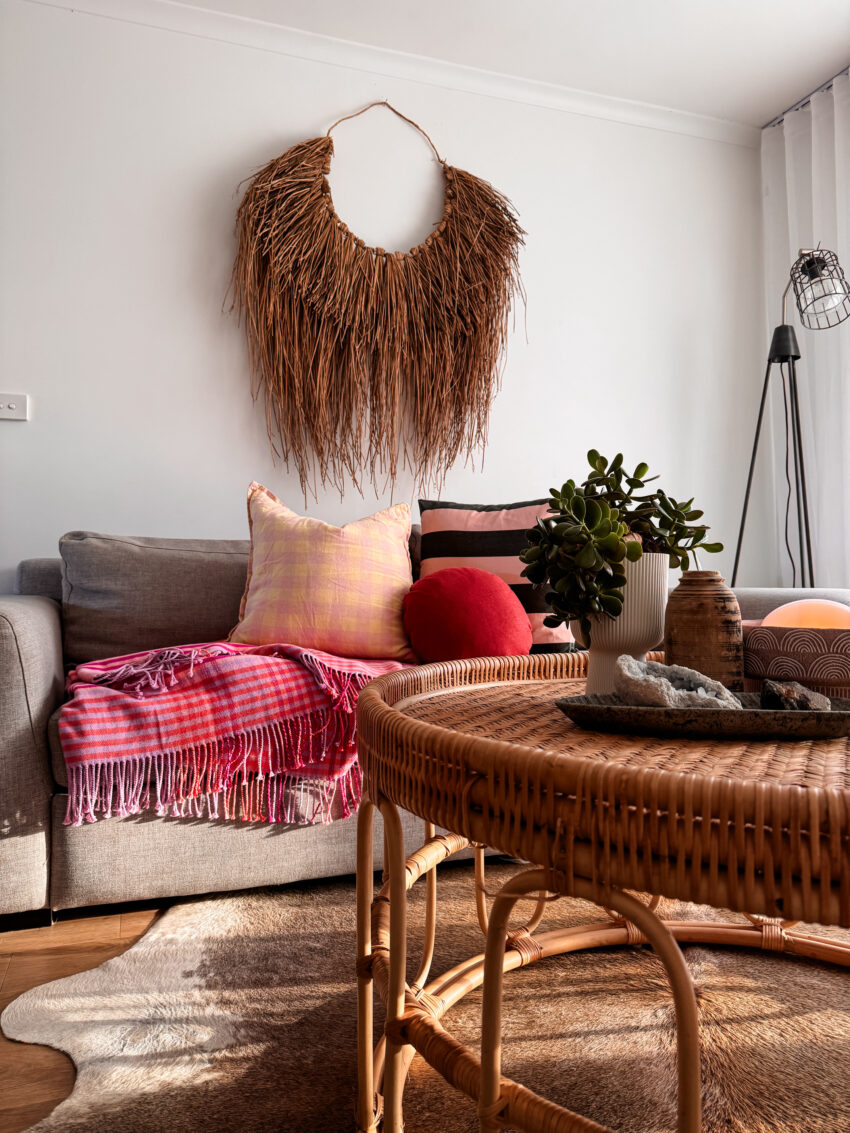
- Bohemian Style: Embrace analogous colours to achieve a rich, layered feel that’s full of depth and character.
- Traditional Design: Opt for complementary colours to create a balanced and timeless elegance.
By incorporating the principles of colour harmony, you can ensure that your interior designs are not only visually appealing but also emotionally resonant, creating spaces that truly feel like home.