All of the houses have now been done on House Rules... Last night we saw Karina & Brian's brand new "coastal-desert" family home. What did you think?? I liked some and wasn't a fan of other parts. I like now that each couple get to go back and fix parts they didn't like in their …
All of the houses have now been done on House Rules… Last night we saw Karina & Brian’s brand new “coastal-desert” family home. What did you think??
I liked some and wasn’t a fan of other parts. I like now that each couple get to go back and fix parts they didn’t like in their own homes. Although I thought the “let’s see the leader board BUT no one is going home” a bit silly. So all the point gathering over the last 6 weeks didn’t even matter in the end? Maybe the producers didn’t want Karina & Brian to go?
Anyhoo…. here are the rooms…
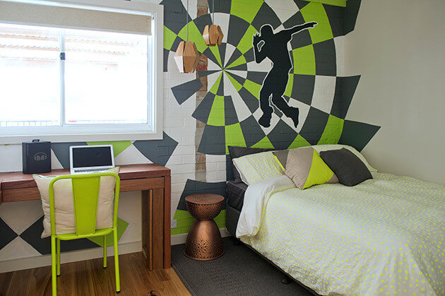
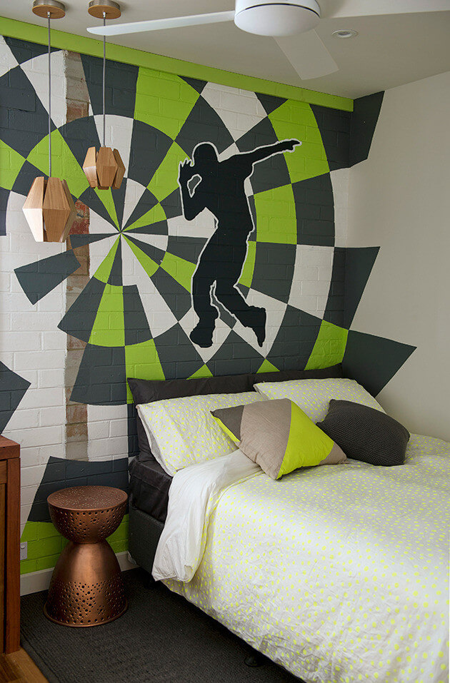
Loved the street art! And the charcoal and lime were winners. The copper side table won’t work for a teenage boy. Plus that linen wasn’t great. Why does no one put a bed-skirt/valance on ensembles anymore??
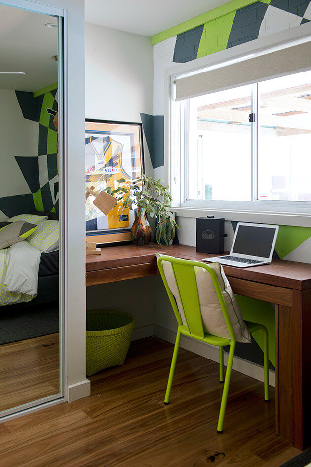
Loved the recycled timber desk and the lime stool.
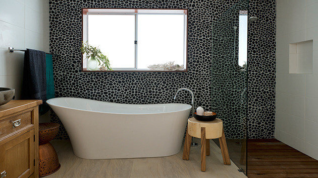
What did you think of the bathroom? I like the pebble tiles but not sure if I would get sick of them. They look like polk-a-dots.
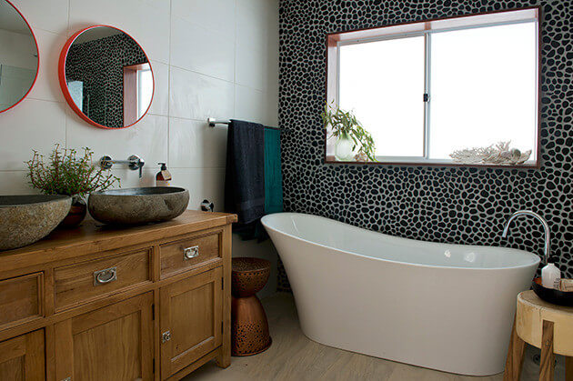
I loved the sinks! Good steal there!
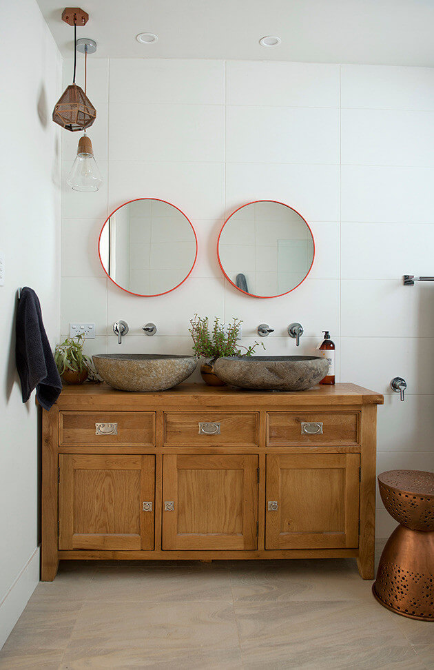
I didn’t like the vanity, it was a bit heavy and the mirrors are too small, but again, those sinks are winners.
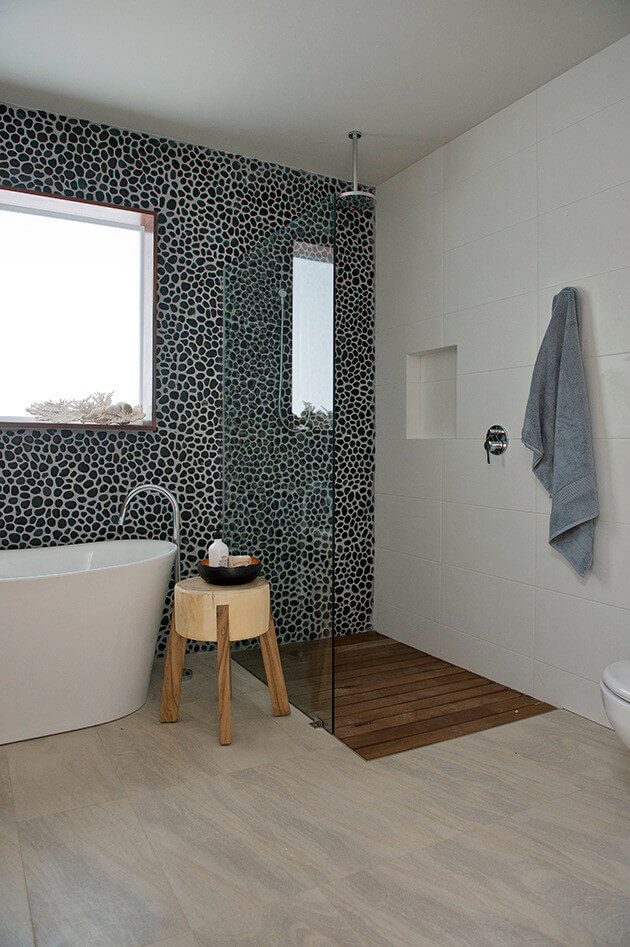
The shower was fab. The boards were great. Would they get yucky after time? What do you think?
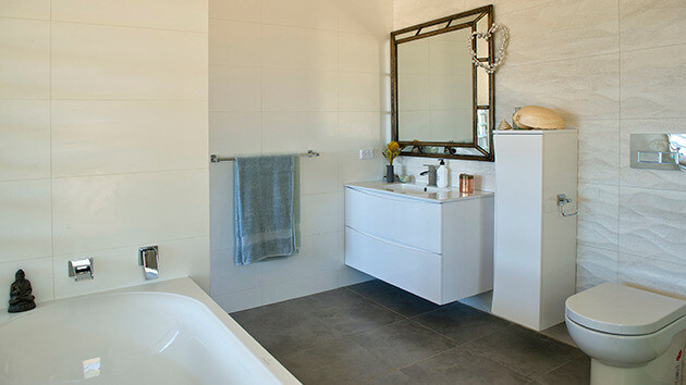
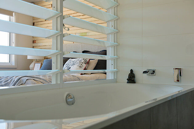
I liked the concept of this ensuite, but wasn’t a fan of the random storage cupboard or mirror, but the space was huge and that’s a bonus! My ensuite is tiny so I am rather jealous 😉
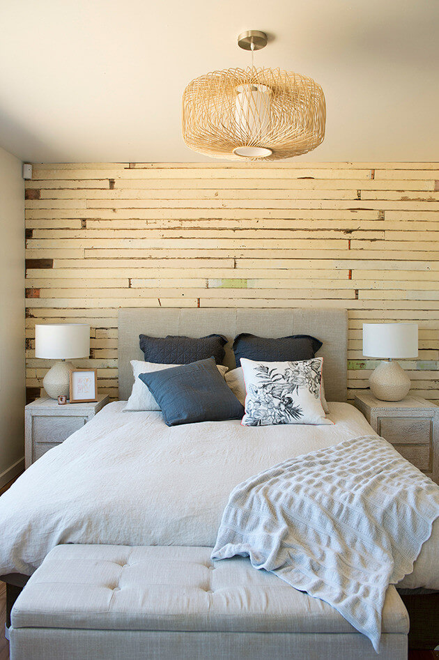
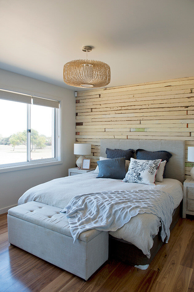
The master bedroom was great! The feature wall was perfect. Again, no bed-skirt??
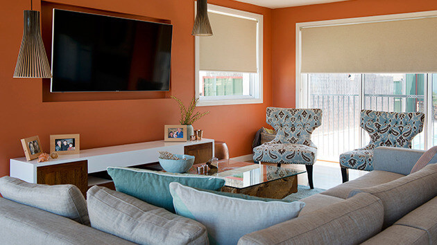
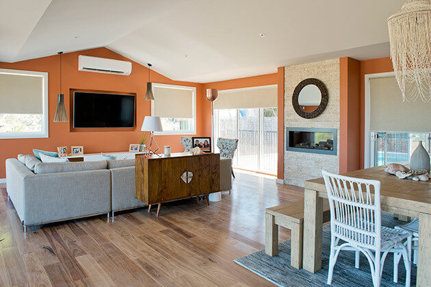
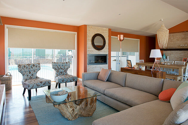
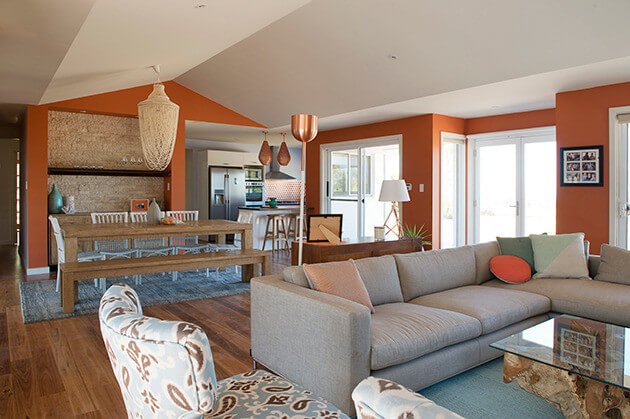
Ok, let’s discuss the orange walls? The literal “desert” walls… Yes or no? For me, no, but I’m boring like that, so it wouldn’t suit me. I love what Karina said “it makes me feel quite hot” haha. So ignoring the walls, what do you think? I loved the couch, the coffee table and the fireplace. The stacked stone was fresh. The odd console behind the couch wasn’t right though.
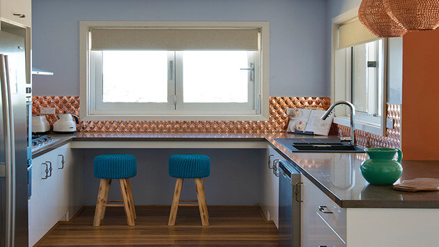
This kitchen wasn’t for me. The copper will date and the ice-blue wasn’t right. But the space was good and the idea was there. If there are no cupboards under that window though, they might have lost some good storage especially for a family of 5 people.
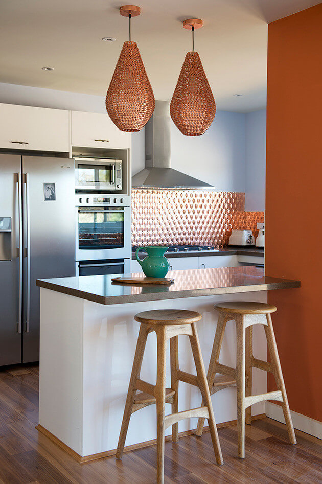
Love the stools!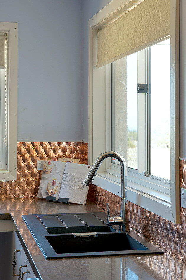
Great sink!
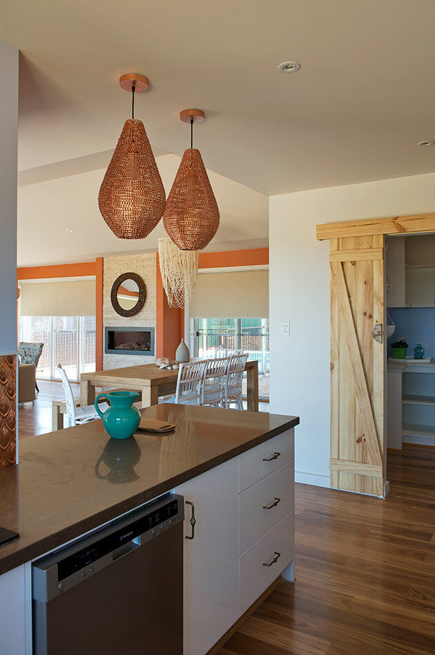
Barn doors are all the rage at the moment and I think they had the right idea, but the materials didn’t work well.
Bring on this week. Can’t wait to see what the couples really disliked in their own homes…
♥ KC.
Be the first to read my stories
Get Inspired by the World of Interior Design
Thank you for subscribing to the newsletter.
Oops. Something went wrong. Please try again later.



Comments
Jan Lance
Did not like the pebble wall in the bathroom.
Nicole Hastings
I agree did not like the cabinet the sinks were on in the main bathroom, and agree the mirrors looked a little out of place, but yes think they were just too small. I’ve wondered the same thing about valances for ages…. Where have they gone?!
Nicole Roberts
I loved the main bathroom, it was the best house by far even with the yucky paint colour.
Sandi Colyer
I find there is too much going on in that bathroom for my taste and those mirrors remind me of 80’s caroma Bathmates range and are out of proportion to the big chunky vanity!
Marissa Coventry
Omg what were those judges on !!! Way to much going on I can’t believe they received a 10 …. No comparison to the block at all!!!
Rachael Glover- Power
Eeewww
Priscilla Fitzgerald
I’m going to sound really bitchy but I am so surprised how generous the judges were. Isn’t she the Editor of Home Beautiful?
Carolyn Drew
The main bedroom is just so beige …