Hello there! Looking for the photos for The Block 2016 - Week 3 Main Bathroom Reveals? Well here they are! Dan and Carleen took out the win. I really liked this room, but I think Julia and Sasha's space was better. What did you think? Come and take a look through the rooms in order of …
Hello there! Looking for the photos for The Block 2016 – Week 3 Main Bathroom Reveals? Well here they are! Dan and Carleen took out the win. I really liked this room, but I think Julia and Sasha’s space was better. What did you think?
Come and take a look through the rooms in order of how the judges scored them…
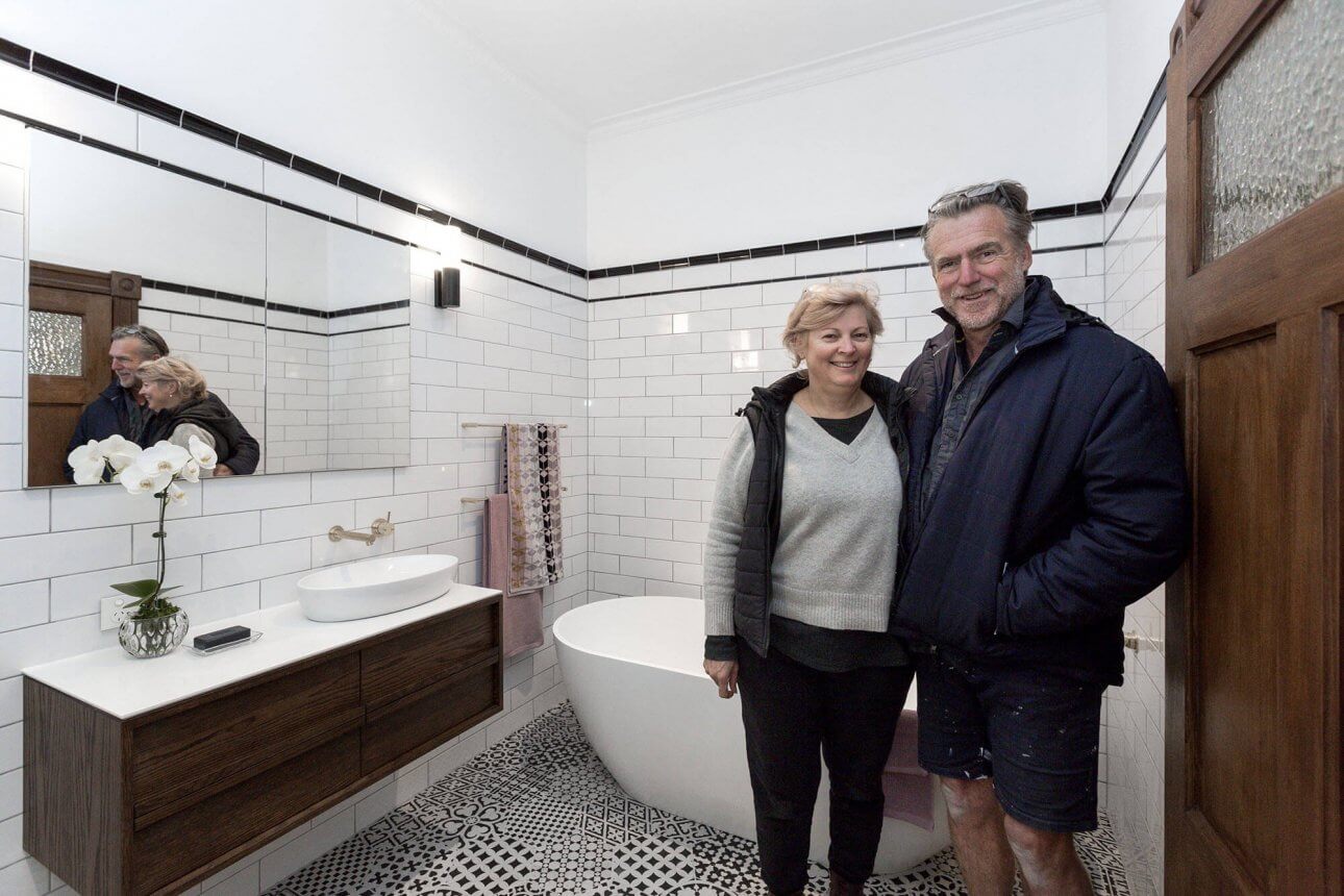
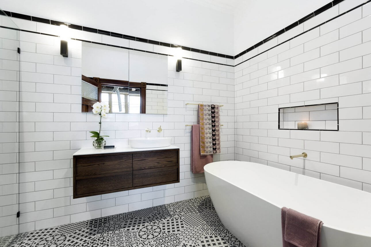
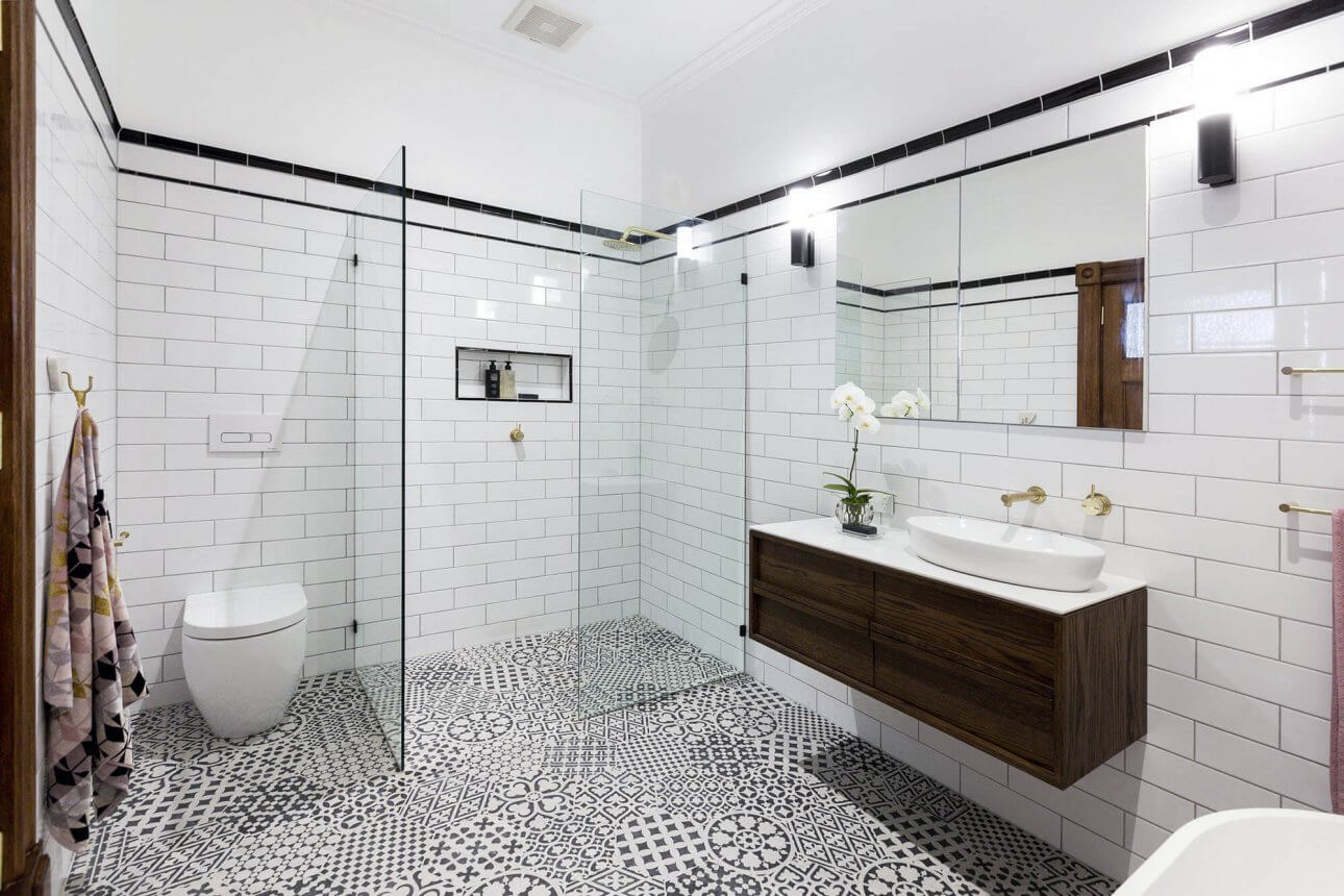
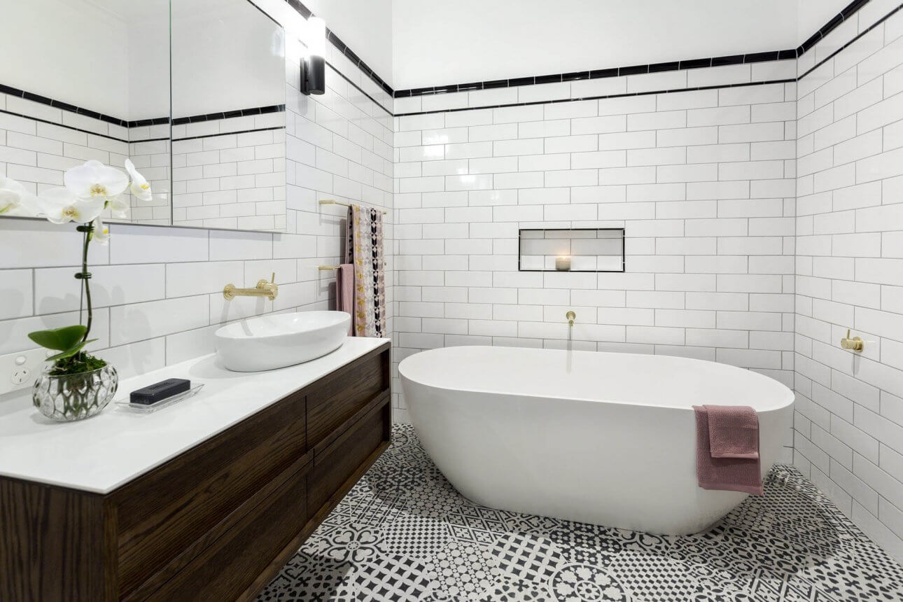
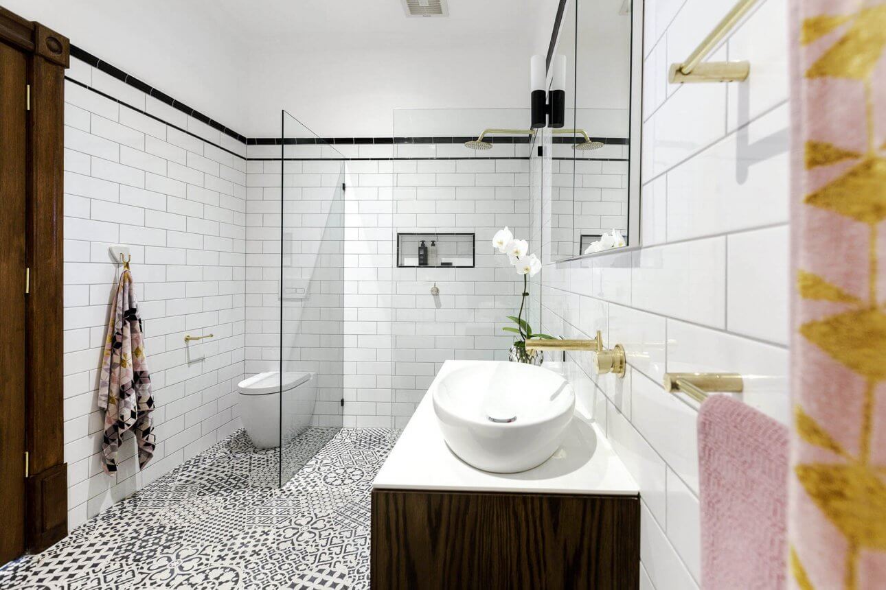
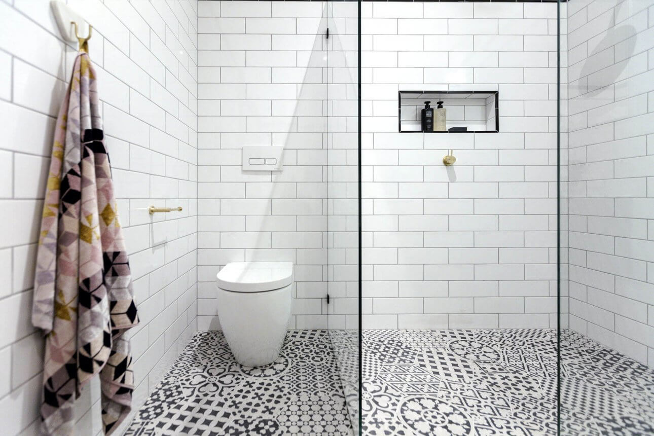
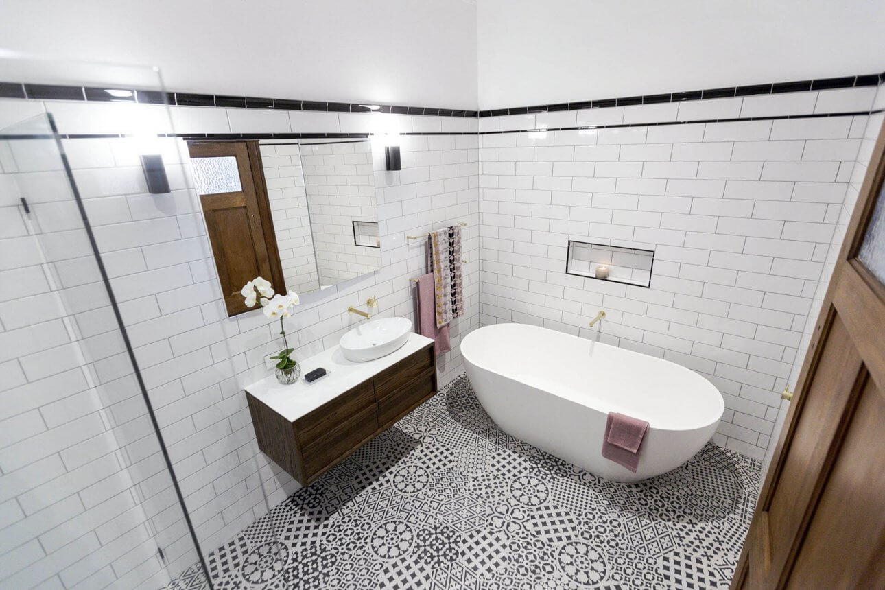
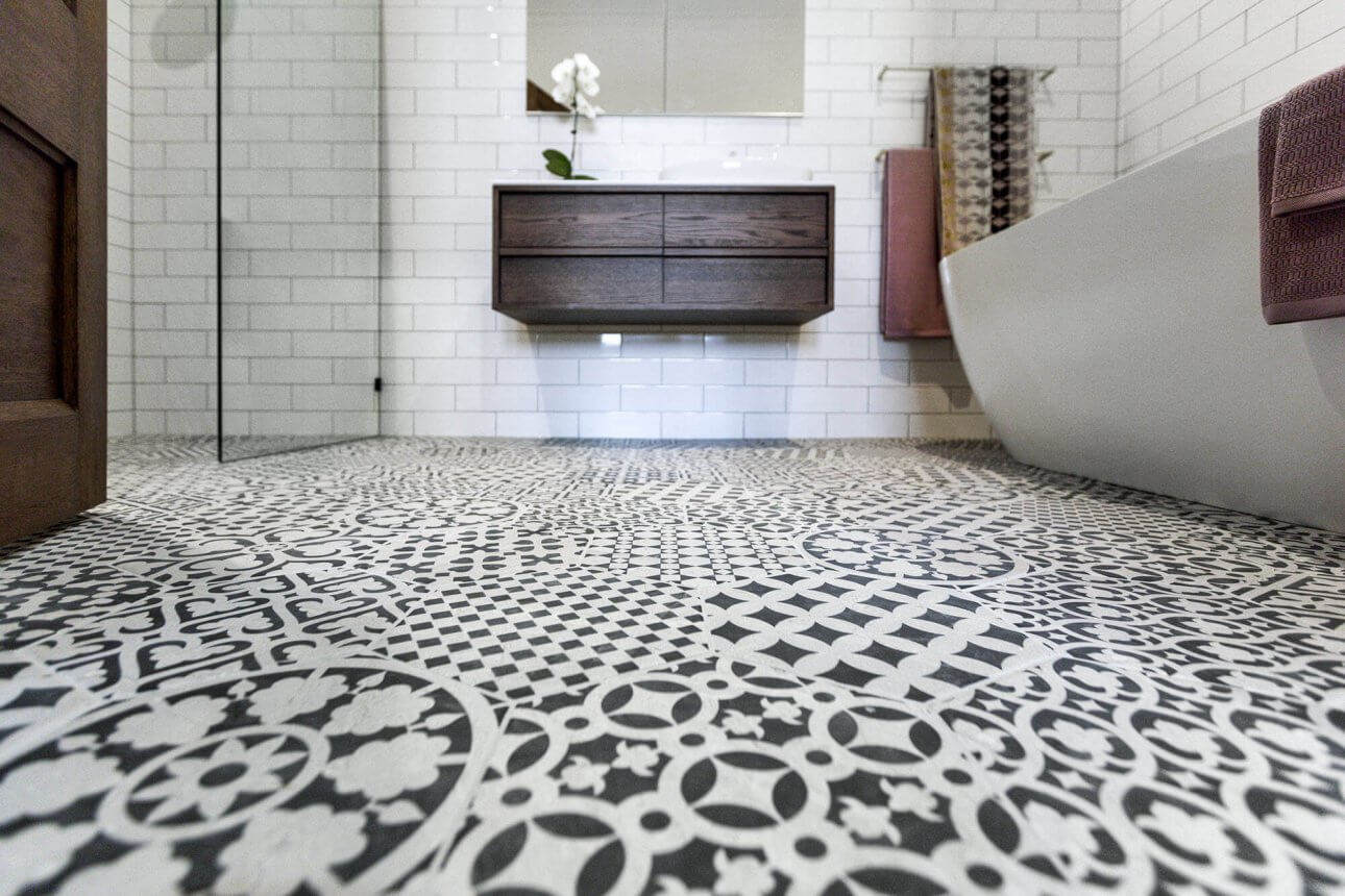
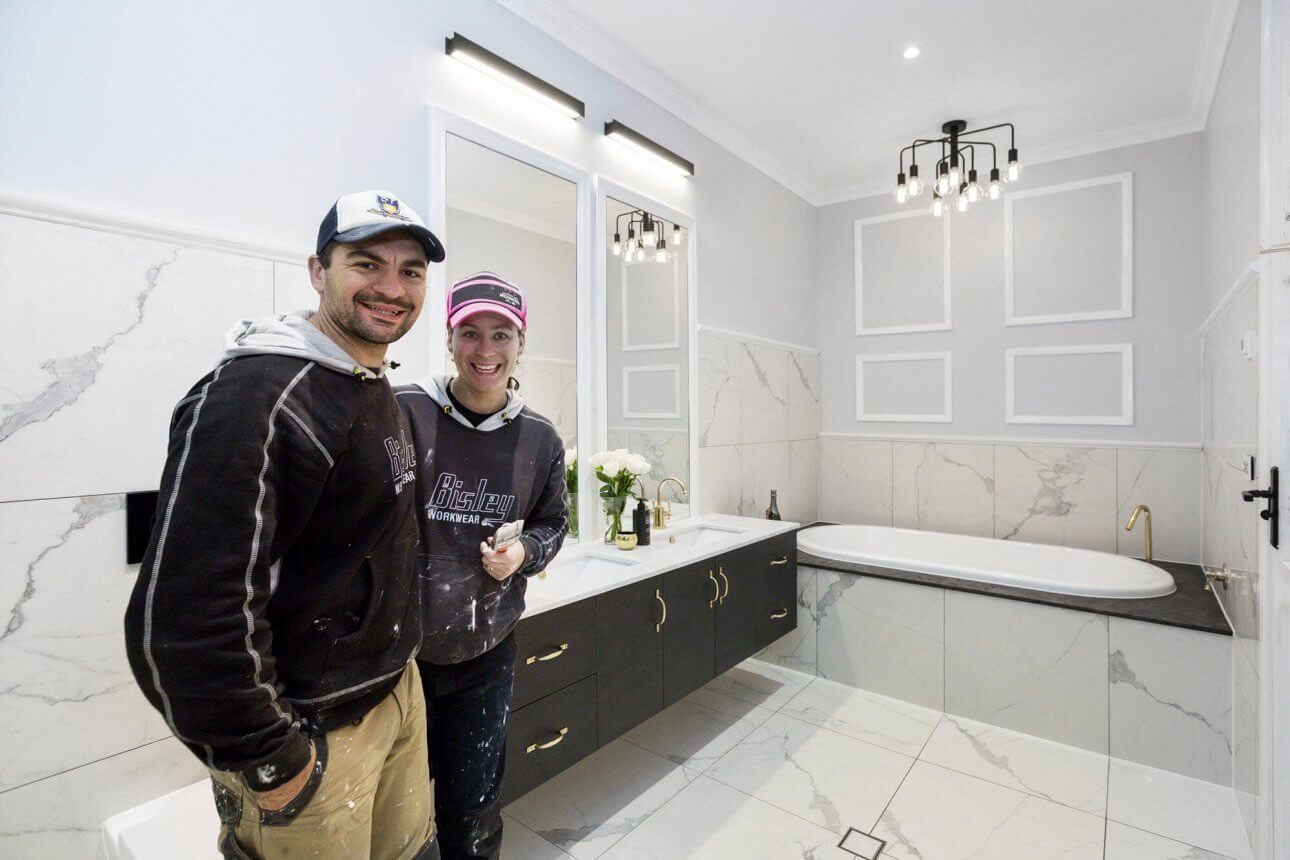
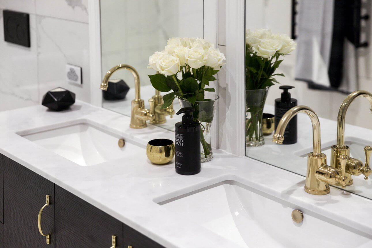
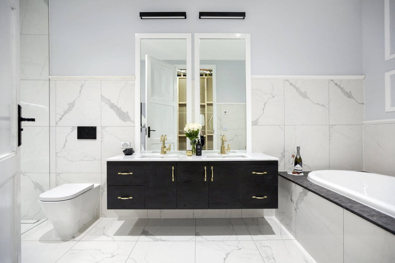
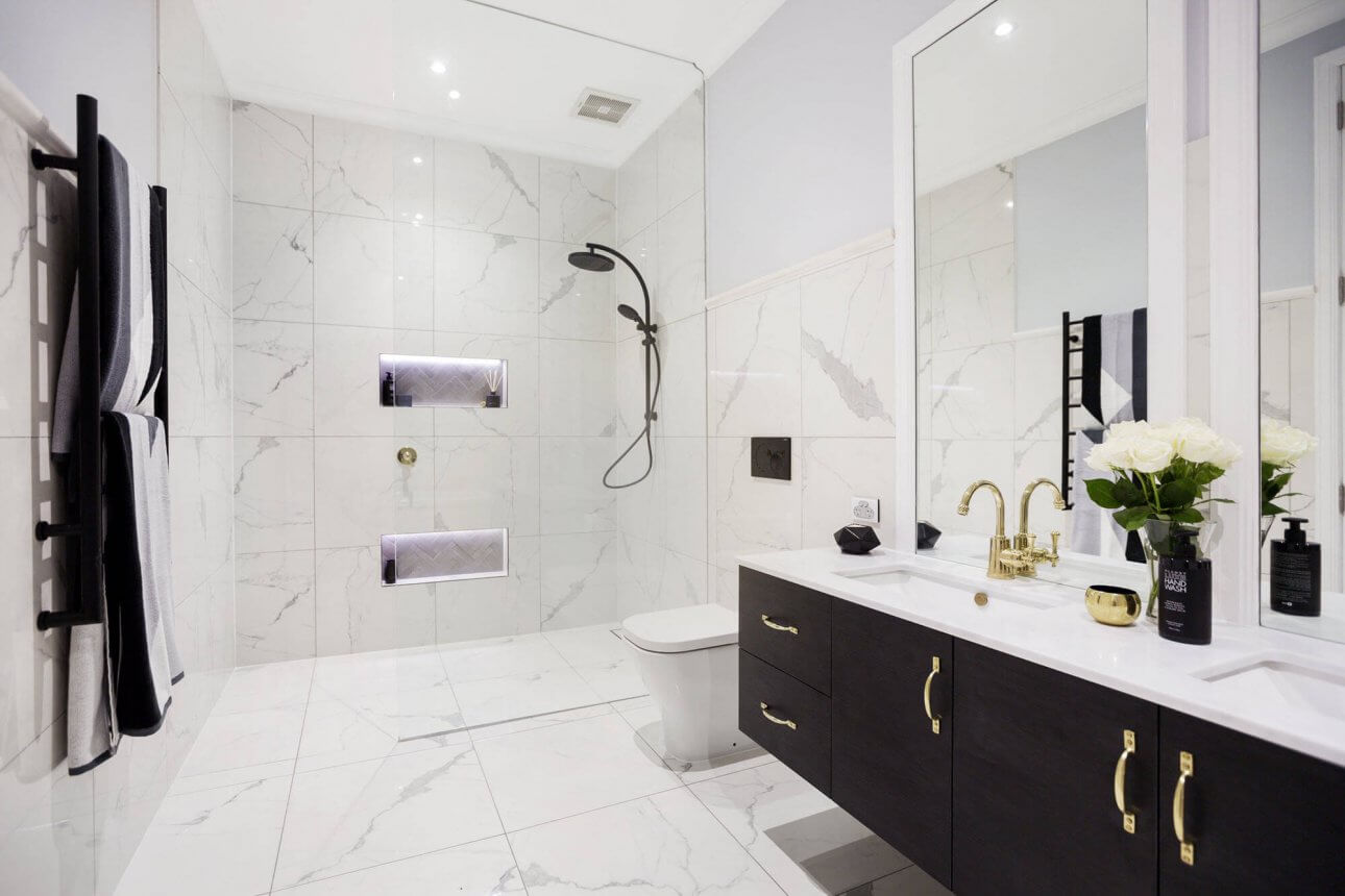
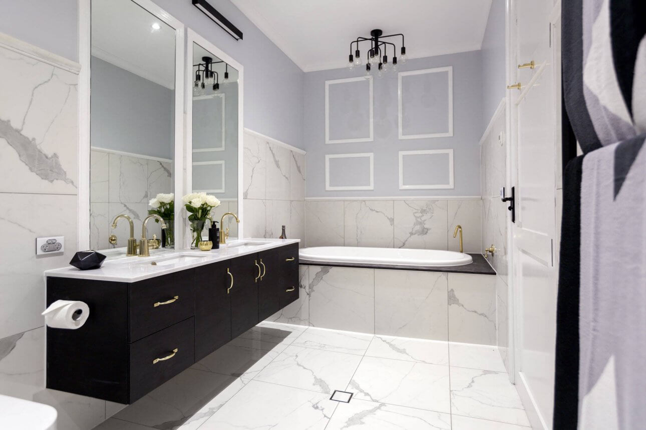
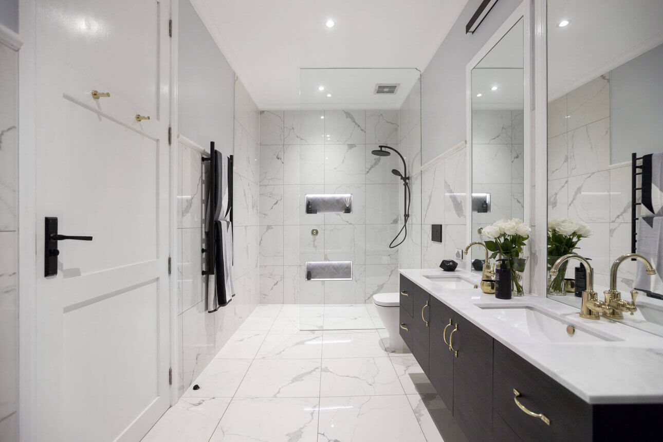
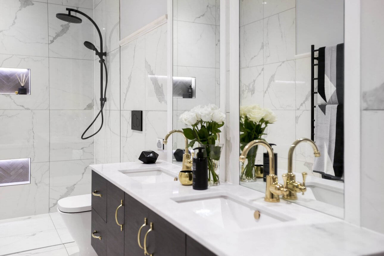
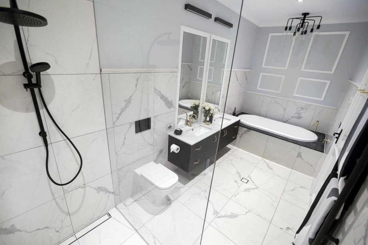
Dan and Carleen
I love the tiles. We all swoon over those. They are a treat! I am warming to the top border tile too. The freestanding tub gets my tick of approval. They also put a tub in their ensuite so that makes 2 for the house so far – I think that will really pay off. The judges gave them 29/30.
…
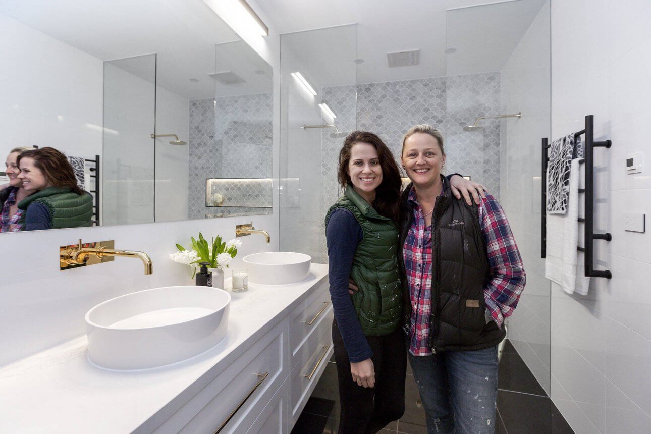
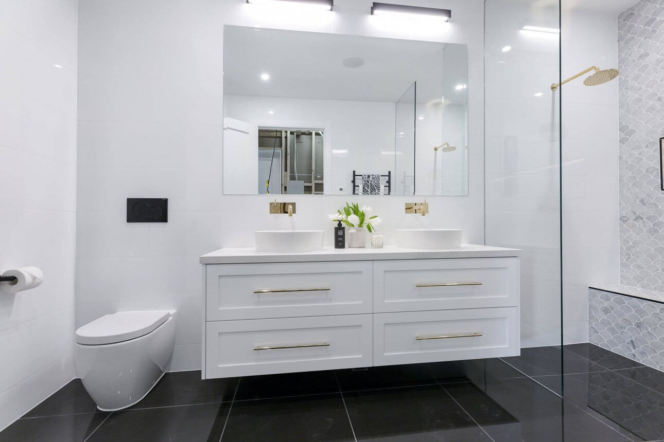
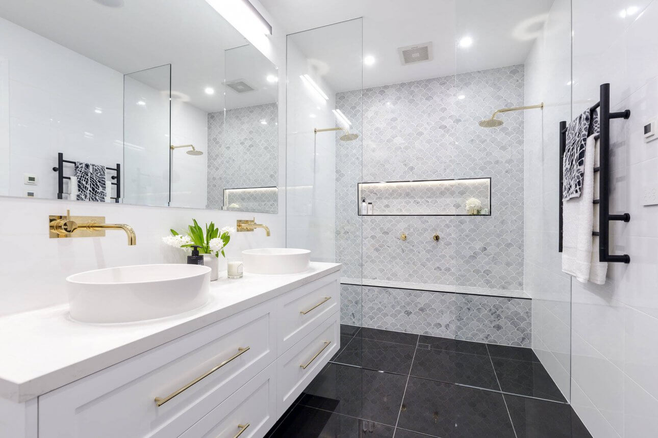
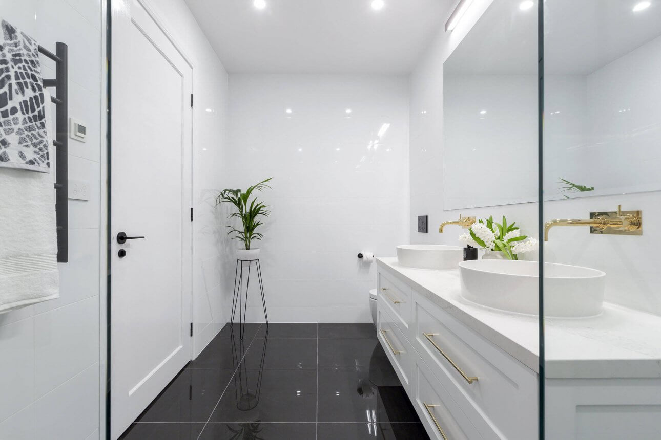
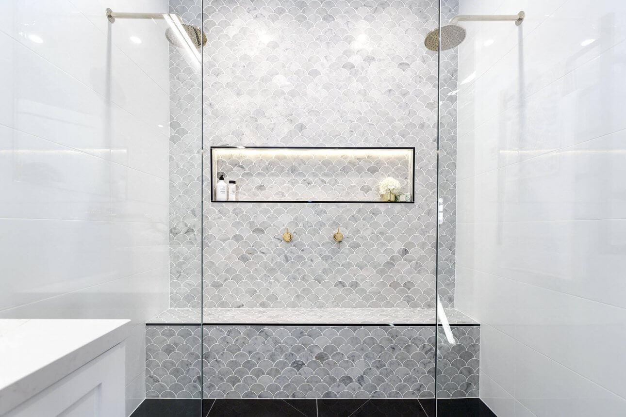
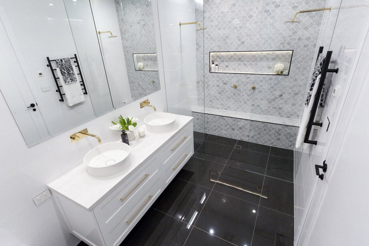
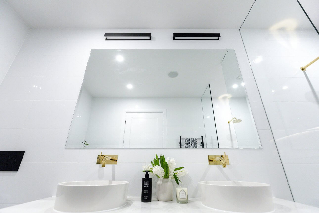
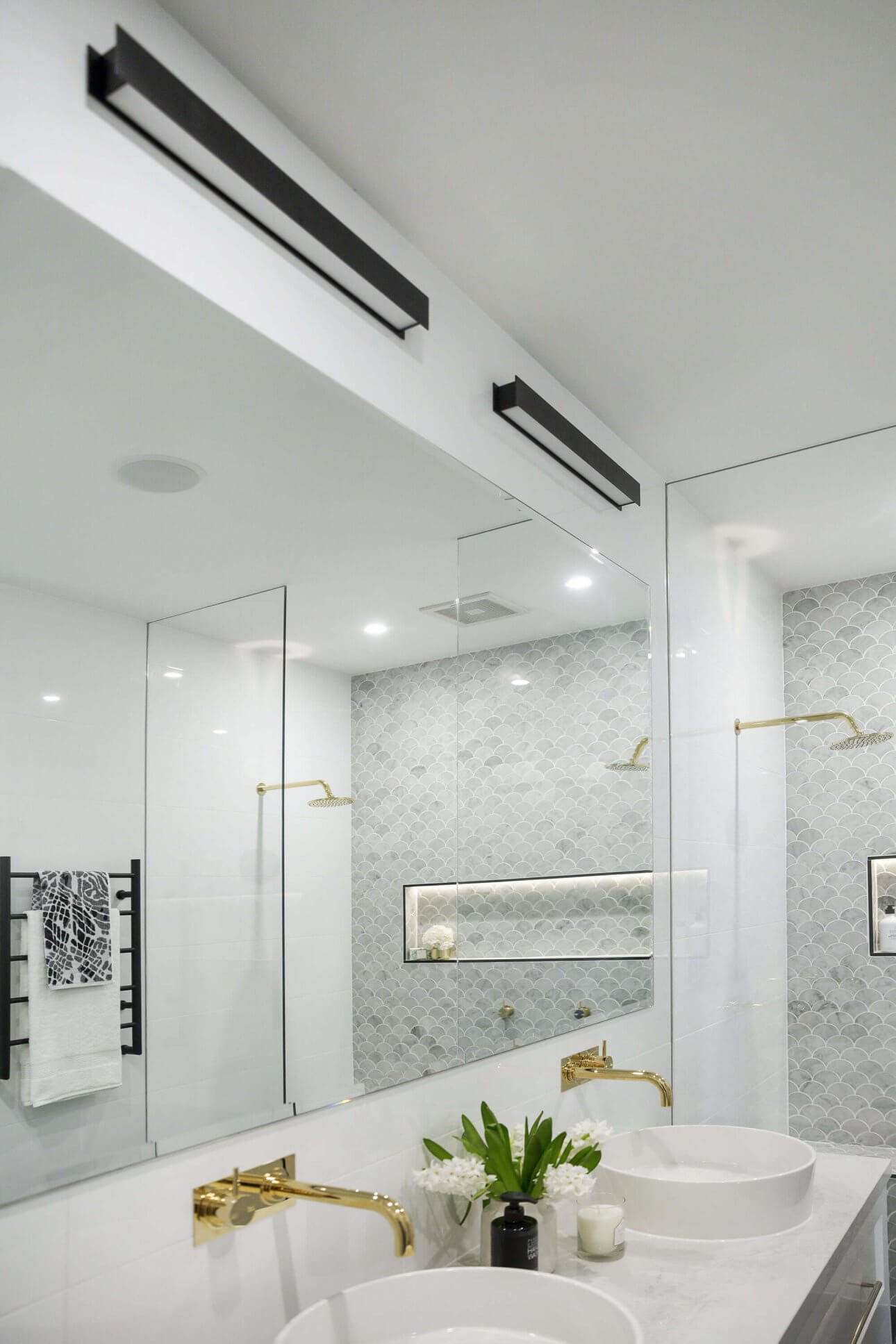
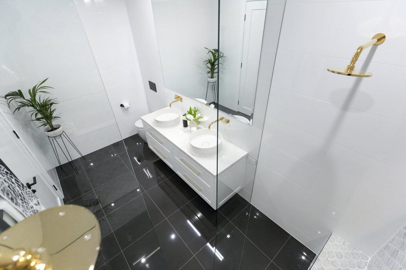
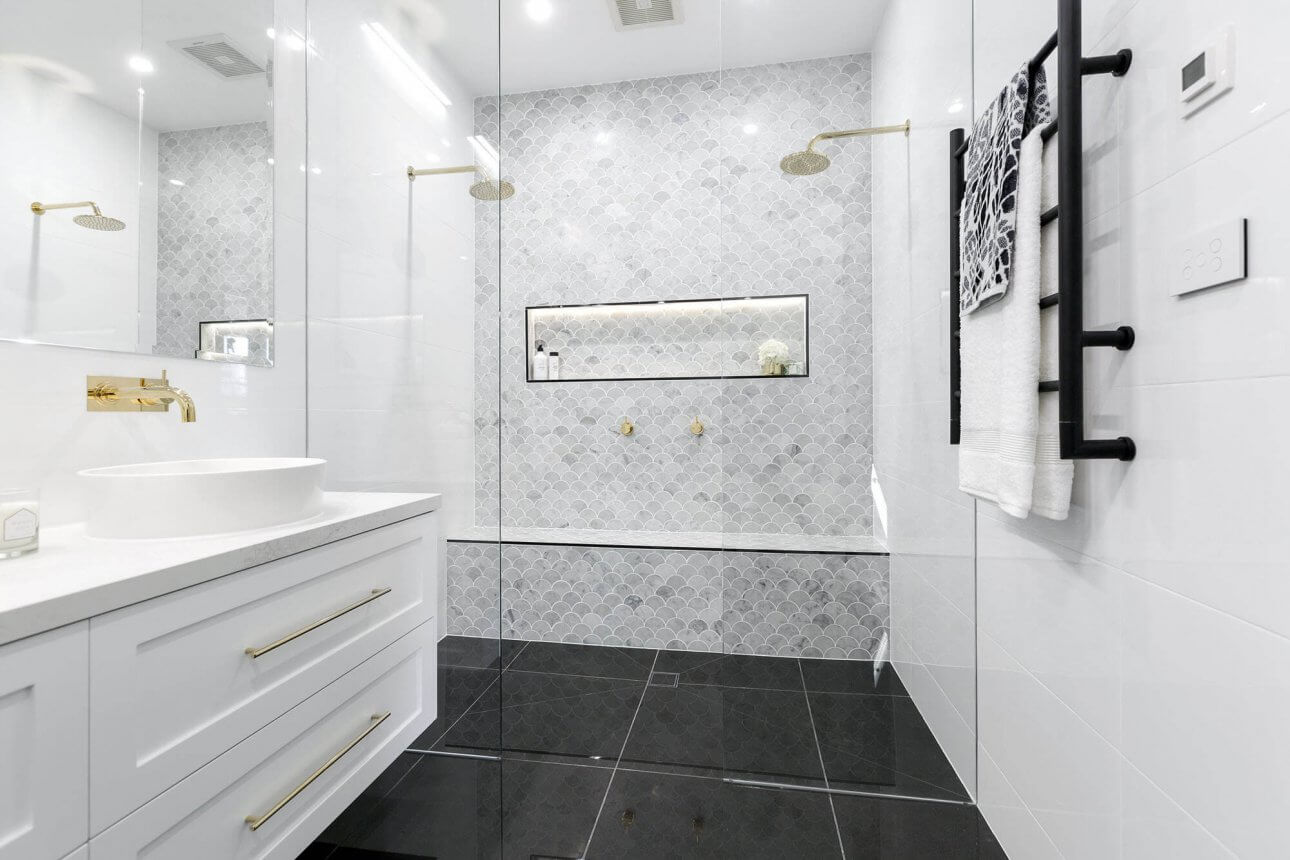
Julia and Sasha
Beautiful. I expected it to be! I love the simplicity and that shower bench is fantastic. Just adds depth to the space. There is no bath in here, but remember their ensuite was ginormous so they did put one in there. The judges gave them 28.5/30.
…
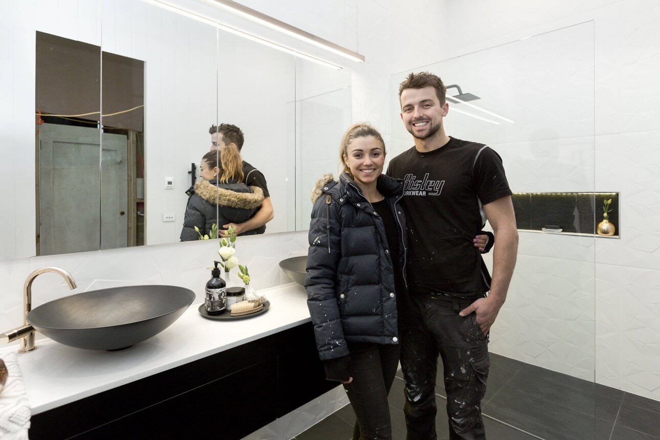
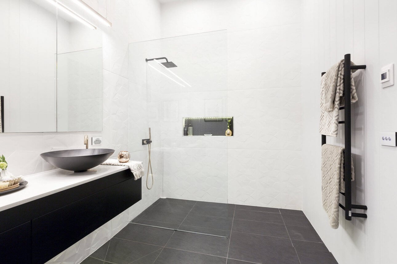
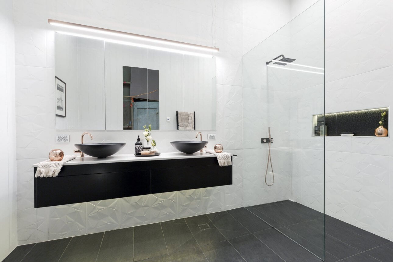
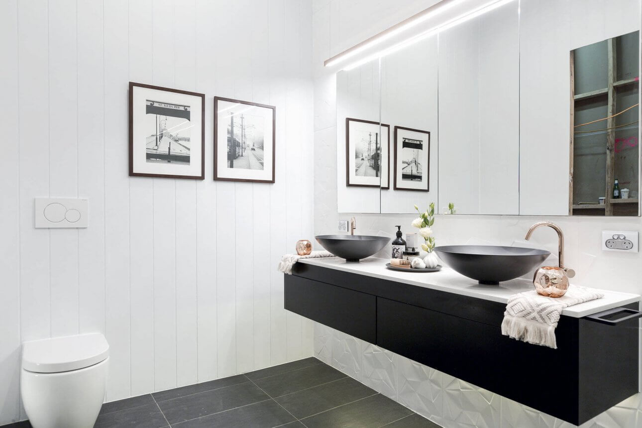
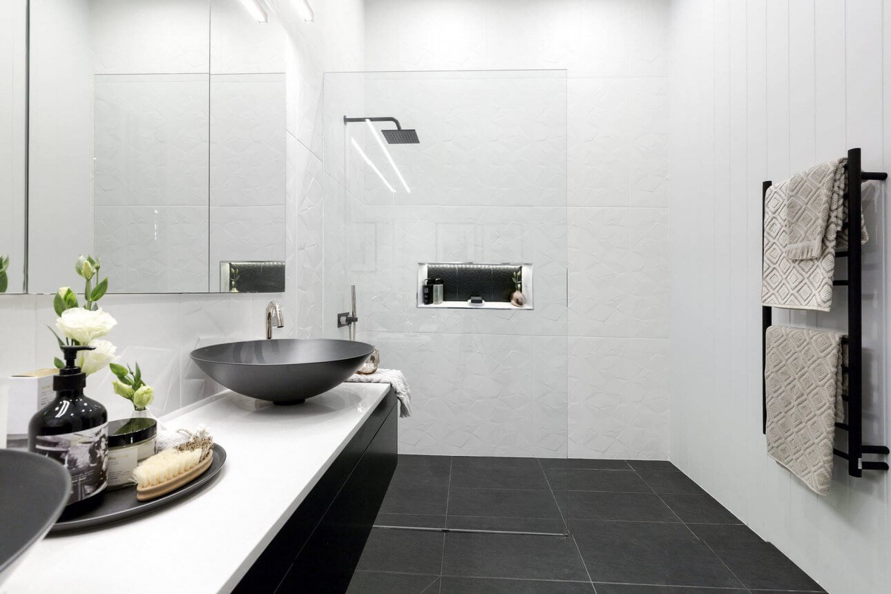
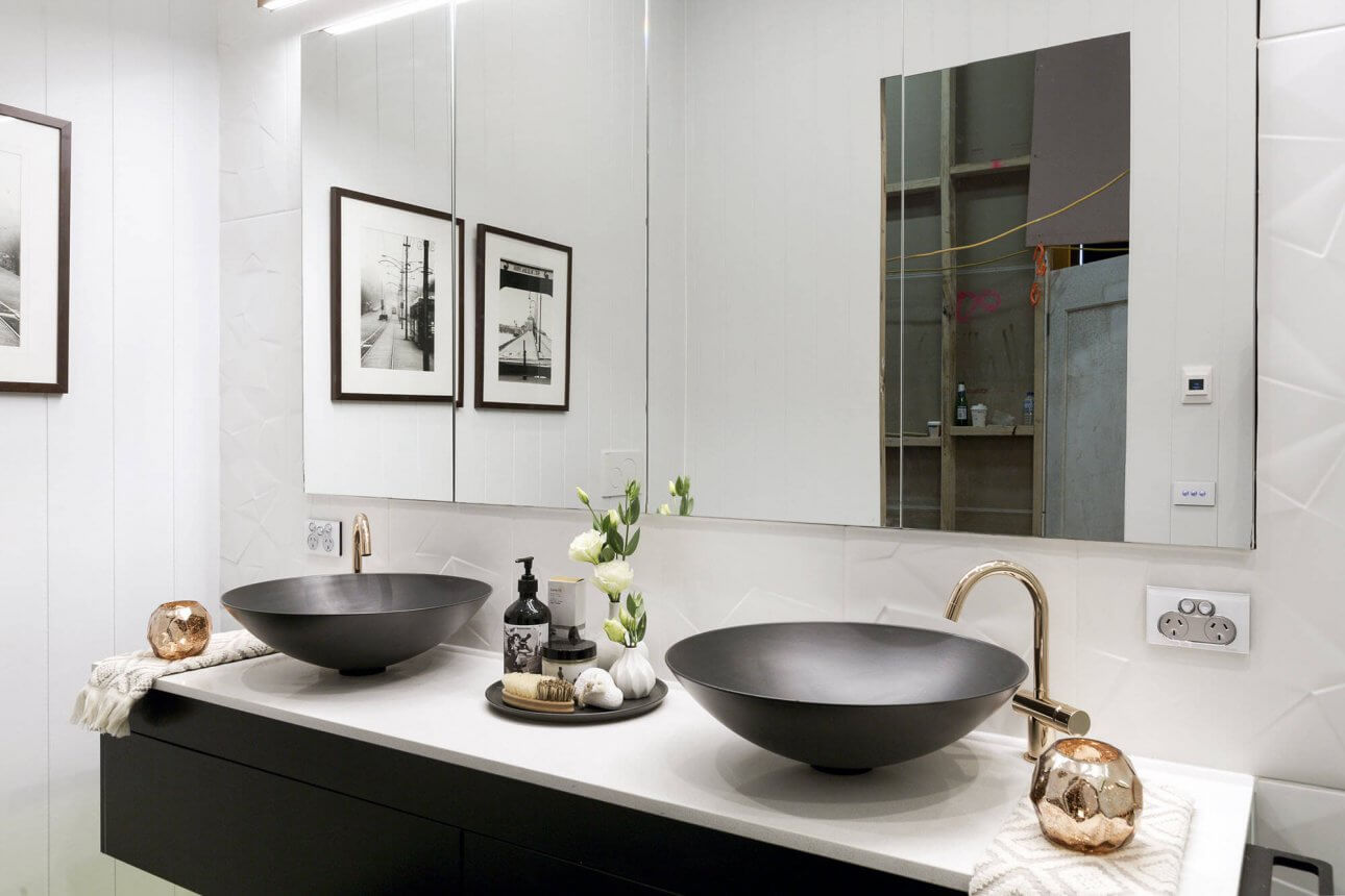
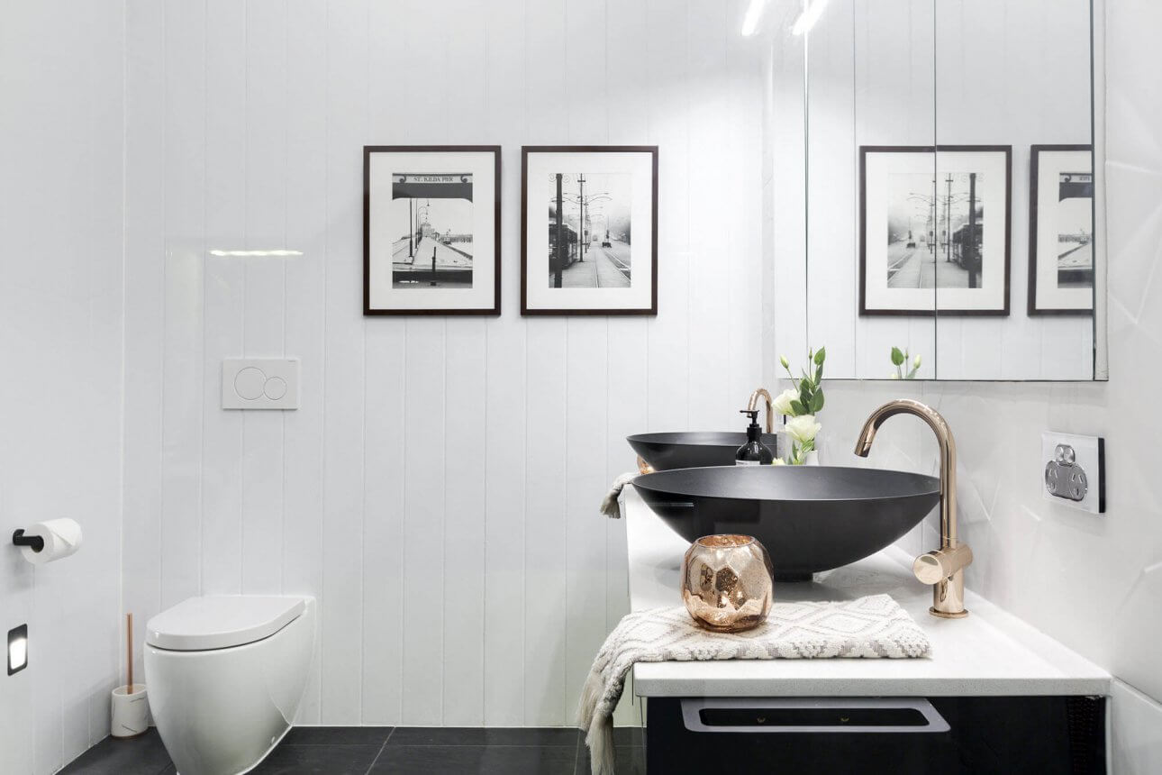
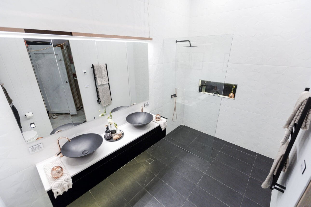
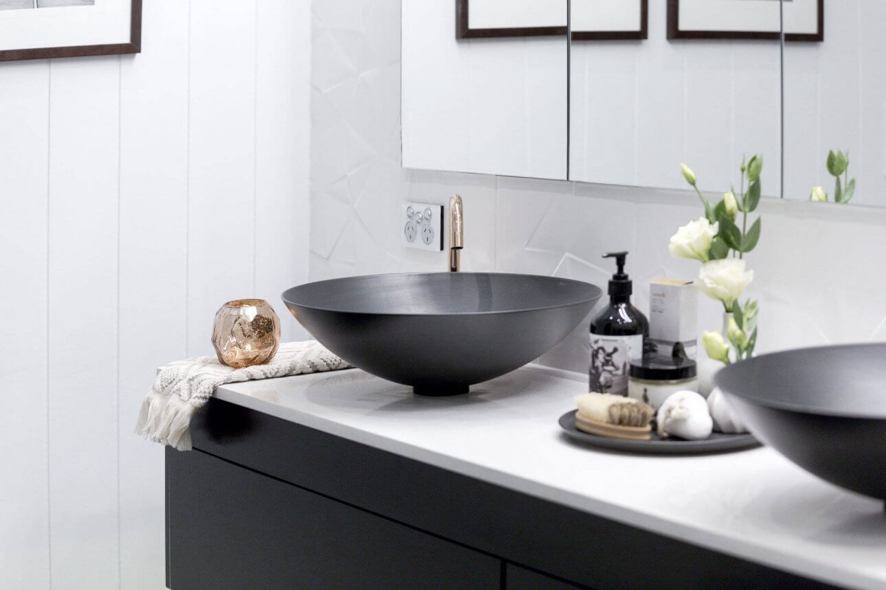
Will and Karlie
This bathroom is tops. They’ve thought of everything with all the little details. The wall tiles are gorgeous – with the panelling on one side too. The toilet flush button is even perfect! They’ve even hung a hairdryer/straightener bracket off the side of the vanity. I think their styling is going to be hard to beat in the coming weeks. The judges gave them 27/30.
…
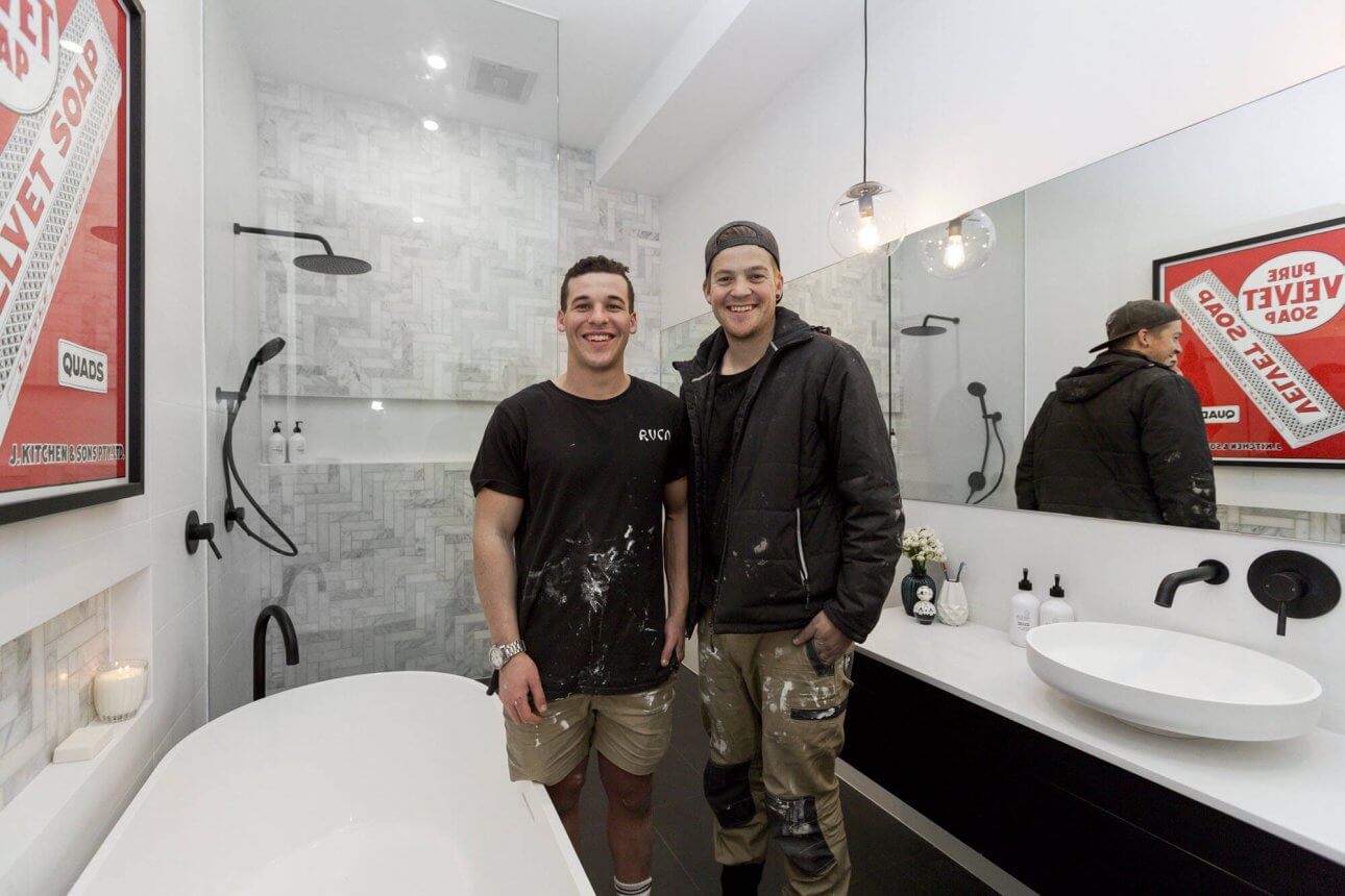
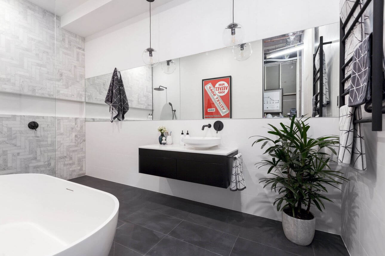
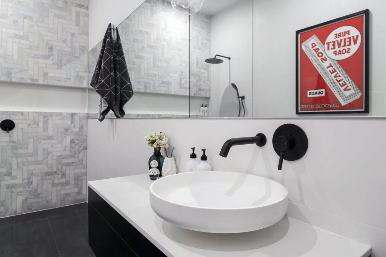
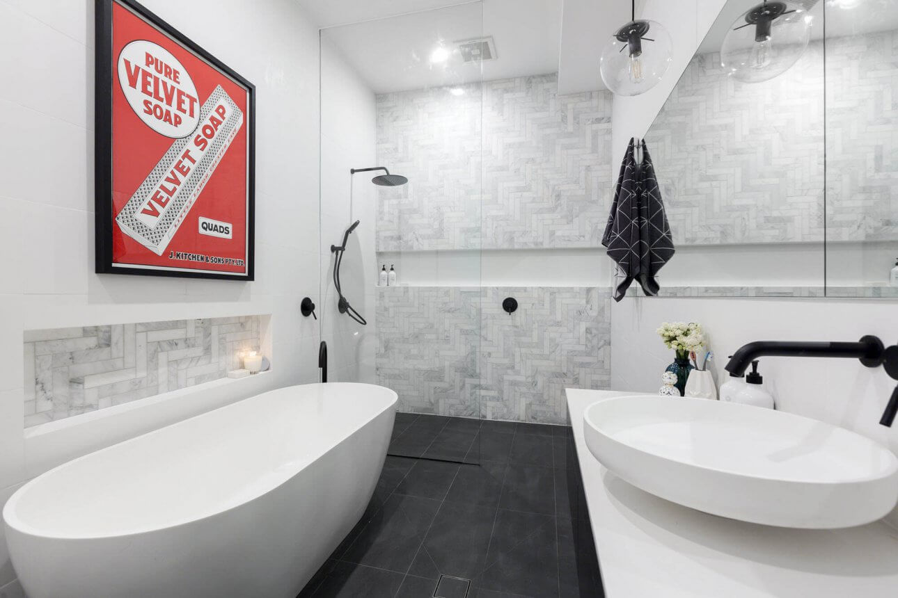
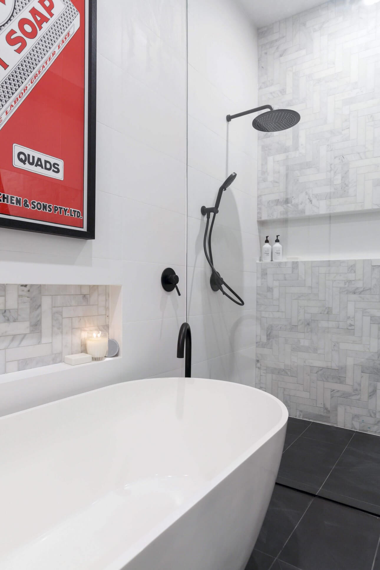
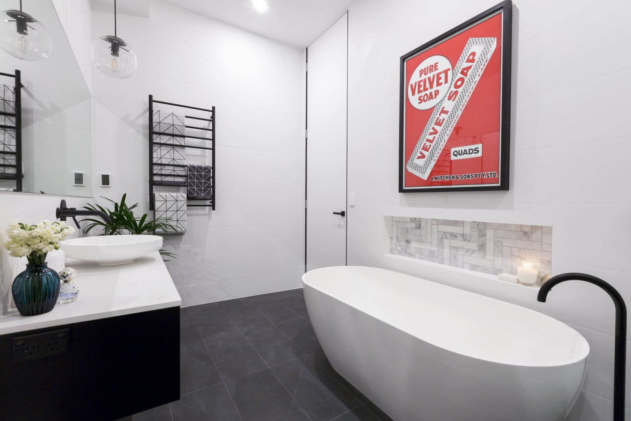
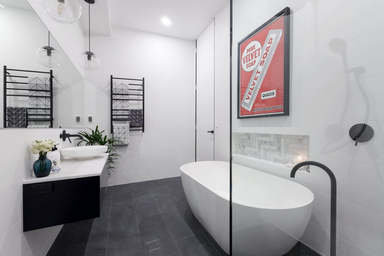
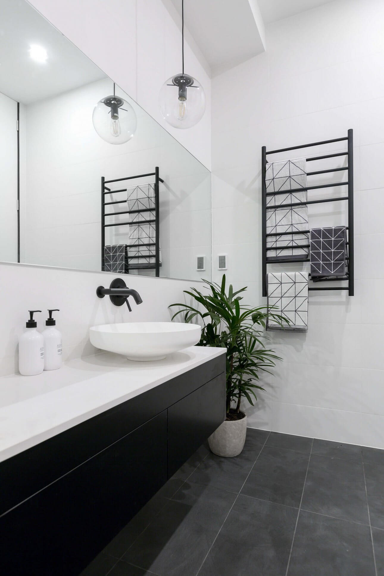
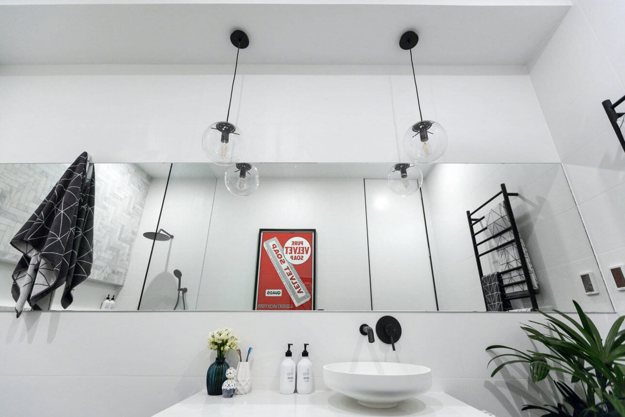
Ben and Andy
The artwork is a huge feature in here. I know they lost points for no toilet, but I feel good about this bathroom. The symmetry in the space is balanced, and the huge glass wall in the shower is a bit special. I love the full-width niche in the shower too. It’s a simple room bit it works for me. The judges gave them 19.5/30.
…
Kim and Chris
No luck for these guys this week. It wasn’t my favourite. The bath hob didn’t work for me, nor did the art deco panels on the wall. Too many things/elements happening in here. The judges gave them 19/30.
…
What did you think of the bathrooms last night?
Be the first to read my stories
Get Inspired by the World of Interior Design
Thank you for subscribing to the newsletter.
Oops. Something went wrong. Please try again later.



Comments
Maria Stephenson
I loved the older couples bathroom as it is more what I love. The boys I felt sorry for as I dont like toilets in bathrooms. X
Maria Stephenson
Loved the older couples bathroom as more my style. The boys I felt sorry for as I do not like toilets in bathrooms, but I know it is the norm now.x
LDC
Also dont like toilets in bathrooms, they need to be separated.
Caroline
I loathe the winning bathroom – what style is it meant to be? Its a complete mish-mash.
Nothing very inspiring in that lot I have to say. Don’t like black shiny floor tiles in the girls’ bathroom. Quite like the boys’ one but its not that great a layout.
Colleen Connolly
I loved Will & Karlie’s! ❤️
Julie
I loved Julia and Sasha’s bathroom! Will and Karlie’s was second for me.
Julee
Will & Karlie
Could you let me know name of panelling used & where I can purchase.
Thank You