Light Mode
Dark Mode

Sign Up For Our Newsletter

Subscribe to get our latest content by email receive a free download on ‘How to Add Value to Your Home’.

Thank you for subscribing to the newsletter.

Oops. Something went wrong. Please try again later.

Home·2014

Year: 2014

If you missed anything this week, never fear, I've linked you up in one post below... ;) Win a $500 Temple and Webster voucher A floor plan which I love Good things I have found on the Internet this week The Block Glasshouse A simple and cool DIY project Aldi is smashing it   PLUS, …

♥ Above is my favourite room of the week. ♥ I signed up to do this course from Living from the Inside Out. I just felt like doing something new and trying something different. It's very refreshing. ♥ This made me laugh- you can spend a night at IKEA next weekend! Visit the article to …

Room 3 has been revealed on The Block Glasshouse - another bedroom + a study... I am really loving the style in this series! Here are all the pictures from the rooms... House 5 – Darren & Dee House 2 – Chris & Jenna House 1 – Michael & Carlene   House 4 – Simon …

I'm back with another Stunning Sunday post. Here's a home for sale in Doonan,(a suburb on the Sunshine Coast), Queensland. Immaculate landscaping sympathetic to the surrounding native hinterland envelops the home. Externally clean, square cut lines finished with a classy grey render meet an impressive sandstone wall at the home's main entrance. - Agent. There's …

Introducing the 2015 IKEA Catalogue, celebrating the bedroom and the bathroom! IKEA has released it's new catalogue today. Hope you can get your hands on one? I received one a couple of weeks ago and it's a beauty. So many new and cool items. IKEA loves the everyday and they are committed to making everyday …

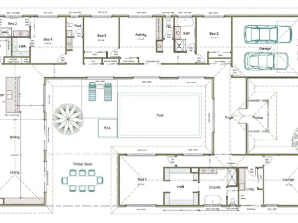
It's Floor Plan Friday today! I found this plan which is cool. Look at the bifold doors off the Master, Office and Dining. Love them! Oh can you just imagine how the outdoor area would look with those doors? A deck? And a pool? Yes please. The kitchen/pantry/laundry layout is perfect. Overall this is a …

1. Use a white background Creating as much white space as possible helps to showcase what really matters - your writing/photos! You want your readers to focus on your content. A white background presents your blog as fresh, clean and sophisticated. Busy backgrounds will hurt your blog (not to mention your eyes). Also, a patterned …

You may have seen around the traps that my lovely friends, Josh & Jenna, have become ambassadors for Beacon Lighting and have released their OWN range of lighting! Winning! I am happy for them and proud because they work hard and have fabulous taste... Here's some information about their new range: Using lamps is an …

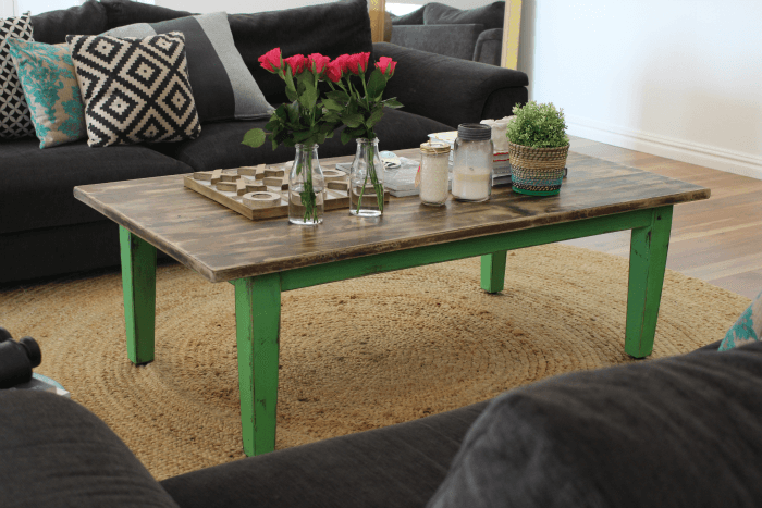
I managed to squeeze in another little DIY project this week using paint from Chalk Paint™ by Annie Sloan. My Mum sent this table over to me after seeing my last coffee table makeover and said she wanted the same but she preferred the colour "mint"... I knew this would turn out great! The orange/timber …

Trending Now